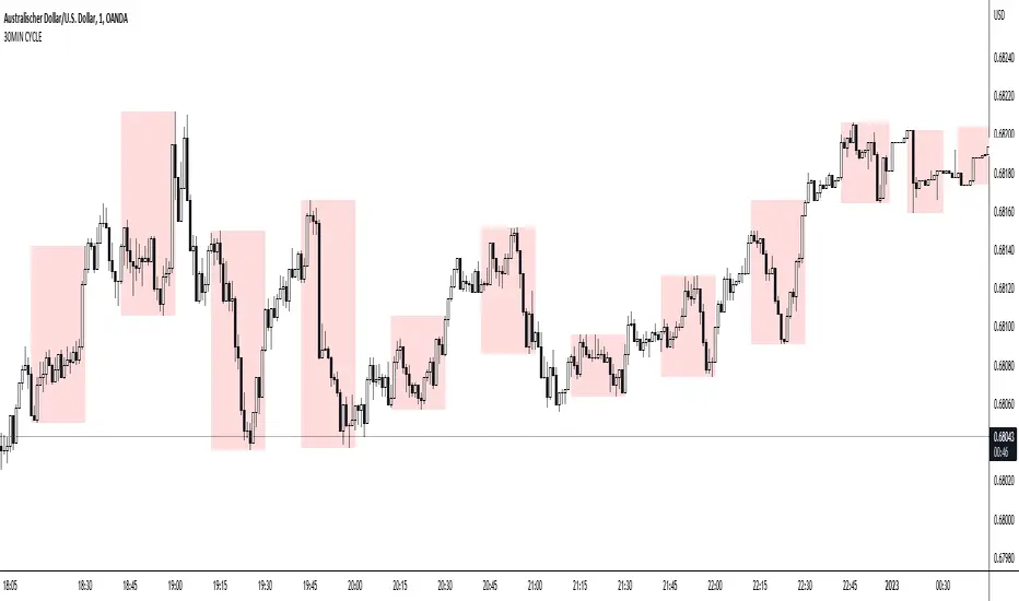
SW Gann Pressure time from tops and bottomsW.D. Gann's trading techniques often emphasized the significance of time in the markets, believing that specific time intervals could influence price movements. Here’s how the 30, 60, 90, 120, 180, and 270 bar intervals relate to Gann's rules:
1. **30 Bars**:
- Gann often viewed shorter time frames as critical for identifying short-term trends. A 30-bar interval can signify minor cycles or potential turning points in price.
2. **60 Bars**:
- This interval is significant as Gann believed in the importance of quarterly cycles. A 60-bar mark could indicate a completion of a two-month cycle, often leading to retracements or reversals.
3. **90 Bars**:
- Gann considered 90 days (or bars) to represent a quarter. This interval can signify a substantial shift in market sentiment or a pivotal point in a longer trend.
4. **120 Bars**:
- The 120-bar mark corresponds to about four months. Gann viewed longer intervals as more significant, often leading to major shifts in market trends.
5. **180 Bars**:
- A 180-bar period relates to a semi-annual cycle, which Gann regarded as critical for major support and resistance levels. Price action around this interval can reveal potential long-term trend reversals.
6. **270 Bars**:
- Gann believed that longer cycles, such as 270 bars (approximately nine months), could indicate significant market phases. This interval may represent major turning points and help identify long-term trends.
### Application in Trading:
- **Identifying Trends**: Traders can use these intervals to spot potential trend reversals or continuations based on Gann’s principles of market cycles.
- **Setting Targets and Stops**: Knowing where these key bars fall can help in setting profit targets and stop-loss orders.
- **Analyzing Market Sentiment**: Price reactions at these intervals can provide insights into market psychology and sentiment shifts.
By marking these intervals on a chart, traders can visually assess when price action aligns with Gann's theories, helping them make more informed trading decisions based on historical patterns and cycles.
Komut dosyalarını "Cycle" için ara
Timed Ranges [mktrader]The Timed Ranges indicator helps visualize price ranges that develop during specific time periods. It's particularly useful for analyzing market behavior in instruments like NASDAQ, S&P 500, and Dow Jones, which often show reactions to sweeps of previous ranges and form reversals.
### Key Features
- Visualizes time-based ranges with customizable lengths (30 minutes, 90 minutes, etc.)
- Tracks high/low range development within specified time periods
- Shows multiple cycles per day for pattern recognition
- Supports historical analysis across multiple days
### Parameters
#### Settings
- **First Cycle (HHMM-HHMM)**: Define the time range of your first cycle. The duration of this range determines the length of all subsequent cycles (e.g., "0930-1000" creates 30-minute cycles)
- **Number of Cycles per Day**: How many consecutive cycles to display after the first cycle (1-20)
- **Maximum Days to Display**: Number of historical days to show the ranges for (1-50)
- **Timezone**: Select the appropriate timezone for your analysis
#### Style
- **Box Transparency**: Adjust the transparency of the range boxes (0-100)
### Usage Example
To track 30-minute ranges starting at market open:
1. Set First Cycle to "0930-1000" (creates 30-minute cycles)
2. Set Number of Cycles to 5 (will show ranges until 11:30)
3. The indicator will display:
- Range development during each 30-minute period
- Visual progression of highs and lows
- Color-coded cycles for easy distinction
### Use Cases
- Identify potential reversal points after range sweeps
- Track regular time-based support and resistance levels
- Analyze market structure within specific time windows
- Monitor range expansions and contractions during key market hours
### Tips
- Use in conjunction with volume analysis for better confirmation
- Pay attention to breaks and sweeps of previous ranges
- Consider market opens and key session times when setting cycles
- Compare range sizes across different time periods for volatility analysis
The Investment ClockThe Investment Clock was most likely introduced to the general public in a research paper distributed by Merrill Lynch. It’s a simple yet useful framework for understanding the various stages of the US economic cycle and which asset classes perform best in each stage.
The Investment Clock splits the business cycle into four phases, where each phase is comprised of the orientation of growth and inflation relative to their sustainable levels:
Reflation phase (6:01 to 8:59): Growth is sluggish and inflation is low. This phase occurs during the heart of a bear market. The economy is plagued by excess capacity and falling demand. This keeps commodity prices low and pulls down inflation. The yield curve steepens as the central bank lowers short-term rates in an attempt to stimulate growth and inflation. Bonds are the best asset class in this phase.
Recovery phase (9:01 to 11:59): The central bank’s easing takes effect and begins driving growth to above the trend rate. Though growth picks up, inflation remains low because there’s still excess capacity. Rising growth and low inflation are the Goldilocks phase of every cycle. Stocks are the best asset class in this phase.
Overheat phase(12:01 to 2:59): Productivity growth slows and the GDP gap closes causing the economy to bump up against supply constraints. This causes inflation to rise. Rising inflation spurs the central banks to hike rates. As a result, the yield curve begins flattening. With high growth and high inflation, stocks still perform but not as well as in recovery. Volatility returns as bond yields rise and stocks compete with higher yields for capital flows. In this phase, commodities are the best asset class.
Stagflation phase (3:01 to 5:59): GDP growth slows but inflation remains high (sidenote: most bear markets are preceded by a 100%+ increase in the price of oil which drives inflation up and causes central banks to tighten). Productivity dives and a wage-price spiral develops as companies raise prices to protect compressing margins. This goes on until there’s a steep rise in unemployment which breaks the cycle. Central banks keep rates high until they reign in inflation. This causes the yield curve to invert. During this phase, cash is the best asset.
Additional notes from Merrill Lynch:
Cyclicality: When growth is accelerating (12 o'clock), Stocks and Commodities do well. Cyclical sectors like Tech or Steel outperform. When growth is slowing (6 o'clock), Bonds, Cash, and defensives outperform.
Duration: When inflation is falling (9 o'clock), discount rates drop and financial assets do well. Investors pay up for long duration Growth stocks. When inflation is rising (3 o'clock), real assets like Commodities and Cash do best. Pricing power is plentiful and short-duration Value stocks outperform.
Interest Rate-Sensitives: Banks and Consumer Discretionary stocks are interest-rate sensitive “early cycle” performers, doing best in Reflation and Recovery when central banks are easing and growth is starting to recover.
Asset Plays: Some sectors are linked to the performance of an underlying asset. Insurance stocks and Investment Banks are often bond or equity price sensitive, doing well in the Reflation or Recovery phases. Mining stocks are metal price-sensitive, doing well during an Overheat.
About the indicator:
This indicator suggests iShares ETFs for sector rotation analysis. There are likely other ETFs to consider which have lower fees and are outperforming their sector peers.
You may get errors if your chart is set to a different timeframe & ticker other than 1d for symbol/tickers GDPC1 or CPILFESL.
Investment Clock settings are based on a "sustainable level" of growth and inflation, which are each slightly subjective depending on the economist and probably have changed since the last time this indicator was updated. Hence, the sustainable levels are customizable in the settings. When I was formally educated I was trained to use average CPI of 3.1% for financial planning purposes, the default for the indicator is 2.5%, and the Medium article backtested and optimized a 2% sustainable inflation rate. Again, user-defined sustainable growth and rates are slightly subjective and will affect results.
I have not been trained or even had much experience with MetaTrader code, which is how this indicator was originally coded. See the original Medium article that inspired this indicator if you want to audit & compare code.
Hover over info panel for detailed information.
Features: Advanced info panel that performs Investment Clock analysis and offers additional hover info such as sector rotation suggestions. Customizable sustainable levels, growth input, and inflation input. Phase background coloring.
⚠ DISCLAIMER: Not financial advice. Not a trading system. DYOR. I am not affiliated with Medium, Macro Ops, iShares, or Merrill Lynch.
About the Author: I am a patent-holding inventor, a futures trader, a hobby PineScripter, and a former FINRA Registered Representative.
CCI with Subjective NormalizationCCI (Commodity Channel Index) with Subjective Normalization
This indicator computes the classic CCI over a user-defined length, then applies a subjective mean and scale to transform the raw CCI into a pseudo Z‑score range. By adjusting the “Subjective Mean” and “Subjective Scale” inputs, you can shift and rescale the oscillator to highlight significant tops and bottoms more clearly in historical data.
1. CCI Calculation:
- Uses the standard formula \(\text{CCI} = \frac{\text{price} - \text{SMA(price, length)}}{0.015 \times \text{mean deviation}}\) over a user-specified length (default 500 bars).
2. Subjective Normalization:
- After CCI is calculated, it is divided by “Subjective Scale” and offset by “Subjective Mean.”
- This step effectively re-centers and re-scales the oscillator, helping you align major lows or highs at values like –2 or +2 (or any desired range).
3. Usage Tips:
- CCI Length controls how far back the script measures average price and deviation. Larger values emphasize multi-year cycles.
- Subjective Mean and Scale let you align the oscillator’s historical lows and highs with numeric levels you prefer (e.g., near ±2).
- Adjust these parameters to fit your particular market analysis or to match known cycle tops/bottoms.
4. Plot & Zero Line:
- The indicator plots the normalized CCI in yellow, along with a zero line for quick reference.
- Positive values suggest price is above its long-term mean, while negative values suggest it’s below.
This approach offers a straightforward momentum oscillator (CCI) combined with a customizable normalization, making it easier to spot historically significant overbought/oversold conditions without writing complex code yourself.
[blackcat] L2 Ehlers Autocorrelation Periodogram V2OVERVIEW
The Ehlers Autocorrelation Periodogram is a sophisticated technical analysis tool that identifies market cycles and their dominant frequencies using autocorrelation and spectral analysis techniques.
BACKGROUND
Developed by John F. Ehlers and detailed in his book "Cycle Analytics for Traders" (2013), this indicator combines autocorrelation functions with discrete Fourier transforms to extract cyclic information from price data.
FUNCTION
The indicator works through these key steps:
Calculates autocorrelation using minimum three-bar averaging
Applies discrete Fourier transform to extract cyclic information
Uses center-of-gravity algorithm to determine dominant cycle
ADVANTAGES
• Rapid response within half-cycle periods
• Accurate relative cyclic power estimation over time
• Correlation constraints between -1 and +1 eliminate amplitude compensation needs
• High resolution independent of windowing functions
HOW TO USE
Add the indicator to your chart
Adjust AvgLength input parameter:
• Default: 3 bars
• Higher values increase smoothing
• Lower values increase sensitivity
Interpret the results:
• Colored bars represent spectral power
• Red to yellow spectrum indicates cycle strength
• White line shows dominant cycle period
INTERPRETATION
• Strong colors indicate significant cyclic activity
• Sharp color transitions suggest potential cycle changes
• Dominant cycle line helps identify primary market rhythm
LIMITATIONS
• Requires sufficient historical data
• Performance may vary in non-cyclical markets
• Results depend on proper parameter settings
NOTES
• Uses highpass and super smoother filtering techniques
• Spectral estimates are normalized between 0 and 1
• Color intensity varies based on spectral power
THANKS
This implementation is based on Ehlers' original work and has been adapted for TradingView's Pine Script platform.
SW Gann DaysGann pressure days, named after the famous trader W.D. Gann, refer to specific days in a trading month that are believed to have significant market influence. These days are identified based on Gann's theories of astrology, geometry, and market cycles. Here’s a general outline of how they might be understood:
1. **Market Cycles**: Gann believed that markets move in cycles and that certain days can have heightened volatility or trend changes. Traders look for specific dates based on historical price movements.
2. **Timing Indicators**: Pressure days often align with key economic reports, earnings announcements, or geopolitical events that can cause price swings.
3. **Mathematical Patterns**: Gann used angles and geometric patterns to predict price movements, with pressure days potentially aligning with these calculations.
4. **Historical Patterns**: Traders analyze past data to identify dates that historically show strong price reactions, using this to predict future behavior.
5. **Astrological Influences**: Some practitioners incorporate astrological elements, believing that celestial events (like full moons or planetary alignments) can impact market psychology.
Traders might use these concepts to make decisions about entering or exiting positions, but it’s important to note that Gann's methods can be complex and are not universally accepted in trading communities.
Interval & Session Market StatisticsThe "Interval & Session Market Statistics" indicator is designed to uncover recurring patterns and market inefficiencies by analyzing market cycles. By breaking down price movements into defined intervals and sessions, this tool helps traders pinpoint periods of strength and weakness—identifying both bullish and bearish trends with clear percentage breakdowns. Its comprehensive visual tables make it easier to detect accumulation, distribution, and potential turning points, providing valuable insights that can be leveraged to optimize trading strategies.
Important: If the indicator does not reveal a strong bias toward either short or long positions and the statistics hover around 50%, consider reducing the analysis start date and adjusting the end time of the first interval in the settings. Over longer periods, the market tends to revert to a 50/50 balance, so significant deviations are often more visible in weekly or monthly intervals. Since this indicator focuses on intraday cycles, fine-tuning these parameters is crucial for capturing actionable trends.
Индикатор "Interval & Session Market Statistics" разработан для выявления закономерностей и неэффективностей на основе рыночных циклов. Разбивая ценовые движения на заданные интервалы и сессии, инструмент помогает трейдерам определить периоды силы и слабости, выявляя как бычьи, так и медвежьи тренды с наглядным процентным отображением. Подробные таблицы позволяют обнаруживать зоны накопления и распределения, а также потенциальные разворотные моменты, что даёт ценные данные для оптимизации торговых стратегий.
Важно: Если индикатор не выявляет ярко выраженного перекоса в сторону шортового или лонгового приоритета, и статистика колеблется в районе 50%, рекомендуется уменьшить дату начала анализа и поработать с окончанием первого интервала в настройках индикатора. На более длительных периодах рынок обычно стремится к балансу в 50%, поэтому существенные отклонения эффективнее искать в рамках недельных или месячных интервалов. Поскольку данный индикатор ориентирован на внутридневные циклы, корректировка этих параметров имеет решающее значение для выявления значимых трендов.
Retrograde Periods (Multi-Planet)**Retrograde Periods (Multi-Planet) Indicator**
This TradingView script overlays your chart with a dynamic visualization of planetary retrograde periods. Built in Pine Script v6, it computes and displays the retrograde status of eight planets—Mercury, Venus, Mars, Jupiter, Saturn, Uranus, Neptune, and Pluto—using hard-coded retrograde intervals from 2009 to 2026.
**Key Features:**
- Dynamic Background Coloring:
The indicator changes the chart’s background color based on the current retrograde status of the planets. The colors follow a priority order (Mercury > Venus > Mars > Jupiter > Saturn > Uranus > Neptune > Pluto) so that if multiple planets are retrograde simultaneously, the highest-priority planet’s color is displayed.
- Interactive Planet Selection:
User-friendly checkboxes allow you to choose which planets to list in the table’s “Selected” row. Note that while these checkboxes control the display of the planet names in the table, the retrograde calculations remain independent of these selections.
- Real-Time Retrograde Status Table:
A table in the top-right corner displays each planet’s retrograde status in real time. “Yes” is shown in red for a planet in retrograde and “No” in green when it isn’t. This offers an at-a-glance view of the cosmic conditions influencing your charts.
- Astrological & Astronomical Insights:
Whether you’re into sidereal astrology or simply fascinated by celestial mechanics, this script lets you visualize those retrograde cycles. In astrology, retrograde periods are often seen as times for reflection and re-evaluation, while in astronomy they reflect the natural orbital motions seen from our perspective on Earth.
Enhance your trading setup by integrating cosmic cycles into your technical analysis. Happy trading and cosmic exploring!
cycle144 dr ramy After Given Date📌 Description for Script Publishing
Cycle144 dr ramy After Given Date is a visual tool that highlights time-based cycles on the chart by marking specific candles that occur after a user-defined starting point.
🔹 How It Works:
You choose a specific date and time.
The script automatically identifies and labels the 18th, 36th, 54th, 72nd, 90th, 108th, 126th, and 144th candles after your selected date.
At each of those candles, the script:
Places a label (e.g., "18th Candle", "36th Candle", etc.).
Draws horizontal lines from the candle's high and low, extended to the right.
🔹 Purpose:
This indicator helps traders observe and analyze market behavior at regular cycle intervals after a significant date. It's useful for cycle-based strategies, time symmetry analysis, or just to visualize how price reacts at recurring time steps.
🛠️ No signals or strategies are included — this is a charting utility only.
Gann & Fibonacci Analysis for MSTRYes! Below is a step-by-step guide to performing Gann Analysis on MSTR in TradingView for the last year.
Step 1: Set Up the Chart
Open TradingView and search for MSTR (MicroStrategy).
Select the 1-day (D) timeframe to analyze the past year.
Set your chart to logarithmic scale (⚙ Settings → Scale → Log).
Enable grid lines for alignment (⚙ Settings → Appearance → Grid Lines).
Step 2: Identify Key Highs and Lows (Last Year)
Find the 52-week high and 52-week low for MSTR.
As of now:
52-Week High: ~$999 (March 2024).
52-Week Low: ~$280 (October 2023).
Step 3: Plot Gann Angles
Using TradingView's Gann Fan Tool:
Select "Gann Fan" (Press / and type “Gann Fan” to find it).
Start at the 52-week low (~$280, October 2023) and drag upwards.
Adjust the angles to match key levels:
1x1 (45°) → Main trendline
2x1 (26.5°) → Strong uptrend
4x1 (15°) → Weak trendline
1x2 (63.75°) → Strong resistance
Repeat the process from the 52-week high (~$999, March 2024) downward to see bearish angles.
Step 4: Apply Fibonacci & Gann Retracement Levels
Using Fibonacci Retracement:
Select "Fibonacci Retracement" tool.
Draw from 52-week high ($999) to 52-week low ($280).
Enable key Fibonacci levels:
23.6% ($816)
38.2% ($678)
50% ($640)
61.8% ($550)
78.6% ($430)
Watch for price reactions near these levels.
Using Gann Retracement Levels:
Select "Gann Box" in TradingView.
Draw from 52-week high ($999) to low ($280).
Enable key Gann retracement levels:
12.5% ($912)
25% ($850)
37.5% ($768)
50% ($640)
62.5% ($550)
75% ($480)
87.5% ($350)
Identify confluences with Gann angles and Fibonacci levels.
Step 5: Identify Significant Dates & Time Cycles
Use "Date Range" Tool in TradingView.
Mark major turning points:
High → Low: ~180 days (Half-year cycle).
Low → High: ~90 days (Quarter cycle).
Use Square-Outs (Time = Price method):
Example: If MSTR hit $500, check 500 days from key events.
Mark key anniversaries of past highs/lows for possible reversals.
Step 6: Analyze and Trade Execution
✅ If MSTR is at a Gann angle + Fibonacci level + key date → Expect a reaction.
✅ Use RSI, MACD, and Volume for extra confirmation.
✅ Set Stop-Loss at nearest Gann support/resistance.
Dominant Direction (DD)The Dominant Direction indicator is a custom technical analysis tool that uses the Dominant Cycle Estimators library to identify the dominant trend direction in the market. The indicator utilizes the MAMA Cycle function, which is a part of the library, to calculate the period of the data. The resulting period is then used to plot lines on the chart that represent the dominant trend direction.
The indicator takes two inputs, the source of data, and the high and low values of the source. The MAMA Cycle function is used to calculate the period of the data, with the lower bound and upper bound of the dynamic length defined by the user. The indicator then plots lines on the chart to represent the dominant trend direction. The lines are plotted from the current bar to the bar that is a certain number of periods away, as defined by the MAMA Cycle function, in the direction of the trend.
The indicator also has a feature of removing the lines when the trend is no longer confirmed. If the bar state is confirmed, the line is deleted and this helps the user to have a clearer view of the chart.
In summary, the Dominant Direction indicator is a powerful tool for identifying the dominant trend direction in the market. It uses the MAMA Cycle function to calculate the period of the data and plots lines on the chart to represent the dominant trend direction. This can help traders identify potential entry and exit points, and make more informed trading decisions.
True Open CalculationsIndicator Description: True Open Calculations
This custom Pine Script indicator calculates and plots key "True Open" levels based on specific time intervals and trading sessions. The True Open levels represent significant price points on the chart, helping traders identify key reference points tied to various market opening times. These levels are important for understanding price action in relation to market sessions and trading cycles. The indicator is designed to plot lines corresponding to different "True Opens" on the chart and display labels with the associated information.
Key Features:
True Year Open:
This represents the opening price on the first Monday of April each year. It serves as a reference point for the yearly price level.
Plot Color: Green.
True Month Open:
This represents the opening price on the second Monday of each month. It helps in identifying monthly trends and provides a key reference for monthly price movements.
Plot Color: Blue.
True Week Open:
This represents the opening price every Monday at 6:00 PM. It gives traders a level to track weekly opening movements and can be useful for weekly trend analysis.
Plot Color: Orange.
True Day Open:
This represents the opening price at 12:00 AM (midnight) each day. It serves as a daily benchmark for price action at the start of the trading day.
Plot Color: Red.
True New York Session Open:
This represents the opening price at 7:30 AM (New York session start time). This level is crucial for traders focused on the New York trading session.
Plot Color: Purple.
Additional Features:
Labels: The indicator displays labels to the right of each plotted line to describe which "True Open" it represents (e.g., "True Year Open," "True Month Open," etc.).
Dynamic Plotting: The lines are only plotted on the current candle, and the lines are dynamically updated for each time period based on the corresponding "True Open."
Visual Cues: The colors of the plotted lines (green, blue, orange, red, purple) help quickly distinguish between different "True Open" levels, making it easy for traders to track price action and make informed decisions.
Use Cases:
Yearly, Monthly, Weekly, Daily, and Session Benchmarking: This indicator provides traders with important price levels to use as benchmarks for the current year, month, week, and day, helping to identify trends and potential reversals.
Session Awareness: It is particularly useful for traders who want to track key market sessions, such as the New York session, and their impact on price movement.
Long-term Analysis: By including the yearly open, this indicator helps traders gain a broader perspective on market trends and provides context for analyzing shorter-term price movements.
Benefits:
Helps identify important reference points for longer-term trends (yearly, monthly) as well as shorter-term moves (daily, weekly, and session).
Visually intuitive with color-coded lines and labels, allowing quick and easy identification of key market open levels.
Dynamic and real-time: The indicator plots and updates the True Open levels dynamically as the market progresses.
Trading Sessions Highs/Lows | InvrsROBINHOODTrading Sessions Highs/Lows | InvrsROBINHOOD
🚀 A powerful indicator for tracking key trading sessions and the highs and lows of each session!
📌 Description
The Trading Sessions Highs/Lows indicator visually marks the most critical trading sessions—Asia, London, and New York—using small colored dots at the bottom of the candle. It also tracks and plots the highs and lows of each session, along with the Daily Open and Weekly Open levels.
This tool is designed to help traders identify session-based liquidity zones, price reactions, and potential trade setups with minimal chart clutter.
Key Features:
✅ Session markers (Asia, London, NY AM, NY Lunch, NY PM) plotted as small dots
✅ Plots session highs and lows for market structure insights
✅ Daily Open line for intraday reference
✅ Weekly Open line for higher timeframe bias
✅ Alerts for session high/low breaks to capture momentum shifts
✅ User-defined UTC offset for global traders
✅ Customizable session colors for personal preference
📖 How to Use the Indicator
1️⃣ Understanding the Sessions
Asia Session (Yellow Dot) → Marks liquidity buildup & pre-London moves
London Session (Blue Dot) → Strong volatility, breakout opportunities
New York AM Session (Green Dot) → Major trends & institutional participation
New York Lunch (Red Dot) → Low volume, ranging market
New York PM Session (Dark Green Dot) → End-of-day movements & reversals
2️⃣ Session Highs & Lows for Market Structure
Session Highs can act as resistance or breakout points.
Session Lows can act as support or stop-hunt zones.
Break of a session high/low with volume may indicate continuation or reversal.
3️⃣ Using the Daily & Weekly Open
The Daily Open (Black Line) helps gauge the intraday trend.
Above Daily Open → Bearish Bias
Below Daily Open → Bullish Bias
The Weekly Open (Red Line) sets the higher timeframe directional bias.
4️⃣ Alerts for Breakouts
The indicator will trigger alerts when price breaks session highs or lows.
Useful for setting stop-losses, breakout trades, and risk management.
💡 Why This Indicator is Important for Beginners
1️⃣ Avoids Overtrading:
Many beginners trade in low-volume periods (NY Lunch, Asia session) and get stuck in choppy price action.
This indicator highlights when volatility is high so traders focus on better opportunities.
2️⃣ Session-Based Liquidity Traps:
Market makers often run stops at session highs/lows before reversing.
Watching session breaks prevents traders from falling into liquidity grabs.
3️⃣ Reduces Emotional Trading:
If price is above the Daily Open, a beginner shouldn’t look for shorts.
If price is below a key session low, it may signal a fake breakout.
4️⃣ Aligns with Institutional Trading:
Smart money traders use session highs/lows to set stop hunts & reversals.
Beginners can use this indicator to spot these zones before entering trades.
🛡️ How to Mitigate Risk with This Indicator
✅ Wait for Confirmations – Don’t trade blindly at session highs/lows. Look for wicks, rejections, or break/retests.
✅ Use Stop-Loss Above/Below Session Levels – If you’re going long, set SL below a session low. If short, set SL above a session high.
✅ Watch Volume & News Events – Breakouts without strong volume or news may be fake moves.
✅ Combine with Other Strategies – Use price action, trendlines, or EMAs with this indicator for higher probability trades.
✅ Use the Weekly Open for Trend Bias – If price stays below the Weekly Open, avoid bullish setups unless key support holds.
🎯 Who is This Indicator For?
📌 Beginners who need clear session-based trading levels.
📌 Day traders & scalpers looking to refine their intraday setups.
📌 Smart money traders using liquidity concepts.
📌 Swing traders tracking higher timeframe momentum shifts.
🚀 Final Thoughts
This indicator is an essential tool for traders who want to understand market structure, liquidity, and volatility cycles. Whether you’re trading forex, stocks, or crypto, it helps you stay on the right side of the market and avoid unnecessary risks.
🔹 Set it up, customize your colors, define your UTC offset, and start trading smarter today! 🏆📈
Yearly Profit BackgroundDescription:
The Yearly Profit Background indicator is a powerful tool designed to help traders quickly visualize the profitability of each calendar year on their charts. By analyzing the annual performance of an asset, this indicator colors the background of each completed year green if the year was profitable (close > open) or red if it resulted in a loss (close < open). This visual representation allows traders to identify long-term trends and historical performance at a glance.
Key Features:
Annual Profit Calculation: Automatically calculates the yearly performance based on the opening price of January 1st and the closing price of December 31st.
Visual Background Coloring: Highlights each completed year with a green (profit) or red (loss) background, making it easy to spot trends.
Customizable Transparency: The background colors are set at 90% transparency, ensuring they don’t obstruct your chart analysis.
Optional Price Plots: Displays the annual opening (blue line) and closing (orange line) prices for additional context.
How to Use:
Add the indicator to your chart.
Observe the background colors for each completed year:
Green: The year was profitable.
Red: The year resulted in a loss.
Use the optional price plots to analyze annual opening and closing levels.
Ideal For:
Long-term investors analyzing historical performance.
Traders looking to identify multi-year trends.
Anyone interested in visualizing annual market cycles.
Why Use This Indicator?
Understanding the annual performance of an asset is crucial for making informed trading decisions. The Yearly Profit Background indicator simplifies this process by providing a clear, visual representation of yearly profitability, helping you spot patterns and trends that might otherwise go unnoticed.
Smoothed ROC Z-Score with TableSmoothed ROC Z-Score with Table
This indicator calculates the Rate of Change (ROC) of a chosen price source and transforms it into a smoothed Z-Score oscillator, allowing you to identify market cycle tops and bottoms with reduced noise.
How it works:
The ROC is calculated over a user-defined length.
A moving average and standard deviation over a separate window are used to standardize the ROC into a Z-Score.
This Z-Score is further smoothed using an exponential moving average (EMA) to filter noise and highlight clearer cycle signals.
The smoothed Z-Score oscillates around zero, with upper and lower bands defined by user inputs (default ±2 standard deviations).
When the Z-Score reaches or exceeds ±3 (customizable), the value shown in the table is clamped at ±2 for clearer interpretation.
The indicator plots the smoothed Z-Score line with zero and band lines, and displays a colored Z-Score table on the right for quick reference.
How to read it:
Values near zero indicate neutral momentum.
Rising Z-Scores towards the upper band suggest increasing positive momentum, possible market tops or strength.
Falling Z-Scores towards the lower band indicate negative momentum, potential bottoms or weakness.
The color-coded table gives an easy visual cue: red/orange for strong positive signals, green/teal for strong negative signals, and gray for neutral zones.
Use cases:
Identify turning points in trending markets.
Filter noisy ROC data for cleaner signals.
Combine with other indicators to time entries and exits more effectively.
Maancyclus Volatiliteitsindicator (2025)This Moon Cycle Volatility Indicator for TradingView is designed to help traders track and analyze market volatility around specific lunar phases, namely the Full Moon and New Moon. The indicator marks the dates of these moon phases on the chart and measures volatility using the Average True Range (ATR) indicator, which gauges market price fluctuations.
Key Features:
Moon Phase Markers: The indicator marks the Full Moon and New Moon on the chart using labels. Blue labels are placed below bars for Full Moons, while red labels are placed above bars for New Moons. These markers are based on a manually curated list of moon phase dates for the year 2025.
Volatility Calculation: The indicator calculates market volatility using the ATR (14), which provides a sense of market movement and potential risk. Volatility is plotted as histograms, with blue histograms representing volatility around Full Moons and red histograms around New Moons.
Comparative Analysis: By comparing the volatility around these moon phases to the average volatility, traders can spot potential patterns or heightened market movements. This can inform trading strategies, such as anticipating increased market activity around specific lunar events.
In essence, this tool helps traders identify potential high-volatility periods tied to lunar cycles, which could impact market sentiment and price action.
FX Rotation Dashboard – FX vs DXYFX Rotation Dashboard
This FX Rotation Dashboard indicator offers a clear, at-a-glance overview of the relative strength and momentum of major FX pairs when measured against the US Dollar Index (DXY). It helps identify which currency pairs are leading or lagging in performance and how their relative positioning is evolving over time.
🔎 Structure
Each row in the table represents a currency pair and provides the following data:
Symbol: The FX pair (e.g., EURJPY, GBPUSD, AUDNZD)
RS: The current relative strength ratio vs. DXY
MOM: The momentum of the RS – showing whether strength is accelerating or decelerating
Quadrant:
🔴 Lagging: Underperforming and losing momentum
🔵 Improving: Underperforming but gaining momentum
🟢 Leading: Outperforming with rising momentum
🟡 Weakening (not visible in current table): Outperforming but slowing down
Meaning: A descriptive label summarizing the quadrant status
🧭 Interpretation
Currency pairs in the Leading quadrant (e.g., EURJPY, GBPJPY, CHFJPY, CADJPY) are currently outperforming the USD with rising momentum – often indicating strength across both RS and MOM dimensions.
Pairs in the Improving quadrant (e.g., GBPUSD, EURUSD, AUDUSD) are showing positive momentum but still lagging in relative strength – potential early signs of rotation into leadership.
Pairs in the Lagging quadrant (e.g., USDCHF, USDJPY, AUDCHF) are underperforming and continue to weaken – often considered the least attractive at the current stage of the cycle.
🧠 Purpose
This FX Rotation visualization is particularly useful for:
Macro-level FX rotation analysis
Spotting emerging trends before they are fully priced in
Tracking performance of G10 and cross pairs against USD
It provides context for currency strength beyond individual price movements by placing them in a relative performance framework.
⚠️ Disclaimer: This indicator is for informational and analytical purposes only. It does not constitute investment advice or a recommendation to buy or sell any financial instrument. Always conduct your own research before making trading decisions.
Simplified STH-MVRV + Z-ScoreSimplified Short Term Holder MVRV (STH-MVRV) + Z-Score Indicator
Description:
This indicator visualizes the Short Term Holder Market Value to Realized Value ratio (STH-MVRV) and its normalized Z-Score, providing insight into Bitcoin’s market cycle phases and potential overbought or oversold conditions.
How it works:
The STH-MVRV ratio compares the market value of coins held by short-term holders to their realized value, helping to identify periods of profit-taking or accumulation by these holders.
The indicator calculates three versions:
STH-MVRV (MVRV): Ratio of current MVRV to its 155-day SMA.
STH-MVRV (Price): Ratio of BTC price to its 155-day SMA.
STH-MVRV (AVG): Average of the above two ratios.
You can select which ratio to display via the input dropdown.
Threshold Lines:
Adjustable upper and lower threshold lines mark significant levels where market sentiment might shift.
The indicator also plots a baseline at 1.0 as a reference.
Z-Score Explanation:
The Z-Score is a normalized value scaled between -3 and +3, calculated relative to the chosen threshold levels.
When the ratio hits the upper threshold, the Z-Score approaches +2, indicating potential overbought conditions.
Conversely, reaching the lower threshold corresponds to a Z-Score near -2, signaling potential oversold conditions.
This Z-Score is shown in a clear table in the top right corner of the chart for easy monitoring.
Data Sources:
MVRV data is fetched from the BTC_MVRV dataset.
Price data is sourced from the BTC/USD index.
Usage:
Use this indicator to assess short-term holder market behavior and to help identify buying or selling opportunities based on extremes indicated by the Z-Score.
Combining this tool with other analysis can improve timing decisions in Bitcoin trading.
Katik Cycle 56 DaysThis script plots vertical dotted lines on the chart every 56 trading days, starting from the first bar. It calculates intervals based on the bar_index and draws the lines for both historical and future dates by projecting the lines forward.
The lines are extended across the entire chart height using extend=extend.both, ensuring visibility regardless of chart zoom level. You can customize the interval length using the input box.
Note: Use this only for 1D (Day) candle so that you can find the changes in the trend...
It Screams When Crypto BottomsGet ready to ride the crypto rollercoaster with your new favourite tool for catching Bitcoin at its juiciest, most oversold moments.
This isn’t just another boring indicator — it screams when it’s time to load your bags and get ready for the ride back up!
Expect it to scream just once or twice per cycle at the very bottom, so you know exactly when the party starts!
Why You'll Love It:
Crypto-Exclusive Magic: It does not really matter what chart you are on; this indicator only bothers about the original and realised market cap of BTC. We all know the rest will follow.
Big Picture Focus: Designed for daily. No noisy intraday drama — just pure, clear signals.
Screaming Alerts: When the signal hits, it’s like a neon sign screaming, “Crypto Bottomed!"
Think of this indicator as your backstage pass to the crypto world’s most dramatic moments. It’s not subtle — it’s bold, loud, and ready to help you time the market like a pro.
P.S.: Use it only on a daily chart. Don’t even try it on shorter timeframes — it won’t scream, and you’ll miss the show! 🙀
AMDX Time ZoneThis script is base on the theory of @traderdaye, on the TimeZone AMDX
Accumulation
Manipulation
Distribution
X reversal / continuation
OR
AMDX
It show you the box on intraday Timeframe:
Q1: 18.00 - 19.30 | Q2: 19.30 - 21.00 | Q3: 21.00 - 22.30 | Q4: 22.30 - 00.00 (90min Cycles of the Asian Session)
Q1: 00.00 - 01.30 | Q2: 01.30 - 03.00 | Q3: 03.00 - 04.30 | Q4: 04.30 - 06.00 (90min Cycles of the London Session)
Q1: 06.00 - 07.30 | Q2: 07.30 - 09.00 | Q3: 09.00 - 10.30 | Q4: 10.30 - 12.00 (90min Cycles of the NY Session)
Q1: 12.00 - 13.30 | Q2: 13.30 - 15.00 | Q3: 15.00 - 16.30 | Q4: 16.30 - 18.00 (90min Cycles of the PM Session)
You can extend this theory to the day => to the week => to the month
Thanks LuxAlgo for the base,
Hope you enjoy it
OPEX & VIX Expiry Markers (Past, Present, Future)Expiry Date Indicator for Options & Index Traders
Track Key Expiration Dates Automatically
For traders focused on options, indices, and expiration-based strategies, staying aware of key expiration dates is essential. This TradingView indicator automatically plots OPEX, VIX Expiry, and Quarterly Expirations on your charts—helping you plan trades more effectively without manual tracking.
Features:
✔ OPEX Expiration Markers – Highlights the third Friday of each month, when equity and index options expire.
✔ VIX Expiration Tracking – Marks Wednesday VIX expirations, useful for volatility-based trades.
✔ Quarterly Expiration Highlights – Identifies major market expiration cycles for better trade management.
✔ Live Countdown to Next OPEX – Displays how many days remain until the next expiration.
✔ Works on Any Timeframe – Past, present, and future expiration dates update dynamically.
✔ Customizable Settings – Enable or disable specific features based on your trading style.
Ideal for Traders Who Use:
📈 SPX / SPY / NDX / VIX Options Strategies
📅 Iron Condors, Credit Spreads, and Expiration-Based Trades
This tool helps traders stay ahead of expiration cycles, ensuring they never miss an important date. Simple, effective, and built for seamless integration into your trading workflow.
This keeps it professional and to the point without overhyping it. Let me know if you'd like any further refinements! 🚀
Bull Bear Indicator (BBI)/Introduction
The Bull Bear Indicator (BBI) identifies bull market conditions and bear market conditions for equity investors so they can avoid missing a bull market or getting caught in a bear market.
/Signals
There are two signals:
1. Bull Market Alert - This indicates prices of stocks in the broader market are rising.
2. Bear market Alert - This indicates prices of stocks in the broader market are falling.
Both signals are indicated by a background colour and an upward/downward triangle. A green background and an upward green triangle below the bar signifies an environment of rising prices. A red background and a downward red triangle above the bar indicates an environment of falling prices.
Lack of a coloured background indicates a transition period from Bull to Bear or Bear to Bull conditions. The transitions may be rapid during periods of high volatility.
/Construction
The indicator is constructed using market breadth, price action and moving averages.
1.Market Breadth:
Definition: Market breadth refers to the number of stocks advancing versus the number declining in the stock market. It provides insight into the overall health and strength of a market move.
Use in Identifying Bull/Bear Markets:
Bull Market Indicators: In a bull market, market breadth is typically strong, with a large number of stocks advancing. This indicates widespread participation in the market rally, confirming the strength and sustainability of the upward trend.
Bear Market Indicators: Conversely, in a bear market, market breadth weakens, with more stocks declining than advancing. This suggests that the downward movement is broad-based across the market, reinforcing the bearish sentiment.
How the indicator does this: The number of stocks in a bullish/bearish trend is counted and normalised to a percentage to determine what percentage of stocks in the overall market are bullish/bearish.
2. Price Action:
Definition: Price action involves the study of historical price movements to predict future price direction. It includes analyzing patterns, trends, and the reactions of prices to certain levels (like support and resistance).
Use in Identifying Bull/Bear Markets:
Bull Market Indicators: In a bull market, price action typically shows higher highs and higher lows, indicating an ongoing upward trend. The reaction to support levels is often strong, with prices bouncing off these levels.
Bear Market Indicators: In a bear market, the price action is characterized by lower highs and lower lows. Prices tend to break through support levels and bounce off resistance levels, reflecting the dominant downward trend.
3. Trend Analysis:
Definition: Trend analysis involves identifying the direction and strength of market movements. This was done using moving averages.
Use in Identifying Bull/Bear Markets:
Bull Market Indicators: A bull market is often identified by upward-sloping trendlines and prices consistently staying above key moving averages.
Bear Market Indicators: In a bear market, the trendlines slope downwards, and prices remain below key moving averages.
How the indicator does this: The average closing prices of the largest capitalised stocks and their intermediate trend is assessed relative to their moving averages, the moving average combines price action and trend because it is simply the average closing price over time.
/Originality
This indicator is simple and effective in that it uses multiple factors to assess the market environment. Market breadth gives an overview of the participation level in the market trend, price action helps identify specific patterns and reactions to key levels indicating a bull or bear market, and trend analysis provides a macro view of the market direction and its strength. Combining these tools can gives a comprehensive picture of the market environment and help in distinguishing between bull and bear markets. The market environments are boldly marked out through background colours and triangle markers. The indicator performance is only valid from 2002 to date because the market breadth data used is not available before this date.
Why market Market breadth: Because it takes into account all the stocks in the market, this is essential in identifying the level of participation in a trend.
Why moving averages: Because it ensures that the price action and overall trend of the stocks can be monitored over a given lookback period
So together, moving average/price action + market breadth = trend + participation
Note:
The indicator has no predictive power, performance described here does not guarantee future results. Equity markets are particularly volatile and prone to cycles, and individual psychology can significantly affect indicator interpretation. Price data may also vary across exchanges.
/Settings
The parameters are fixed and there is no room for optimisation however, style settings can be modified by the user.
/Tickers
The BBI indicator is ticker agnostic but best viewed on a 1 day chart of the SPY.