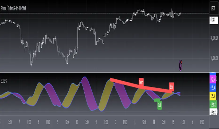
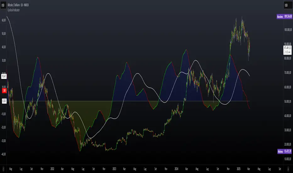
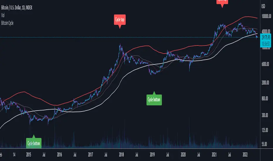
Enhanced Trading Setup ScannerThis is an auto trading script designed to follow my strategy. My strategy consist of a value system and this script will identify trends and market phases for good trades. Feel free to leave feedback.
The Main value on the scrip is always the target. You can change the colors and more modifications inside the tool area to your liking.
Komut dosyalarını "Cycle" için ara
DB1800 Gann Angle Levels Table (CMP Based)Gann Angles for Resistance and Support
2 = 360 degree for 1 month
1 = 180 degree for 1 week
0.5 = 90 degree for 1 to 2 days
0.25 = 45 degree for next day
0.125 = 22.5 degree for more granular than next day (scalping)
The only thing that multiplies when you share it is knowledge.
Inspired by Sudhir Sharma Sir
www.youtube.com
Global M2 Money Supply (USD)Global M2 Money Supply from multiple markets, with days-offset option, defaulted to 107-day shift. Credit to miguelfinance and dylanleclair, on which this script is built on
200MA + MACD + 成交量放量警報🚀 200MA + MACD 金叉 + 成交量放量警報指標 🔥
簡介:
全幣種通用合約日內神器!
結合 200MA 均線趨勢判斷、MACD 金叉死叉動能確認,再搭配 成交量放量過濾假突破,有效提升入場勝率!
支援警報通知,自動提醒多空訊號。
👉 喜歡記得按 ❤️ 收藏,開圖表通知 🔔
🚀 200MA + MACD Golden Cross + Trading Volume Alert Indicator 🔥
Introduction:
A universal tool for all currencies for intraday contracts!
Combined with 200MA moving average trend judgment, MACD Golden Cross and Dead Cross kinetic energy confirmation, and combined with trading volume to filter false breakthroughs, it effectively improves the entry success rate!
Supports alarm notifications and automatically reminds long and short signals.
👉 If you like it, remember to press ❤️ to collect it and open the chart notification 🔔
Market Sleep ZonesHey traders 👋
This script shows when the market is in a "sleeping" or low volatility phase. I call it Market Sleep Zones 😴
It looks at the average price movement over a window (default 20 bars), and if the price changes are small (under a % threshold you set), it highlights that area on the chart with a soft green background.
💡 This can help spot moments when the market is quiet — maybe before a breakout or just moving sideways.
It also places labels to mark where these zones start and end, so it's easy to track.
You can change:
The window size (how many bars to look back)
The breath depth (how much price is allowed to move before it’s "not sleeping" anymore)
Not perfect, but helpful if you want to avoid getting chopped in low-volatility zones or want to prepare for when the market "wakes up" 😄
Let me know if you find it useful or have ideas to improve it!
Equal Highs/Lows + SMT Divergences + Range FilterKey Functional Areas
🔹 Equal Highs and Lows Detection
Strict Swing High/Low: Looks for equal swing points and ensures untouched in-between levels.
Regular Equal High/Low: Uses a range filter (default 9.75 points across 5 bars) to validate.
Volume and Time Filtering: You allow user toggles to include only periods with sufficient volume or time of day.
🔹 Swing Point Helpers
Functions isSwingHigh() and isSwingLow() are used for strict equal high/low detection.
🔹 Range Filter
Checks whether the high-low range over the last 5 candles meets a user-defined minimum (ensures significance).
🔹 Moving Averages
Includes optional plotting of 20 and 200 SMA.
🔹 SMT Divergences
Compares pivots between main symbol and two others (default: ES1! and YM1!).
Detects divergence based on opposite directional movement at pivot points.
Customizable color, thickness, and labels.
Simple Monthly SeasonalityThis script helps traders quickly visualize how an asset performs month by month over a customizable historical period.
🔍 What it does:
• Calculates average monthly returns over the past N years (default: 15).
• Highlights the current month for quick context.
• Displays results in a clean 2-column table (Month | Avg % Return).
💡 Features:
• Works on any timeframe – internally pulls monthly data.
• Color-coded performance (green for positive, red for negative).
• Dynamic highlights – the current month is softly emphasized.
• Fully customizable lookback period (1–50 years).
📈 Use cases:
• Spot seasonal market trends.
• Time entries/exits based on recurring historical strength/weakness.
• Build the foundation for more advanced seasonality or macro scripts.
Just load it on any chart and see which months historically outshine the rest.
⸻
XAU/USD Custom Levels
XAU/USD Dynamic Support & Resistance Levels
This indicator automatically draws horizontal support and resistance levels for Gold (XAU/USD) based on the current market price, eliminating the need for manual price range adjustments.
**Key Features:**
- **Dynamic Price Range**: Automatically calculates levels above and below the current price using a customizable percentage range (default 5%)
- **Multi-Tier Level System**: Four distinct level types with different visual styling:
- Major Levels (100s) - Blue, thick lines
- Sub Levels (50s) - Red, medium lines
- Sub-Sub Levels (25s) - Yellow, thin lines
- Mini Levels (12.5s) - Gray, dotted lines
- **Fully Customizable**: Adjust range percentage, step size, colors, and line history through input settings
- **Universal Compatibility**: Works at any gold price level - whether $1800, $2500, $3300 or beyond
**How It Works:**
The script centers the level grid around the current closing price and extends lines from a specified number of bars back to the right edge of the chart. The hierarchical level system helps identify key psychological price points and potential support/resistance zones commonly used in gold trading.
**Settings:**
- Price Range %: Control how far above/below current price to draw levels (1-20%)
- Level Step Size: Adjust spacing between levels (1.0-50.0)
- Bars Back: Set how far back in history to start the lines
- Color Customization: Personalize colors for each level type
Perfect for gold traders who need clean, automatically-updating support and resistance levels without manual configuration.
Swing High Low By RSThis indicator helps you visually identify important support and resistance levels based on recent swing highs and lows in the market — automatically and with clarity.
Many traders struggle with figuring out where to buy or sell, or where price might reverse. This tool solves that by marking those critical turning points for you.
🧠 What It Does:
It looks at recent price action to find swing highs (where price temporarily peaked) and swing lows (where price temporarily bottomed).
When a new swing point is found, the indicator draws a horizontal line on your chart.
These lines act as support (green) or resistance (red) levels — key zones where price has reacted before.
✨ Unique Feature – Limited Line Length:
Unlike other indicators that draw lines all the way to the right edge of the screen, this one keeps things clean and focused by extending lines only for a limited number of candles (default: 50).
This means:
Less clutter on your chart.
You focus only on the most relevant and recent levels.
📊 How to Use It:
Support Levels (Green Lines)
These form after a swing low is detected. They often act as buy zones or bounce areas when price comes down.
Resistance Levels (Red Lines)
These form after a swing high is detected. They often act as sell zones or rejection areas when price goes up.
Trading Strategy
Use the lines as reference to plan entries, exits, and stop-losses.
Combine with price action, candlestick patterns, or other indicators (like RSI, moving averages) for confirmation.
Works great on any timeframe and across all markets — Forex, Crypto, Stocks, Commodities, etc.
📌 Customizable Settings:
Adjust how many candles are checked before identifying a swing.
Control how far each line stretches (how many bars it should stay visible).
👥 Best For:
Beginner to advanced traders
Price action traders
Scalpers, intraday traders, and swing traders
Anyone who wants to trade clean charts without drawing levels manually
This is your go-to tool for identifying powerful support and resistance levels based on actual market structure — not just math or indicators. It saves time, reduces noise, and increases confidence in your trade decisions.
Enjoy...
Weekly Session Divider (Alt Background) | Chart_BullyThis tool adds subtle alternating background shading for each new week, helping you visually distinguish trading sessions at a glance.
✅ Alternates background by weekly session
✅ Works great on intraday and daily timeframes
✅ Ideal for traders who rely on weekly pivots, volume profiles, or macro structure
✅ Compatible with both RTH and ETH charts
✅ Clean design for easy chart integration
Use it to improve your session awareness, spot emerging weekly trends, and avoid mental fatigue when reading extended charts.
Golden SMA 50 200Two simple moving averages (short-term vs long-term), e.g. 50-day and 200-day SMA.
Signal: Enter long (bullish) when the short MA crosses above the long MA (a Golden Cross); exit (or go short) when it crosses below (a Death Cross). This classic trend-following combo keeps you in bull markets and gets you out during prolonged downtrends. In Bitcoin, using a MA crossover on daily charts filters out noise and catches the big trend reversals.
VuManChu Silver Bullet Signals © Trading Whale by SebasV
🛡️ VuManChu Silver Bullet Signals © Trading Whale by SebasV
A precision tool designed to trade the ICT Silver Bullet strategy during the most impactful market sessions: London, New York, Sydney, and Tokyo.
What does this indicator do?
This script automatically plots key session ranges (e.g., 9–11 AM and 1–3 PM NY) and identifies significant breaks of session highs and lows based on institutional liquidity concepts.
It also includes enhanced VuManChu-style signals using WaveTrend, RSI-MFI, and optional Heikin Ashi filters to spot high-probability trade setups:
Buy Strong
Sell Strong
Golden Buy
Golden Sell
Long Rocket🚀
Short Bear 🐻
Key Features:
✅ Works on any asset and any timeframe below 15 minutes
✅ Optional Heikin Ashi filter to validate signals
✅ Option to display signals even if they don’t pass the filter
✅ Smart alerts with signal type, symbol, timeframe, and a live chart link
AI Trend Strategy (Fast/Slow Line with Alternate Signals)just trial. iam usin a ema strategy a very basic one. just buy when buy signal appears and sell when it says sell
Day Separator with Day LabelsAdjustable day separator that paints vertical lines through the start of day. Default set to GMT however totally customisable.
Has the day of week ladled also which is also optional in position.
there is a check box for a light chart background chart but default is dark background.
Vertical lines are customisable regarding thickness and colour.
Pretty new to it all so welcome feedback and amendment ideas.
Crypto Degen Indicator (DD)Shows the delta of meme coins in comparison to the alt coin market. Periods where the indicator spikes indicate high degen activity, and a likely top. Best used on the Daily timeframe.
NSE/BSE Derivative - Next Expiry Date With HolidaysNSE & BSE Expiry Tracker with Holiday Adjustments
This Pine Script is a TradingView indicator that helps traders monitor upcoming expiry dates for major Indian derivative contracts. It dynamically adjusts these expiry dates based on weekends and holidays, and highlights any expiry that falls on the current day.
⸻
Key Features
1. Tracks Expiry Dates for Major Contracts
The script calculates and displays the next expiry dates for the following instruments:
• NIFTY (weekly expiry every Thursday)
• BANKNIFTY, FINNIFTY, MIDCPNIFTY, NIFTYNXT50 (monthly expiry on the last Thursday of the month)
• SENSEX (weekly expiry every Tuesday)
• BANKEX and SENSEX 50 (monthly expiry on the last Tuesday of the month)
• Stocks in the F&O segment (monthly expiry on the last Thursday)
2. Holiday Awareness
Users can input a list of holiday dates in the format YYYY-MM-DD,YYYY-MM-DD,.... If any calculated expiry falls on one of these holidays or a weekend, the script automatically adjusts the expiry to the previous working day (Monday to Friday).
3. Customization Options
The user can:
• Choose the position of the expiry table on the chart (e.g. top right, bottom left).
• Select the font size for the expiry table.
• Enable or disable the table entirely (if implemented as an input toggle).
4. Visual Expiry Highlighting
If today is an expiry day for any instrument, the script highlights that instrument in the display. This makes it easy to spot significant expiry days, which are often associated with increased volatility and trading volume.
⸻
How It Works
• The script calculates the next expiry for each index using built-in date/time functions.
• For weekly expiries, it finds the next occurrence of the designated weekday.
• For monthly expiries, it finds the last Thursday or Tuesday of the month.
• Each expiry date is passed through a check to adjust for holidays or weekends.
• If today matches the adjusted expiry date, that row is visually emphasized.
⸻
Use Case
This script is ideal for traders who want a quick glance at which instruments are expiring soon — especially those managing options, futures, or expiry-based strategies.
Average RSI (Daily + Weekly)📈 Average RSI (Relative Strength Index) – Beginner’s Guide
What it is:
The Average RSI is a technical indicator that combines multiple RSI values—such as daily and weekly RSI—into a single, smoothed line. This helps traders get a clearer picture of a stock’s momentum over both short- and medium-term timeframes.
Why it matters:
The RSI tells you whether a stock is potentially overbought (priced too high and due for a pullback) or oversold (priced too low and due for a bounce). Traditional RSI uses a scale from 0 to 100, with key levels at 70 (overbought) and 30 (oversold).
By averaging RSI across different timeframes, you reduce noise and get a better signal for trends and reversals.
How traders use it:
✅ Buy zone: When the average RSI dips below 40, it could signal a good entry point.
⚠️ Neutral zone: Between 40 and 60 means the trend isn’t strong—wait for more confirmation.
🚫 Sell zone: Above 60–70 may indicate the asset is overbought or due for a pullback.
Helpful for:
Spotting better entry/exit points
Filtering out false signals
Staying in trend-following trades longer
Bradley Siderograph Correlation: [Blueprint_So9]█ Bradley Siderograph Correlation Indicator
This tool is designed for use within TradingView’s Pine Beta Screener. It enables users to scan their watchlist and identify which assets have shown the highest positive or inverse correlation to a selected window of the Bradley Siderograph.
How to Use:
Go to your TradingView profile and click the Products tab.
Scroll down to Screeners, then click on the Pine option marked as Beta.
Select your preferred watchlist or a custom list you’ve created.
Click “Choose your favorite indicator” and select Bradley Siderograph Correlation Indicator (make sure to favorite it first so it appears in the list).
Once loaded, set:
The timeframe for analysis (e.g., 1D)
The window (number of bars to look back from the current bar)
Use my open-source Bradley Siderograph overlay to identify a recent pivot or turn, then match that window to scan for alignment across your watchlist.
Output:
The screener returns a sortable table displaying each asset in your selected watchlist, with a correlation coefficient ranging from -1 to +1:
+1 = Strong positive correlation
-1 = Strong inverse correlation
0 = No significant correlation
You can sort the column to quickly identify which assets are most aligned—or most divergent—from the Planetary barometer's behavior within your chosen window.
Timeframe Awareness:
Crypto = 24/7 (calendar-based)
Stocks/Forex = Weekday trading sessions (exclude weekends)
This tool enables watchlist-level filtering to identify correlation and inverse correlation between price movement and the Bradley Siderograph over a defined window.
Credits & Acknowledgments:
This is my implementation of Donald Bradley’s Siderograph, as described in Stock Market Prediction: The Planetary Barometer and How to Use It.
Built using planetary data from Astrolib by @BarefootJoey
Melody Markets Moving Average Transitions🎵 Melody Markets Moving Average Transitions – The Ultimate Trend State Indicator 🎵
📌 Indicator Description
Melody Markets Moving Average Transitions is a powerful indicator designed to accurately represent the market trend state by combining the 5 main moving averages (MA7, MA20, MA50, MA100, MA200) and their 120 possible configurations.
Unlike traditional indicators that display moving averages separately, this tool synthesizes these multiple combinations into a dynamic trend line, which can be displayed directly on the selected moving average or via a specially calculated dynamic moving average.
It provides a clear and precise view of trend strength and momentum, helping traders better anticipate price movements.
🔍 Key Features
✅ Comprehensive Trend State → Analyzes up to 120 configurations between 5 moving averages for a detailed trend state.
✅ Dynamic Trend Line → Simple and intuitive visualization of the trend via a single line, shown directly on the chosen MA or the dynamic MA.
✅ Signal Visualization → Displays signals generated by each moving average, facilitating decision-making.
✅ Relevant Pullbacks Display → Highlights meaningful pullbacks according to trend strength and context.
✅ Fully Customizable → Choose moving averages, toggle signals and pullbacks, and customize colors.
✅ Overlay on Price Chart → Smooth and clear integration directly on the price chart.
📖 How to Use Melody Markets Moving Average Transitions?
1️⃣ Select the moving average (MA7, MA20, MA50, MA100, MA200) to track the trend state.
2️⃣ Activate the dynamic trend line to visualize overall market direction in real-time.
3️⃣ Enable signal and pullback displays to catch key trade setups and corrections.
4️⃣ Customize colors and display options to suit your trading style.
5️⃣ Combine with other technical tools for enhanced entry and exit confirmations.
🎯 Who Is This Indicator For?
🔹 Trend Traders & Swing Traders → Get a clear, precise overview of trend strength and pullbacks.
🔹 Day Traders & Scalpers → Quickly identify relevant signals without clutter.
🔹 Beginner to Advanced Traders → Intuitive and comprehensive trend analysis for all levels.
🔥 Conclusion
Melody Markets Moving Average Transitions revolutionizes trend analysis by combining complex moving average configurations into a single, clear dynamic line and signal system. It empowers traders with a deeper understanding of market conditions, improving decision-making and timing.
📌 Add it to your chart now and experience trend analysis like never before! 🚀
Correlation Coefficient📊 Correlation Coefficient (CC)
This indicator measures the statistical correlation between two selected securities over a defined period, scaled from -100 to +100.
It helps you quickly assess whether assets are moving:
Together (positive correlation)
Opposite (negative correlation)
Independently (zero correlation)
🔧 Features:
Select any two symbols (default: NIFTY & BANKNIFTY)
Adjustable length parameter for short-term or long-term correlation analysis
Clean, color-coded plot with horizontal levels to easily identify key correlation zones
📈 Useful For:
Pair trading setups
Hedging strategies
Detecting market regime shifts or intermarket divergences
⚠️ Disclaimer: This is not trading or investment advice.
This indicator is intended for informational purposes only and is not recommended for making
direct trading decisions.
Visually Layered OscillatorVisually Layered Oscillator User's Manual
Visually Layered Oscillator is a multi-oscillator designed to provide an intuitive visualization of RSI, MACD, ADX + DMI, allowing traders to interpret multiple signals at a glance.
It is designed to allow comparison within the same panel while maintaining the inherent meaning of each oscillator and compensating for visual distortion issues caused by size differences.
Component Overview
Item Description
RSI (x10) Displays relative buy/sell strength. Values above 70 are overbought; values below 30 are oversold.
MACD (3,16,10) Momentum indicator showing the difference between moving averages. Consists of lines and histograms
ADX ×50 + DMI Indicates the strength of the trend; ADX determines the strength of the trend and DMI determines whether it is buy/sell dominant.
White background color treatment Removes difficult-to-see grid lines to improve visibility.
🖥️ Screen Example
The panel is divided into the following three layers
mathematica
Copy
Edit
Top: ⬆️ RSI (purple)
Middle: 📈 MACD, Signal, Histogram + Color Fill
Bottom: 📉 ADX × 50, DMI+ / DMI- (Red, Blue, Orange)
TIP: If you zoom in on the indicators at a larger scale, you can see that each indicator is drawn at a different height level and placed in such a way that they do not overlap.
⚙️ Settings
Fast Length: MACD Quick Line Duration (Basic 3)
Slow Length: MACD slow line period (basic 16)
Smoothing: Signal line smoothing value (basic 10)
Notes and Tips
RSI × 10 and ADX × 50 are for visualization purposes only multiplied by multiples of the actual values. It does not affect the calculation and maintains the original RSI/ADX characteristics.
The MACD fill color visually highlights crossing conditions.
The background is treated in full white, making the indicator look clean without grid lines.
Multi-Timeframe Opening Dots with PlotcharPlot clean, smart dots that mark where the real action starts — the opening levels of the three higher timeframes above your current chart.
How it works:
Automatically grabs the next 3 higher timeframes.
Drops a slick dot right at each opening price — but only while that bar is still active.
Color-coded at a glance: Price above open? → green dot. Price below open? → red dot.
Why it’s useful: Get instant visual cues on higher timeframe opens — powerful markers for support, resistance, and directional bias.
Perfect for intraday traders and swing strategists who want to stay synced with the big picture.