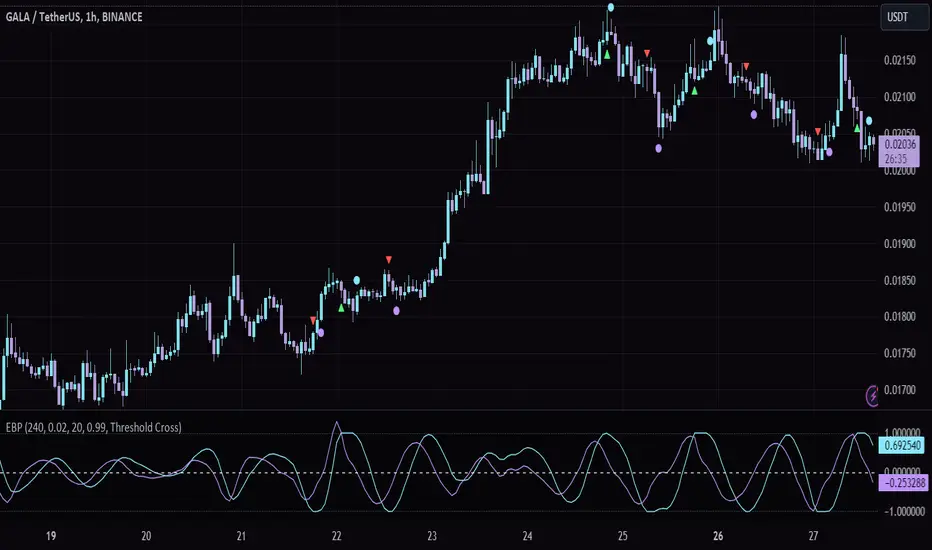
Session Overlay [Tokyo, London, NY]This indicator is for Distinguishing between US Tokyo/London sessions we can easily determine each of them with color in background works better on 15 minute to 1 hour time frame.
Komut dosyalarını "Cycle" için ara
Visual Risk Manager [FX + Futures]Visual Risk Manager helps you calculate position sizes directly on the chart.
Draw your Entry and Stop-Loss levels using the visual lines.
It auto-calculates correct lot size (Forex) or contract size (Futures) based on dollar risk.
Supports customizable pip size and value for Forex brokers.
Designed to work like cTrader’s position tool for fast, precise risk management.
Kompas Peluang (CCI Focused View)
📌 Kompas Peluang — Smart Signal Detection Based on Momentum & Volatility Confluence
Kompas Peluang is a multi-signal indicator designed to help traders identify potential entry zones using a fusion of four key components: ✅ CCI (Commodity Channel Index) ✅ RSI (Relative Strength Index) ✅ MACD (Moving Average Convergence Divergence) ✅ WVF (Williams Vix Fix for volatility spikes)
When two or more signals align, the indicator highlights a strategic buy zone — ideal for disciplined “Buy the Dip” or DCA-style entries.
⚙️ Key Features:
Filters opportunities based on multi-signal confluence, not a single trigger
Blends momentum and volatility to detect potential reversals
Clean visuals, intuitive logic, and highly customizable
Use it standalone or pair it with the Kompas Trend EMA tool to boost timing precision and avoid false entries.
Weekly DividerAdds clear weekly vertical lines to your chart. Simple, customizable, and works with Pine Script v6. Ideal for anyone who wants to see weekly transitions on any instrument — Forex, crypto, stocks, etc. Made with love by Imani 💫
Week Window AlgorithmWeek Window Algorithm
The Week Window Algorithm is an advanced intraday trading overlay built for precision session tracking and key level visualization.
🔹 Features:
1. Time Lines
Automatically plots vertical lines 30 minutes ahead of specific London times (07, 08, 09, 13, 14, 15UK), with adjustable height in pips and custom color.
2. Session Boxes
Draws price range boxes for:
Asia (22:00–06:00 UK)
Europe AM (08:00–09:00 UK)
Europe PM (14:00–15:00 UK)
Each box auto-updates during the session and fades after 3 days. Fill color is fully customizable via settings.
3. Yesterday’s High/Low Levels
Captures and plots yesterday’s high and low at 23:00 UK. Lines extend through today and highlight first-time hits.
🛠️ Customization:
Enable/disable sessions individually
Set pip size for early lines
Choose colors for each session box and line style
🕒 Recommended Timeframes:
Optimized for 1–15 minute charts. Works best on intraday setups.
Session Candles NY #ffsjr"The candle bodies tell the story, wicks do the damage" by ICT
Based on ICT words, I created the sessions indicator, to facilitate the visualization of each session in candle format, with the most important points being the confluence of session openings and closings.
Usually I use to create support and resistances lines using candle sessions bodies and to draw sessions liquidities.
Use on 15 minutes chart and hide default TradingView candles.
Enjoy
Copper to Bitcoin RatioRatio: Divides copper price by Bitcoin price (copper / bitcoin). Since copper is in USD per pound and Bitcoin is in USD, the ratio is unitless but reflects copper’s value relative to Bitcoin.
Plotting: The ratio is plotted as a blue line, with an optional 20-period simple moving average (red line) for smoothing.
This can reflect market sentiment (e.g., industrial demand vs. crypto speculation).
Copper to Gold Ratioratio = copper / gold: Calculates the ratio by dividing copper price by gold price.
plot(ratio): Plots the ratio as a blue line.
ma = ta.sma(ratio, 20): Adds a 20-period simple moving average (optional) to smooth the ratio, plotted as a red line.
A rising Copper/Gold ratio often signals economic expansion (strong copper demand relative to gold), while a falling ratio may indicate economic uncertainty or recession fears, as gold outperforms copper.
The ratio is also used as a leading indicator for 10-year U.S. Treasury yields, with a rising ratio often correlating with higher yields.
Weekend Background Highlighter (UTC+12)## Weekend Background Highlighter (UTC+12)
### Description
This indicator automatically highlights weekend periods on your TradingView charts specifically for the UTC+12 timezone (New Zealand Standard Time). Perfect for traders who need to visualize market closures and weekend gaps in the New Zealand/Pacific time zone, regardless of their exchange's native timezone or chart settings.
### Key Features
- **Fixed UTC+12 Timezone**: Hardcoded to always show weekends according to UTC+12, independent of exchange or chart timezone settings
- **Customizable Appearance**: Adjust background color and opacity to match your chart theme
- **Optional Weekend Labels**: Mark the beginning of each weekend period with customizable labels
- **Debug Mode**: View real-time timezone calculations to verify correct weekend detection
- **Lightweight**: Minimal performance impact with efficient calculations
### Use Cases
- **Forex Traders**: Identify weekend gaps and Monday openings in NZD pairs
- **Cryptocurrency Traders**: Visualize weekend trading patterns in the Pacific timezone
- **Multi-Market Traders**: Maintain consistent weekend awareness across different exchanges
- **Risk Management**: Clearly see when markets are closed for position management
### Settings
- **Weekend Background Color**: Choose any color for the weekend highlight
- **Opacity**: Control transparency (0-100%) to maintain chart visibility
- **Show Weekend Labels**: Toggle labels marking weekend start
- **Debug Info**: Display timezone calculations for verification
### How It Works
The indicator calculates the current UTC time and adds 12 hours to determine the UTC+12 time. It then checks if the resulting day falls on Saturday or Sunday, highlighting these periods on your chart. This ensures weekends are always displayed according to New Zealand time, regardless of your broker's timezone or your local settings.
### Notes
- Weekends begin at 00:00 Saturday UTC+12 (12:00 Friday UTC)
- Weekends end at 00:00 Monday UTC+12 (12:00 Sunday UTC)
- Works on all timeframes and markets
- Compatible with Pine Script v6
### Tags
weekend, background, timezone, UTC+12, New Zealand, highlight, trading sessions, forex, crypto, time zones, market hours, pacific time
True Hour Open🧠 Why Count an Hour from 30th Minute to 30th Minute?
✅ Traditional Hour vs. Functional Hour
Traditional Time Logic: We’re used to viewing time in clean hourly chunks: 12:00 to 1:00, 1:00 to 2:00, and so on. This structure is fine for general purposes like clocks, meetings, and schedules.
Market Logic: Markets, however, don’t always respect these arbitrary human-made time divisions. Price action often develops momentum, structure, and transitions based on market participants' behavior, not on the clock.
🛠 What the Indicator Does
Marks the start of each hour at the 30th minute past the hour (e.g., 1:30, 2:30, 3:30).
Can highlight or segment candles that fall within a “30-to-30” hourly window.
Optionally draws background shading, lines, or boxes to visually group candles from one 30-minute mark to the next.
This helps you:
Visually align your trading with more accurate price behavior windows.
Anchor time blocks around actual market rhythm, not artificial time slots.
Backtest and strategize based on how candles behave in these alternative hourly segments.
📈 Summary
Trading is about timing. But great trading is about timing that makes sense.
By redefining the hour from 30 to 30, you’re not changing time—you’re aligning with how price moves in time.
Time HighlightHow This Works:
Time Conversion: The script converts the current time to HHMM format (e.g., 9:16 becomes 916) for easy comparison.
Timeframe Detection: It checks the current chart's timeframe:
For 1-minute charts: Exactly matches the target times
For 5-minute charts: Checks if the target time falls within the 5-minute window
For 15-minute charts: Checks if the target time falls within the 15-minute window
Highlighting: When the condition is met, it highlights the candle with a semi-transparent yellow color.
Note:
The script will work on 1-minute, 5-minute, and 15-minute timeframes only
The highlight appears on the candle that contains the specified time
The transparency is set to 70% so you can still see the candle through the highlight
You can adjust the transparency level by changing the transp parameter (0 = fully opaque, 100 = fully transparent).
make a pine script which change the color of the candle in yellow color in 1,5,15 timeframe at the time of 9:16, 9:31, 9:46
ICT TIME ELEMENTS [KaninFX]## Overview
The ICT Time Elements indicator is a comprehensive trading tool designed to visualize the most critical market sessions and timeframes according to Inner Circle Trader (ICT) methodology. This indicator helps traders identify high-probability trading opportunities by highlighting key market sessions, killzones, and liquidity periods throughout the trading day.
## Key Features
### 🕐 Complete ICT Time Framework
- **Asian Range**: 8:00 PM - 12:00 AM (NY Time) - Evening consolidation period
- **London Killzone**: 2:00 AM - 5:00 AM (NY Time) - European market opening liquidity
- **NY Killzone**: 7:00 AM - 10:00 AM (NY Time) - US market opening with high volatility
- **Silver Bullet Sessions**:
- London Silver Bullet: 3:00 AM - 4:00 AM
- AM Silver Bullet: 10:00 AM - 11:00 AM
- PM Silver Bullet: 2:00 PM - 3:00 PM
- **Lunch Hours**: 5:00 AM - 7:00 AM & 12:00 PM - 1:00 PM (Lower volatility periods)
- **News Embargo**: 8:30 AM - 9:30 AM (High impact news release window)
- **20-Minute Macros**: :50 to :10 minutes of each hour (Short-term reversal periods)
- **True Day Close**: 4:00 PM - 4:30 PM (Official market close)
### 🎨 Visual Customization
- **Multiple Themes**: Dark, Light, and Custom color schemes
- **Adjustable Opacity**: Control zone transparency (0-100%)
- **Font Customization**: Tiny, Small, Normal, Large text sizes
- **Custom Colors**: Personalize each zone with your preferred colors
- **Professional Display**: Clean histogram visualization with zone labels
### 🌍 Multi-Timezone Support
Built-in support for major trading centers:
- America/New_York (Default)
- America/Chicago
- America/Los_Angeles
- Europe/London
- Asia/Tokyo
- Asia/Shanghai
- Australia/Sydney
### 📊 Smart Information Display
- **Real-time Zone Detection**: Automatically identifies current active session
- **Zone Labels**: Clear labeling at the center of each time period
- **Current Zone Indicator**: Arrow pointer showing the active session
- **Comprehensive Info Table**: Quick reference for all time zones and their schedules
- **Flexible Table Positioning**: Place info table in any corner of your chart
### ⚡ Performance Optimized
- **Memory Management**: Automatic cleanup of old labels to maintain performance
- **Efficient Processing**: Optimized time calculations for smooth operation
- **Resource Control**: Limited label generation to prevent system overload
## How It Works
The indicator continuously monitors the current time against predefined ICT session schedules. When price action enters a recognized time zone, the indicator:
1. **Highlights the Period**: Colors the histogram bar according to the active session
2. **Labels the Zone**: Places descriptive text identifying the current market condition
3. **Updates Info Table**: Shows current session status and complete schedule
4. **Tracks Macro Periods**: Identifies 20-minute reversal windows within major sessions
### Special Features
- **Macro Detection**: Automatically identifies when current time falls within a 20-minute macro period
- **Session Overlap Handling**: Properly manages overlapping time zones with priority logic
- **Dynamic Color Adjustment**: Theme-aware color selection for optimal visibility
## Best Use Cases
### For ICT Traders
- Identify optimal entry times during killzone sessions
- Recognize silver bullet opportunities for quick scalps
- Avoid trading during lunch hour consolidations
- Prepare for news embargo volatility
### For Session Traders
- Track major market session transitions
- Plan trading strategy around high-liquidity periods
- Understand global market flow and timing
### For Swing Traders
- Identify macro trend continuation points
- Time position entries during optimal sessions
- Understand market structure changes across sessions
## Installation & Setup
1. Add the indicator to your TradingView chart
2. Select your preferred timezone from the dropdown
3. Choose theme (Dark/Light) or customize colors
4. Adjust font size and table position to your preference
5. Enable/disable features as needed for your trading style
## Pro Tips
- **Combine with Price Action**: Use time zones alongside support/resistance levels
- **Focus on Killzones**: Highest probability setups occur during London and NY killzones
- **Watch Silver Bullets**: These 1-hour windows often provide excellent reversal opportunities
- **Respect Lunch Hours**: Lower volatility periods - consider smaller position sizes
- **News Embargo Awareness**: Prepare for potential whipsaws during 8:30-9:30 AM
## Conclusion
The ICT Time Elements indicator transforms complex ICT timing concepts into an easy-to-read visual tool. Whether you're a beginner learning ICT methodology or an experienced trader looking to optimize your timing, this indicator provides the essential market session awareness needed for successful trading.
*Compatible with all TradingView plans and timeframes. Works best on 1-minute to 1-hour charts for optimal session visualization.*
5:30 AM IST Close + Offset Lines + TablesDescription:
This script captures the 5:30 AM IST close price and plots it on the chart along with dynamic offset levels above and below (±5, ±20, ±40, ±60, ±80 points). It also displays these levels in neatly organized tables at the top-right and bottom-right corners for quick reference.
🔹 Timezone: Asia/Kolkata (IST)
🔹 Useful for: Intraday traders who reference early morning levels
🔹 Visual aids:
Orange line for 5:30 AM close
Green lines for points above
Red lines for points below
Tables summarizing all levels
This tool helps identify key early-morning reference zones that can act as support/resistance or breakout targets.
Tight Range Display with Background🌟 Tight Range Transparency Display with Background
What Is This Indicator?
Hey traders! Ever wanted a simple way to spot those quiet, low-volatility moments in the market that often signal a big move is coming? The Tight Range Transparency Display with Background does exactly that! This indicator highlights periods where the price is moving in a tight range—think of it as the calm before the storm. It paints the chart background blue to show these zones, with the shade getting darker the tighter the range becomes. It’s like having a visual cue to say, “Hey, something might be brewing here!”
Why You’ll Love It
Spot Key Moments Easily: The blue background makes it super easy to see when the market is in a tight range, which often happens before breakouts or big trends.
Customizable Settings: You can tweak the range thresholds to match your trading style—whether you’re looking for super tight zones or slightly broader ones.
Visual Clarity: The background gets darker when the range is tighter, giving you a quick sense of how compressed the price action is.
Perfect for Any Market: Works on stocks, forex, crypto, or any chart you trade, across any timeframe.
How to Use It
Add It to Your Chart:
Just copy this script into TradingView’s Pine Editor and hit "Add to Chart." It’ll overlay right on your price chart.
Tweak the Settings:
Open the indicator settings and use the dropdown menus to pick your preferred "Tight Range %" and "Wide Range %." For example, set a Tight Range % of 2.0% to catch smaller ranges, or go higher like 10.0% for broader ones.
You can also adjust the ATR Period (default is 5) to make the indicator more or less sensitive to recent price swings.
Watch for the Blue Background:
When the price enters a tight range, the chart background turns blue. The darker the blue, the tighter the range—meaning a potential breakout could be closer!
Trade Smarter:
Use these tight range zones to prepare for potential breakouts. For example, if you see a dark blue background, it might be a good time to watch for a big price move.
Pair this with other tools like support/resistance levels or volume spikes to confirm your trades.
Who Is This For?
Swing Traders: Perfect for spotting consolidation zones before a big swing.
Breakout Traders: Tight ranges often lead to breakouts—use this to time your entries.
Smart Money Followers: If you’re into smart money concepts, tight ranges can signal accumulation or distribution phases.
Beginners & Pros Alike: It’s easy to use for new traders but powerful enough for seasoned pros.
Real-World Example
Imagine you’re trading a stock on a 1-hour chart. You notice the background turns blue, and it’s getting darker over a few bars. This tells you the price range is tightening—maybe the stock is consolidating after a big move. You check your other indicators, see a volume spike, and spot a breakout above resistance. Boom! You catch the next big trend, all because this indicator helped you focus on the right moment.
Tips for Best Results
Try Different Timeframes: Tight ranges on a 15-minute chart might signal short-term moves, while a daily chart could highlight bigger trends.
Adjust for Your Market: For volatile markets like crypto, you might want a higher Tight Range % (e.g., 10.0%). For calmer markets like forex, try a lower setting (e.g., 2.0%).
Combine with Other Tools: Use this alongside trendlines, moving averages, or volume indicators to confirm your setups.
Why I Made This
I created this indicator because I wanted a simple, visual way to spot those critical low-volatility zones without cluttering my chart. The dynamic background color makes it intuitive to see when the market is “coiling up” for a potential move. I hope it helps you find better trading opportunities just like it does for me!
Let’s Connect
If you find this indicator helpful, I’d love to hear about it! Drop a comment or a rating to let me know how it’s working for you. Got ideas to make it even better? Feel free to message me on TradingView—I’m always open to suggestions.
Published On
Date: May 22, 2025
Happy trading, and may your charts always be in your favor! 🚀
How to Publish on TradingView
Open Pine Editor:
On TradingView, open a chart and go to the Pine Editor tab at the bottom.
Paste the Code:
Copy the script you provided and paste it into the Pine Editor.
Compile:
Click "Add to Chart" to ensure it compiles without errors.
Publish:
Click the "Publish Script" button (paper plane icon) in the Pine Editor.
Select "Publish New Script."
Add the Description:
Title: "Tight Range Transparency Display with Background"
Description: Copy the content above into the description field.
Visibility: Choose "Public" to share with everyone (or "Invite-Only" for restricted access).
Tags: Add tags like "tight range", "breakout", "smart money", "volatility", "swing trading".
Screenshot: Add a screenshot of the indicator on a chart, showing the blue background during a tight range.
Submit:
Click "Publish" to submit. TradingView will review it and make it live if it meets their guidelines.
Additional Notes
Screenshot Tip: Use a chart where the blue background is clearly visible (e.g., during a consolidation period) to make the indicator’s effect stand out.
Engage with Users: After publishing, respond to comments and feedback to build a positive reputation on TradingView.
This content is designed to be approachable and engaging, helping traders understand the value of your indicator and encouraging them to try it out.
Round Levels + BoxesRound Levels Indicator
The Round Levels indicator automatically detects and marks round price levels ending in .000 on the chart. These levels are often important support and resistance zones where significant price reaction occurs. Main features
Automatic detection of round levels (.000)
Display horizontal lines on levels
Add price labels for each level
Dynamic update of levels when price moves
How to use
Add the indicator to the chart
The indicator will automatically display the 20 nearest round levels (10 above and 10 below the current price)
When the price moves significantly, the levels are automatically recalculated
Trading ideas
Use as support and resistance levels
Track price reaction at round levels
Combine with other indicators to confirm signals
Use to identify potential trend reversal zones
Notes
The indicator only marks levels ending in .000
Lines are automatically extended to the right for better visibility
The gray color of the lines is chosen for minimal impact on the perception of the chart
Version
Developed for TradingView Pine Script v6
Works on all timeframes
Compatible with all trading tools
Settings
The indicator has a simple interface and does not require additional settings. If necessary, you can change in the code:
Number of displayed levels
Color and style of lines
Display format of price labels
Warning
This indicator is an auxiliary tool for technical analysis. It is recommended to use it in combination with other analysis methods and risk management tools.
Custom Session Tracker (KN)**Custom Session Tracker (KN)**
Visually highlight any intraday session’s high, low, and midpoint on your chart with full styling control.
**Description**
Custom Session Tracker (KN) lets you define any trading session (e.g. 09:30–16:00 NY time) and automatically draws:
* A translucent box spanning the session’s High and Low
* A horizontal line marking the session midpoint
All elements update in real time and persist after session close.
**Features**
* **Session Range Box**: Plots from session open through close
* **Mid-Price Line**: Marks the exact midpoint of High/Low
* **Timezone Input**: Aligns session to any GMT offset
* **Custom Colors**: Fill, border, and mid-line colors
* **Line & Border Styles**: Choose solid or dashed
**Inputs**
* **Timezone** – GMT offset for your market
* **Session** – Hours in `HHMM-HHMM` format
* **Fill Color** – Box interior transparency
* **Border Color** – Box outline
* **Box Border Style** – Solid or dashed
* **Midline Color** – Mid-price line color
* **Mid Price Line Style** – Solid or dashed
**How to Use**
1. Add the script to your chart.
2. Set your session hours and timezone.
3. Customize colors and styles.
4. Watch each session’s high, low, and midpoint appear automatically.
Perfect for session-overlap strategies, mean-reversion signals, or simply keeping key levels in view.
Simplified Hashrate Oscillator + Z-ScoreIndicator Description for TradingView
Simplified Hashrate Oscillator + Z-Score (SHO + Z)
This indicator analyzes the Bitcoin network's mining hashrate data by comparing short-term and long-term moving averages of the hashrate to create an oscillator that reflects changes in mining activity.
How it works:
The indicator calculates two Simple Moving Averages (SMAs) of the Bitcoin network hashrate — a short-term SMA (default 21 days) and a long-term SMA (default 105 days).
The difference between these two averages is normalized and expressed as a percentage, forming the Hashrate Oscillator line.
Two user-defined threshold lines (default ±7%) are plotted as upper and lower reference levels on the oscillator.
When the oscillator approaches these levels, it indicates potential extremes in mining activity.
Z-Score Explanation:
The Z-Score is a normalized measure that translates the oscillator's current value into a standardized scale roughly ranging from -2 to +2.
It shows how far the current hashrate oscillator value deviates from the user-defined thresholds.
A Z-Score near +2 means the oscillator is close to or above the upper threshold (possible overbought conditions).
A Z-Score near -2 means the oscillator is near or below the lower threshold (possible oversold conditions).
This helps users assess the relative strength or weakness of the mining hashrate movement in a normalized context.
Data Source:
The hashrate data is sourced daily from the Bitcoin network hashrate dataset provided by Quandl (QUANDL:BCHAIN/HRATE), a reliable blockchain data provider.
The indicator requests daily hashrate values and calculates SMAs accordingly.
How to use:
Watch the Hashrate Oscillator line for movements towards or beyond the threshold lines as signals of miner capitulation or recovery phases.
Use the Z-Score displayed in the table to quickly gauge how extreme the current reading is relative to set thresholds.
Adjust the short and long SMA periods and threshold lines to suit your preferred sensitivity and trading timeframe.
Yield Curve Approximation
A yield curve is a graph that plots the yields (interest rates) of bonds with the same credit quality but different maturity dates. It helps investors understand the relationship between short-term and long-term interest rates.
🔹 Types of Yield Curves
1️⃣ Normal Yield Curve – Upward-sloping, indicating economic expansion.
2️⃣ Inverted Yield Curve – Downward-sloping, often a recession warning.
3️⃣ Flat Yield Curve – Suggests economic uncertainty or transition.
The yield curve is widely used to predict economic conditions and interest rate movements. You can learn more about it here. Would you like insights on how traders use the yield curve for investment decisions?
How to Trade Using This?
✅ If the yield curve is steepening (green) → Favor growth stocks, commodities, and high-risk assets.
✅ If the yield curve is flattening or inverting (red) → Consider bonds, defensive sectors, or hedging strategies.
✅ Pair with economic news and interest rate decisions to refine predictions.
CUSTOM PRO RANGE V2.0 with AlertsCore Functions
Tracks High/Low Ranges
Daily (DR) or Initial (IDR) ranges within custom time windows (e.g., 9:30 AM–4:00 PM).
Optional extended hours (e.g., overnight).
Visual Tools
Draws boxes/lines for range boundaries, midpoints, and opening prices.
Custom colors/styles for clarity.
Smart Alerts
Notifies when price breaks high/low/mid of the range.
Avoids spam with once-per-bar alerts.
Flexible Timeframes
Works for intraday, daily, or even quarterly ranges with minor tweaks.
🎯 Who It Helps
Day Traders: Spot breakouts/reversals.
Swing Traders: Identify key support/resistance.
Analysts: Study price behavior in specific sessions.
Midpoint of Last 3 CandlesThis indicator highlights the market structure by plotting the midpoints of the current and previous two candles. It draws a horizontal line at the average of the high and low for each of these candles, giving a visual cue of the short-term balance point in price action. These midpoints can act as dynamic support and resistance levels, helping traders assess areas of potential reaction or continuation.
Each line is color-coded for clarity: green represents the current candle, orange marks the previous candle, and yellow indicates the one before that. All lines extend into the future on the chart, allowing you to see how price interacts with these levels as new candles form. This simple yet effective tool can be useful in various strategies, especially those focused on price action, scalping, or intraday analysis.
Stochastic Strategy Table with Trend (1m–4H) + Toggle📊 Multi-Timeframe Stochastic Strategy Table with Trend Detection
This script is designed for intraday and swing traders who want to monitor Stochastic momentum across multiple timeframes in real-time — all directly on the main chart.
🔎 What This Script Does
This script builds a compact, color-coded table that displays:
✅ %K and %D values of the Stochastic oscillator
✅ Cross direction (K > D or K < D)
✅ Overbought/Oversold zone conditions
✅ Short-term trend detection via %K movement
It covers ten timeframes:
1m, 2m,3m,5m, 15m, 30m, 1H, 2H, 3H, 4H
🟩 How to Use It
Trend colors in header:
🟢 Green = %K is rising (uptrend)
🔴 Red = %K is falling (downtrend)
⚪ Gray = flat or neutral
Cross Row:
Green background = Bullish (%K > %D)
Red background = Bearish (%K < %D)
Zone Row:
Green = Oversold (%K and %D below 20)
Red = Overbought (%K and %D above 80)
Gray = Neutral zone
Use Case:
Look for multiple timeframes aligning in trend
Enter trades on short timeframes (e.g. 5m) when HTFs confirm direction
Especially powerful when used with price action on 5m/15m candles
⚙️ Configurable Inputs
%K Length
%K Smoothing
%D Length
Table location
Table size
💡 Why This Script Is Unique
Shows true higher timeframe Stochastic values (not interpolated from current chart)
Works in real-time with consistent updates
Trend direction is visualized without needing extra space
Built for serious intraday traders who rely on clean data and signal alignment
🙏 Credits & Notes
This tool was created to solve a real problem: getting accurate HTF stochastic data in a clean, real-time, decision-friendly format.
I built it for my own use — and now I'm sharing it for luck, and for anyone else looking to trade more clearly and confidently.
Feel free to fork, customize, or build upon it.
Good luck, and trade safe! 🍀💹
[blackcat] L2 Rhythm RiderOVERVIEW
The L2 Rhythm Rider is an advanced technical analysis tool meticulously crafted to assist traders in identifying intricate market rhythms and uncovering lucrative trading opportunities. By integrating sophisticated calculations such as weighted averages, deviations from Simple Moving Averages (SMAs), and bespoke oscillators, this indicator offers profound insights into market dynamics, momentum, and trend reversals. Whether you're a seasoned trader looking to refine your strategies or a novice seeking robust analytical tools, the Rhythm Rider provides a comprehensive suite of features tailored to enhance your decision-making process 📊✅.
FEATURES
Comprehensive Calculation Suite:
Percentage Deviation from SMA: Quantifies the deviation of the current price from the Simple Moving Average, providing a nuanced understanding of price behavior relative to historical trends.
Normalized Price Range: Standardizes price movements within a defined range, offering a clearer perspective on market volatility and stability.
Explore Line and Average: Utilizes Exponential Moving Averages (EMAs) to gauge market momentum, helping traders anticipate potential shifts in direction.
Banker Fund and Average: Evaluates market sentiment across varying timeframes, enabling traders to align their strategies with broader market trends.
RSI-Like Indicator: Delivers a Relative Strength Index-inspired metric that assesses the magnitude of price changes, akin to traditional RSI but with unique enhancements.
Bear Power: Analyzes selling pressure by examining recent highs and lows, providing valuable insights into bearish market conditions.
Enhanced Color Coding:
Overbought Conditions: Values exceeding 70 are emphasized with warm hues like red and orange, signaling potential overbought scenarios where caution is advised 🔥.
Oversold Conditions: Values falling below 60 are accentuated with cool tones such as blue and cyan, indicating oversold situations ripe for potential buying opportunities ❄️.
Adjusted Line Widths:
Improved Visibility: Line widths have been fine-tuned to ensure clear differentiation between various plotted elements, making it easier to interpret complex market data at a glance 👀.
Visual Representation:
Explore Line: Displayed in blue or red, depending on its value, to signify bullish or bearish momentum.
Banker Fund: Illustrated in orange or aqua, reflecting differing levels of market sentiment.
Bear Power: Depicted through purple columns, highlighting areas of significant selling pressure.
Trade Signals:
Buy ('B') and Sell ('S') Labels: Clearly marked on the chart to indicate optimal entry and exit points, facilitating swift and informed trading decisions 🏷️.
Automated Alerts:
Customizable Notifications: Generate alerts based on predefined conditions, ensuring traders never miss out on critical market movements 🔔.
HOW TO USE
Adding the Indicator:
Navigate to your TradingView chart and select the L2 Rhythm Rider from the indicators list.
Interpreting Visual Elements:
Familiarize yourself with the various plotted lines and columns, each representing distinct facets of market momentum and sentiment.
Monitoring Trade Opportunities:
Keep an eye on the chart for buy and sell labels, which signal potential trading opportunities based on the indicator's calculations.
Setting Up Alerts:
Configure alerts to notify you when specific conditions are met, allowing for timely action without constant chart monitoring 📲.
Combining Insights:
Integrate the information derived from all plotted elements to form a holistic view of the market, enhancing the reliability of your trading decisions.
LIMITATIONS
Market Volatility: In highly volatile or ranging markets, the indicator might produce false signals, necessitating additional confirmation from other analytical tools 🌪️.
Supplementary Analysis: For enhanced accuracy, users should complement this indicator with other forms of technical and fundamental analysis.
Asset and Timeframe Sensitivity: The performance of the indicator can fluctuate based on the asset type and chosen timeframe, requiring periodic adjustments and evaluations.
NOTES
Data Sufficiency: Ensure ample historical data is available to facilitate precise calculations and reliable results.
Demo Testing: Thoroughly test the indicator on demo accounts prior to deploying it in live trading environments to understand its nuances and limitations 🔍.
Personalization: Tailor the indicator’s settings and visual preferences to better suit individual trading styles and objectives.