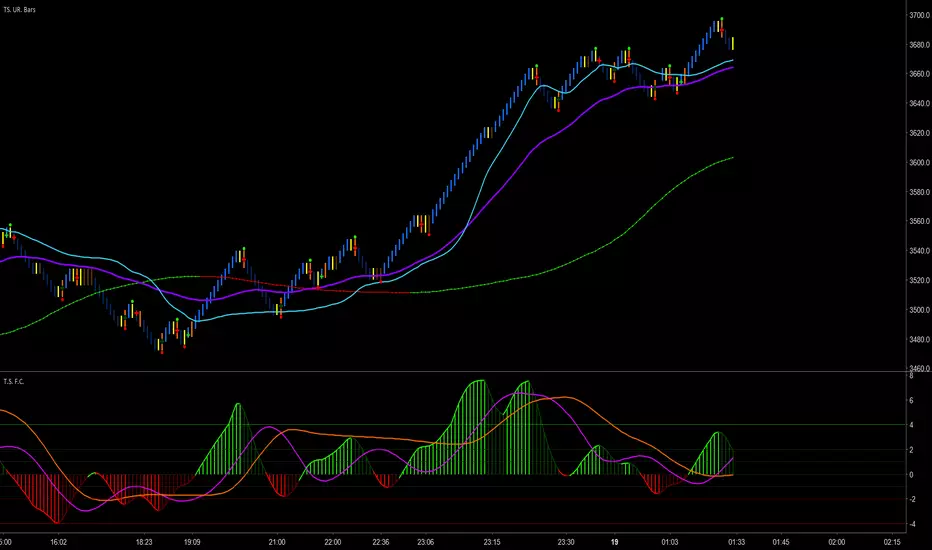
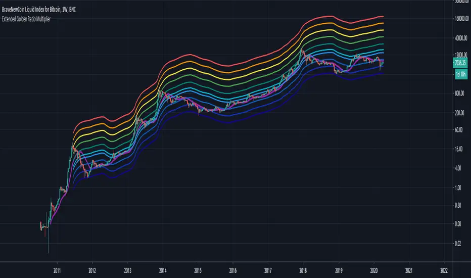
Global M2 YoY % Increase signalThe script produces a signal each time the global M2 increases more than 2.5%. This usually coincides with bitcoin prices pumps, except when it is late in the business cycle or the bitcoin price / halving cycle.
It leverages dylanleclair Global M2 YoY % change, with several modifications:
adding a 10 week lead at the YoY Change plot for better visibility, so that the bitcoin pump moreless coincides with the YoY change.
signal increases > 2.5 in Global M2 at the point at which they occur with a green triangle up.
Komut dosyalarını "Cycle" için ara
Moon+Lunar Cycle Vertical Delineation & Projection
Automatically highlights the exact candle in which Moonphase shifts occur.
Optionally including shifts within the Microphases of the total Lunar Cycle.
This allow traders to pre-emptively identify time-based points of volatility,
focusing on mean-reversion; further simplified via the use of projections.
Projections are calculated via candle count, values displayed in "Debug";
these are useful in understanding the function & underlying mechanics.
CCI with Signals & Divergence [AIBitcoinTrend]👽 CCI with Signals & Divergence (AIBitcoinTrend)
The Hilbert Adaptive CCI with Signals & Divergence takes the traditional Commodity Channel Index (CCI) to the next level by dynamically adjusting its calculation period based on real-time market cycles using Hilbert Transform Cycle Detection. This makes it far superior to standard CCI, as it adapts to fast-moving trends and slow consolidations, filtering noise and improving signal accuracy.
Additionally, the indicator includes real-time divergence detection and an ATR-based trailing stop system, helping traders identify potential reversals and manage risk effectively.
👽 What Makes the Hilbert Adaptive CCI Unique?
Unlike the traditional CCI, which uses a fixed-length lookback period, this version automatically adjusts its lookback period using Hilbert Transform to detect the dominant cycle in the market.
✅ Hilbert Transform Adaptive Lookback – Dynamically detects cycle length to adjust CCI sensitivity.
✅ Real-Time Divergence Detection – Instantly identifies bullish and bearish divergences for early reversal signals.
✅ Implement Crossover/Crossunder signals tied to ATR-based trailing stops for risk management
👽 The Math Behind the Indicator
👾 Hilbert Transform Cycle Detection
The Hilbert Transform estimates the dominant market cycle length based on the frequency of price oscillations. It is computed using the in-phase and quadrature components of the price series:
tp = (high + low + close) / 3
smooth = (tp + 2 * tp + 2 * tp + tp ) / 6
detrender = smooth - smooth
quadrature = detrender - detrender
inPhase = detrender + quadrature
outPhase = quadrature - inPhase
instPeriod = 0.0
deltaPhase = math.abs(inPhase - inPhase ) + math.abs(outPhase - outPhase )
instPeriod := nz(3.25 / deltaPhase, instPeriod )
dominantCycle = int(math.min(math.max(instPeriod, cciMinPeriod), 500))
Where:
In-Phase & Out-Phase Components are derived from a detrended version of the price series.
Instantaneous Frequency measures the rate of cycle change, allowing the CCI period to adjust dynamically.
The result is bounded within a user-defined min/max range, ensuring stability.
👽 How Traders Can Use This Indicator
👾 Divergence Trading Strategy
Bullish Divergence Setup:
Price makes a lower low, while CCI forms a higher low.
Buy signal is confirmed when CCI shows upward momentum.
Bearish Divergence Setup:
Price makes a higher high, while CCI forms a lower high.
Sell signal is confirmed when CCI shows downward momentum.
👾 Trailing Stop & Signal-Based Trading
Bullish Setup:
✅ CCI crosses above -100 → Buy signal.
✅ A bullish trailing stop is placed at Low - (ATR × Multiplier).
✅ Exit if the price crosses below the stop.
Bearish Setup:
✅ CCI crosses below 100 → Sell signal.
✅ A bearish trailing stop is placed at High + (ATR × Multiplier).
✅ Exit if the price crosses above the stop.
👽 Why It’s Useful for Traders
Hilbert Adaptive Period Calculation – No more fixed-length periods; the indicator dynamically adapts to market conditions.
Real-Time Divergence Alerts – Helps traders anticipate market reversals before they occur.
ATR-Based Risk Management – Stops automatically adjust based on volatility.
Works Across Multiple Markets & Timeframes – Ideal for stocks, forex, crypto, and futures.
👽 Indicator Settings
Min & Max CCI Period – Defines the adaptive range for Hilbert-based lookback.
Smoothing Factor – Controls the degree of smoothing applied to CCI.
Enable Divergence Analysis – Toggles real-time divergence detection.
Lookback Period – Defines the number of bars for detecting pivot points.
Enable Crosses Signals – Turns on CCI crossover-based trade signals.
ATR Multiplier – Adjusts trailing stop sensitivity.
Disclaimer: This indicator is designed for educational purposes and does not constitute financial advice. Please consult a qualified financial advisor before making investment decisions.
AHR999X IndexAHR999X Index - A Tool to Watch BITSTAMP:BTCUSD Bitcoin Tops
The AHR999X Index is designed as an extension of the well-known AHR999 Index, specifically to help identify Bitcoin's market tops. This index combines two critical components:
200-Day Fixed Investment Cost:
The average cost if you invested a fixed amount into Bitcoin every day over the last 200 days (using a geometric mean).
Growth Estimate:
A price estimate derived from a logarithmic regression model based on Bitcoin's age.
The formula for AHR999X is:
AHR999X = (Bitcoin Price ÷ 200-Day Fixed Investment Cost) × (Bitcoin Price ÷ Growth Estimate) × 3
How to Interpret AHR999X
Above 8: Accumulation Zone – Bitcoin is historically undervalued.
Between 0.45 and 8: Neutral Zone – Bitcoin is within a reasonable price range.
Below 0.45: Exit Zone – Historically signals market tops and high-risk areas.
A Cycle Observation
One important point to note:
The bottom value of AHR999X increases with every Bitcoin market cycle.
This reflects Bitcoin's long-term price appreciation and diminishing volatility over time.
Altcoins vs BTC Market Cap HeatmapAltcoins vs BTC Market Cap Heatmap
"Ground control to major Tom" 🌙 👨🚀 🚀
This indicator provides a visual heatmap for tracking the relationship between the market cap of altcoins (TOTAL3) and Bitcoin (BTC). The primary goal is to identify potential market cycle tops and bottoms by analyzing how the TOTAL3 market cap (all cryptocurrencies excluding Bitcoin and Ethereum) compares to Bitcoin’s market cap.
Key Features:
• Market Cap Ratio: Plots the ratio of TOTAL3 to BTC market caps to give a clear visual representation of altcoin strength versus Bitcoin.
• Heatmap: Colors the background red when altcoins are overheating (TOTAL3 market cap equals or exceeds BTC) and blue when altcoins are cooling (TOTAL3 market cap is half or less than BTC).
• Threshold Levels: Includes horizontal lines at 1 (Overheated), 0.75 (Median), and 0.5 (Cooling) for easy reference.
• Alerts: Set alert conditions for when the ratio crosses key levels (1.0, 0.75, and 0.5), enabling timely notifications for potential market shifts.
How It Works:
• Overheated (Ratio ≥ 1): Indicates that the altcoin market cap is on par or larger than Bitcoin's, which could signal a top in the cycle.
• Cooling (Ratio < 0.5): Suggests that the altcoin market cap is half or less than Bitcoin's, potentially signaling a market bottom or cooling phase.
• Median (Ratio ≈ 0.75): A midpoint that provides insight into the market's neutral zone.
Use this tool to monitor market extremes and adjust your strategy accordingly when the altcoin market enters overheated or cooling phases.
SeasonsThis code represents a seasonal indicator that has a number of unique functions to help traders better understand the market and make informed decisions. Let's take a closer look at each of them:
1. **Chart background shading for each season:** This function allows you to visually see seasonal changes in the market. You'll be able to easily track how the market changes in different seasons, thanks to the color labeling: blue for winter, green for summer, orange for autumn, and yellow for spring.
2. **Vertical markings for each month:** Additional markers on the chart help you orient yourself in time and better understand price dynamics throughout the year. This is especially useful when analyzing seasonal changes and identifying market cyclicality.
3. **Halving timers:** Connecting halving timers on the chart allows you to track important events, such as the reduction of bitcoin mining rewards. Knowing the timing of halving can be a key moment for decision-making and can affect asset prices.
These functions help traders better analyze the market, identify trends and cyclicality, and optimize their trading strategy. Use this indicator in your trading practice to unleash its full potential and reach new heights in your trading career. Don't miss the opportunity to improve your results - apply the seasonal indicator today!
The seasonal indicator is a powerful tool for traders, helping them analyze the market and make informed decisions based on seasonal and cyclical changes. Here are a few reasons why using this indicator can be advantageous:
1. **Identifying seasonal trends:** The seasonal indicator helps identify seasonal trends in the market, such as changes in activity during different seasons or months. For example, some markets may be more volatile or predictable at certain times of the year, and knowing these trends can help in making decisions about entering or exiting positions.
2. **Optimizing trading strategy:** Understanding seasonal changes in the market allows traders to optimize their trading strategy based on the time of year. For example, they may adjust their risk management approaches or choose specific types of trades according to the current season.
3. **Predicting market cyclicality:** The seasonal indicator can also help in predicting market cyclicality and identifying recurring price movement patterns. This enables traders to build their strategies based on past market behavior within specific time intervals.
How to use the seasonal indicator:
1. **Study seasonal changes:** Use the indicator to analyze how the market changes throughout the year. Pay attention to changes in volatility, trading volumes, and price directions depending on the season.
2. **Optimize trading strategy:** Use the data obtained to optimize your trading strategy. Consider entering or exiting positions within specific time intervals to account for seasonal factors.
3. **Predict cyclicality:** Analyze past market behavior using the seasonal indicator to identify cyclicality and recurring patterns. This will help you make more informed decisions based on expected price movements in the future.
Ultimately, using the seasonal indicator allows traders to better understand the market, adapt their strategies, and make more informed decisions based on seasonal and cyclical changes.
All elements on the chart of a particular color will be attributed to the corresponding season. For example, trend lines or levels marked in blue will be associated with winter.
______________________________________________________
Winter
Explanation of price movement during the winter season:
1. Number 1 and the blue line denote the maximum price of Bitcoin. Note that they always form at the peaks, which is consistent.
2. Number 2 and the blue line represent the minimum price specifically during the winter period. This is indeed the minimum price and the bottom point in the cycle.
3. Number 3 and the blue line indicate a local maximum after the breakthrough, after which the price starts to rise towards line number 1, which acts as global resistance.
4. Number 4 denotes the last winter cycle before the breakthrough of the global maximum. It should be noted that in 2017, the resistance was not broken immediately - first in spring, and then at the beginning of 2018, the maximum was set, and the asset growth occurred in winter.
Additionally, it's worth noting that numbers 1 form the maximum, numbers 2 form the minimum, and since the trend is descending, I have marked its line in blue.
______________________________________________________
Summer
Now let's consider the price behavior chart for the summer. To make the situation clearer, I've left a descending trend in blue on the graph. I reiterate that the elements shown in green on the graph pertain specifically to the summer period.
1. Number 1 on the graph denotes the first summer period! The price during this period remains within a narrow range 90% of the time; however, it's worth noting that impulsive movements can occur at the beginning, middle, or end. Thus, 90% of the time the price is in a low volatility zone, while the remaining percentage is in a high volatility zone.
2. Number 2 on the graph represents the second summer period, where a pattern is observed: the price tends to rise at the beginning of the summer period and fall towards the end. Therefore, I've marked this time with an arc, and there's a pattern to it. It's worth noting that during the period of the descending trend from 2014 to 2016, the situation after the downward trend differs from the situation in 2018 and 2023, when changes in the arrangement of this situation occur after the breakout of the descending trend based on wave analysis and the price of the asset itself.
3. Number 3 represents the third summer period! During this period, the price movement direction is upward and then downward, forming a correction in the upward trend. It should be noted that in this movement, all lows gradually rise, while highs renew all previous local highs of the asset price. This period exhibits increased volatility and impulsive movements, with the asset price mostly staying within a range of minimal volatility, with volatility not exceeding 1-2% on some stretches.
4. Under number 4, the fourth summer period is indicated, which has an overall upward direction. In this period, the movement is aggressively upward. Starting from the first month until the middle of summer, the price moves downward, forming a correction in the upward trend. Then, during the next month, the price moves aggressively upward, renewing price highs. Volatility in this period is anomalously high, resembling a hot July summer.
Additionally, based on the price movement in the summer period, we can assume that fractals are evident here, which we can use to our advantage for profit.
______________________________________________________
Shark Trading - We urge all traders to delve deeper into this indicator and incorporate it into their trading practices. It can become an invaluable aid in market analysis and help traders reach new heights in their trading endeavors.
Adaptive, Double Jurik Filter Moving Average (AJFMA) [Loxx]Adaptive, Double Jurik Filter Moving Average (AJFMA) is moving average like Jurik Moving Average but with the addition of double smoothing and adaptive length (Autocorrelation Periodogram Algorithm) and power/volatility {Juirk Volty) inputs to further reduce noise and identify trends.
What is Jurik Volty?
One of the lesser known qualities of Juirk smoothing is that the Jurik smoothing process is adaptive. "Jurik Volty" (a sort of market volatility ) is what makes Jurik smoothing adaptive. The Jurik Volty calculation can be used as both a standalone indicator and to smooth other indicators that you wish to make adaptive.
What is the Jurik Moving Average?
Have you noticed how moving averages add some lag (delay) to your signals? ... especially when price gaps up or down in a big move, and you are waiting for your moving average to catch up? Wait no more! JMA eliminates this problem forever and gives you the best of both worlds: low lag and smooth lines.
Ideally, you would like a filtered signal to be both smooth and lag-free. Lag causes delays in your trades, and increasing lag in your indicators typically result in lower profits. In other words, late comers get what's left on the table after the feast has already begun.
That's why investors, banks and institutions worldwide ask for the Jurik Research Moving Average ( JMA ). You may apply it just as you would any other popular moving average. However, JMA's improved timing and smoothness will astound you.
What is adaptive Jurik volatility?
One of the lesser known qualities of Juirk smoothing is that the Jurik smoothing process is adaptive. "Jurik Volty" (a sort of market volatility ) is what makes Jurik smoothing adaptive. The Jurik Volty calculation can be used as both a standalone indicator and to smooth other indicators that you wish to make adaptive.
What is an adaptive cycle, and what is Ehlers Autocorrelation Periodogram Algorithm?
From his Ehlers' book Cycle Analytics for Traders Advanced Technical Trading Concepts by John F. Ehlers , 2013, page 135:
"Adaptive filters can have several different meanings. For example, Perry Kaufman’s adaptive moving average ( KAMA ) and Tushar Chande’s variable index dynamic average ( VIDYA ) adapt to changes in volatility . By definition, these filters are reactive to price changes, and therefore they close the barn door after the horse is gone.The adaptive filters discussed in this chapter are the familiar Stochastic , relative strength index ( RSI ), commodity channel index ( CCI ), and band-pass filter.The key parameter in each case is the look-back period used to calculate the indicator. This look-back period is commonly a fixed value. However, since the measured cycle period is changing, it makes sense to adapt these indicators to the measured cycle period. When tradable market cycles are observed, they tend to persist for a short while.Therefore, by tuning the indicators to the measure cycle period they are optimized for current conditions and can even have predictive characteristics.
The dominant cycle period is measured using the Autocorrelation Periodogram Algorithm. That dominant cycle dynamically sets the look-back period for the indicators. I employ my own streamlined computation for the indicators that provide smoother and easier to interpret outputs than traditional methods. Further, the indicator codes have been modified to remove the effects of spectral dilation.This basically creates a whole new set of indicators for your trading arsenal."
Included
- Double calculation of AJFMA for even smoother results
Gabriel's Squeeze Momentum PRO“Gabriel’s Squeeze Momentum PRO” is a next-generation evolution of the classic SQZMOM concept. It layers multiple John Ehlers filters, Jurik smoothing, adaptive cycle-detection, and a Cauchy-weighted price filter on top of the familiar Bollinger-Band-inside-Keltner-Channel squeeze logic. The goal is to pinpoint volatility contractions and immediately gauge whether forthcoming expansion is likely to break bullish or bearish—while screening out noise, lag, and regime shifts across any symbol or timeframe.
1 · What the script plots
Plot What it represents Why it matters
Momentum line (teal/red) Price-de-trended linear-regression of a Cauchy-filtered source, optionally normalized. Measures directional thrust during / after a squeeze.
Signal line (white JMA) Jurik moving average of the momentum line. Smooth trigger for crossovers / reversals.
Squeeze dots (blue, black, red, yellow, purple, green) Real-time volatility state: No squeeze → Wide → Normal → Narrow → Very Narrow → Fired. Helps anticipate explosive moves as BB exits KC.
Cyclic RSI bands (cyan / fuchsia) Dynamic overbought / oversold bands derived by MESA dominant-cycle analysis. Contextualizes momentum extremes—no fixed 70/30.
Rate-of-Change (optional) (orange / blue shading) ROC of the momentum-signal spread, scaled. Highlights acceleration / deceleration.
Reversal guide lines (optional colored rays) Drawn when momentum crosses its JMA and reversal-mode is on. Visual confirmation of early trend change.
2 · Key engine components
Cauchy PDF-weighted moving average
Creates a heavy-tailed weighting curve; center bars dominate while still capturing fat-tail outliers—excellent for choppy instruments or volume-weighting (Volume weighted?).
Butterworth High-Pass & Super-Smoother Low-Pass
Strip out drift, then smooth what’s left. This isolates true cyclic motion before momentum is computed.
Fast RMS normalizer
Converts the band-pass output into a unit-scale “power” reading—vital for adaptive thresholds.
Goertzel + MESA dominant-cycle
Auto-detects fast & slow cycles, then blends them to size overbought / oversold bands and to set the adaptiveLength (if Use Adaptive Length? is enabled).
Jurik RSX & JMA
Provide ultra-low-lag smoothing for momentum and for reversal detection.
3 · Input groups and how to tune them
Group Why change it Tips
Normalization (Unbounded / Min-Max / Standard Deviations) Puts momentum & signal on the scale that best suits the asset. Crypto / small-caps: StdDev (handles volatility).
FX / indices: Min-Max or leave unbounded for raw juice.
Cauchy Distribution Tailors the Cauchy filter. Gamma ↓ (0.1-0.4) ⇒ faster / riskier. Use Adaptive Length pairs it with MESA cycle length for auto speed control.
Rate of Change Visual momentum acceleration. Leave off (Show Rate of Change = false) if you want a cleaner pane.
Momentum Colors / Directional Momentum? Switch between classic SQZMOM coloring and trend-biased histogram. Turn on when you prefer “green-gets-greener / red-gets-redder” style signals.
Squeeze Colors & Thresholds Fine-tune what “wide / normal / narrow” mean. Larger assets (SPX, BTC-Perp): raise the thresholds a touch. Thin or low-ATR symbols: lower them.
Multi-Time-frame blocks (1 h, 4 h, D, W, M) Pre-sets for BB/KC length, squeeze thresholds, and reversal MA length per TF. The script auto-detects the chart timeframe and loads the matching row—just adjust each block once.
Reversal Signals Whether to draw vertical rays on momentum crossovers. Use on swing-trading timeframes (≥1 h) to catch early momentum flips.
4 · How to read & trade it
Scan for purple / yellow / red dots
These indicate Very-Narrow, Narrow, and Normal squeezes—markets are coiling.
Wait for a fired squeeze (green dot)
BB has pushed outside KC; volatility is expanding. Momentum direction often dictates breakout bias.
Check momentum relative to zero & signal
Bullish setup: Momentum > 0 and crossing above signal. Bearish setup: Momentum < 0 and crossing below signal. Alerts “Bullish / Bearish Trend Reversal” are raised here if enabled.
Validate with cyclic bands
If momentum launches from near the lower cyan band, bullish moves are higher-probability (symmetrical for upper fuchsia band).
Confirm trend strength
Directional-momentum histogram keeps turning brighter in trend direction; ROC is above zero and rising.
Manage the trade
First target = prior squeeze mid-range or recent swing high/low.
Consider scaling out when momentum weakens (histogram fades) or reverses through signal line.
Optional: draw the reversal rays to highlight exit zones automatically.
5 · Practical workflows
Scalpers (1-5 min)
Uncheck Use Adaptive Length, set main Length to 10-12, Gamma to 0.3.
Use ROC for ultra-fast divergences.
Treat Normal squeezes (red) as tradable; ignore Wide. Healthy Volume is ideal.
Swing traders (1 h – 4 h)
Keep default adaptive length; enable 1-H/4-H reversal blocks.
Trade only after Very-Narrow/Narrow squeezes; ride until weekly/daily reversal ray prints.
Position / Trend followers (Daily+)
Raise Wide/Normal thresholds a bit (e.g., 2.2 / 1.7).
Momentum normalization = Standard Deviations to filter regime shifts.
Combine with higher-timeframe MTF panel or moving-average ribbons.
6 · Built-in alert catalog
Alert name Fires when Typical action
🟢 Fired Squeeze Green dot appears (vol expansion already under way) Stay in trend or add on pullbacks.
🟠 Low / 🔴 Normal / 🟡 Tight / 🟣 Very Tight Respective squeeze engages Get your watch-list ready; plan trades.
🐂 Bullish / 🐻 Bearish Trend Reversal Momentum crosses signal in requested direction Entry / exit / scale adds.
Set alerts on “Once Per Bar Close” for reliable signals.
7 · Best practices & caveats
Context is king – Use higher-timeframe structure (support/resistance, VWAP, market profile) to avoid false breakouts.
Data quality – On illiquid symbols, consider turning volume weighting off (pre-market gaps distort results).
Normalization choice – Mixing different normalizations across charts can confuse muscle memory; pick one style per asset class.
Lag vs. noise – If entries feel late, lower Gamma or disable adaptive length. If too jumpy, increase Length or choose Standard-Deviation normalization.
Not a stand-alone holy grail – Combine with risk management (ATR-based stops, Kelly-fraction sizing) and confirm with price action.
Harness the script’s adaptive filtering, multi-TF presets, and rich alert suite to spot compression, time breakouts, and stay on the right side of momentum—whether you’re scalping ES futures or swing-trading alt-coins.
Bitcoin: The Puell MultipleBitcoin: The Puell Multiple Indicator Overview
The Puell Multiple is an indicator originally used to analyze Bitcoin's valuation based on mining revenue. However, this approximate version uses Bitcoin's current price to give us a similar perspective. It’s helpful for understanding whether Bitcoin’s price is currently high or low compared to its historical trend.
Recommended Timeframe:
For optimal insights, it’s recommended to use this indicator on the weekly timeframe. This timeframe smooths out daily fluctuations, making it easier to capture long-term valuation trends and better understand market cycles.
What Does the Indicator Show?
This indicator compares the current price of Bitcoin to its average price over the past 365 days. Here’s what it helps you see:
When Bitcoin Might Be Undervalued:
If the indicator value is below a certain low threshold (e.g., 0.51 by default), it suggests that Bitcoin might be undervalued compared to its long-term trend. Historically, periods where the indicator is low have sometimes coincided with good buying opportunities, as Bitcoin is seen as “cheap” in relation to its recent average.
When Bitcoin Might Be Overvalued:
If the indicator value is above a certain high threshold (e.g., 3.4 by default), it suggests that Bitcoin might be overvalued. In the past, these high points have sometimes signaled times to consider selling, as Bitcoin is viewed as “expensive” relative to its recent trend.
How to Read the Indicator
Indicator Line: The main line in the indicator panel shows the value of the Puell Multiple over time, fluctuating based on the comparison between current and past prices.
Threshold Lines: Two horizontal lines represent the high and low thresholds:
Bottom Threshold (Red Line): Indicates a high value, suggesting that Bitcoin might be overvalued.
Top Threshold (Green Line): Indicates a low value, suggesting that Bitcoin might be undervalued.
Color Coding:
The background may appear green when the indicator is below the low threshold (suggesting undervaluation) or red when it’s above the high threshold (suggesting overvaluation).
How You Can Use This Indicator
Long-Term Investment Insights: This indicator can help you identify favorable buying or selling conditions based on historical price trends. When the value is low, Bitcoin might be in a more attractive price range; when it’s high, the price might be inflated compared to its yearly trend.
Market Timing: This tool is best used alongside other indicators, as it’s primarily helpful for understanding broader trends rather than predicting short-term movements.
The Puell Multiple (Approximate) indicator thus offers a historical lens on Bitcoin’s valuation, helping you make decisions informed by past price trends. For best results, keep in mind the weekly timeframe recommendation to capture meaningful market cycles.
Trend Titan Neutronstar [QuantraSystems]Trend Titan NEUTRONSTAR
Credits
The Trend Titan NEUTRONSTAR is a comprehensive aggregation of nearly 100 unique indicators and custom combinations, primarily developed from unique and public domain code.
We'd like to thank our TradingView community members: @IkKeOmar for allowing us to add his well-built "Normalized KAMA Oscillator" and "Adaptive Trend Lines " indicators to the aggregation, as well as @DojiEmoji for his valuable "Drift Study (Inspired by Monte Carlo Simulations with BM)".
Introduction
The Trend Titan NEUTRONSTAR is a robust trend following algorithm meticulously crafted to meet the demands of crypto investors. Designed with a multi layered aggregation approach, NEUTRONSTAR excels in navigating the unique volatility and rapid shifts of the cryptocurrency market. By stacking and refining a variety of carefully selected indicators, it combines their individual strengths while reducing the impact of noise or false signals. This "aggregation of aggregators" approach enables NEUTRONSTAR to produce a consistently reliable trend signal across assets and timeframes, making it an exceptional tool for investors focused on medium to long term market positioning.
NEUTRONSTAR ’s powerful trend following capabilities provide investors with straightforward, data driven analysis. It signals when tokens exhibit sustained upward momentum and systematically removes allocations from assets showing signs of weakness. This structure aids investors in recognizing peak market phases. In fact, one of NEUTRONSTAR ’s most valuable applications is its potential to help investors time exits near the peak of bull markets. This aims to maximize gains while mitigating exposure to downturns.
Ultimately, NEUTRONSTAR equips investors with a high precision, adaptable framework for strategic decision making. It offers robust support to identify strong trends, manage risk, and navigate the dynamic crypto market landscape.
With over a year of rigorous forward testing and live trading, NEUTRONSTAR demonstrates remarkable robustness and effectiveness, maintaining its performance without succumbing to overfitting. The system has been purposefully designed to avoid unnecessary optimization to past data, ensuring it can adapt as market conditions evolve. By focusing on aggregating valuable trend signals rather than tuning to historical performance, the NEUTRONSTAR serves as a reliable universal trend following system that aligns with the natural market cycles of growth and correction.
Core Methodology
The foundation of the NEUTRONSTAR lies in its multi aggregated structure, where five custom developed trend models are combined to capture the dominant market direction. Each of these aggregates has been carefully crafted with a specific trend signaling period in mind, allowing it to adapt seamlessly across various timeframes and asset classes. Here’s a breakdown of the key components:
FLARE - The original Quantra Signaling Matrix (QSM) model, best suited for timeframes above 12 hours. It forms the foundation of long term trend detection, providing stable signals.
FLAREV2 - A refined and more sophisticated model that performs well across both high and low timeframes, adding a layer of adaptability to the system.
NEBULA - An advanced model combining FLARE and FLAREV2. NEBULA brings the advantages of both components together, enhancing reliability and capturing smoother, more accurate trends.
SPARK - A high speed trend aggregator based on the QSM Universal model. It focuses on fast moving trends, providing early signals of potential shifts.
SUNBURST - A balanced aggregate that combines elements of SPARK and FLARE, confirming SPARK’s signals while minimizing false positives.
Each of these models contributes its own unique perspective on market movement. By layering fast, medium, and slower trend following signals, NEUTRONSTAR can confirm strong trends while filtering out shorter term noise. The result is a comprehensive tool that signals clear market direction with minimized false signals.
A Unique Approach to Trend Aggregation
One of the defining characteristics of NEUTRONSTAR is its deliberate choice to avoid perfectly time coherent indicators within its aggregation. In simpler terms, NEUTRONSTAR purposefully incorporates trend following indicators with slightly different signal periods, rather than synchronizing all components to a single signaling period. This choice brings significant benefits in terms of diversification, adaptability, and robustness of the overall trend signal.
When aggregating multiple trend following components, if all indicators were perfectly time coherent - meaning they responded to market changes in exactly the same way and over the time periods - the resulting signal would effectively be no different from a single trend following indicator. This uniformity would limit the system’s ability to capture a variety of market conditions, leaving it vulnerable to the same noise or false signals that any single indicator might encounter. Instead, NEUTRONSTAR leverages a balanced mix of indicators with varied timing: some fast, some slower, and some in the medium range. This choice allows the system to extract the unique strengths of each component, creating a combined signal that is stronger and more reliable than any single indicator.
By incorporating different signal periods, NEUTRONSTAR achieves what can be thought of as a form of edge accumulation. The fast components within NEUTRONSTAR , for example, are highly sensitive to quick shifts in market direction. These indicators excel at identifying early trend signals, enabling NEUTRONSTAR to react swiftly to emerging momentum. However, these fast indicators alone would be prone to reacting to market noise, potentially generating too many premature signals. This is where the medium term indicators come into play. These components operate with a slower reaction time, filtering out the short term fluctuations and confirming the direction of the trend established by the faster indicators. The combination of these varying signal speeds results in a balanced, adaptive response to market changes.
This approach also allows NEUTRONSTAR to adapt to different market regimes seamlessly. In fast moving, volatile markets, the faster indicators provide an early alert to potential trend shifts, while the slower components offer a stabilizing influence, preventing overreaction to temporary noise. Conversely, in steadier or trending markets, the medium and slower indicators sustain the trend signal, reducing the likelihood of premature exits. This flexible design enhances NEUTRONSTAR ’s ability to operate effectively across multiple asset classes and timeframes, from short term fluctuations to longer term market cycles.
The result is a powerful, multi-layered trend following tool that remains adaptive, capturing the benefits of both fast and medium paced reactions without becoming overly sensitive to short term noise. This unique aggregation methodology also supports NEUTRONSTAR ’s robustness, reducing the risk of overfitting to historical data and ensuring that the system can perform reliably in forward testing and live trading environments. The slightly staggered signal periods provide a greater degree of resilience, making NEUTRONSTAR a dependable choice for traders looking to capitalize on sustained trends while minimizing exposure during periods of market uncertainty.
In summary, the lack of perfect time coherence among NEUTRONSTAR ’s sub components is not a flaw - but a deliberate, robust design choice.
Risk Management through Market Mode Analysis
An essential part of NEUTRONSTAR is its ability to assess the market's underlying behavior and adapt accordingly. It employs a Market Mode Analysis mechanism that identifies when the market is either in a “Trending State” or a “Mean Reverting State.” When enough confidence is established that the market is trending, the system confirms and signals a “Trending State,” which is optimal for maintaining positions in the direction of the trend. Conversely, if there’s insufficient confidence, it labels the market as “Mean Reverting,” alerting traders to potentially avoid trend trades during likely sideways movement.
This distinction is particularly valuable in crypto, where asset prices often oscillate between aggressive trends and consolidation periods. The Market Mode Analysis keeps traders aligned with the broader market conditions, minimizing exposure during periods of potential whipsaws and maximizing gains during sustained trends.
Zero Overfitting: Design and Testing for Real World Resilience
Unlike many trend following indicators that rely heavily on backtesting and optimization, NEUTRONSTAR was built to perform well in forward testing and live trading without post design adjustments. Over a year of live market exposure has all but proven its robustness, with the system’s methodology focused on universal applicability and simplicity rather than curve fitting to past data. This approach ensures the aggregator remains effective across different market cycles and maintains relevance as new data unfolds.
By avoiding overfitting, NEUTRONSTAR is inherently more resistant to the common issue of strategy degradation over time, making it a valuable tool for traders seeking reliable market analysis you can trust for the long term.
Settings and Customization Options
To accommodate a range of trading styles and market conditions, NEUTRONSTAR includes adjustable settings that allow for fine tuning sensitivity and signal generation:
Calculation Method - Users can choose between calculating the NEUTRONSTAR score based on aggregated scores or by using the state of individual aggregates (long, neutral, short). The score method provides faster signals with slightly more noise, while the state based approach offers a smoother signal.
Sensitivity Threshold - This setting adjusts the system’s sensitivity, defining the width of the neutral zone. Higher thresholds reduce sensitivity, allowing for a broader range of volatility before triggering a trend reversal.
Market Regime Sensitivity - A sensitivity adjustment, ranging from 0 to 100, that affects the sensitivity of the sub components in market regime calculation.
These settings offer flexibility for users to tailor NEUTRONSTAR to their specific needs, whether for medium term investment strategies or shorter term trading setups.
Visualization and Legend
For intuitive usability, NEUTRONSTAR uses color coded bar overlays to indicate trend direction:
Green - indicates an uptrend.
Gray - signals a neutral or transition phase.
Purple - denotes a downtrend.
An optional background color can be enabled for market mode visualization, indicating the overall market state as either trending or mean reverting. This feature allows traders to assess trend direction and strength at a glance, simplifying decision making.
Additional Metrics Table
To support strategic decision making, NEUTRONSTAR includes an additional metrics table for in depth analysis:
Performance Ratios - Sharpe, Sortino, and Omega ratios assess the asset’s risk adjusted returns.
Volatility Insights - Provides an average volatility measure, valuable for understanding market stability.
Beta Measurement - Calculates asset beta against BTC, offering insight into asset volatility in the context of the broader market.
These metrics provide deeper insights into individual asset behavior, supporting more informed trend based allocations. The table is fully customizable, allowing traders to adjust the position and size for a seamless integration into their workspace.
Final Summary
The Trend Titan NEUTRONSTAR indicator is a powerful and resilient trend following system for crypto markets, built with a unique aggregation of high performance models to deliver dependable, noise reduced trend signals. Its robust design, free from overfitting, ensures adaptability across various assets and timeframes. With customizable sensitivity settings, intuitive color coded visualization, and an advanced risk metrics table, NEUTRONSTAR provides traders with a comprehensive tool for identifying and riding profitable trends, while safeguarding capital during unfavorable market phases.
HSI - Halving Seasonality Index for Bitcoin (BTC) [Logue]Halving Seasonality Index (HSI) for Bitcoin (BTC) - The HSI takes advantage of the consistency of BTC cycles. Past cycles have formed macro tops around 538 days after each halving. Past cycles have formed macro bottoms every 948 days after each halving. Therefore, a linear "risk" curve can be created between the bottom and top dates to measure how close BTC might be to a bottom or a top. The default triggers are set at 98% risk for tops and 5% risk for bottoms. Extensions are also added as defaults to allow easy identification of the dates of the next top or bottom according to the HSI.
CSI - Calendar Seasonality Index for Bitcoin (BTC) [Logue]Calendar Seasonality Index (CSI) for Bitcoin (BTC) - The CSI takes advantage of the consistency of BTC cycles. Past cycles have formed macro tops every four years near November 21st, starting from in 2013. Past cycles have formed macro bottoms every four years near January 15th, starting from 2011. Therefore, a linear "risk" curve can be created between the bottom and top dates to measure how close BTC might be to a bottom or a top. The default triggers are at 98% risk for tops and 5% risk for bottoms. Extensions are also added as defaults to allow easy identification of the dates of the next top or bottom according to the CSI.
Triple Ehlers Market StateClear trend identification is an important aspect of finding the right side to trade, another is getting the best buying/selling price on a pullback, retracement or reversal. Triple Ehlers Market State can do both.
Three is always better
Ehlers’ original formulation produces bullish, bearish and trendless signals. The indicator presented here gate stages three correlation cycles of adjustable lengths and degree thresholds, displaying a more refined view of bullish, bearish and trendless markets, in a compact and novel way.
Stick with the default settings, or experiment with the cycle period and threshold angle of each cycle, then choose whether ‘Recent trend weighting’ is included in candle colouring.
John Ehlers is a highly respected trading maths head who may need no introduction here. His idea for Market State was published in TASC June 2020 Traders Tips. The awesome interpretation of Ehlers’ work on which Triple Ehlers Market State’s correlation cycle calculations are based can be found at:
DISCLAIMER: None of this is financial advice.
Take Profit ScreenerI'm going to introduce you to the Take Profit Screener tool.
It allows you to manually scan your watchlist to determine at a glance the assets that have the best profitability potential.
It is a 2 in 1 tool that allows you to :
identify where your Take Profit ratios are located whether you are in SHAD or Cycle Strategy
identify the potential reward percentages when approaching the key Fibonacci levels
Before you start using it, you need to:
sort your watchlist according to the price (Last) in order to have price ranges more or less close to each other when jumping from a symbol to another
disable the Auto Scale and Magnet feature
select your first symbol
display the tool (the indicator more exactly)
The settings dialog box is organised in 3 sections:
Strategy : By setting this section, you will answer the question " Where do my Take Profit ratios stand in relation to my entry price, and according to Risk Management Strategy adopted (SHAD or Cycle)? "
Fibonacci : By setting this section, you will answer the question " What percentage gain can I expect as I approach one of the key Fibonacci levels? "
Layout : This is the settings for the look and feel
Strategy Section
Active : This part of the indicator won't display on your chart if unchecked
Type : Choose between SHAD or Cycle Strategy. When choosing SHAD, you can select 2, 4, 8 or 16 SHAD Levels. When choosing Cycle, you can enter whatever ratio value you wish in the Strategy Ratio (Cycle only) input.
SHAD xNN : When choosing SHAD Strategy, you should select at least one level and more if need be.
Strategy Ratio (Cycle only) : When choosing Strategy Type Cycle, you can enter whatever ratio value you wish there.
Freeze Entry Price & Value : Leave it unchecked whenever the current price of the asset is located within your desired area (i.e. Reload Zone) while attempting to estimate its potential reward. Conversely, keep it checked whenever the current price of the asset is outside your desired area, but you need to anticipate the potential reward of this asset if its price reaches a certain level, your Entry price. Enter this price there and check the box.
Show price : If checked, both Take Profit ratio and Price are displayed. If unchecked, then price is hidden.
Extend Line : If checked, then lines showing Take Profit levels extend to the left.
Label Offset : If checked, then the label that displays Take Profit ratio and price shift to the right by a value that ranges from 0 to 100 candles.
Label Style : You can choose between Right or Top. This will determine the orientation of the label.
Fibonacci Section
Active : This part of the indicator won't display on your chart if unchecked
Type : Choose between SHAD or Cycle Strategy. When choosing SHAD, you can select 2, 4, 8 or 16 SHAD Levels. When choosing Cycle, you can enter whatever ratio value you wish in the Strategy Ratio (Cycle only) input.
SHAD xNN : When choosing SHAD Strategy, you should select at least one level and more if need be.
Strategy Ratio (Cycle only) : When choosing Strategy Type Cycle, you can enter whatever ratio value you wish there.
Freeze Entry Price : Leave it unchecked whenever the current price of the asset is located within your desired area (i.e. Reload Zone) while attempting to estimate its potential reward. Conversely, keep it checked whenever the current price of the asset is outside your desired area, but you need to anticipate the potential reward of this asset if its price reaches a certain level, your Entry price. Enter this price there and check the box.
Color : You can define the color of Fibonacci line levels
π Cycle Market Tops & Bottoms Performante IndicatorWhy is it called the Pi Cycle Tops & Bottoms Indicator?
When the 111-Day moving average crosses over the (350-Day moving average X 2), we've seen the price come to a key top or bottom within the Bitcoin market for the past 3 cycles.
350 divided by 111 is very close to π - hence the name the Pie cycle!
Yes, we are selecting arbitrary numbers initially, but through the use of proper back-testing, we are able to find key cycle shifts using mathematical numbers (fibs, Pi, etc)
We use this topping & bottoming signal when things look overbought over oversold within the market.
The "topping" label turns on as soon as we see the 111-Day moving average cross above the 350-Day moving average.
The "bottoming" signal turns on as soon as we see the 111-day moving average cross below the 350-Day moving average.
This indicator should only be used on the daily timeframe!
Historically speaking, we've seen this indicator become impressively accurate.
Sav FX - Time based PDA V.11.0 Smart EditionSav FX Time-Based PDA v11.0 – Smart Edition
Developer: Sav FX
Platform: Pine Script v5+ (TradingView)
Max Bars Back: 5,000
Type: Advanced Market Cycle Analysis Tool
📌 Core Features
🕒 1. Temporal Pattern Recognition
Detects 45min / 90min / 3h / 6h / 12h cycles
Adaptive cycle marking with GMT offset support (±12h)
TimeFinder Mode: Dynamic time node detection
FocusMode: Intraday vs. swing cycle zoom
SemiMode: Symmetrical interval mapping
📈 2. Price Confluence Analysis
OHLC-based validation
ATR-threshold logic (default: 14)
Smart S/R levels with recurrence filtering
🎯 3. Visualization Toolkit
ATR-adjusted premium/discount zones
Dynamic labels + multi-TF line/box drawing
6 customizable visual styles
🔄 Cross-Asset Correlation
Compare up to 4 symbols simultaneously
Relative strength overlays
Normalized price distance logic
🔗 Social & Research
Twitter: @Sav_Fx_
YouTube: @Sav_FX
Instagram: @pluto_sav
⚠️ Compliance Notice
Retrospective analysis only
No future price predictions
Uses approved Pine Script functions
Full transparency in calculations
Note: TradingView Premium recommended for full functionality. Results may vary depending on volatility and market behavior.
Altseason Index | AlchimistOfCrypto
🌈 Altseason Index | AlchimistOfCrypto – Revealing Bitcoin-Altcoin Dominance Cycles 🌈
"The Altseason Index, engineered through advanced mathematical methodology, visualizes the probabilistic distribution of capital flows between Bitcoin and altcoins within a multi-cycle paradigm. This indicator employs statistical normalization principles where ratio coefficients create mathematical boundaries that define dominance transitions between cryptographic asset classes. Our implementation features algorithmically enhanced rainbow visualization derived from extensive market cycle analysis, creating a dynamic representation of value flow with adaptive color gradients that highlight critical phase transitions in the cyclical evolution of the crypto market."
📊 Professional Trading Application
The Altseason Index transcends traditional sentiment models with a sophisticated multi-band illumination system that reveals the underlying structure of crypto sector rotation. Scientifically calibrated across different ratios (TOTAL2/BTC, OTHERS/BTC) and featuring seamless daily visualization, it enables investors to perceive capital transitions between Bitcoin and altcoins with unprecedented clarity.
- Visual Theming 🎨
Scientifically designed rainbow gradient optimized for market cycle recognition:
- Green-Blue: Altcoin accumulation zones with highest capital flow potential
- Neutral White: Market equilibrium zone representing balanced capital distribution
- Yellow-Red: Bitcoin dominance regions indicating defensive capital positioning
- Gradient Transitions: Mathematical inflection points for strategic reallocation
- Market Phase Detection 🔍
- Precise zone boundaries demarcating critical sentiment shifts in the crypto ecosystem
- Daily timeframe calculation ensuring consistent signal reliability
- Multiple ratio analysis revealing the probabilistic nature of market capital flows
🚀 How to Use
1. Identify Market Phase ⏰: Locate the current index relative to colored zones
2. Understand Capital Flow 🎚️: Monitor transitions between Bitcoin and altcoin dominance
3. Assess Mathematical Value 🌈: Determine optimal allocation based on zone location
4. Adjust Investment Strategy 🔎: Modulate position sizing based on dominance assessment
5. Prepare for Rotation ✅: Anticipate capital shifts when approaching extreme zones
6. Invest with Precision 🛡️: Accumulate altcoins in lower zones, reduce in upper zones
7. Manage Risk Dynamically 🔐: Scale portfolio allocations based on index positioning
Smart Trend Tracker Name: Smart Trend Tracker
Description:
The Smart Trend Tracker indicator is designed to analyze market cycles and identify key trend reversal points. It automatically marks support and resistance levels based on price dynamics, helping traders better navigate market structure.
Application:
Trend Analysis: The indicator helps determine when a trend may be nearing a reversal, which is useful for making entry or exit decisions.
Support and Resistance Levels: Automatically marks key levels, simplifying chart analysis.
Reversal Signals: Provides visual signals for potential reversal points, which can be used for counter-trend trading strategies.
How It Works:
Candlestick Sequence Analysis: The indicator tracks the number of consecutive candles in one direction (up or down). If the price continues to move N bars in a row in one direction, the system records this as an impulse phase.
Trend Exhaustion Detection: After a series of directional bars, the market may reach an overbought or oversold point. If the price continues to move in the same direction but with weakening momentum, the indicator records a possible trend slowdown.
Chart Display: The indicator marks potential reversal points with numbers or special markers. It can also display support and resistance levels based on key cycle points.
Settings:
Cycle Length: The number of bars after which the possibility of a reversal is assessed.
Trend Sensitivity: A parameter that adjusts sensitivity to trend movements.
Dynamic Levels: Setting for displaying key levels.
Название: Smart Trend Tracker
Описание:
Индикатор Smart Trend Tracker предназначен для анализа рыночных циклов и выявления ключевых точек разворота тренда. Он автоматически размечает уровни поддержки и сопротивления, основываясь на динамике цены, что помогает трейдерам лучше ориентироваться в структуре рынка.
Применение:
Анализ трендов: Индикатор помогает определить моменты, когда тренд может быть близок к развороту, что полезно для принятия решений о входе или выходе из позиции.
Определение уровней поддержки и сопротивления: Автоматически размечает ключевые уровни, что упрощает анализ графика.
Сигналы разворота: Индикатор предоставляет визуальные сигналы о возможных точках разворота, что может быть использовано для стратегий, основанных на контртрендовой торговле.
Как работает:
Анализ последовательности свечей: Индикатор отслеживает количество последовательных свечей в одном направлении (вверх или вниз). Если цена продолжает движение N баров подряд в одном направлении, система фиксирует это как импульсную фазу.
Выявление истощения тренда: После серии направленных баров рынок может достичь точки перегрева. Если цена продолжает двигаться в том же направлении, но с ослаблением импульса, индикатор фиксирует возможное замедление тренда.
Отображение на графике: Индикатор отмечает точки потенциального разворота номерами или специальными маркерами. Также возможен вывод уровней поддержки и сопротивления, основанных на ключевых точках цикла.
Настройки:
Длина цикла (Cycle Length): Количество баров, после которых оценивается возможность разворота.
Фильтрация тренда (Trend Sensitivity): Параметр, регулирующий чувствительность к трендовым движениям.
Уровни поддержки/сопротивления (Dynamic Levels): Настройка для отображения ключевых уровней.
Trend Condition [TradersPro]
OVERVIEW
The Trend Condition Indicator measures the strength of the bullish or bearish trend by using a ribbon pattern of exponential moving averages and scoring system. Trend cycles naturally expand and contract as a normal part of the cycle. It is the rhythm of the market. Perpetual expansion and contraction of trend.
As trend cycles develop the indicator shows a compression of the averages. These compression zones are key locations as trends typically expand from there. The expansion of trend can be up or down.
As the trend advances the ribbon effect of the indicator can be seen as each average expands with the price action. Once they have “fanned” the probability of the current trend slowing is high.
This can be used to recognize a powerful trend may be concluding. Traders can tighten stops, exit positions or utilize other prudent strategies.
CONCEPTS
Each line will display green if it is higher than the prior period and red if it is lower than the prior period. If the average is green it is considered bullish and will score one point in the bullish display. Red lines are considered bearish and will score one point in the bearish display.
The indicator can then be used at a quick glance to see the number of averages that are bullish and the number that are bearish.
A trader may use these on any tradable instrument. They can be helpful in stock portfolio management when used with an index like the S&P 500 to determine the strength of the current market trend. This may affect trade decisions like possession size, stop location and other risk factors.
Triad QT - BetaQT Profiler is the ultimate tool for Quarterly Theory traders. It's great both for trading and backtesting purposes.
The indicator includes the following features:
- accurate plotting of quarters for cycles from micro to quadrennial, consistent across different markets
- plotting previous quarter high and previous quarter low with possibility of projecting it into next quarters
- plotting DFR for each cycle in convenient, clear way
- plotting True Opens with possibility of looking up higher cycle quarters on lower timeframe charts (you can look up even TYO on micro cycle!) in consistent manner
- plotting SSMTs both for present, as well as historical charts in vey fast fashion - priceless for backtesting and trading purposes
- 3 SSMT detection ways : wick above previous quarter high, close above previous quarter's high, close above previous quarter's highest close (vice versa for lows)
- possibility of choosing the triad you're using from drop down list, as well as setting up your custom triad
- fast performance due to unique coding solutions
------
Brought to you by Triad Trading Community
EmKa
Phase-Accumulation Adaptive EMA w/ Expanded Source Types [Loxx]Phase-Accumulation Adaptive EMA w/ Expanded Source Types is a Phase Accumulation Adaptive Exponential Moving Average with Loxx's Expanded Source Types. This indicator is meant to better capture trend movements using dominant cycle inputs. Alerts are included.
What is Phase Accumulation?
The phase accumulation method of computing the dominant cycle is perhaps the easiest to comprehend. In this technique, we measure the phase at each sample by taking the arctangent of the ratio of the quadrature component to the in-phase component. A delta phase is generated by taking the difference of the phase between successive samples. At each sample we can then look backwards, adding up the delta phases.When the sum of the delta phases reaches 360 degrees, we must have passed through one full cycle, on average.The process is repeated for each new sample.
The phase accumulation method of cycle measurement always uses one full cycle’s worth of historical data.This is both an advantage and a disadvantage.The advantage is the lag in obtaining the answer scales directly with the cycle period.That is, the measurement of a short cycle period has less lag than the measurement of a longer cycle period. However, the number of samples used in making the measurement means the averaging period is variable with cycle period. longer averaging reduces the noise level compared to the signal.Therefore, shorter cycle periods necessarily have a higher out- put signal-to-noise ratio.
Included:
-Toggle on/off bar coloring
-Alerts
Fourier Oscillator Suite [SeerQuant]| Fourier Oscillator Suite |
WHY THE FOURIER TRANSFORM?
The Discrete Fourier Transform (DFT) extracts dominant cyclical patterns from market price data. Fourier analysis allows for the decomposition of price movements into frequency components, distinguishing trend-driven behaviour from noise and identifying oscillatory cycles within the market. This approach is effective in detecting dominant cycles in data, filtering out random fluctuations, and providing insights into price behaviour beyond conventional indicators.
This indicator applies a Fourier transform to the selected price source, converting it into a frequency-based signal. Instead of directly working with raw price data, the transformed signal acts as a smoothed and cycle-adjusted input for multiple technical indicators, enhancing their ability to adapt to market conditions dynamically.
Once the Fourier transform is applied, the extracted signal is processed through a suite of technical indicators, which are then normalized and aggregated into a single, actionable metric.
FEATURES AND BENEFITS
✅ Multi-Factor Aggregation:
By blending volatility, momentum, and volume-based oscillators, this indicator provides a comprehensive view of market conditions.
✅ Enhanced Signal Clarity:
Fourier transformation filters noise, revealing more reliable trading signals.
✅ Adaptive Market Sensitivity:
Unlike static oscillators, the Fourier-enhanced input dynamically adjusts to price shifts.
INDICATOR COMPONENTS
The Fourier Oscillator Suite aggregates the output of the transformed signal into three primary market components:
1. Volatility-Based Metrics
Commodity Channel Index (CCI) – Measures price deviation from a moving average.
Bollinger Band %B (BB%) – Evaluates price positioning within the Bollinger Bands.
Relative Volatility Index (RVI) – Identifies periods of heightened or subdued volatility.
2. Momentum Indicators
Relative Strength Index (RSI) – Gauges trend momentum and overbought/oversold levels.
Coppock Curve – A long-term momentum oscillator, often used for detecting major trend shifts.
Momentum (MOM), TRIX, and Stochastic Momentum Index (SMI) – Further refine momentum analysis.
3. Volume-Based Oscillators
Money Flow Index (MFI) – Measures price strength relative to volume.
Volume Zone Oscillator (VZO) – Detects accumulation and distribution phases.
Elder's Force Index (EFI) & Klinger Volume Oscillator (KVO) – Assess money flow strength.
These individual metrics are first normalized within a defined period and then smoothed using the selected moving average type. The final composite signal is derived from a weighted combination of the volatility, momentum, and volume components, each of which can be customized by the user.
SETTINGS
The indicator includes an extensive set of options for users to tailor its performance:
📌 Fourier Transform Parameters
Source Selection – Choose which price input (e.g., HLC3) is used for Fourier analysis.
Fourier Period – Defines the number of cycles analyzed for signal extraction.
📌 Aggregation Settings
Normalization Period – Controls how indicator values are scaled.
Smoothing Length – Adjusts the sensitivity of moving averages applied to oscillators.
Weight Adjustments – Fine-tune the impact of volatility, momentum, and volume-based inputs on the final signal.
📌 White Noise Control
White Noise Amplitude & Period – Filters out excessive market noise to improve signal clarity.
Enable/Disable White Noise Overlay – Provides optional visualization of filtered noise levels.
📌 Custom Styling & Visual Enhancements
Selectable Color Schemes – Choose from Default, Modern, Cool, or Monochrome.
Bull & Bear Color Customization – Define custom colors for positive/negative momentum shifts.
Adaptive Gradient Fills – Highlights market conditions dynamically based on oscillator movements.
The Fourier Oscillator Suite is designed for advanced traders seeking a noise-reduced, multi-dimensional view of market dynamics. By incorporating Fourier-transformed signals into a broad range of oscillators, this tool offers a highly adaptive, filter-enhanced, and customizable approach to momentum and trend analysis. Whether you are a trend follower, mean reversion trader, or volume analyst, this suite provides actionable insights with enhanced clarity.
Next Moon Phases 2025Next Moon Phases 2025
This custom indicator marks both past and future moon phases with vertical lines on your chart, providing a unique way to incorporate lunar cycles into your trading strategy.
This indicator is best used on the Daily timeframe. The lunar cycle is most effective when viewed in daily bars, providing the clearest correlation between moon phases and market trends.
Key Features:
Past Moon Phases (2016–2024): Marks the key lunar phases—New Moon, First Quarter, Full Moon, and Last Quarter—with vertical lines on the chart. Perfect for backtesting and analyzing the historical relationship between moon phases and market movements.
Future Moon Phases (2025): Unlike most indicators, this tool also projects upcoming moon phases for 2025, allowing you to plan ahead and anticipate potential market reactions based on future lunar events.
Adjustable Visibility: Customize which moon phases are displayed by toggling the visibility of each phase (New Moon, First Quarter, Full Moon, Last Quarter) with a simple control.
Why Moon Phases Matter in Trading:
Many traders believe that the lunar cycle can influence market sentiment and behavior. For example:
New Moon is often associated with new beginnings and potential market reversals.
Full Moon is thought to bring increased volatility and market climaxes.
First Quarter and Last Quarter may indicate periods of consolidation or momentum shifts.
By including both past and future moon phases, this indicator allows you to examine historical data while also planning for upcoming lunar events, giving you a strategic edge for both short-term and long-term trading decisions.