Volume Standard Deviation Alert GusPurpose
The script detects and alerts traders when the volume of a trading asset significantly exceeds a calculated threshold based on the standard deviation of volume over a specified lookback period. It optionally filters these alerts based on whether the price action is bullish or bearish.
Key Components
Inputs
lookback (default: 20)
The number of bars to consider when calculating the moving average and standard deviation of volume.
stdDevFactor (default: 2.0)
The multiplier for the standard deviation to determine the threshold for a volume spike.
alertOnClose (default: true)
Determines whether alerts should only be triggered after the bar has closed.
checkBullBear (default: false)
Enables filtering of alerts based on the bullishness or bearishness of the bar.
Calculations
volSMA
The simple moving average (SMA) of the volume over the lookback period.
volStd
The standard deviation of the volume over the lookback period.
threshold
The alert threshold is calculated as:
Threshold
=
volSMA
+
(
stdDevFactor
×
volStd
)
Threshold=volSMA+(stdDevFactor×volStd)
isBullish & isBearish
Determines whether the current bar is bullish (close > open) or bearish (close < open).
volumeSpikeCondition
A condition that triggers when the current volume exceeds the calculated threshold.
bullishCondition & bearishCondition
Refines the spike condition by requiring the bar to be bullish or bearish when checkBullBear is enabled.
finalCondition
The ultimate alert condition based on the user’s preference for bullish/bearish filtering.
finalTrigger
Ensures the alert only triggers at bar close if alertOnClose is set to true.
Visualization
Plots the SMA of the volume (volSMA) and the threshold line (threshold), helping traders visually understand the conditions.
Histograms the current volume and colors the bars:
Red: Volume exceeds the threshold.
Blue: Volume is below the threshold.
Alerts
The script generates an alert message when the finalTrigger condition is met:
"Bullish Volume Spike!" if the bar is bullish.
"Bearish Volume Spike!" if the bar is bearish.
"High Volume Spike!" if no bull/bear filter is applied.
Alerts are sent using alert() with the message and set to trigger once per bar close.
Usage
Traders can use this script to identify unusual volume activity, which often precedes significant price movements.
Customizability allows traders to tune the lookback period, standard deviation multiplier, and whether to filter for bullish/bearish spikes.
Visual and audible cues help in identifying important market events in real time.
This indicator is particularly useful for spotting market breakouts or breakdowns driven by high trading activity.
"BULL" için komut dosyalarını ara

Directional Volume IndexDirectional Volume Index (DVI) (buying/selling pressure)
This index is adapted from the Directional Movement Index (DMI), but based on volume instead of price movements. The idea is to detect building directional volume indicating a growing amount of orders that will eventually cause the price to follow. (DVI is not displayed by default)
The rough algorithm for the Positive Directional Volume Index (green bar):
calculate the delta to the previous green bar's volume
if the delta is positive (growing buying pressure) add it to an SMA, else add 0 (also for red bars)
divide these average deltas by the average volume
the result is the Positive Directional Volume Index (DVI+) (vice versa for DVI-)
Differential Directional Volume Index (DDVI) (relative pressure)
Creating the difference of both Directional Volume Indexes (DVI+ - DVI-) creates the Differential Directional Volume Index (DDVI) with rising values indicating a growing buying pressure, falling values a growing selling pressure. (DDVI is displayed by default, smoothed by a custom moving average)
Average Directional Volume Index (ADVX) (pressure strength)
Putting the relative pressure (DDVI) in relation to the total pressure (DVI+ + DVI-) we can determine the strength and duration of the currently building volume change / trend. For the DMI/ADX usually 20 is an indicator for a strong trend, values above 50 suggesting exhaustion and approaching reversals. (ADVX is not displayed by default, smoothed by a custom moving average)
Divergences of the Differential Directional Volume Index (DDVI) (imbalances)
By detecting divergences we can detect situations where e.g. bullish volume starts to build while price is in a downtrend, suggesting that there is growing buying pressure indicating an imminent bullish pullback/order block or reversal. (strong and hidden divergences are displayed by default)
Divergences Overview:
strong bull: higher lows on volume, lower lows on price
medium bull: higher lows on volume, equal lows on price
weak bull: equal lows on volume, lower lows on price
hidden bull: lower lows on volume, higher lows on price
strong bear: lower highs on volume, higher highs on price
medium bear: lower highs on volume, equal highs on price
weak bear: equal highs on volume, higher highs on price
hidden bear: higher highs on volume, lower highs on price
DDVI Bands (dynamic overbought/oversold levels)
Using Bollinger Bands with DDVI as source we receive an averaged relative pressure with stdev band offsets. This can be used as dynamic overbought/oversold levels indicating reversals on sharp crossovers.
Alerts
As of now there are no alerts built in, but all internal data is exposed via plot and plotshape functions, so it can be used for custom crossover conditions in the alert dialog. This is still a personal research project, so if you find good setups, please let me know.

Custom RSI & MACD Momentum Entry SignalsIndicator Explanation: Custom RSI & MACD Momentum Entry Signals
Introduction
The "Custom RSI & MACD Momentum Entry Signals" indicator combines the Relative Strength Index (RSI) and the Moving Average Convergence Divergence (MACD) to generate precise long and short entry signals. This indicator offers a powerful combination of overbought/oversold zones, momentum analysis, and RSI-EMA crossovers to assist traders in making better decisions.
How the Indicator Works
1. RSI Calculation and EMA
The RSI is calculated based on the closing price with an adjustable period (default: 14).
An Exponential Moving Average (EMA) of the RSI (default: 9) is plotted to identify RSI trend changes.
When the RSI crosses its EMA upwards, it signals a bullish impulse. Conversely, a downward cross indicates a bearish impulse.
2. MACD Calculation and Momentum Shifts
The MACD line is derived from the difference between a fast EMA (default: 12) and a slow EMA (default: 26).
The Signal line is the EMA of the MACD line (default: 9).
The MACD histogram represents the difference between the MACD line and the Signal line.
Momentum shifts are detected as follows:
Weakening Bearish: Histogram is negative but increasing (less bearish pressure).
Strengthening Bullish: Histogram is positive and rising.
Weakening Bullish: Histogram is positive but decreasing.
Strengthening Bearish: Histogram is negative and falling.
Signal Generation
Long Signals
A Long signal is triggered when all of the following conditions are met:
The RSI was previously below 30 (oversold condition).
MACD momentum shifts from "strengthening bearish" to "weakening bearish" or turns bullish.
The RSI crosses its EMA upwards.
A green upward arrow is displayed below the bar, and the background is lightly shaded green for additional visualization.
Short Signals
A Short signal is triggered when all of the following conditions are met:
The RSI was previously above 70 (overbought condition).
MACD momentum shifts from "strengthening bullish" to "weakening bullish" or turns bearish.
The RSI crosses its EMA downwards.
A red downward arrow is displayed above the bar, and the background is lightly shaded red for additional visualization.
Visual Elements
RSI and EMA:
The RSI is shown in purple.
The RSI EMA is shown in blue.
Horizontal lines at 30 (oversold) and 70 (overbought) provide additional context.
MACD:
The MACD line is displayed in blue.
The Signal line is displayed in orange.
The zero line is added for easier interpretation.
Signals:
Green arrows: Long signals.
Red arrows: Short signals.
Background color: Light green for long conditions, light red for short conditions.
Use Cases
This indicator is ideal for:
Trend Followers: Combining RSI and MACD allows traders to identify entry points during impulsive trend shifts.
Swing Traders: Long and short signals can be used at reversal points to capture short-term price movements.
Momentum Traders: By considering MACD momentum, the indicator provides additional confidence in signal generation.
Customizable Settings
The indicator provides flexible input options:
RSI Period (default: 14)
RSI EMA Period (default: 9)
MACD Parameters: Fast, slow, and signal EMAs can be adjusted.
Conclusion
The Custom RSI & MACD Momentum Entry Signals indicator is a powerful tool for traders looking to combine RSI and MACD to identify high-probability entry signals. With clear visualization and precise signal generation, traders can make decisions more efficiently and capitalize on market movements.

RSI ATR Range [SS]Hey everyone,
Over the course of the last year I had a bunch of requests to do something with RSI. I did do an RSI expected move plotter, but the requests were to overhaul RSI and make it better I guess.
So here is my attempt!
This is the RSI ATR plotter. Its similar to my RSI expected move plotter, however, it gives you the ATR ranges associated with the current RSI value. This allows you to conceptualize RSI in a different way. Instead of looking for "oversold" over "overbought", you can actually just see the expected high to open range and the expected open to low range based on the current RSI.
This will allow you to determine such things as:
a) Is it likely to be bullish?
b) Is it likely to be bearish?
c) The average move, in a dollar amount, associated with this RSI.
In addition to presenting RSI in terms of ranges as opposed to the actual RSI value, the indicator will also signal likely reversal areas. Whenever there is a huge spike in RSI and range, whether it be up or down, this generally corresponds to an imminent reversal. The indicator is programmed to recognize this and plot little grey circles to notify you of an impending reversal.
Let's take a look at some reversal examples using NVDA:
In the chart above, we can see that the RSI signaled a reversal. As it was part of a downtrend, the reversal was bullish.
Let's look at a top reversal:
The chart above shows a likely downside reversal.
And some little bounce reversals here and there:
In addition to showing you the ATR range and reversals, the indicator will show you the RSI in a bar graph format:
You won't be able to look for RSI divergences, if you are a believer of those. However, you can definitely visualize them in the ATR ranges which are directly affected by the RSI readings.
Aspects of the indicator:
Bull ranges are displayed in green.
Bear ranges are displayed in red.
When green is present we know its entering or currently in a bullish RSI range:
Inversely, when it starts to shift red, we know we are entering a bearish RSI range:
There is a border that circles the range. It will be green when we are in a bullish range and red when we are in a bearish range. In addition to these 2 signals, the RSI bar chart itself will turn green in bullish ranges, and red in bearish ranges.
Here is bullish:
Here is bearish:
Customizability
You can customize the Source input for the RSI (default is close). As well as the length (default is 14).
The ATR length is defaulted to 500. My suggestion is to leave this be. You can increase it but I would not suggest decreasing it as it may omit some of the RSI ranges from its history.
And that is the indicator my friends! Hope you enjoy!
As always, safe trades!

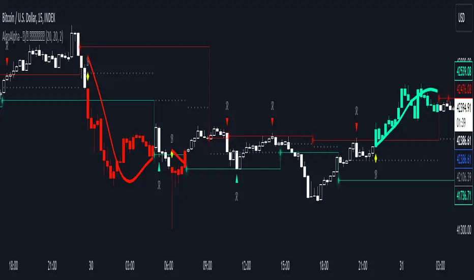
Reversal and Breakout Signals [AlgoAlpha]🚀🌟 Introducing the Reversal and Breakout Signals by AlgoAlpha 🌟🚀
This innovative tool is crafted to enhance your chart analysis by identifying potential reversal and breakout opportunities directly on your charts. It's designed with both novice and experienced traders in mind, providing intuitive visual cues for better decision-making. Let's dive into the key features and how it operates:
### Key Features:
🔶 Dynamic Period Settings: Customize the sensitivity of the indicator with user-defined periods for both the indicator and volume strength.
📊 Volume Threshold: Set a threshold to define what constitutes strong volume, enabling the identification of significant market movements.
💡 Trend Coloring: Option to color candles during trends, making it easier to visualize bullish and bearish market conditions.
🌈 Customizable Visuals: Choose your preferred colors for bullish, bearish, and breakout signals, personalizing the chart to your liking.
🚨 Advanced Alert System: Configure alerts for reversal and breakout signals, ensuring you never miss a potential trading opportunity.
### How to Use:
To maximize the effectiveness of the Reversal and Breakout Signals tool, follow these steps:
1. 🔧 Set Up Your Preferences:
- Adjust the Indicator Period and Volume Strength Period to match the timeframe of your trading strategy. This fine-tuning allows the indicator to better align with your specific market analysis needs.
- Define the Strong Volume Threshold to distinguish between ordinary and significant volume movements. This helps in identifying breakout or reversal signals with higher confidence.
2. 🎨 Customize Visuals:
- Choose colors for Bullish , Bearish , and Breakout Signals to visually differentiate between different types of market activities. This customization facilitates quicker decision-making while scanning charts.
3. 🔍 Reversal Signals:
- Bullish Reversal : Look for a triangle below the bar indicating a potential upward movement. It's identified when the price dips below the lower level but closes above it, suggesting a rejection of lower prices.
- Bearish Reversal : A triangle above the bar signals a potential downward movement. This occurs when the price spikes above the upper level but closes below, indicating a rejection of higher prices.
4. 📈 Trend and Breakout Signals:
- Diamonds represent breakout signals. A bullish breakout is marked below the bar when the price closes above the upper level, suggesting strong buying pressure. Conversely, a bearish breakout above the bar indicates strong selling pressure as the price closes below the lower level.
- The tool also features a Trend Tracker that highlights the current market trend using the Hull Moving Average (HMA). This can help you stay aligned with the overall market direction for your trades.
By integrating these steps into your trading strategy, the Reversal and Breakout Signals tool can provide actionable insights to help identify potential entry and exit points, enhancing your trading decisions with visual cues and alerts for market reversals and breakouts.
### How It Works:
The core logic revolves around calculating weighted moving averages of high and low prices over a user-defined period, identifying the highest and lowest points within this period to establish potential breakout or breakdown levels while reducing the amount of noise, hence the use of moving averages.
1. Weighted Moving Averages Calculation:
sh = ta.wma(high, len)
sl = ta.wma(low, len)
h = ta.highest(sh, len)
l = ta.lowest(sl, len)
2. Breakout and Reversal Detection:
The script then employs logic to detect bullish and bearish breakouts and reversals based on the closing price's position relative to these levels, combined with volume analysis to confirm the strength of the move.
if not (h < h or h > h )
hstore := h
if not (l < l or l > l )
lstore := l
bullishbreakout := (breakout or ((breakout or breakout or breakout or breakout ) and candledir == 1)) and strongvol and not (bullishbreakout or bullishbreakout or bullishbreakout )
bearishbreakout := (breakdown or ((breakdown or breakdown or breakdown or breakdown ) and candledir == -1)) and strongvol and not (bearishbreakout or bearishbreakout or bearishbreakout )
3. Visual Indicators and Alerts:
Visual cues such as triangle shapes for reversals and diamonds for breakouts, along with colored bars, make it easy to spot these opportunities. Additionally, alerts can be set up for these events, ensuring traders can react promptly to potential trading setups.
plotshape(bullishrej and not (state ==- 1) ? low * 0.9995 : na, " Bullish Reversal ", shape.triangleup, location.belowbar, color.new(green, 0), size = size.tiny, text = "𝓡", textcolor = color.gray)
plotshape(bearishrej and not (state == 1) ? high * 1.0005 : na, " Bearish Reversal ", shape.triangledown, location.abovebar, color.new(red, 0), size = size.tiny, text = "𝓡", textcolor = color.gray)
plotshape(bullishbreakout ? low * 0.999 : na, " Bullish Breakout ", shape.diamond, location.belowbar, color.new(yellow, 0), size = size.tiny, text = "𝓑", textcolor = color.gray)
plotshape(bearishbreakout ? high * 1.001 : na, " Bearish Breakout ", shape.diamond, location.abovebar, color.new(yellow, 0), size = size.tiny, text = "𝓑", textcolor = color.gray)
This script is a versatile tool designed to aid in the identification of key reversal and breakout points, helping traders to make informed decisions based on technical analysis. Its customization options allow for a tailored analysis experience, fitting the unique needs and strategies of each trader.
Cryptogrithm's Secret Momentum and Volatility IndicatorThis indicator is hard-coded for Bitcoin, but you may try it on other asset classes/coins. I have not updated this indicator in over 3 years, but it seems to still work very well for Bitcoin.
This indicator is NOT for beginners and is directed towards intermediate/advanced traders with a sensibility to agree/disagree with what this indicator is signalling (common sense).
This indicator was developed back in 2018 and I has not been maintained since, which is the reason why I am releasing it. (It still works great though! At the time of this writing of May 2022).
How to use:
Terms:
PA (Price Action): Literally the candlestick formations on your chart (and the trend formation). If you don't know how to read and understand price action, I will make a fast-track video/guide on this later (but in the meanwhile, you need to begin by learning Order-Flow Analysis, please google it first before asking).
CG Level (Cryptogrithm Level/Yellow Line): PA level above = bullish, PA level below = bearish
CG Bands (Cryptogrithm Bands): This is similar to how bollingers work, you can use this the same was as bollinger bands. The only difference is that the CG bands are more strict with the upper and lower levels as it uses different calculations to hug the price tighter allowing it to be more reactive to drastic price changes (earlier signals for oversold/overbought).
CG Upper Band (Red Upper Line): Above this upper bound line means overbought.
CG Middle Band (Light Blue Line): If PA trades above this line, the current PA trend is bullish continuing in the uptrend. If PA trades below this line, the current PA trend is bearish continuing in the downtrend. This band should only be used for short-term trends.
CG Lower Band (Green Lower Line): Below this lower bound line means oversold.
What the CG Level (yellow line) tells you:
PA is trading above CG Level = Bullish
PA is trading below CG Level = Bearish
Distance between CG Level and price = Momentum
What this means is that the further away the price is from the CG Level, the greater the momentum of the current PA trend. An increasing gap between the CG Level and PA indicates the price's strength (momentum) towards the current upward/downward trend. Basically when the PA and CG Level diverge, it means that the momentum is increasing in the current trend and when they converge, the current trend is losing momentum and the direction of the PA trend may flip towards the other direction (momentum flip).
PA+CG Level Momentum:
To use the CG Level as a momentum indicator, you need to pay attention to how the price and the CG level are moving away/closer from each other:
PA + CG Level Diverges = Momentum Increasing
PA + CG Level Converges = Momentum Decreasing
Examples (kind of common sense, but just for clarity):
Case 1: Bullish Divergence (Bullish): The PA is ABOVE and trending AWAY above from the CG Level = very bullish, this means that momentum is increasing towards the upside and larger moves will come (increasing gap between the price and CG Level)
Case 2: Bearish Convergence (Bearish): - The PA is ABOVE the CG Level and trending TOWARDS the CG Level = bearish, there is a possibility that the upward trend is ending. Look to start closing off long positions until case 1 (divergence) occurs again.
Case 3: Neutral - The PA is trading on the CG Level (no clear divergence or convergence between the PA and CG Level) = Indicates a back and forth (tug of war) between bears and bulls. Beware of choppy price patterns as the trend is undecisive until either supply/liquidity is dried out and a winner between bull/bear is chosen. This is a no trade zone, but do as you wish.
Case 4: Bearish Divergence (Bearish): The PA is BELOW and trending AWAY BELOW from the CG Level = very bearish, this means that momentum is increasing towards the downside and larger downward moves will come (increasing gap between the price and CG Level).
Case 5: Bullish Convergence (Bullish): - The PA is BELOW the CG Level and trending TOWARDS the CG Level = bullish, there is a possibility that the downward trend is ending and a trend flip is occuring. Look to start closing off short positions until case 4 (divergence) occurs again.
CG Bands + CG Level: You can use the CG bands instead of the PA candles to get a cleaner interpretation of reading the momentum. I won't go into detail as this is pretty self-explanatory. It is the same explanation as PA+CG Level Momentum, but you are replacing the PA candles with the CG Bands for interpretation. So instead of the PA converging/diverging from the CG Level, the Upper and Lower Bound levels are converging/diverging from the CG level instead.
Convergence: CG Level (yellow line) trades inside the CG bands
Divergence: CG Level (yellow line) trades outside the CG bands
Bullish/Bearish depends on whether the CG Band is trading below or above the CG level. If CG Band is above the CG Level, this is bullish. If CG Band is below the CG level, this is bearish.
Crosses (PA or CG Band crosses with CG level): This typically indicates volatility is incoming.
There are MANY MANY MANY other ways to use this indicator that is not explained here and even other undiscovered methods. Use some common sense as to how this indicator works (it is a momentum indicator and volatility predictor). You can get pretty creative and apply your own methods / knowledge to it and look for patterns that occur. Feel free to comment and share what you came up with!

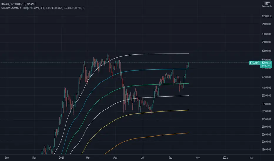
SRG Fibs SmoothedPLEASE READ: HOW TO UNDERSTAND HOW THIS INDICATOR WORKS FOR ME!
Why did I code this?
I never know where is the best place to buy
Sometimes I get greedy and just don't want to sell...
I want to protect myself from losses and still be able to make some trades
What does this do?
This script plots Fibonacci levels dynamically according to a specified length
It also has a smooting value so it looks a bit more clean (and allows for dynamic trailing stop loss)
Internal Fib levels allow to plot fibonacci levels between each main level (scalpers and day traders should be happy with this)
Fib Projection toggle so we can have "the same behaviour" during aggressive Bull Runs.
How to test this thing?
BTC USD Daily chart
For starters, use the following settings:
- Length: 365 (lookback of a full year)
- Smooth: 56 (8 week period)
- Inter Fib levels: OFF
- Fib projection: OFF
Have a look into the chart and check some support/resistance zones. Also check the behaviour of the indicator during the 2021 Jan -> Mar bull run (we will need it later)
If you like to check different time frames. Use these settings:
- Indicator Timeframe: 4 hours
- Length: 2190 (1 year)
- Smooth: 336 (8 weeks)
- Inter Fib Levels: ON
- Fib Projection: OFF
You can now test the chart using the 2H timeframe to see the movement, and how the Internal Fib levels work
Now as we're getting bullish:
- Indicator Timeframe: 4 hours
- Length: 2190 (1 year)
- Smooth: 336 (8 weeks)
- Inter Fib Levels: OFF
- Fib Projection: ON
You can now check the behaviour of the indicator during the 2021 Jan - Mar Bullrun in the 2H or 4H chart, to see some stop loss magic.
ICT Ultimate + SIGNALS [Entry/Exit/SL/TP]📖 ENTRY/EXIT RULES EXPLAINED (Hinglish):
🟢 BUY SIGNAL Kab Aayega?
Condition Required
Market Structure Bullish Trend (HH, HL)
BOS/CHoCH Bullish Break hona chahiye
Order Block Price Bullish OB par ho
Zone DISCOUNT zone mein ho
Time Kill Zone active ho (London/NY)
FVG Bullish FVG mein ho (optional)
Confluence Score: Kam se kam 2-4 conditions match honi chahiye (mode ke hisaab se)
🔴 SELL SIGNAL Kab Aayega?
Condition Required
Market Structure Bearish Trend (LH, LL)
BOS/CHoCH Bearish Break hona chahiye
Order Block Price Bearish OB par ho
Zone PREMIUM zone mein ho
Time Kill Zone active ho
FVG Bearish FVG mein ho (optional)
🛑 STOP LOSS Kahan Lagega?
Method Description
OB Based Order Block ke neeche/upar (recommended)
Swing Based Recent Swing Low/High ke neeche/upar
ATR Based ATR multiplier use karke
Fixed Pips Fixed pips (e.g., 20 pips)
🎯 TAKE PROFIT Levels:
Level Default R:R Example
TP1 1.5:1 Risk 20 pips = TP 30 pips
TP2 2.5:1 Risk 20 pips = TP 50 pips
TP3 4.0:1 Risk 20 pips = TP 80 pips
🎮 HOW TO USE (Step by Step):
Step 1: Add Indicator
text
1. TradingView kholein
2. Pine Editor open karein
3. Code paste karein
4. "Add to Chart" click karein
Step 2: Settings Adjust Karein
text
⚙️ Settings > ENTRY/EXIT SIGNALS section:
- Signal Mode:
• Conservative = 4+ confluence (kam signals, high accuracy)
• Moderate = 3+ confluence (balanced)
• Aggressive = 2+ confluence (zyada signals)
- Kill Zone Required: ON (recommended)
- Premium/Discount Required: ON (recommended)
Step 3: Trade Execution
text
1. 🔼 BUY ya 🔽 SELL arrow dekhein
2. Dashboard mein Entry, SL, TP levels check karein
3. Lines chart par draw ho jayengi
4. Trade lein!
Step 4: Trade Management
text
✓ TP1 Hit → 50% position close karein
✓ TP2 Hit → 30% aur close karein
✓ TP3 Hit → Full position close
✗ SL Hit → Exit trade
📱 DASHBOARD EXPLAINED:
text
┌─────────────────────────────────┐
│ ICT SIGNAL PANEL │
├─────────────────────────────────┤
│ 📈 Trend │ BULLISH 🟢 │
│ 📍 Zone │ DISCOUNT ⬇️ │
│ ⏰ Kill Zone │ NEW YORK 🟠 │
│ 🎯 Silver Bullet │ ACTIVE ✓ │
│ 🔢 Bull Confluence │ 5/3 │
│ 🔢 Bear Confluence │ 1/3 │
├─────────────────────────────────┤
│ ACTIVE TRADE │
├─────────────────────────────────┤
│ Direction │ 🔼 LONG │
│ Entry Price │ 1.0850 │
│ 🛑 Stop Loss │ 1.0820 │
│ 🎯 TP1 │ 1.0895 │
│ 🎯 TP2 │ 1.0925 │
│ 🎯 TP3 │ 1.0970 │
│ 📊 Risk (Pips)│ 30 │
└─────────────────────────────────┘
🔔 ALERTS Setup:
Chart par right-click karein
"Add Alert" select karein
Condition mein "ICT Ultimate + SIGNALS" select karein
Alert type choose karein:
ICT Buy Signal
ICT Sell Signal
TP1/TP2/TP3 Hit
Stop Loss Hit
Kill Zone Active
Silver Bullet Active
⚠️ IMPORTANT TIPS:
Best Practices:
text
✅ 15min ya 5min timeframe use karein
✅ Kill Zone mein hi trade karein
✅ Confluence 3+ hona chahiye
✅ Always SL lagayein
✅ Partial profit booking karein (TP1 par 50%)
Avoid:
text
❌ Asian session mein trade na karein
❌ News time par avoid karein
❌ Ek saath bohot trades na lein
❌ SL ke bina trade na karein
Koi bhi cheez samajh nahi aayi toh poochein! 🙏

TQ Gold Trend (Macro Regime)This indicator answers one question only:
Is gold in a monetary uptrend right now?
It does not:
Forecast prices
Time entries
Use momentum or volatility
It simply classifies the macro trend regime of gold.
3️⃣ Logic (Simple, Explicit)
Timeframe: Weekly
Indicator: 30-week Simple Moving Average
Interpretation:
Bullish: Price above a rising 30W SMA
Bearish: Price below a falling 30W SMA
Neutral: Everything else (transition / range)
This is classic macro trend / stage analysis, adapted for gold as a monetary asset.
4️⃣ How to Use It (User Instructions)
How to read the chart
>If Gold is Bull, precious metals matter.
>If Gold is Bear, ignore silver and miners.
>If Gold is Neutral, wait — no edge.
Best use
Check once per week
Use as the first filter before looking at:
Gold/DXY
Gold/SPY
Silver/Gold
Recommended timeframe
Weekly only (designed for macro regimes, not trading)

TQ Silver / Gold (Weekly Macro)This indicator tracks the Silver / Gold ratio on a weekly basis to determine whether silver is leading gold (risk appetite returning inside metals) or gold is leading silver (a more defensive precious-metals posture).
Within the TQ Weekly Macro Framework, this indicator is designed to be used after confirming the broader macro environment using TQ Gold Trend (Weekly Macro), TQ Gold / DXY (Weekly Macro), and TQ Gold / SPY (Weekly Macro).
Why Silver / Gold matters
>When Silver / Gold rises, silver is outperforming gold — often associated with reflation, growth expectations, or broad risk appetite within precious metals.
>When Silver / Gold falls, gold is outperforming silver — often associated with defense, uncertainty, or tighter financial conditions.
>This ratio is not a timing tool — it is a regime and leadership indicator within the metals complex.
How it works (regime rules)
Using weekly data:
Compute Silver ÷ Gold
Apply a 30-week SMA
Regime definitions:
Bull: Ratio above a rising 30-week SMA (silver leading)
Bear: Ratio below a falling 30-week SMA (gold leading)
Neutral: Transition / range
A clear label marks the current regime.
How to use it in your system
Use after confirming:
TQ Gold Trend (Weekly Macro)
TQ Gold / DXY (Weekly Macro)
TQ Gold / SPY (Weekly Macro)
> If Silver / Gold is Bull, metals participation is broadening and silver often has more upside torque.
> If Silver / Gold is Bear, gold leadership is defensive and silver exposure may underperform.
> Neutral often signals rotation or consolidation.
Best timeframe
Designed for weekly macro regime analysis.

TQ Gold / SPY (Weekly Macro)What this indicator does
This indicator tracks the Gold/SPY ratio on a weekly basis to show whether gold is outperforming U.S. equities (risk assets). It helps you determine if the market is favoring hard money / defensive leadership vs risk-on equity leadership.
Within the TQ Weekly Macro Framework, this indicator is intended to be used after confirming gold’s primary trend using TQ Gold Trend (Weekly Macro) and its monetary backdrop using TQ Gold / DXY (Weekly Macro).
Why Gold/SPY matters
Gold can rise during equity booms and during equity stress.
The Gold/SPY ratio tells you which asset class is winning in relative terms.
Rising Gold/SPY often signals defensive leadership, shifting macro preferences, or risk repricing, especially when aligned with TQ Gold Trend (Weekly Macro).
How it works (regime rules)
Using weekly data:
Compute Gold ÷ SPY
Apply a 30-week SMA
Regime definitions:
Bull: Ratio above a rising 30-week SMA (gold leading equities)
Bear: Ratio below a falling 30-week SMA (equities leading gold)
Neutral: Transition / range
A clear label marks the current regime.
How to use it in your system
Use after TQ Gold Trend (Weekly Macro) and TQ Gold / DXY (Weekly Macro).
> If Gold/SPY is Bull, gold is leading risk assets — metals tend to behave stronger and more “macro-relevant.”
> If Gold/SPY is Bear, equities are winning — gold moves may be less dominant.
> Neutral usually means rotation or consolidation.
Best timeframe
Designed for weekly macro regime analysis, not short-term trading.

Weekly macro ratio indicator tracking Silver/Gold with a 30-weekWhat this indicator does
This indicator tracks the Silver/Gold ratio on a weekly basis to determine whether silver is leading gold (risk appetite returning inside metals) or gold is leading silver (more defensive precious-metals posture).
Why Silver/Gold matters
When Silver/Gold rises, silver is outperforming gold — often associated with reflation, growth expectations, or broad risk appetite.
When Silver/Gold falls, gold is outperforming silver — often associated with defense, uncertainty, or tighter financial conditions.
This ratio is not a timing tool — it’s a regime/leadership indicator.
How it works (regime rules)
Using weekly data:
Compute Silver ÷ Gold
Apply a 30-week SMA
Regime definitions:
Bull: Ratio above a rising 30-week SMA (silver leading)
Bear: Ratio below a falling 30-week SMA (gold leading)
Neutral: Transition/range
A clear label marks the current regime.
How to use it in your system - This indicator is designed to be used as part of the broader TQ Weekly Macro Framework, alongside other TQ indicators such as TQ Gold Trend (Weekly Macro), TQ Gold / DXY (Weekly Macro), and TQ Gold / SPY (Weekly Macro).
Each indicator can also be used independently.
Use after confirming:
Pane 1: Gold Trend
Pane 2: Gold/DXY
Pane 3: Gold/SPY
If Silver/Gold is Bull, metals participation is broadening and silver often has more upside torque.
If Silver/Gold is Bear, gold leadership is defensive; silver exposure may underperform.
Neutral often signals rotation or consolidation.
Best timeframe
Designed for weekly macro regime analysis.

Weekly macro ratio indicator comparing gold vs SPY 30 SMAWhat this indicator does
This indicator tracks the Gold/SPY ratio on a weekly basis to show whether gold is outperforming U.S. equities (risk assets). It helps you determine if the market is favoring hard money / defensive leadership vs risk-on equity leadership.
Why Gold/SPY matters
Gold can rise during equity booms and during equity stress.
The Gold/SPY ratio tells you which asset class is winning in relative terms.
Rising Gold/SPY often signals defensive leadership, shifting macro preferences, or risk repricing.
How it works (regime rules)
Using weekly data:
Compute Gold ÷ SPY
Apply a 30-week SMA
Regime definitions:
Bull: Ratio above a rising 30-week SMA (gold leading equities)
Bear: Ratio below a falling 30-week SMA (equities leading gold)
Neutral: Transition/range
A clear label marks the current regime.
How to use it in your system
Use after Pane 1 (Gold Trend) and Pane 2 (Gold/DXY).
If Gold/SPY is Bull, gold is leading risk assets — metals tend to behave stronger and more “macro-relevant.”
If Gold/SPY is Bear, equities are winning — gold moves may be less dominant.
Neutral usually means rotation or consolidation.
Best timeframe
Designed for weekly macro regime analysis, not short-term trading.

Gold And Silver Macro Dashboard A weekly, macro-focused dashboard for precious metals that tracks gold’s trend plus three key relative-strength ratios: Gold/DXY, Gold/SPY, and Silver/Gold. Uses a 30-week SMA regime filter to label each series as Bull / Neutral / Bear and provides a quick “full picture” read.
What this indicator does
This dashboard helps you read the big picture for precious metals using a simple regime framework (weekly + 30-week SMA). It combines four signals into one view:
Gold (XAUUSD) — establishes the core precious-metals trend
Gold / DXY — shows whether gold is outperforming the U.S. dollar
Gold / SPY — shows whether gold is outperforming U.S. equities (risk assets)
Silver / Gold — shows whether risk appetite is returning inside metals (silver leadership)
How it works (simple rules)
Each item is classified using the same weekly regime logic:
Bull: price/ratio is above a rising 30-week SMA
Bear: price/ratio is below a falling 30-week SMA
Neutral: everything else (transition/range)
How to use it (30-second weekly scan)
Start with Gold: if Gold is Bull, metals have a tailwind.
Confirm with Gold/DXY: Bull means gold is beating fiat.
Confirm with Gold/SPY: Bull means gold is beating risk assets.
Use Silver/Gold to size aggressiveness: Bull implies reflation/confidence and often stronger silver participation.
Best timeframe
Designed for Weekly charts. The script can force weekly calculations, so it remains consistent even if you view other timeframes.
Customization
Change tickers if your preferred feed differs (OANDA spot vs futures vs ETFs).
Toggle the plotted lines on/off and keep only the dashboard table if you want a cleaner screen.
Important note
This is a macro regime tool for orientation and context. It is not meant to time entries/exits on lower timeframes.
Default symbols are:
Gold: OANDA:XAUUSD
Silver: OANDA:XAGUSD
Dollar Index: TVC:DXY
SPY: AMEX:SPY
Core Rule: Gold tells you WHEN metals matter. Ratios tell you WHY and HOW aggressive to be.
Bull across all four = strongest PM regime. Mixed readings = transition. Gold Bull + Silver/Gold Bear = defensive gold-led phase.

SA CloudRegimes GC.5min 1.12.2026 OVERNIGHTSignal Architect™ — Developer Note
These daily posts are intentional.
They are designed to help potential users visually observe consistency—not just in outcomes, but in process—across multiple futures products, market conditions, and timeframes, using the Stop Hunt Indicator alongside my proprietary Signal Architect™ framework.
The goal is simple:
To show how structure, behavior, and probability repeat—every day—despite a constantly changing market.
If you follow these posts over time, you will begin to recognize that:
• The same behaviors appear across different futures contracts
• The same reactions occur on multiple timeframes
• The same structural traps and stop events repeat regardless of volatility regime
That consistency is not coincidence.
Consistency is the signal.
Over time, that consistency should become familiar—
and familiarity should become your edge.
________________________________________
🧠 What You’re Seeing (And Why It Matters)
This indicator includes a limited visual preview of a proprietary power signal I have personally developed and refined across:
• Futures
• Algorithmic trading systems
• Options structure
• Equity market behavior
Every tool I release is built around one core principle:
Clarity of direction without over-promising or over-fitting.
That is why all Signal Architect™ tools emphasize:
• Market structure first
• High-probability directional context
• Clear, visual risk framing
• No predictive claims
• No curve-fit illusions
What you see publicly is not the full system—only controlled, educational previews meant to demonstrate how structure and probability align in real markets.
________________________________________
📊 Background & Scope
Over the years, I have personally developed 800+ programs, including:
• Equity systems
• Futures strategies
• Options structure tools
• Dividend & income frameworks
• Portfolio construction and allocation logic
This includes 40+ Nasdaq-100 trading bots, several operating under extremely strict rule-sets and controlled deployment conditions.
Nothing shared publicly represents my complete internal framework.
Public posts exist for education, observation, and pattern recognition—not signals, not advice, and not promises.
________________________________________
🤝 For Those Who Find Value
If these daily posts help you see the market more clearly:
• Follow, boost, and share my scripts, Ideas, and MINDS posts
• Feel free to message me directly with questions or build requests
• Constructive feedback and collaboration are always welcome
For traders who want to go deeper, optional memberships may include:
• Additional signal access
• Early previews
• Occasional free tools and upgrades
🔗 Membership & Signals:
trianchor.gumroad.com
________________________________________
⚠️ Final Note
Everything published publicly is educational and analytical only.
Markets carry risk.
Discipline, patience, and risk management always come first.
Watch the consistency.
Study the structure.
Let the market repeat itself.
— Signal Architect™
________________________________________
🔗 Personally Developed GPT Tools
• AuctionFlow GPT
chatgpt.com
• Signal Architect™ Gamma Desk – Market Intelligence
chatgpt.com
• Gamma Squeeze Watchtower™
chatgpt.com
SA CloudRegimes + HLC3 Reclaim + CONF% (VWAP Always-On)
Purpose:
This is a market-regime + trigger engine. It paints cloud zones to show what the market is doing (expanding vs contracting, bullish vs bearish) and then fires reclaim signals when price confirms continuation via HLC3 reclaim + wick reclaim behavior.
What makes it different
VWAP is always enforced (session VWAP when available; otherwise a rolling VWAP proxy).
It separates regime (cloud) from execution (signal).
It gives a real-time confirmation score (CONF%) so you can filter out low-quality setups.
1) The 4 Cloud Zones (Regimes)
Each cloud represents a behavioral state. You don’t “guess direction” inside the cloud — you use the cloud to understand what kind of market you’re in, then you wait for the reclaim trigger.
🟩 GREEN Cloud — Bullish Expansion (Uptrend continuation)
Meaning: Trend is aligned and volatility/energy is expanding upward.
Conditions (conceptually):
Trend stack bullish: SMA3 > SMA8 > SMA20 > SMA50
Price above VWAP
Momentum/pressure supportive: W%R bullish, PFE bullish
Range behavior indicates expansion
How to trade it:
Best for: continuation longs
Wait for: Bull reclaim trigger (triangle up) to enter
Risk: false continuation late in the move (use CONF% + wick gate)
💗 PINK Cloud — Bearish Contraction in an Uptrend (Bull pullback / hedge phase)
Meaning: The market is still in an uptrend, but it is pulling back and compressing (often a hedge/unwind pause before continuation).
Conditions:
Trend still bullish (uptrend stack)
Price remains above VWAP
W%R is oversold, PFE weak → indicating pullback pressure
Range indicates contraction
How to trade it:
Best for: “buy-the-pullback” continuation
Wait for: Bull reclaim trigger after the pullback stabilizes
This is your “reload zone” — don’t long blindly; let reclaim confirm.
🟥 RED Cloud — Bearish Expansion (Downtrend continuation)
Meaning: Trend is aligned bearish and volatility/energy is expanding downward.
Conditions:
Trend stack bearish: SMA3 < SMA8 < SMA20 < SMA50
Price below VWAP
W%R oversold + PFE weak/negative
Range behavior indicates expansion
How to trade it:
Best for: continuation shorts
Wait for: Bear reclaim trigger (triangle down) to enter
Risk: late-stage selling → use CONF% + wick gate.
🟩 (Light Green) Cloud — Bullish Contraction in a Downtrend (Bear pullback / bounce phase)
Meaning: The market is still in a downtrend, but it’s bouncing and compressing (often the pause before continuation lower).
Conditions:
Downtrend stack remains intact
Price remains below VWAP
W%R improving / PFE stabilizing
Range indicates contraction
How to trade it:
Best for: sell-the-bounce continuation
Wait for: Bear reclaim trigger to confirm the bounce is ending.
2) Zone Signals (G / P / R / LG markers)
These are zone-entry markers that fire only on the first bar when a zone turns on.
G = Green Zone started (bull expansion)
P = Pink Zone started (bear contraction inside uptrend)
R = Red Zone started (bear expansion)
LG = Light Green Zone started (bull contraction inside downtrend)
How to use them:
These are context markers, not trade entries.
They tell you: “We just entered a new regime. Now wait for reclaim.”
3) The Actual Trade Triggers: “Reclaim” Signals (RECL triangles)
The triangle “RECL” signals are your execution triggers.
Bull Reclaim (Triangle Up)
Fires only when the system believes the market is in a bullish regime (Green or Pink) and then sees:
A bull candle
A cross back above HLC3
A prior-bar reclaim wick (optional but recommended)
Interpretation:
Pullback resolved → price reclaimed balance (HLC3) → continuation likely.
Bear Reclaim (Triangle Down)
Fires only when the system believes the market is in a bearish regime (Red or Light Green) and then sees:
A bear candle
A cross back below HLC3
A prior-bar reclaim wick (optional)
Interpretation:
Bounce resolved → price lost balance (HLC3) → continuation lower likely.
4) CONF% Bubble (Real-Time Probability Filter)
Whenever a reclaim signal fires, the script calculates a confirmation score (0–100) using weighted factors:
Trend alignment
VWAP alignment
Zone alignment
HLC3 reclaim cross
Wick reclaim gate (if enabled)
W%R alignment
PFE alignment
Default filter
Bubble only prints if CONF% ≥ 40%
You can raise it if you want fewer, cleaner trades:
50–60% = fewer but higher quality
70%+ = very selective
How to use CONF% properly
It’s not “win rate.”
It’s a confluence meter: “How many of my conditions are aligned right now?”
Use it as a trade permission layer.
5) Recommended Workflow (The Correct Way)
Step 1 — Identify the active cloud
Green/ Pink = you’re looking for long continuation
Red/ Light Green = you’re looking for short continuation
Step 2 — Let the pullback finish
Pink and Light Green are pullback/bounce phases.
Don’t jump in — wait.
Step 3 — Take ONLY reclaim triggers
Triangle up/down is your “go” signal.
Step 4 — Use CONF% to filter
If CONF% is low, skip.
If CONF% is strong, you have confluence.
6) Best Timeframes (Practical)
This tool works on many charts, but it shines where regimes develop clearly.
Best (most stable)
15m
1H
2H
4H
Faster (more signals, more noise)
3m / 5m can work, but you’ll need:
tighter tickSize accuracy
slightly looser thresholds
higher CONF% filtering
7) Key Settings You’ll Actually Adjust
If you don’t see many clouds on a timeframe:
Lower pfeBullThresh (ex: 35 → 30)
Lower expansionMin (60 → 55)
Raise contractionMax (35 → 40)
If you see too many weak signals:
Raise minConfirmPct (40 → 50/60)
Keep usePrevWickGate = true
8) Simple Interpretation Cheat Sheet
Green: bull continuation environment → wait for bull reclaim
Pink: pullback in bull trend → best “reload” → wait for bull reclaim
Red: bear continuation environment → wait for bear reclaim
Light Green: bounce in bear trend → best “sell bounce” → wait for bear reclaim

Order Blocks Volume Delta 3D | Flux ChartsGENERAL OVERVIEW:
Order Blocks Volume Delta 3D by Flux Charts is a rule-based order block and volume delta visualization tool. It detects bullish and bearish order blocks using a profile-of-price approach: the indicator finds the most actively traded price area (Point of Control, or POC) between a swing high/low and the Break of Structure (BOS), then anchors the order block to the earliest still-valid candle that traded through that POC band. From there, it tracks all candles that continue to interact with that zone and overlays both 2D and 3D volume delta views directly inside the order block.
Unlike traditional order block tools that simply use candle bodies or wicks, this indicator is volume-aware. It lets you optionally pull volume from a lower timeframe feed (for example, using 1-minute data while watching a 5-minute chart) to build a much more accurate picture of how buyers and sellers actually traded inside the zone. This makes every block not just a price box, but a volume story: which side dominated, where, and by how much.
All order blocks printed by this indicator are confirmed: BOS and retests are evaluated strictly on closed candles. Nothing is drawn or alerted on partially formed bars, which helps avoid repaint-style flicker and keeps the signals clean and stable.
What is the theory behind the indicator?:
The core idea behind Order Blocks Volume Delta 3D is that not all price levels inside an order block are equal. Some prices are barely touched, while others act like magnets where candles repeatedly trade and heavy volume passes through.
The indicator first finds a swing high or swing low, waits for a clear Break of Structure (BOS), then scans the candles between the swing point and the BOS to find the price level that was touched the most. That level is treated as the POC.
From all candles in the swing-to-BOS range that interact with this POC band, the indicator looks for the earliest candle that is not already mitigated and uses that as the anchor candle for the order block:
The top of the block equals the anchor candle’s high (for a bearish OB) or the top of its wick zone.
The bottom equals the anchor candle’s low (for a bullish OB) or the bottom of its wick zone.
This “earliest valid POC-touching candle” rule makes it easier to visualize how price and volume developed from the very start of a meaningful zone, while ignoring POC touches that are already fully mitigated by the time the structure is confirmed. On top of that, each candle is split into bullish and bearish volume. If you choose a lower timeframe volume input, the tool aggregates lower timeframe candles into your chart timeframe, giving a more granular bull-versus-bear breakdown for each bar. The result is
an order block that not only shows where price moved but also which side pushed it, how aggressively, and how that balance shifted over time.
ORDER BLOCKS VOLUME DELTA 3D FEATURES:
The Order Blocks Volume Delta 3D indicator includes 4 main features:
1. Order Blocks
2. Volume Delta
3. 3D Visualization
4. Alerts
ORDER BLOCKS:
🔹What is an Order Block
An order block is a price zone where a clear displacement move began after liquidity was taken. It usually forms around the last consolidation or cluster of candles before price breaks structure with a strong move.
In this indicator, order blocks are defined as structured zones that:
Begin at the earliest unmitigated candle that interacted with the most-touched price level (POC) between swing and BOS.
Extend through the full wick range of that anchor candle.
Stretch forward in time, tracking how price continues to trade through, respect, retest, or invalidate the zone.
Are only printed once the BOS is fully confirmed on closed candles (confirmed order blocks only).
Example of bullish and bearish order blocks anchored at the earliest unmitigated candle in the POC zone:
🔹How are Order Blocks detected
The indicator uses a step-by-step, rules-based process to detect bullish and bearish order blocks. The logic is designed to match discretionary Smart Money concepts but with strict, repeatable rules.
Step 1: Detect swing highs and swing lows
Swing High: a candle whose high is higher than the highs of surrounding candles.
Swing Low: a candle whose low is lower than the lows of surrounding candles.
The Swing Length input controls how many candles are checked to the left and right.
Example of swing high and swing low detection:
Step 2: Confirm Break of Structure (BOS)
Once a swing is confirmed, the indicator waits for price to break past that swing:
Bullish BOS: price closes above a previous swing high.
Bearish BOS: price closes below a previous swing low.
To avoid “live” flicker, BOS logic is evaluated based on the previous closed candle. The order block is only confirmed once the BOS candle has fully closed and the next bar has opened. This is one of the reasons the script only shows confirmed, non-repainting order blocks.
Example of bullish BOS and bearish BOS:
Step 3: Build the POC range between swing and BOS
Between the swing candle and the BOS candle, the indicator:
Scans all candles in that range.
Tracks every price level touched using binning (POC bins).
Counts how many times each price band was touched by candle wicks.
The bin with the highest touch count becomes the POC band. This is where price traded most often, not necessarily where volume was highest.
Example of the POC band between swing and BOS.
Step 4 – Anchor the order block to the earliest valid POC candle
From all candles in the swing-to-BOS range, the indicator finds the earliest candle whose high/low overlaps the POC band and whose zone is not already mitigated. That candle becomes the anchor candle for the order block:
For a bearish OB, the block spans the anchor candle’s full wick range, with its top at the high.
For a bullish OB, the block spans the anchor candle’s full wick range, with its bottom at the low.
By requiring the anchor to be the earliest unmitigated interaction with POC, the script avoids building blocks from price action that has already been fully traded through and is less relevant.
Step 5: Extend and manage the order block
Once created, the block:
Extends to the right by a configurable number of candles (Extend Zones).
Continues until it is invalidated by wick or close, depending on the chosen method.
Can show retest labels when price revisits the zone after creation.
Is included or excluded from display depending on the Show Nearest and Hide Invalidated Zones settings.
Example of active and invalidated OB.
🔹Order Block Settings
◇ Swing Length
Swing Length controls how sensitive swing highs and lows are.
Lower Swing Length: Swings form more frequently, which leads to more frequent BOS events and order block formations.
Higher Swing Length: Only larger, more meaningful swings are detected, which leads to less frequent BOS events and less order block formations.
◇ Invalidation
Invalidation determines how an order block is considered “mitigated” or no longer valid.
Wick: For bullish OBs, if price wicks completely through the bottom of the zone, the order block is invalidated. For bearish OBs, if price wicks completely through the top, the order block is invalidated.
Close: For bullish OBs, the block is invalidated only when a candle closes below the bottom. For bearish OBs, it is invalidated only when a candle closes above the top.
Example of wick invalidation:
Example of close invalidation:
◇ Show Nearest
Show Nearest limits how many active order blocks are displayed based on proximity to current price. For example, a value of 2 will display only the two nearest bullish order blocks and two nearest bearish order blocks.
Chart with Show Nearest set to 3:
◇ Extend Zones
Extend Zones define how many candles forward each order block should project beyond the right most candle on the chart.
Chart with Extend Zones set to 10:
◇ Retest Labels
When enabled, the indicator prints labels on every clean retest of an active order block, as long as that block remains valid. Key points:
A retest label is only printed once the retest candle has fully closed – you always see confirmed retests, not intrabar tests.
Retest labels are positioned on the actual retest candle so you can visually see which bar interacted with the zone.
In addition, if multiple retests occur in quick succession, the indicator applies a built-in three-candle buffer between retests. That means only the first valid retest within each three-bar window is labeled (and can trigger an alert), helping to reduce clutter while still highlighting meaningful interactions with the zone.
Example of retest labels on bullish and bearish order blocks.
◇ Hide Invalidated Zones
Hide Invalidated Zones controls whether mitigated/invalidated blocks stay drawn.
Enabled: Only currently valid, unmitigated order blocks are shown (subject to Show Nearest)
Disabled: Both active and invalidated order blocks are displayed.
VOLUME DELTA:
🔹What is Volume Delta
Volume delta measures the difference between buying and selling volume. Instead of only showing “how much volume traded”, it separates volume into bullish and bearish components.
In this indicator:
Bullish volume = volume from candles (or lower timeframe candles) that closed higher.
Bearish volume = volume from candles that closed lower.
Delta % shows how dominant one side was compared to the total.
Example of bullish and bearish order blocks with volume delta and total volume.
🔹How is Volume Delta calculated?
The indicator uses a flexible, timeframe-aware volume engine.
1. Choose a Volume Delta Timeframe.
If the selected timeframe is equal to or higher than the chart timeframe, the indicator simply uses chart-volume per candle.
If the selected timeframe is lower than the chart timeframe (for example, 1‑minute volume on a 5‑minute chart), the indicator pulls all lower timeframe candles for each chart bar and sums them.
2. Split each bar into bull and bear volume.
For each contributing candle:
If close > open → its volume is added to bullish volume.
If close < open → its volume is added to bearish volume.
If close == open → its volume is split evenly between bullish and bearish.
3. Aggregate for each order block.
For each order block:
The indicator loops once from the swing candle to the BOS candle.
It records every candle that touches the POC band.
For each touching candle, it adds its bull and bear volumes (either directly from chart candles or from aggregated lower timeframe candles).
Total volume = bullish volume + bearish volume
Delta % = (bullish volume or bearish volume / total volume ) * 100, depending on which side is dominant.
🔹Volume Delta Settings:
◇ Display Style
Display Style controls how the volume delta is drawn inside each order block:
Horizontal:
Bullish and bearish fills extend horizontally from left to right.
The filled strip sits along the base of the block, with a bull vs bear gradient.
Vertical:
Bullish and bearish fills stretch vertically inside the zone.
The bullish percentage controls how much of the block is filled with the “dominant” color.
Example of Horizontal display style.
Example of Vertical display style.
◇ Volume Delta Timeframe
Volume Delta Timeframe tells the indicator whether to use chart volume or lower timeframe volume. When set to a lower timeframe, the indicator aggregates all lower timeframe candles that fall inside each chart bar, splitting their volume into bullish and bearish components before summing.
Using a lower timeframe:
Increases precision for how volume truly behaved inside each bar.
Helps reveal hidden absorption and aggressive flows that a higher timeframe candle might hide.
Example of volume delta based on chart timeframe.
Example of volume delta based on lower timeframe than chart(same OB as above)
◇ Display Total Volume
When enabled, the indicator prints the total volume for each order block as a label positioned inside the zone, near the bottom-right corner. This total is the sum of bullish and bearish volume used in the delta calculation and gives you a quick sense of how “heavy” the trading was in that block compared to others.
Example of total volume label inside multiple order blocks.
◇ Show Delta %
Show Delta % draws a small text label on the strip of the block that displays the dominant side’s percentage. For example, a bullish block might show “72%” if 72% of all volume inside that POC band came from bullish volume.
Example of Delta %:
3D VISUALIZATION:
The 3D Visualization feature turns each order block into a 3D plot.
🔹What the 3D Visualization does:
Wraps the order block with side faces and a top face to create a 3D bar effect.
Uses delta percentages to tilt the top face toward the dominant side.
Projects blocks into the future using Extend Zones, making the 3D blocks visually stand out.
🔹How it works:
The front face of the OB shows the standard 2D zone.
The side face extends forward in time based on the 3D depth setting.
The top face is angled depending on the Display Style and bull vs bear delta, making strong bullish blocks “rise” and strong bearish blocks “sink”.
🔹How the 3D depth setting affects visuals
Lower 3D depth:
Shorter side faces.
Subtle 3D effect.
Higher 3D depth:
Longer side faces projecting further into the future.
Stronger 3D effect that visually highlights key zones.
Example of lower 3D depth:
Example of higher 3D depth:
ALERTS:
The indicator supports alert conditions through TradingView’s AnyAlert() engine, allowing you to set alerts for the following:
New Bullish Order Block formed
New Bearish Order Block formed
Bullish OB Retest
Bearish OB Retest
Important alert behavior:
Order block alerts only fire when a new block is confirmed (after BOS closes and the next bar opens).
Retest alerts only fire when a retest candle has completely finished, matching the behavior of the visual retest labels.
IMPORTANT NOTES:
3D faces for order blocks are built using polylines. In some situations, especially when an order block’s starting point (its left edge) is beyond the chart’s left-most visible bar, the top 3D face may appear slightly irregular, skewed, or incomplete. This is purely a drawing limitation related to how the chart engine handles off-screen polyline points. Once the starting point of that order block comes into view (by zooming out or scrolling back), the 3D top face corrects itself and the visual becomes fully consistent. This issue affects only the 3D top face drawing, not the actual order-block box itself. The underlying zone, prices, and volume calculations remain accurate at all times.
If all conditions are met to create a new order block but the resulting zone would overlap an existing active order block, the new block is intentionally not created. A built-in guard prevents overlapping active zones to keep the structure clean and easier to interpret.
3D face drawing is implemented using an adaptive polyline method, which can be relatively calculation-heavy on certain symbols, timeframes, or chart histories. In some cases this may lead to calculation timeout error from TradingView.
UNIQUENESS:
This indicator is unique because it:
Anchors each order block to the earliest unmitigated candle that traded through the most-touched POC band between swing and BOS, rather than a generic “last up/down candle” or a random volume spike.
Builds a dedicated volume engine that can pull either chart timeframe volume or aggregated lower timeframe volume, then splits it into bull and bear components.
Adds 3D visualization on top of standard zones, turning each OB into a visually weighted slab rather than a flat rectangle.
Provides clean toggles (Show Nearest, Hide Invalidated Zones, Extend Zones, Display Style, Delta %, and total volume labels) so you can dial the indicator from extremely minimal to fully detailed, depending on your trading workflow.
Combined, these features make the indicator not just an order block plotter, but a complete volume‑informed structure tool tailored for traders who want to see where price actually traded and whether bulls or bears truly controlled the move inside each order block.

Quantum Reversal Detector [JOAT]
Quantum Reversal Detector - Multi-Factor Reversal Probability Analysis
Introduction and Purpose
Quantum Reversal Detector is an open-source overlay indicator that combines multiple reversal detection methods into a unified probability-based framework. The core problem this indicator addresses is the unreliability of single-factor reversal signals. A price touching support means nothing without momentum confirmation; an RSI oversold reading means nothing without price structure context.
This indicator solves that by requiring multiple independent factors to align before generating reversal signals, then expressing the result as a probability score rather than a binary signal.
Why These Components Work Together
The indicator combines five analytical approaches, each addressing a different aspect of reversal detection:
1. RSI Extremes - Identifies momentum exhaustion (overbought/oversold)
2. MACD Crossovers - Confirms momentum direction change
3. Support/Resistance Proximity - Ensures price is at a significant level
4. Multi-Depth Momentum - Analyzes momentum across multiple timeframes
5. Statistical Probability - Quantifies reversal likelihood using Bayesian updating
These components are not randomly combined. Each filter catches reversals that others miss:
RSI catches momentum exhaustion but misses structural reversals
MACD catches momentum shifts but lags price action
S/R proximity catches structural levels but ignores momentum
Multi-depth momentum catches divergences across timeframes
Probability scoring combines all factors into actionable confidence levels
How the Detection System Works
Step 1: Pattern Detection
The indicator first identifies potential reversal conditions:
// Check if price is at support/resistance
float lowestLow = ta.lowest(low, period)
float highestHigh = ta.highest(high, period)
bool atSupport = low <= lowestLow * 1.002
bool atResistance = high >= highestHigh * 0.998
// Check RSI conditions
float rsi = ta.rsi(close, 14)
bool oversold = rsi < 30
bool overbought = rsi > 70
// Check MACD crossover
float macd = ta.ema(close, 12) - ta.ema(close, 26)
float signal = ta.ema(macd, 9)
bool macdBullish = ta.crossover(macd, signal)
bool macdBearish = ta.crossunder(macd, signal)
// Combine for reversal detection
if atSupport and oversold and macdBullish
bullishReversal := true
Step 2: Multi-Depth Momentum Analysis
The indicator calculates momentum across multiple periods to detect divergences:
calculateQuantumMomentum(series float price, simple int period, simple int depth) =>
float totalMomentum = 0.0
for i = 0 to depth - 1
int currentPeriod = period * (i + 1)
float momentum = ta.roc(price, currentPeriod)
totalMomentum += momentum
totalMomentum / depth
This creates a composite momentum reading that smooths out noise while preserving genuine momentum shifts.
Step 3: Bayesian Probability Calculation
The indicator uses Bayesian updating to calculate reversal probability:
bayesianProbability(series float priorProb, series float likelihood, series float evidence) =>
float posterior = evidence > 0 ? (likelihood * priorProb) / evidence : priorProb
math.min(math.max(posterior, 0.0), 1.0)
The prior probability starts at 50% and updates based on:
RSI extreme readings increase likelihood
MACD crossovers increase likelihood
S/R proximity increases likelihood
Momentum divergence increases likelihood
Step 4: Confidence Intervals
Using Monte Carlo simulation concepts, the indicator estimates price distribution:
monteCarloSimulation(series float price, series float volatility, simple int iterations) =>
float sumPrice = 0.0
float sumSqDiff = 0.0
for i = 0 to iterations - 1
float randomFactor = (i % 10 - 5) / 10.0
float simulatedPrice = price + volatility * randomFactor
sumPrice += simulatedPrice
float avgPrice = sumPrice / iterations
// Calculate standard deviation for confidence intervals
This provides 95% and 99% confidence bands around the current price.
Signal Classification
Signals are classified by confirmation level:
Confirmed Reversal : Pattern detected for N consecutive bars (default 3)
High Probability : Confirmed + Bayesian probability > 70%
Ultra High Probability : High probability + PDF above average
Dashboard Information
The dashboard displays:
Bayesian Probability - Updated reversal probability (0-100%)
Quantum Momentum - Multi-depth momentum average
RSI - Current RSI value with overbought/oversold status
Volatility - Current ATR as percentage of price
Reversal Signal - BULLISH, BEARISH, or NONE
Divergence - Momentum divergence detection
MACD - Current MACD histogram value
S/R Zone - AT SUPPORT, AT RESISTANCE, or NEUTRAL
95% Confidence - Price range with 95% probability
Bull/Bear Targets - ATR-based reversal targets
Visual Elements
Quantum Bands - ATR-based upper and lower channels
Probability Field - Circle layers showing probability distribution
Confidence Bands - 95% and 99% confidence interval circles
Reversal Labels - REV markers at confirmed reversals
High Probability Markers - Star diamonds at high probability setups
Reversal Zones - Boxes around confirmed reversal areas
Divergence Markers - Triangles at momentum divergences
How to Use This Indicator
For Reversal Trading:
1. Wait for Bayesian Probability to exceed 70%
2. Confirm price is at S/R zone (dashboard shows AT SUPPORT or AT RESISTANCE)
3. Check that RSI is in extreme territory (oversold for longs, overbought for shorts)
4. Enter when REV label appears with high probability marker
For Risk Management:
1. Use the 95% confidence band as a stop-loss reference
2. Use Bull/Bear Targets for take-profit levels
3. Higher probability readings warrant larger position sizes
For Filtering False Signals:
1. Increase Confirmation Bars to require more consecutive signals
2. Only trade when probability exceeds 70%
3. Require divergence confirmation for highest conviction
Input Parameters
Reversal Period (21) - Lookback for S/R and momentum calculations
Quantum Depth (5) - Number of momentum layers for multi-depth analysis
Confirmation Bars (3) - Consecutive bars required for confirmation
Detection Sensitivity (1.2) - Band width and target multiplier
Bayesian Probability (true) - Enable probability calculation
Monte Carlo Simulation (true) - Enable confidence interval calculation
Normal Distribution (true) - Enable PDF calculation
Confidence Intervals (true) - Enable confidence bands
Timeframe Recommendations
1H-4H: Best for swing trading reversals
Daily: Fewer but more significant reversal signals
15m-30m: More signals, requires higher probability threshold
Limitations
Statistical concepts are simplified implementations for Pine Script
Monte Carlo uses deterministic pseudo-random factors, not true randomness
Bayesian probability uses simplified prior/likelihood model
Reversal detection does not guarantee actual reversals will occur
Confirmation bars add lag to signal generation
Open-Source and Disclaimer
This script is published as open-source under the Mozilla Public License 2.0 for educational purposes. The source code is fully visible and can be studied to understand how each component works.
This indicator does not constitute financial advice. Reversal detection is probabilistic, not predictive. The probability scores represent statistical likelihood based on historical patterns, not guaranteed outcomes. Past performance does not guarantee future results. Always use proper risk management, position sizing, and stop-losses.
- Made with passion by officialjackofalltrades

EMA Slope - RSI Indicator# EMA Slope - RSI Indicator
## Script Description (for Publishing Page)
**EMA Slope - RSI Indicator** combines normalized EMA slope momentum analysis with RSI divergence detection and momentum comparison to create a visual signal indicator with five distinct signal types. The indicator's originality lies in its unique "No Trade Zone" (NTZ) concept applied to slope momentum, combined with centered RSI format for direct comparison, and multiple complementary signal methods that work together to identify both trend-following and reversal opportunities across different market conditions.
**Core Concept - EMA Slope Normalization:** Calculates rate of change of long MA (default 160 EMA) by comparing current value to N bars ago (default 3 bars). Raw slope difference normalized to -100 to +100 scale using 500-bar rolling range: normalizedSlope = 100 * (longMA - longMA ) / (highest(maDF, 500) - lowest(maDF, 500)). Creates consistent momentum oscillator comparable across price levels and timeframes.
**No Trade Zone (NTZ) Logic:** NTZ (±8 default) creates neutral zone where slope momentum is too weak for reliable signals. Indicator only triggers NTZ Cross signals when slope crosses out of threshold zone, ensuring signals occur only when momentum is sufficiently strong.
**Centered RSI Format (RSI-50):** Traditional RSI (0-100 range) difficult to compare with slope. This indicator uses centered RSI = (RSI - 50), creating -50 to +50 range zero-centered on same scale as normalized slope. Enables direct visual and mathematical comparison between RSI and slope momentum, enabling Slope-RSI exhaustion detection and RSI-Slope Oscillator signals.
**Component Integration:** Five signal types target different market conditions. NTZ Cross and Acceleration target trend-following when momentum strong. RSI Divergence and Slope-RSI Divergence target reversals when price/momentum diverge. RSI-Slope Oscillator targets momentum alignment when RSI and slope converge. Multi-method approach provides signals across trending, reversing, and ranging markets.
### 📊 Technical Calculations
**Slope Normalization:** maDF = longMA - longMA , normalized: maDf = 100 * maDF / (highest(maDF, 500) - lowest(maDF, 500)), ranges -100 to +100.
**Acceleration Detection:** maAcce = abs(maDf - maDf ) * smoothBars * 2, normalized: maAcc = 50 * maAcce / highest(maAcce, 200). Values above threshold (35 display, 40 signals) indicate sudden momentum shifts. Visualized as colored circles: cyan (bullish), red (bearish).
**RSI Calculation:** rsi = sma(rsi(source, length), smoothing), centered: cRsi = rsi - 50 (ranges -50 to +50). Smoothed using SMA (default 3 bars) to reduce noise.
**RSI Divergence:** Uses pivot high/low detection on smoothed RSI. Pivot lookback = 16 - sensitivityInput (inverse: sensitivity 6 = 10-bar lookback, sensitivity 10 = 6-bar lookback). Compares price pivots (actual high/low including wicks) against RSI pivots. Bullish: priceLowerLow AND rsiHigherLow. Bearish: priceHigherHigh AND rsiLowerHigh. Stores multiple previous pivots (default 8 max) for comparison.
**Slope-RSI Exhaustion:** Compares normalized slope against centered RSI on same scale. Bearish: slope accelerating up (delta > 0, slope > NTZ) BUT RSI declining (cRsi < cRsi AND cRsi < cRsi ). Bullish: slope accelerating down (delta < 0, slope < -NTZ) BUT RSI rising. Gap threshold (default 10.0 points) filters noise. Visualized with dashed lines and gap labels.
**RSI-Slope Oscillator:** State machine tracks cross events (rsiSlopeCrossUp = cRsi > maDf AND cRsi <= maDf ), waits for confirmation: both RSI and slope heading same direction. Long: RSI crosses above slope AND both heading UP. Short: RSI crosses below slope AND both heading DOWN. Useful for range-bound markets.
**Stretch Filter:** maPercentDiff = (longMA - shortMA) / shortMA * 100. Blocks long signals if longMA > shortMA by threshold (overextended up). Blocks short signals if shortMA > longMA by threshold (overextended down). Default 0.45% prevents signals when MAs too far apart.
**Delta Calculation:** Measures change in normalized slope between bars. Timeframe mode: compares current confirmed slope with previous confirmed (more reliable, slight delay). Standard mode: compares current with previous bar (faster, may use unconfirmed). Minimum threshold (default 3.4) filters weak momentum changes.
**Trailing Stop (Blackflag FTS Swingarm):** Uses Wilder's MA of true range. Modified mode: trueRange = max(HiLo, HRef, LRef) with enhanced gap handling. Unmodified: standard true range. Trailing stop calculated based on ATR factor and price trend direction. Separate settings for divergence signals (wider stops, grace periods).
### 🚀 Signal Types and Conditions
**1. NTZ Cross Signals:** Long: Slope crosses above +NTZ (default +8) AND positive delta ≥ threshold (default 3.4) AND stretch filter allows AND optional trend confirmation (short MA > long MA). Short: Slope crosses below -NTZ AND negative delta ≥ threshold AND filters allow. Exit: Slope re-enters NTZ OR reverses direction for confirmation bars OR trailing stop.
**2. Acceleration Signals:** Long: Acceleration ≥ threshold (default 40) AND slope above NTZ AND positive delta sufficient AND filters allow. Short: Acceleration ≥ threshold AND slope below -NTZ AND negative delta sufficient AND filters allow. Visual: Colored circles (cyan bullish, red bearish). Works independently to catch sudden momentum bursts.
**3. RSI Divergence Signals:** Bullish: Price lower low while smoothed RSI higher low, detected via pivot comparison (default up to 8 pivots). Bearish: Price higher high while RSI lower high. Optional Slope-RSI confirmation. Visual: Purple lines (bearish), lime lines (bullish). Exit: Divergence-specific trailing stop (wider ATR, grace period).
**4. Slope-RSI Divergence Signals:** Bullish: Slope accelerating down (negative delta, slope < -NTZ) BUT RSI rising over lookback AND gap exceeds threshold (default 10.0 points). Bearish: Slope accelerating up (positive delta, slope > NTZ) BUT RSI declining AND gap exceeds threshold. Visual: Orange triangles (bullish exhaustion), yellow triangles (bearish exhaustion) with dashed lines. Exit: Divergence-specific trailing stop.
**5. RSI-Slope Oscillator Signals:** Long: RSI crosses above slope AND both heading upward. Short: RSI crosses below slope AND both heading downward. State machine tracks cross then confirms direction. Exit: Opposite oscillator condition (allows reversal) OR trailing stop after grace period.
### 📖 How to Use
**Adding to Chart:** TradingView → Indicators → Search "EMA Slope - RSI Indicator" → Add (displays in separate pane below price).
**Visual Elements:** Colored area = normalized EMA slope (Green = bullish above NTZ, Red = bearish below -NTZ, Gray = NTZ zone). Blue line = Centered RSI (-50 to +50). Colored circles = Acceleration (Cyan = bullish, Red = bearish). Green triangles (↑) = Long signals (bottom). Red triangles (↓) = Short signals (top). Orange X = Exit signals. Dashed lines = NTZ boundaries. Purple/Lime lines = RSI divergences. Orange/Yellow triangles = Slope-RSI exhaustion. Table (top-right) = Current Slope, RSI, Gap values.
**Parameter Configuration:** MA Settings: Short 40 (stretch filter), Long 160 (slope), Types: SMA/EMA/DEMA/TEMA/WMA/VWMA/SMWMA/SWMA/HMA. Ratios: 20/80 (fast), 40/160 (standard), 50/200 (slow). Core: NTZ Threshold 8 (5-6 more signals, 10-12 stronger), Min Delta 3.4 (5-10 stronger, 1-3 sensitive), Max Stretch 0.45% (0.3% conservative, 1.0% permissive, 0 disable), Use Timeframe Delta true (confirmed bar vs previous bar). RSI: Length 14, Smoothing 3, Source close. Divergence: Sensitivity 6 (higher = more sensitive, 6 = 10-bar lookback, 10 = 6-bar lookback), Max Peaks 8 (2-15 range), Show Divergences true. Slope-RSI: Lookback 4 (2-10, higher = conservative), Min Gap 10.0 pts (0-100, higher = strong only, 0 disable), Show Exhaustion true. Signal Enables: NTZ Cross true, Acceleration true, RSI Divergence false, Slope-RSI Divergence true, RSI-Slope Oscillator true, Require Slope-RSI Confirmation false. Exit: Confirmation Bars 4 (0-10, 0 immediate, 2-4 filters false), Show Trailing Stop true, Trail Type Modified/Unmodified, ATR Period 10, ATR Factor 4.0 (2-3 tight, 4 standard, 5-6 wide), Divergence Grace 3 bars, Divergence ATR 4.0 (recommend 5-8), Oscillator Grace 3 bars, Oscillator ATR 4.0.
**Alerts:** Right-click indicator pane → Add Alert → Choose condition (Long/Short Entry/Exit) → Configure notifications.
**Interpreting Signals:** Trending Markets: Focus NTZ Cross and Acceleration, higher NTZ (10-12) for stronger signals, use trend confirmation. Reversal Opportunities: Enable RSI Divergence and Slope-RSI Divergence, look for exhaustion markers and divergence lines, use wider stops. Range-Bound: Enable RSI-Slope Oscillator, signals when RSI and slope align, allows position reversal. Multi-Timeframe: Higher TF for trend, lower TF for timing, stronger when aligned. Market Adjustments: Crypto 20/80 MA, NTZ 6-7, Delta 4-5 | Forex 40/160 MA, NTZ 8, Delta 3.4 | Stocks 50/200 MA, NTZ 10-12, Delta 2-3.
### 📈 Use Cases
Day Trading (5m-15m, fast MAs 20/80), Swing Trading (1h-4h, standard 40/160), Position Trading (4h-Daily, slow 50/200), Trend Following (NTZ Cross/Acceleration in trends), Reversal Trading (RSI Divergence/Slope-RSI at reversals), Range Trading (RSI-Slope Oscillator in choppy markets), Momentum Analysis (Centered RSI and normalized slope comparison), Trend Exhaustion Detection (Slope-RSI exhaustion markers).
### ⚠️ Important Disclaimer
**THIS IS NOT FINANCIAL ADVICE**
This indicator is for educational and informational purposes only. Trading involves substantial risk of loss and is not suitable for all investors. Past performance does not guarantee future results. No guarantee of accuracy - signals may be false. Not professional financial advice - consult a qualified advisor. Use only as part of comprehensive analysis. Always use proper risk management. Combine with other analysis techniques before making trading decisions. Indicator signals don't guarantee profitable trades. You are solely responsible for trading decisions and risk management. By using this indicator, you acknowledge understanding the risks and that you use it at your own risk. Never invest more than you can afford to lose. Works on all markets: Crypto, Forex, Stocks, Commodities, Futures
## Short Description (for Script Header - 200-300 chars)
Visual signal indicator combining normalized EMA slope momentum (No Trade Zone concept) with centered RSI format for direct comparison. Five signal types: NTZ momentum crosses, acceleration bursts, price-RSI divergences, slope-RSI exhaustion reversals, and RSI-slope oscillator alignment. Includes stretch filter, exit confirmation bars, and trailing stop exits with separate settings per signal type.
## Tags (for Publishing)
EMA, Moving Average, Slope, Momentum, No Trade Zone, NTZ, Indicator, Technical Analysis, RSI, Relative Strength Index, Centered RSI, RSI-50, Divergence, Slope-RSI, Exhaustion, RSI-Slope Oscillator, Normalized Comparison, Stretch Filter, Trend Confirmation, Exit Confirmation, Trailing Stop, Alerts, Signals, Visual Signals, Entry Signals, Exit Signals, Crypto, Forex, Stocks, Futures, Swing Trading, Day Trading, Reversal Trading, Range Trading, Momentum Analysis
## Category
**Indicators** → **Momentum**

Moving Average Ribbon - version 4There are many different strategies using Moving Averages such as the Guppy, Super Guppy, Madrid Ribbon and others. Some strategies use one type of calculation over the other.
I am not advocating one strategy over another and this indicator is not a particular strategy. It provides up to 27 moving averages. You can choose between Simple, Exponential (default), ALMA, Hull, WMA, RMA and DEMA for the calculation method.
You can choose which Moving Averages to show and not show.
You can change the lengths of any of the Moving Averages.
Some strategies I have seen uses different sources. You can set the source for each individual Moving Average.
If you use this indicator more than once on the same chart, you can offset the two indicators if needed.
The indicator has two methods for coloring the plots. The default is by direction and order. If going up and the faster MA is higher than the next slower MA, it is bullish. If going down and the faster MA is lower than the next slower MA, it is bearish. Otherwise, it is neutral.
An alternate means looks at separation distance. A slower MA will inherit the color of the faster MA if the distance between the two is equal or greater than the previous candle.
If standard colors are used, there is a Strong Bear, Weak Bear, Strong Bull and Weak Bull. If you choose to use Alternate colors, you have a Bullish and Bearish color.
Defaults are simply set to how I have been using it. I also have it applied on multiple charts across multiple timeframes. It is not a recommendation or promise of best method. I am still experimenting with different layouts.

Relative Strength Index SmoothedDefinition
The Relative Strength Index (RSI) is a well versed momentum based oscillator which is used to measure the speed (velocity) as well as the change (magnitude) of directional price movements. Essentially RSI, when graphed, provides a visual mean to monitor both the current, as well as historical, strength and weakness of a particular market. The strength or weakness is based on closing prices over the duration of a specified trading period creating a reliable metric of price and momentum changes. Given the popularity of cash settled instruments (stock indexes) and leveraged financial products (the entire field of derivatives); RSI has proven to be a viable indicator of price movements.
History
J.Welles Wilder Jr. is the creator of the Relative Strength Index. A former Navy mechanic, Wilder would later go on to a career as a mechanical engineer. After a few years of trading commodities, Wilder focused his efforts on the study of technical analysis. In 1978 he published New Concepts in Technical Trading Systems. This work featured the debut of his new momentum oscillator, the Relative Strength Index, better known as RSI.
Over the years, RSI has remained quite popular and is now seen as one of the core, essential tools used by technical analysts the world over. Some practitioners of RSI have gone on to further build upon the work of Wilder. One rather notable example is Andrew Cardwell who used RSI for trend confirmation.
Calculation
RSI = 100 – 100/ (1 + RS)
RS = Average Gain of n days UP / Average Loss of n days DOWN
For a practical example, the built-in Pine Script function rsi(), could be replicated in long form as follows.
change = change(close)
gain = change >= 0 ? change : 0.0
loss = change < 0 ? (-1) * change : 0.0
avgGain = rma(gain, 14)
avgLoss = rma(loss, 14)
rs = avgGain / avgLoss
rsi = 100 - (100 / (1 + rs))
"rsi", above, is exactly equal to rsi(close, 14).
The basics
As previously mentioned, RSI is a momentum based oscillator. What this means is that as an oscillator, this indicator operates within a band or a set range of numbers or parameters. Specifically, RSI operates between a scale of 0 and 100. The closer RSI is to 0, the weaker the momentum is for price movements. The opposite is also true. An RSI closer to 100 indicates a period of stronger momentum.
- 14 days is likely the most popular period, however traders have been known to use a wide variety of numbers of days.
What to look for
Overbought/Oversold
Wilder believed that when prices rose very rapidly and therefore momentum was high enough, that the underlying financial instrument/commodity would have to eventually be considered overbought and a selling opportunity was possibly at hand. Likewise, when prices dropped rapidly and therefore momentum was low enough, the financial instrument would at some point be considered oversold presenting a possible buying opportunity.
There are set number ranges within RSI that Wilder consider useful and noteworthy in this regard. According to Wilder, any number above 70 should be considered overbought and any number below 30 should be considered oversold.
An RSI between 30 and 70 was to be considered neutral and an RSI around 50 signified “no trend”.
Some traders believe that Wilder’s overbought/oversold ranges are too wide and choose to alter those ranges. For example, someone might consider any number above 80 as overbought and anything below 20 as oversold. This is entirely at the trader’s discretion.
Divergence
RSI Divergence occurs when there is a difference between what the price action is indicating and what RSI is indicating. These differences can be interpreted as an impending reversal. Specifically there are two types of divergences, bearish and bullish.
Bullish RSI Divergence – When price makes a new low but RSI makes a higher low.
Bearish RSI Divergence – When price makes a new high but RSI makes a lower high.
Wilder believed that Bearish Divergence creates a selling opportunity while Bullish Divergence creates a buying opportunity.
Failure Swings
Failure swings are another occurrence which Wilder believed increased the likelihood of a price reversal. One thing to keep in mind about failure swings is that they are completely independent of price and rely solely on RSI. Failure swings consist of four “steps” and are considered to be either Bullish (buying opportunity) or Bearish (selling opportunity).
Bullish Failure Swing
RSI drops below 30 (considered oversold).
RSI bounces back above 30.
RSI pulls back but remains above 30 (remains above oversold)
RSI breaks out above its previous high.
Bearish Failure Swing
RSI rises above 70 (considered overbought)
RSI drops back below 70
RSI rises slightly but remains below 70 (remains below overbought)
RSI drops lower than its previous low.
Cardwell’s trend confirmations
Of course no one indicator is a magic bullet and almost nothing can be taken simply at face value. Andrew Cardwell, who was mentioned earlier, was one of those students who took Wilder’s RSI interpretations and built upon them. Cardwell’s work with RSI led to RSI being a great tool not just for anticipating reversals but also for confirming trends.
Uptrends/Downtrends
Cardwell made keen observations while studying Wilder’s ideas of divergence. Cardwell believed that:
Bullish Divergence only occurs in a Bearish Trend.
Bearish Divergence only occurs in an Bullish Trend.
Both Bullish and Bearish Divergence usually cause a brief price correction and not an actual trend reversal.
What this means is that essentially Divergence should be used as a way to confirm trends and not necessarily anticipate reversals.
Reversals
Cardwell also discovered what are referred to as Positive and Negative Reversals. Positive and Negative Reversals are basically the opposite of Divergence.
Positive Reversal occurs when price makes a higher low while RSI makes a lower low. Price proceeds to rise. Positive Reversals only occur in Bullish Trends.
Negative Reversal occurs when price makes a lower high while RSI makes a higher high. Price proceeds to fall. Negative Reversals only occur in Bearish Trends.
Positive and Negative Reversals can be boiled down to cases where price outperformed momentum. And because Positive and Negative Reversals only occur in their specified trends, they can be used as yet another tool for trend confirmation.
Summary
For more than four decades the Relative Strength Index (RSI) has been an extremely valuable tool for almost any serious technical analyst. Wilder’s work with momentum laid the groundwork for future chartists and analysts to dive in deeper to further explore the implications of his RSI modeling and its correlation with underlying price movements. As such, RSI is simply one of the best tools or indicators in a trader’s arsenal of market metrics to develop most any trading methodology. Only the novice will take one look at RSI and assume which direction the market will be heading next based off of one number. Wilder believed that a bullish divergence was a sign that the market would soon be on the rise, while Cardwell believed that such a divergence was merely a slight price correction on the continued road of a downward trend. As with any indicator, a trader should take the time to research and experiment with the indicator before relying on it as a sole source of information for any trading decision. When used in proper its perspective, RSI has proven to be a core indicator and reliable metric of price, velocity and depth of market.

Proactive Execution MachineProactive Execution Machine: Multi-State Momentum Engine
Overview
The Proactive Execution Machine is a comprehensive trading workspace designed to filter market noise and highlight high-probability execution windows. It combines Dynamic Supply/Demand Zones, Manual Level Proximity, and a proprietary Dual-Candle Momentum Scoring system to categorize the market into specific "States" in real-time.
Instead of a simple arrow, this script provides a System Status dashboard that tells you exactly what phase the market is in—whether it's "Level Absorption," a "Demand Vortex," or a "Tired Trend. "Core Components
1. The Momentum Gauge (Bottom Left)
This table provides a deep-dive into order flow by scoring the last two candles based on:
Close Location: Where price closed relative to its range (Upper, Middle, Lower).
Body-to-Wick Ratio: Measuring the "effort vs. result" of the move.
Range Relativity: Whether the current bar is an "Inside" or "Outside" bar relative to the previous candle.
Slope (Linear Regression): A real-time trendline of momentum strength to see if conviction is accelerating or decelerating.
2. Dynamic State Engine The script automatically identifies and colors the chart into three primary zones:
Supply Zone (Red): The upper 30% of the recent price discovery range.
Demand Zone (Green): The lower 30% of the recent price discovery range.
Proximity Zones: When price nears your Manual Levels (PDH, PDL, NY Open, etc.), the engine switches priority to monitor for "Breakouts" or "Level Attacks."
3. System Status (Bottom Right)The dynamic HUD changes size and color based on conviction levels. It will notify you of specific market conditions:
Supply/Demand Overrun: When momentum is so strong it is smashing through reversal zones. Level Absorption/Stalling: When price reaches a key level but momentum has "flattened," suggesting a potential reversal or high-volume churn.
Buy/Sell Now: High-conviction signals triggered only when Location (Zone) and Momentum (Score) align.
How to Trade with the "Machine"
For Trend Followers: Look for the status "TREND (ACTIVE)" combined with a Momentum Score of $\pm 4$ or higher.
For Reversion Traders: Watch for "WATCH LONGS/SHORTS" when price enters a Supply or Demand zone. Wait for the status to flip to "BUY/SELL NOW" as momentum begins to shift back toward the mean.
For Level Traders: Input your daily levels (VAH, VAL, POC) in the settings. The machine will automatically prioritize these levels, changing status to "AT LEVEL" the moment price enters your specified proximity.
Key Settings
Manual Levels: Input up to 5 custom price levels for the proximity engine.
Proximity Sensitivity: Adjust how close price must be to a level (in points/pips) to trigger an "At Level" state.
Aggression (1-5): Tuning the pivot detection. Lower numbers respond faster to micro-structure; higher numbers focus on major swing points.
Visual Coding
Candle bodies are colored to assist with single candle pattern detection:
Lime/Pink Bar Highlights: The script uses a custom color engine to highlight "Shaved" (Marubozu) bars.
Lime indicates aggressive bullish conviction, while Pink (Fuchsia) highlights aggressive bearish conviction.
Green indicates bull engulfing candle
Red indicates bear engulfing candle
Orange is an outside bar
Yellow an inside bar
Gray a Doji bar
Black all other bars
Dynamic Zones: The chart features two primary background areas:
Red Zone (Top): The Supply Zone, identifying where sellers historically reclaim control.
Green Zone (Bottom): The Demand Zone, identifying where buyers historically step in.
System Status HUD (Bottom Right): This is the "brain" of the machine. The text size is adjusted to attract the trader's attention when the slope of the momentum increases above 5 (bullish expansion) or greater than - 5 (Bearish expansion). The system status changes color based on the market state too:
HUD Coloring:
Aqua: Active Bullish Trend.
Gray: Bull trend tired.
Orange: Active Bearish Trend.
Gray: Bear trend tired.
Red: For sell now.
Green: For buy now.
Lime: Bull price level under attack.
Marron: Bear price level under attack.
Gray: Price level absorption.
Yellow: Price at level and stalling.
Maroon: An "Overrun" or "Vortex" where price is smashing through supply/demand with extreme momentum.
The text size serves as a "Volatility Alarm." * When the text is Small, the market is in a "sideways" or "absorbing" state. You should be cautious about entering new trend trades.
When the text is Large, the Machine has detected that "Aggressive" participants have entered the order flow. This is your cue that a "Level Attack" or a "Trend Breakout" is currently in progress.
The 1-Minute Tactical Setup Guide:
Proactive Execution Machine Operating on the 1-minute (1m) timeframe requires a balance between speed and noise filtration. Because the Proactive Execution Machine uses a "State Engine" logic, it is uniquely suited for the high-velocity environment of the NY Open.
I follow these three tactical steps to optimize the chart for the 1m timeframe:
Step 1: Calibrate the "Proximity Sensitivity" On a 1m chart, a "Level" isn't a single price—it's a zone.
Adjustment: In the script settings, set your Proximity Sensitivity to a value that represents the average "noise" of your instrument.
For ES (S&P 500 Futures): 1.5 to 2.5 points.
For NQ (Nasdaq Futures): 5 to 10 points.
For Forex (EURUSD): 1 to 2 pips.
The Goal: You want the "AT LEVEL" status to trigger just as price is "sniffing" the level, giving you time to prepare your order before the touch.
Step 2: Watch the "History" Column in the Momentum Gauge
The bottom-left table is your most important tool for the 1m chart. It shows you the momentum of the last three bars ($T-0$, $T-1$, $T-2$).
Momentum Sequence: Look for a "Sequence of Three." If you see $T-2$ (Neutral), $T-1$ (Long), and $T-0$ (STR Long), you have a momentum explosion.
The Trap: If you see STR LONG followed immediately by a NEUTRAL bar while in a Supply Zone, the "Machine" will shift to "SUPPLY STALLING." This is your signal to tighten your trailing stop or take profit—it means the bulls are hitting a wall of sell orders.
Step 3: The "Level Attack" Execution
The script features a unique state called "LEVEL ATTACK." This is designed specifically for breakout/breakdown traders.
The Setup: Price is approaching a Manual Level (like the NY Open or PDH).
The Signal: If the status changes to "LEVEL ATTACK (BULL)," it means the momentum score is high ($>3$) and the slope is positive while within the proximity of the level.
The Action: This is a "Proactive" entry. Instead of waiting for the candle to close above the level, you are entering as the "Machine" detects institutional pressure "attacking" the level.
Daily Routine for the "Machine"
1) 09:25 AM: Input your 5 manual levels (PDH, PDL, NY Open, VAH, VAL).
2) 09:30 AM: Wait for the first 5 minutes of volatility to settle.
3) The Window: Look for the System Status to move from "IDLE" to a colored state.
4) The Trigger: Never take a signal if the Momentum Gauge is in the "Neutral" (Yellow) zone. Only execute when the gauge shows LONG/SHORT or STR LONG/STR SHORT.

ICT Concepts [Kodexius]ICT Concepts is an all in one, chart overlay toolkit that combines several widely used ICT style components into a single, modular workflow. It is designed to help you map higher timeframe context, track directional structure, and refine execution areas with imbalance and liquidity concepts, without turning the chart into a cluttered drawing board.
Instead of plotting everything indefinitely, each module focuses on “live relevance” and chart readability. Zones, lines, and labels are managed with sensible limits so the most recent and most meaningful structures remain visible while older objects are automatically retired.
Because the system is modular, you can run it like a complete toolkit:
- Use multi timeframe Order Blocks to define high probability zones
- Use Market Structure (BOS and MSS) for bias and context
- Validate intent with SMT Divergence when you want intermarket confirmation
- Refine with Imbalances (FVG, BPR, CE) and Liquidity Sweeps
- Add timing structure via Killzones and risk structure via auto Fibonacci
🔹 Features
🔸 Multi Timeframe Order Blocks (3 candle displacement OB)
The OB engine detects a strict 3 candle displacement sequence (bull and bear) and projects the “order block candle” as a forward extending zone. Detection can run on the chart timeframe or on a user selected higher timeframe and then be displayed on your execution chart.
🔸 Overlap Control
Before adding a new OB, the script checks overlap against existing zones of the same direction. If a new zone intersects an existing one, it is ignored to reduce redundant stacking in the same price area.
🔸 Automatic Extension and Mitigation for Order Blocks
OB zones extend forward on every bar and are removed once mitigation is confirmed. Mitigation is evaluated by close breaking decisively beyond the relevant boundary:
- Bullish OB mitigates when close prints below the OB bottom
- Bearish OB mitigates when close prints above the OB top
🔸 Market Structure (BOS and MSS)
Market Structure is built from swing pivots using a configurable pivot length. When price closes through the latest swing, the script prints a structure event:
BOS (Break of Structure) for continuation
MSS (Market Structure Shift) for a directional change
To keep the chart readable, older structure drawings are capped by history limits.
🔸 SMT Divergence with optional mini panel
SMT can compare the current instrument with a user selected symbol to highlight divergence at swing points. A divergence is flagged when one market makes a new swing extreme while the other fails to confirm.
Optional: a compact right side “compare symbol” candle panel can be enabled so you can visually confirm what the secondary market is doing without leaving the chart.
🔸 Imbalances: FVG, BPR, and CE modes
You can choose between three imbalance views depending on your style:
FVG mode: Fair Value Gaps are plotted as extending zones
CE mode: Consequent Encroachment is visualized using a midpoint line and a half zone fill
BPR mode: Balanced Price Range is formed when a new FVG overlaps an opposing FVG, producing a “balanced” region that often behaves differently than a standalone gap
🔸 Automatic extension, limits, and mitigation for imbalances
Imbalance objects extend forward until mitigated. Mitigation uses wick based logic:
Bullish imbalance mitigates when price wicks below the zone bottom
Bearish imbalance mitigates when price wicks above the zone top
The script also enforces per side limits and removes older items to keep performance stable.
🔸 Liquidity sweeps (buyside and sellside)
The liquidity module tracks swing highs and lows and marks sweep events when price runs the level and then closes back through it, which often behaves like a rejection signal. Sweeps are visualized with a level line plus a small sweep highlight box, with an optional history cap.
🔸 Auto anchored Fibonacci (EQ and OTE focus)
Fibonacci levels are automatically anchored using the most recent structure context so you do not need to manually re draw fibs every time the market evolves. EQ and OTE focused bands are plotted to support common premium discount style workflows, with optional extra levels if desired.
🔸 Killzones (session boxes with optional range tracking)
Asian, London Open, New York AM, and New York PM killzones can be displayed using UTC-5 session definitions. Session boxes dynamically expand as new highs and lows are formed during the session, and historical zones can be retained up to a user set count. Rendering is restricted to intraday timeframes up to 60 minutes for clean scaling and performance.
🔹 Calculations
1) Order Block detection (3 candle displacement)
The OB pattern is defined inside detectLogic() . The zone boundaries always come from candle (the middle candle of the 3 candle sequence).
detectLogic() =>
bool isBull = open > close and close > open and close > open and low < low and close > high
bool isBear = open < close and close < open and close < open and high > high and close < low
[isBull, high , low , time , isBear, high , low , time ]
Interpretation (bullish side):
Candle is bearish
Candle is bullish (the OB candle)
Current candle is bullish and closes above high
low undercuts low to form the sweep style condition
Bearish logic is the mirrored inverse.
2) Multi timeframe projection and duplicate control
If the timeframe input is set, detections are computed on that timeframe and projected onto the current chart using request.security . A last processed time check prevents duplicate prints.
=
request.security(syminfo.tickerid, i_tf, detectLogic())
var int lastBullTime = 0
var int lastBearTime = 0
if mtf_isBull and mtf_bullTime != lastBullTime
lastBullTime := mtf_bullTime
if mtf_isBear and mtf_bearTime != lastBearTime
lastBearTime := mtf_bearTime
3) OB overlap validation and mitigation
Overlap is checked before pushing a new zone, then zones are extended and removed once mitigated by close.
method hasOverlap(array OBs, float top, float bottom) =>
bool overlap = false
if OBs.size() > 0
for i = 0 to OBs.size() - 1
OB item = OBs.get(i)
if (top < item.top and top > item.bottom) or (bottom > item.bottom and bottom < item.top)
overlap := true
break
overlap
method isMitigated(OB this, float currentClose) =>
this.isBull ? (currentClose < this.bottom) : (currentClose > this.top)
4) Market Structure: pivots, BOS, and MSS
Swings are derived from pivots; then BOS/MSS prints when price crosses the latest swing. The script tracks trend state to decide whether the break is continuation (BOS) or shift (MSS).
float ph = ta.pivothigh(i_structLen, i_structLen)
float pl = ta.pivotlow(i_structLen, i_structLen)
bool brokenHigh = ta.crossover(close, lastHigh)
bool brokenLow = ta.crossunder(close, lastLow)
// drawStructure(..., "BOS", ...) or drawStructure(..., "MSS", ...) depending on trend state
5) SMT Divergence conditions
SMT uses pivot highs/lows on both instruments. A bearish SMT prints when the main chart makes a higher high but the compare symbol fails to exceed its prior high. A bullish SMT prints when the main chart makes a lower low but the compare symbol fails to make a lower low.
bool bearishSmt = not na(smtAHighPrev) and not na(smtBHighPrev) and (smtAHighLast > smtAHighPrev) and (smtBHighLast <= smtBHighPrev)
bool bullishSmt = not na(smtALowPrev) and not na(smtBLowPrev) and (smtALowLast < smtALowPrev) and (smtBLowLast >= smtBLowPrev)
6) FVG detection, BPR construction, and CE level
FVGs are detected via a classic 3 bar gap condition. When a new FVG overlaps an opposing FVG, the script builds a BPR using the intersecting region. CE is the midpoint (top + bottom) / 2, plotted as a dashed line plus a half fill box.
bool fvgBullDetected = low > high
bool fvgBearDetected = high < low
// CE
float ceLevel = (this.top + this.bottom) / 2
Imbalance mitigation uses wick logic:
method isMitigated(FVG this, float currentHigh, float currentLow) =>
this.isBull ? (currentLow < this.bottom) : (currentHigh > this.top)
7) Liquidity sweep trigger
A sweep is confirmed only when price runs the pivot level and closes back through it (reject style).
bool sweepBull = i_showLiq and not na(liqLastLow) and not liqLastLowSwept and low < liqLastLow and close > liqLastLow
bool sweepBear = i_showLiq and not na(liqLastHigh) and not liqLastHighSwept and high > liqLastHigh and close < liqLastHigh
8) Killzone session mapping
Sessions are defined in UTC-5 using time() session strings.
string kzTz = "UTC-5"
kzInSession(string sess) =>
not na(time(timeframe.period, sess, kzTz))
bool inAsian = kzInSession("2000-0000")
bool inLondon = kzInSession("0200-0500")
bool inNY = kzInSession("0830-1100")

Ocean Master [JOAT]Ocean Master QE - Advanced Oceanic Market Analysis with Quantum Flow Dynamics
Overview
Ocean Master QE is an open-source overlay indicator that combines multiple analytical techniques into a unified market analysis framework. It uses ATR-based dynamic channels, volume-weighted order flow analysis, multi-timeframe correlation (quantum entanglement concept), and harmonic oscillator calculations to provide traders with a comprehensive view of market conditions.
What This Indicator Does
The indicator calculates and displays several key components:
Dynamic Price Channels - ATR-adjusted upper, middle, and lower channels that adapt to current volatility conditions
Order Flow Analysis - Separates buying and selling volume pressure to calculate a directional delta
Smart Money Index - Volume-weighted order flow metric that highlights potential institutional activity
Harmonic Oscillator - Weighted combination of 10 Fibonacci-period EMAs (5, 8, 13, 21, 34, 55, 89, 144, 233, 377) to identify trend direction
Multi-Timeframe Correlation - Measures price correlation across 1H, 4H, and Daily timeframes
Wave Function Analysis - Momentum-based state detection that identifies when price action becomes decisive
How It Works
The core channel calculation uses ATR with a configurable quantum sensitivity factor:
float atr = ta.atr(i_atrLength)
float quantumFactor = 1.0 + (i_quantumSensitivity * 0.1)
float quantumATR = atr * quantumFactor
upperChannel := ta.highest(high, i_length) - (quantumATR * 0.5)
lowerChannel := ta.lowest(low, i_length) + (quantumATR * 0.5)
midChannel := (upperChannel + lowerChannel) * 0.5
Order flow is calculated by separating volume into buy and sell components based on candle direction:
The harmonic oscillator weights shorter EMAs more heavily using inverse weighting (1/1, 1/2, 1/3... 1/10), creating a responsive yet smooth trend indicator.
Signal Generation
Confluence signals require multiple conditions to align:
Bullish: Harmonic oscillator crosses above zero + positive Smart Money Index + positive Order Flow Delta
Bearish: Harmonic oscillator crosses below zero + negative Smart Money Index + negative Order Flow Delta
Dashboard Panel (Top-Right)
Bias - Current market direction based on price vs mid-channel
Entanglement - Multi-timeframe correlation score (0-100%)
Wave State - COLLAPSED (decisive) or SUPERPOSITION (uncertain)
Volume - Current volume relative to 20-period average
Volatility - ATR as percentage of price
Smart Money - Volume-weighted order flow reading
Visual Elements
Ocean Depth Layers - Gradient fills between channel levels representing different price zones
Channel Lines - Upper (surface), middle, and lower (seabed) dynamic levels
Divergence Markers - Triangle shapes when harmonic oscillator crosses zero
Confluence Labels - BULL/BEAR labels when multiple factors align
Suggested Use Cases
Identify trend direction using the harmonic oscillator and channel position
Monitor order flow for potential institutional activity
Use multi-timeframe correlation to confirm trade direction across timeframes
Watch for confluence signals where multiple factors align
Input Parameters
Length (default: 14) - Base period for channel and indicator calculations
ATR Length (default: 14) - Period for ATR calculation
Quantum Depth (default: 3) - Complexity factor for calculations
Quantum Sensitivity (default: 1.5) - Channel width multiplier
Timeframe Recommendations
Works on all timeframes. Higher timeframes (4H, Daily) provide smoother signals; lower timeframes require faster reaction times and may produce more noise.
Limitations
Multi-timeframe requests add processing overhead
Order flow estimation is based on candle direction, not actual order book data
Correlation calculations require sufficient historical data
Open-Source and Disclaimer
This script is published as open-source under the Mozilla Public License 2.0 for educational purposes. It does not constitute financial advice. Past performance does not guarantee future results. Always use proper risk management and conduct your own analysis before trading.
- Made with passion by officialjackofalltrades
