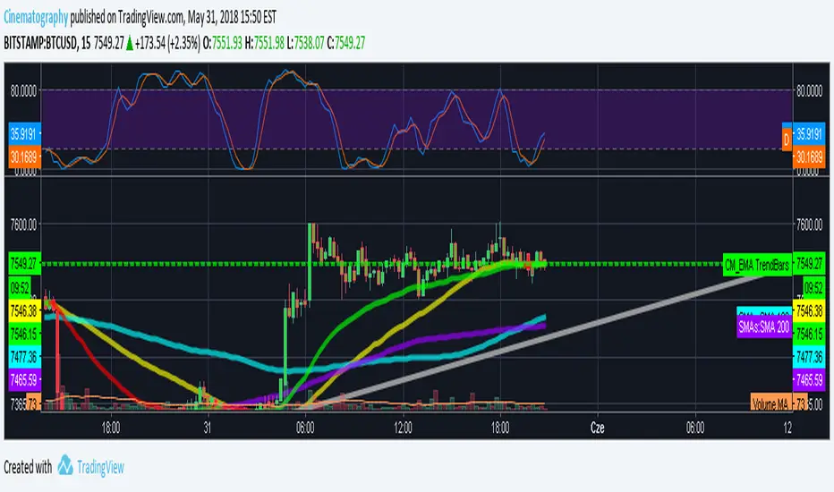
Bollinger Bands Physics with SMA 50 and EMA 15// opening bollinger bands green triangle at bottom
// sma 50 orange line
// ema 15 green line
// low above ema, and ema above sma, and diff of sma and ema increasing teal on top
// opposite red X at bottom
// use with MACD double Physics
// thank you to other users on tradingview for code for bollinger bands, sma, ema script
"科创50成分股" için komut dosyalarını ara

Simple Moving Averages (7, 30, 50, 100, 200)7, 30, 50, 100, 200 simple moving averages, bundled in one indicator (for users who are using the free TradingView service and can only load limited number of indicators at any given time).
You can turn each moving average on or off at will and change the colors.
SMA 50/100 / 200Couldn't find a simple moving average that combined the three i was looking for so I made it. Nothing special.

Multi Indicators v1 - 20 50 200 EMA/SMA, Bollinger Bands, VWAPMulti Indicators v1
20 50 200 EMA/SMA, Bollinger Bands, VWAP
These can be turned on and off
I'll be adding to this multi indicator in future updates
30, 50, 100 and 200 Day Simple Moving AveragesEasy to Use to see 30, 50, 100 and 200 Day Simple Moving Averages.
Multiple Ema 20/50/100Multiple Ema 20/50/100 and you can add more EMA Plot easily by changing the codes.

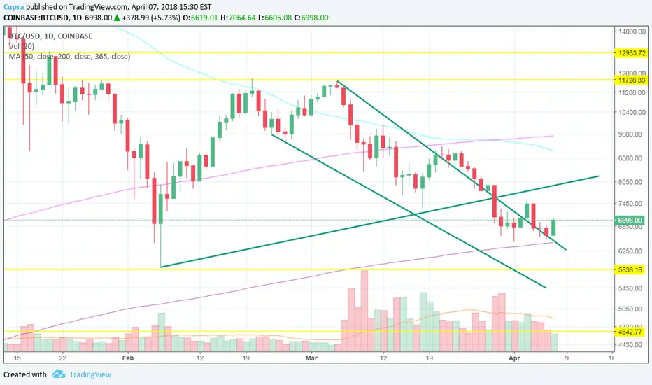
Death Cross - 200 MA / 50 Cross CheckerBITFINEX:BTCUSD
You can check if 200 day MA crossed by 50 day MA. Nuff said.
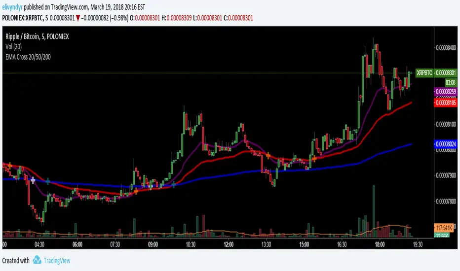
EMA Cross 20/50/200Added a 20 EMA cross to the avaiable 50/200 EMA Cross script in the public library
Single Indicator 5 EMAS 12/26/50/100/200Hey guys. Here's a basic script that puts 5 EMAs on your screen at once without having to use multiple indicator slots. The colors and bandwidths are customizable, and you can can even hide EMAs which you are not currently using, say if you wanted 12/26 only or 50/200. Happy trading!

Moving Average 50/200 Golden Cross or Dead CrossA strategy is to apply two moving averages to a chart, one longer and one shorter. When the shorter MA 50 day scrosses above the longer term MA 200 days it's a buy signal as it indicates the trend is shifting up.This is known as a "golden cross."
When the shorter MA crosses below the longer term MA it's a sell signal as it indicates the trend is shifting down. This is known as a "dead/death cross"
For cryptocurrencies use 4 hour charts.
EMA 20/50/100/200Script that publishes the EMA for 20, 50, 100, and 200.
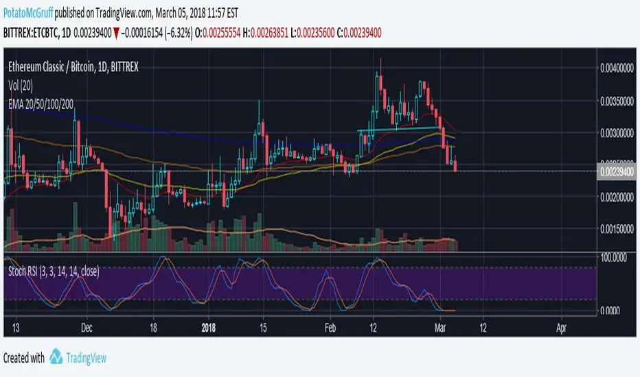
Follow me on Twitter at @PotatoMcGruff