Volume Tick ExperimentThis ticks-based indicator provides real-time volume information for a trading asset. Volume is analyzed and updated continuously, not just at candle close. It is based on DGT's Bull vs Bear Power indicator but adds a gas signal that activates when buying or selling volume percentage reaches a predetermined threshold.
This indicator can also help traders determine the direction and aggressiveness of pushes in buying or selling volume. By monitoring the volume percentages and gas signals, traders can get an idea of whether the market is pushing in a particular direction and how strong the push is. This information can be helpful in making trading decisions and identifying potential entry or exit points.
The indicator uses open, high, low, and close prices of the asset to calculate volume information. It determines the average volume over a selected period and calculates volume for both buying and selling. This information is used to calculate the percentage of buying and selling volume. A gas signal is triggered when either the buying or selling percentage reaches a predetermined threshold.
Enjoy!
"文华财经tick价格" için komut dosyalarını ara

Cumulative Histogram TickThis script is designed to create a cumulative histogram based on tick data from a specific financial instrument. The histogram resets at the start of each trading session, which is defined by a fixed time.
Key Components:
Tick Data Retrieval:
The script fetches the closing tick values from the specified instrument using request.security("TICK.NY", timeframe.period, close). This line ensures that the script works with the tick data for each bar on the chart.
Session Start and End Detection:
Start Hour: The script checks if the current bar's time is 9:30 AM (hour == 9 and minute == 30). This is used to reset the cumulative value at the beginning of each trading session.
End Hour: It also checks if the current bar's time is 4:00 PM (hour == 16). However, this condition is used to prevent further accumulation after the session ends.
Cumulative Value Management:
Reset: When the start hour condition is met (startHour), the cumulative value (cumulative) is reset to zero. This ensures that each trading session starts with a clean slate.
Accumulation: For all bars that are not at the end hour (not endHour), the tick value is added to the cumulative total. This process continues until the end of the trading session.
Histogram Visualization:
The cumulative value is plotted as a histogram using plot.style_histogram. The color of the histogram changes based on whether the cumulative value is positive (green) or negative (red).
Usage
This script is useful for analyzing intraday market activity by visualizing the accumulation of tick data over a trading session. It helps traders identify trends or patterns within each session, which can be valuable for making informed trading decisions.

Name of tickerDescription:
This indicator displays the instrument’s ticker symbol and the current chart timeframe at the top center of the chart.
Features:
• Shows the ticker (e.g., BTCUSDT, AAPL, etc.).
• Displays the current timeframe (1m, 5m, 1H, 1D, etc.).
• Positioned at the top center of the chart for easy reference.
• Transparent background for minimal interference with price action.
• Lightweight and simple, no extra settings required.
Usage:
• Works with any instrument: stocks, crypto, futures.
• Useful for traders who want to always see the ticker and timeframe while analyzing the chart.
Settings:
• Text size can be adjusted in the script (text_size).
• Text and background colors can be customized (text_color, bgcolor).

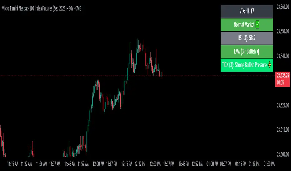
VIX Filter/RSI/EMA Bias/Cum-TICK w/ Exhaustion Zone DashboardThis all-in-one dashboard gives intraday traders a real-time visual read of market conditions, combining volatility regime, trend bias, momentum exhaustion, and internal strength — all in a fully customizable overlay that won’t clutter your chart.
📉 VIX Market Regime Detector
Identifies "Weak", "Normal", "Volatile", or "Danger" market states based on customizable VIX ranges and symbol (e.g., VXN or VIX).
📊 RSI Momentum Readout
Displays real-time RSI from any selected timeframe or symbol, with adjustable length, OB/OS thresholds, and color-coded exhaustion alerts.
📈 EMA Trend Bias Scanner
Compares fast and slow EMAs to define bullish or bearish bias, using your preferred timeframe, symbol, and EMA lengths — ideal for multi-timeframe setups.
🧠 Cumulative TICK Pressure & Exhaustion Engine
Analyzes internal market strength using cumulative TICK data to classify conditions as:
-Strong / Mild Bullish or Bearish Pressure
-Choppy / No Edge
-⚠️ Exhaustion Zones — when raw TICK values hit extreme highs/lows, a separate highlight box appears in the dashboard, warning of potential turning points
All logic is customizable, including TICK symbol, timeframes, thresholds, and lookback periods.
Scalpers and day traders who want fast, visual insight into market internals, exhaustion, and trend bias.
CFD Ticks LevelsSimple but very effective script that finds areas of support and resistance through ticks exchange. Only works with CFDs
(You must enter in the settings the value corresponding to the CFD, example: US500 = 500, DAX30 = 30, FRANCE40 = 40 etc ...)
As usual, if you have any suggestions or bug reports don't hesitate.
Cheers

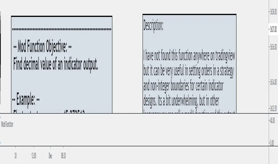
Mod and Round To Tick FunctionI have not found this function anywhere on Tradingview but it can be very useful in setting orders in a strategy and non-integer boundaries for certain indicator designs. Its a bit underwhelming, but in other languages you can call a mod() function and the output will be the remainder of the integer.
If you want to set an order at a specific tick value, particularly in futures, you can't set it at a specific tick when using calculated values like ATR or Standard Deviation without a function like this.
It can also be used to clean up certain band/envelope style indicators if you want to have a straight line, but don't want to simply round to an integer.
Credit for the round to tick aspect goes to the eternal fountain of resources, the Backtesting & Trading Engine script from @pinecoders
This is just another tool to throw in the box for when you might need it.
Moving Average Suite + VWAP + TICKThis indicator combines some of the commonly used moving averages, VWAP, and TICK sentiment, all of which are useful for all types of trading
By default, this indicator includes:
- 21/50/100/200 period smoothed simple moving average
- great for determining trends
- also act as support / resistance line for price
- 9 period exponential moving average
- fast trend / direction indicator
- Volume Weighted Average Price
- no explanation required
- $TICK sentiment as background fill
- overall market sentiment and direction
- +/- 500 levels are colored green/red and are usually indication of institutional order flow --> critical for trading indexes such as SPY or QQQ
- deep green/red background indicates +/-1000 on the $TICK, which are usually associated with overbought or oversold

Ticker SummaryTicker Summary provides at-a-glance summary information about a ticker near the current bar on the chart:
P/E ratio
Fwd P/E ratio
PEG ratio
Floating shares vs. total shares outstanding
% of trading volume that was short over the last 3 days
Average True Range (ATR) over last 14 days
There are a few less common items of information:
How many ATR multiples the ATR is extended over the last 10 bars. This gives an idea of how far the stock is currently extended.
"R-frequency", explained below.
An optional "ATR Reticule" is shown near the price. This is useful for traders that use ATR as a guideline for price targets and stop losses. On the left is the # of ATRs the stock is currently above the session open. On the right is the # of ATRs the stock is extended above the 10-bar moving average.
R-frequency: a measure of liquidity relevant to your own trading size. It is the frequency at which 1-R of your trading account is traded for a stock. Formula:
(1-R worth of shares) / (average dollar value traded per second), where:
"1-R worth of shares" is how many shares you would buy for a stop loss of -1 ATR, with max risk dollar value based on the Balance and Max Risk % indicator options.
"Average dollar value traded per second" is the 14-day average of (avg(high, low and close) * daily volume)
R-frequency of a second or less is very liquid. If the value is higher (for example, over 60 seconds) the stock is less liquid and you may have some trouble filling limit orders quickly.

TickerWhen viewing an asset's chart, the ticker symbol and company description are automatically displayed in the top left corner, providing quick identification of the asset being analyzed.

Ticker Correlation Reference IndicatorHello,
I am super excited to be releasing this Ticker Correlation assessment indicator. This is a big one so let us get right into it!
Inspiration:
The inspiration for this indicator came from a similar indicator by Balipour called the Correlation with P-Value and Confidence Interval. It’s a great indicator, you should check it out!
I used it quite a lot when looking for correlations; however, there were some limitations to this indicator’s functionality that I wanted. So I decided to make my own indicator that had the functionality I wanted. I have been using this for some time but decided to actual spruce it up a bit and make it user friendly so that I could share it publically. So let me get into what this indicator does and, most importantly, the expanded functionality of this indicator.
What it does:
This indicator determines the correlation between 2 separate tickers. The user selects the two tickers they wish to compare and it performs a correlation assessment over a defaulted 14 period length and displays the results. However, the indicator takes this much further. The complete functionality of this indicator includes the following:
1. Assesses the correlation of all 4 ticker variables (Open, High, Low and Close) over a user defined period of time (defaulted to 14);
2. Converts both tickers to a Z-Score in order to standardize the data and provide a side by side comparison;
3. Displays areas of high and low correlation between all 4 variables;
4. Looks back over the consistency of the relationship (is correlation consistent among the two tickers or infrequent?);
5. Displays the variance in the correlation (there may be a statistically significant relationship, but if there is a high variance, it means the relationship is unstable);
6. Permits manual conversion between prices; and
7. Determines the degree of statistical significance (be it stable, unstable or non-existent).
I will discuss each of these functions below.
Function 1: Assesses the correlation of all 4 variables.
The only other indicator that does this only determines the correlation of the close price. However, correlation between all 4 variables varies. The correlation between open prices, high prices, low prices and close prices varies in statistically significant ways. As such, this indicator plots the correlation of all 4 ticker variables and displays each correlation.
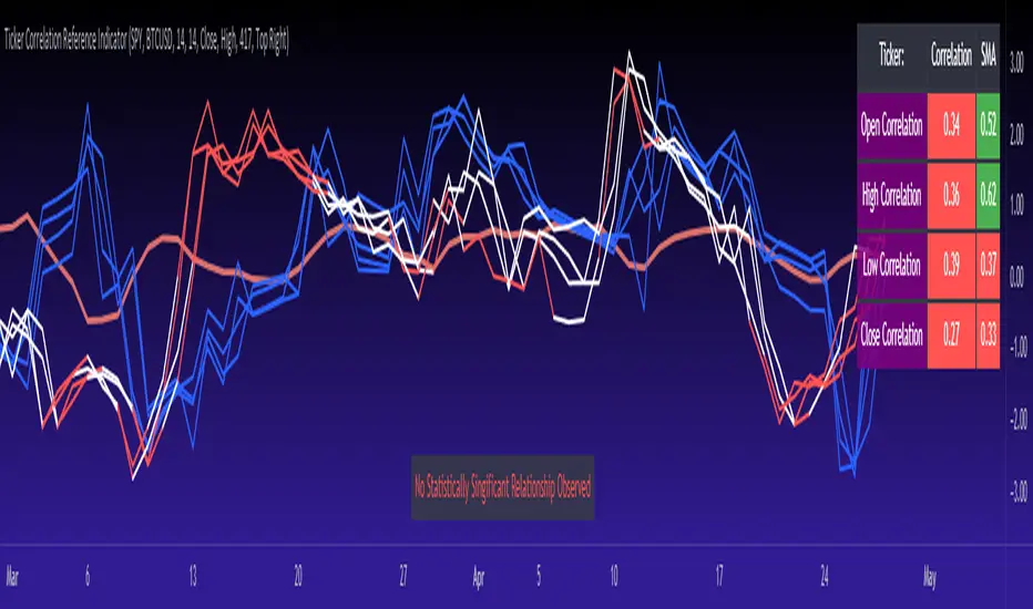
Assessing this matters because sometimes a stock may not have the same magnitude in highs and lows as another stock (one stock may be more bullish, i.e. attain higher highs in comparison to another stock). Close price is helpful but does not pain the full picture. As such, the indicator displays the correlation relationship between all 4 variables (image below):
Function 2: Converts both tickers to Z-Score
Z-Score is a way of standardizing data. It simply measures how far a stock is trading in relation to its mean. As such, it is a way to express both tickers on a level playing field. Z-Score was also chosen because the Z-Score Values (0 – 4) also provide an appropriate scale to plot correlation lines (which range from 0 to 1).
The primary ticker (Ticker 1) is plotted in blue, the secondary comparison ticker (Ticker 2) is plotted in a colour changing format (which will be discussed below). See the image below:
Function 3: Displays areas of high and low correlation
While Ticker 1 is plotted in a static blue, Ticker 2 (the comparison ticker) is plotted in a dynamic, colour changing format. It will display areas of high correlation (i.e. areas with a P value greater than or equal to 0.9 or less than and equal to -0.9) in green, areas of moderate correlation in white. Areas of low correlation (between 0.4 and 0 or -0.4 and 0) are in red. (see image below):
Function 4: Checks consistency of relationship
While at the time of assessing a stock there very well maybe a high correlation, whether that correlation is consistent or not is the question. The indicator employs the use of the SMA function to plot the average correlation over a defined period of time. If the correlation is consistently high, the SMA should be within an area of statistical significance (over 0.5 or under -0.5). If the relationship is inconsistent, the SMA will read a lower value than the actual correlation.
You can see an example of this when you compare ETH to Tezos in the image below:
You can see that the correlation between ETH and Tezo’s on the high level seems to be inconsistent. While the current correlation is significant, the SMA is showing that the average correlation between the highs is actually less than 0.5.
The indicator also tells the user narratively the degree of consistency in the statistical relationship. This will be discussed later.
Function 5: Displays the variance
When it comes to correlation, variance is important. Variance simply means the distance between the highest and lowest value. The indicator assess the variance. A high degree of variance (i.e. a number surpassing 0.5 or greater) generally means the consistency and stability of the relationship is in issue. If there is a high variance, it means that the two tickers, while seemingly significantly correlated, tend to deviate from each other quite extensively.
The indicator will tell the user the variance in the narrative bar at the bottom of the chart (see image below):
Function 6: Permits manual conversion of price
One thing that I frequently want and like to do is convert prices between tickers. If I am looking at SPX and I want to calculate a price on SPY, I want to be able to do that quickly. This indicator permits you to do that by employing a regression based formula to convert Ticker 1 to Ticker 2.
The user can actually input which variable they would like to convert, whether they want to convert Ticker 1 Close to Ticker 2 Close, or Ticker 1 High to Ticker 2 High, or low or open.
To do this, open the settings and click “Permit Manual Conversion”. This will then take the current Ticker 1 Close price and convert it to Ticker 2 based on the regression calculations.
If you want to know what a specific price on Ticker 1 is on Ticker 2, simply click the “Allow Manual Price Input” variable and type in the price of Ticker 1 you want to know on Ticker 2. It will perform the calculation for you and will also list the standard error of the calculation.
Below is an example of calculating a SPY price using SPX data:
Above, the indicator was asked to convert an SPX price of 4,100 to a SPY price. The result was 408.83 with a standard error of 4.31, meaning we can expect 4,100 to fall within 408.83 +/- 4.31 on SPY.
Function 7: Determines the degree of statistical significance
The indicator will provide the user with a narrative output of the degree of statistical significance. The indicator looks beyond simply what the correlation is at the time of the assessment. It uses the SMA and the highest and lowest function to make an assessment of the stability of the statistical relationship and then indicates this to the user. Below is an example of IWM compared to SPY:
You will see, the indicator indicates that, while there is a statistically significant positive relationship, the relationship is somewhat unstable and inconsistent. Not only does it tell you this, but it indicates the degree of inconsistencies by listing the variance and the range of the inconsistencies.
And below is SPY to DIA:
SPY to BTCUSD:
And finally SPY to USDCAD Currency:
Other functions:
The indicator will also plot the raw or smoothed correlation result for the Open, High, Low or Close price. The default is to close price and smoothed. Smoothed just means it is displaying the SMA over the raw correlation score. Unsmoothing it will show you the raw correlation score.
The user also has the ability to toggle on and off the correlation table and the narrative table so that they can just review the chart (the side by side comparison of the 2 tickers).
Customizability
All of the functions are customizable for the most part. The user can determine the length of lookback, etc. The default parameters for all are 14. The only thing not customizable is the assessment used for determining the stability of a statistical relationship (set at 100 candle lookback) and the regression analysis used to convert price (10 candle lookback).
User Notes and important application tips:
#1: If using the manual calculation function to convert price, it is recommended to use this on the hourly or daily chart.
#2: Leaving pre-market data on can cause some errors. It is recommended to use the indicator with regular market hours enabled and extended market hours disabled.
#3: No ticker is off limits. You can compare anything against anything! Have fun with it and experiment!
Non-Indicator Specific Discussions:
Why does correlation between stocks mater?
This can matter for a number of reasons. For investors, it is good to diversify your portfolio and have a good array of stocks that operate somewhat independently of each other. This will allow you to see how your investments compare to each other and the degree of the relationship.
Another function may be getting exposure to more expensive tickers. I am guilty of trading IWM to gain exposure to SPY at a reduced cost basis :-).
What is a statistically significant correlation?
The rule of thumb is anything 0.5 or greater is considered statistically significant. The ideal setup is 0.9 or more as the effect is almost identical. That said, a lot of factors play into statistical significance. For example, the consistency and variance are 2 important factors most do not consider when ascertaining significance. Perhaps IWM and SPY are significantly correlated today, but is that a reliable relationship and can that be counted on as a rule?
These are things that should be considered when trading one ticker against another and these are things that I have attempted to address with this indicator!
Final notes:
I know I usually do tutorial videos. I have not done one here, but I will. Check back later for this.
I hope you enjoy the indicator and please feel free to share your thoughts and suggestions!
Safe trades all!
Ticker Tape█ OVERVIEW
This indicator creates a dynamic, scrolling display of multiple securities' latest prices and daily changes, similar to the ticker tapes on financial news channels and the Ticker Tape Widget . It shows realtime market information for a user-specified list of symbols along the bottom of the main chart pane.
█ CONCEPTS
Ticker tape
Traditionally, a ticker tape was a continuous, narrow strip of paper that displayed stock prices, trade volumes, and other financial and security information. Invented by Edward A. Calahan in 1867, ticker tapes were the earliest method for electronically transmitting live stock market data.
A machine known as a "stock ticker" received stock information via telegraph, printing abbreviated company names, transaction prices, and other information in a linear sequence on the paper as new data came in. The term "ticker" in the name comes from the "tick" sound the machine made as it printed stock information. The printed tape provided a running record of trading activity, allowing market participants to stay informed on recent market conditions without needing to be on the exchange floor.
In modern times, electronic displays have replaced physical ticker tapes. However, the term "ticker" remains persistent in today's financial lexicon. Nowadays, ticker symbols and digital tickers appear on financial news networks, trading platforms, and brokerage/exchange websites, offering live updates on market information. Modern electronic displays, thankfully, do not rely on telegraph updates to operate.
█ FEATURES
Requesting a list of securities
The "Symbol list" text box in the indicator's "Settings/Inputs" tab allows users to list up to 40 symbols or ticker Identifiers. The indicator dynamically requests and displays information for each one. To add symbols to the list, enter their names separated by commas . For example: "BITSTAMP:BTCUSD, TSLA, MSFT".
Each item in the comma-separated list must represent a valid symbol or ticker ID. If the list includes an invalid symbol, the script will raise a runtime error.
To specify a broker/exchange for a symbol, include its name as a prefix with a colon in the "EXCHANGE:SYMBOL" format. If a symbol in the list does not specify an exchange prefix, the indicator selects the most commonly used exchange when requesting the data.
Realtime updates
This indicator requests symbol descriptions, current market prices, daily price changes, and daily change percentages for each ticker from the user-specified list of symbols or ticker identifiers. It receives updated information for each security after new realtime ticks on the current chart.
After a new realtime price update, the indicator updates the values shown in the tape display and their colors.
The color of the percentages in the tape depends on the change in price from the previous day . The text is green when the daily change is positive, red when the value is negative, and gray when the value is 0.
The color of each displayed price depends on the change in value from the last recorded update, not the change over a daily period. For example, if a security's price increases in the latest update, the ticker tape shows that price with green text, even if the current price is below the previous day's closing price. This behavior allows users to monitor realtime directional changes in the requested securities.
NOTE: Pine scripts execute on realtime bars when new ticks are available in the chart's data feed. If no new updates are available from the chart's realtime feed, it may cause a delay in the data the indicator receives.
Ticker motion
This indicator's tape display shows a list of security information that incrementally scrolls horizontally from right to left after new chart updates, providing a dynamic visual stream of current market data. The scrolling effect works by using a counter that increments across successive intervals after realtime ticks to control the offset of each listed security. Users can set the initial scroll offset with the "Offset" input in the "Settings/Inputs" tab.
The scrolling rate of the ticker tape display depends on the realtime ticks available from the chart's data feed. Using the indicator on a chart with frequent realtime updates results in smoother scrolling. If no new realtime ticks are available in the chart's feed, the ticker tape does not move. Users can also deactivate the scrolling feature by toggling the "Running" input in the indicator's settings.
█ FOR Pine Script™ CODERS
• This script utilizes dynamic requests to iteratively fetch information from multiple contexts using a single request.security() instance in the code. Previously, `request.*()` functions were not allowed within the local scopes of loops or conditional structures, and most `request.*()` function parameters, excluding `expression`, required arguments of a simple or weaker qualified type. The new `dynamic_requests` parameter in script declaration statements enables more flexibility in how scripts can use `request.*()` calls. When its value is `true`, all `request.*()` functions can accept series arguments for the parameters that define their requested contexts, and `request.*()` functions can execute within local scopes. See the Dynamic requests section of the Pine Script™ User Manual to learn more.
• Scripts can execute up to 40 unique `request.*()` function calls. A `request.*()` call is unique only if the script does not already call the same function with the same arguments. See this section of the User Manual's Limitations page for more information.
• This script converts a comma-separated "string" list of symbols or ticker IDs into an array . It then loops through this array, dynamically requesting data from each symbol's context and storing the results within a collection of custom `Tape` objects . Each `Tape` instance holds information about a symbol, which the script uses to populate the table that displays the ticker tape.
• This script uses the varip keyword to declare variables and `Tape` fields that update across ticks on unconfirmed bars without rolling back. This behavior allows the script to color the tape's text based on the latest price movements and change the locations of the table cells after realtime updates without reverting. See the `varip` section of the User Manual to learn more about using this keyword.
• Typically, when requesting higher-timeframe data with request.security() using barmerge.lookahead_on as the `lookahead` argument, the `expression` argument should use the history-referencing operator to offset the series, preventing lookahead bias on historical bars. However, the request.security() call in this script uses barmerge.lookahead_on without offsetting the `expression` because the script only displays results for the latest historical bar and all realtime bars, where there is no future information to leak into the past. Instead, using this call on those bars ensures each request fetches the most recent data available from each context.
• The request.security() instance in this script includes a `calc_bars_count` argument to specify that each request retrieves only a minimal number of bars from the end of each symbol's historical data feed. The script does not need to request all the historical data for each symbol because it only shows results on the last chart bar that do not depend on the entire time series. In this case, reducing the retrieved bars in each request helps minimize resource usage without impacting the calculated results.
Look first. Then leap.
Tick StrategyTick Strategy:
Questions many pine coders/traders have is, How to enter/exit trade as soon as trade condition is met i.e. do not wait till candle completion to enter/exit the trade. This strategy will help you to understand one of the way to achieve it.
This is an educational strategy to demonstrate, how one can trade based on tick data. This being a strategy based on tick data, it can be tested only on real time candles. This strategy will not take any trades on historical candles and cannot be used for back testing. All the strategy trades taken on real time candles will disappear (repainting) once chart is refreshed and new trades will be entered on real time candles.
The strategy will do nothing during off market hours and will not take any trades.
The strategy has been designed based on rules/inputs below:
1. Count the ticks from start of a candle till end of candle
2. Bifurcate ticks as up-ticks and down-ticks. If tick price is above previous tick price the tick is considered as up-tick and vice versa
3. Count the successive up-ticks and successive down-ticks
Strategy rules:
1. Track candle type (green or red) continuously on each tick (green candle is when latest tick price > previous tick price)
2. Take a long trade if work in progress (WIP) candle is green candle and we get successive up-ticks equal to user input ticks for trade
3. Take a short trade if work in progress (WIP) candle is red candle and we get successive down-ticks equal to user input ticks for trade
4. Exit the trade when we get successive ticks equal to user input ticks in opposite direction
5. Optionally for trade entry, user can decide whether to calculate successive up-ticks/down-ticks from beginning of candle or successive up-ticks/down-ticks anytime during the candle formation
6. Optionally for trade exit/square off, user can decide whether to apply exit rules on the entry candle or only from subsequent candle
Strategy setting:
1. '' – This is just to describe when trades are entered. This parameter is not used for any calculation
2. 'No of successive ticks to enter the trade' – User input to decide, number of successive ticks for trade entry
3. 'Count successive ticks for trade only from start of candle' – check this to count successive ticks only from beginning of a candle
4. 'Exit if succussive ticks in opposite direction' - User input to decide, number of successive ticks in opposite direction for exiting the trade
5. 'Apply exit criteria on entry candle' – check to allow exit of trade on the entry candle, if un-checked, trade will not be exited on the entry candle i.e. opposite direction ticks will be counted from subsequent candle
Information below will be displayed continuously on the chart:
1. Candle no – Candles are counted from start of the trading session. This is current candle being formed on the chart
2. Candle now – This shows either ‘Green’ or ‘Red’ based on type of candle being formed
3. Tick count – This is current tick number being processed. Tick number starts from 1 for each new candle
4. Up-tick count – Number of up-ticks during formation of current candle
5. Down-tick count – Number of down-ticks during formation of current candle
6. Successive up-ticks – Current successive up-tick count
7. Successive down-ticks – Current successive down-tick count
8. Up-tick volume – Volume associated with up-ticks
9. Down-tick volume – Volume associated with down-ticks
10. Up-tick volume % - This is % of volume associated with up-ticks
11. Total volume – Candle volume till now. (Some times you might observe small difference between total volume and the volume shown by volume indicator. The difference could be because of refresh rate of your screen)
12. Candle completion % - This shows current candles completion %. This is candle progress from start of candle till close of candle

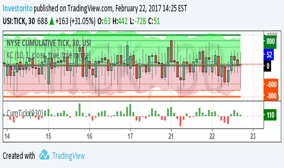
TICK Price Label Colors[Salty]The ticker symbol for the NYSE CUMULATIVE Tick Index is TICK. The Tick Index is a short-term indicator that shows the number of stocks trading up minus the number of stocks trading down. Traders can use this ratio to make quick trading decisions based on market movement. For example, a positive tick index can indicate market optimism, while readings of +1,000 and -1,000 can indicate overbought or oversold conditions.
This script is used to color code the price label of the Symbol values zero or above in Green(default), and values below zero in red(default). For a dynamic symbol like the TICK this tells me the market is bullish when Green or Bearish when Red. I was previously using the baseline style with a Base level of 50 to accomplish this view of the symbol, but it was always difficult to maintain the zero level at the zero TICK value. This indicator is always able to color code the price label properly. Also, it has the benefit of setting the timeframe to 1 second(default) that is maintained even when the chart timeframe is changed.
Update: Added the ability to show the TICK Symbol to support viewing multiple TICK tickers at once as shown.
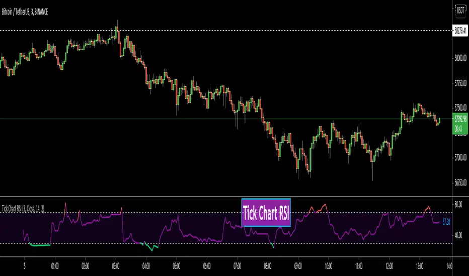
Tick Chart RSIHello All,
This is Tick Chart RSI script and it calculates & shows RSI for Tick Chart. What is Tick chart? Tick Chart is created using ticks and each candlestick in Tick Chart shows the price variation of X consecutive ticks (X : Number of Ticks Per Candle). For example if you set "Number of Ticks Per Candle" = 100 then each candlestick is created using 100 ticks. so, Tick Charts are NOT time-based charts (like Renko or Point & Figure Charts). Tick is the price change in minimum time interval defined in the platform. There are several advantages of Tick Charts. You can find many articles about Tick Charts on the net.
Tick Chart and Tick Chart RSI only work on realtime bars.
You can set " Number of Ticks Per Candle " and the colors. You can also set any of the candles OHLC values as source for RSI.
While using Tick Chart RSI I recommend you to add Tick Chart as well.
P.S. Tick Chart RSI script can be developed using different methods. in this script, all RSI values are calculated on each tick because RSI is calculated for only real-time bars, and also calculated for limited number of bars
Tick Chart and Tick Chart RSI:
Tick Chart RSI:
Enjoy!
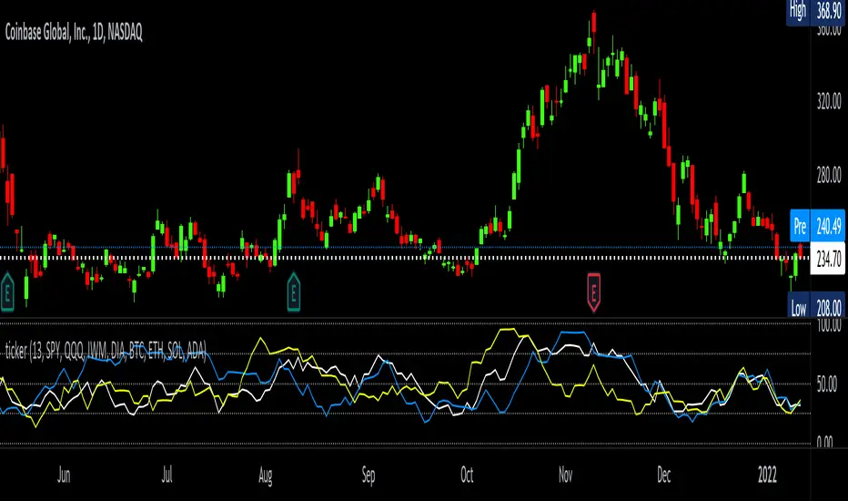
tickerTracker MFI OscillatorDid you ever want to have a neat indicator window in line with your chart showing a different ticker? tickerTracker is a Money Flow Index (MFI) oscillator. The Money Flow Index (MFI) is a technical oscillator that uses price and volume for identifying overbought or oversold conditions in an asset. More or less, everything is connected in the market. The tickerTracker lets you see what is happening with another ticker that you have connected a correlation between them. For my example here, I'm using COIN in the main chart with the tickerTracker displaying BTC, QQQ and COIN Money Flow Index (MFI) in its window. As the end user, you can customize the colors, the length input and the ticker. Like any other indicator, the shorter length input, the more quickly responsive and the longer the length input, the smoother curve print.
Default Values:
MFI Length = 13
Chart ticker = white
SPY = white
QQQ = blue
IWM = yellow
DIA = orange
BTC/USD = yellow
ETH/USD = green
SOL/USD = purple
ADA/USD = red
Do your own due diligence, your risk is 100% your responsibility. This is for educational and entertainment purposes only. You win some or you learn some. Consider being charitable with some of your profit to help humankind. Good luck and happy trading friends...
*3x lucky 7s of trading*
7pt Trading compass:
Price action, entry/exit
Volume average/direction
Trend, patterns, momentum
Newsworthy current events
Revenue
Earnings
Balance sheet
7 Common mistakes:
+5% portfolio trades, capital risk management
Beware of analyst's motives
Emotions & Opinions
FOMO : bad timing, the market is ruthless, be shrewd
Lack of planning & discipline
Forgetting restraint
Obdurate repetitive errors, no adaptation
7 Important tools:
Trading View app!, Brokerage UI
Accurate indicators & settings
Wide screen monitor/s
Trading log (pencil & graph paper)
Big, organized desk
Reading books, playing chess
Sorted watch-list
Checkout my indicators:
Fibonacci VIP - volume
Fibonacci MA7 - price
pi RSI - trend momentum
TTC - trend channel
AlertiT - notification
tickerTracker - MFI Oscillator
www.tradingview.com
Tick travel ⍗This script is a further exploration of 'ticks' (only on realtime - live bars), based on my previous script:
- www.tradingview.com -
What are 'ticks'?
... Once the script’s execution reaches the rightmost bar in the dataset, if trading is currently active on the chart’s symbol,
then Pine indicators will execute once every time an update occurs, i.e., price or volume changes ...
(www.tradingview.com)
This script has 2 parts:
1) Option: ' Tick up/down'
This is a further progression of previous work.
During bar development, every time there is an update (tick), a dot is placed.
If for example there is 1 tick (first of new bar), a dot will be placed on 1,
if it is the 8th tick off that bar, there will be a dot placed on 8.
While my previous script had the issue that there was an upper limit per bar (max 32),
this script (because it is working with labels) can place max 500 dots.
For each bar this is better, it has to be mentioned though that looking in history, once the limit of 500 has been reached,
you'll notice the last ones are being deleted. This is one of the reasons the script is not suitable for higher timeframes
(1h and higher, even higher than 5 minutes can give some issues if it is a highly traded ticker), if a bar would have more
than 500 ticks, they won't be drawn anymore (which is not desirable of course)
2) Option: ' Tick progression'
These are the same ticks, but placed on the candle itself, or you can show the candle:
Or 'without' candle (or 'black' colour):
When 'No candles' are enabled, the 'candles' get the colour at the right.
At the moment it is not possible to drawn between 2 candles, this technique uses labels with 'text',
each tick on a candle will have a 'space' added, so you can see a progression to the right.
Colours
- if price is higher than previous tick price -> green
- if price is lower than previous tick price -> red
- otherwise -> blue (dimmed)
There are options to choose the 'dot', when choosing 'custom',
just enter (copy/paste) your symbol of your choice in the 'custom' field:
Caveats:
- Labels and text will not always be exactly on the price itself
- The scripts needs more testings, possibly some ticks don't always get drawn as they should.
The lower the timeframe, the more possible issues can occur
- Since (candle option) the dots move to the right, the higher the timeframe and/or the more ticks,
the sooner ticks will go in the area of next candle.
That's why I made a separate 'start symbol'
-> This is the very first tick on each candle, then you can zoom in/out more easily until the dots don't merge into each other candle area:
A timeframe higher than 5 minutes mostly won't be feasible I believe
This script wouldn't be possible without the help of @LucF, also because of his script
With very much respect I am hugely inspired by him! Many Thanks to him, Tradingview, and everything associated with them!
Cheers!

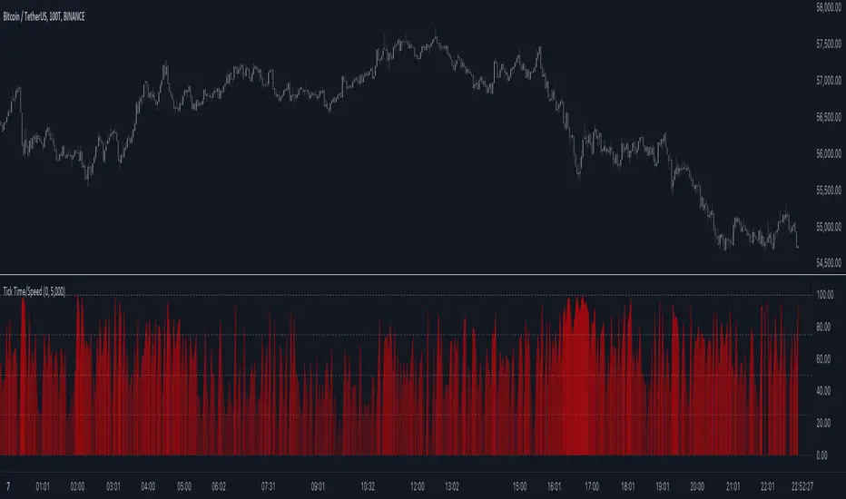
Tick Time/SpeedThe Tick Time/Speed indicator highlights the latest TradingView feature, Tick Charts (beta) , and aims to provide a visual representation of the speed.
🔶 USAGE
1-minute chart
Unlike regular charts, where the time difference between two bars is relatively equal, the time difference between two tick bars can vary.
1T chart
10T chart (ticks groups per 10)
100T chart (ticks groups per 100)
(zoom in to see the time scale, as can be seen in the above two examples, higher values represent more ticks in a shorter period of time)
The difference in time (speed) against previous tick(s) is added to an array and sorted. The measured speed is compared against every value in the array and then plotted.
A smaller difference in time against other ticks (more ticks in less time) is plotted higher, while a more prominent time difference is plotted at a lower level.
The amount of data (to compare with) can be set by "Calculated Bars".
The above example uses data from the last 5000, 100, and 77 bars.
🔶 SETTINGS
• Color & transparency setting
• Calculated Bars: sets the size of the array; in other words, sets the amount of available data for 'speed' comparison
🔶 NOTES
At this point of time, Tick Charts are only reserved for Professional-tier plans – Expert, Elite, or Ultimate plan.
The indicator can only be used with Tick Data .
Not all exchanges have tick data at the moment, this means not every ticker will have Tick Data.
Tick up/downWith this script I aim to explore 'ticks' a bit more (only on realtime - live bars).
... if trading is currently active on the chart’s symbol, then Pine indicators will execute once every time an update occurs, i.e., price or volume changes ...
( www.tradingview.com )
On every bar, everything gets reset.
During bar development, every time there is an update (tick), a dot is placed.
If for example there is 1 tick (first of new bar), a dot will be placed on 1,
if it is the 8th tick off that bar, there will be a dot placed on 8.
Colours:
- if price is higher than previous tick price -> green
- if price is lower than previous tick price -> red
- otherwise -> blue (dimmed)
Because of the maximum allowed amount of plot's, I only can plot max. 32 dots, so max. 32 ticks.
Therefore this script is only useful on a 1 sec or 5 sec chart.
Otherwise, all ticks - updates more than 32/bar won't be displayed.
Frankly, I'm not sure about the benefit for trading, this script can be seen more as exploring what is out there.
Cheers!

Ticker Performance ComparisonTicker Performance Comparison Indicator
With this tool you can compare how three different tickers of your choice have performed over a specific period you choose. It can be used on any timeframe.
As you can see in the image above, I am comparing Nvidia, Bitcoin and Wadzpay over a 365 day period. This shows me at glance which asset has done better and by how much.
It shows how the closing prices have changed from the start of your chosen period to now, by automatically drawing lines on the same scale.
Key Features:
Lookback Period: You decide how many bars (days, weeks, etc.) back to look from today.
Three Tickers: Enter up to three different ticker symbols to see how they stack up against each other
Percentage Change: The tool calculates how much each ticker's closing price has changed, in percentage terms, from the start of your lookback period.
Performance Labels: Labels at the end of the period show the percentage change for each ticker.
Important:
Ignore the lines that are drawn before your lookback period: The lines before your chosen lookback period might be misleading. They appear due to the way historical data is processed and should be ignored. Only consider the data and trends from the start of the lookback period you entered to the present for an accurate comparison.
Use this tool to easily compare how different assets have performed over the timeframe that matters to you.

Ticker Correlation Matrix Table and Heatmap [SS]Hello everyone,
I am in the process of releasing some of my own utility indicators/things I use to reference and perform analyses.
I do a lot of quantitative/math based analyses, including correlation assessments that I traditionally would need to export data from Tradingview and perform in SPSS, Excel or R. I have been slowly building a repertoire of Excel/R functionality right on pinescript so I do not need to constantly export data and can perform the assessments right on Tradingview.
This is an example of such an indicator.
About the Indicator:
It is a correlation table/matrix indicator. It will allow up to 10 ticker inputs, which can be stocks, economic data, anything available on Tradingview, and it will perform a correlation assessment in a matrix / heatmap style.
The indicator will show the various correlations among all of the selected ticker inputs and will colour them based on correlation strength and type.
Strong negative correlations will appear bright red.
Strong positive correlations will appear bright green.
Complete absence of correlation (i.e. 0) will show bright orange.
The rest will show a darker shade to indicate less strength/correlation.
Calculation Functions
In addition to outputting a correlation matrix, the indicator is also able to express the relationship between tickers in a linear expression using the y = mx + b formula.
If we look at table, we can see that MSFT and AAPL have a significantly strong correlation of 0.82.
If we wanted to express this relationship mathmatically, we can ask the indicator to represent the linear relationship in our y = mx + b format. We simply toggle to our menu and select the Convert From MSFT (Ticker 2) and convert to APPL (Ticker 3):
When we select this, a new table will populate below and give you the expression as well as the amount of error associated with it:
In this case, we can see that the equation is y = 0.553x + 0.626 with a range of around 10 points in either direction.
This means that, to convert MSFT to AAPL, we would multiply the MSFT price by 0.553 and then add 0.626. So if we try it, MSFT closed at 328.41. So we substitute:
AAPL price = 0.553(328.41) + 0.626
AAPL price = 181.61 + 0.626
AAPL Price = 182.24 +/- 10
AAPL actually closed at 184.12. So pretty good. If we try another, let's do SPY to XLF:
So we substitute, SPY closed at 449.16.
XLF Price = 449.16(0.077) + 0.084
XLF price = 34.59 + 0.084
XLF price = 34.67
XLF actually closed at 34.49.
This is handy if you want to see how one stock price may affect another. If you are long on one stock and short on another, you can use this to determine what the likely outcome may be for the alternative stock. However, I recommend only performing this on tickers that have a relationship of 0.7 or higher, or a relationship of -0.7 or lower.
I always had to use SPSS to do this, so being able to do this right in Pinescript for me is a huge convenience!
Some other uses:
As I tend to post educational stuff on Tradingview and I frequently use correlation matrices, I have formatted the indicator to be more aesthetically pleasing for these purposes. Thus, you can unselect extra ticker slots that you do not need. IF I only need to display 3 tickers, I can unselect tickers 4 - 10. The end result is a cleaner table:
Essential Functions:
The assessment length is defaulted to 75 candles on the daily timeframe. Be sure to have the daily timeframe opened when you are viewing the indicator.
You can increase or decrease the assessment length as you desire.
You can also specify the source. The source is defaulted to close, but if you want to see the direct correlation of ticker's highs and/or lows, you can modify the source input in the settings menu to look at this.
Just remember to have the chart opened to whatever timeframe you are looking at.
And that's the indicator! Hopefully you find it helpful. Its more of an academic indicator, but it is performing a function that I personally use frequently in analyses, so I hope you may also benefit from it as well!
Thanks for checking it out! Safe trades everyone!

TICK and Price Action Indicator for NQ 5 minuteThis indicator for 5 minute NQ charts utilises TICK index and price action.
Where TICK opens beyond +1000/-1000 this is an overbought/oversold signal.
Similarly, when TICK closes below -200 it is a sell signal, and above +200 it is a buy signal.
This indicator colours the NQ bars based on the closing/opening values of the previous TICK.
It also draws arrows where price action (close above previous high, close below previous low) is in concordance with TICK behaviour.
Tick Lines
Just a script to plot lines on TICK. I hate having to plot lines using the drawing tools, so I created a simple script.
the idea is to put this on the TICK, but you can use this with any instrument. I think it will also look good on Market Breadth/Advance Decline (ADV-DECL)