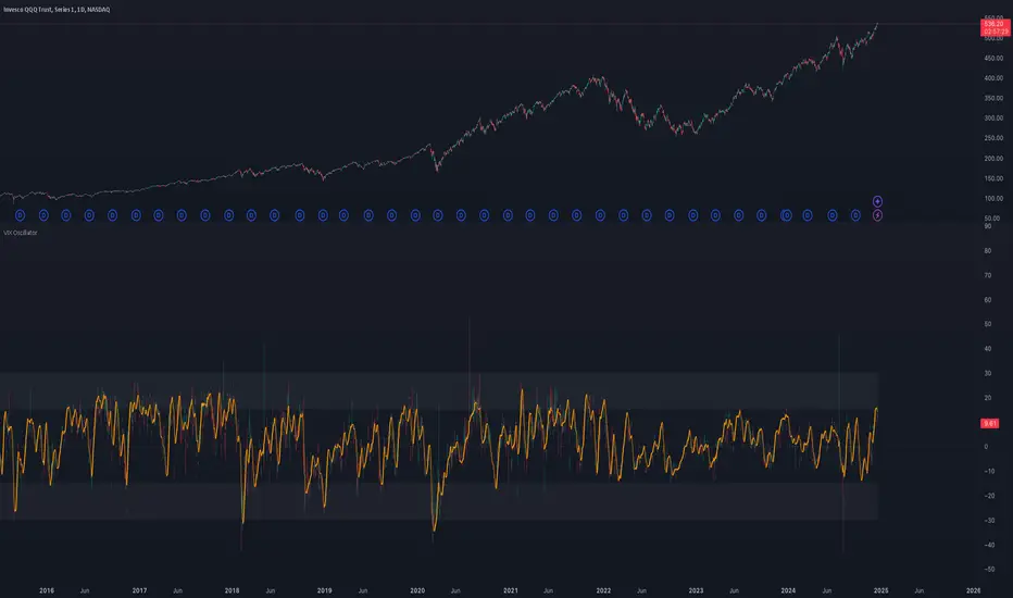
VIX OscillatorOVERVIEW
Plots an oscillating value as a percentage, derived from the VIX and VIX3M . This can help identify broader market trends and pivots on higher time frames (ie. 1D), useful when making swing trades.
DATA & MATH
The VIX is a real-time index of expected S&P 500 volatility over the next 30 days, derived from option prices with near-term expirations. Similarly, the VIX3M measures expected volatility over the next 90 days.
Dividing one by the other yields an oscillating value, normalizing the relative strength of the expected volatility. Most commonly the VIX is divided by the VIX3M. However, because the VIX is inversely correlated to market sentiment (typically), this indicator divides the VIX3M by the VIX to visually correlate the plot direction with the anticipated market direction. Further, it subtracts 1.1 from the quotient to visually center the plot, and multiplies that difference by 100 to amplify the value as a percentage:
( VIX3M / VIX - 1.1 ) * 100
This variation makes identifying sentiment extremes easier within a buy-low-sell-high paradigm, where values below zero are bearish and values above zero are bullish.
PLOTS
Two plots are used, maximizing data fidelity and convenience. Candles are used to accurately reflect the quantized math and a Linear Regression is used to simplify contextualization. If you're not familiar with what a Linear Regression is, you can think of it like a better moving average. High / Low zones are also plotted to help identify sentiment extremes.
This combination allows you to quickly identify the expected sentiment (bullish / bearish) and its relative value (normal / extreme), which you can then use to anticipate if a trend continuation or pivot is more likely.
INPUTS
Candle colors (rise and fall)
Linear regression colors and length
Zone thresholds and zero line
"摩根标普500指数基金的收益如何" için komut dosyalarını ara
Correlated Imbalance Detector# Correlated Imbalance Detector
This indicator helps traders identify strong market movements while avoiding fakeouts by detecting correlated imbalances across two trading instruments. By requiring confirmation from correlated markets like major indices (ES, NQ) or related forex pairs, it filters out potential false signals.
## What it Does
The indicator analyzes price action patterns known as 'imbalances' on two correlated instruments simultaneously. An imbalance occurs when there's a significant gap between price levels that hasn't been filled, indicating strong buying or selling pressure. By requiring both instruments to show the same pattern, it helps eliminate false breakouts and fakeouts.
### Key Features:
- Detects bullish and bearish imbalances across two correlated instruments
- Filters out fakeouts through correlation confirmation
- Uses candlestick direction for additional validation
- Simple visual signals with customizable colors
### Signals:
- Green square: Bullish imbalance detected on both instruments
- Red square: Bearish imbalance detected on both instruments
## Avoiding Fakeouts
The indicator's core strength lies in its correlation requirement:
- A signal only appears when both instruments show the same pattern
- Reduces false signals that might appear on a single instrument
- Helps validate genuine market moves through correlation
- Particularly effective in filtering out noise in choppy markets
## Index Correlation and Bias
Major indices often show strong correlation in their movements:
- ES (S&P 500 futures) and NQ (Nasdaq futures) typically move together
- When both show the same imbalance pattern, it significantly reduces the chance of a fakeout
- Use this correlation to confirm your market bias and strengthen your trading decisions
## Settings
- Correlated Symbol: Enter the symbol you want to correlate with
- Bearish Color: Customize the color for bearish signals
- Bullish Color: Customize the color for bullish signals
## Usage Tips
1. Particularly effective with correlated indices (ES/NQ)
2. Use to confirm your existing market bias
3. Best used on higher timeframes (H1 and above)
4. Wait for confirmation from both instruments to avoid fakeouts
5. Consider overall market context when interpreting signals
6. Use the absence of correlation as a warning sign for potential fakeouts
Note: This indicator is designed to help filter out false signals through correlation. It works best as part of your broader market analysis and should align with your trading bias and strategy.

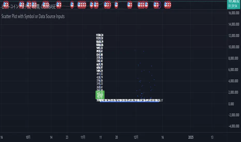
Scatter Plot with Symbol or Data Source InputsDescription of setting items
Use Symbol for X Data?
Type: Checkbox (input.bool)
Explanation: Selects whether the data used for the X axis is obtained from a “symbol” or a “data source”.
If true: data for the X axis will be taken from a symbol (e.g. stock ticker).
If false: X axis data will be taken from the specified data source (e.g., closing price or volume).
Use Symbol for Y Data?
type: checkbox (input.bool)
Explanation: Selects whether the data used for the Y axis is retrieved from a “symbol” or a “data source”.
If true: Y-axis data is obtained from symbols.
If false: Data for the Y axis is obtained from the specified data source.
Select Ticker Symbol for X Data
type: symbol input (input.symbol)
description: selects the symbol to be used for the X axis (default is “AAPL”).
If “Use Symbol for X Data?” is set to true, this symbol will be used as the data for the X axis.
Select Ticker Symbol for Y Data
Type: Symbol input (input.symbol)
description: selects the symbol to be used for the Y axis (default is “GOOG”).
If “Use Symbol for Y Data?” is set to true, this symbol will be used as the data for the Y axis.
X Data Source
type: data source input (input.source)
description: specifies the data source to be used for the X axis.
Default is “close” (closing price).
Other possible values include open, high, low, volume, etc.
Y Data Source
Type: data source input (input.source)
Description: Specifies the data source to be used for the Y axis.
Default is “volume” (volume).
Other possible values include open, high, low, close, etc.
X Offset
type: integer input (input.int)
description: sets the offset value of the X axis.
This shifts the position of the X axis on the grid. The range is from -500 to 500.
Y Offset
Type: Integer input (constant)
description: offset value for y-axis.
Defaults to 0, but can be changed to adjust the Y axis position.
grid_width
type: integer input (input.int)
description: sets the width of the grid.
The default is 200. Increasing the value results in a finer grid.
grid_height
type: integer input (input.int)
description: sets the height of the grid.
Defaults to 200. Increasing the value results in a finer grid.
Frequency of updates
type: integer input (input.int)
description: set frequency of updates.
The higher the frequency of updates, the more bars will be used to calculate minimum and maximum values.
X Tick Interval
type: integer input (input.int)
description: sets the tick interval for the X axis.
The default is 10. To increase the number of ticks, decrease the value.
Y Tick Interval
Box border color
type: select color (input.color)
description: select color for grid box border
Default is blue.
Explanation of usage
To use symbol data: Set Use Symbol for X Data?
When “Use Symbol for X Data?” and “Use Symbol for Y Data?” are set to true, the data of the specified symbol is displayed on each axis. For example, you can use “AAPL” (Apple's stock price data) for the X axis and “GOOG” (Google's stock price data) for the Y axis.
To set the symbol, select the desired ticker in Select Ticker Symbol for X Data and Select Ticker Symbol for Y Data.
To use a data source: select the
You can set Use Symbol for X Data? and Use Symbol for Y Data? to false and use the data source specified in X Data Source or Y Data Source instead (e.g., closing price or volume).
Change Grid Size:.
Set the width and height of the grid with grid_width and grid_height. Larger values allow for more detailed scatter plots.
Set Tick Intervals: Set the X Tick Interval and Y Tick Interval.
Adjust X Tick Interval and Y Tick Interval to change the tick spacing on the X and Y axes.
Data Range Adjustment: Adjust the Frequency of updates to change the frequency of updates.
The Frequency of updates can be changed to control how often the data range is updated. The higher this value, the more historical data is considered and displayed.
Box Color.
Box Border Color allows you to change the color of the box border.
This script is useful for visualizing different symbols and data sources, especially to show the relationship between financial data.
Caution.
Some data may exceed the memory size, but the scale is the same, so you will know most of the locations.
*I made it myself because I could not find anything to draw a scatter plot. You can also compare more than 3 pieces of data by displaying more than one scatter plot. Here is how to do it. Set X or Y as the reference data. Set the data you want to compare to the one that is not the standard. Next, set the same indicator and set the reference to another set of data you wish to compare. Now you can compare the three sets of data. It is effective to change the color of the display box to prevent the user from not knowing which is which. Thus, you should be able to compare more than 3 pieces of data, so give it a try.
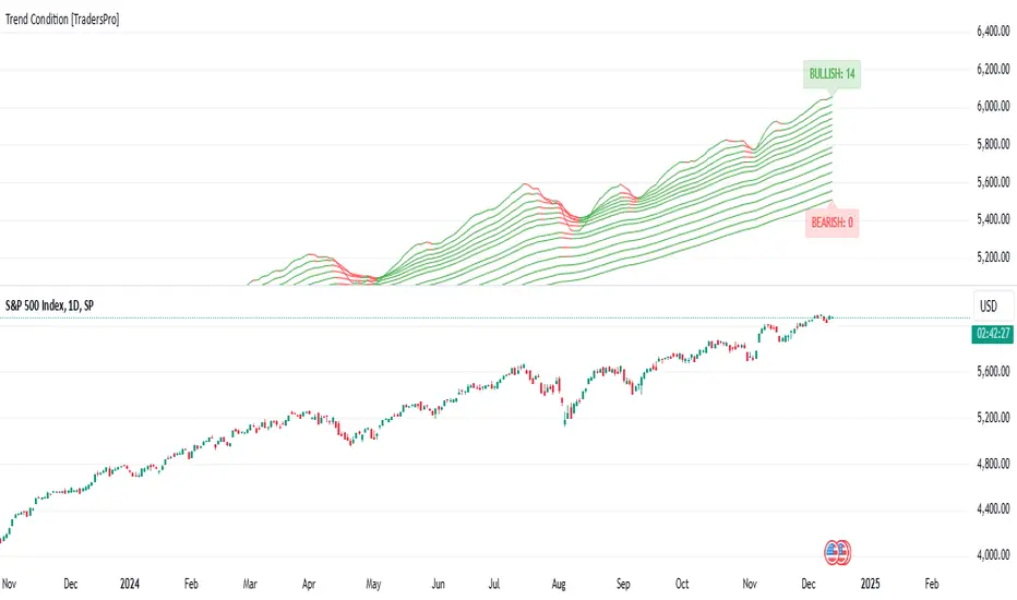
Trend Condition [TradersPro]
OVERVIEW
The Trend Condition Indicator measures the strength of the bullish or bearish trend by using a ribbon pattern of exponential moving averages and scoring system. Trend cycles naturally expand and contract as a normal part of the cycle. It is the rhythm of the market. Perpetual expansion and contraction of trend.
As trend cycles develop the indicator shows a compression of the averages. These compression zones are key locations as trends typically expand from there. The expansion of trend can be up or down.
As the trend advances the ribbon effect of the indicator can be seen as each average expands with the price action. Once they have “fanned” the probability of the current trend slowing is high.
This can be used to recognize a powerful trend may be concluding. Traders can tighten stops, exit positions or utilize other prudent strategies.
CONCEPTS
Each line will display green if it is higher than the prior period and red if it is lower than the prior period. If the average is green it is considered bullish and will score one point in the bullish display. Red lines are considered bearish and will score one point in the bearish display.
The indicator can then be used at a quick glance to see the number of averages that are bullish and the number that are bearish.
A trader may use these on any tradable instrument. They can be helpful in stock portfolio management when used with an index like the S&P 500 to determine the strength of the current market trend. This may affect trade decisions like possession size, stop location and other risk factors.
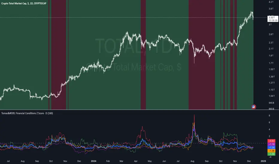
Tomas' Financial Conditions Z Score"The indicator is a composite z-score comprised of the following four components (equally-weighted):
Credit spreads - ICE BofA High Yield Option Adjusted Spread (BAMLH0A0HYM2) and ICE BofA Corporate Index Option Adjusted Spread (BAMLC0A0CM)
Volatility indexes - VIX (S&P 500 implied volatility) and MOVE (US Treasury bond implied volatility)
I've got it set to a 160-day lookback period, which I think is roughly the best setting after some tinkering.
When the z-score is above zero, it throws a red signal - and when the z-score is below zero, it throws a green signal.
This indicator is a follow-on from the "traffic light financial conditions indicator" that I wrote a thread about a couple of months ago.
I moved on from that previous indicator because it is based on the Federal Reserve's NFCI, which is regularly revised, but I didn't take that into account at the time.
So not a great real-time indicator, if the signal can be subsequently revised in the opposite direction weeks later.
This new indicator is based on real-time market data, so there's no revisions, and it also updates daily, as opposed to weekly for the NFCI"
ATR SL Band (No-Repaint, Multi-Timeframe) + Risk per ContractThis indicator draws a non-repainting band for ATR-based Stoploss placement.
If used on Futures, it shows the distance + risk from the previous candle close, as well as from the current price.
The risk value is automatically calculated for the following symbols:
(Micro) ES (S&P 500)
(Micro) NQ (NASDAQ 100)
(Micro) YM (Dow Jones Industrial Average / US30)
The timeframe can be set individually. It is not recommended to use a lower timeframe than the chart timeframe as values differ from the actual timeframe's ATR SL in this case.

Optimal MA FinderIntroduction to the "Optimal MA Finder" Indicator
The "Optimal MA Finder" is a powerful and versatile tool designed to help traders optimize their moving average strategies. This script combines flexibility, precision, and automation to identify the most effective moving average (MA) length for your trading approach. Whether you're aiming to improve your long-only strategy or implement a buy-and-sell methodology, the "Optimal MA Finder" is your go-to solution for enhanced decision-making.
What Does It Do?
The script evaluates a wide range of moving average lengths, from 10 to 500, to determine which one produces the best results based on historical data. By calculating critical metrics such as the total number of trades and the profit factor for each MA length, it identifies the one that maximizes profitability. It supports both simple moving averages (SMA) and exponential moving averages (EMA), allowing you to tailor the analysis to your preferred method.
The logic works by backtesting each MA length against the price data and assessing the performance under two strategies:
Buy & Sell: Includes both long and short trades.
Long Only: Focuses solely on long positions for more conservative strategies.
Once the optimal MA length is identified, the script overlays it on the chart, highlighting periods when the price crosses over or under the optimal MA, helping traders identify potential entry and exit points.
Why Is It Useful?
This indicator stands out for its ability to automate a task that is often labor-intensive and subjective: finding the best MA length. By providing a clear, data-driven answer, it saves traders countless hours of manual testing while significantly enhancing the accuracy of their strategies. For example, instead of guessing whether a 50-period EMA is more effective than a 200-period SMA, the "Optimal MA Finder" will pinpoint the exact length and type of MA that has historically yielded the best results for your chosen strategy.
Key Benefits:
Precision: Identifies the MA length with the highest profit factor for maximum profitability.
Automation: Conducts thorough backtesting without manual effort.
Flexibility: Adapts to your preferred MA type (SMA or EMA) and trading strategy (Buy & Sell or Long Only).
Real-Time Feedback: Provides actionable insights by plotting the optimal MA directly on your chart and highlighting relevant trading periods.
Example of Use: Imagine you're trading a volatile stock and want to optimize your long-only strategy. By applying the "Optimal MA Finder," you discover that a 120-period EMA results in the highest profit factor. The indicator plots this EMA on your chart, showing you when to consider entering or exiting positions based on price movements relative to the EMA.
In short, the "Optimal MA Finder" empowers traders by delivering data-driven insights and improving the effectiveness of trading strategies. Its clear logic, combined with robust automation, makes it an invaluable tool for both novice and experienced traders seeking consistent results.
MES Position Sizing EstimatorDescription and Use:
Here is an indicator which aims to help all Micro-ES futures traders who struggle with risk management! I created this indicator designed as a general guideline to help short term traders (designed for 1 minute candles) determine how many contracts to trade on the MES for their desired profit target.
To use the indicator, simply go to MES on the 1 minute timeframe, apply the indicator, and enter your Holding Period (how long you want to have your position open for), Value Per Tick
(usually 1.25 for MES since one point is $5) and your target PnL for the trade in the inputs tab.
It will then show in a table the recommended position sizing, as well as the estimated price change for your holding period. Additionally, there are two plotted lines also showing the position sizing and estimated price change historically.
How the indicator works
On the technical level, I made calculations for this indicator using Python. I downloaded 82 days of 1 minute OHLC data from TradingView, and then ran regression (log-transformed linear regression specifically) to calculate how the average price change in MES futures scales with the amount of time a position is held for, and then ran these regressions for every hour of the day. I then copied the equations from those regressions into Pinescript, and used the assumption that:
position size = target PnL / (estimated price change for time * tick value)
Therefore, Choosing the number of contracts to trade position sizing for Micro E-mini S&P 500 Futures (MES) based on time of day, holding period, and tick value. This tool leverages historical volatility patterns and log-transformed linear regression models to provide precise recommendations tailored to your trading strategy.
If you want to check out how the regression code worked in python, it is all open source and available on my Github repository for it .
Notes:
The script assumes a log-normal distribution of price movements and is intended as an educational tool to aid in risk management.
It is not a standalone trading system and should be used in conjunction with other trading strategies and risk assessments.
Past performance is not indicative of future results, and traders should exercise caution and adjust their strategies based on personal risk tolerance.
This script is open-source and available for use and modification by the TradingView community. It aims to provide a valuable resource for traders seeking to enhance their risk management practices through data-driven insights.
Romantic Information CoefficientThis script calculates the Mutual Information (MI) between the closing prices of two assets over a defined lookback period. Mutual Information is a measure of the shared information between two time-series datasets. A higher MI indicates a stronger relationship between the two assets.
Key Features:
Ticker Inputs: You can select the tickers for two assets. For example, SPY (S&P 500 ETF) and AAPL (Apple stock) can be compared.
Lookback Period: Choose the number of bars to look back and calculate the Mutual Information. A larger lookback period incorporates more data, but may be less responsive to recent price changes.
Bins for Discretization: Control the level of granularity for discretizing the asset prices. More bins result in a more detailed MI calculation but can also reduce the signal-to-noise ratio.
Color Coded MI: The MI plot dynamically changes color to provide visual feedback on whether the relationship between the two assets is strengthening (red) or weakening (blue).
Only for educational purposes. Not in anyway, investment advice.
Ensemble Alerts█ OVERVIEW
This indicator creates highly customizable alert conditions and messages by combining several technical conditions into groups , which users can specify directly from the "Settings/Inputs" tab. It offers a flexible framework for building and testing complex alert conditions without requiring code modifications for each adjustment.
█ CONCEPTS
Ensemble analysis
Ensemble analysis is a form of data analysis that combines several "weaker" models to produce a potentially more robust model. In a trading context, one of the most prevalent forms of ensemble analysis is the aggregation (grouping) of several indicators to derive market insights and reinforce trading decisions. With this analysis, traders typically inspect multiple indicators, signaling trade actions when specific conditions or groups of conditions align.
Simplifying ensemble creation
Combining indicators into one or more ensembles can be challenging, especially for users without programming knowledge. It usually involves writing custom scripts to aggregate the indicators and trigger trading alerts based on the confluence of specific conditions. Making such scripts customizable via inputs poses an additional challenge, as it often involves complicated input menus and conditional logic.
This indicator addresses these challenges by providing a simple, flexible input menu where users can easily define alert criteria by listing groups of conditions from various technical indicators in simple text boxes . With this script, you can create complex alert conditions intuitively from the "Settings/Inputs" tab without ever writing or modifying a single line of code. This framework makes advanced alert setups more accessible to non-coders. Additionally, it can help Pine programmers save time and effort when testing various condition combinations.
█ FEATURES
Configurable alert direction
The "Direction" dropdown at the top of the "Settings/Inputs" tab specifies the allowed direction for the alert conditions. There are four possible options:
• Up only : The indicator only evaluates upward conditions.
• Down only : The indicator only evaluates downward conditions.
• Up and down (default): The indicator evaluates upward and downward conditions, creating alert triggers for both.
• Alternating : The indicator prevents alert triggers for consecutive conditions in the same direction. An upward condition must be the first occurrence after a downward condition to trigger an alert, and vice versa for downward conditions.
Flexible condition groups
This script features six text inputs where users can define distinct condition groups (ensembles) for their alerts. An alert trigger occurs if all the conditions in at least one group occur.
Each input accepts a comma-separated list of numbers with optional spaces (e.g., "1, 4, 8"). Each listed number, from 1 to 35, corresponds to a specific individual condition. Below are the conditions that the numbers represent:
1 — RSI above/below threshold
2 — RSI below/above threshold
3 — Stoch above/below threshold
4 — Stoch below/above threshold
5 — Stoch K over/under D
6 — Stoch K under/over D
7 — AO above/below threshold
8 — AO below/above threshold
9 — AO rising/falling
10 — AO falling/rising
11 — Supertrend up/down
12 — Supertrend down/up
13 — Close above/below MA
14 — Close below/above MA
15 — Close above/below open
16 — Close below/above open
17 — Close increase/decrease
18 — Close decrease/increase
19 — Close near Donchian top/bottom (Close > (Mid + HH) / 2)
20 — Close near Donchian bottom/top (Close < (Mid + LL) / 2)
21 — New Donchian high/low
22 — New Donchian low/high
23 — Rising volume
24 — Falling volume
25 — Volume above average (Volume > SMA(Volume, 20))
26 — Volume below average (Volume < SMA(Volume, 20))
27 — High body to range ratio (Abs(Close - Open) / (High - Low) > 0.5)
28 — Low body to range ratio (Abs(Close - Open) / (High - Low) < 0.5)
29 — High relative volatility (ATR(7) > ATR(40))
30 — Low relative volatility (ATR(7) < ATR(40))
31 — External condition 1
32 — External condition 2
33 — External condition 3
34 — External condition 4
35 — External condition 5
These constituent conditions fall into three distinct categories:
• Directional pairs : The numbers 1-22 correspond to pairs of opposing upward and downward conditions. For example, if one of the inputs includes "1" in the comma-separated list, that group uses the "RSI above/below threshold" condition pair. In this case, the RSI must be above a high threshold for the group to trigger an upward alert, and the RSI must be below a defined low threshold to trigger a downward alert.
• Non-directional filters : The numbers 23-30 correspond to conditions that do not represent directional information. These conditions act as filters for both upward and downward alerts. Traders often use non-directional conditions to refine trending or mean reversion signals. For instance, if one of the input lists includes "30", that group uses the "Low relative volatility" condition. The group can trigger an upward or downward alert only if the 7-period Average True Range (ATR) is below the 40-period ATR.
• External conditions : The numbers 31-35 correspond to external conditions based on the plots from other indicators on the chart. To set these conditions, use the source inputs in the "External conditions" section near the bottom of the "Settings/Inputs" tab. The external value can represent an upward, downward, or non-directional condition based on the following logic:
▫ Any value above 0 represents an upward condition.
▫ Any value below 0 represents a downward condition.
▫ If the checkbox next to the source input is selected, the condition becomes non-directional . Any group that uses the condition can trigger upward or downward alerts only if the source value is not 0.
To learn more about using plotted values from other indicators, see this article in our Help Center and the Source input section of our Pine Script™ User Manual.
Group markers
Each comma-separated list represents a distinct group , where all the listed conditions must occur to trigger an alert. This script assigns preset markers (names) to each condition group to make the active ensembles easily identifiable in the generated alert messages and labels. The markers assigned to each group use the format "M", where "M" is short for "Marker" and "x" is the group number. The titles of the inputs at the top of the "Settings/Inputs" tab show these markers for convenience.
For upward conditions, the labels and alert messages show group markers with upward triangles (e.g., "M1▲"). For downward conditions, they show markers with downward triangles (e.g., "M1▼").
NOTE: By default, this script populates the "M1" field with a pre-configured list for a mean reversion group ("2,18,24,28"). The other fields are empty. If any "M*" input does not contain a value, the indicator ignores it in the alert calculations.
Custom alert messages
By default, the indicator's alert message text contains the activated markers and their direction as a comma-separated list. Users can override this message for upward or downward alerts with the two text fields at the bottom of the "Settings/Inputs" tab. When the fields are not empty , the alerts use that text instead of the default marker list.
NOTE: This script generates alert triggers, not the alerts themselves. To set up an alert based on this script's conditions, open the "Create Alert" dialog box, then select the "Ensemble Alerts" and "Any alert() function call" options in the "Condition" tabs. See the Alerts FAQ in our Pine Script™ User Manual for more information.
Condition visualization
This script offers organized visualizations of its conditions, allowing users to inspect the behaviors of each condition alongside the specified groups. The key visual features include:
1) Conditional plots
• The indicator plots the history of each individual condition, excluding the external conditions, as circles at different levels. Opposite conditions appear at positive and negative levels with the same absolute value. The plots for each condition show values only on the bars where they occur.
• Each condition's plot is color-coded based on its type. Aqua and orange plots represent opposing directional conditions, and purple plots represent non-directional conditions. The titles of the plots also contain the condition numbers to which they apply.
• The plots in the separate pane can be turned on or off with the "Show plots in pane" checkbox near the top of the "Settings/Inputs" tab. This input only toggles the color-coded circles, which reduces the graphical load. If you deactivate these visuals, you can still inspect each condition from the script's status line and the Data Window.
• As a bonus, the indicator includes "Up alert" and "Down alert" plots in the Data Window, representing the combined upward and downward ensemble alert conditions. These plots are also usable in additional indicator-on-indicator calculations.
2) Dynamic labels
• The indicator draws a label on the main chart pane displaying the activated group markers (e.g., "M1▲") each time an alert condition occurs.
• The labels for upward alerts appear below chart bars. The labels for downward alerts appear above the bars.
NOTE: This indicator can display up to 500 labels because that is the maximum allowed for a single Pine script.
3) Background highlighting
• The indicator can highlight the main chart's background on bars where upward or downward condition groups activate. Use the "Highlight background" inputs in the "Settings/Inputs" tab to enable these highlights and customize their colors.
• Unlike the dynamic labels, these background highlights are available for all chart bars, irrespective of the number of condition occurrences.
█ NOTES
• This script uses Pine Script™ v6, the latest version of TradingView's programming language. See the Release notes and Migration guide to learn what's new in v6 and how to convert your scripts to this version.
• This script imports our new Alerts library, which features functions that provide high-level simplicity for working with complex compound conditions and alerts. We used the library's `compoundAlertMessage()` function in this indicator. It evaluates items from "bool" arrays in groups specified by an array of strings containing comma-separated index lists , returning a tuple of "string" values containing the marker of each activated group.
• The script imports the latest version of the ta library to calculate several technical indicators not included in the built-in `ta.*` namespace, including Double Exponential Moving Average (DEMA), Triple Exponential Moving Average (TEMA), Fractal Adaptive Moving Average (FRAMA), Tilson T3, Awesome Oscillator (AO), Full Stochastic (%K and %D), SuperTrend, and Donchian Channels.
• The script uses the `force_overlay` parameter in the label.new() and bgcolor() calls to display the drawings and background colors in the main chart pane.
• The plots and hlines use the available `display.*` constants to determine whether the visuals appear in the separate pane.
Look first. Then leap.

ETF-Benchmark AnalyzerHave you ever wondered which ETF performs the best? Which one is the most volatile, or which one has the smallest drawdown?
This Pine Script™ "ETF-Benchmark Analyzer" compares the performance of an ETF (such as SPY, the S&P 500 ETF) against a benchmark, which can also be adjusted by the user. It provides several key financial metrics, such as:
Performance (%): Displays the total return over a specified lookback period (e.g., 1 year). It compares the performance of the ETF against the benchmark and shows the difference.
Alpha (%): Measures the excess return of the ETF over the expected return, which is calculated using the benchmark’s return. Positive alpha indicates that the ETF has outperformed the benchmark, while negative alpha suggests underperformance. This metric is important because it isolates performance that cannot be explained by exposure to the benchmark's movements.
Sharpe Ratio: A risk-adjusted measure of return. It is calculated by dividing the excess return of the ETF (above the risk-free rate) by its standard deviation (volatility). A higher Sharpe ratio indicates better risk-adjusted returns. The Sharpe ratio is calculated for both the ETF and the benchmark, and their difference is displayed as well.
Drawdown: The percentage decrease from the highest price to the lowest price over the lookback period. This is a critical measure of risk, as it shows the largest potential loss an investor might face during a specific period.
Beta: Measures the ETF’s sensitivity to movements in the benchmark. A beta of 1 means the ETF moves in line with the benchmark; greater than 1 means it is more volatile, while less than 1 means it is less volatile.
These metrics provide a holistic view of the ETF’s performance compared to the benchmark, allowing traders to assess the risk and return profile more effectively.
Scientific Sources
Sharpe Ratio: Sharpe, W. F. (1994). The Sharpe Ratio. Journal of Portfolio Management, 21(1), 49-58. This paper defines and develops the Sharpe ratio as a measure of risk-adjusted return.
Alpha and Beta: Jensen, M. C. (1968). The Performance of Mutual Funds in the Period 1945–1964. The Journal of Finance, 23(2), 389-416. This paper discusses the concepts of alpha and beta in the context of mutual fund performance.

M2 Money Shift for Bitcoin [SAKANE]M2 Money Shift for Bitcoin was developed to visualize the impact of M2 Money, a macroeconomic indicator, on the Bitcoin market and to support trade analysis.
Bitcoin price fluctuations have a certain correlation with cycles in M2 money supply.In particular, it has been noted that changes in M2 supply can affect the bitcoin price 70 days in advance.Very high correlations have been observed in recent years in particular, making it useful as a supplemental analytical tool for trading.
Support for M2 data from multiple countries
M2 supply data from the U.S., Europe, China, Japan, the U.K., Canada, Australia, and India are integrated and all are displayed in U.S. dollar equivalents.
Slide function
Using the "Slide Days Forward" setting, M2 data can be slid up to 500 days, allowing for flexible analysis that takes into account the time difference from the bitcoin price.
Plotting Total Liquidity
Plot total liquidity (in trillions of dollars) by summing the M2 supply of multiple countries.
How to use
After applying the indicator to the chart, activate the M2 data for the required country from the settings screen. 2.
2. adjust "Slide Days Forward" to analyze the relationship between changes in M2 supply and bitcoin price
3. refer to the Gross Liquidity plot to build a trading strategy that takes into account macroeconomic influences.
Notes.
This indicator is an auxiliary tool for trade analysis and does not guarantee future price trends.
The relationship between M2 supply and bitcoin price depends on many factors and should be used in conjunction with other analysis methods.
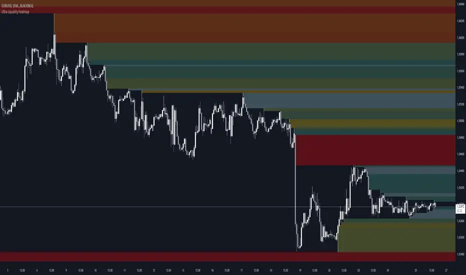
Ultra Liquidity HeatmapThe Ultra Liquditiy Heatmap is a unique visualization tool designed to map out areas of high liquidity on the chart using a dynamic heatmap, helping traders identify significant price zones effectively.
Introduction
The Ultra Liquidity Heatmap is an advanced indicator for visualizing key liquidity areas on your chart. Whether you're a scalper, swing trader, or long-term investor, understanding liquidity dynamics can offer a powerful edge in market analysis. This tool provides a straightforward visual representation of these zones directly on your chart.
Detailed Description
The Ultra Liquidity Heatmap identifies high and low liquidity zones by dynamically marking price ranges with heatmap-like boxes.
.........
Dynamic Zone Creation
For low liquidity zones, the script draws boxes extending from the low to the high of the bar. If the price breaks below a previously defined zone, that box is removed.
Similarly, for high liquidity zones, the script tracks and highlights price ranges above the current high, removing boxes if the price exceeds the zone.
.....
Customizable Visuals
Users can adjust the transparency and color of the heatmap, tailoring the visualization to their preference.
.....
Real-Time Updates
The indicator constantly updates as new price data comes in, ensuring that the heatmap reflects the most current liquidity zones.
.....
Efficiency and Scalability
The script uses optimized arrays and a maximum box limit of 500 to ensure smooth performance even on higher timeframes or during high-volatility periods.
.........
The Ultra Liquidity Heatmap bridges the gap between raw price data and actionable market insight. Add it to your toolbox and elevate your trading strategy today!
COT Report Indicator with Selectable Data TypeOverview
The COT Report Indicator with Selectable Data Types is a powerful tool for traders who want to gain deeper insights into market sentiment using the Commitment of Traders (COT) data. This indicator allows you to visualize the net positions of different participant categories—Commercial, Noncommercial, and Nonreportable—directly on your chart.
The indicator is fully customizable, allowing you to select the type of data to display, sync with your chart's timeframe, or choose a custom timeframe. Whether you're analyzing gold, crude oil, indices, or forex pairs, this indicator adapts seamlessly to your trading needs.
Features
Dynamic Data Selection:
Choose between Commercial, Noncommercial, or Nonreportable data types.
Analyze the net positions of market participants for more informed decision-making.
Flexible Timeframes:
Sync with the chart's timeframe for quick analysis.
Select a custom timeframe to view COT data at your preferred granularity.
Wide Asset Coverage:
Supports various assets, including gold, silver, crude oil, indices, and forex pairs.
Automatically adjusts to the ticker you're analyzing.
Clear Visual Representation:
Displays Net Long, Net Short, and Net Difference (Long - Short) positions with distinct colors for easy interpretation.
Error Handling:
Alerts you if the symbol is unsupported, ensuring you know when COT data isn't available for a specific asset.
How to Use
Add the Indicator:
Click "Indicators" in TradingView and search for "COT Report Indicator with Selectable Data Types."
Add it to your chart.
Customize the Settings:
Data Type: Choose between Commercial, Noncommercial, or Nonreportable positions.
Data Source: Select "Futures Only" or "Futures and Options."
Timeframe: Sync with the chart's timeframe or specify a custom one (e.g., weekly, monthly).
Interpret the Data:
Green Line: Net Long Positions.
Red Line: Net Short Positions.
Black Line: Net Difference (Long - Short).
Supported Symbols:
Gold, Silver, Crude Oil, Natural Gas, Forex Pairs, S&P 500, US30, NAS100, and more.
Who Can Benefit
Trend Followers: Identify the buying/selling trends of Commercial and Noncommercial participants.
Sentiment Analysts: Understand shifts in sentiment among major market players.
Long-Term Traders: Use COT data to confirm or contradict your fundamental analysis.
Example Use Case
For example, if you're trading gold (XAUUSD) and select Noncommercial Positions, you’ll see the long and short positions of speculators. An increase in net long positions may signal bullish sentiment, while an increase in net short positions may indicate bearish sentiment.
If you switch to Commercial Positions, you'll get insights into how hedgers and institutions are positioning themselves, helping you confirm or counterbalance your current trading strategy.
Limitations
The indicator only works with supported symbols (COT data availability is limited to specific assets).
The COT data is updated weekly, so it is not suitable for short-term intraday trading.

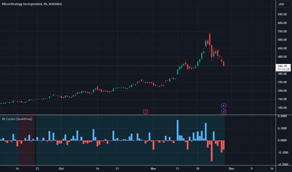
RS Cycles [QuantVue]The RS Cycles indicator is a technical analysis tool that expands upon traditional relative strength (RS) by incorporating Beta-based adjustments to provide deeper insights into a stock's performance relative to a benchmark index. It identifies and visualizes positive and negative performance cycles, helping traders analyze trends and make informed decisions.
Key Concepts:
Traditional Relative Strength (RS):
Definition: A popular method to compare the performance of a stock against a benchmark index (e.g., S&P 500).
Calculation: The traditional RS line is derived as the ratio of the stock's closing price to the benchmark's closing price.
RS=Stock Price/Benchmark Price
Usage: This straightforward comparison helps traders spot periods of outperformance or underperformance relative to the market or a specific sector.
Beta-Adjusted Relative Strength (Beta RS):
Concept: Traditional RS assumes equal volatility between the stock and benchmark, but Beta RS accounts for the stock's sensitivity to market movements.
Calculation:
Beta measures the stock's return relative to the benchmark's return, adjusted by their respective volatilities.
Alpha is then computed to reflect the stock's performance above or below what Beta predicts:
Alpha=Stock Return−(Benchmark Return×β)
Significance: Beta RS highlights whether a stock outperforms the benchmark beyond what its Beta would suggest, providing a more nuanced view of relative strength.
RS Cycles:
The indicator identifies positive cycles when conditions suggest sustained outperformance:
Short-term EMA (3) > Mid-term EMA (10) > Long-term EMA (50).
The EMAs are rising, indicating positive momentum.
RS line shows upward movement over a 3-period window.
EMA(21) > 0 confirms a broader uptrend.
Negative cycles are marked when the opposite conditions are met:
Short-term EMA (3) < Mid-term EMA (10) < Long-term EMA (50).
The EMAs are falling, indicating negative momentum.
RS line shows downward movement over a 3-period window.
EMA(21) < 0 confirms a broader downtrend.
This indicator combines the simplicity of traditional RS with the analytical depth of Beta RS, making highlighting true relative strength and weakness cycles.
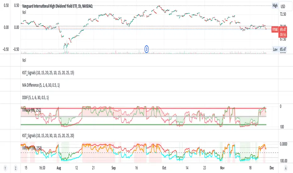
IV Rank/Percentile with Williams VIX FixDisplay IV Rank / IV Percentile
This indicator is based on William's VixFix, which replicates the VIX—a measure of the implied volatility of the S&P 500 Index (SPX). The key advantage of the VixFix is that it can be applied to any security, not just the SPX.
IV Rank is calculated by identifying the highest and lowest implied volatility (IV) values over a selected number of past periods. It then determines where the current IV lies as a percentage between these two extremes. For example, if over the past five periods the highest IV was 30%, the lowest was 10%, and the current IV is 20%, the IV Rank would be 50%, since 20% is halfway between 10% and 30%.
IV Percentile, on the other hand, considers all past IV values—not just the highest and lowest—and calculates the percentage of these values that are below the current IV. For instance, if the past five IV values were 30%, 10%, 11%, 15%, and 17%, and the current IV is 20%, the IV Rank remains at 50%. However, the IV Percentile is 80% because 4 out of the 5 past values (80%) are below the current IV of 20%.
Stock vs Sector Comparison with HighlightsThis graph is meant as a support to select a stock that is expected to perform better than the sector.
The graph is based on weekly chart. So this is a medium / long term strategy.
How is expected to be used: when the stock has under performed the sector for some time, there is a natural tendence that it will catch up with the sector again. So, for example, if the color change from green to red, you should consider find another stock in the sector. If the stock looses the green color, but is not red yet, you should wait. And vice versa if you start with red. However, life is not that simple, as you can get fake signal. To mitigate this problem, you can adjust the threshold in the input setting, so just go for the signal after x weeks over/underperforming. You also need remember to select the sector in the settings, as the sector is not give automatically when you select the stock.
Below the sectors used:
Sector Name Ticker
S&P 500 (Market Index) SPY
Technology XLK
Financials XLF
Consumer Discretionary XLY
Industrials XLI
Health Care XLV
Consumer Staples XLP
Energy XLE
Utilities XLU
Communication Services XLC
Real Estate XLRE
Materials XLB

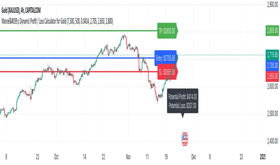
Marcel's Dynamic Profit / Loss Calculator for GoldOverview
This Dynamic Risk / Reward Tool for Gold is designed to help traders efficiently plan and manage their trades in the volatile gold market. This script provides a clear visualisation of trade levels (Entry, Stop Loss, Take Profit) while dynamically calculating potential profit and loss. It ensures gold traders can assess their positions with precision, saving time and improving risk management.
Key Features
1. Trade Level Visualisation:
Plots Entry (Blue), Stop Loss (Red), and Take Profit (Green) lines directly on the chart.
Helps you visualise and confirm trade setups quickly which is good for scalping and day trades.
2. Dynamic Risk and Reward Calculations:
Calculates potential profit and loss in real time based on user-defined inputs such as position size, leverage, and account equity.
Displays a summary panel showing risk/reward metrics directly on the chart.
3. Customisable Settings:
Allows you to adjust key parameters like account equity, position size, leverage, and specific price levels for Entry, Stop Loss, and Take Profit.
Defaults are dynamically generated for convenience but remain fully adjustable for flexibility.
How It Works
The script uses gold-specific conventions (e.g., 1 lot = 100 ounces, 1 pip = 0.01 price change) to calculate accurate risk and reward metrics.
It dynamically positions Stop Loss and Take Profit levels relative to the entry price, based on user-defined or default offsets.
A real-time summary panel is displayed in the bottom-right corner of the chart, showing:
Potential Profit: The monetary value if the Take Profit is hit.
Potential Lo
ss: The monetary value if the Stop Loss is hit.
How to Use It
1. Add the script to your chart on a gold trading pair (e.g., XAUUSD).
2. Input your:
Account equity.
Leverage.
Position size (in lots).
Desired En
try Price (default: current close price).
3. Adjust the Stop Loss and Take Profit levels to your strategy, or let the script use default offsets of:
500 pips below the Entry for Stop Loss.
1000 pips above the Entry for Take Profit.
4. Review the plotted levels and the summary panel to confirm your trade aligns with your risk/reward goals.
Why Use This Tool?
Clarity and Precision:
Provides clear trade visuals and financial metrics for confident decision-making.
Time-Saving:
Automates the calculations needed to evaluate trade risk and reward.
Improved Risk Management:
Ensures you never trade without knowing your exact potential loss and gain.
This script is particularly useful for both novice and experienced traders looking to enhance their risk management and trading discipline in the Gold market. Enjoy clearer trades at speed.
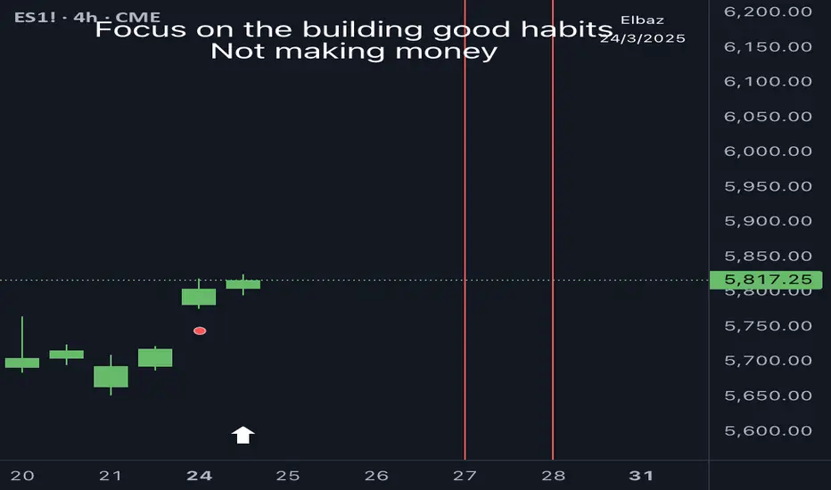
PSP Indicator [Elbaz]Precision Swing Point or PSP is a unique technical analysis tool designed to compare the price action of three tickers that are in sync.
It highlights moments when the price structure diverges between the markets, identifying ideal entry points for trades - We would like to enter a trade when we found PSP and one of the tickers took the wick while others didn't.
This strategy provides an edge by focusing on periods of desynchronization between the indices, where one index may be showing strength while another is lagging. The idea is to find the moments where the candle colors (bullish or bearish) differ across the markets, then wait for one of the tickers to "take" the wick of the PSP while other didn't and enter a trade.
Once a divergence is detected, the indicator plots an arrow on the chart, signaling a potential trade entry. To minimize risk, a good place to put stop loss will at the end of the wick of the PSP — the high or low wick of the candle where the divergence occurs.
The PSP Indicator allows for several custom inputs:
- Tickers: Customize the tickers to compare. The default values are S&P 500 E-mini, NASDAQ E-mini, and Dow Jones E-mini, if you trade Crypto you might want to use BTC, ETH, TOTAL3.
- Lookback Period: The lookback input defines how far back the indicator should evaluate to calculate the price structure point.
- Highlight Bar Times: Users can specify particular times during the trading day to highlight, such as the market open or significant news events. This helps traders focus on key trading windows.
RS Theory IndicatorHow to Use:
Customize the Reference Symbol: In the settings of the indicator, you can change the referenceSymbol to the benchmark or asset you want to compare against.
RS Interpretation:
RS > 1: The current asset is outperforming the reference symbol.
RS < 1: The current asset is underperforming the reference symbol.
RS = 1: The current asset and the reference symbol are performing equally.
Alerts: You can enable alerts for when the RS crosses certain levels (e.g., when RS > 1 or RS < 1).
How It Works:
Reference Symbol: The user inputs the benchmark asset or symbol (e.g., "SPY" for an S&P 500 ETF). This will be used as the comparison symbol.
RS Calculation: The RS Value is calculated by dividing the current asset's close price by the reference asset's close price:
RS
=
Close Price of Current Asset
Close Price of Reference Asset
RS=
Close Price of Reference Asset
Close Price of Current Asset
Plotting:
The RS value is plotted on the chart as a line.
A horizontal line at RS = 1 is drawn for easy comparison, representing parity (when the asset and reference symbol have the same price).
Background Coloring: The background is colored:
Green when RS > 1 (indicating the asset is outperforming the benchmark).
Red when RS < 1 (indicating the asset is underperforming the benchmark).
Alerts: Alerts are triggered when the RS value is above or below 1, indicating outperformance or underperformance relative to the benchmark.

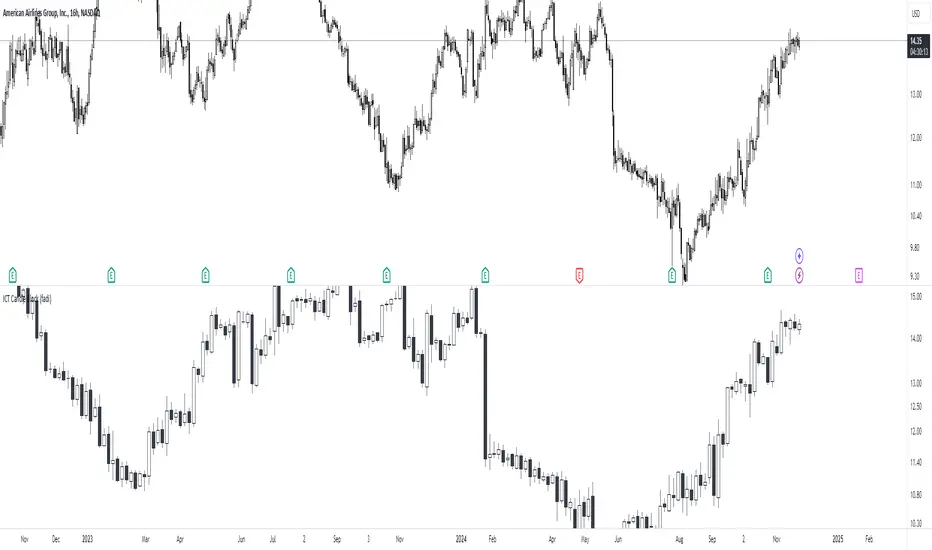
ICT Candle Block (fadi)ICT Candle Block
When trading using ICT concepts, it is often beneficial to treat consecutive candles of the same color as a single entity. This approach helps traders identify Order Blocks, liquidity voids, and other key trading signals more effectively.
However, in situations where the market becomes choppy or moves slowly, recognizing continuous price movement can be challenging.
The ICT Candle Block indicator addresses these challenges by combining consecutive candles of the same color into a single entity. It redraws the resulting candles, making price visualization much easier and helping traders quickly identify key trading signals.
FVGs and Blocks
In the above snapshot, FVGs/Liquidity Voids, Order Blocks, and Breaker Blocks are easily identified. By analyzing the combined candles, traders can quickly determine the draw on liquidity and potential price targets using ICT concepts.
Unlike traditional higher timeframes that rigidly combine lower timeframe candles based on specific start and stop times, this indicator operates as a "mixed timeframe." It combines all buying and all selling activities into a single candle, regardless of when the transactions started and ended.
Limitations
There are currently TradingView limitations that affect the functionality of this indicator:
TradingView does not have a Candle object; therefore, this indicator relies on using boxes and lines to mimic the candles. This results in wider candles than expected, leading to misalignment with the time axis below (plotcandle is not the answer).
There is a limit on the number of objects that can be drawn on a chart. A maximum of 500 candles has been set.
A rendering issue may cause a sideways box to appear across the chart. This is a display bug in TradingView; scroll to the left until it clears.
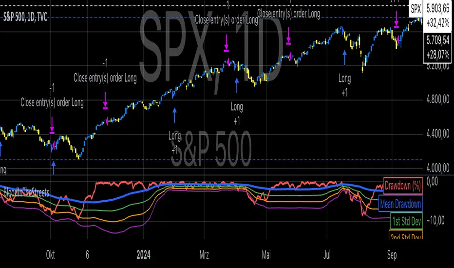
Buy When There's Blood in the Streets StrategyStatistical Analysis of Drawdowns in Stock Markets
Drawdowns, defined as the decline from a peak to a trough in asset prices, are an essential measure of risk and market dynamics. Their statistical properties provide insights into market behavior during extreme stress periods.
Distribution of Drawdowns: Research suggests that drawdowns follow a power-law distribution, implying that large drawdowns, while rare, are more frequent than expected under normal distributions (Sornette et al., 2003).
Impacts of Extreme Drawdowns: During significant drawdowns (e.g., financial crises), the average recovery time is significantly longer, highlighting market inefficiencies and behavioral biases. For example, the 2008 financial crisis led to a 57% drawdown in the S&P 500, requiring years to recover (Cont, 2001).
Using Standard Deviations: Drawdowns exceeding two or three standard deviations from their historical mean are often indicative of market overreaction or capitulation, creating contrarian investment opportunities (Taleb, 2007).
Behavioral Finance Perspective: Investors often exhibit panic-selling during drawdowns, leading to oversold conditions that can be exploited using statistical thresholds like standard deviations (Kahneman, 2011).
Practical Implications: Studies on mean reversion show that extreme drawdowns are frequently followed by periods of recovery, especially in equity markets. This underpins strategies that "buy the dip" under specific, statistically derived conditions (Jegadeesh & Titman, 1993).
References:
Sornette, D., & Johansen, A. (2003). Stock market crashes and endogenous dynamics.
Cont, R. (2001). Empirical properties of asset returns: stylized facts and statistical issues. Quantitative Finance.
Taleb, N. N. (2007). The Black Swan: The Impact of the Highly Improbable.
Kahneman, D. (2011). Thinking, Fast and Slow.
Jegadeesh, N., & Titman, S. (1993). Returns to Buying Winners and Selling Losers: Implications for Stock Market Efficiency.
SPX Open vs SMA AlertThis indicator is specifically designed to identify the first market-relevant candle of the S&P 500 (SPX) after the market opens. The opening price of the trading day is compared to a customizable simple moving average (SMA) period. A visual marker and an alert are triggered when the opening price is above the SMA. Perfect for traders seeking early market trends or integrating automated trading strategies.
Features:
Market Open: The indicator uses the New York market open time (09:30 ET), accounting for time zones and daylight saving time changes.
Flexible Time Offset: Users can set a time offset to trigger alerts after the market opens.
Customizable SMA: The SMA period is adjustable, with a default value of 10.
Visual Representation: A step-line SMA is plotted directly on the chart with subtle transparency and clean markers.
Alert Functionality: Alerts are triggered when conditions are met (opening price > SMA).
Usage:
This indicator is ideal for identifying relevant trading signals early in the session.
Alerts can also serve as triggers for automated trading, e.g., in conjunction with the Trading Automation Toolbox.
Supports both intraday and daily charts.
Alarm Settings:
Select the appropriate symbol (e.g., SPX) and the alert condition "SPX Open > SMA10".
Trigger Settings:
Choose "Once Per Bar Close" to ensure the condition is evaluated at the end of each candle.
If you prefer to evaluate the condition immediately when it becomes true, choose "Once Per Minute".
Duration:
Set the alarm to "Open-ended" if you want it to remain active indefinitely.
Alternatively, set a specific expiration date for the alarm.
