High Threshold Volume BarHigh Threshold Volume Bar (HP Vol Bar) has the following features highlighted below.
Overview:
The High Threshold Volume Bar (HP Vol Bar) is an advanced technical analysis tool designed to identify statistically significant price bars based on volume, range, and trend dynamics. It helps traders spot high-probability continuation or reversal setups by analyzing bar size relative to historical volatility, volume spikes, and trend strength.
Key Features
1. Adaptive Threshold Detection
.Uses standard deviation bands and moving averages to dynamically adjust the significance threshold based on recent market conditions.
.Bars exceeding this threshold are flagged as "significant" and color-coded for easy identification.
2. Volume & Range Normalization
.Adjusts bar size calculations by factoring in volume spikes (relative to SMA-smoothed volume) and full price range (high-low or just body size).
.Prevents false signals by capping extreme volume outliers.
3. Trend Strength & Direction
Incorporates Directional Movement (DMI) to assess trend strength.
Classifies signals as continuation or reversal based on trend alignment.
4. Percentile Ranking
.Compares current bar size against a lookback period (default: 100 bars) to determine its statistical rarity (top 20% = high significance).
5. Consecutive Signal Filtering
.Requires multiple consecutive significant bars (configurable) to confirm high-probability setups, reducing noise.
6. Visual & Alert System
.Color-coded bars:
.Blue (Bullish Continuation) / Pink (Bearish Continuation) for high-probability signals.
.Teal (Bullish) / Maroon (Bearish) for significant but unconfirmed bars.
.Info Table: Displays real-time metrics (signal type, percentile, trend strength, volatility regime).
.Alerts: Triggers when a high-probability sequence is detected.
Input Parameters
1. Parameter Description Default
2. SMA Length Smoothing period for average bar size. 50
3. Standard Deviation Period Lookback for volatility calculation. 20
4. Standard Deviation Multiplier Adjusts sensitivity of threshold. 2.5
5. Factor in Volume Normalizes bar size using volume. true
6. Use Full Range Measures high-low instead of open-close. true
7. Min Consecutive Bars Required confirmations for high-probability signals. 2
8. Historical Comparison Period Lookback for percentile ranking. 100
9. Trend Strength Period Smoothing for DMI-based trend assessment. 14
How It Works
1. Calculates Bar Size:
.Uses either full range (high-low) or body size (open-close).
.Adjusts for volume spikes via EMA-normalized volume.
2. Determines Significance:
.Bar size must exceed:
.Adaptive threshold = SMA + (StdDev × Multiplier × Volatility Factor).
.Percentile rank > 80% (top 20% of recent bars).
.Trend strength > 20% (DMI-derived).
3. Classifies Signals:
.Continuation: Significant bar aligns with prior trend.
.Reversal: Significant bar contradicts prior trend.
4. Confirms High-Probability Setups:
.Requires consecutive significant bars (user-defined) to filter noise.
7. Usage Guidelines
.Bullish Signals: Look for blue bars (confirmed) or teal bars (unconfirmed) in uptrends.
.Bearish Signals: Look for pink bars (confirmed) or maroon bars (unconfirmed) in downtrends.
.Alerts: Use built-in alerts to notify when a high-probability sequence forms.
.Combine With: Support/resistance levels, candlestick patterns, or momentum oscillators for confluence.
8. Why This Script?
.Dynamic Adaptation: Adjusts to changing volatility and volume regimes.
.Statistical Rigor: Uses percentile ranking to avoid overfitting.
.Clear Visuals: Intuitive color-coding and table for quick analysis.
Note: This is a closed-source script, but the logic is transparently explained to ensure traders understand its methodology.
How to Use "High Threshold Volume Bar" for Trade Entries
The HP Vol Bar indicator identifies high-probability trade setups based on statistically significant price bars. Here’s how to use it for entries, exits, and trade management:
1. Trade Entry Rules (Table Values to consider to trade)
A) Bullish Continuation Setup (Trend Following)
Conditions:
✅Signal Status: Active
✅ Signal Type: bullish_cont (Blue,Teal bar)
✅Size percentile: 90%
✅ Trend Strength: > 20% (Strong trend)
✅ Consecutive Bars: ≥ 1or2
✅ Volume Regime : High
Entry:
.Buy at the close of the second (or Nth) confirmed blue bar.
.Stop Loss (SL): Below the lowest bar in the sequence.
.Take Profit (TP):
1.5× to 2× the bar size (adaptive to volatility).
Example:
Bearish Continuation Example
B) Bearish Continuation Setup (Trend Following)
Conditions:
✅Signal Status: Active
✅ Signal Type: bearish_cont (Pink bar)
✅Size percentile: 90%
✅ Trend Strength: > 20%
✅ Consecutive Bars: ≥ 1or2
✅ Volume Regime : High
Entry:
Sell Short at the close of the second (or Nth) confirmed pink bar.
Stop Loss (SL): Above the highest bar in the sequence.
Take Profit (TP): Similar to bullish (1.5-2× bar size).
C) Bullish/Bearish Reversal Setup (Counter-Trend)
Conditions:
✅Signal Status: Active
✅ Signal Type: bullish_rev or bearish_rev
✅Size percentile: 90%
✅ Trend Strength: > 20%
✅ Consecutive Bars: ≥ 1or2
✅ Volume Regime : High
Entry:
Wait for confirmation (next bar closes in reversal direction).
SL: Opposite extreme of the signal bar.
Example:
Reversal Example
2. Filtering & Confluence (Improving Accuracy)
Trend Alignment: Only trade in the direction of the higher timeframe trend (e.g., use EMA 50/200)
Support/Resistance: Enter near key levels for better risk-reward.
Volume Confirmation: Avoid signals with below-average volume.
3. Advanced Strategies
A) Breakout Confirmation
If a significant bar breaks a key level, enter on retest.
Example: Blue bar breaks resistance → Buy on pullback.
B) Mean Reversion (Range Markets)
Use low volatility mode (volRegimeText = "LOW") + reversal signals.
Fade extreme moves back to the mean (e.g., SMA).
Komut dosyalarını " TABLE " için ara

Opening/Closing Range [Pro] (jdam18)Indicator Summary
The Opening/Closing Range indicator systematically captures and displays the Opening Range (OR) (9:30am ET) and Closing Range (CR) (3:50pm ET) for each trading session with flexible historical tracking and visual customization options.
Key functionalities include:
Opening and Closing Ranges: Dynamically plots the OR and CR session boxes with options for high/low lines, midline (equilibrium) plotting, and customizable extension to the current bar.
Extensions: Automatically generates extension levels above and below the range based on user-defined multipliers, facilitating clearer identification of price expansion levels.
Merging Logic: Optionally merges overlapping OR and CR ranges into unified boxes, enhancing clarity when sessions overlap significantly. Merged boxes may display a consolidated central line (CE) and visual extensions.
Event Horizons: Detects and highlights meaningful price gaps ("Event Horizons") between non-overlapping ranges, with optional subdivision into quarters and eighths for detailed gap structure analysis.
Weekly Extensions: Independently tracks Monday and Wednesday Opening and Closing Ranges, projecting expansion levels for the week.
Weekly Extension Table: Provides an optional summary table displaying the status of Monday and Wednesday extensions, range size, and the current location of price relative to key extension thresholds. Table positioning is customizable.
The script is designed to be performance-conscious, modular, and highly configurable, supporting intraday timeframes up to 15 minutes, and providing comprehensive visualizations to aid in market structure analysis and trading decisions.

Cointegration Buy and Sell Signals [EdgeTerminal]The Cointegration Buy And Sell Signals is a sophisticated technical analysis tool to spot high-probability market turning points — before they fully develop on price charts.
Most reversal indicators rely on raw price action, visual patterns, or basic and common indicator logic — which often suffer in noisy or trending markets. In most cases, they lag behind the actual change in trend and provide useless and late signals.
This indicator is rooted in advanced concepts from statistical arbitrage, mean reversion theory, and quantitative finance, and it packages these ideas in a user-friendly visual format that works on any timeframe and asset class.
It does this by analyzing how the short-term and long-term EMAs behave relative to each other — and uses statistical filters like Z-score, correlation, volatility normalization, and stationarity tests to issue highly selective Buy and Sell signals.
This tool provides statistical confirmation of trend exhaustion, allowing you to trade mean-reverting setups. It fades overextended moves and uses signal stacking to reduce false entries. The entire indicator is based on a very interesting mathematically grounded model which I will get into down below.
Here’s how the indicator works at a high level:
EMAs as Anchors: It starts with two Exponential Moving Averages (EMAs) — one short-term and one long-term — to track market direction.
Statistical Spread (Regression Residuals): It performs a rolling linear regression between the short and long EMA. Instead of using the raw difference (short - long), it calculates the regression residual, which better models their natural relationship.
Normalize the Spread: The spread is divided by historical price volatility (ATR) to make it scale-invariant. This ensures the indicator works on low-priced stocks, high-priced indices, and crypto alike.
Z-Score: It computes a Z-score of the normalized spread to measure how “extreme” the current deviation is from its historical average.
Dynamic Thresholds: Unlike most tools that use fixed thresholds (like Z = ±2), this one calculates dynamic thresholds using historical percentiles (e.g., top 10% and bottom 10%) so that it adapts to the asset's current behavior to reduce false signals based on market’s extreme volatility at a certain time.
Z-Score Momentum: It tracks the direction of the Z-score — if Z is extreme but still moving away from zero, it's too early. It waits for reversion to start (Z momentum flips).
Correlation Check: Uses a rolling Pearson correlation to confirm the two EMAs are still statistically related. If they diverge (low correlation), no signal is shown.
Stationarity Filter (ADF-like): Uses the volatility of the regression residual to determine if the spread is stationary (mean-reverting) — a key concept in cointegration and statistical arbitrage. It’s not possible to build an exact ADF filter in Pine Script so we used the next best thing.
Signal Control: Prevents noisy charts and overtrading by ensuring no back-to-back buy or sell signals. Each signal must alternate and respect a cooldown period so you won’t be overwhelmed and won’t get a messy chart.
Important Notes to Remember:
The whole idea behind this indicator is to try to use some stat arb models to detect shifting patterns faster than they appear on common indicators, so in some cases, some assumptions are made based on historic values.
This means that in some cases, the indicator can “jump” into the conclusion too quickly. Although we try to eliminate this by using stationary filters, correlation checks, and Z-score momentum detection, there is still a chance some signals that are generated can be too early, in the stock market, that's the same as being incorrect. So make sure to use this with other indicators to confirm the movement.
How To Use The Indicator:
You can use the indicator as a standalone reversal system, as a filter for overbought and oversold setups, in combination with other trend indicators and as a part of a signal stack with other common indicators for divergence spotting and fade trades.
The indicator produces simple buy and sell signals when all criteria is met. Based on our own testing, we recommend treating these signals as standalone and independent from each other . Meaning that if you take position after a buy signal, don’t wait for a sell signal to appear to exit the trade and vice versa.
This is why we recommend using this indicator with other advanced or even simple indicators as an early confirmation tool.
The Display Table:
The floating diagnostic table in the top-right corner of the chart is a key part of this indicator. It's a live statistical dashboard that helps you understand why a signal is (or isn’t) being triggered, and whether the market conditions are lining up for a potential reversal.
1. Z-Score
What it shows: The current Z-score value of the volatility-normalized spread between the short EMA and the regression line of the long EMA.
Why it matters: Z-score tells you how statistically extreme the current relationship is. A Z-score of:
0 = perfectly average
> +2 = very overbought
< -2 = very oversold
How to use it: Look for Z-score reaching extreme highs or lows (beyond dynamic thresholds). Watch for it to start reversing direction, especially when paired with green table rows (see below)
2. Z-Score Momentum
What it shows: The rate of change (ROC) of the Z-score:
Zmomentum=Zt − Zt − 1
Why it matters: This tells you if the Z-score is still stretching out (e.g., getting more overbought/oversold), or reverting back toward the mean.
How to use it: A positive Z-momentum after a very low Z-score = potential bullish reversal A negative Z-momentum after a very high Z-score = potential bearish reversal. Avoid signals when momentum is still pushing deeper into extremes
3. Correlation
What it shows: The rolling Pearson correlation coefficient between the short EMA and long EMA.
Why it matters: High correlation (closer to +1) means the EMAs are still statistically connected — a key requirement for cointegration or mean reversion to be valid.
How to use it: Look for correlation > 0.7 for reliable signals. If correlation drops below 0.5, ignore the Z-score — the EMAs aren’t moving together anymore
4. Stationary
What it shows: A simplified "Yes" or "No" answer to the question:
“Is the spread statistically stable (stationary) and mean-reverting right now?”
Why it matters: Mean reversion strategies only work when the spread is stationary — that is, when the distance between EMAs behaves like a rubber band, not a drifting cloud.
How to use it: A "Yes" means the indicator sees a consistent, stable spread — good for trading. "No" means the market is too volatile, disjointed, or chaotic for reliable mean reversion. Wait for this to flip to "Yes" before trusting signals
5. Last Signal
What it shows: The last signal issued by the system — either "Buy", "Sell", or "None"
Why it matters: Helps avoid confusion and repeated entries. Signals only alternate — you won’t get another Buy until a Sell happens, and vice versa.
How to use it: If the last signal was a "Buy", and you’re watching for a Sell, don’t act on more bullish signals. Great for systems where you only want one position open at a time
6. Bars Since Signal
What it shows: How many bars (candles) have passed since the last Buy or Sell signal.
Why it matters: Gives you context for how long the current condition has persisted
How to use it: If it says 1 or 2, a signal just happened — avoid jumping in late. If it’s been 10+ bars, a new opportunity might be brewing soon. You can use this to time exits if you want to fade a recent signal manually
Indicator Settings:
Short EMA: Sets the short-term EMA period. The smaller the number, the more reactive and more signals you get.
Long EMA: Sets the slow EMA period. The larger this number is, the smoother baseline, and more reliable trend bases are generated.
Z-Score Lookback: The period or bars used for mean & std deviation of spread between short and long EMAs. Larger values result in smoother signals with fewer false positives.
Volatility Window: This value normalizes the spread by historical volatility. This allows you to prevent scale distortion, showing you a cleaner and better chart.
Correlation Lookback: How many periods or how far back to test correlation between slow and long EMAs. This filters out false positives when EMAs lose alignment.
Hurst Lookback: The multiplier to approximate stationarity. Lower leads to more sensitivity to regime change, higher produces a more stricter filtering.
Z Threshold Percentile: This value sets how extreme Z-score must be to trigger a signal. For example, 90 equals only top/bottom 10% of extremes, 80 = more frequent.
Min Bars Between Signals: This hard stop prevents back-to-back signals. The idea is to avoid over-trading or whipsaws in volatile markets even when Hurst lookback and volatility window values are not enough to filter signals.
Some More Recommendations:
We recommend trying different EMA pairs (10/50, 21/100, 5/20) for different asset behaviors. You can set percentile to 85 or 80 if you want more frequent but looser signals. You can also use the Z-score reversion monitor for powerful confirmation.

Altcoin Screener | QuantumResearchAltcoin Screener | QuantumResearch
🔍 Multi-Factor Asset Ranking & Portfolio Allocator for Altcoins
This screener is an advanced tool designed to help crypto investors identify the strongest-performing altcoins among a custom selection of up to 40 assets. It evaluates multiple factors across trend strength, momentum, relative performance, and risk-adjusted returns — then allocates a portfolio accordingly.
🔬 How it Works:
Each altcoin is scored using a blend of custom-built indicators developed by QuantumResearch:
Beta (volatility relative to BTC) – Measures how much an asset moves compared to Bitcoin. Higher beta = higher volatility.
Alpha – Measures the asset’s excess return versus Bitcoin (BTC is the required benchmark for this model).
ARSI – Adaptative RSI signal score to determine directional strength.
AVWO – Adaptative Volume-weighted momentum oscillator detecting momentum
Uni1 – Universal algorithme 1
Uni2 – Universal algorithme 2
7D ROC – 7-day rate of change (short-term momentum).
Relative Strength Matrix – Evaluates price ratio behavior between all selected assets.
Omega Ratio – A refined risk/reward filter favoring stable upside.
All scores are aggregated into a Final Score, which determines each token’s overall rank in the current environment.
⚠️ Important Requirements:
This script must be applied to the BTCor TOTAL chart, as BTC/TOTAL is used as the benchmark to compute accurate Beta and Alpha values.
All selected assets must have at least 300 bars of price history to ensure the filters function properly (especially for Alpha, Beta, and Omega computations).
💼 Portfolio Allocation Modes:
Choose how you'd like to allocate based on your risk preference:
🧠 Conservative → Top 3 assets (50% / 30% / 20%)
⚖️ Mix → Top 2 assets (80% / 20%)
🔥 Aggressive → Top 1 asset (100%)
The result is a simple and powerful table showing your top allocations, backed by sound multi-factor analysis.
📊 Key Features:
Supports up to 40 customizable assets from any exchange
Displays performance stats like Beta, Alpha, and Omega
Color-coded tables highlight winners, metrics, and risk zones
Automatically updates allocation tables based on rankings
View mean & median values for deeper benchmarking
🧠 Use Cases:
Build a custom altcoin portfolio with solid statistical backing
Identify strong trends early with momentum + ratio blend
Visualize volatility and risk-adjusted strength versus BTC
Allocate based on signals, not social hype
🔧 Built by QuantumResearch
📈 Engineered for strategic signal discovery
⚠️ For research and educational purposes only — not financial advice.

DTT Yearly Volatility Grid [Pro+] (NINE/ANARR)Introduction :
This tool is designed to automate the Digital Time Theory (DTT) framework created by Ivan and Anarr and applies the DTT Yearly Volatility Grid to uncover swing trading opportunities by analyzing Time-based statistical market behavior across the 4H to Daily chart.
Description:
Built upon the proprietary Digital Time Theory (DTT) , this advanced version is tailored for traders seeking multi-day to multi-week moves . It equips swing traders with an edge by analyzing macro Time intervals and volatility behavior across higher Timeframes. Applicable to all major asset classes, including stocks, crypto, forex, and futures , this script breaks down the entire yearly range into Higher-Time Frame Time Models and statistical zones .
This version uses daily intervals to track broader volatility waves, highlight the DTT framework, and pinpoint premium/discount areas across swing cycles. Powered by Time-driven data insights, this tool assists traders in anticipating expansions, understanding long-range Time distortions, and positioning around statistically significant zones in the higher-Time frame narrative.
Key Features:
Time-Based Models and Macro Volatility Awareness:
Automatically populates the chart with DTT Yearly Time Models (4H, Daily), engineered to spotlight macro volatility events across broader market sessions. Helps swing traders identify potential inflection points, reversals, or trend continuation zones.
Average Model Range Probability (AMRP):
Measure the average volatility expected over higher Time-based models. Use AMRP Levels and Projections to assess the range potential of each Yearly Model Time window—vital for monitoring reversals, breakouts, or continuation plays across several sessions or weeks.
Digital Root Candles and HTF Liquidity Draws:
For DTT Yearly Models, the Digital Root Candles are calculated as a specific Daily candle, and can be viewed on the Daily or 4H Timeframe. Analysts can frame premium and discount zones, based on where price is trading in relation to the current or previous model's Digital Roots. These areas also act as anchors for institutional price movement, often serving as bases for accumulation/distribution periods or large impulse moves.
Extended Visualization:
Track and project prior model ranges (high, low, equilibrium) into the current swing window. This helps visualize macro support/resistance , range expansion, failure zones, and price gravitation levels for longer-term trade planning.
Lookback Periods and Model Count
Utilize adjustable lookback periods to control the number of past DTT Yearly Models displayed—ideal for swing traders and quarterly outlooks. Whether you’re reviewing one yearly model to focus on the present range or several months’ worth of data for backtesting and confluence, this feature keeps charts clean, structured, and aligned with your preferred historical perspective.
By tailoring how many previous Time-based models appear on the chart, traders can better visualize and backtest repeated behaviors, major volatility clusters, and how key levels evolve over Time.
Detailed Data Table:
View statistical AMRP data for multiple DTT Yearly Models in real-Time. The data table helps confirm whether current price movement exceeds, respects, or fails to reach historical volatility ranges—key for analyzing market compression or expansion phases.
Customization Options:
Toggle inner Time interval, calculate AMRP utilizing a custom model lookback, and display styles (solid/dotted lines), including color coordination per drawing. Easily customize your charts and settings to fit your swing trading system or macro analysis.
How Swing Traders Can Use DTT Yearly Volatility Grid Effectively
Identify Swing Premium and Discount Zones:
Use Root Candles and Yearly Time Model AMRP Zones to evaluate where price is positioned in the current Time Model. Using this tool, traders can plan trades with a longer term horizon for a minimum of 1 to 2-weeks or manage entries/exits around market structure shifts and liquidity pools
Expect Macro Volatility Shifts:
Use the HTF models to forecast when and which volatility models are historically known to create larger market impulses . These tools help spot periods of potential exhaustion or breakout, especially near key economic releases, quarterly closes , or macro liquidity zones .
Avoid Low Volatility Consolidations:
AMRP helps you detect when the market is compressing or coiling within a DTT Yearly Model. If price is trading between Digital Root Candles or the AMRP zones, analysts are likely to notice periods of consolidation, and the inability to reach their historical volatility averages.
Usage Guidance:
Add DTT Yearly Volatility Grid (NINE/ANARR) to your TradingView chart.
Make sure to be on the 4H, or Daily Timeframes depending on your asset class and analysis.
Use the DTT Model elements and the Data Table to track expansion zones, premium/discount extremes, and model range behavior.
Terms and Conditions
Our charting tools are products provided for informational and educational purposes only and do not constitute financial, investment, or trading advice. Our charting tools are not designed to predict market movements or provide specific recommendations. Users should be aware that past performance is not indicative of future results and should not be relied upon for making financial decisions. By using our charting tools, the purchaser agrees that the seller and the creator are not responsible for any decisions made based on the information provided by these charting tools. The purchaser assumes full responsibility and liability for any actions taken and the consequences thereof, including any loss of money or investments that may occur as a result of using these products. Hence, by purchasing these charting tools, the customer accepts and acknowledges that the seller and the creator are not liable nor responsible for any unwanted outcome that arises from the development, the sale, or the use of these products. Finally, the purchaser indemnifies the seller from any and all liability. If the purchaser was invited through the Friends and Family Program, they acknowledge that the provided discount code only applies to the first initial purchase of the Toodegrees Premium Suite subscription. The purchaser is therefore responsible for cancelling – or requesting to cancel – their subscription in the event that they do not wish to continue using the product at full retail price. If the purchaser no longer wishes to use the products, they must unsubscribe from the membership service, if applicable. We hold no reimbursement, refund, or chargeback policy. Once these Terms and Conditions are accepted by the Customer, before purchase, no reimbursements, refunds or chargebacks will be provided under any circumstances.
By continuing to use these charting tools, the user acknowledges and agrees to the Terms and Conditions outlined in this legal disclaimer.

Multi-Timeframe Anchored VWAP Valuation# Multi-Timeframe Anchored VWAP Valuation
## Overview
This indicator provides a unique perspective on potential price valuation by comparing the current price to the Volume Weighted Average Price (VWAP) anchored to the start of multiple timeframes: Weekly, Monthly, Quarterly, and Yearly. It synthesizes these comparisons into a single oscillator value, helping traders gauge if the current price is potentially extended relative to significant volume-weighted levels.
## Core Concept & Calculation
1. **Anchored VWAP:** The script calculates the VWAP separately for the current Week, Month, Quarter (3 Months), and Year (12 Months), starting the calculation from the first bar of each period.
2. **Price Deviation:** It measures how far the current `close` price is from each of these anchored VWAPs. This distance is measured in terms of standard deviations calculated *within* that specific anchor period (e.g., how many weekly standard deviations the price is away from the weekly VWAP).
3. **Deviation Score (Multiplier):** Based on this standard deviation distance, a score is assigned. The further the price is from the VWAP (in terms of standard deviations), the higher the absolute score. The indicator uses linear interpolation to determine scores between the standard deviation levels (defaulted at 1, 2, and 3 standard deviations corresponding to scores of +/-2, +/-3, +/-4, with a score of 1 at the VWAP).
4. **Timeframe Weighting:** Longer timeframes are considered more significant. The deviation scores are multiplied by fixed scalars: Weekly (x1), Monthly (x2), Quarterly (x3), Yearly (x4).
5. **Final Valuation Metric:** The weighted scores from all four timeframes are summed up to produce the final oscillator value plotted in the indicator pane.
## How to Interpret and Use
* **Histogram (Indicator Pane):**
* The main output is the histogram representing the `Final Valuation Metric`.
* **Positive Values:** Suggest the price is generally trading above its volume-weighted averages across the timeframes, potentially indicating strength or relative "overvaluation."
* **Negative Values:** Suggest the price is generally trading below its volume-weighted averages, potentially indicating weakness or relative "undervaluation."
* **Values Near Zero:** Indicate the price is relatively close to its volume-weighted averages.
* **Histogram Color:**
* The color of the histogram bars provides context based on the metric's *own recent history*.
* **Green (Positive Color):** The metric is currently *above* its recent average plus a standard deviation band (dynamic upper threshold). This highlights potentially significant "overvalued" readings relative to its normal range.
* **Red (Negative Color):** The metric is currently *below* its recent average minus a standard deviation band (dynamic lower threshold). This highlights potentially significant "undervalued" readings relative to its normal range.
* **Gray (Neutral Color):** The metric is within its typical recent range (between the dynamic upper and lower thresholds).
* **Orange Line:** Plots the moving average of the `Final Valuation Metric` itself (based on the "Threshold Lookback Period"), serving as the centerline for the dynamic thresholds.
* **On-Chart Table:**
* Provides a detailed breakdown for transparency.
* Shows the calculated VWAP, the raw deviation multiplier score, and the final weighted (adjusted) metric for each individual timeframe (W, M, Q, Y).
* Displays the current price, the final combined metric value, and a textual interpretation ("Overvalued", "Undervalued", "Neutral") based on the dynamic thresholds.
## Potential Use Cases
* Identifying potential exhaustion points when the indicator reaches statistically high (green) or low (red) levels relative to its recent history.
* Assessing whether price trends are supported by underlying volume-weighted average prices across multiple timeframes.
* Can be used alongside other technical analysis tools for confirmation.
## Settings
* **Calculation Settings:**
* `STDEV Level 1`: Adjusts the 1st standard deviation level (default 1.0).
* `STDEV Level 2`: Adjusts the 2nd standard deviation level (default 2.0).
* `STDEV Level 3`: Adjusts the 3rd standard deviation level (default 3.0).
* **Interpretation Settings:**
* `Threshold Lookback Period`: Defines the number of bars used to calculate the average and standard deviation of the final metric for dynamic thresholds (default 200).
* `Threshold StDev Multiplier`: Controls how many standard deviations above/below the metric's average are used to set the "Overvalued"/"Undervalued" thresholds (default 1.0).
* **Table Settings:** Customize the position and colors of the data table displayed on the chart.
## Important Considerations
* This indicator measures price deviation relative to *anchored* VWAPs and its *own historical range*. It is not a standalone trading system.
* The interpretation of "Overvalued" and "Undervalued" is relative to the indicator's logic and calculations; it does not guarantee future price movement.
* Like all indicators, past performance is not indicative of future results. Use this tool as part of a comprehensive analysis and risk management strategy.
* The anchored VWAP and Standard Deviation values reset at the beginning of each respective period (Week, Month, Quarter, Year).

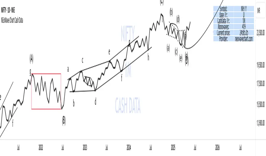
NEoWave Chart Cash Data The NEoWave Chart Cash Data indicator is an efficient tool for generating wave charts or cash data based on the NeoWave method, benefiting not only NeoWave analysts but also Elliott Wave practitioners. This indicator produces cash data with exceptional precision.
Developed by Glenn Neely, NeoWave is considered a more complete, scientific, and innovative iteration of the Elliott Wave theory. This method relies on a specialized chart known as a "wave chart" or "cash data," which, when drawn manually by recording the highest and lowest prices in their order of occurrence, is a complex and time-consuming process. However, this indicator automatically and in real-time identifies the highest and lowest prices for any symbol and time frame, plotting them in sequence. For instance, in a daily time frame, it separates each month's data and prepares a "monthly cash data chart" for analysis using the NeoWave method.
Fully compatible with all account types, this tool enables the creation of cash data across various time frames (from minutes to years) and customizable scales. Its standout features include real-time updates, watermarking capabilities, display of useful data in tables, detection of suspicious monowaves (where the highest and lowest prices occur within the same candlestick), simultaneous display of two cash data charts with different time frames, and the ability to view cash data for any desired time period.
CASH DATA TIMEFRAMES
The core feature of this indicator is CASH DATA TIMEFRAMES, which generates and displays Cash Data based on your base timeframe. Here’s how it works:
.1 Minute ("1"): Cash Data: 5, 10, 15, 30, 60, 120, 180 minutes
.3 Minutes ("3"): Cash Data: 30, 60, 120, 180, 240 minutes
.5 Minutes ("5"): Cash Data: 30, 60, 120, 180, 240 minutes, 1 day (1D)
.15 Minutes ("15"): Cash Data: 120, 180, 240 minutes, 1 day (1D), 2 days (2D), 3 days (3D)
.30 Minutes ("30"): Cash Data: 180, 240 minutes, 1 day (1D), 2 days (2D), 3 days (3D), 1 week (1W)
.1 Hour ("60"): Cash Data: 1 day (1D), 2 days (2D), 3 days (3D), 1 week (1W), 2 weeks (2W)
.2 Hours ("120"): Cash Data: 1 day (1D), 2 days (2D), 3 days (3D), 1 week (1W), 2 weeks (2W), 1 month (1M)
.3 Hours ("180"): Cash Data: 1 day (1D), 2 days (2D), 3 days (3D), 1 week (1W), 2 weeks (2W), 1 month (1M)
.4 Hours ("240"): Cash Data: 2 days (2D), 3 days (3D), 1 week (1W), 2 weeks (2W), 1 month (1M), 2 months (2M)
.Daily ("D"): Cash Data: 1 week (1W), 2 weeks (2W), 1 month (1M), 2 months (2M), 3 months (3M), 6 months (6M), 12 months (12M)
.Weekly ("W"): Cash Data: 2 months (2M), 3 months (3M), 6 months (6M)
.Monthly ("M"): Cash Data: 6 months (6M), 12 months (12M)
Suspicious monowaves
Suspicious monowaves, visible in the "Inputs" section under the label "Sus Monowaves," are highlighted in red upon detection. This occurs when the highest and lowest prices within a given time period appear in a single candlestick. As illustrated, suspicious monowaves are marked with red squares, and the candlestick indicated by a red arrow is the trigger for identifying these monowaves.
In such instances, our indicator automatically plots the monowaves with high precision. This feature is tailored for users seeking cash data of the utmost accuracy. Whenever these monowaves appear on the chart, it is recommended that users examine the suspicious monowaves in a lower time frame for further analysis.
Other Cash Data TF
One of the key features of this indicator is the "Other Cash Data TF" option, which, when enabled, allows you to create two cash data charts with different time frames within your base time frame. This feature becomes particularly useful when, for example, your base time frame is daily, and you’ve identified a pattern like a zigzag in the monthly cash data. To confirm this pattern, you need to examine the internal waves A and C to determine whether they are impulsive. By activating this option and setting "Other TF" to a weekly time frame, you can easily analyze the internal waves of your chosen wave without altering the base time frame.
When this option is activated, a column is added to the table, indicating that the "Base TF" is daily, "Cash Data TF" is monthly, and "Other Cash Data TF" is weekly (as shown in the image below).
Other features of the indicator include:
.A Table providing useful information such as the symbol, base time frame, cash data time frame (Cash Data TF), number of monowaves, and live price.
.Customizable options for the table (including color, size, and column removal), watermark, cash data lines, suspicious monowaves, and more.
.A Time Separator that divides the chart into equal periods.
.The ability to add a watermark.
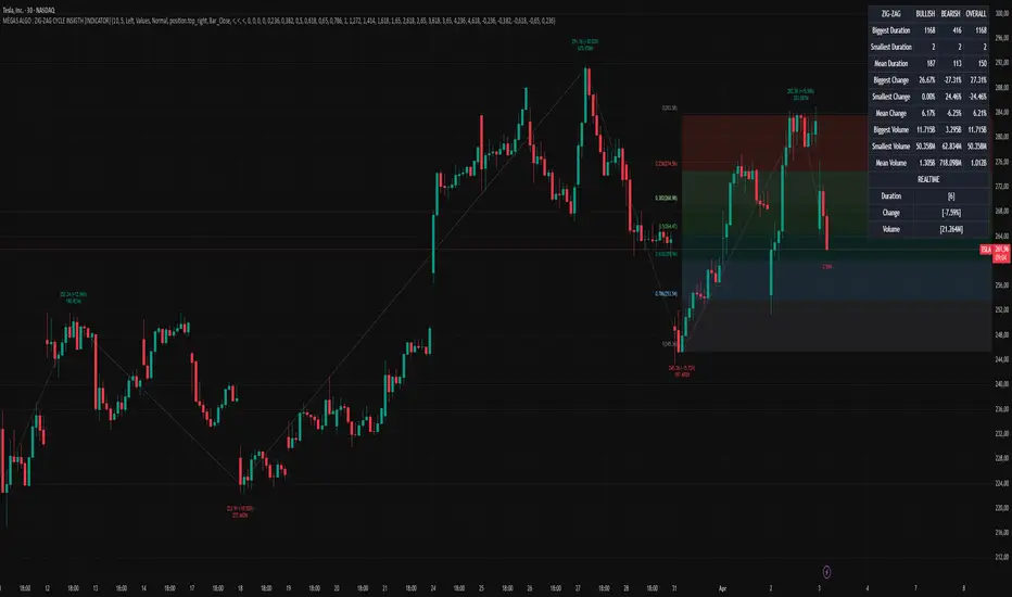
MÈGAS ALGO : ZIG-ZAG CYCLE INSIGTH [INDICATOR]Overview
The Zig-Zag Cycle Insigth is a revisited version of the classic Zig Zag indicator, designed to provide traders with a more comprehensive and actionable view of price movements.
This advanced tool not only highlights significant price swings but also incorporates additional features such as cycle analysis, real-time data tracking, and Fibonacci retracement levels. These enhancements make it an invaluable resource for identifying trends, potential reversal points, and market structure.
This indicator adheres to TradingView's guidelines and is optimized for both technical analysts and active traders who seek deeper insights into market dynamics.
Key Features:
1. Customizable Thresholds for Price Movements:
- Users can set personalized thresholds for price movement percentages and time periods.
This ensures that only significant price swings are plotted, reducing noise and increasing
clarity.
- Straight lines connect swing highs and lows, providing a cleaner visual representation of
the trend.
2. Cycle Analysis Table:
- A dynamic table is included to analyze price cycles based on three key factors:
- Price Change: Measures the magnitude of each swing (high-to-low or low-to-high).
- Time Duration (Bar Count): Tracks the number of bars elapsed between consecutive swings,
offering precise timing insights.
- Volume: Analyzes trading volume during each segment of the cycle.
- The indicator calculates the **maximum**, **minimum**, and **mean** values for each
parameter across all completed cycles, providing deeper statistical insights into market
behavior.
- This table updates in real-time, offering traders a quantitative understanding of how price
behaves over different cycles.
3. Real-Time Data Integration:
- The indicator displays live updates of current price action relative to the last identified
swing high/low. This includes:
- Current distance from the last pivot point.
- Percentage change since the last pivot.
- Volume traded since the last pivot.
4. Fibonacci Retracement Levels:
- Integrated Fibonacci retracement levels are dynamically calculated based on the most
recent significant swing high and low.
- Key retracement levels (23.6%, 38.2%, 50%, 61.8%, and 78.6%) are plotted alongside the Zig
Zag lines, helping traders identify potential support/resistance zones.
- Extension levels (100%, 161.8%, etc.) are also included to anticipate possible breakout
targets.
5. Customizable Alerts:
- Users can configure alerts for specific real-time conditions, such as:
- Price Change
- Duration
- Volume
- Fibonacci Retracement Levels
How It Works:
1. Zig Zag Identification:
- The indicator scans historical price data to identify significant turning points where the
price moves by at least the user-defined percentage threshold.
- These turning points are connected by straight lines to form the Zig Zag pattern.
2. Cycle Analysis:
For each completed cycle (from one swing high/low to the next), the indicator calculates:
- Price Change: Difference between the start and end prices of the cycle.
- Maximum Price Change: The largest price difference observed across all cycles.
- Minimum Price Change: The smallest price difference observed across all cycles.
- Mean Price Change: The average price difference across all cycles.
- Time Duration (Bar Count): Number of bars elapsed between consecutive swings.
- Maximum Duration: The longest cycle in terms of bar count.
- Minimum Duration: The shortest cycle in terms of bar count.
- Mean Duration: The average cycle length in terms of bar count.
- Volume: Total volume traded during the cycle.
- Maximum Volume: The highest volume traded during any single cycle.
- Minimum Volume: The lowest volume traded during any single cycle.
- Mean Volume: The average volume traded across all cycles.
- These calculations provide traders with a statistical overview of market behavior, enabling
them to identify patterns and anomalies in price, time, and volume.
3. Fibonacci Integration:
- Once a new swing high or low is identified, the indicator automatically calculates Fibonacci
retracement and extension levels.
- These levels serve as reference points for potential entry/exit opportunities.
4. Real-Time Updates:
- As the market evolves, the indicator continuously monitors the relationship between the
current price and the last identified swing point.
- Real-time metrics, such as percentage change and volume, are updated dynamically.
5. Alerts Based on Real-Time Parameters:
- The indicator allows users to set customizable alerts based on real-time conditions:
- Price Change Alert: Triggered when the real-time price change is less or greater than a
predefined percentage threshold (e.g., > or < fixed value).
- Duration Alert: Triggered when the cycle duration (in bars) is less or greater than a
predefined
bar count threshold (e.g., > or < fixed value).
- Volume Alert: Triggered when the trading volume during the current cycle is less or greater
than a predefined volume threshold (e.g., > or < fixed value).
Advantages of Zig-Zag Cycle Insigth
- Comprehensive Insights: Combining cycle analysis, Fibonacci retracements, and real-time data
provides a holistic view of market conditions.
- Statistical Analysis: The inclusion of maximum, minimum, and mean values for price change,
duration, and volume offers deeper insights into market behavior.
- Actionable Signals: Customizable alerts ensure traders never miss critical market events based
on real-time price, duration, and volume parameters.
- User-Friendly Design: Clear visuals and intuitive controls make it accessible for traders of all
skill levels.
Reference:
TradingView/ZigZag
TradingView/AutofibRetracement
Please Note:
This indicator is provided for informational and educational purposes only. It is not financial advice, and it should not be considered a recommendation to buy, sell, or trade any financial instrument. Trading involves significant risks, including the potential loss of your entire investment. Always conduct your own research and consult with a licensed financial advisor before making any trading decisions.
The results and images provided are based on algorithms and historical/paid real-time market data but do not guarantee future results or accuracy. Use this tool at your own risk, and understand that past performance is not indicative of future outcomes.
Combined SMA Cross & RSI Multi-Timeframe Indicator K2Combined SMA Cross & RSI Multi-Timeframe Indicator
This Pine Script v6 indicator combines two popular technical analysis tools—Simple Moving Average (SMA) crossover and Relative Strength Index (RSI) crossover—across multiple timeframes to generate bullish and bearish trading signals. It overlays SMA lines on the chart, displays signals with shapes, and provides a table summarizing SMA crossover states across 11 timeframes.
Features:
SMA Crossover:
Compares a short SMA (default: 20 periods) with a long SMA (default: 50 periods).
Bullish signal: Short SMA crosses above Long SMA.
Bearish signal: Short SMA crosses below Long SMA.
Plotted as green (short) and red (long) lines on the chart.
RSI Crossover:
Calculates RSI (default: 14 periods) and its SMA (default: 14 periods).
Bullish signal: RSI crosses above its SMA.
Bearish signal: RSI crosses below its SMA.
Multi-Timeframe Analysis:
Evaluates SMA and RSI conditions across 11 timeframes: 1M, 5M, 15M, 30M, 1H, 2H, 4H, 8H, 12H, 1D, 1W.
User can toggle which timeframes to include via input settings.
Combined Logic:
Generates a signal only when both SMA and RSI conditions (if enabled) are met across all selected timeframes.
Bullish: All selected timeframes show bullish SMA and RSI crossovers.
Bearish: All selected timeframes show bearish SMA and RSI crossovers.
Logic toggles allow enabling/disabling SMA or RSI components.
Visuals:
Triangles: Green triangle below bar for bullish signals, red triangle above bar for bearish signals.
Arrows: Green upward arrow for "Long" signals, red downward arrow for "Short" signals, ensuring no overlap with previous signals.
Table: Displays SMA crossover states for all 11 timeframes at the bottom center of the chart (green for bullish, red for bearish).
Alerts:
Triggers alerts for combined bullish ("SMA Cross and RSI timeframes are bullish!") and bearish ("SMA Cross and RSI timeframes are bearish!") signals.
Inputs:
SMA Settings: Short SMA length (20), Long SMA length (50).
RSI Settings: RSI length (14), RSI SMA length (14).
Logic Toggles: Enable/disable SMA Cross and RSI logic.
Timeframe Toggles: Enable/disable each of the 11 timeframes.
Usage:
Add the indicator to your chart and adjust inputs as needed.
Use the signals for trend confirmation or entry/exit points, combining multi-timeframe SMA and RSI analysis.
Monitor the table to assess alignment across timeframes.
Notes:
Designed for TradingView with Pine Script v6.
Signals are confirmed on closed bars (barstate.isconfirmed) to avoid repainting.
Ideal for traders seeking a multi-timeframe confirmation tool.
Этот индикатор Pine Script v6 объединяет два популярных инструмента технического анализа — кроссовер Simple Moving Average (SMA) и кроссовер Relative Strength Index (RSI) — на нескольких таймфреймах для генерации бычьих и медвежьих торговых сигналов. Он накладывает линии SMA на график, отображает сигналы с помощью фигур и предоставляет таблицу, обобщающую состояния пересечения SMA на 11 таймфреймах.
Функции:
Кроссовер SMA :
Сравнивает короткую SMA (по умолчанию: 20 периодов) с длинной SMA (по умолчанию: 50 периодов).
Бычий сигнал: короткая SMA пересекает длинную SMA сверху вниз.
Медвежий сигнал: короткая SMA пересекает длинную SMA снизу вверх.
На графике это обозначено зеленой (короткой) и красной (длинной) линиями.
Кроссовер RSI :
Рассчитывает RSI (по умолчанию: 14 периодов) и его SMA (по умолчанию: 14 периодов).
Бычий сигнал: RSI пересекает SMA выше.
Медвежий сигнал: RSI пересекает SMA ниже.
Анализ нескольких таймфреймов :
Оценивает состояния SMA и RSI на 11 таймфреймах: 1M, 5M, 15M, 30M, 1H, 2H, 4H, 8H, 12H, 1D, 1W.
Пользователь может переключать включаемые временные интервалы с помощью настроек ввода.
Комбинированная логика :
Генерирует сигнал только тогда, когда выполняются оба условия SMA и RSI (если они включены) на всех выбранных таймфреймах.
Бычий: все выбранные таймфреймы показывают бычьи пересечения SMA и RSI.
Медвежий: все выбранные таймфреймы показывают медвежьи пересечения SMA и RSI.
Логические переключатели позволяют включать/отключать компоненты SMA или RSI.
Визуальные эффекты :
Треугольники : зеленый треугольник под полосой — бычьи сигналы, красный треугольник над полосой — медвежьи сигналы.
Стрелки : зеленая стрелка вверх для «длинных» сигналов, красная стрелка вниз для «коротких» сигналов, что гарантирует отсутствие наложения с предыдущими сигналами.
Таблица : отображает состояния пересечения SMA для всех 11 таймфреймов в нижней центральной части графика (зеленый для бычьего тренда, красный для медвежьего).
Оповещения :
Запускает оповещения для комбинированных бычьих («Таймфреймы SMA Cross и RSI являются бычьими!») и медвежьих («Таймфреймы SMA Cross и RSI являются медвежьими!») сигналов.
Входные данные:
Настройки SMA : короткая длина SMA (20), длинная длина SMA (50).
Настройки RSI : длина RSI (14), длина RSI SMA (14).
Переключатели логики : включение/выключение логики SMA Cross и RSI.
Переключение таймфреймов : включение/отключение каждого из 11 таймфреймов.
Использование:
Добавьте индикатор на свой график и при необходимости скорректируйте входные данные.
Используйте сигналы для подтверждения тренда или точек входа/выхода, комбинируя многовременной анализ SMA и RSI.
Следите за таблицей, чтобы оценить согласованность по всем временным интервалам.
Примечания:
Разработано для TradingView с использованием Pine Script v6.
Сигналы подтверждаются на закрытых барах ( barstate.isconfirmed ), чтобы избежать перерисовки.
Идеально подходит для трейдеров, которым нужен инструмент подтверждения с несколькими таймфреймами.

SMA Multi-Timeframe Trend Indicator (Enhanced)Here is the description of the "SMA Multi-Timeframe Trend Indicator (Enhanced)" in English, based on the latest version of the code:
Description of the Indicator: SMA Multi-Timeframe Trend Indicator (Enhanced)
Purpose:
The indicator is designed to identify trends based on the price crossing a Simple Moving Average (SMA) on the current timeframe, with additional confirmation of the trend direction across multiple timeframes. It assists traders in finding entry points (Long or Short), displaying signals only at the moment of the first crossing of the candle body through the SMA, avoiding repeated signals until the next opposite crossing.
Indicator Type: Overlay — displayed on top of the price chart.
Key Features:
Entry Signals:
Long (green triangle and "Long" label): Appears when the candle body fully crosses the SMA upward (the candle's low low becomes higher than the SMA) and it is the first crossing after a previous bearish signal or from the chart's start.
Short (red triangle and "Short" label): Appears when the candle body fully crosses the SMA downward (the candle's high high becomes lower than the SMA) and it is the first crossing after a previous bullish signal or from the chart's start.
Signals are shown only once until the next opposite crossing, preventing redundant notifications.
Multi-Timeframe Confirmation:
The indicator analyzes the trend state across 9 timeframes: 1M, 5M, 15M, 30M, 1H, 4H, 8H, 1D, 1W.
For each timeframe, it checks the price position relative to the SMA:
Bullish state (low > SMA) — green color.
Bearish state (high < SMA) — red color.
An entry signal is generated only if all enabled timeframes confirm the trend direction (all bullish for Long, all bearish for Short).
Visualization:
SMA Line: Displayed on the current timeframe chart (green color, RGB: 9, 247, 108, linewidth 1).
Triangles: Green below the candle for Long, red above the candle for Short.
Labels: "Long" (green) or "Short" (red) appear on the last confirmed candle below the chart.
Table: Positioned at the bottom center of the chart, containing 9 cells (one for each timeframe), showing the current state (green or red background).
Customizability:
SMA Length: Users can set the SMA period (default is 20).
Timeframe Selection: Each of the 9 timeframes can be enabled or disabled in the logic settings (default: only 1H enabled).
Alerts:
Two types of notifications are generated:
"Bullish Cross": When the price crosses above the SMA on all enabled timeframes.
"Bearish Cross": When the price crosses below the SMA on all enabled timeframes.
How the Indicator Works:
SMA Calculation:
A Simple Moving Average (SMA) is calculated on the current timeframe with the specified period.
The trend state is determined on each of the 9 timeframes based on the price's position relative to the SMA.
Signal Conditions:
For Long: The low of the current candle (low) crosses the SMA upward (ta.crossover(low, smaCurrent)), and all enabled timeframes show a bullish state.
For Short: The high of the current candle (high) crosses the SMA downward (ta.crossunder(high, smaCurrent)), and all enabled timeframes show a bearish state.
A signal triggers only if the previous signal was in the opposite direction or absent, controlled by the lastSignalWasBullish variable.
Display:
When conditions are met, a triangle and label of the corresponding direction appear on the chart.
The table updates on each candle, reflecting the current state of all timeframes.
Usage:
Timeframe: Suitable for any timeframe, but tested on 1H with all other timeframes disabled.
Default Settings:
smaLength = 20
Only 1H enabled (use1h = true), others disabled (false).
Recommendations:
For more frequent signals, reduce smaLength (e.g., to 10).
To filter noise, enable additional timeframes (e.g., 4H, 1D).
Use alerts for automatic entry point notifications.
Example of Operation:
Scenario on 1H:
The price on the previous bar was below the SMA (high < smaCurrent), and on the current bar, low > smaCurrent. If 1H is the only enabled timeframe, a green triangle and "Long" label appear immediately.
Then the price drops, and high < smaCurrent after crossing downward — a red triangle and "Short" label appear.
Signals do not repeat until the price crosses the SMA in the opposite direction.
Limitations:
If all timeframes are disabled, the indicator will not generate signals (at least one timeframe must be enabled).
On highly volatile markets or with a large smaLength, crossings may be infrequent.
The table always displays the state of all 9 timeframes, even if they are not used in the logic.
Описание индикатора: SMA Multi-Timeframe Trend Indicator (Enhanced)
Назначение:
Индикатор предназначен для определения трендов на основе пересечения цены с простой скользящей средней (SMA) на текущем таймфрейме с дополнительным подтверждением состояния тренда на нескольких таймфреймах. Он помогает трейдерам находить точки входа в позицию (Long или Short), отображая сигналы только в момент первого пересечения тела свечи через SMA, избегая повторных сигналов до следующего противоположного пересечения.
Тип индикатора: Наложение (Overlay) — отображается поверх графика цены.
Основные особенности:
Сигналы входа:
Long (зелёный треугольник и метка "Long"): Появляется, когда тело свечи полностью пересекает SMA вверх (минимум свечи low становится выше SMA) и это первое пересечение после предыдущего медвежьего сигнала или с начала графика.
Short (красный треугольник и метка "Short"): Появляется, когда тело свечи полностью пересекает SMA вниз (максимум свечи high становится ниже SMA) и это первое пересечение после предыдущего бычьего сигнала или с начала графика.
Сигналы отображаются только один раз до следующего противоположного пересечения, что предотвращает избыточные уведомления.
Мультитаймфреймовое подтверждение:
Индикатор анализирует состояние тренда на 9 таймфреймах: 1M, 5M, 15M, 30M, 1H, 4H, 8H, 1D, 1W.
Для каждого таймфрейма проверяется положение цены относительно SMA:
Бычье состояние (low > SMA) — зелёный цвет.
Медвежье состояние (high < SMA) — красный цвет.
Сигнал на вход появляется только если все включённые таймфреймы подтверждают направление тренда (все бычьи для Long, все медвежьи для Short).
Визуализация:
Линия SMA: Отображается на графике текущего таймфрейма (зелёный цвет, RGB: 9, 247, 108, толщина 1).
Треугольники: Зелёные под свечой для Long, красные над свечой для Short.
Метки: "Long" (зелёная) или "Short" (красная) появляются на последней подтверждённой свече внизу графика.
Таблица: Расположена по центру внизу графика, содержит 9 ячеек (по одной для каждого таймфрейма), показывающих текущее состояние (зелёный или красный фон).
Настраиваемость:
Длина SMA: Пользователь может задать период скользящей средней (по умолчанию 20).
Выбор таймфреймов: Каждый из 9 таймфреймов можно включить или выключить в настройках логики (по умолчанию включён только 1H).
Алерты:
Генерируются два типа уведомлений:
"Bullish Cross": Когда цена пересекает SMA вверх на всех включённых таймфреймах.
"Bearish Cross": Когда цена пересекает SMA вниз на всех включённых таймфреймах.
Как работает индикатор:
Расчёт SMA:
На текущем таймфрейме рассчитывается простая скользящая средняя (SMA) с заданным периодом.
На каждом из 9 таймфреймов определяется состояние тренда на основе положения цены относительно SMA.
Условия сигнала:
Для Long: Минимум текущей свечи (low) пересекает SMA вверх (ta.crossover(low, smaCurrent)), и все включённые таймфреймы показывают бычье состояние.
Для Short: Максимум текущей свечи (high) пересекает SMA вниз (ta.crossunder(high, smaCurrent)), и все включённые таймфреймы показывают медвежье состояние.
Сигнал срабатывает только если предыдущий сигнал был противоположным или отсутствовал, что контролируется переменной lastSignalWasBullish.
Отображение:
При выполнении условий на графике появляются треугольник и метка соответствующего направления.
Таблица обновляется на каждой свече, показывая текущее состояние всех таймфреймов.
Использование:
Таймфрейм: Подходит для любого таймфрейма, но протестирован на 1H с отключёнными остальными таймфреймами.
Настройки по умолчанию:
smaLength = 20
Только 1H включён (use1h = true), остальные выключены (false).
Рекомендации:
Для более частых сигналов уменьшите smaLength (например, до 10).
Для фильтрации шума включите дополнительные таймфреймы (например, 4H, 1D).
Используйте алерты для автоматического уведомления о точках входа.
Пример работы:
Сценарий на 1H:
Цена на предыдущем баре была ниже SMA (high < smaCurrent), а на текущем баре low > smaCurrent. Если 1H — единственный включённый таймфрейм, сразу появляется зелёный треугольник и метка "Long".
Затем цена падает, и high < smaCurrent после пересечения вниз — появляется красный треугольник и метка "Short".
Сигналы не повторяются, пока цена не пересечёт SMA в противоположном направлении.
Ограничения:
Если все таймфреймы отключены, индикатор не будет генерировать сигналы (требуется хотя бы один включённый таймфрейм).
На очень волатильных рынках или при большом значении smaLength пересечения могут быть редкими.
Таблица всегда показывает состояние всех 9 таймфреймов, даже если они не используются в логике.

FOMC Meeting DatesFOMC Meeting Dates Indicator
This indicator visualizes Federal Open Market Committee (FOMC) meeting dates on your TradingView charts, allowing you to track market performance between monetary policy decisions. By clearly marking past and future FOMC meetings with vertical lines, this tool helps you analyze how the market reacts to Fed policy changes and identify potential trading patterns.
Key Features:
Visual Timeline: Displays all FOMC meetings from 2021 onward as vertical lines on your chart (black for past meetings, blue for future meetings)
Period Performance: Color-codes periods between FOMC meetings based on price returns (green for positive, red for negative)
Comprehensive Returns Table: Shows performance statistics for each FOMC-to-FOMC period, including the current period and historical average
Future Meeting Forecasting: Displays projected future FOMC meetings through 2027, helping with long-term planning
Customizable Appearance: Adjust colors, line width, shading transparency, and more to suit your chart setup
Market Type Setting: Special optimization for stock market trading hours vs. 24/7 markets like crypto
How to Use:
Track FOMC Impact: See at a glance how markets have historically performed between Fed meetings
Identify Patterns: Analyze if certain FOMC periods consistently show similar market behavior
Plan Around Meetings: Prepare trading strategies with awareness of upcoming Fed meetings
Compare Returns: Use the table to quantify and compare returns between different policy periods
Customization Options:
Appearance: Adjust line colors, width, and extension
Date Labels: Toggle date labels on/off for cleaner charts
Table Settings: Modify position, color, transparency, and number of rows
Shading Options: Change colors or disable period shading
Start Year: Select which year to begin showing FOMC meetings from
This indicator helps traders and investors understand market behavior around monetary policy decisions and can be a valuable addition to your technical analysis toolkit.

Volume +OBV + ADXVolume + OBV + ADX Table
Optimized Buyer & Seller Volume with Trend Indications
Overview:
This indicator provides a comprehensive view of market participation and trend strength by integrating Volume, On Balance Volume (OBV) trends, and ADX (Average Directional Index) signals into a visually structured table. Designed for quick decision-making, it highlights buyer and seller dominance while comparing the selected stock with another custom symbol.
Features:
✅ Buyer & Seller Volume Analysis:
Computes buyer and seller volume percentages based on market movements.
Displays daily cumulative volume statistics to assess ongoing market participation.
✅ On Balance Volume (OBV) Trends:
Identifies positive, negative, or neutral OBV trends using an advanced smoothing mechanism.
Highlights accumulation or distribution phases with colored visual cues.
✅ ADX-Based Trend Confirmation:
Evaluates Directional Indicators (DI+ and DI-) to determine the trend direction.
Uses customizable ADX settings to filter out weak trends.
Provides uptrend, downtrend, or neutral signals based on strength conditions.
✅ Custom Symbol Comparison:
Allows users to compare two different assets (e.g., a stock vs. an index or ETF).
Displays a side-by-side comparison of volume dynamics and trend strength.
✅ User-Friendly Table Display:
Presents real-time calculations in a compact and structured table format.
Uses color-coded trend signals for easier interpretation.
Recommended Usage for Best Results:
📌 Pairing this indicator with Sri_Momentum and Sri(+) Pivot will enhance accuracy and provide better trade confirmations.
📌 Adding other major indicators like RSI, CCI, etc., will further increase the probability of winning trades.
How to Use:
Select a custom symbol for comparison.
Adjust ADX settings based on market conditions.
Analyze the table to identify buyer/seller dominance, OBV trends, and ADX trend strength.
Use the combined signals to confirm trade decisions and market direction.
Best Use Cases:
🔹 Trend Confirmation – Validate breakout or reversal signals.
🔹 Volume Strength Analysis – Assess buyer/seller participation before entering trades.
🔹 Multi-Asset Comparison – Compare the behavior of two related instruments.
This indicator is ideal for traders looking to combine volume dynamics with trend-following strategies. 🚀📈
Risk MeterRisk Meter Indicator for TradingView
The Risk Meter is a powerful market risk assessment tool designed to help traders evaluate the current risk environment using a simple, data-driven score. By analyzing four critical market factors—VIX (volatility index), market breadth, trailing volatility, and credit spreads—the indicator generates a risk score between 0 and 4. This score empowers traders to make informed decisions about hedging, exiting positions, or re-entering the market, with clear visual cues and alerts for intraday monitoring.
What It Does
Calculates a Risk Score: Assigns a score from 0 to 4, where each point reflects an active risk condition based on four market indicators.
Identifies Risk Levels:
A score of 3 or higher indicates a high-risk environment, suggesting traders consider hedging or reducing exposure.
A score of 2 or lower for at least two consecutive days signals a potential opportunity to re-enter the market.
Provides Visual Feedback: Uses color-coded Columns, threshold markers, and a component table for quick interpretation.
Supports Decision-Making: Offers a structured approach to managing risk and timing trades.
How It Works
The Risk Meter aggregates four key risk conditions, each contributing 1 point to the total score when triggered:
Elevated and Rising VIX (Risk 1)
Condition: The VIX is above 18 and higher than it was 20 days ago.
Purpose: Detects increasing market fear or uncertainty.
Market Breadth Dropping (Risk 2)
Condition: Either:
Fewer than 50% of S&P 500 stocks are above their 200-day moving average and fewer than 70% are above their 50-day moving average, or
The 3-day EMA of the 200-day breadth falls below 80% of its 20-day SMA.
Purpose: Identifies weakening participation across the market.
Trailing Volatility (Risk 3)
Condition: The 30-day annualized volatility of the equal-weight S&P 500 (RSP) exceeds 35%.
Purpose: Highlights periods of heightened price instability.
Credit Spreads (Risk 4)
Condition: The price ratio of high-yield bonds (HYG) to Treasuries (TLT or IEF) is lower than it was 20 days ago, indicating widening credit spreads.
Purpose: Signals potential stress in credit markets.
The total risk score is the sum of these conditions (0 to 4). Additionally, the indicator tracks consecutive days with a score of 2 or lower to generate re-entry signals.
How to Read It Intraday
The Risk Meter is built on daily data but can be monitored intraday for real-time insights. Here’s how traders can interpret it:
Risk Score Plot:
Displayed as a step line ranging from 0 to 4.
Colors:
Red: High risk (score ≥ 3) – caution advised.
Green: Re-entry signal – score ≤ 2 for at least two consecutive days (triggered when the count increments from 1 to 2).
Blue: Neutral or low risk (score < 3 without a re-entry signal).
Threshold Lines:
Dashed Gray Line at 3: Marks the high-risk threshold.
Dotted Gray Line at 2: Indicates the low-risk threshold for re-entry signals.
Risk Component Table:
Located in the top-right corner, it lists:
VIX, Breadth, Volatility, and Credit Spreads.
Status: Shows "" (warning, red) if the risk condition is met, or "✓" (safe, blue) if not.
Helps traders pinpoint which factors are driving the score.
Alerts:
High Risk Alert: Triggers when the score moves from < 3 to ≥ 3.
Re-entry Signal Alert: Triggers when the score ≤ 2 for two consecutive days.
Intraday Usage Tips
Check the indicator throughout the day for early signs of risk shifts, especially if the score is near a threshold (e.g., 2 or 3).
Combine with other intraday tools (e.g., price action, volume) since the Risk Meter updates daily but reflects broader market conditions.
How Traders Can Use It
High-Risk Signal (Score ≥ 3):
Consider hedging positions (e.g., with options) or reducing equity exposure to protect against potential downturns.
Re-entry Signal (Score ≤ 2 for 2+ Days):
Look to re-enter the market or increase exposure, as it suggests stabilizing conditions.
Daily Risk Management:
Use the score and table to assess overall market health and adjust strategies accordingly.
Alert-Driven Trading:
Set up alerts to stay notified of critical risk changes without constant monitoring.
Why Use the Risk Meter?
This indicator offers a systematic, multi-factor approach to risk assessment, blending volatility, breadth, and credit market data into an easy-to-read score. Whether you’re an intraday trader or a longer-term investor, the Risk Meter helps you stay proactive, avoid surprises, and time your trades with greater confidence.
Financial Risk Disclaimer for the Risk Meter Tool
Important Notice: The Risk Meter is a market risk assessment tool designed to provide insights into current market conditions based on historical data and predefined indicators. It is intended for informational and educational purposes only and should not be considered financial advice, a recommendation to buy or sell any securities, or a guarantee of future market performance.
Key Considerations
No Guarantee of Accuracy: While the Risk Meter utilizes reliable data sources and established financial metrics, the creators do not guarantee the accuracy, completeness, or timeliness of the information provided. Financial markets are complex and subject to rapid, unpredictable changes, and the tool’s output may not fully reflect all market dynamics.
Market Risks: Trading and investing in financial markets carry significant risks, including the potential loss of principal. Market volatility, economic shifts, and other factors can lead to unexpected outcomes. Past performance is not a reliable indicator of future results, and the Risk Meter’s assessments are based on historical data, not future predictions.
Not a Substitute for Professional Advice: The Risk Meter is not intended to replace personalized financial guidance. Users are strongly encouraged to consult a qualified financial advisor, perform their own research, and evaluate their personal financial situation, risk tolerance, and investment objectives before making any trading or investment decisions.
Limitation of Liability: The creators of the Risk Meter, including any affiliates, developers, or contributors, are not liable for any direct, indirect, incidental, or consequential losses or damages arising from the use of this tool. This includes, but is not limited to, financial losses, missed opportunities, or decisions based on the tool’s output.
User Responsibility: By using the Risk Meter, you accept full responsibility for your trading and investment decisions. You acknowledge that you use the tool at your own risk and that the creators bear no responsibility for any outcomes resulting from its use.
Final Note
The Risk Meter is a supplementary tool designed to enhance your understanding of market risk. It is not a comprehensive solution for investment management. Approach trading and investing with caution, ensuring your decisions align with your personal financial strategy.

Trend Structure Shift By BCB ElevateTrend Structure Shift by BCB Elevate
This indicator helps traders identify trend structure shifts by detecting Higher Highs (HH) and Lower Lows (LL) to determine bullish, bearish, or neutral market conditions. It provides real-time trend classification to help traders align with market direction.
How It Works:
📌 Bullish Trend: A new Higher High (HH) is detected, signaling potential uptrend continuation.
📌 Bearish Trend: A new Lower Low (LL) is detected, indicating potential downtrend continuation.
📌 Neutral: No significant trend shift is detected.
Key Features:
✅ Dynamic Trend Detection – Identifies key trend structure shifts using swing highs and lows.
✅ Customizable Settings – Adjust the swing length to fine-tune trend detection.
✅ Trend Table Display – Shows current trend as Bullish, Bearish, or Neutral in a convenient on-chart table.
✅ Table Position Selection – Choose where the trend table appears on the chart (Top/Bottom Left or Right).
✅ Works on All Markets & Timeframes – Use it for Crypto, Forex, Stocks, Commodities, and Indices.
How to Use:
1️⃣ Apply the indicator to your chart.
2️⃣ Observe the Trend Table to determine the market condition.
3️⃣ Use it with support/resistance, moving averages, or other indicators for better trade decisions.
BRT CHARTS MTFDescription of the Indicator
This indicator is designed to visualize and analyze price movements across multiple timeframes simultaneously. It displays candles from selected time intervals directly on the current chart, allowing traders to quickly assess market conditions without switching between different timeframes. This is particularly useful for traders who use multi-timeframe analysis to make trading decisions.
Key Features of the Indicator:
1. Displaying Candles from Multiple Timeframes:
- The indicator allows you to select three timeframes (e.g., 1 hour, 4 hours, and 1 day) and displays their candles on the current chart. This helps to see the overall market picture without switching between charts.
- Candles are displayed as vertical columns, each containing the body and wicks (shadows) of the candle. The colors of the candles (green for bullish and red for bearish) are customizable.
2. Dynamic Updates:
- The indicator automatically updates the candles as new data arrives, allowing you to track market changes in real time.
3. Customizable Number of Candles:
- The user can choose how many candles to display for each timeframe (default is 4 candles). This allows the indicator to be adapted to individual needs.
4. Range Display (High/Low):
- The indicator can show High and Low levels for each timeframe, helping to identify key support and resistance levels.
- It is also possible to display the Mid level (average between High and Low), which can be useful for identifying consolidation zones.
5. Data Table:
- The indicator supports displaying a table with key levels (High, Low, Mid) for each timeframe. The table can be placed in any corner of the chart, and its size and text/background colors are customizable.
6. Flexible Appearance Settings:
- The user can customize the colors of the candles, their wicks, High/Low/Mid levels, as well as the placement of the columns on the chart.
How the Indicator Helps in Trading:
- Multi-Timeframe Analysis: The indicator allows you to analyze multiple timeframes simultaneously, helping to better understand the overall trend and find entry points. For example, if the trend is bullish on the daily timeframe and there is a correction on the hourly timeframe, this could be a good opportunity to buy.
- Identifying Key Levels: Displaying High, Low, and Mid levels helps quickly identify support and resistance zones, which is useful for setting stop-loss and take-profit levels.
- Time-Saving: The indicator eliminates the need to switch between timeframes, speeding up the analysis and decision-making process.
- Visual Clarity: Visualizing candles from different timeframes on a single chart makes analysis more convenient and intuitive.
Example Use Cases:
1. Trend Trading: If a clear uptrend is visible on the daily timeframe and a correction is occurring on the hourly timeframe, you can look for buy opportunities near support levels.
2. Range Trading: If the price is moving sideways across all timeframes, you can use High and Low levels to trade from the boundaries of the range.
3. Identifying Reversal Points: If the price approaches a key resistance level on the higher timeframe and a bearish candle forms on the lower timeframe, this could be a signal to sell.
Conclusion:
This indicator is a powerful tool for traders who use multi-timeframe analysis. It helps quickly assess market conditions, identify key levels, and make informed trading decisions. Thanks to its flexible settings, the indicator can be adapted to any trading style and visualization preferences.
Historical Monthly Returns TrackerThe Historical Monthly Returns Tracker is a powerful Pine Script v5 indicator designed to provide a detailed performance analysis of an asset’s monthly returns over time. It calculates and displays the percentage change for each month, aggregated into a structured table. The indicator helps traders and investors identify seasonal trends, recurring patterns, and historical profitability for a selected asset.
Key Features
✅ Historical Performance Analysis – Tracks monthly percentage changes for any asset.
✅ Customizable Start Year – Users can define the beginning year for data analysis.
✅ Comprehensive Data Table – Displays a structured table with yearly returns per month.
✅ Aggregated Statistics – Shows average return, total sum, number of positive months, and win rate (WR) for each month.
✅ Clear Color Coding – Highlights positive returns in green, negative in red, and neutral in gray.
✅ Works on Daily & Monthly Timeframes – Ensures accurate calculations based on higher timeframes.
How It Works
Data Collection:
The script fetches monthly closing prices.
It calculates month-over-month percentage change.
The values are stored in a matrix for further processing.
Table Generation:
Displays a structured table where each row represents a year, and each column represents a month (Jan–Dec).
Monthly returns are color-coded for easy interpretation.
Aggregated Statistics:
AVG: The average return per month across all available years.
SUM: The total cumulative return for each month.
+ive: The number of times a month had positive performance vs. total occurrences.
WR (Win Rate): The percentage of times a month had a positive return.
Use Cases
📈 Seasonality Analysis: Identify which months historically perform better or worse.
📊 Risk Management: Plan trading strategies based on historical trends.
🔍 Backtesting Aid: Support algorithmic and discretionary traders with real data insights.
🔄 Asset Comparison: Compare different stocks, forex pairs, or cryptocurrencies for their seasonal behavior.
How to Use
Apply the Indicator to a chart in TradingView.
Ensure your timeframe is Daily or Monthly (lower timeframes are not supported).
The table will automatically populate based on available historical data.
Analyze the patterns, trends, and win rates to optimize trading decisions.
Limitations
⚠️ Requires a sufficient amount of historical data to provide accurate analysis.
⚠️ Works best on high-liquidity assets (stocks, indices, forex, crypto).
⚠️ Not a predictive tool but rather a historical performance tracker.
Final Thoughts
The Historical Monthly Returns Tracker is an excellent tool for traders seeking to leverage seasonal trends in their strategies. Whether you're a stock, forex, or crypto trader, this indicator provides clear, data-driven insights to help refine entry and exit points based on historical patterns.
🚀 Use this tool to make smarter, more informed trading decisions!
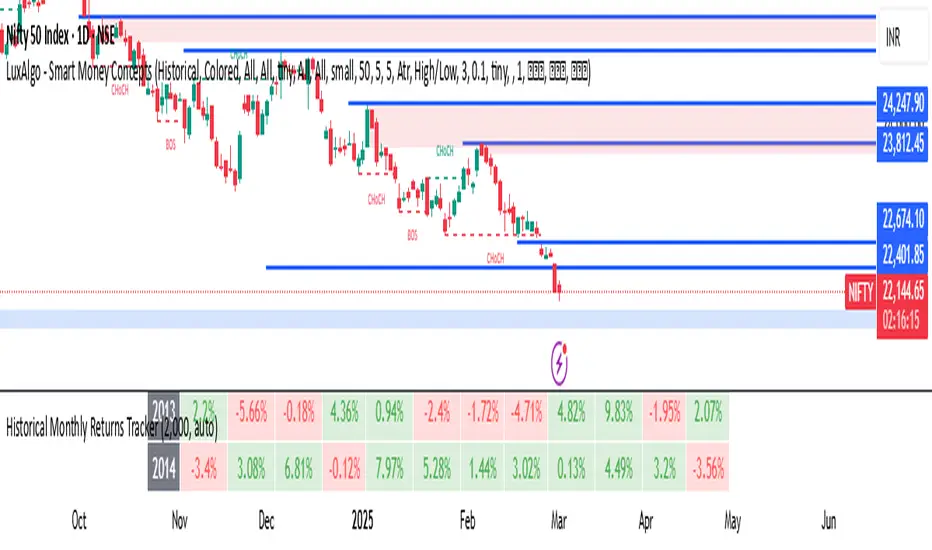
Oracle Fear and GreedCustom Fear and Greed Oscillator with Movement Table
This indicator provides a unique perspective on market sentiment by calculating a custom fear/greed oscillator based on Heikin-Ashi candles. The oscillator is centered at 50, with values above 50 suggesting bullish sentiment ("greed") and below 50 indicating bearish sentiment ("fear"). The calculation incorporates candle body size, range, and a custom "candle strength" measure, providing an innovative approach to understanding market behavior.
Key Features:
Heikin-Ashi Based Oscillator:
Utilizes Heikin-Ashi candles to compute a custom oscillator. The value is centered at 50, with deviations indicating the prevailing market sentiment.
Dynamic Gradient Coloring:
The oscillator line is dynamically colored with a smooth gradient—from blue (representing fear) at lower values to pink (representing greed) at higher values—making it visually intuitive.
Horizontal Levels:
Two additional horizontal lines are drawn at 40.62 ("Bottom") and 60.74 ("Top"), which may serve as potential oversold and overbought boundaries respectively.
Fast Movement Metrics:
Every 5 bars, the indicator calculates the percentage change in the Heikin-Ashi close. This fast movement analysis distinguishes rapid downward moves (fast fear) from rapid upward moves (fast greed), helping to capture sudden market shifts.
Information Table:
A table in the top-right corner displays the most recent fast movement values for both fear and greed, offering quick insights into short-term market dynamics.
Usage Tips:
Adjust the smoothing period to match your preferred trading timeframe.
Use the oscillator alongside other analysis tools for more robust trading decisions.
Ideal for those looking to experiment with new approaches to sentiment analysis and momentum detection.
Disclaimer:
This indicator is intended for educational and experimental purposes. It should not be used as the sole basis for any trading decisions. Always combine with comprehensive market analysis and risk management strategies.
You can add this description when publishing your indicator on TradingView to help other users understand its features and intended use.
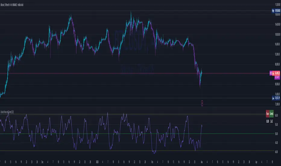
Power Play Signal Indicator [Masky18]Power Play Signal Indicator
The Power Play Signal Indicator is a sophisticated custom trading strategy designed to identify high-probability breakout and breakdown opportunities by combining consolidation detection, trend alignment, volume analysis, and relative strength ranking. Unlike simple mashups of existing indicators, this script integrates multiple technical concepts into a cohesive strategy that helps traders capitalize on market momentum with precision.
What Makes This Indicator Unique?
The PowerPlay Signal Indicator is not just a combination of existing indicators; it is a custom-built strategy that uses original logic to filter out low-probability setups and focus on high-quality trading opportunities. Here’s how it works:
Consolidation Detection:
The script identifies consolidation zones by analyzing price action over a user-defined period (default: 6 bars). It calculates the high, low, and midpoint of the consolidation range and ensures the price stays within a specified percentage range (default: 13%).
Consolidations are classified as Tight, Loose, or Okay, helping traders gauge the strength of the potential breakout or breakdown.
Breakout & Breakdown Logic:
Breakouts and breakdowns are confirmed using a combination of:
Price Action: The script checks if the price closes above the consolidation high (breakout) or below the consolidation low (breakdown).
Volume Analysis: A significant volume spike (default: 20% increase) is required to confirm the move.
MACD & Moving Averages: The script uses MACD and moving averages (50-day and 200-day) to ensure the breakout/breakdown aligns with the prevailing trend.
Trend Alignment:
The script ensures trades are aligned with the long-term trend by using:
50-day SMA and 200-day SMA to confirm uptrends or downtrends.
150-day SMA as an additional filter to ensure the trend is strong.
52-week high/low conditions to ensure the price is in a favorable position relative to its historical range.
Relative Strength Ranking:
The script compares the asset’s performance against a benchmark asset (e.g., SPY) to ensure it is outperforming the market. This is done using a customizable Relative Strength (RS) Threshold (default: 70).
Golden Candle Signals:
For high-probability setups, the script identifies Golden Candles—strong breakout or breakdown candles with:
Large price movement (default: 7.5% to 12.5% candle size).
High volume (default: 2x the average consolidation volume).
Alignment with MACD and moving averages.
Risk Management:
The script provides stop loss, trailing stop, and take profit levels based on:
ATR (Average True Range): Dynamic stop loss levels are calculated using ATR (default: 14-period ATR with a 2x multiplier).
Trailing Stop Percentage: User-defined trailing stop (default: 2%).
Take Profit Percentage: User-defined take profit (default: 5%).
Performance Tracking:
The script includes a Performance Table that tracks:
Total breakouts and breakdowns.
Successful and failed trades.
Win rates for breakouts and breakdowns.
Golden candle signals.
How Does It Work?
The PowerPlay Signal Indicator combines the following key components to generate signals:
Consolidation Detection:
The script calculates the high, low, and midpoint of the consolidation range over a user-defined period.
It ensures the price stays within a specified percentage range (default: 13%) to confirm consolidation.
Breakout/Breakdown Confirmation:
A breakout is confirmed when:
The price closes above the consolidation high.
Volume increases by at least 20%.
MACD is positive and above the signal line.
The price is above the 50-day and 200-day SMAs.
A breakdown is confirmed when:
The price closes below the consolidation low.
Volume increases by at least 20%.
MACD is negative and below the signal line.
The price is below the 50-day and 200-day SMAs.
Golden Candle Signals:
Golden Candles are identified when:
The candle size is between 7.5% and 12.5%.
Volume is at least 2x the average consolidation volume.
The candle aligns with the prevailing trend and MACD.
Risk Management:
Stop loss levels are calculated using ATR (default: 14-period ATR with a 2x multiplier).
Trailing stop and take profit levels are based on user-defined percentages.
How to Use the Indicator
Input Parameters:
Consolidation Periods: Set the number of bars to analyze for consolidation (default: 6).
Maximum Consolidation Range: Define the maximum percentage range for consolidation (default: 13%).
Stop Loss Factor: Adjust the stop loss multiplier based on the midpoint of the consolidation range (default: 0.985).
RS Threshold: Set the relative strength threshold for trend alignment (default: 70).
Comparison Asset: Enable comparison with a benchmark asset (e.g., SPY) to ensure the asset is outperforming the market.
Trailing Stop Percentage: Set the trailing stop percentage (default: 2%).
Take Profit Percentage: Set the take profit percentage (default: 5%).
Time Exit Bars: Define the maximum number of bars to hold a trade (default: 10).
Interpreting Signals:
Breakout Signal: A green label ("BO") appears when a breakout is detected.
Breakdown Signal: A red label ("BD") appears when a breakdown is detected.
Golden Candle Signal: A gold medal icon (🥇) appears for high-probability setups.
Performance Table:
The performance table displays the number of trades, successful trades, failed trades, and win rates for breakouts and breakdowns.
Alerts:
Enable alerts for breakouts, breakdowns, and golden candles to stay informed about potential trading opportunities.
Why Choose the PowerPlay Signal Indicator?
Original Logic: Combines consolidation detection, trend alignment, volume analysis, and relative strength ranking into a unique strategy.
High-Probability Signals: Focuses on high-quality setups with strong volume and trend alignment.
Risk Management: Built-in stop loss, trailing stop, and take profit options help you manage risk effectively.
Performance Tracking: Tracks trade outcomes and win rates to help you refine your strategy.
Customizable: Fully adjustable inputs allow you to adapt the indicator to your trading style and market conditions.

Multi-Asset & TF RSI
Multi-Asset & TF RSI
This indicator allows you to compare the Relative Strength Index (RSI) values of two different assets across multiple timeframes in a single pane. It’s ideal for traders who wish to monitor momentum across different markets or instruments simultaneously.
Key Features:
Primary Asset RSI:
The indicator automatically calculates the RSI for the chart’s asset. You can adjust the timeframe for this asset using a dropdown that offers standard TradingView timeframes, a "Chart" option (which syncs with your current chart timeframe), or a "Custom" option where you can enter any timeframe.
Optional Second Asset RSI:
Enable the “Display Second Asset” option to compare another asset’s RSI. Simply select the symbol (default is “DXY”) and choose its timeframe from an identical dropdown. When enabled, the second asset’s RSI is computed and plotted for easy comparison.
RSI Settings:
Customize the RSI length and choose the data source (e.g., close price) to suit your trading strategy.
Visual Aids:
Overbought (70) and oversold (30) levels are clearly marked, along with a midline at 50. These visual cues help you quickly assess market conditions.
Asset Information Table:
A dynamic table at the top of the pane displays the symbols being analysed – the chart’s asset as the “1st” asset and, if enabled, the second asset as the “2nd.”
How to Use:
Apply the Indicator:
Add the indicator to your chart. By default, it will calculate the RSI for the chart’s current asset using your chart’s timeframe.
Adjust Primary Asset Settings:
Use the “Main Asset Timeframe” dropdown to choose the timeframe for the RSI calculation on the chart asset. Select “Chart” to automatically match your current chart’s timeframe or choose a preset/custom timeframe.
Enable and Configure the Second Asset:
Toggle the “Display Second Asset” option to enable the second asset’s RSI. Select the asset symbol and its desired timeframe using the provided dropdown. The RSI for the second asset will be plotted if enabled.
Monitor the RSI Values:
Observe the plotted RSI lines along with the overbought/oversold levels. Use the table at the top-centre of the pane to verify which asset symbols are being displayed.
This versatile tool is designed to support multi-asset analysis and can be a valuable addition to your technical analysis toolkit. Enjoy enhanced RSI comparison across markets and timeframes!
Happy Trading!

52-Week & 5-Year High/Low with DatesThis indicator is designed to help traders quickly identify key price levels and their historical context by displaying the 52-week high/low and 5-year high/low prices along with their respective dates. It provides a clear visual representation of these levels directly on the chart and in a dashboard table for easy reference.
Key Features
52-Week High/Low:
Displays the highest and lowest prices over the last 252 trading days (approximately 52 weeks).
Includes the exact date when these levels were reached.
5-Year High/Low:
Displays the highest and lowest prices over the last 1260 trading days (approximately 5 years).
Includes the exact date when these levels were reached.
Visual Labels:
High and low levels are marked on the chart with labels that include the price and date.
Dashboard Table:
A table in the top-right corner of the chart summarizes the 52-week and 5-year high/low prices and their dates for quick reference.
Customizable Date Format:
Dates are displayed in the YYYY-MM-DD format for clarity and consistency.
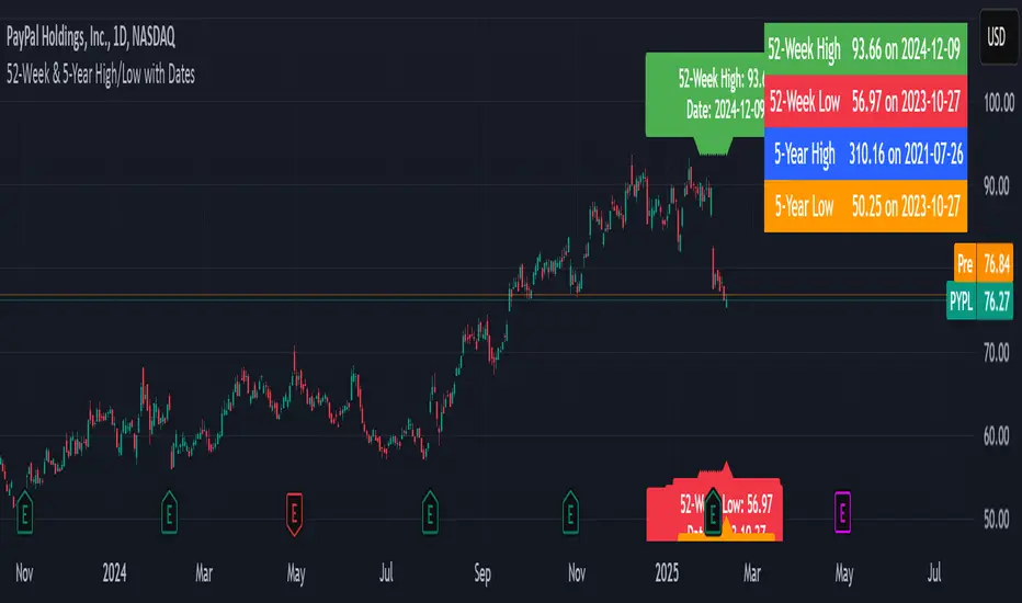
Level based on elasticityDaily Variation Indicator and Probability Levels (SD)
This indicator calculates and displays the daily variation of an asset (open/close and high/low spread), as well as probability levels based on the standard deviations (SD) of past variations. It provides a clear view of daily trends and the probability levels for the day's volatility.
Features:
Calculation of Daily Variations:
- Variation between the open and close.
- Difference between the highest and lowest prices of the day.
Probability Levels SD:
- SD+1, SD+2, SD+3 for upward moves.
- SD-1, SD-2, SD-3 for downward moves.
Display Customization:
- Option to display or hide the SD level lines.
- Option to color the background based on the day's variation (up or down).
- Customization of colors and line types.
Statistical Summary Table:
- Detailed information on variations and SD levels with options to display it in various positions (top/bottom, left/right).
Configuration Options:
SD Lines:
- Choose to display the lines for each probability level (SD+1, SD+2, SD+3 and their negative counterparts SD-1, SD-2, SD-3).
- Option to extend the lines to the right, left, or both.
Colors and Opacities:
- Lines can be colored to differentiate positive and negative levels.
- Transparent colored background for enhanced visibility of variations.
Table Position:
- Select where to display the statistical information table (e.g., top/right, bottom/right, etc.).
Advantages:
Helps visualize volatility and daily trends.
Quickly identifies days when movements are significantly above or below the historical average.
A practical tool for monitoring intraday variations.
Usage:
Particularly useful for short-term traders or anyone wanting to observe detailed daily fluctuations.
Ideal for enhancing volatility analysis and adjusting strategies based on market movements.

Reversal Opportunity📌 Indicator Description – Reversal Opportunity 🎯
🔍 General Overview
The Reversal Opportunity indicator is designed to identify ideal conditions for Reversal Trading, but it does not provide trade entry signals. Instead, it helps traders determine whether the market conditions are favorable for a potential reversal.
It is specifically designed for traders who execute Reversal trades (Long or Short) and want a clear indication of whether the market is currently suitable for such setups.
💡 What does this indicator do?
- Identifies strong momentum before a reversal (a sharp upward or downward move).
- Detects momentum slowdown (decreasing volume and smaller candles).
- Checks if the RSI is at an extreme level (above 70 or below 30), indicating potential overbought or oversold conditions.
- Displays a table at the top center of the screen with the following key data:
- Are the conditions for a reversal met?
- Is there a slowdown in momentum?
- Is RSI at an extreme level?
- Was there strong uptrend momentum before a possible Short Reversal?
- Was there strong downtrend momentum before a possible Long Reversal?
⚙️ How Does the Indicator Work?
The indicator displays a table in the center of the screen, updating every 5 candles to indicate whether the market conditions are ideal for a reversal trade.
📊 Main Status Row:
- ✔ Ideal Reversal Setup → Conditions for a reversal trade are met (not a trade recommendation).
- ✖ Not Ideal → Reversal conditions are not met; it may be better to wait.
📌 Key Criteria Displayed in the Table:
1. ⚠️ Momentum Slowdown
- Yes → Momentum is weakening (a good sign for reversal trades).
- No → The market is still moving strongly, and a reversal might not be ready yet.
2. 📈 RSI Extreme
- Yes → RSI is above 70 (overbought) or below 30 (oversold), indicating a potential reversal.
- No → RSI is still in a normal range, suggesting that waiting for further confirmation might be wise.
3. 📊 Uptrend Momentum Before Reversal
- Yes → There was a strong uptrend over multiple consecutive candles, potentially setting up for a Short Reversal.
- No → No strong upward momentum was detected, meaning conditions for a Short Reversal may not be ideal.
4. 📉 Downtrend Momentum Before Reversal
- Yes → There was a strong downtrend over multiple consecutive candles, potentially setting up for a Long Reversal.
- No → No strong downward momentum was detected, meaning conditions for a Long Reversal may not be ideal.
🛠️ How to Use the Indicator?
- If "✔ Ideal Reversal Setup" appears, there is a high probability of a market reversal – use your personal entry strategy for further confirmation.
- If Momentum Slowdown = Yes, RSI Extreme = Yes, and strong momentum occurred beforehand, this is an ideal setup for a reversal trade.
- If any conditions are missing ("No"), it may be better to wait for further confirmation instead of entering too early.
- The indicator does NOT provide trade entries! Use your existing trading system for confirmation before entering a trade.
👥 Who Is This Indicator For?
- Reversal traders (entering against the current trend after a strong move).
- Intraday traders looking for reversal trades at extreme market levels.
- Technical traders who rely on Price Action and Volume for trade setups.
⚠️ Disclaimer:
This indicator does not recommend trade entries but provides insight into market conditions. The trader is responsible for risk management and decision-making.
It is best used in combination with additional confirmations such as reversal candles, Order Flow, Bookmap, or Volume Profile to improve accuracy.
🚀 The indicator is ready to use – add it to TradingView and get instant feedback on whether the market is ideal for a Reversal trade!
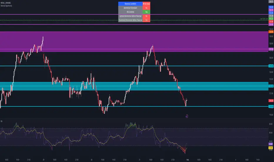
Trend Matrix - XTrend Matrix - X: Advanced Market Trend Analysis
Introduction: Trend Matrix - X is a powerful indicator designed to provide a comprehensive view of market trends, state transitions, and dynamics. By integrating advanced algorithms, statistical methods, and smoothing techniques, it identifies Bullish, Bearish, or Ranging market states while offering deep insights into trend behavior.
This indicator is ideal for traders seeking a balance between noise reduction and real-time responsiveness, with configurations that adapt dynamically to market conditions.
How It Works?
The indicator combines K-Median Clustering, Kalman Filtering, Fractal Dimension Analysis, and various regression techniques to provide actionable insights.
Market State Detection
- Divides data into three clusters: Bullish, Bearish, and Ranging.
- Uses K-Median Clustering to partition data based on medians, ensuring robust state classification even in volatile markets.
- Slope-Based Trend Analysis: Calculates trend slopes using Linear, Polynomial, or Exponential Regression. The slope represents the trend direction and strength, updated dynamically based on market conditions. It can apply Noise Reduction with Kalman Filter to balance stability and sensitivity
Dynamic Lookback Adjustment
- Automatically adjusts the analysis window length based on market stability, volatility, skewness, and kurtosis.
- This feature ensures the indicator remains responsive in fast-moving markets while providing stability in calmer conditions.
Fractal Dimension Measurement
- Calculates Katz Fractal Dimension to assess market roughness and choppiness.
- Helps identify periods of trend consistency versus noisy, range-bound markets.
Why Use Trend Matrix - X?
- Actionable Market States: Quickly determine whether the market is Bullish, Bearish, or Ranging.
- Advanced Smoothing: Reduces noise while maintaining trend-following precision.
- Dynamic Adaptation: Automatically adjusts to market conditions for consistent performance across varying environments.
- Customization: Configure regression type, lookback dynamics, and smoothing to suit your trading style.
- Integrated Visualization: Displays trend states, fractal dimensions, and cluster levels directly on the chart.
Configuration Options
Matrix Type (Raw or Filtered)
- Raw shows the unfiltered slope for real-time precision.
- Filtered applies Kalman smoothing for long-term trend clarity.
Regression Type
- Choose Linear, Polynomial, or Exponential Regression to calculate slopes based on your market strategy.
Dynamic Lookback Adjustment
- Enable Gradual Adjustment to smoothly adapt lookback periods in response to market volatility.
Noise Smoothing
- Toggle Smooth Market Noise to apply advanced filtering, balancing stability with responsiveness.
Cluster State Detection
- Visualize the current state of the market by coloring the candles to match the detected state.
How to Use the Trend Matrix - X Indicator
Step-by-Step Guide
Add the Indicator to Your Chart
- Once applied, it will display: Trend line (Trend Matrix) for identifying market direction, A state table showing the current market state (Bullish, Bearish, or Ranging), Cluster levels (High, Mid, and Low) for actionable price areas, Fractal dimension metrics to assess market choppiness or trend consistency.
Configure Your Settings
- Matrix Source (Raw vs. Filtered): Raw Matrix : Displays real-time, unsmoothed slope values for immediate precision. Ideal for fast-moving markets where rapid changes need to be tracked. Filtered Matrix : Applies advanced smoothing (Kalman Filter) for a clearer trend representation. Recommended for longer-term analysis or noisy markets
- Regression Type (Choose how the trend slope is calculated): Linear Regression : Tracks the average linear rate of change. Best for stable, straightforward trends. Polynomial Regression : Captures accelerating or decelerating trends with a curved fit. Ideal for dynamic, cyclical markets. Exponential Regression : Highlights compounding growth or decay rates. Perfect for parabolic trends or exponential moves.
- Market Noise Smoothing: Applies an adaptive (no lag) smoothing technique to the Matrix Source.
- Gradual Lookback Adjustment: Enable "Gradually Adjust Lookback" to allow the indicator to dynamically adapt its analysis window. (Indicator already does an automatic window, this just refines it).
Read the Outputs
- Trend Matrix Line: Upward Line (Bullish): Market is trending upward; look for buy opportunities. Downward Line (Bearish): Market is trending downward; look for sell opportunities.
- Cluster Levels: High Level (Cluster 0): Represents the upper bound of the trend, often used as a resistance level. Mid Level (Cluster 2): Serves as a key equilibrium point in the trend. Low Level (Cluster 1): Indicates the lower bound of the trend, often used as a support level.
- Market State Table: Displays the current state of the market. Bullish State: Strong upward trend, suitable for long positions. Bearish State: Strong downward trend, suitable for short positions. Ranging State: Sideways market, suitable for range-bound strategies.
- Fractal Dimension Analysis: Low Fractal Dimension (< 1.6): Indicates strong trend behavior; look for trend-following setups. High Fractal Dimension (> 1.6): Suggests choppy, noisy markets; focus on range-trading strategies.
Advanced Usage
- Adaptive Clustering: The indicator uses K-Median Clustering to dynamically identify Bullish, Bearish, and Ranging states based on market data. For traders interested in state transitions, monitor the cluster levels and the state table for actionable changes.
Trading Strategies
- Trend-Following: Use the Filtered Matrix and Fractal Dimension (< 1.6) to identify and follow strong trends. Enter long positions in Bullish States and short positions in Bearish States.
Disclaimer
I am not a professional market analyst, financial advisor, or trading expert. This indicator, Trend Matrix - X, is the result of personal research and development, created with the intention of contributing something that the trading community might find helpful.
It is important to note that this tool is experimental and provided "as-is" without any guarantees of accuracy, profitability, or suitability for any particular trading strategy. Trading involves significant financial risk, and past performance is not indicative of future results.
Users should exercise caution and use their own discretion when incorporating this indicator into their trading decisions. Always consult with a qualified financial advisor before making any financial or trading decisions.
By using this indicator, you acknowledge and accept full responsibility for your trading activities and outcomes. This tool is intended for educational and informational purposes only.
