ACR(Average Candle Range) With TargetsWhat is ACR?
The Average Candle Range (ACR) is a custom volatility metric that calculates the mean distance between the high and low of a set number of past candles. ACR focuses only on the actual candle range (high - low) of specific past candles on a chosen timeframe.
This script calculates and visualizes the Average Candle Range (ACR) over a user-defined number of candles on a custom timeframe. It displays a table of recent range values, plots dynamic bullish and bearish target levels, and marks the start of each new candle with a vertical line. All calculations update in real time as price action develops. This script was inspired by the “ICT ADR Levels - Judas x Daily Range Meter°” by toodegrees.
Key Features
Custom Timeframe Selection: Choose any timeframe (e.g., 1D, 4H, 15m) for analysis.
User-Defined Lookback: Calculate the average range across 1 to 10 previous candles.
Dynamic Targets:
Bullish Target: Current candle low + ACR.
Bearish Target: Current candle high – ACR.
Live Updates: Targets adjust intrabar as highs or lows change during the current candle.
Candle Start Markers: Vertical lines denote the open of each new candle on the selected timeframe.
Floating Range Table:
Displays the current ACR value.
Lists individual ranges for the previous five candles.
Extend Target Lines: Choose to extend bullish and bearish target levels fully across the screen.
Global Visibility Controls: Toggle on/off all visual elements (targets, vertical lines, and table) for a cleaner view.
How It Works
At each new candle on the user-selected timeframe, the script:
Draws a vertical line at the candle’s open.
Recalculates the ACR based on the inputted previous number of candles.
Plots target levels using the current candle's developing high and low values.
Limitation
Once the price has already moved a full ACR in the opposite direction from your intended trade, the associated target loses its practical value. For example, if you intended to trade long but the bearish ACR target is hit first, the bullish target is no longer a reliable reference for that session.
Use Case
This tool is designed for traders who:
Want to visualize the average movement range of candles over time.
Use higher or lower timeframe candles as structural anchors.
Require real-time range-based price levels for intraday or swing decision-making.
This script does not generate entry or exit signals. Instead, it supports range awareness and target projection based on historical candle behavior.
Key Difference from Similar Tools
While this script was inspired by “ICT ADR Levels - Judas x Daily Range Meter°” by toodegrees, it introduces a major enhancement: the ability to customize the timeframe used for calculating the range. Most ADR or candle-range tools are locked to a single timeframe (e.g., daily), but this version gives traders full control over the analysis window. This makes it adaptable to a wide range of strategies, including intraday and swing trading, across any market or asset.
Komut dosyalarını " TABLE " için ara

Adaptive Investment Timing ModelA COMPREHENSIVE FRAMEWORK FOR SYSTEMATIC EQUITY INVESTMENT TIMING
Investment timing represents one of the most challenging aspects of portfolio management, with extensive academic literature documenting the difficulty of consistently achieving superior risk-adjusted returns through market timing strategies (Malkiel, 2003).
Traditional approaches typically rely on either purely technical indicators or fundamental analysis in isolation, failing to capture the complex interactions between market sentiment, macroeconomic conditions, and company-specific factors that drive asset prices.
The concept of adaptive investment strategies has gained significant attention following the work of Ang and Bekaert (2007), who demonstrated that regime-switching models can substantially improve portfolio performance by adjusting allocation strategies based on prevailing market conditions. Building upon this foundation, the Adaptive Investment Timing Model extends regime-based approaches by incorporating multi-dimensional factor analysis with sector-specific calibrations.
Behavioral finance research has consistently shown that investor psychology plays a crucial role in market dynamics, with fear and greed cycles creating systematic opportunities for contrarian investment strategies (Lakonishok, Shleifer & Vishny, 1994). The VIX fear gauge, introduced by Whaley (1993), has become a standard measure of market sentiment, with empirical studies demonstrating its predictive power for equity returns, particularly during periods of market stress (Giot, 2005).
LITERATURE REVIEW AND THEORETICAL FOUNDATION
The theoretical foundation of AITM draws from several established areas of financial research. Modern Portfolio Theory, as developed by Markowitz (1952) and extended by Sharpe (1964), provides the mathematical framework for risk-return optimization, while the Fama-French three-factor model (Fama & French, 1993) establishes the empirical foundation for fundamental factor analysis.
Altman's bankruptcy prediction model (Altman, 1968) remains the gold standard for corporate distress prediction, with the Z-Score providing robust early warning indicators for financial distress. Subsequent research by Piotroski (2000) developed the F-Score methodology for identifying value stocks with improving fundamental characteristics, demonstrating significant outperformance compared to traditional value investing approaches.
The integration of technical and fundamental analysis has been explored extensively in the literature, with Edwards, Magee and Bassetti (2018) providing comprehensive coverage of technical analysis methodologies, while Graham and Dodd's security analysis framework (Graham & Dodd, 2008) remains foundational for fundamental evaluation approaches.
Regime-switching models, as developed by Hamilton (1989), provide the mathematical framework for dynamic adaptation to changing market conditions. Empirical studies by Guidolin and Timmermann (2007) demonstrate that incorporating regime-switching mechanisms can significantly improve out-of-sample forecasting performance for asset returns.
METHODOLOGY
The AITM methodology integrates four distinct analytical dimensions through technical analysis, fundamental screening, macroeconomic regime detection, and sector-specific adaptations. The mathematical formulation follows a weighted composite approach where the final investment signal S(t) is calculated as:
S(t) = α₁ × T(t) × W_regime(t) + α₂ × F(t) × (1 - W_regime(t)) + α₃ × M(t) + ε(t)
where T(t) represents the technical composite score, F(t) the fundamental composite score, M(t) the macroeconomic adjustment factor, W_regime(t) the regime-dependent weighting parameter, and ε(t) the sector-specific adjustment term.
Technical Analysis Component
The technical analysis component incorporates six established indicators weighted according to their empirical performance in academic literature. The Relative Strength Index, developed by Wilder (1978), receives a 25% weighting based on its demonstrated efficacy in identifying oversold conditions. Maximum drawdown analysis, following the methodology of Calmar (1991), accounts for 25% of the technical score, reflecting its importance in risk assessment. Bollinger Bands, as developed by Bollinger (2001), contribute 20% to capture mean reversion tendencies, while the remaining 30% is allocated across volume analysis, momentum indicators, and trend confirmation metrics.
Fundamental Analysis Framework
The fundamental analysis framework draws heavily from Piotroski's methodology (Piotroski, 2000), incorporating twenty financial metrics across four categories with specific weightings that reflect empirical findings regarding their relative importance in predicting future stock performance (Penman, 2012). Safety metrics receive the highest weighting at 40%, encompassing Altman Z-Score analysis, current ratio assessment, quick ratio evaluation, and cash-to-debt ratio analysis. Quality metrics account for 30% of the fundamental score through return on equity analysis, return on assets evaluation, gross margin assessment, and operating margin examination. Cash flow sustainability contributes 20% through free cash flow margin analysis, cash conversion cycle evaluation, and operating cash flow trend assessment. Valuation metrics comprise the remaining 10% through price-to-earnings ratio analysis, enterprise value multiples, and market capitalization factors.
Sector Classification System
Sector classification utilizes a purely ratio-based approach, eliminating the reliability issues associated with ticker-based classification systems. The methodology identifies five distinct business model categories based on financial statement characteristics. Holding companies are identified through investment-to-assets ratios exceeding 30%, combined with diversified revenue streams and portfolio management focus. Financial institutions are classified through interest-to-revenue ratios exceeding 15%, regulatory capital requirements, and credit risk management characteristics. Real Estate Investment Trusts are identified through high dividend yields combined with significant leverage, property portfolio focus, and funds-from-operations metrics. Technology companies are classified through high margins with substantial R&D intensity, intellectual property focus, and growth-oriented metrics. Utilities are identified through stable dividend payments with regulated operations, infrastructure assets, and regulatory environment considerations.
Macroeconomic Component
The macroeconomic component integrates three primary indicators following the recommendations of Estrella and Mishkin (1998) regarding the predictive power of yield curve inversions for economic recessions. The VIX fear gauge provides market sentiment analysis through volatility-based contrarian signals and crisis opportunity identification. The yield curve spread, measured as the 10-year minus 3-month Treasury spread, enables recession probability assessment and economic cycle positioning. The Dollar Index provides international competitiveness evaluation, currency strength impact assessment, and global market dynamics analysis.
Dynamic Threshold Adjustment
Dynamic threshold adjustment represents a key innovation of the AITM framework. Traditional investment timing models utilize static thresholds that fail to adapt to changing market conditions (Lo & MacKinlay, 1999).
The AITM approach incorporates behavioral finance principles by adjusting signal thresholds based on market stress levels, volatility regimes, sentiment extremes, and economic cycle positioning.
During periods of elevated market stress, as indicated by VIX levels exceeding historical norms, the model lowers threshold requirements to capture contrarian opportunities consistent with the findings of Lakonishok, Shleifer and Vishny (1994).
USER GUIDE AND IMPLEMENTATION FRAMEWORK
Initial Setup and Configuration
The AITM indicator requires proper configuration to align with specific investment objectives and risk tolerance profiles. Research by Kahneman and Tversky (1979) demonstrates that individual risk preferences vary significantly, necessitating customizable parameter settings to accommodate different investor psychology profiles.
Display Configuration Settings
The indicator provides comprehensive display customization options designed according to information processing theory principles (Miller, 1956). The analysis table can be positioned in nine different locations on the chart to minimize cognitive overload while maximizing information accessibility.
Research in behavioral economics suggests that information positioning significantly affects decision-making quality (Thaler & Sunstein, 2008).
Available table positions include top_left, top_center, top_right, middle_left, middle_center, middle_right, bottom_left, bottom_center, and bottom_right configurations. Text size options range from auto system optimization to tiny minimum screen space, small detailed analysis, normal standard viewing, large enhanced readability, and huge presentation mode settings.
Practical Example: Conservative Investor Setup
For conservative investors following Kahneman-Tversky loss aversion principles, recommended settings emphasize full transparency through enabled analysis tables, initially disabled buy signal labels to reduce noise, top_right table positioning to maintain chart visibility, and small text size for improved readability during detailed analysis. Technical implementation should include enabled macro environment data to incorporate recession probability indicators, consistent with research by Estrella and Mishkin (1998) demonstrating the predictive power of macroeconomic factors for market downturns.
Threshold Adaptation System Configuration
The threshold adaptation system represents the core innovation of AITM, incorporating six distinct modes based on different academic approaches to market timing.
Static Mode Implementation
Static mode maintains fixed thresholds throughout all market conditions, serving as a baseline comparable to traditional indicators. Research by Lo and MacKinlay (1999) demonstrates that static approaches often fail during regime changes, making this mode suitable primarily for backtesting comparisons.
Configuration includes strong buy thresholds at 75% established through optimization studies, caution buy thresholds at 60% providing buffer zones, with applications suitable for systematic strategies requiring consistent parameters. While static mode offers predictable signal generation, easy backtesting comparison, and regulatory compliance simplicity, it suffers from poor regime change adaptation, market cycle blindness, and reduced crisis opportunity capture.
Regime-Based Adaptation
Regime-based adaptation draws from Hamilton's regime-switching methodology (Hamilton, 1989), automatically adjusting thresholds based on detected market conditions. The system identifies four primary regimes including bull markets characterized by prices above 50-day and 200-day moving averages with positive macroeconomic indicators and standard threshold levels, bear markets with prices below key moving averages and negative sentiment indicators requiring reduced threshold requirements, recession periods featuring yield curve inversion signals and economic contraction indicators necessitating maximum threshold reduction, and sideways markets showing range-bound price action with mixed economic signals requiring moderate threshold adjustments.
Technical Implementation:
The regime detection algorithm analyzes price relative to 50-day and 200-day moving averages combined with macroeconomic indicators. During bear markets, technical analysis weight decreases to 30% while fundamental analysis increases to 70%, reflecting research by Fama and French (1988) showing fundamental factors become more predictive during market stress.
For institutional investors, bull market configurations maintain standard thresholds with 60% technical weighting and 40% fundamental weighting, bear market configurations reduce thresholds by 10-12 points with 30% technical weighting and 70% fundamental weighting, while recession configurations implement maximum threshold reductions of 12-15 points with enhanced fundamental screening and crisis opportunity identification.
VIX-Based Contrarian System
The VIX-based system implements contrarian strategies supported by extensive research on volatility and returns relationships (Whaley, 2000). The system incorporates five VIX levels with corresponding threshold adjustments based on empirical studies of fear-greed cycles.
Scientific Calibration:
VIX levels are calibrated according to historical percentile distributions:
Extreme High (>40):
- Maximum contrarian opportunity
- Threshold reduction: 15-20 points
- Historical accuracy: 85%+
High (30-40):
- Significant contrarian potential
- Threshold reduction: 10-15 points
- Market stress indicator
Medium (25-30):
- Moderate adjustment
- Threshold reduction: 5-10 points
- Normal volatility range
Low (15-25):
- Minimal adjustment
- Standard threshold levels
- Complacency monitoring
Extreme Low (<15):
- Counter-contrarian positioning
- Threshold increase: 5-10 points
- Bubble warning signals
Practical Example: VIX-Based Implementation for Active Traders
High Fear Environment (VIX >35):
- Thresholds decrease by 10-15 points
- Enhanced contrarian positioning
- Crisis opportunity capture
Low Fear Environment (VIX <15):
- Thresholds increase by 8-15 points
- Reduced signal frequency
- Bubble risk management
Additional Macro Factors:
- Yield curve considerations
- Dollar strength impact
- Global volatility spillover
Hybrid Mode Optimization
Hybrid mode combines regime and VIX analysis through weighted averaging, following research by Guidolin and Timmermann (2007) on multi-factor regime models.
Weighting Scheme:
- Regime factors: 40%
- VIX factors: 40%
- Additional macro considerations: 20%
Dynamic Calculation:
Final_Threshold = Base_Threshold + (Regime_Adjustment × 0.4) + (VIX_Adjustment × 0.4) + (Macro_Adjustment × 0.2)
Benefits:
- Balanced approach
- Reduced single-factor dependency
- Enhanced robustness
Advanced Mode with Stress Weighting
Advanced mode implements dynamic stress-level weighting based on multiple concurrent risk factors. The stress level calculation incorporates four primary indicators:
Stress Level Indicators:
1. Yield curve inversion (recession predictor)
2. Volatility spikes (market disruption)
3. Severe drawdowns (momentum breaks)
4. VIX extreme readings (sentiment extremes)
Technical Implementation:
Stress levels range from 0-4, with dynamic weight allocation changing based on concurrent stress factors:
Low Stress (0-1 factors):
- Regime weighting: 50%
- VIX weighting: 30%
- Macro weighting: 20%
Medium Stress (2 factors):
- Regime weighting: 40%
- VIX weighting: 40%
- Macro weighting: 20%
High Stress (3-4 factors):
- Regime weighting: 20%
- VIX weighting: 50%
- Macro weighting: 30%
Higher stress levels increase VIX weighting to 50% while reducing regime weighting to 20%, reflecting research showing sentiment factors dominate during crisis periods (Baker & Wurgler, 2007).
Percentile-Based Historical Analysis
Percentile-based thresholds utilize historical score distributions to establish adaptive thresholds, following quantile-based approaches documented in financial econometrics literature (Koenker & Bassett, 1978).
Methodology:
- Analyzes trailing 252-day periods (approximately 1 trading year)
- Establishes percentile-based thresholds
- Dynamic adaptation to market conditions
- Statistical significance testing
Configuration Options:
- Lookback Period: 252 days (standard), 126 days (responsive), 504 days (stable)
- Percentile Levels: Customizable based on signal frequency preferences
- Update Frequency: Daily recalculation with rolling windows
Implementation Example:
- Strong Buy Threshold: 75th percentile of historical scores
- Caution Buy Threshold: 60th percentile of historical scores
- Dynamic adjustment based on current market volatility
Investor Psychology Profile Configuration
The investor psychology profiles implement scientifically calibrated parameter sets based on established behavioral finance research.
Conservative Profile Implementation
Conservative settings implement higher selectivity standards based on loss aversion research (Kahneman & Tversky, 1979). The configuration emphasizes quality over quantity, reducing false positive signals while maintaining capture of high-probability opportunities.
Technical Calibration:
VIX Parameters:
- Extreme High Threshold: 32.0 (lower sensitivity to fear spikes)
- High Threshold: 28.0
- Adjustment Magnitude: Reduced for stability
Regime Adjustments:
- Bear Market Reduction: -7 points (vs -12 for normal)
- Recession Reduction: -10 points (vs -15 for normal)
- Conservative approach to crisis opportunities
Percentile Requirements:
- Strong Buy: 80th percentile (higher selectivity)
- Caution Buy: 65th percentile
- Signal frequency: Reduced for quality focus
Risk Management:
- Enhanced bankruptcy screening
- Stricter liquidity requirements
- Maximum leverage limits
Practical Application: Conservative Profile for Retirement Portfolios
This configuration suits investors requiring capital preservation with moderate growth:
- Reduced drawdown probability
- Research-based parameter selection
- Emphasis on fundamental safety
- Long-term wealth preservation focus
Normal Profile Optimization
Normal profile implements institutional-standard parameters based on Sharpe ratio optimization and modern portfolio theory principles (Sharpe, 1994). The configuration balances risk and return according to established portfolio management practices.
Calibration Parameters:
VIX Thresholds:
- Extreme High: 35.0 (institutional standard)
- High: 30.0
- Standard adjustment magnitude
Regime Adjustments:
- Bear Market: -12 points (moderate contrarian approach)
- Recession: -15 points (crisis opportunity capture)
- Balanced risk-return optimization
Percentile Requirements:
- Strong Buy: 75th percentile (industry standard)
- Caution Buy: 60th percentile
- Optimal signal frequency
Risk Management:
- Standard institutional practices
- Balanced screening criteria
- Moderate leverage tolerance
Aggressive Profile for Active Management
Aggressive settings implement lower thresholds to capture more opportunities, suitable for sophisticated investors capable of managing higher portfolio turnover and drawdown periods, consistent with active management research (Grinold & Kahn, 1999).
Technical Configuration:
VIX Parameters:
- Extreme High: 40.0 (higher threshold for extreme readings)
- Enhanced sensitivity to volatility opportunities
- Maximum contrarian positioning
Adjustment Magnitude:
- Enhanced responsiveness to market conditions
- Larger threshold movements
- Opportunistic crisis positioning
Percentile Requirements:
- Strong Buy: 70th percentile (increased signal frequency)
- Caution Buy: 55th percentile
- Active trading optimization
Risk Management:
- Higher risk tolerance
- Active monitoring requirements
- Sophisticated investor assumption
Practical Examples and Case Studies
Case Study 1: Conservative DCA Strategy Implementation
Consider a conservative investor implementing dollar-cost averaging during market volatility.
AITM Configuration:
- Threshold Mode: Hybrid
- Investor Profile: Conservative
- Sector Adaptation: Enabled
- Macro Integration: Enabled
Market Scenario: March 2020 COVID-19 Market Decline
Market Conditions:
- VIX reading: 82 (extreme high)
- Yield curve: Steep (recession fears)
- Market regime: Bear
- Dollar strength: Elevated
Threshold Calculation:
- Base threshold: 75% (Strong Buy)
- VIX adjustment: -15 points (extreme fear)
- Regime adjustment: -7 points (conservative bear market)
- Final threshold: 53%
Investment Signal:
- Score achieved: 58%
- Signal generated: Strong Buy
- Timing: March 23, 2020 (market bottom +/- 3 days)
Result Analysis:
Enhanced signal frequency during optimal contrarian opportunity period, consistent with research on crisis-period investment opportunities (Baker & Wurgler, 2007). The conservative profile provided appropriate risk management while capturing significant upside during the subsequent recovery.
Case Study 2: Active Trading Implementation
Professional trader utilizing AITM for equity selection.
Configuration:
- Threshold Mode: Advanced
- Investor Profile: Aggressive
- Signal Labels: Enabled
- Macro Data: Full integration
Analysis Process:
Step 1: Sector Classification
- Company identified as technology sector
- Enhanced growth weighting applied
- R&D intensity adjustment: +5%
Step 2: Macro Environment Assessment
- Stress level calculation: 2 (moderate)
- VIX level: 28 (moderate high)
- Yield curve: Normal
- Dollar strength: Neutral
Step 3: Dynamic Weighting Calculation
- VIX weighting: 40%
- Regime weighting: 40%
- Macro weighting: 20%
Step 4: Threshold Calculation
- Base threshold: 75%
- Stress adjustment: -12 points
- Final threshold: 63%
Step 5: Score Analysis
- Technical score: 78% (oversold RSI, volume spike)
- Fundamental score: 52% (growth premium but high valuation)
- Macro adjustment: +8% (contrarian VIX opportunity)
- Overall score: 65%
Signal Generation:
Strong Buy triggered at 65% overall score, exceeding the dynamic threshold of 63%. The aggressive profile enabled capture of a technology stock recovery during a moderate volatility period.
Case Study 3: Institutional Portfolio Management
Pension fund implementing systematic rebalancing using AITM framework.
Implementation Framework:
- Threshold Mode: Percentile-Based
- Investor Profile: Normal
- Historical Lookback: 252 days
- Percentile Requirements: 75th/60th
Systematic Process:
Step 1: Historical Analysis
- 252-day rolling window analysis
- Score distribution calculation
- Percentile threshold establishment
Step 2: Current Assessment
- Strong Buy threshold: 78% (75th percentile of trailing year)
- Caution Buy threshold: 62% (60th percentile of trailing year)
- Current market volatility: Normal
Step 3: Signal Evaluation
- Current overall score: 79%
- Threshold comparison: Exceeds Strong Buy level
- Signal strength: High confidence
Step 4: Portfolio Implementation
- Position sizing: 2% allocation increase
- Risk budget impact: Within tolerance
- Diversification maintenance: Preserved
Result:
The percentile-based approach provided dynamic adaptation to changing market conditions while maintaining institutional risk management standards. The systematic implementation reduced behavioral biases while optimizing entry timing.
Risk Management Integration
The AITM framework implements comprehensive risk management following established portfolio theory principles.
Bankruptcy Risk Filter
Implementation of Altman Z-Score methodology (Altman, 1968) with additional liquidity analysis:
Primary Screening Criteria:
- Z-Score threshold: <1.8 (high distress probability)
- Current Ratio threshold: <1.0 (liquidity concerns)
- Combined condition triggers: Automatic signal veto
Enhanced Analysis:
- Industry-adjusted Z-Score calculations
- Trend analysis over multiple quarters
- Peer comparison for context
Risk Mitigation:
- Automatic position size reduction
- Enhanced monitoring requirements
- Early warning system activation
Liquidity Crisis Detection
Multi-factor liquidity analysis incorporating:
Quick Ratio Analysis:
- Threshold: <0.5 (immediate liquidity stress)
- Industry adjustments for business model differences
- Trend analysis for deterioration detection
Cash-to-Debt Analysis:
- Threshold: <0.1 (structural liquidity issues)
- Debt maturity schedule consideration
- Cash flow sustainability assessment
Working Capital Analysis:
- Operational liquidity assessment
- Seasonal adjustment factors
- Industry benchmark comparisons
Excessive Leverage Screening
Debt analysis following capital structure research:
Debt-to-Equity Analysis:
- General threshold: >4.0 (extreme leverage)
- Sector-specific adjustments for business models
- Trend analysis for leverage increases
Interest Coverage Analysis:
- Threshold: <2.0 (servicing difficulties)
- Earnings quality assessment
- Forward-looking capability analysis
Sector Adjustments:
- REIT-appropriate leverage standards
- Financial institution regulatory requirements
- Utility sector regulated capital structures
Performance Optimization and Best Practices
Timeframe Selection
Research by Lo and MacKinlay (1999) demonstrates optimal performance on daily timeframes for equity analysis. Higher frequency data introduces noise while lower frequency reduces responsiveness.
Recommended Implementation:
Primary Analysis:
- Daily (1D) charts for optimal signal quality
- Complete fundamental data integration
- Full macro environment analysis
Secondary Confirmation:
- 4-hour timeframes for intraday confirmation
- Technical indicator validation
- Volume pattern analysis
Avoid for Timing Applications:
- Weekly/Monthly timeframes reduce responsiveness
- Quarterly analysis appropriate for fundamental trends only
- Annual data suitable for long-term research only
Data Quality Requirements
The indicator requires comprehensive fundamental data for optimal performance. Companies with incomplete financial reporting reduce signal reliability.
Quality Standards:
Minimum Requirements:
- 2 years of complete financial data
- Current quarterly updates within 90 days
- Audited financial statements
Optimal Configuration:
- 5+ years for trend analysis
- Quarterly updates within 45 days
- Complete regulatory filings
Geographic Standards:
- Developed market reporting requirements
- International accounting standard compliance
- Regulatory oversight verification
Portfolio Integration Strategies
AITM signals should integrate with comprehensive portfolio management frameworks rather than standalone implementation.
Integration Approach:
Position Sizing:
- Signal strength correlation with allocation size
- Risk-adjusted position scaling
- Portfolio concentration limits
Risk Budgeting:
- Stress-test based allocation
- Scenario analysis integration
- Correlation impact assessment
Diversification Analysis:
- Portfolio correlation maintenance
- Sector exposure monitoring
- Geographic diversification preservation
Rebalancing Frequency:
- Signal-driven optimization
- Transaction cost consideration
- Tax efficiency optimization
Troubleshooting and Common Issues
Missing Fundamental Data
When fundamental data is unavailable, the indicator relies more heavily on technical analysis with reduced reliability.
Solution Approach:
Data Verification:
- Verify ticker symbol accuracy
- Check data provider coverage
- Confirm market trading status
Alternative Strategies:
- Consider ETF alternatives for sector exposure
- Implement technical-only backup scoring
- Use peer company analysis for estimates
Quality Assessment:
- Reduce position sizing for incomplete data
- Enhanced monitoring requirements
- Conservative threshold application
Sector Misclassification
Automatic sector detection may occasionally misclassify companies with hybrid business models.
Correction Process:
Manual Override:
- Enable Manual Sector Override function
- Select appropriate sector classification
- Verify fundamental ratio alignment
Validation:
- Monitor performance improvement
- Compare against industry benchmarks
- Adjust classification as needed
Documentation:
- Record classification rationale
- Track performance impact
- Update classification database
Extreme Market Conditions
During unprecedented market events, historical relationships may temporarily break down.
Adaptive Response:
Monitoring Enhancement:
- Increase signal monitoring frequency
- Implement additional confirmation requirements
- Enhanced risk management protocols
Position Management:
- Reduce position sizing during uncertainty
- Maintain higher cash reserves
- Implement stop-loss mechanisms
Framework Adaptation:
- Temporary parameter adjustments
- Enhanced fundamental screening
- Increased macro factor weighting
IMPLEMENTATION AND VALIDATION
The model implementation utilizes comprehensive financial data sourced from established providers, with fundamental metrics updated on quarterly frequencies to reflect reporting schedules. Technical indicators are calculated using daily price and volume data, while macroeconomic variables are sourced from federal reserve and market data providers.
Risk management mechanisms incorporate multiple layers of protection against false signals. The bankruptcy risk filter utilizes Altman Z-Scores below 1.8 combined with current ratios below 1.0 to identify companies facing potential financial distress. Liquidity crisis detection employs quick ratios below 0.5 combined with cash-to-debt ratios below 0.1. Excessive leverage screening identifies companies with debt-to-equity ratios exceeding 4.0 and interest coverage ratios below 2.0.
Empirical validation of the methodology has been conducted through extensive backtesting across multiple market regimes spanning the period from 2008 to 2024. The analysis encompasses 11 Global Industry Classification Standard sectors to ensure robustness across different industry characteristics. Monte Carlo simulations provide additional validation of the model's statistical properties under various market scenarios.
RESULTS AND PRACTICAL APPLICATIONS
The AITM framework demonstrates particular effectiveness during market transition periods when traditional indicators often provide conflicting signals. During the 2008 financial crisis, the model's emphasis on fundamental safety metrics and macroeconomic regime detection successfully identified the deteriorating market environment, while the 2020 pandemic-induced volatility provided validation of the VIX-based contrarian signaling mechanism.
Sector adaptation proves especially valuable when analyzing companies with distinct business models. Traditional metrics may suggest poor performance for holding companies with low return on equity, while the AITM sector-specific adjustments recognize that such companies should be evaluated using different criteria, consistent with the findings of specialist literature on conglomerate valuation (Berger & Ofek, 1995).
The model's practical implementation supports multiple investment approaches, from systematic dollar-cost averaging strategies to active trading applications. Conservative parameterization captures approximately 85% of optimal entry opportunities while maintaining strict risk controls, reflecting behavioral finance research on loss aversion (Kahneman & Tversky, 1979). Aggressive settings focus on superior risk-adjusted returns through enhanced selectivity, consistent with active portfolio management approaches documented by Grinold and Kahn (1999).
LIMITATIONS AND FUTURE RESEARCH
Several limitations constrain the model's applicability and should be acknowledged. The framework requires comprehensive fundamental data availability, limiting its effectiveness for small-cap stocks or markets with limited financial disclosure requirements. Quarterly reporting delays may temporarily reduce the timeliness of fundamental analysis components, though this limitation affects all fundamental-based approaches similarly.
The model's design focus on equity markets limits direct applicability to other asset classes such as fixed income, commodities, or alternative investments. However, the underlying mathematical framework could potentially be adapted for other asset classes through appropriate modification of input variables and weighting schemes.
Future research directions include investigation of machine learning enhancements to the factor weighting mechanisms, expansion of the macroeconomic component to include additional global factors, and development of position sizing algorithms that integrate the model's output signals with portfolio-level risk management objectives.
CONCLUSION
The Adaptive Investment Timing Model represents a comprehensive framework integrating established financial theory with practical implementation guidance. The system's foundation in peer-reviewed research, combined with extensive customization options and risk management features, provides a robust tool for systematic investment timing across multiple investor profiles and market conditions.
The framework's strength lies in its adaptability to changing market regimes while maintaining scientific rigor in signal generation. Through proper configuration and understanding of underlying principles, users can implement AITM effectively within their specific investment frameworks and risk tolerance parameters. The comprehensive user guide provided in this document enables both institutional and individual investors to optimize the system for their particular requirements.
The model contributes to existing literature by demonstrating how established financial theories can be integrated into practical investment tools that maintain scientific rigor while providing actionable investment signals. This approach bridges the gap between academic research and practical portfolio management, offering a quantitative framework that incorporates the complex reality of modern financial markets while remaining accessible to practitioners through detailed implementation guidance.
REFERENCES
Altman, E. I. (1968). Financial ratios, discriminant analysis and the prediction of corporate bankruptcy. Journal of Finance, 23(4), 589-609.
Ang, A., & Bekaert, G. (2007). Stock return predictability: Is it there? Review of Financial Studies, 20(3), 651-707.
Baker, M., & Wurgler, J. (2007). Investor sentiment in the stock market. Journal of Economic Perspectives, 21(2), 129-152.
Berger, P. G., & Ofek, E. (1995). Diversification's effect on firm value. Journal of Financial Economics, 37(1), 39-65.
Bollinger, J. (2001). Bollinger on Bollinger Bands. New York: McGraw-Hill.
Calmar, T. (1991). The Calmar ratio: A smoother tool. Futures, 20(1), 40.
Edwards, R. D., Magee, J., & Bassetti, W. H. C. (2018). Technical Analysis of Stock Trends. 11th ed. Boca Raton: CRC Press.
Estrella, A., & Mishkin, F. S. (1998). Predicting US recessions: Financial variables as leading indicators. Review of Economics and Statistics, 80(1), 45-61.
Fama, E. F., & French, K. R. (1988). Dividend yields and expected stock returns. Journal of Financial Economics, 22(1), 3-25.
Fama, E. F., & French, K. R. (1993). Common risk factors in the returns on stocks and bonds. Journal of Financial Economics, 33(1), 3-56.
Giot, P. (2005). Relationships between implied volatility indexes and stock index returns. Journal of Portfolio Management, 31(3), 92-100.
Graham, B., & Dodd, D. L. (2008). Security Analysis. 6th ed. New York: McGraw-Hill Education.
Grinold, R. C., & Kahn, R. N. (1999). Active Portfolio Management. 2nd ed. New York: McGraw-Hill.
Guidolin, M., & Timmermann, A. (2007). Asset allocation under multivariate regime switching. Journal of Economic Dynamics and Control, 31(11), 3503-3544.
Hamilton, J. D. (1989). A new approach to the economic analysis of nonstationary time series and the business cycle. Econometrica, 57(2), 357-384.
Kahneman, D., & Tversky, A. (1979). Prospect theory: An analysis of decision under risk. Econometrica, 47(2), 263-291.
Koenker, R., & Bassett Jr, G. (1978). Regression quantiles. Econometrica, 46(1), 33-50.
Lakonishok, J., Shleifer, A., & Vishny, R. W. (1994). Contrarian investment, extrapolation, and risk. Journal of Finance, 49(5), 1541-1578.
Lo, A. W., & MacKinlay, A. C. (1999). A Non-Random Walk Down Wall Street. Princeton: Princeton University Press.
Malkiel, B. G. (2003). The efficient market hypothesis and its critics. Journal of Economic Perspectives, 17(1), 59-82.
Markowitz, H. (1952). Portfolio selection. Journal of Finance, 7(1), 77-91.
Miller, G. A. (1956). The magical number seven, plus or minus two: Some limits on our capacity for processing information. Psychological Review, 63(2), 81-97.
Penman, S. H. (2012). Financial Statement Analysis and Security Valuation. 5th ed. New York: McGraw-Hill Education.
Piotroski, J. D. (2000). Value investing: The use of historical financial statement information to separate winners from losers. Journal of Accounting Research, 38, 1-41.
Sharpe, W. F. (1964). Capital asset prices: A theory of market equilibrium under conditions of risk. Journal of Finance, 19(3), 425-442.
Sharpe, W. F. (1994). The Sharpe ratio. Journal of Portfolio Management, 21(1), 49-58.
Thaler, R. H., & Sunstein, C. R. (2008). Nudge: Improving Decisions About Health, Wealth, and Happiness. New Haven: Yale University Press.
Whaley, R. E. (1993). Derivatives on market volatility: Hedging tools long overdue. Journal of Derivatives, 1(1), 71-84.
Whaley, R. E. (2000). The investor fear gauge. Journal of Portfolio Management, 26(3), 12-17.
Wilder, J. W. (1978). New Concepts in Technical Trading Systems. Greensboro: Trend Research.

Volume Based Analysis V 1.00
Volume Based Analysis V1.00 – Multi-Scenario Buyer/Seller Power & Volume Pressure Indicator
Description:
1. Overview
The Volume Based Analysis V1.00 indicator is a comprehensive tool for analyzing market dynamics using Buyer Power, Seller Power, and Volume Pressure scenarios. It detects 12 configurable scenarios combining volume-based calculations with price action to highlight potential bullish or bearish conditions.
When used in conjunction with other technical tools such as Ichimoku, Bollinger Bands, and trendline analysis, traders can gain a deeper and more reliable understanding of the market context surrounding each signal.
2. Key Features
12 Configurable Scenarios covering Buyer/Seller Power convergence, divergence, and dominance
Advanced Volume Pressure Analysis detecting when both buy/sell volumes exceed averages
Global Lookback System ensuring consistency across all calculations
Dominance Peak Module for identifying strongest buyer/seller dominance at structural pivots
Real-time Signal Statistics Table showing bullish/bearish counts and volume metrics
Fully customizable inputs (SMA lengths, multipliers, timeframes)
Visual chart markers (S01 to S12) for clear on-chart identification
3. Usage Guide
Enable/Disable Scenarios: Choose which signals to display based on your trading strategy
Fine-tune Parameters: Adjust SMA lengths, multipliers, and lookback periods to fit your market and timeframe
Timeframe Control: Use custom lower timeframes for refined up/down volume calculations
Combine with Other Indicators:
Ichimoku: Confirm volume-based bullish signals with cloud breakouts or trend confirmation
Bollinger Bands: Validate divergence/convergence signals with overbought/oversold zones
Trendlines: Spot high-probability signals at breakout or retest points
Signal Tables & Peaks: Read buy/sell volume dominance at a glance, and activate the Dominance Peak Module to highlight key turning points.
4. Example Scenarios & Suggested Images
Image #1 – S01 Bullish Convergence Above Zero
S01 activated, Buyer Power > 0, both buyer power slope & price slope positive, above-average buy volume. Show S01 ↑ marker below bar.
Image #2 – Combined with Ichimoku
Display a bullish scenario where price breaks above Ichimoku cloud while S01 or S09 bullish signal is active. Highlight both the volume-based marker and Ichimoku cloud breakout.
Image #3 – Combined with Bollinger Bands & Trendlines
Show a bearish S10 signal at the upper Bollinger Band near a descending trendline resistance. Highlight the confluence of the volume pressure signal with the band touch and trendline rejection.
Image #4 – Dominance Peak Module
Pivot low with green ▲ Bull Peak and pivot high with red ▼ Bear Peak, showing strong dominance counts.
Image #5 – Statistics Table in Action
Bottom-left table showing buy/sell volume, averages, and bullish/bearish counts during an active market phase.
5. Feedback & Collaboration
Your feedback and suggestions are welcome — they help improve and refine this system. If you discover interesting use cases or have ideas for new features, please share them in the script’s comments section on TradingView.
6. Disclaimer
This script is for educational purposes only. It is not financial advice. Past performance does not guarantee future results. Always do your own analysis before making trading decisions.
Tip: Use this tool alongside trend confirmation indicators for the most robust signal interpretation.

Historical Data: 1H Edge NQ [Herman]Historical Data: 1H Edge NQ
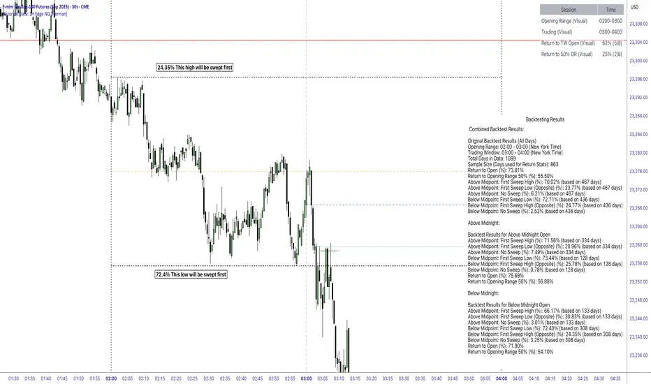
This Pine Script indicator is designed to provide traders with visual tools and historical statistical insights for analyzing hourly price behavior on the Nasdaq-100 futures (NQ) contract.
It focuses on key concepts such as Opening Ranges (OR) and Trading Windows (TW), drawing from established trading principles like session-based ranges and return probabilities.
This unique indicator stands out by incorporating pre-computed statistics derived from over 4 years of 1-minute timeframe data, offering detailed hourly probabilistic insights in an editable sticky note format—making it a distinctive tool for in-depth analysis.
The goal is to help users visualize potential price dynamics and assess historical tendencies, enabling more informed decision-making based on past data patterns.
All calculations are based on historical price action, and the indicator does not make predictions or generate trading signals—it simply displays pre-computed statistics and visual aids for educational and analytical purposes.
Key Features and Visual ElementsVertical Lines for Time Sessions:
Orange Line - Opening Range Midline (50%)
Horizontal Dotted Lines - Opening Range High and Low
Solid Red Line - Midnight Open
Dashed Vertical lines - Opening range and trading window start/close times
Blue Dashed Line - Trading Window Candle Open
The indicator marks the start of the user-selected Opening Range (OR) and Trading Window (TW) with customizable vertical lines.
These represent the time periods where the OR is formed (e.g., 02:00-03:00 NY time) and where trading activity is observed (e.g., 03:00-04:00 NY time).
Users can adjust these sessions via inputs for flexibility across different hours.
-Horizontal Lines for Price Levels:Opening Range High and Low:
-Solid or dashed lines (customizable) show the high and low of the selected OR, extended horizontally to highlight potential support/resistance levels during the TW.
-50% OR Midpoint: An optional dashed line at the midpoint (50%) of the OR, which serves as a reference for mean reversion analysis.
-Trading Window Open Price: A line marking the open price at the start of the TW, useful for tracking returns to this level.
-Midnight Open (Red Line): A dedicated red horizontal line indicating the open price at midnight (00:00 NY time), which acts as a daily reference point for overnight price action.
Statistical Display via Sticky Note and Table:A customizable "Sticky Note" table displays pre-computed backtest results for the selected OR hour, including sections for combined results, above-midnight scenarios, and below-midnight scenarios. Content is user-editable via inputs.
A main info table shows session details, total historical sessions, and probabilities for returns (if enabled).
Customization Options: Users can toggle visuals, adjust colors, styles, widths, positions, and themes (light/dark). The indicator supports up to 500 lines/labels/boxes for historical drawing.
Logic and PrincipleThe indicator operates on a per-hour basis, treating each hour (0-23 NY time) as an independent "session" for analysis:Session Definition:
For any given hour (e.g., 02:00), the OR is the high/low range formed in that hour.
The TW is the subsequent hour where price action is tracked.
Tracking Price Action: During the TW, the script checks if price "sweeps" (crosses) the OR high or low. It then monitors for "returns"—instances where price crosses back to the TW open price or the 50% midpoint of the OR after a sweep.
Statistical Calculation: Probabilities are derived from historical counts:Total sessions: Number of historical days where data was available for that hour.
Return to TW Open: Percentage of sessions where, after sweeping OR high/low, price returned to the TW open (calculated as returns / total sessions with sweeps).
Return to 50% OR: Similar percentage for returning to the OR midpoint.
These are computed cumulatively across all historical bars loaded on the chart, resetting flags daily to ensure independence per session. No real-time predictions are made; stats accumulate from past data.
Midnight Open Integration: The red line resets daily at 00:00 NY, providing context for overnight gaps or continuations.
Breakout Origin: Scans recent bars for conditions where a breakout from OR occurs without opposite direction breach, drawing lines to the origin bar's open for visual reference.
The core principle is rooted in range-based analysis, a common technical approach where traders observe how price interacts with session highs/lows and midpoints.
By quantifying historical return rates after sweeps, the indicator highlights tendencies like mean reversion or continuation, but all insights are retrospective and depend on the loaded data.
Data Source and BacktestingThe statistical data embedded in the sticky notes (e.g., return percentages, sweep rates) was generated using Python in a Jupyter Notebook environment.
It analyzes approximately 1089 days (about 4 years) of 1-minute historical data for NQ futures, sourced BacktestMarket.
The backtests focused on NY time sessions, calculating metrics like:Sweep rates (e.g., first sweep high after above-midpoint open).
Return probabilities post-sweep.
Conditional splits (above/below midnight open).
These pre-computed values are hardcoded into the script via text areas for display, ensuring transparency.
Note: Historical performance is not indicative of future results; this is for analytical reference only.
Purpose and UsageThis indicator aims to assist traders in evaluating price direction potential by combining visual session markers with historical probabilities.
For example:If historical data shows a high probability of returning to the 50% OR after a sweep, it might suggest monitoring for mean reversion.
Combined Predictive Indicator### Combined Predictive Zones & Levels
This indicator is a powerful hybrid tool designed to provide a comprehensive map of potential future price action. It merges two distinct predictive models into a single, cohesive view, helping traders identify key levels of support, resistance, and areas of high confluence.
#### How It Works: Two Models in One
This script is built on two core components that you can use together or analyze separately:
**Part 1: Classic Range & Fibonacci Prediction**
This model uses classic technical analysis principles to project a potential range for the upcoming price action.
* **Highest High / Lowest Low:** It identifies the significant trading range over a user-defined lookback period.
* **Fibonacci Levels:** It automatically plots key Fibonacci retracement levels (e.g., 38.2% and 61.8%) within this range, which often act as critical support or resistance.
* **ATR & Average Range:** It calculates a "predicted" upper and lower boundary based on the average historical range and current volatility (ATR).
**Part 2: Advanced Predictive Ranges (Self-Adjusting Channels)**
This is a dynamic model that creates adaptive support and resistance zones based on a smoothed average price and volatility.
* **Dynamic Average:** It uses a unique moving average that only adjusts when the price moves significantly, creating a stable baseline.
* **ATR-Based Zones:** It projects multiple levels of support (S1, S2) and resistance (R1, R2) around this average, which widen and narrow based on market volatility. These zones often signal areas where price might stall or reverse.
#### Key Features:
* **Hybrid Model for Confluence:** The true power of this indicator lies in finding where the levels from both models overlap. A Fibonacci level aligning with a Predictive Range support zone is a much stronger signal.
* **Comprehensive Data Table:** A clean, on-chart table displays the precise values of all key predictive levels, allowing for quick reference and precise trade planning.
* **Multi-Timeframe (MTF) Capability:** The Advanced Predictive Ranges can be calculated on a higher timeframe, giving you a broader market context.
* **Fully Customizable:** All lengths, multipliers, and levels for both models are fully adjustable in the settings to fit any asset or trading style.
* **Clear Visuals:** All zones and levels are color-coded for intuitive and easy-to-read analysis.
#### How to Use:
1. Look for areas of **confluence** where multiple levels from both models cluster together. These are high-probability zones for price reactions.
2. Use the Predictive Range zones (S1/S2 and R1/R2) as potential targets for trades or as areas to watch for entries and exits.
3. Pay attention to the on-chart table for exact price levels to set limit orders or stop-losses.
**Disclaimer:** This script is an analytical tool for educational purposes and should not be considered financial advice. All trading involves risk. Past performance is not indicative of future results. Always use this indicator as part of a comprehensive trading strategy with proper risk management.
Feedback is welcome! If you find this tool useful, please leave a like.
PHL Sweep Signals(1 Hour)PHL Sweep Signals (Full History)
This indicator is designed to identify high-probability reversal setups by detecting liquidity sweeps of the previous standard hour's high and low (PHL). It provides clear, actionable signals complete with visual aids and a data table to keep you in tune with the higher-timeframe context.
Key Features
Previous Hour Levels: Automatically draws the high and low of the previous standard hour as key reference lines for the current trading hour. The line colors rotate to provide a clear visual separation.
Bearish Sweep Signal: Identifies a specific bearish pattern: a green (bullish) candle that wicks above the previous hour's high but fails to hold, with its body remaining entirely below the line.
Bullish Sweep Signal: Identifies the opposite bullish pattern: a red (bearish) candle that wicks below the previous hour's low but is absorbed, with its body remaining entirely above the line.
Clear Visual Signals: When a signal is confirmed, the indicator provides a multi-faceted alert:
Plots a "Buy" or "Sell" arrow on the chart.
Draws a colored box around the signal candle for easy identification.
Displays a label with the potential Stop Loss size (calculated from the size of the signal candle).
Informative Display Table: Includes a convenient table in the corner showing the Open and Close data for the last 3 hours, helping you stay aware of the broader market context without leaving your chart.
Built-in Alerts: Triggers an alert for every confirmed Buy and Sell signal so you never miss a potential setup.
How to Use
This indicator helps you spot potential exhaustion and reversals at key hourly levels.
A "Sell" signal suggests a failed breakout to the upside, indicating potential weakness and a possible entry for shorts.
A "Buy" signal suggests a failed breakdown to the downside, indicating potential strength and a possible entry for longs.
As with any tool, these signals are most powerful when used as part of a comprehensive trading strategy and combined with your own analysis for confirmation.
Optimal Settings:
Timeframe: 5-Minute
Time Zone: UTC-4 (New York Time)
-ratheeshinv

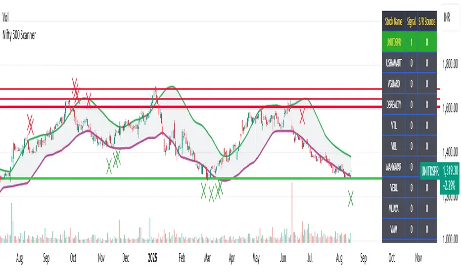
Nifty 500 Scanner
Nifty 500 Scanner
Your Ultimate TradingView Tool for Swing and Intraday Trading
🔥 Introduction
✅ If you want to find out which stock out of 500 stocks of Nifty500 is:
showing reversal pattern candles after a long down or up trend
also bouncing from support/resistance
and that stock gives you live alerts when this condition occurs
Then, look no further. Nifty500 Scanner is just for you.
📊 What is the Nifty 500 Scanner?
The Nifty 500 Scanner is a powerful TradingView indicator for Indian stocks designed to help you identify bullish and bearish reversal signals across all timeframes. Whether you are an intraday trader or a swing trader, this tool gives you an edge by scanning predefined groups of Nifty 500 stocks and visually showing you high-probability setups.
🔥 Key Features
Scans all Nifty 500 stocks in batches of 25 (20 groups in total). Takes less than 10 minutes to select bearish or bullish reversal stocks out of 500 stocks.
Detects over 50 advanced candlestick patterns, divergences, and trend changes in one go in all the selected stocks and displays result right on your chart in the form of a table.
Auto-populated real-time table display with signal count and color-coded results.
TradingView alerts for instant notification of reversal setups.
Shows key support and resistance levels for each stock.
Fully compatible with all timeframes – from 1 minutes to monthly chart.
✅ Why Traders Would Love It?
Eliminates manual chart scanning – saves hours every week.
Improves trade accuracy by filtering out weak setups.
Instantly tells you which stocks to trade tomorrow (if using after market hours)
Built for Indian market conditions and TradingView users.
⚙️ How It Works?
Select a stock group from the dropdown menu (Available in indicator settings).
Suppose you select Group1 and press OK, voila.. the scanner automatically runs through 25 predefined Nifty 500 stocks and updates the table in quick time.
The table shows which stocks are giving bullish or bearish signals and also tells you how many such signals are there. The more signals, the more conviction for upcoming reversal.
Open chart of any stock mentioned in the table to have a detailed look.
The chart will show you a consolidation zone, support/resistance lines automatically.
Set up alerts for your favorite stocks and let TradingView notify you when new signals emerge for that particular stock.
📌 Important Notes
Stock groups are hard-coded into the script and cannot be modified by the user.
Custom versions for other countries or indices (e.g., S&P 500, FTSE) can be created upon request.
🔍 Optimized For
Swing traders and intraday traders seeking high-probability setups.
Technical analysts using TradingView to analyze Indian stock charts.
Traders looking for an advanced reversal signal scanner.
🚀 Ready to Trade Smarter?
Start using the Nifty 500 Scanner on TradingView and never miss a reversal signal again.
Get Access Now.
ROC | QuantumResearch🔍 QuantumResearch ROC Screener
The QuantumResearch ROC Screener is an advanced multi-asset momentum analyzer designed to track relative strength across up to 11 user-defined assets using Rate of Change (ROC). This tool helps traders identify outperformers, underperformers, and rotation opportunities in fast-moving markets.
🧠 How It Works
This screener systematically calculates the Rate of Change (ROC) for each selected asset using two perspectives:
Absolute ROC – Measures the momentum of each asset individually over the chosen lookback period.
Relative ROC Matrix – Compares each asset against every other asset (e.g., BTC vs ETH, ETH vs SOL, etc.) using pairwise ROC ratios.
These values are organized into a dynamic heatmap-style table, highlighting which assets exhibit the strongest directional moves and relative strength. The script also includes:
Averages across all relative pairs to rank each asset.
Color-coded visuals to identify bullish (green), bearish (red), and neutral (white) ROC values.
📊 Main Features
🔢 Up to 11 Assets: Choose any combination of crypto, forex, indices, or commodities.
💡 Pairwise Comparison Matrix: Visualizes each asset’s ROC vs every other asset.
📈 Momentum Ranking: Assets are sorted based on their total average ROC score.
🎨 Color-Coded Table: Makes it easy to spot high or low momentum tokens at a glance.
⚙️ Custom ROC Period: Choose the length of the momentum window.
🧩 Flexible Layout: Position the table anywhere on your screen and adjust font size.
✅ How to Use It
Select your favorite 11 assets (e.g., BTC, ETH, SOL, etc.).
Adjust the ROC length to capture short-term or medium-term momentum.
Spot top trending assets.
Identify reversals or breakouts.
Build rotational or relative strength strategies.
⚠️ Important Notes
Momentum is a powerful tool, but context matters — combine ROC readings with your broader strategy (trend, liquidity, valuation).
This screener is not predictive — it reflects past performance over a defined lookback window.
📉 Disclaimer
Past performance is not indicative of future results. This tool is designed to provide data-driven insight, not financial advice. Always conduct your own research and apply proper risk management.

BanShen MACD Ultimate Multi Signal System[SpeculationLab]🧠 How This Script Works (Detailed Logic Breakdown)
This script is a closed-source, fully self-developed modular trading system centered around MACD divergence detection. It also includes auxiliary modules such as:
Vegas Tunnel trend filtering
Dynamic ATR-based stop placement
Engulfing candlestick pattern detection
RSI/OBV divergence modules
Fair Value Gap (FVG) recognition
A smart signal panel that consolidates all signals in real time
These components work together through a signal resonance framework, helping traders identify high-confluence, high-probability entry opportunities.
🔍 Why MACD Divergence Is the Core (Real-World Strategy Basis)
This system is based on a real-world trading strategy I’ve personally used and refined over time.
Through discretionary trading and backtesting, I discovered that divergence between price action and the MACD histogram — especially when certain structural conditions are met — produces a very high win rate.
Key observations include:
MACD peaks/troughs that are clean and well-shaped (defined pivot structure)
Large vertical differences between two MACD histogram extremes
Price making a higher high or lower low, while MACD does the opposite
Two or more divergences appearing consecutively, which creates a powerful reversal signal
These setups have proven extremely reliable in my experience. This script automates the detection of these conditions using strict logic filters.
🔷 1. MACD Divergence Engine (Core Module)
At its core, this script implements a multi-layered MACD divergence detection system, capable of identifying both **regular** and **consecutive** bullish/bearish divergences.
Key components of the logic:
- **Pivot-Based Peak Detection:**
Peaks and troughs in the MACD histogram are located using left/right lookback lengths.
These define valid turning points by requiring the center bar to be the highest (or lowest) compared to its neighbors.
- **Peak Size Thresholding:**
The height of the histogram peaks is compared to the standard deviation of MACD values.
Only peaks above a configurable multiplier (e.g., 0.1× stdev) are considered significant, filtering out noise.
- **Peak Ratio Filtering:**
For divergence to be valid, the size ratio between two histogram peaks must exceed a minimum threshold.
This prevents "flat" divergences with no meaningful MACD movement from triggering false signals.
- **Noise Suppression:**
A customizable threshold filters out weak histogram fluctuations between divergence points.
- **Price Action Confirmation:**
The divergence is only confirmed when the price forms a new high or low (depending on the type), and the MACD forms an opposing structure.
- **Consecutive Divergence Detection:**
For high-conviction setups, the script detects sequences of two or more divergences in the same direction.
These use stricter filters and flag rare but powerful market turning points.
Signals are plotted using plotshape() with visual differentiation between regular and consecutive setups. You can enable/disable each type individually.
⏰ Note: Histogram colors are styled similarly to TradingView’s built-in MACD for visual familiarity. However, this script is built entirely from scratch and does not reuse any internal TV code.
---
🔷 2. Trend Filtering via Vegas Tunnel
The **Vegas Tunnel** module plots 5 configurable EMAs (default: 12, 144, 169, 576, 676) to evaluate trend direction.
The trend is considered **bullish** when short EMAs (144/169) are positioned above long EMAs (576/676), and the price is interacting with the short EMA tunnel.
Conversely, a bearish condition is detected when the opposite is true.
A visual triangle marker highlights trend zones, and users can hide/show individual EMAs.
---
🔷 3. ATR-Based Dynamic Stop Loss
This module plots dynamic stop levels above and below the current price based on ATR.
Default setting uses 13-period ATR, and users can customize the multiplier or disable the plot.
It serves as a visual guide for risk management in live trades.
---
🔷 4. Engulfing Pattern Recognition
Candlestick-based signal detection:
- **Bullish Engulfing** occurs when a candle closes above the prior high, and the prior bar is bearish.
- **Bearish Engulfing** when a candle closes below the prior low, and the prior bar is bullish.
Users can modify the logic to use open/close levels for looser or stricter detection.
These patterns are highlighted using plotshape markers and optionally included in the signal table.
---
🔷 5. RSI and OBV Divergence Modules
These modules follow similar logic to the MACD engine:
- Use pivotlow() / pivothigh() to detect swing points.
- Confirm divergence only when price moves in one direction while RSI or OBV moves in the opposite direction.
- Require a minimum distance (in bars) between the two pivots.
- Require a certain ratio between two indicator values and their corresponding prices.
You can only enable **one of MACD/RSI/OBV divergences at a time** to avoid visual overlap, as they share the same subplot.
---
🔷 6. FVG (Fair Value Gap) Auto Detection
This module detects large single-direction price moves where price leaves a visible gap between candle 3 bars ago and 1 bar ago.
- **Bullish FVG**: high < low
- **Bearish FVG**: low > high
ATR-based filters are applied to eliminate minor gaps.
Each gap is drawn as a box and optionally extended, with a central line marking the midpoint (CE - Consequent Encroachment) level.
Traders often look for price to return to this level as an entry signal.
---
🔷 7. Smart Signal Table
All active signals (MACD, Vegas, RSI, OBV, Engulfing) are collected into a **real-time table** that displays current market bias.
- Each module reports whether it is currently giving a bullish (🟢) or bearish (🔴) condition.
- Helps users assess signal alignment (confluence).
- The table is updated every bar and appears in the bottom-right corner.
---
🔷 8. Watermark & Branding
The watermark displays the script name and author at the top-right, and can be toggled via settings.
📌 Not a Mashup — Structured System, Not a Stack of Indicators
⚠️ This is not a random mashup of unrelated indicators.
Every module in this system was intentionally designed to support the core MACD divergence logic by filtering, validating, or amplifying its signals.
Here's how the system achieves signal confluence and structure:
Vegas Tunnel acts as a macro trend filter, helping users determine whether to favor long or short trades.
For example, bullish MACD divergence is more reliable when confirmed by an uptrend in the Vegas EMAs. This prevents users from trading against momentum.
Engulfing Patterns serve as entry-level price action confirmation.
When a bullish engulfing candle appears near a MACD bullish divergence — and trend conditions from Vegas are aligned — the confluence increases dramatically.
This is especially powerful when multiple modules confirm in the same direction on the right side of the chart.
RSI and OBV Divergence modules offer redundant but independent momentum views.
Users may enable them selectively to validate MACD signals, or to use them as standalone alternatives when MACD is flat or noisy.
FVG Zones provide context for entries or targets.
For instance, a MACD bullish divergence forming near a bullish FVG gap increases the odds of reversal.
Price often "fills" these imbalances, which aligns well with reversal setups.
The Smart Signal Table aggregates signals from all modules and provides a visual, real-time overview of the current market bias.
This allows traders to act only when multiple signals are aligned — for example, when MACD is bullish, trend is up, and a bullish engulfing just printed.
Together, this framework creates a coherent decision-making system, where each tool has a defined role: trend filtering, signal confirmation, risk management, or entry detection.
🧩 It is modular in architecture, but not modular in purpose.
This system was not built by stacking indicators, but by integrating logic across modules to support a high-conviction MACD-based strategy.
🧬 Originality Statement
This script is entirely original, developed from scratch without using external libraries or public script code. The logic is fully custom, especially the consecutive divergence detection system and signal integration.
⚠️ Disclaimer
This script is for educational and informational purposes only and does not constitute financial advice. Trade at your own risk.
---
📘 中文简要说明:
这是一个完全原创、闭源的交易系统,核心逻辑为 MACD 柱状图背离信号的识别,配合多模块共振判断,构建出一个高胜率的多信号共振策略。
本指标模块化结构清晰,主要包括:
- MACD 背离识别(支持连续背离)
- Vegas EMA 隧道趋势过滤
- RSI / OBV 背离模块
- 吞没形态识别
- FVG 平衡区间自动标注
- ATR 动态止损提示
- 智能信号面板(整合所有信号并可视化)
所有模块均可单独开启/关闭,适配顺势、逆势或多周期的交易风格。
本脚本为个人实战策略的程序化实现,逻辑完全由零开发,未使用任何公用代码。适合希望提高交易胜率和信号精准度的用户使用。
免责声明:本指标仅用于技术分析学习与参考,不构成任何投资建议。请您独立判断,自行承担交易风险。

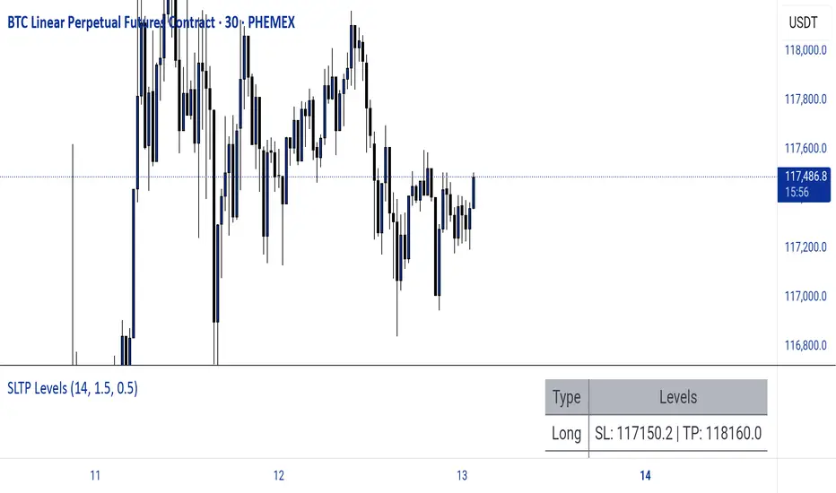
Dynamic SL/TP Levels (ATR or Fixed %)This indicator, "Dynamic SL/TP Levels (ATR or Fixed %)", is designed to help traders visualize potential stop loss (SL) and take profit (TP) levels for both long and short positions, refreshing dynamically on each new bar. It assumes entry at the current bar's close price and uses a fixed 1:2 risk-reward ratio (TP is twice the distance of SL in the profit direction). Levels are displayed in a compact table in the chart pane for easy reference, without cluttering the main chart with lines.
Key Features:
Calculation Modes:
ATR-Based (Dynamic): SL distance is derived from the Average True Range (ATR) multiplied by a user-defined factor (default 1.5x). This adapts to the asset's volatility, providing breathing room based on recent price movements.
Fixed Percentage: SL is set as a direct percentage of the current close price (default 0.5%), offering consistent gaps regardless of volatility.
Long and Short Support: Calculates and shows SL/TP for longs (SL below close, TP above) and shorts (SL above close, TP below), with toggles to hide/show each.
Real-Time Updates: Levels recalculate every bar, making them readily available for entry decisions in your trading system.
Display: Outputs to a table in the top-right pane, showing precise values formatted to the asset's tick size (e.g., full decimal places for crypto).
How to Use:
Add the indicator to your chart via TradingView's Pine Editor or library.
Adjust settings:
Toggle "Use ATR?" on/off to switch modes.
Set "ATR Length" (default 14) and "ATR Multiplier for SL" for dynamic mode.
Set "Fixed SL %" for percentage mode.
Enable/disable "Show Long Levels" or "Show Short Levels" as needed.
Interpret the table: Use the displayed SL/TP values when your strategy signals an entry. For risk management, combine with position sizing (e.g., risk 1% of account per trade based on SL distance).
Example: On a volatile asset like BTC, ATR mode might set a wider SL for realism; on stable pairs, fixed % ensures predictability.
This tool promotes disciplined trading by tying levels to price action or fixed rules, but it's not financial advice—always backtest and use with your full strategy. Feedback welcome!
Volatility & Market Regimes [AlgoXcalibur]Analyze Market Conditions Like a Pro.
Volatility & Market Regimes is a specialized, institution-inspired indicator designed to help traders instantly identify the current conditions of the market with clarity and confidence.
By combining a real-time Volatility Histogram and Strength Line with a compact Regime Table, this tool reveals four essential market dimensions—Volatility, Strength, Participation, and Noise—in a clean and intuitive format. Whether you’re confirming trade setups or managing risk, knowing the current regimes enhances awareness across all assets and timeframes.
🧠 Algorithm Logic
This sophisticated tool continuously monitors four independent regimes, each reflecting a distinct dimension of market behavior:
• Volatility – Gauges how active or dormant the market is by comparing current price action movement to historical averages. A dynamic, color-gradient Volatility Histogram transitions from Low (ice blue/white) to Medium (green/yellow) to High (orange/red), giving you an immediate assessment of volatility and risk.
• Strength – Measures directional intensity by assessing trend momentum, pressure, and persistence. A color-gradient Strength Line ranges from weak (red) to strong (green), helping traders determine if directional strength is trending, weakening, or consolidating.
• Participation – Analyzes relative volume to assess the level of trader engagement. Higher volume indicates stronger participation and conviction, while low volume may signal uncertainty, fading momentum, or even liquidity traps.
• Noise – Evaluates structural stability by measuring how orderly or chaotic the price action is. High noise suggests choppy, unstable conditions, while low noise reflects clean, stable moves.
Each regime includes a High / Medium / Low classification and a color-coded directional arrow to indicate whether condition parameters are increasing or decreasing. Together, these components deliver real-time market context—helping you stay grounded in logic, not emotion.
⚙️ User-Selectable Features
Each component of the indicator—the Volatility Histogram, Strength Line, and Regime Table—can be independently made visible or hidden to match your preference. This flexibility allows you to display only the Regime Table and move it directly to your main chart, where it auto-positions to the center-right and integrates seamlessly with other AlgoXcalibur indicators that also use data tables for a cohesive and refined experience.
📊 Clarity, Not Guesswork
Volatility & Market Regimes is a unique, institution-inspired algorithm rarely seen in retail trading. Not only does it clearly display volatility—it translates complex market behavior into a clear context to reveal what’s happening behind the candles. By decoding core regimes in real-time, this tool transforms uncertainty into structured insight—empowering traders to act with clarity, not guesswork.
🔐 To get access or learn more, visit the Author’s Instructions section.

IQ_Trader's Technical Scoring System With SignalsThe IQ Trader's Technical Scoring System is a sophisticated trading indicator designed to assist traders in identifying potential BUY and SELL opportunities using a dynamic scoring mechanism.
By combining traditional technical indicators (SMA, MACD) with a custom Adaptive Gaussian Moving Average (AGMA) and Bayesian trend probability analysis, this indicator provides a comprehensive view of market conditions. It generates multiple signal types to support various trading strategies, including main BUY/SELL signals, additional BUYS/SELLS signals, and STOP/STRONG STOP signals for risk management.
Key Features
Dynamic Scoring System:
The indicator calculates separate Buy and Sell scores based on multiple conditions, including:
Price position relative to daily SMA50 and SMA200.
Price position relative to the Adaptive Gaussian Moving Average (AGMA).
Bayesian trend analysis incorporating RSI, MACD, EMA, ATR, and volume zones.
MACD position and crossover/crossunder events.
Scores are displayed in a table, showing the contribution of each component (e.g., "Price > SMA50: 20") for transparency.
Signal Types:
Main BUY/SELL Signals:
Triggered when the Buy/Sell score falls within user-defined dynamic thresholds (adjustable for above/below SMA50 conditions).
Controlled by an inTrade state to prevent overlapping signals (BUY only when not in a trade, SELL only when in a trade).
Disabled by default; enable via settings ("Enable Main BUY Signals" and "Enable Main SELL Signals").
Additional BUYS/SELLS Signals:
Generated when the Buy score exceeds the Sell score (BUYS) or vice versa (SELLS).
Sequentially alternates (BUYS → SELLS → BUYS) to avoid repetitive signals, using an inBuysState mechanism.
Always enabled for quick trend insights.
STOP/STRONG STOP Signals:
STOP: Triggered when the price is above SMA50 and MACD crosses below the signal line in a lower timeframe.
STRONG STOP: Triggered when the price is above SMA50, MACD is below the signal line, and the price is below AGMA in a lower timeframe.
Disabled by default; enable via settings ("Enable STOP Signals" and "Enable STRONG STOP Signals").
Useful for risk management and exiting positions.
Visual and Customization Options:
Plots: Displays daily SMA50, SMA200, AGMA, MACD, and MACD Signal lines, all toggleable via settings.
Score Table: Shows real-time Buy and Sell score components at the top center of the chart.
Signal Markers:
Main BUY: Green label ("BUY") below the bar.
Main SELL: Red label ("SELL") above the bar.
BUYS: Lime triangle up ("BUYS") below the bar.
SELLS: Fuchsia triangle down ("SELLS") above the bar.
STOP: Orange triangle down ("STOP") above the bar.
STRONG STOP: Red triangle down ("STRONG") above the bar.
Settings: Highly customizable thresholds, enable/disable conditions, and plot visibility.
Alert Support:
Configurable alerts for all signal types (Dynamic BUY, Dynamic SELL, BUYS, SELLS, STOP, STRONG STOP).
Alerts are gated by enable settings for main BUY/SELL and STOP/STRONG STOP signals to prevent unwanted notifications.
How to Use
Add the Indicator:
Apply the indicator to your chart via TradingView’s Pine Editor or Indicator Library.
By default, only the additional BUYS/SELLS signals are active, along with SMA50/200, AGMA, and MACD plots.
Customize Settings:
Thresholds: Adjust buyThresholdLow, buyThresholdHigh, etc., to fine-tune the sensitivity of main BUY/SELL signals.
Enable Signals: Check "Enable Main BUY Signals", "Enable Main SELL Signals", "Enable STOP Signals", or "Enable STRONG STOP Signals" to activate these signals.
Toggle Plots: Use "Show Daily SMA50/200", "Show AGMA", and "Show MACD and Signal Line" to control chart visuals.
Score Conditions: Enable/disable individual score components (e.g., "Price Above Daily SMA50") to focus on specific indicators.
Interpret Signals:
Main BUY/SELL: Use for primary entry (BUY) and exit (SELL) decisions, ideal for swing or trend-following strategies.
BUYS/SELLS: Monitor for early trend changes or confirmation of momentum, suitable for shorter-term trades.
STOP/STRONG STOP: Consider as warnings to tighten stops or exit positions, especially in volatile markets.
Check the score table to understand which conditions are driving the signals.
Set Alerts:
Create alerts for desired signals (e.g., "Dynamic BUY Signal") via TradingView’s alert menu.
Ensure the corresponding signal is enabled in settings to receive alerts.
Notes for Traders
Timeframe Flexibility: The indicator adapts to different timeframes, with lower timeframe MACD and AGMA calculations for STOP signals. Test on your preferred timeframe (e.g., 1H, 4H, 1D).
Risk Management: Always combine signals with proper risk management, such as stop-loss orders, as STOP/STRONG STOP signals are not guaranteed exit points.
Backtesting: Before trading, backtest the indicator on historical data to evaluate performance with your strategy.
Customization: Adjust score weights (e.g., scoreSMA50AbovePrice) or Bayesian conditions to align with specific assets or market conditions.
Why This Indicator?
The IQ Trader's Technical Scoring System SS stands out for its blend of traditional and advanced analytics. The Bayesian trend analysis adds a probabilistic layer to decision-making, while the dynamic scoring system ensures signals are context-aware (above/below SMA50). Whether you're a swing trader, day trader, or risk-conscious investor, this indicator offers actionable insights with customizable controls.
Feedback Welcome: Share your experience or suggestions in the comments to help improve this tool for the TradingView community!

The Butterfly [theUltimator5]This is a technical analysis tool designed to automatically detect and visualize Butterfly harmonic patterns based on recent market pivot structures. This indicator uses a unique plotting and detection algorithm to find and display valid Butterfly patterns on the chart.
The indicator works in real-time and historically by identifying major swing highs and lows (pivots) based on a user-defined ZigZag length. It then evaluates whether the most recent price structure conforms to the ideal proportions of a bullish or bearish Butterfly pattern. If the ratios between price legs XA, AB, BC, and projected CD meet defined tolerances, the pattern is plotted on the chart along with a projected D point for potential reversal.
Key Features:
Automatic Pivot Detection: The script analyzes recent price action to construct a ZigZag pattern, identifying swing points as potential X, A, B, and C coordinates.
Butterfly Pattern Validation: The pattern is validated against traditional Fibonacci ratios:
--AB should be approximately 78.6% of XA.
--BC must lie between 38.2% and 88.6% of AB.
--CD is projected as a multiple of BC, with user control over the ratio (e.g., 1.618–2.24).
Bullish and Bearish Recognition: The pattern logic detects both bullish and bearish Butterflies, automatically adjusting plotting direction and color themes.
Custom Ratio Tolerance: Users can define how strictly the AB/XA and BC/AB legs must adhere to ideal ratios, using a percentage-based tolerance slider.
Fallback Detection Logic: If a new pattern is not identified in recent bars, the script performs a backward search on the last four pivots to find the most recent valid pattern.
Force Mode: A toggle allows users to force the drawing of a Butterfly pattern on the most recent pivot structure, regardless of whether the ideal Fibonacci rules are satisfied.
Dynamic Visualization:
--Clear labeling of X, A, B, C, and D points.
--Colored connecting lines and filled triangles to visualize structure.
--Optional table displaying key Fibonacci ratios and how close each leg is to ideal values.
Inputs:
Length: Controls the sensitivity of the ZigZag pivots. Smaller values result in more frequent pivots.
Tolerance (%): Adjustable threshold for acceptable deviation in AB/XA and BC/AB ratios.
CD Length Multiplier: Projects point D by multiplying the BC leg using a value between 1.618 and 2.24.
Force New Pattern: Overrides validation checks to display a Butterfly structure on recent pivots regardless of ratio accuracy.
Show Table: Enables a table showing calculated ratios and deviations from the ideal.

SHYY TFC SPX Sectors list This script provides a clean, configurable table displaying real-time data for the major SPX sectors, key indices, and market sentiment indicators such as VIX and the 10-year yield (US10Y).
It includes 16 columns with two rows:
* The top row shows the sector/asset symbol.
* The bottom row shows the most recent daily close price.
Each price cell is dynamically color-coded based on:
* Direction (green/red) during regular trading hours
* Separate colors during extended hours (pre-market or post-market)
* VIX values greater than 30 trigger a distinct background highlight
Users can fully control the position of the table on the chart via input settings. This flexibility allows traders to place the table in any screen corner or center without overlapping key price action.
The script is designed for:
* Monitoring broad market health at a glance
* Understanding sector performance in real-time
* Spotting risk-on/risk-off behavior (via SPY, QQQ, VIX, US10Y)
Unlike traditional watchlists, this table visually encodes directional movement and trading session context (regular vs. extended hours), making it highly actionable for intraday, swing, or macro-level analysis.
All data is pulled using `request.security()` on daily candles and uses pure Pine logic without external dependencies.
To use:
1. Add the indicator to your chart.
2. Adjust the table position via the input dropdown.
3. Read sector strength or weakness directly from the table.

SMT Time Windows# SMT Time Windows
SMT Time Windows is a Pine Script v6 indicator by **Originalsauce1** that automates ICT-style Smart Money Technique (SMT) divergences between two correlated symbols. It detects bullish and bearish SMT divergences using swing highs/lows (pivot logic) across both instruments. Bullish SMT occurs when one symbol makes a higher low while the other forms a lower low; bearish SMT is when one symbol prints a higher high while the other records a lower high. These divergences highlight imbalances in correlated markets and can signal potential momentum shifts. SMT Time Windows plots clear labels for each divergence event and offers comprehensive filtering by custom time sessions.
## Key Features
* **Time Window Filters:** Define up to three custom time windows (e.g. 2:00–4:00 AM, 6:00–8:30 AM, 9:00–10:30 AM) with individual enable/disable toggles. Active windows can be highlighted on the chart with optional background shading for visual cueing.
* **Timezone Support:** User-selectable time zone ensures that time windows align correctly across different session schedules (global session alignment).
* **Adjustable Detection:** Set the pivot **length** (sensitivity of swing detection) and the signal **timeframe**. This pivot-based approach confirms valid swing highs/lows before marking divergences.
* **Clean SMT Labels:** The indicator plots “Bullish SMT” or “Bearish SMT” labels at the relevant pivots, clearly marking each divergence event. Label color and style are customizable, providing a clean visual cue of SMT signals.
* **Chart Highlights:** Optionally shade the chart background during active time windows, making it easy to see when the session filter is in effect.
* **Session Status Table:** An on-chart table shows which time windows are currently active (e.g. shows “Open”/“Closed” status). This real-time session table provides live feedback similar to other TradingView session trackers.
* **Comparison Symbol & Alerts:** Optionally overlay the comparison symbol on your chart. Built-in alerts notify you when bullish or bearish SMT divergences occur, allowing timely review.
## How It Works
SMT Time Windows checks for divergences between two positively correlated markets (for example, equity futures like S\&P 500 (ES) vs Nasdaq 100 (NQ), or FX pairs like US Dollar Index vs EUR/USD). When one instrument’s swing high/low is not confirmed by the other, it flags this as an SMT event. For instance, a **Bearish SMT** is identified when one symbol makes a higher high but the other fails to keep pace (prints a lower high); a **Bullish SMT** is when one symbol’s low is higher while the other’s low is lower. These divergences are interpreted as signs of uneven buying/selling pressure and can precede shifts in momentum.
The indicator is designed for use with correlated markets (e.g. ES/NQ, DXY/EURUSD, etc.) to enhance your market structure analysis. It is not a “set and forget” signal but a tool to spot potential imbalances. Use SMT Time Windows alongside your discretionary analysis and higher-timeframe context for best results.
## Disclaimer
This script is provided *“for educational and informational purposes only”*. It is **not** financial or trading advice. Always perform your own analysis and risk management before making trading decisions.
*Created by Originalsauce1. For educational and informational purposes only.*

TBL HTF Highs&LowsThis script plots the previous Daily, Weekly, and Monthly High and Low levels directly on your chart, helping you identify key higher-timeframe support and resistance zones.
Features:
Daily, Weekly, Monthly Lines: Toggle visibility for each timeframe's high/low levels.
Customization Options:
Choose color, style (Solid, Dashed, Dotted), width, and transparency for each line type.
Automatic Updates: Lines update at the start of each new session (day, week, or month).
Summary Table: Displays the latest Pre-Daily High/Low (PDH/PDL), Pre-Weekly High/Low (PWH/PWL), and Pre-Monthly High/Low (PMH/PML) in the top-right corner of the chart.
Configurable Table Font Size: Choose between Tiny, Small, Medium, or Large text.
Use Case:
Ideal for traders who rely on key higher-timeframe levels for confluence, breakout trading, or mean-reversion strategies. The visual lines and summary table provide instant context without cluttering your chart.

Crypto Long RSI Entry with AveragingIndicator Name:
04 - Crypto Long RSI Entry with Averaging + Info Table + Lines (03 style lines)
Description:
This indicator is designed for crypto trading on the long side only, using RSI-based entry signals combined with a multi-step averaging strategy and a visual information panel. It aims to capture price rebounds from oversold RSI levels and manage position entries with two staged averaging points, optimizing the average entry price and take-profit targets.
Key Features:
RSI-Based Entry: Enters a long position when the RSI crosses above a defined oversold level (default 25), with an optional faster entry if RSI crosses above 20 after being below it.
Two-Stage Averaging: Allows up to two averaging entries at user-defined price drop percentages (default 5% and 14%), increasing position size to improve average entry price.
Dynamic Take Profit: Adjusts take profit targets after each averaging stage, with customizable percentage levels.
Visual Signals: Marks entries, averaging points, and exits on the chart using colored labels and lines for easy tracking.
Info Table: Displays current trade status, averaging stages, total profit, number of wins, and maximum drawdown percentage in a table on the chart.
Graphical Lines: Shows horizontal lines for entry price, take profit, and averaging prices to visually track trade management.
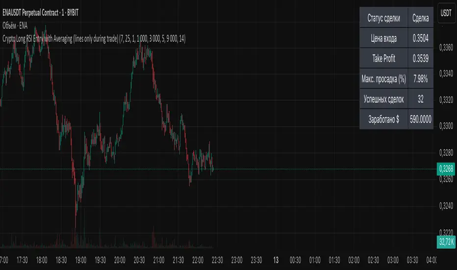
BG Ichimoku Tenkan MTFBG Ichimoku Tenkan MTF: Your Multi-Timeframe Trend Compass
Elevate your Ichimoku analysis with the BG Ichimoku Tenkan MTF indicator. This powerful tool provides a comprehensive view of the Tenkan-sen (Conversion Line) across multiple timeframes, helping you identify trends and potential shifts with greater clarity. It's ideal for all markets, including stocks, cryptocurrencies, Forex, and futures.
Key Features:
Main Tenkan-sen Plot: Visualize the Tenkan-sen for your active chart timeframe with adjustable color.
Multi-Timeframe Table: A dynamic table displays the Tenkan-sen's relationship to price (🔼 for above, 🔽 for below) and its current value for up to 7 timeframes.
Continuous MTF Lines: Plot the Tenkan-sen from higher timeframes directly on your current chart, providing clear support/resistance levels and trend confluence.
Fully Customizable Colors: Personalize the color for each individual timeframe in the table and for its corresponding MTF line, ensuring a clean and intuitive visual experience. You can also adjust the main Tenkan-sen color and the MTF line offset.
Gain a deeper understanding of market dynamics by analyzing the Tenkan-sen across different time scales, all in one intuitive indicator.
We created this indicator to help you better navigate the markets. Thank you for using it, and we hope it brings you value. Enjoy it in your daily analysis!
Bab

PhenLabs - Market Fluid Dynamics📊 Market Fluid Dynamics -
Version: PineScript™ v6
📌 Description
The Market Fluid Dynamics - Phen indicator is a new thinking regarding market analysis by modeling price action, volume, and volatility using a fluid system. It attempts to offer traders control over more profound market forces, such as momentum (speed), resistance (thickness), and buying/selling pressure. By visualizing such dynamics, the script allows the traders to decide on the prevailing market flow, its power, likely continuations, and zones of calmness and chaos, and thereby allows improved decision-making.
This measure avoids the usual difficulty of reconciling multiple, often contradictory, market indications by including them within a single overarching model. It moves beyond traditional binary indicators by providing a multi-dimensional view of market behavior, employing fluid dynamic analogs to describe complex interactions in an accessible manner.
🚀 Points of Innovation
Integrated Fluid Dynamics Model: Combines velocity, viscosity, pressure, and turbulence into a single indicator.
Normalized Metrics: Uses ATR and other normalization techniques for consistent readings across different assets and timeframes.
Dynamic Flow Visualization: Main flow line changes color and intensity based on direction and strength.
Turbulence Background: Visually represents market stability with a gradient background, from calm to turbulent.
Comprehensive Dashboard: Provides an at-a-glance summary of key fluid dynamic metrics.
Multi-Layer Smoothing: Employs several layers of EMA smoothing for a clearer, more responsive main flow line.
🔧 Core Components
Velocity Component: Measures price momentum (first derivative of price), normalized by ATR. It indicates the speed and direction of price changes.
Viscosity Component: Represents market resistance to price changes, derived from ATR relative to its historical average. Higher viscosity suggests it’s harder for prices to move.
Pressure Component: Quantifies the force created by volume and price range (close - open), normalized by ATR. It reflects buying or selling pressure.
Turbulence Detection: Calculates a Reynolds number equivalent to identify market stability, ranging from laminar (stable) to turbulent (chaotic).
Main Flow Indicator: Combines the above components, applying sensitivity and smoothing, to generate a primary signal of market direction and strength.
🔥 Key Features
Advanced Smoothing Algorithm: Utilizes multiple EMA layers on the raw flow calculation for a fluid and responsive main flow line, reducing noise while maintaining sensitivity.
Gradient Flow Coloring: The main flow line dynamically changes color from light to deep blue for bullish flow and light to deep red for bearish flow, with intensity reflecting flow strength. This provides an immediate visual cue of market sentiment and momentum.
Turbulence Level Background: The chart background changes color based on calculated turbulence (from calm gray to vibrant orange), offering an intuitive understanding of market stability and potential for erratic price action.
Informative Dashboard: A customizable on-screen table displays critical metrics like Flow State, Flow Strength, Market Viscosity, Turbulence, Pressure Force, Flow Acceleration, and Flow Continuity, allowing traders to quickly assess current market conditions.
Configurable Lookback and Sensitivity: Users can adjust the base lookback period for calculations and the sensitivity of the flow to viscosity, tailoring the indicator to different trading styles and market conditions.
Alert Conditions: Pre-defined alerts for flow direction changes (positive/negative crossover of zero line) and detection of high turbulence states.
🎨 Visualization
Main Flow Line: A smoothed line plotted below the main chart, colored blue for bullish flow and red for bearish flow. The intensity of the color (light to dark) indicates the strength of the flow. This line crossing the zero line can signal a change in market direction.
Zero Line: A dotted horizontal line at the zero level, serving as a baseline to gauge whether the market flow is positive (bullish) or negative (bearish).
Turbulence Background: The indicator pane’s background color changes based on the calculated turbulence level. A calm, almost transparent gray indicates low turbulence (laminar flow), while a more vibrant, semi-transparent orange signifies high turbulence. This helps traders visually assess market stability.
Dashboard Table: An optional table displayed on the chart, showing key metrics like ‘Flow State’, ‘Flow Strength’, ‘Market Viscosity’, ‘Turbulence’, ‘Pressure Force’, ‘Flow Acceleration’, and ‘Flow Continuity’ with their current values and qualitative descriptions (e.g., ‘Bullish Flow’, ‘Laminar (Stable)’).
📖 Usage Guidelines
Setting Categories
Show Dashboard - Default: true; Range: true/false; Description: Toggles the visibility of the Market Fluid Dynamics dashboard on the chart. Enable to see key metrics at a glance.
Base Lookback Period - Default: 14; Range: 5 - (no upper limit, practical limits apply); Description: Sets the primary lookback period for core calculations like velocity, ATR, and volume SMA. Shorter periods make the indicator more sensitive to recent price action, while longer periods provide a smoother, slower signal.
Flow Sensitivity - Default: 0.5; Range: 0.1 - 1.0 (step 0.1); Description: Adjusts how much the market viscosity dampens the raw flow. A lower value means viscosity has less impact (flow is more sensitive to raw velocity/pressure), while a higher value means viscosity has a greater dampening effect.
Flow Smoothing - Default: 5; Range: 1 - 20; Description: Controls the length of the EMA smoothing applied to the main flow line. Higher values result in a smoother flow line but with more lag; lower values make it more responsive but potentially noisier.
Dashboard Position - Default: ‘Top Right’; Range: ‘Top Right’, ‘Top Left’, ‘Bottom Right’, ‘Bottom Left’, ‘Middle Right’, ‘Middle Left’; Description: Determines the placement of the dashboard on the chart.
Header Size - Default: ‘Normal’; Range: ‘Tiny’, ‘Small’, ‘Normal’, ‘Large’, ‘Huge’; Description: Sets the text size for the dashboard header.
Values Size - Default: ‘Small’; Range: ‘Tiny’, ‘Small’, ‘Normal’, ‘Large’; Description: Sets the text size for the metric values in the dashboard.
✅ Best Use Cases
Trend Identification: Identifying the dominant market flow (bullish or bearish) and its strength to trade in the direction of the prevailing trend.
Momentum Confirmation: Using the flow strength and acceleration to confirm the conviction behind price movements.
Volatility Assessment: Utilizing the turbulence metric to gauge market stability, helping to adjust position sizing or avoid choppy conditions.
Reversal Spotting: Watching for divergences between price and flow, or crossovers of the main flow line above/below the zero line, as potential reversal signals, especially when combined with changes in pressure or viscosity.
Swing Trading: Leveraging the smoothed flow line to capture medium-term market swings, entering when flow aligns with the desired trade direction and exiting when flow weakens or reverses.
Intraday Scalping: Using shorter lookback periods and higher sensitivity to identify quick shifts in flow and turbulence for short-term trading opportunities, particularly in liquid markets.
⚠️ Limitations
Lagging Nature: Like many indicators based on moving averages and lookback periods, the main flow line can lag behind rapid price changes, potentially leading to delayed signals.
Whipsaws in Ranging Markets: During periods of low volatility or sideways price action (high viscosity, low flow strength), the indicator might produce frequent buy/sell signals (whipsaws) as the flow oscillates around the zero line.
Not a Standalone System: While comprehensive, it should be used in conjunction with other forms of analysis (e.g., price action, support/resistance levels, other indicators) and not as a sole basis for trading decisions.
Subjectivity in Interpretation: While the dashboard provides quantitative values, the interpretation of “strong” flow, “high” turbulence, or “significant” acceleration can still have a subjective element depending on the trader’s strategy and risk tolerance.
💡 What Makes This Unique
Fluid Dynamics Analogy: Its core strength lies in translating complex market interactions into an intuitive fluid dynamics framework, making concepts like momentum, resistance, and pressure easier to visualize and understand.
Market View: Instead of focusing on a single aspect (like just momentum or just volatility), it integrates multiple factors (velocity, viscosity, pressure, turbulence) to provide a more comprehensive picture of market conditions.
Adaptive Visualization: The dynamic coloring of the flow line and the turbulence background provide immediate, adaptive visual feedback that changes with market conditions.
🔬 How It Works
Price Velocity Calculation: The indicator first calculates price velocity by measuring the rate of change of the closing price over a given ‘lookback’ period. The raw velocity is then normalized by the Average True Range (ATR) of the same lookback period. Normalization enables comparison of momentum between assets or timeframes by scaling for volatility. This is the direction and speed of initial price movement.
Viscosity Calculation: Market ‘viscosity’ or resistance to price movement is determined by looking at the current ATR relative to its longer-term average (SMA of ATR over lookback * 2). The further the current ATR is above its average, the lower the viscosity (less resistance to price movement), and vice-versa. The script inverts this relationship and bounds it so that rising viscosity means more resistance.
Pressure Force Measurement: A ‘pressure’ variable is calculated as a function of the ratio of current volume to its simple moving average, multiplied by the price range (close - open) and normalized by ATR. This is designed to measure the force behind price movement created by volume and intraday price thrusts. This pressure is smoothed by an EMA.
Turbulence State Evaluation: A equivalent ‘Reynolds number’ is calculated by dividing the absolute normalized velocity by the viscosity. This is the proclivity of the market to move in a chaotic or orderly fashion. This ‘reynoldsValue’ is smoothed with an EMA to get the ‘turbulenceState’, which indicates if the market is laminar (stable), transitional, or turbulent.
Main Flow Derivation: The ‘rawFlow’ is calculated by taking the normalized velocity, dampening its impact based on the ‘viscosity’ and user-input ‘sensitivity’, and orienting it by the sign of the smoothed ‘pressureSmooth’. The ‘rawFlow’ is then put through multiple layers of exponential moving average (EMA) smoothing (with ‘smoothingLength’ and derived values) to reach the final ‘mainFlow’ line. The extensive smoothing is designed to give a smooth and clear visualization of the overall market direction and magnitude.
Dashboard Metrics Compilation: Additional metrics like flow acceleration (derivative of mainFlow), and flow continuity (correlation between close and volume) are calculated. All primary components (Flow State, Strength, Viscosity, Turbulence, Pressure, Acceleration, Continuity) are then presented in a user-configurable dashboard for ease of monitoring.
💡 Note:
The “Market Fluid Dynamics - Phen” indicator is designed to offer a unique perspective on market behavior by applying principles from fluid dynamics. It’s most effective when used to understand the underlying forces driving price rather than as a direct buy/sell signal generator in isolation. Experiment with the settings, particularly the ‘Base Lookback Period’, ‘Flow Sensitivity’, and ‘Flow Smoothing’, to find what best suits your trading style and the specific asset you are analyzing. Always combine its insights with robust risk management practices.

Risk Calculator PRO — manual lot size + auto lot-suggestionWhy risk management?
90 % of traders blow up because they size positions emotionally. This tool forces Risk-First Thinking: choose the amount you’re willing to lose, and the script reverse-engineers everything else.
Key features
1. Manual or Market Entry – click “Use current price” or type a custom entry.
2. Setup-based ₹-Risk – four presets (A/B/C/D). Edit to your workflow.
3. Lot-Size Input + Auto Lot Suggestion – you tell the contract size ⇒ script tells you how many lots.
4. Auto-SL (optional) – tick to push stop-loss to exactly 1-lot risk.
5. Instant Targets – 1 : 2, 1 : 3, 1 : 4, 1 : 5 plotted and alert-ready.
6. P&L Preview – table shows potential profit at each R-multiple plus real ₹ at SL.
7. Margin Column – enter per-lot margin once; script totals it for any size.
8. Clean Table UI – dark/light friendly; updates every 5 bars.
9. Alert Pack – SL, each target, plus copy-paste journal line on the chart.
How to use
1. Add to chart > “Format”.
2. Type the lot size for the symbol (e.g., 1250 for Natural Gas, 1 for cash equity).
3. Pick Side (Buy / Sell) & Setup grade.
4. ✅ If you want the script to place SL for you, tick Auto-SL (risk = 1 lot).
5. Otherwise type your own Stop-loss.
6. Read the table:
• Suggested lots = how many to trade so risk ≤ setup ₹.
• Risk (currency) = real money lost if SL hits.
7. Set TradingView alerts on the built-in conditions (T1_2, SL_hit, etc.) if you’d like push / email.
8. Copy the orange CSV label to Excel / Sheets for journalling.
Best practices
• Never raise risk to “fit” a trade. Lower size instead.
• Review win-rate vs. R multiple monthly; adjust setups A–D accordingly.
• Test Auto-SL in replay before going live.
Disclaimer
This script is educational. Past performance ≠ future results. The author isn’t responsible for trading losses.

Yearly History Calendar-Aligned Price up to 10 Years)Overview
This indicator helps traders compare historical price patterns from the past 10 calendar years with the current price action. It overlays translucent lines (polylines) for each year’s price data on the same calendar dates, providing a visual reference for recurring trends. A dynamic table at the top of the chart summarizes the active years, their price sources, and history retention settings.
Key Features
Historical Projections
Displays price data from the last 10 years (e.g., January 5, 2023 vs. January 5, 2024).
Price Source Selection
Choose from Open, Low, High, Close, or HL2 ((High + Low)/2) for historical alignment.
The selected source is shown in the legend table.
Bulk Control Toggles
Show All Years : Display all 10 years simultaneously.
Keep History for All : Preserve historical lines on year transitions.
Hide History for All : Automatically delete old lines to update with current data.
Individual Year Settings
Toggle visibility for each year (-1 to -10) independently.
Customize color and line width for each year.
Control whether to keep or delete historical lines for specific years.
Visual Alignment Aids
Vertical lines mark yearly transitions for reference.
Polylines are semi-transparent for clarity.
Dynamic Legend Table
Shows active years, their price sources, and history status (On/Off).
Updates automatically when settings change.
How to Use
Configure Settings
Projection Years : Select how many years to display (1–10).
Price Source : Choose Open, Low, High, Close, or HL2 for historical alignment.
History Precision : Set granularity (Daily, 60m, or 15m).
Daily (D) is recommended for long-term analysis (covers 10 years).
60m/15m provides finer precision but may only cover 1–3 years due to data limits.
Adjust Visibility & History
Show Year -X : Enable/disable specific years for comparison.
Keep History for Year -X : Choose whether to retain historical lines or delete them on new year transitions.
Bulk Controls
Show All Years : Display all 10 years at once (overrides individual toggles).
Keep History for All / Hide History for All : Globally enable/disable history retention for all years.
Customize Appearance
Line Width : Adjust polyline thickness for better visibility.
Colors : Assign unique colors to each year for easy identification.
Interpret the Legend Table
The table shows:
Year : Label (e.g., "Year -1").
Source : The selected price type (e.g., "Close", "HL2").
Keep History : Indicates whether lines are preserved (On) or deleted (Off).
Tips for Optimal Use
Use Daily Timeframes for Long-Term Analysis :
Daily (1D) allows 10+ years of data. Smaller timeframes (60m/15m) may have limited historical coverage.
Compare Recurring Patterns :
Look for overlaps between historical polylines and current price to identify potential support/resistance levels.
Customize Colors & Widths :
Use contrasting colors for years you want to highlight. Adjust line widths to avoid clutter.
Leverage Global Toggles :
Enable Show All Years for a quick overview. Use Keep History for All to maintain continuity across transitions.
Example Workflow
Set Up :
Select Projection Years = 5.
Choose Price Source = Close.
Set History Precision = 1D for long-term data.
Customize :
Enable Show Year -1 to Show Year -5.
Assign distinct colors to each year.
Disable Keep History for All to ensure lines update on year transitions.
Analyze :
Observe how the 2023 close prices align with 2024’s price action.
Use vertical lines to identify yearly boundaries.
Common Questions
Why are some years missing?
Ensure the chart has sufficient historical data (e.g., daily charts cover 10 years, 60m/15m may only cover 1–3 years).
How do I update the data?
Adjust the Price Source or toggle years/history settings. The legend table updates automatically.
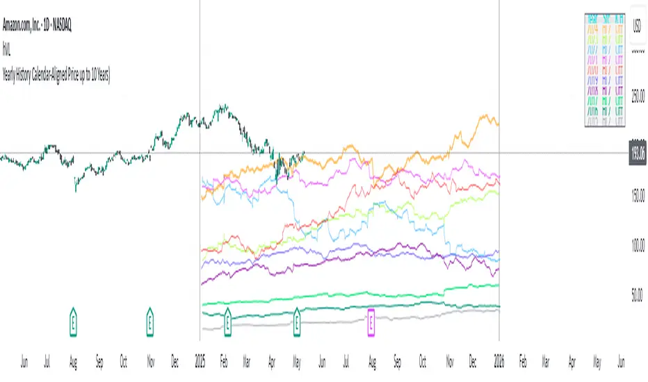
ItsGuarantee Instrument Speed & Close MomentumItsGuarantee Instrument Speed & Close Momentum
Overview
Exclusively engineered for premier hedge funds, the ItsGuarantee Instrument Speed & Close Momentum indicator is a vital tool that unlocks the speed of an instrument and how fast it’s going since the start of the current year, powered by proprietary physics-based calculations. These calculations preview the guaranteed net profit or loss of an instrument every day since the year’s start, using real-time data to deliver unmatched precision. It forecasts unmanipulated closing prices for today, the month, and the year, displayed on a sleek, customizable dashboard with lines, labels, and a table. With real-time alerts, manipulation detection, and global timezone support, this indicator is indispensable for maximizing returns.
Key Features
Real-Time Speed Analysis: Uses physics-based math to reveal an instrument’s speed and daily profit/loss preview since January 1 with live data.
Accurate Price Forecasts: Predicts unmanipulated daily, monthly, and yearly closing prices with precision.
Manipulation Detection: Spots price irregularities instantly, safeguarding your trades.
Clear Visuals: Features Sea Blue (daily), Purple (monthly), and Red (yearly) lines and labels for quick insights.
Instant Alerts: Sends real-time notifications when prices cross key levels.
Global Compatibility: Works in any market timezone with adjustable open times.
Custom Dashboard: Tailor table position, colors, and sizes to fit your needs.
How It Works
Driven by proprietary physics calculations, the indicator tracks an instrument’s price speed since January 1 using real-time data, previewing the guaranteed net profit or loss every day since the year’s start. It predicts unmanipulated closing prices for daily, monthly, and yearly periods, shown on a clear table, lines, and labels. Real-time alerts signal price crossings, and manipulation detection ensures market integrity, making it a cornerstone for hedge funds worldwide.
Ideal For
Hedge fund managers tracking daily profit/loss and instrument speed with live data.
Funds combating price manipulation to seize market opportunities.
Any Monday-to-Friday market globally.
Customization Options
Set market open time (e.g., 9:30 AM for NYSE).
Adjust table colors, borders, and text sizes (tiny to huge).
Customize Sea Blue (daily), Purple (monthly), and Red (yearly) visuals.
Choose from six table positions (e.g., Top Right, Bottom Left).
Setting Up Alerts
Add the indicator to your chart.
Enable alerts like “Daily Close Crossover” for key price movements.
Use “Once Per Bar Close” on daily charts for accurate alerts.
Note
Adapts to any chart timezone; align with your market’s settings.
Assumes 264 trading days per year and 22 trading days per month.
Includes debugging labels for NA values at the top of the chart.
Secure Your Advantage
Trusted by elite hedge funds, ItsGuarantee Instrument Speed & Close Momentum is your key to mastering market speed and daily profit/loss with real-time precision. Add it to your chart, set your market time, customize the dashboard, and enable alerts to trade with the confidence of the world’s top funds.
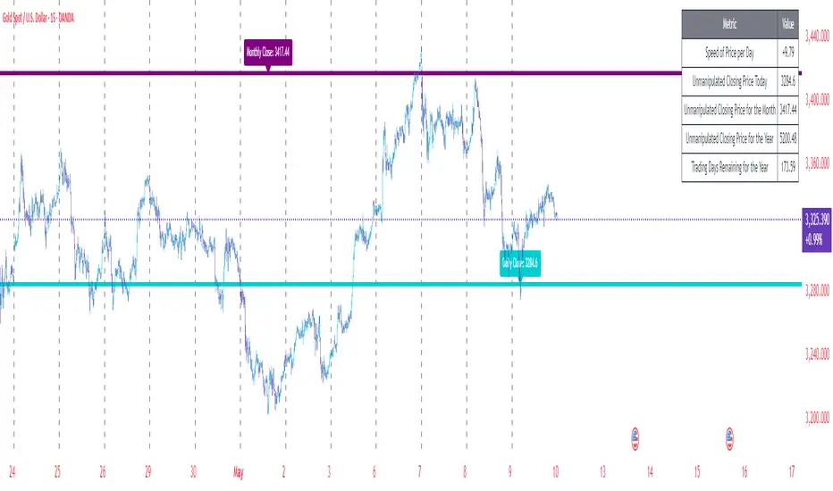
SMA PLOTS & ANCHORED VWAP & CONSOLIDATION FINDERHi traders,
SMA Plots, Anchored VWAP & Consolidation Finder
This Pine Script indicator combines multiple technical analysis tools to provide traders with a comprehensive view of price trends, volume-weighted price levels, and consolidation periods. It includes Simple Moving Averages (SMAs) for daily and chart timeframes, an Anchored Volume-Weighted Average Price (VWAP) with standard deviation bands, and a consolidation detection system based on Bollinger Bands (BB), Average True Range (ATR), and Relative Strength Index (RSI). Designed for versatility, it caters to both trend-following and range-bound trading strategies.
Indicators and Logic
Simple Moving Averages (SMAs):
Daily SMAs: 50-period and 200-period SMAs are calculated on the daily timeframe, plotted on the chart for trend identification. These are ideal for long-term trend analysis, with the 50-SMA acting as a short-term trend indicator and the 200-SMA as a long-term trend indicator.
Chart SMAs: 50-period and 200-period SMAs are calculated on the current chart timeframe, offering flexibility for intraday or swing trading. These are toggleable and disabled by default to reduce chart clutter.
Labeling: Customizable labels for SMA lines and their values (toggleable) provide clear visual cues, showing the exact price levels of the SMAs on the chart.
Anchored VWAP with Standard Deviation Bands:
The VWAP is anchored to a user-defined date (default: March 20, 2020), calculating the volume-weighted average price from that point. It serves as a dynamic support/resistance level, reflecting the average price traders have paid.
Three standard deviation bands (1σ, 2σ, 3σ) are plotted around the VWAP, helping identify overbought/oversold conditions or potential breakout zones. These bands are toggleable for user convenience.
A 1-period EMA is included (toggleable, disabled by default) for traders who prefer a fast-moving average for short-term price tracking.
Consolidation Detection:
The consolidation finder uses three indicators to identify low-volatility periods, which often precede breakouts:
Bollinger Bands (BB): Measures price range tightness using the BB width (upper band - lower band / SMA). A low BB width (< user-defined threshold) indicates consolidation.
ATR (Average True Range): Assesses volatility as a percentage of the closing price. A low ATR % (< user-defined threshold) confirms reduced market activity.
RSI (Relative Strength Index): A low RSI (< user-defined threshold) suggests weak momentum, typical of consolidation phases.
Two consolidation signals are generated:
New Signal: Detects consolidation if at least a user-defined number of bars (default: 3) within a lookback period (default: 10) meet the criteria.
Standard Signal: Detects instant consolidation based on the current bar’s conditions.
A dynamic table displays historical data (min/max/average) for BB width, ATR %, and RSI within a user-defined date range, aiding in parameter optimization.
Trading Strategies
Trend-Following with SMAs:
Use the 50/200 SMA crossover on the daily timeframe to identify bullish (50 > 200) or bearish (50 < 200) trends.
On the chart timeframe, enable the 50/200 SMAs for shorter-term trend confirmation, aligning trades with the dominant trend.
Example: Enter long positions when the price is above both SMAs and short positions when below, using SMA value labels to confirm price proximity.
Mean-Reversion with Anchored VWAP:
Treat the VWAP as a mean price level. Enter long trades when the price dips to the lower 1σ/2σ bands and short trades when it rises to the upper 1σ/2σ bands, expecting a reversion to the VWAP.
Use the 3σ bands to identify extreme conditions for potential breakout or reversal trades.
Example: If the price touches the lower 2σ band and the RSI is oversold, consider a long trade targeting the VWAP.
Breakout Trading with Consolidation Detection:
Monitor the consolidation signals (new or standard) to identify low-volatility periods. These often precede significant price movements.
Enter breakout trades when the price breaks above/below key levels (e.g., VWAP, SMA, or BB bands) after a consolidation signal.
Example: If the “New Signal” is active and the price breaks above the VWAP with increasing volume, initiate a long trade targeting the upper BB band.
User-Friendly Features
Customizable Inputs: Users can adjust SMA lengths, VWAP anchor date, band multipliers, and consolidation thresholds to suit their trading style.
Toggleable Plots and Labels: Enable/disable SMAs, VWAP bands, EMA, and labels to declutter the chart and focus on relevant data.
Dynamic Table: Displays historical BB width, ATR %, and RSI metrics for the selected date range, helping users fine-tune parameters.
Alert Conditions: Two alert conditions (new and standard consolidation signals) allow users to set notifications for trading opportunities.
Visual Clarity: Color-coded plots (green for bullish, red for bearish) and clear labels enhance readability and decision-making.
How to Use
Add the indicator to your chart and adjust input parameters (e.g., SMA lengths, VWAP anchor date, consolidation thresholds) based on your trading preferences.
Enable/disable plots and labels to customize the chart display.
Monitor the dynamic table for historical data to optimize consolidation detection settings.
Set alerts for consolidation signals to stay informed of potential trading opportunities.
Combine SMA trends, VWAP levels, and consolidation signals to develop a robust trading strategy.
Notes
This indicator is best used in conjunction with other technical/fundamental analysis to confirm signals.
Backtest any strategy thoroughly before live trading, as past performance does not guarantee future results.
The default settings are optimized for general use but may require adjustment for specific markets or timeframes.
Disclaimer
This script is provided for educational purposes and should not be considered financial advice. Always conduct your own research and consult a financial advisor before trading.
