[Marmotte] Support & ResistanceDynamic Support/Resistance Indicator
Available on charts of all symbols, not just Bitcoin.
Timeframe
The chart time to base the support/resistance values on.
This value cannot be less than the current chart timeframe.
ex) Current chart timeframe = 15 minutes, option value = 60 (1 hour) O
ex) Current chart timeframe = 4 hours, option = 60 (1 hour) X
Mode
This is how support/resistance values are calculated.
The “Pivot” option takes the PivotHigh and PivotLow for a specific period of time (number of candles).
The “Normal” option is used to get the Highest and Lowest for a specific time period (number of candles).
Lookback Candle
When set to 20 and the “Pivot” option is selected, the highest price of the 20 candles before the specific candle is selected.
If set to 20 and the “Normal” option is selected, the highest price of the 20 candles before the current candle is selected.
Sensitivity
This option only applies when “General” is selected.
Different support/resistance values calculated based on sensitivity
Extract the reference high/low for the “Lookback Candle” in the selected “Timeframe” based on the “Mode”.
Compare the Bar Index (candle order) of the extracted reference high/low and divide the upside/downside (ex: up if the reference low came before the reference high, down if the reference high came before the reference low, etc.).
Now, based on the baseline high/low and up/down, calculate the , and plot them on the chart.
Updates the extracted values based on the “base value” when the reference high/low for the “calculation period (number of candles)” in the selected “chart time” changes.
The indicator is built with simple logic that automatically identifies tops and bottoms, and then calculates and plots the corresponding Fibonacci retracements and extensions.
Therefore, it is not recommended to trade blindly on the support/resistance plotted by the indicator.
The indicator can be used to enhance the ability of support-resistance lines or to reference support-resistance on longer time frames from shorter time frames. For example, you can set up a 4-hour support/resistance on a 15-minute timeframe. This way, you can see the support/resistance of a higher timeframe that looks like a pullback/recovery in the short term, but is more reliable and can be used as a reference for trading.
The recommended time frame is 4 hour.
Please note that this may not work properly on symbols with too small an amount (e.g. it does not work properly on symbols like 0.005$)
-------------------------------------------------
동적 지지/저항선 인디케이터
비트코인뿐 아니라 모든 심볼의 차트에서 사용가능합니다.
차트 시간
지지/저항 값을 계산에 기본이 될 차트 시간입니다.
이 값은 현재 차트 타임프레임보다 작을 수 없습니다.
ex) 현재 차트 타임프레임 = 15분, 옵션값 = 60(1시간) O
ex) 현재 차트 타임프레임 = 4시간, 옵션값 = 60(1시간) X
베이스 값
지지/저항 값을 계산하는 방법입니다.
"피봇고저" 옵션은 특정 기간(캔들 수)의 PivotHigh, PivotLow를 구하여 사용합니다.
"일반고저" 옵션은 특정 기간(캔들 수)의Highest, Lowest를 구하여 사용합니다.
계산 기간
20으로 설정 후 "Pivot" 옵션을 선택한 경우, 특정 캔들 이전 20개의 캔들 중 해당 캔들이 제일 고가가 높을 때 선택
20으로 설정 후 "Normal" 옵션을 선택한 경우, 현재 캔들 이전 20개의 캔들 중 가장 고가 선택
민감도
해당 옵션은 "Normal"를 선택했을때만 적용됩니다.
민감도에 따라 계산되는 지지/저항 값이 다름
선택한 "차트 시간"에서 "계산 기간(캔들 수)" 동안의 기준 고가/저가를 "모드"에 기반하여 추출합니다.
추출된 기준 고가/저가의 Bar Index(캔들 순서)를 비교하여 상승/하락을 나눕니다. (ex. 기준 저가가 기준 고가보다 먼저 나왔다면 상승, 기준 고가가 기준 저가보다 먼저 나왔다면 하락)
이제 기준 고가/저가와 상승/하락을 토대로 , 을 계산하여 차트에 그립니다.
선택한 "차트 시간"에서 "계산 기간(캔들 수)" 동안의 기준 고가/저가를 "모드"에 기반하여 추출한 값이 변경될 때 업데이트 됩니다.
해당 지표는 고점과 저점을 자동으로 식별하여 상승/하락을 파악 후 그에 맞는 피보나치 되돌림 및 확장을 계산하여 그려주는 간단한 로직으로 만들어졌습니다.
그렇기에 해당 지표에서 그려주는 지지/저항을 맹목적으로 믿고 트레이딩에 임하는 것은 권장하지 않습니다.
해당 지표는 지지저항선의 능력을 키우거나 단기 프레임에서 장기 프레임의 지지저항을 참고하는데 사용할 수 있습니다. 예를 들어서 15분 타임프레임에서 4시간 지지/저항을 설정하여 확인할 수 있습니다. 이렇게되면 단기적으로는 하락/상승처럼 보이지만, 비교적 신뢰도가 더 높은 상위 타임프레임의 지지/저항을 확인하여 매매에 참고로 사용할 수 있습니다.
권장 타임 프레임은 1시간 입니다.
너무 금액이 작은 심볼에선 제대로 동작하지 않을 수 있습니다. (ex. 0.005$와 같은 심볼에서는 제대로 작동하지 않음)
Pivot Noktaları

Intelligent Support & Resistance Lines (MTF)This script automatically detects and updates key Support & Resistance (S/R) levels using a higher timeframe (MTF) approach. By leveraging volume confirmation, levels are only identified when significant volume (relative to the SMA of volume) appears. Each level is drawn horizontally in real time, and whenever the market breaks above a resistance level (and retests it), the script automatically converts that resistance into support. The opposite occurs if the market breaks below a support level.
Key Features:
Multi-Timeframe (MTF) Data
Select a higher timeframe for more robust S/R calculations.
The script fetches High, Low, Volume, and SMA of Volume from the chosen timeframe.
Automatic Role Reversal
Resistance becomes Support if a breakout retest occurs.
Support becomes Resistance if a breakdown retest occurs.
Dynamic Line Width & Labeling
Each S/R line’s thickness increases with additional touches, making frequently tested levels easier to spot.
Labels automatically display the number of touches (e.g., “R 3” or “S 2”) and can have adjustable text size.
Volume Threshold
Only significant pivots (where volume exceeds a specified multiplier of average volume) are plotted, reducing noise.
Horizontal Offset for Clarity
Lines are drawn with timestamps instead of bar_index, ensuring that old levels remain visible without chart limitations.
Adjustable Maximum Levels
Maintain a clean chart by limiting how many S/R lines remain at once.
How It Works:
Pivot Detection: The script identifies swing highs and lows from the higher timeframe (timeframeSR).
Volume Check: Only pivots with volume ≥ (SMA Volume * volumeThreshold) qualify.
Line Creation & Updates: New lines are drawn at these pivots, labeled “R #” or “S #,” indicating how many times they’ve been touched.
Role Reversal: If price breaks above a resistance and retests it from above, that line is removed from the resistance array and re-created in the support array (and vice versa).
Inputs:
Timeframe for S/R: Choose the higher timeframe for S/R calculations.
Swing Length: Number of bars to consider in a pivot calculation.
Minimum Touches: Minimum required touches before drawing or updating a level.
Volume Threshold (Multiplier): Determines how much volume (relative to SMA) is needed to confirm a pivot.
Maximum Number of Levels: Caps how many S/R lines can be shown at once.
Color for Resistance & Color for Support: Customize your preferred colors for lines and labels.
Label Size: Select from "tiny", "small", "normal", "large", or "huge" to resize the labels.
Disclaimer:
This script is intended for educational purposes and should not be interpreted as financial or investment advice. Always conduct your own research or consult a qualified professional before making trading decisions.
Pattern Pro VPOCSummary:
This indicator combines multi-timeframe pattern detection (triangles and wedges), Volume Point of Control (VPOC) visualization, predictive volume modeling, and a swing-based VWAP. It provides traders with a detailed view of key trading patterns, high-volume levels, and entry/exit opportunities, all integrated into one powerful tool.
How This Script is Unique:
Multi-Timeframe Pattern Analysis:
Identifies chart patterns like triangles and wedges across multiple timeframes, enhancing the trader's ability to spot actionable opportunities.
Dynamically tracks pivot points and projected trendlines to visualize ongoing and potential patterns.
Volume Point of Control (VPOC):
Automatically calculates and plots the VPOC for detected patterns, highlighting the price level with the highest traded volume.
Helps identify strong support/resistance levels within patterns.
Predictive Volume Modeling:
Predicts high-volume trading times based on historical averages, allowing traders to anticipate periods of increased market activity.
Bars are color-coded to reflect projected volume activity.
Swing-Based VWAP:
Incorporates swing highs and lows into VWAP calculations, making it adaptive to current market conditions.
Offers a more dynamic view compared to traditional static VWAP indicators.
Trade Management Features:
Visualizes stop-loss (SL) and take-profit (TP) levels directly on the chart.
Tracks active trades and peak performance, enabling effective trade management.
Customizability:
Offers user-defined settings for timeframe selection, risk management, and volume modeling, making it adaptable to various trading strategies.
How to Use:
Pattern Detection:
The script automatically identifies triangle and wedge patterns. No manual input is needed for detection.
Patterns are displayed with top and bottom trendlines and the associated VPOC.
Volume Modeling:
Enable "Use Predictive Volume" under the Predictive Volume settings to highlight periods of projected high activity.
Customize the moving average period and date range for better precision.
Swing-Based VWAP:
Enable "Use VWAP" and configure the anchor period to suit your trading timeframe (e.g., Session, Week, Month).
The VWAP adapts dynamically to swings for precise insights.
Risk Management:
Adjust initial risk, multiplier, and drawdown limits under Risk Management settings.
Visual SL and TP boxes make it easy to monitor trade progress.
Alerts:
Enable "Pattern Alert" to receive notifications for detected patterns.
Use "Trade Alert" to get notified of potential entry opportunities.
Custom Inputs:
Customize "Lookback Bars for VPOC" to define how far back the indicator searches for volume data.
Modify "Row Size" and "POC Settings" for precise VPOC plotting.
Related Links:
Swing-Based VWAP
Intraday Predictive High-Volume Activity Sessions
Trade Settings:
Pattern Timeframe Input:
Select the timeframe used for detecting patterns (e.g., Chart, 15m, 1H).
Use: Helps identify patterns specific to the selected timeframe.
Bars to Entry:
Defines the number of bars within which a trade should be entered after a pattern is detected.
Use: Ensures timely entries based on identified patterns.
Plot Peak Profit:
Toggles the visualization of the peak profit level for trades.
Use: Helps monitor the maximum potential profit from a trade.
Use Close of Candle Above/Below Top/Bottom Line:
When enabled, the script uses the close of the candle instead of wicks to determine line breakouts.
Use: Ensures more precise break detection for pattern confirmation.
Pattern VPOC Settings:
Lookback Bars for VPOC:
Specifies the number of bars to analyze for calculating the Volume Point of Control (VPOC).
Use: Adjusts the depth of data analyzed for VPOC determination.
Row Size:
Determines the granularity of VPOC calculations. Higher values result in finer divisions.
Use: Fine-tune VPOC plotting for greater precision.
Pattern VPOC Color:
Sets the color of the VPOC line on the chart.
Use: Customize chart aesthetics for better visibility.
Width:
Adjusts the thickness of the VPOC line.
Use: Makes the line more prominent on the chart.
Risk Management:
Initial Risk:
Specifies the base risk amount for each trade.
Use: Helps determine the trade size based on risk tolerance.
Risk Increment Type:
Selects whether risk increments are linear or exponential after consecutive losses.
Use: Adjusts risk dynamically to manage losses effectively.
Multiplier:
Multiplies the risk in exponential mode to calculate the next risk value after a loss.
Use: Defines the growth factor for exponential risk.
Max Drawdown:
Sets the maximum drawdown value before halting trading.
Use: Protects against significant capital depletion.
Initial Capital:
Specifies the starting capital for performance calculations.
Use: Helps measure performance and calculate drawdown percentages.
Alert Settings:
Trade Alert:
Enables alerts for detected trade setups.
Use: Keeps the user notified about potential trade opportunities.
Pattern Alert:
Enables alerts for detected patterns.
Use: Provides immediate notification when a pattern is identified.
Predictive Volume:
Use Predictive Volume:
Toggles the predictive volume modeling feature.
Use: Highlights projected high-volume periods for better timing.
Select Timeframe for Predictive Volume:
Defines the timeframe for predictive volume analysis.
Use: Allows predictive modeling to align with the user's trading style.
MA Average Periods:
Sets the moving average length for volume prediction.
Use: Smoother or more responsive predictive models based on user preference.
Date Range:
Specifies the historical range used for volume analysis.
Use: Limits the scope of volume data for calculations.
VWAP Settings:
Use VWAP:
Toggles the VWAP calculation and plotting.
Use: Tracks the average price weighted by volume to find key price levels.
Hide VWAP on 1D or Above:
Hides VWAP plots on daily or higher timeframes.
Use: Avoids clutter on charts with higher timeframes.
Anchor Period:
Sets the anchor period for VWAP calculation (e.g., Session, Week, Month).
Use: Aligns VWAP with the selected timeframe.
Source:
Defines the price source for VWAP calculation (default: hlc3).
Use: Adjusts VWAP based on the preferred price type.
Offset:
Adjusts the VWAP line's placement by the specified number of bars.
Use: Moves the VWAP line forward or backward for better visual alignment.
Swing Size:
Defines the sensitivity for detecting swing highs and lows in VWAP calculations.
Use: Refines VWAP calculations to match market swings.

Swing-Based VWAPSwing-Based VWAP
Summary:
The "Swing-Based VWAP" indicator enhances traditional VWAP calculations by incorporating swing-based logic. It dynamically adapts to market conditions by identifying key swing highs and lows and calculating VWAP levels around these pivot points. This makes it a versatile tool for traders seeking actionable price insights.
Explanation:
What is Swing-Based VWAP?
The Swing-Based VWAP is a modified version of the Volume-Weighted Average Price (VWAP). It calculates VWAP not only for a chosen timeframe (e.g., session, week) but also adapts dynamically to market swings. By identifying swing highs and lows, it offers more precise levels for potential price action.
Unique Features:
1. Dynamic Swing Integration:
- Uses pivot points to determine significant price levels.
- Calculates VWAP based on these points to adapt to market trends.
2. User-Friendly Settings:
- Includes options to hide VWAP on higher timeframes for chart clarity.
- Flexible swing size input for adjusting sensitivity.
How to Use:
1. Configuring Swing Settings:
- Use the "Swing Setting" input to determine the sensitivity of swing detection.
- Higher values identify broader swings, while smaller values capture more granular movements.
2. Enabling/Disabling VWAP:
- Toggle VWAP visibility using the "Use VWAP" option.
- The "Hide VWAP on 1D or Above" setting lets you control visibility on higher timeframes.
3. Anchor Period:
- Select your preferred anchoring period (e.g., session, week) to match your trading style.
4. Adjusting the Data Source:
- Use the "Source" input to select the price source (default: HLC3).
5. Visualizing Swing-Based VWAP:
- The script plots a dynamic VWAP line based on detected swing points.
- This line highlights average price levels weighted by volume and swing pivots.
Auto Swing TPAutomatic TP generator from recent swing highs and swing lows
Multiple long & short TPs from current price are displayed.
Results will differ by timeframe.
The main parameter is the "cell size" which is the least significant price move for the current asset. The default value of 0.4% is optimized for crypto. You may want to use less for less volatile asset classes.
How it works
We divide price into cells of a certain percent sizes, mainly because this makes the computation a lot easier.
We note in which bar every price cell was last visited. We take the distance to the current bar and then the logarithm of that to a certain base (the "time dimension"). Using a logarithm gives a nice balance of near-term and long-term targets. We call that logarithmic value the "level" of that price cell.
If a price cell has a significantly higher or lower level (at least by +2 or -2) than the cell above or below, this is considered a possible TP area.
Finally we check if the trade makes sense (meaning is of a certain size, at least 10 cells by default). If yes, we reduce the TP by a bit (by default 2 cells) and add it to the chart.

Multi Timeframe Candle/Retracement (MTCR)This script provides a visual representation of candlestick and pivot point information from higher timeframes within a lower timeframe chart. It is ideal for traders looking to analyze price movements and identify potential support and resistance zones in the context of a broader timeframe.
Key Features :
Multi-Timeframe Candlestick Visualization:
Displays candlesticks of the selected higher timeframe.
Highlights bullish and bearish candles with distinct colors to identify trends.
Pivot Point Analysis:
Calculates and visualizes pivot points based on the standard or Fibonacci model.
Supports customizable step sizes (rounding pivot values).
Highlights resistance levels (R1, R2, R3), support zones (S1, S2, S3), and a central base line.
Medians and High/Low Zones:
Visualizes median lines between pivot levels.
Optionally displays high and low zones.
Dynamic Updates:
Automatically updates lines and boxes with new candles or pivot calculations.
Visually marks when the current price touches key levels.
Settings :
Timeframe Selection:
Choose a higher timeframe for candlestick and pivot point visualization.
Customizable Colors:
Adjust colors for bullish and bearish candles, as well as for pivot point zones.
Flexible Display Options:
Display only the desired elements, such as pivot lines, median lines, high/low zones, or the base line.
Use Cases :
Identify key support and resistance zones using pivot points.
Analyze price movements on higher timeframes while trading on lower ones.
Utilize median lines to find potential reversal zones or areas for risk/reward analysis.
Notes :
This script is designed for advanced users with a solid understanding of multi-timeframe analysis and pivot points.
It uses multiple drawing objects (lines, boxes), so ensure your chart does not hit its drawing object limit.
Good luck with your trading! 🚀

Key LevelsKey Levels Indicator
In the world of trading, manually identifying and plotting key levels for every close can be a tedious and error-prone task. This indicator stands out by automatically detecting and plotting only those levels where a significant shift in market sentiment has occurred. Unlike traditional indicators that plot lines for every open or close, this tool focuses on levels where liquidity has changed hands, indicating a potential shift in momentum.
How It Works:
- The indicator identifies Higher Timeframe (HTF) reversals, plotting levels only when a bearish candle is followed by a bullish one, or vice versa.
- Weekly levels are represented by dashed lines, while monthly levels are solid, providing clear visual differentiation.
- Levels are drawn at the open price of the reversal candle, starting precisely at the beginning of the new HTF bar.
Why It's Different:
- Focuses on genuine shifts in market sentiment rather than arbitrary price points.
- Automatically manages the number of visible levels to prevent chart clutter.
- Ideal for range traders and mean reversion strategies, offering insights into potential support and resistance zones where market participants have shown a change in behavior.
Usage Note:
While this indicator provides valuable insights, it should not be used in isolation. Always consider the broader market context and combine it with other analysis techniques for optimal results.
Settings:
- Toggle weekly/monthly levels
- Adjust the number of visible levels (1-20)
- Customize level colors
Hidden SMT Divergence ICT 01 [TradingFinder] HSMT SMC Technique🔵 Introduction
Hidden SMT Divergence, an advanced concept within the Smart Money Technique (SMT), identifies discrepancies between correlated assets by focusing on their closing prices.
Unlike the standard SMT Divergence, which uses high and low prices for analysis, Hidden SMT Divergence uncovers subtle signals by examining divergences based on the assets' closing values.
These divergences often highlight potential reversals or trend continuations, making this technique a valuable tool for traders aiming to anticipate market movements.
This approach applies across various markets and asset classes, including :
Commodities : CAPITALCOM:GOLD vs. CAPITALCOM:SILVER or BLACKBULL:BRENT vs. BLACKBULL:WTI .
Indices : NASDAQ:NDX vs. TVC:SPX vs. FX:US30 .
FOREX : FX:EURUSD vs. OANDA:GBPUSD vs. TVC:DXY (US Dollar Index).
Cryptocurrencies : BITSTAMP:BTCUSD vs. COINBASE:ETHUSD vs. KUCOIN:SOLUSDT vs. CRYPTOCAP:TOTAL3 .
Volatility Measures : FOREXCOM:XAUUSD vs. TVC:VIX (Volatility Index).
By identifying divergences within these asset groups, traders can gain actionable insights into potential market reversals or shifts in trend direction. Hidden SMT Divergence is particularly effective for pinpointing subtle market signals that traditional methods may overlook.
Bullish Hidden SMT Divergence : This divergence emerges when one asset forms a higher low, while the correlated asset creates a lower low in terms of their closing prices. It often signals weakening downward momentum and a potential reversal to the upside.
Bearish Hidden SMT Divergence : This occurs when one asset establishes a higher high, while the correlated asset forms a lower high based on their closing prices. It typically reflects declining upward momentum and a probable shift to the downside.
🔵 How to Use
The Hidden SMT Divergence indicator provides traders with a systematic approach to identify market reversals or trend continuations through divergences in closing prices between two correlated assets.
🟣 Bullish Hidden SMT Divergence
Bullish Hidden SMT Divergence occurs when the closing price of the primary asset forms a higher low, while the correlated asset creates a lower low. This pattern indicates weakening downward momentum and signals a potential reversal to the upside.
After identifying the divergence, confirm it using additional tools like support levels, volume trends, or indicators such as RSI and MACD. Enter a buy position as the price shows signs of reversal near support zones, ensuring proper risk management by placing a stop-loss below the support level.
Bearish Hidden SMT Divergence
Bearish Hidden SMT Divergence is identified when the closing price of the primary asset forms a higher high, while the correlated asset creates a lower high. This divergence suggests a weakening uptrend and a likely reversal to the downside.
Validate the signal by examining resistance levels, declining volume, or complementary indicators. Consider entering a sell position as the price starts declining from resistance levels, and set a stop-loss above the resistance zone to limit potential losses.
🔵 Setting
Second Symbol : Select the secondary asset to compare with the primary asset. By default, "XAUUSD" (Gold) is used, but it can be customized to any stock, cryptocurrency, or currency pair.
Divergence Fractal Periods : Defines the number of past candles considered for identifying divergences. The default value is 2, but traders can adjust it for greater precision.
Bullish Divergence Line : Displays a dashed line connecting the points of bullish divergence.
Bearish Divergence Line : Shows a similar line for bearish divergence points.
Bullish Divergence Label : Marks areas of bullish divergence with a "+SMT" label.
Bearish Divergence Label : Highlights bearish divergences with a "-SMT" label.
Chart Type : Choose between Line or Candle charts for enhanced visualization.
🔵 Conclusion
Hidden SMT Divergence offers traders a refined method for identifying market reversals by analyzing closing price discrepancies between correlated assets. Its ability to uncover subtle divergences makes it an essential tool for traders who aim to stay ahead of market trends.
By integrating this technique with other technical analysis tools and sound risk management, traders can enhance their decision-making process and capitalize on market opportunities with greater confidence.
Hidden SMT Divergence’s focus on closing prices ensures more precise signals, helping traders refine their strategies across various markets, including Forex, commodities, indices, and cryptocurrencies.
Its open-source nature allows for customization and verification, providing transparency and flexibility to suit diverse trading needs. Hidden SMT Divergence stands as a powerful addition to the arsenal of any trader seeking to unlock hidden opportunities in dynamic financial markets.

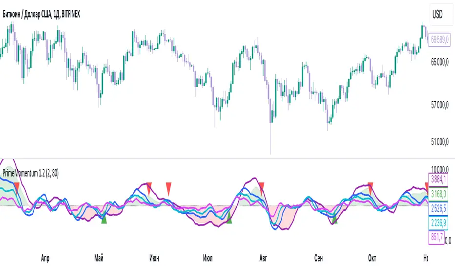
PrimeMomentum 1.1The PrimeMomentum indicator is not just an adaptation of classic tools like MA, BB, RSI, or WaveTrend. It is an innovative tool that combines several key elements and offers a unique methodology for market analysis. Its primary goal is to help traders avoid false entries and provide signals for making trading decisions.
What Makes PrimeMomentum Unique?
Integration of Multi-Timeframe Data with a Unique Signal Filtering Approach
PrimeMomentum processes data from four timeframes simultaneously, not merely to display trends but to assess the synchronization of momentum across each timeframe. This allows traders to receive signals only when all intervals confirm the direction. This approach minimizes the risk of false signals often encountered with standard tools.
PrimeMomentum analyzes the market across four timeframes:
TF1 (long-term): Displays the overall market direction.
TF2 (medium-term): Refines the current dynamics.
TF3 (short-term): Provides detailed analysis.
TF4 (very short-term): Confirms entry or exit points.
The combination of data from these timeframes allows traders to avoid frequent switching between intervals, simplifying analysis.
Innovative Reversal Logic
PrimeMomentum features a specialized algorithm for identifying trend reversals. Its uniqueness lies in the interaction between dynamic smoothing (EMA) and multi-level momentum assessment, enabling accurate identification of potential trend reversal points.
Dynamic Adaptation to Market Conditions
The indicator automatically adjusts smoothing parameters and threshold values based on market volatility. This enables it to adapt effectively to both calm and volatile markets.
Signals for entering Long or Short positions are generated only when the following conditions are met:
- Momentum shifts from negative to positive (for Long) or from positive to negative (for Short).
- Dynamic smoothing confirms the trend.
- Defined thresholds are reached.
Trend Strength Assessment
Unlike traditional indicators, PrimeMomentum evaluates not only the direction but also the strength of a trend by analyzing the relationship between momentum across each timeframe. This helps traders understand how stable the current market movement is.
The indicator analyzes price changes over a specific period, determining how much current prices deviate from previous ones. This data allows for assessing the strength of market movements.
Combination of Classic Elements with Proprietary Logic
While PrimeMomentum may utilize some widely known components like EMA, its algorithm is built on proprietary logic for evaluating market conditions. This sets it apart from standard solutions that merely display basic indicators without deeper analysis.
Added Value of PrimeMomentum
Trend Visualization with Concept Explanations
PrimeMomentum provides traders with clear visual signals, simplifying market analysis. Each element (color, line direction) is based on momentum and trend-smoothing concepts, enabling traders to make decisions quickly.
Results are displayed as color-coded lines:
- Dark violet: Long-term trend.
- Blue: Medium-term trend.
- Turquoise and light blue: Short-term trends.
If all momentum lines reach a peak and begin turning downward, it may indicate an approaching bearish trend.
If all lines reach a bottom and start turning upward, it may signal the beginning of a bullish trend.
Reversals can also serve as signals for exiting positions.
MoneyFlow
The PrimeMomentum indicator includes a visualization of MoneyFlow, allowing traders to assess capital flows within the selected timeframe. This functionality helps to analyze market trends more accurately and make well-informed decisions.
MoneyFlow Features:
Dynamic MoneyFlow Visualization:
MoneyFlow is displayed as an area that changes color based on its value:
- Green (with transparency) when MoneyFlow is above zero (positive flow).
- Red (with transparency) when MoneyFlow is below zero (negative flow).
Automatic Scaling:
MoneyFlow values automatically adjust to the chart’s scale to ensure visibility alongside the Momentum lines.
Double Smoothing:
To ensure a smoother and more representation, MoneyFlow uses double smoothing based on EMA.
Customizable Colors and Transparency:
Traders can customize the colors for positive and negative MoneyFlow and adjust the transparency level to fit their preferences.
How MoneyFlow Works:
- MoneyFlow calculations are based on the MFI (Money Flow Index), which considers both price and volume.
- MoneyFlow values are integrated into the overall PrimeMomentum chart and combined with other signals for deeper analysis.
Advantages of the New Functionality:
- Helps quickly identify capital flows into or out of the market.
- Complements Momentum analysis to provide a more comprehensive view of market conditions.
- Enhances decision-making efficiency through flexible visualization settings.
Note: MoneyFlow adapts to the selected timeframe and displays data corresponding to the current interval on the price chart.
Simplicity for Beginners and Depth for Professionals
The indicator is designed to be user-friendly for traders of all experience levels. Beginners benefit from intuitive signals, while experienced traders can leverage in-depth analysis for more complex strategies.
PrimeMomentum Usage Modes
PrimeMomentum adapts to various strategies and supports three modes:
Short-term: Recommended to use a 2H timeframe. Optimal for intraday trading with small TakeProfit levels.
Medium-term: Recommended to use a 1D timeframe for trades lasting several days.
Long-term: Use the 1W timeframe for analyzing global trends.
Support for Different Strategies
Thanks to its flexible settings and support for multiple timeframes, PrimeMomentum is suitable for both day trading and long-term analysis.
Why Is PrimeMomentum Worth Your Attention?
Unlike standard indicators, which often rely solely on basic mathematical models or publicly available components, PrimeMomentum offers a comprehensive approach to market analysis. It combines unique momentum assessment algorithms, multi-timeframe analysis, and volatility adaptation. This not only provides traders with signals but also helps them understand the underlying market processes, making it a truly innovative solution.
Disclaimer
The PrimeMomentum indicator is designed to assist traders in market analysis but does not guarantee future profitability. Its use should be combined with traders' own research and informed decision-making.
Pairs trading[Maxxxz7]Pairs Trading
This script is designed to analyze and visualize the divergence or convergence of two selected financial instruments, making it an excellent tool for implementing a pairs trading strategy. Developed for the TradingView platform, it offers extensive customization options for analysis.
Key Features:
Asset Selection:
The first asset can be taken directly from the chart or specified manually.
The second asset is always selected manually.
Data Normalization:
Calculates the percentage change of both assets relative to their initial prices.
Includes an offset for better visual interpretation.
Visualization:
Plots normalized price charts for both assets.
Highlights crossovers between the assets.
Displays the spread (difference between normalized prices) graphically.
Alerts (Works only on the 30-minute timeframe):
Configurable thresholds to trigger alerts (e.g., when the difference is smaller or larger than a set value).
Alerts for crossovers of prices and exponential moving averages (EMA).
Dynamic Labels:
Automatically adds labels to mark key events: crossovers, critical spread values, and current price information.
EMA and Deviation Analysis:
Calculates EMA for each asset.
Alerts for EMA crossovers.

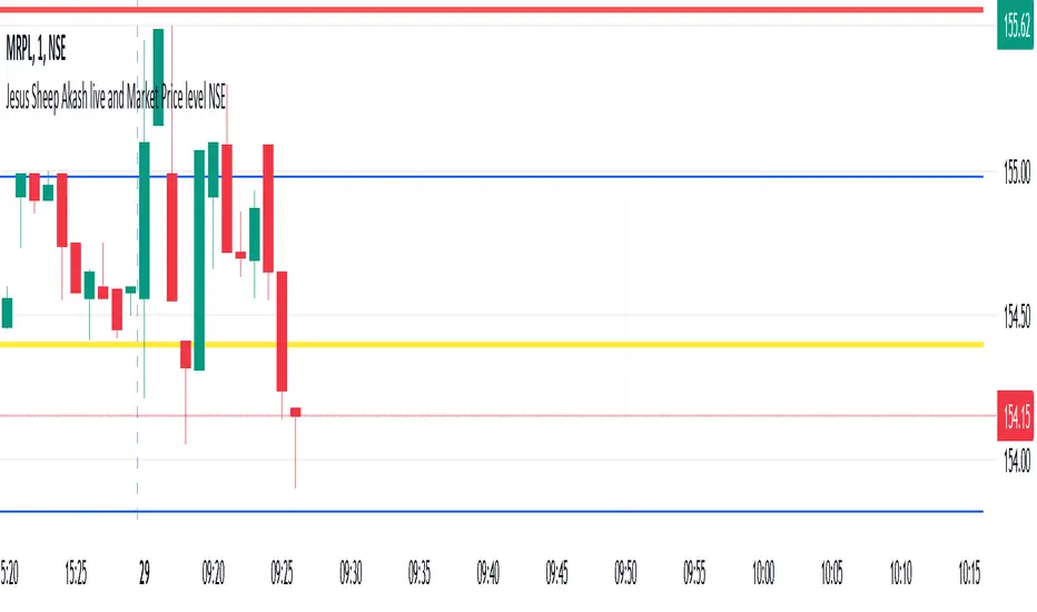
Jesus Sheep Akash live and Market Price level NSEJesus Sheep Akash live and Market Price level NSE
This Pine Script indicator is designed to assist traders by dynamically calculating and displaying key resistance and support levels based on market volatility (using the India VIX) and previous day's closing prices. It combines technical analysis principles with dynamic adjustments to account for changing market conditions.
Key Features:
Ticker Support:
Tracks both the India VIX (NSE:INDIAVIX) and the current market ticker.
Dynamic Resistance and Support Levels:
Calculates resistance and support levels based on the previous day's market close, adjusted dynamically using the VIX.
Includes half-resistance and half-support levels for intermediate targets.
Extends calculations to include additional resistance and support levels (up to four levels above and below).
Market Volatility Factor:
Integrates a volatility adjustment factor based on the 20-day standard deviation of prices, fine-tuning the calculated levels.
Real-Time Visualization:
Draws lines for:
Resistance levels (red lines).
Support levels (green lines).
Half-resistance and half-support (blue lines).
Highlights key price levels with labels on the chart.
Provides a dynamic table showing:
Current and previous day VIX.
Current price, price change, and previous close.
Alerts and Notifications:
Sends alerts when the market price crosses resistance or support levels, signaling potential trading opportunities.
Ease of Analysis:
Automatically updates lines and levels at the start of each trading session.
Provides a clear and structured view of key price points for informed decision-making.
Interactive Labeling:
Displays VIX data and previous day's closing value as a label near the chart for easy reference.
How to Use:
Trading Strategy:
Use the resistance levels as potential selling or shorting points.
Use support levels as potential buying or long entry points.
Monitor alerts for breakouts above resistance or breakdowns below support to identify significant market moves.
Customization:
Adjust daily_count or calculation parameters to match your specific market conditions or trading style.
Overlay Placement:
The indicator is designed to overlay directly on the chart for seamless integration with your technical analysis.
This indicator is ideal for traders looking to blend market sentiment (VIX) with precise price action analysis to identify trading opportunities dynamically.
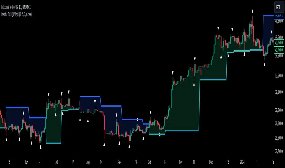
Fractal Trail [UAlgo]The Fractal Trail is designed to identify and utilize Williams fractals as dynamic trailing stops. This tool serves traders by marking key fractal points on the chart and leveraging them to create adaptive stop-loss trails, enhancing risk management and trade decision-making.
Williams fractals are pivotal in identifying potential reversals and critical support/resistance levels. By plotting fractals dynamically and providing configurable options, this indicator allows for personalized adjustments based on the trader's strategy.
This script integrates both visual fractal markers and adjustable trailing stops, offering insights into market trends while catering to a wide variety of trading styles and timeframes.
🔶 Key Features
Williams Fractals Identification: The indicator marks Williams Fractals on the chart, which are significant highs and lows within a specified range. These fractals are crucial for identifying potential reversal points in the market.
Dynamic Trailing Stops: The indicator generates dynamic trailing stops based on the identified fractals. These stops adjust automatically as new fractals are formed, providing a responsive and adaptive approach to risk management.
Fractal Range: Users can specify the number of bars to the left and right for analyzing fractals, allowing for flexibility in identifying significant price points.
Trail Buffer Percentage: A percentage-based safety margin can be added between the fractal price and the trailing stop, providing additional control over risk management.
Trail Invalidation Source: Users can choose whether the trailing stop flips based on candle closing prices or the extreme points (high/low) of the candles.
Alerts and Notifications: The indicator provides alerts for when the price crosses the trailing stops, as well as when new Williams Fractals are confirmed. These alerts can be customized to fit the trader's notification preferences.
🔶 Interpreting the Indicator
Fractal Markers: The triangles above and below the bars indicate Williams Fractals. These markers help traders identify potential reversal points in the market.
Trailing Stops: The dynamic trailing stops are plotted as lines on the chart. These lines adjust based on the latest identified fractals, providing a visual representation of potential support and resistance levels.
Fill Colors: The optional fill colors between the trailing stops and the price action help traders quickly identify the current trend and potential pullback zones.
🔶 Disclaimer
Use with Caution: This indicator is provided for educational and informational purposes only and should not be considered as financial advice. Users should exercise caution and perform their own analysis before making trading decisions based on the indicator's signals.
Not Financial Advice: The information provided by this indicator does not constitute financial advice, and the creator (UAlgo) shall not be held responsible for any trading losses incurred as a result of using this indicator.
Backtesting Recommended: Traders are encouraged to backtest the indicator thoroughly on historical data before using it in live trading to assess its performance and suitability for their trading strategies.
Risk Management: Trading involves inherent risks, and users should implement proper risk management strategies, including but not limited to stop-loss orders and position sizing, to mitigate potential losses.
No Guarantees: The accuracy and reliability of the indicator's signals cannot be guaranteed, as they are based on historical price data and past performance may not be indicative of future results.
ViPlay Signal Indicator ProViPlay Signal Indicator Pro is an innovative tool designed for traders looking to enhance the accuracy and effectiveness of their trading decisions. It provides a comprehensive approach to market analysis, generating informative trend change signals based on in-depth market analysis and advanced algorithms.
By adjusting the RISK parameter, traders can customize the signal frequency to match their preferences and trading strategies. This versatile tool is suitable for various trading styles and assets, including Forex, stocks, cryptocurrencies, and commodities, helping traders make informed decisions across any market.
Key Features of the Indicator
1. The RISK parameter controls the frequency of trend change signals. The lower the value, the more frequent the signals will appear, and vice versa. This gives users flexibility in adjusting the indicator according to their strategy.
2. Signal Generation:
Modified Range Oscillator (MRO):
This is the core element of the indicator's functionality. It works in two stages:
– MRO1: This stage focuses on short-term price movements, identifying volatility peaks and potential reversal points that may indicate an upcoming trend change. It is particularly useful for traders looking for quick opportunities.
– MRO2: This stage analyzes long-term trends, filtering out minor market fluctuations. It helps traders focus on more stable movements, reducing the impact of noise.
Williams %R:
This indicator works in conjunction with MRO, confirming reversal points by analyzing market overbought or oversold conditions. This reduces the likelihood of false signals, providing additional confidence in forecasts.
The combination of MRO and Williams %R ensures that traders receive reliable and timely signals, reflecting both immediate market conditions (via MRO1) and long-term trends (via MRO2), making the tool suitable for different trading horizons.
How the components work together:
MRO performs the primary task of identifying potential trend reversal points, dividing the analysis into short-term and long-term perspectives. In the first stage (MRO1), it evaluates market volatility and predicts potential reversals. In the second stage (MRO2), it filters out random fluctuations, providing more stable signals. Williams %R acts as an additional layer of confirmation: if MRO indicates a trend reversal and Williams %R confirms it by showing overbought or oversold conditions, the signal is considered more reliable.
In an uptrend, MRO1 indicates a reversal when the price reaches a local high, while MRO2 confirms the trend's stability. Williams %R further validates this signal, reducing the likelihood of a false entry. In a downtrend, the indicator works similarly, helping traders lock in profits or open short positions.
Williams %R:
Complements MRO by assessing market conditions for overbought or oversold levels. If MRO1 indicates a reversal and Williams %R confirms it, the likelihood of a false signal is significantly reduced.
RISK parameter:
Controls the sensitivity of MRO1 to changes in volatility. At higher values, minor fluctuations are filtered out, which is useful for long-term strategies. At lower values, the signals become more frequent, making it suitable for scalping.
3. Visual Signals:
– Green Up Arrow: Marks potential upward trends.
– Red Down Arrow: Marks potential downward trends, helping traders identify possible entry points
4. How levels are calculated:
Support and resistance levels are calculated based on historical price data. Specifically:
Support 1: This is the minimum price (low) over the last 200 bars.
Support 2: This is the minimum price over the last 500 bars.
Support 3: This is the minimum price over the last 1000 bars.
Resistance 1: This is the maximum price (high) over the last 200 bars.
Resistance 2: This is the maximum price over the last 500 bars.
Resistance 3: This is the maximum price over the last 1000 bars.
The levels are not static; they update with every bar, allowing traders to see current price zones. Users can enable or disable the display of different levels through parameters.
Support and resistance levels help traders identify key points for potential price reversals. The indicator automatically calculates these levels and displays them on the chart, allowing the user to use them for making trading decisions.
How to Use ViPlay Signal Indicator Pro
1. Add the Indicator to the Chart
2. Choose a Timeframe suitable for your trading strategy. The indicator supports all timeframes.
3. Customize Parameters:
Adjust the RISK parameter to control signal frequency (1–49, default 49).
Set the Take-Profit percentage (default 7%).
Configure moving average periods.
Adjust support and resistance levels.
4. Analyze:
– Use informative buy and sell signals based on market analysis.
– Use a customizable Take-Profit level based on the entry price to determine optimal exit points.
– Utilize key support and resistance levels on the selected timeframe to identify optimal entry and exit points.
– The information in the table indicates the strength of the current trend. When the value reaches 0 or 100, the trend changes.
* Note that the indicator serves as an analytical tool and does not replace sound trading strategies.
Uniqueness and Originality
1. Innovative Algorithms
The combination of Modified Range Oscillator (MRO) and Williams %R is not a standard pairing in trading tools. The two-phase approach of MRO provides users with a comprehensive understanding of the market, offering information on both short-term fluctuations and long-term trends, while Williams %R serves as an additional filter to eliminate false signals.
2. The indicator uses mathematical functions such as True Range (TR) to analyze volatility and identify potential entry and exit points.
3. Versatility
The indicator supports all financial market assets, including Forex, stocks, cryptocurrencies, and commodities. It adapts to any trading style or strategy. Additionally, it is compatible with all timeframes, benefiting both short-term and long-term traders.
4. Ease of Use
5. All elements of the indicator can be customized or hidden according to the user’s needs, making it a convenient tool for market analysis. The indicator is compatible with all financial market assets, including Forex, stocks, cryptocurrencies, and commodities.
Important Notes
This indicator is an analytical tool and does not guarantee profits. Signals should be used alongside personal analysis and risk management strategies. Traders should note that no indicator can provide 100% accurate predictions, and there is always a possibility of false signals.

Percent % Change Since Specific Date / TimeFUNCTIONS
- User specified Date/Time of importance
- Calculate the percent change since user input date/time to current price
- Plot a line at user input date/time
USAGE
You want to see how much price has changed since a certain important date/time.
Example important date: Trump win, FED rate change, Earnings, etc.

Dollar Cost Averaging (YavuzAkbay)The Dollar Cost Averaging (DCA) indicator is designed to support long-term investors following a Dollar Cost Averaging strategy. The core aim of this tool is to provide insights into overbought and oversold levels, assisting investors in managing buy and sell decisions with a clear visual cue system. Specifically developed for use in trending or fluctuating markets, this indicator leverages support and resistance levels to give structure to investors' buying strategies. Here’s a detailed breakdown of the indicator’s key features and intended usage:
Key Features and Color Coding
Overbought/Oversold Detection:
The indicator shades candles from light green to dark green when an asset becomes increasingly overbought. Dark green signals indicate a peak, where the asset is overbought, suggesting a potential opportunity to take partial profits.
Conversely, candles turn from light red to dark red when the market is oversold. Dark red signifies a heavily oversold condition, marking an ideal buying window for initiating or adding to a position. This color scheme provides a quick visual reference for investors to manage entries and exits effectively.
Support and Resistance Levels:
To address the risk of assets falling further after an overbought signal, the DCA indicator dynamically calculates support and resistance levels. These levels guide investors on key price areas to watch for potential price reversals, allowing them to make more informed buying or selling decisions.
Support levels help investors assess whether they should divide their capital across multiple buy orders, starting at the current oversold zone and extending to anticipated support zones for maximum flexibility.
Usage Methodology
This indicator is intended for Dollar Cost Averaging, a method where investors gradually add to their position rather than entering all at once. Here’s how it complements the DCA approach:
Buy at Oversold Levels: When the indicator shows a dark red candle, it signals that the asset is oversold, marking an optimal entry point. The presence of support levels can help investors determine if they should fully invest their intended amount or stagger buys at potential lower levels.
Sell at Overbought Levels: When the indicator transitions to dark green, it suggests that the asset is overbought. This is an ideal time to consider selling a portion of holdings to realize gains. The resistance levels, marked by the indicator, offer guidance on where the price may encounter selling pressure, aiding investors in planning partial exits.
Customizable Settings
The DCA indicator offers several user-adjustable parameters:
Pivot Frequency and Source: Define the pivot point frequency and the source (candle wick or body) for more tailored support/resistance detection.
Maximum Pivot Points: Set the maximum number of pivot points to be used in support/resistance calculations, providing flexibility in adapting to different market structures.
Channel Width and Line Width: Adjust the width of the channel for support/resistance levels and the thickness of the lines for easier visual tracking.
Color Intensities for Overbought/Oversold Levels: Customize the shading intensity for each overbought and oversold level to align with your trading preferences.
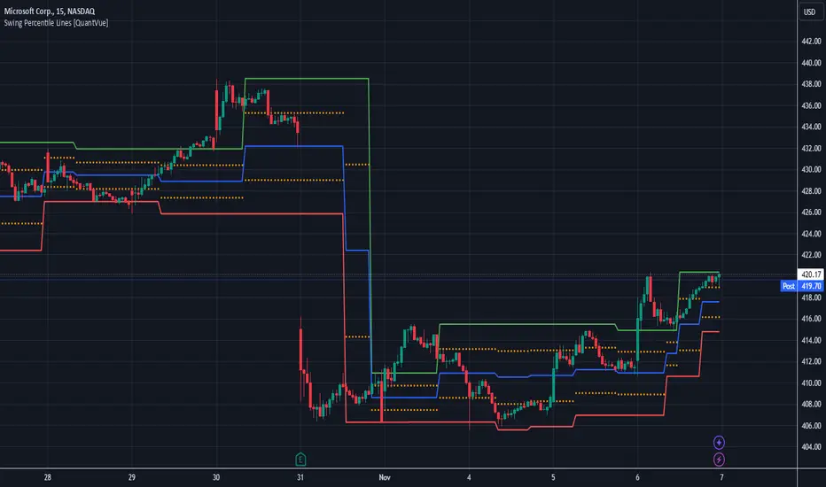
Swing Percentile Lines [QuantVue]The Swing High/Low Percentile Indicator is designed to help traders identify key price levels based on the most recent swing high and low. By anchoring to the most recent swing high and swing low, the indicator automatically generates percentile lines ( 25%, 50%, 75%) that act as dynamic support and resistance levels.
What Does the Indicator Do?
The Swing High/Low Percentile Indicator works by identifying the most recent significant price swings, whether it's a swing high or swing low. It then calculates the range between these points and divides the distance into percentage-based levels. These levels are plotted on the chart as clear, easy-to-read lines at 25%, 50%, and 75% of the range between the swing high and low.
These percentile lines serve as dynamic price zones where traders can anticipate potential reactions, whether the market is trending or consolidating.
How Can Traders Use the Indicator?
Support and Resistance: The percentile lines act as evolving support and resistance zones. Traders can anticipate price bounces or breaks at these levels, providing opportunities for trend-following or reversal trades.
Trend Identification: The indicator helps traders determine the strength of a trend. In a strong uptrend, price will likely stay above the 50% or 75% lines, while in a downtrend, it may remain below the 50% or 25% lines. This gives traders an edge in recognizing the overall market direction.
Entry and Exit Points: Traders can use the percentile lines to time their entries and exits. For example, entering a trade on a pullback to the 25% or 50% line offers a favorable risk-to-reward ratio. Similarly, the percentile lines serve as natural profit targets, allowing traders to plan exits as the price approaches the 50% or 75% levels.
Risk Management: The clear delineation of price levels makes it easy for traders to set stop-loss orders. For example, if price falls below the 25% line in an uptrend, it may signal weakness, prompting an exit or reduced position size.
Breakout and Breakdown Scenarios: When price breaks above a recent swing high or below a swing low, the percentile lines provide traders with pullback entry opportunities or key levels to watch for continuation of the move.
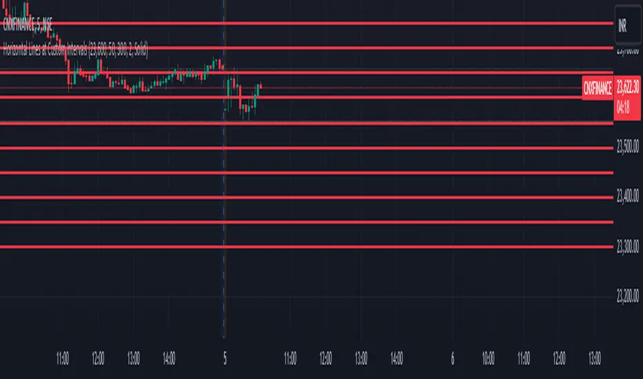
Horizontal Lines at Custom IntervalsThis Pine Script indicator, "Horizontal Lines at Custom Intervals," is a versatile tool designed to help traders visualize key price levels at regular intervals above and below a specified starting price. It is particularly useful for identifying support and resistance zones, psychological price levels, or potential entry and exit points around a central price reference.
Customizable Starting Price**: Set a central price around which the lines will be drawn, such as a current asset price, pivot level, or significant historical level.
- **Adjustable Intervals and Range**: Choose the interval distance (in points) between each horizontal line, as well as the total range above and below the starting price. This flexibility allows the indicator to adapt to different asset classes and timeframes.
- **Full Chart Extensions**: Each line is set to extend across the entire chart, providing a clear, continuous visual reference that spans both past and future price action.
- **Editable Line Style, Width, and Color**: Personalize the appearance of the lines with selectable color, width, and style options (Solid, Dotted, Dashed), enabling the indicator to match your charting preferences and visual style.
### Applications:
1. **Support and Resistance Identification**: Traders can use the evenly spaced lines to identify potential support and resistance zones around the starting price, helping to mark areas of interest where price may react.
2. **Psychological Levels**: Round-number levels often hold psychological significance in trading. By setting intervals to common round numbers, this indicator can help identify these critical levels.
3. **Scalping and Range Trading**: This tool is especially valuable in range-bound markets, where repeated price action within defined levels allows traders to buy and sell around predictable zones.
4. **Trend Reversal and Breakout Signals**: In trending markets, observing how price interacts with these levels can offer insights into possible breakouts or trend reversals.
### Example Use Case:
For instance, if BankNifty is trading around 51,130, you can set this as the starting price. With 50-point intervals and a range of 1,000 points, the indicator will plot lines at 50-point increments both above and below 51,130, covering a total range of 2,000 points. This setup provides clear visual cues for potential price reaction zones as the asset moves through different price levels.
This indicator is a simple yet powerful addition to any trader’s toolkit, offering a structured approach to analyzing price levels and making informed trading decisions.
Valid Pullbacks and Trend by kpt. GonzoThis script helps identify valid pullbacks. Based on the marked pullbacks, it can draw both internal and external structure trendlines.
A pullback is marked with a small triangle above or below the candle that created the local high or low.
A new local high is marked with a red triangle above the candle if at least one subsequent candle has a low lower than the low of the candle that created the new local high.
A new local low is marked with a green triangle below the candle if at least one subsequent candle has a high higher than the high of the candle that created the new local low.
Based on the marked local highs and lows, the internal structure trendline is created by simply connecting all highs and lows with a line.
The external structure is drawn in a similar way, but only highs and lows that have broken the previous structure are connected. This helps focus on important pivots and better understand the market structure.
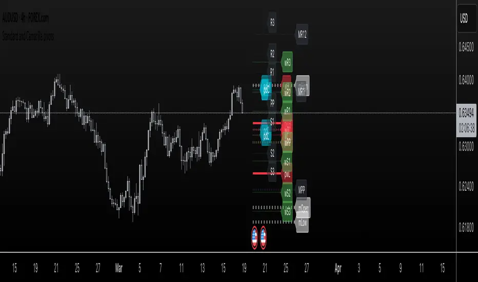
Standard and Camarilla pivotsHi guys, I would like too introduce to all of you my script. As the name already tell you what this script is all about. It's about pivot points.
You may ask, Tradingview already have a script for pivot points, why would I need another script?
here is the answer: This script allow you to add more than one type of pivot, sounds good right?
But there's more: You can see not just one timeframe pivots, you can see many timeframe pivots, nice huh?
let dive into it to know a bit more.
In this script you can see daily pivots include Standard pivots as R1, R2, R3 and Camarilla pivots as cR1, cR2, cR3, and I you different color for different pivots, so you don't confuse between those two.
You can see weekly pivots the same as daily pivots only has letter "w" in front of it, for examples: "wR1, wR2, wcR1, wcR2" ,nice right?
What's about month level: yes, you can see monthly pivots too, and it start with "m".
Along with pivots points above, you also can see daily open, previous day close, previous high,.., for instances: daily open as "O", previous day open as "PDO",
You are able to see previous week level, previous month levels.
have fun.
I dont wanna lock this script because open-source script help me learn how to code pine script, so that's why I keep it open. Thank to all the coders out there that shared everything they have for us to learn.
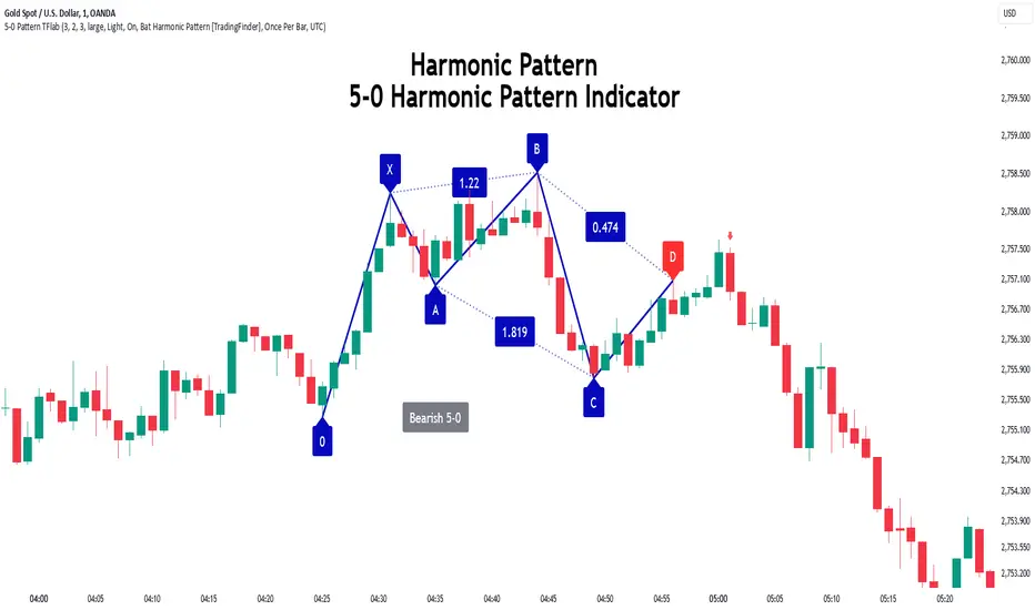
5-0 Harmonic Pattern [TradingFinder] 0XABCD 50 Harmonic Detector🔵 Introduction
Harmonic patterns are a powerful tool in technical analysis, widely used to detect reversal points and trend changes. Among these, the 5-0 Harmonic Pattern stands out due to its reliance on specific Fibonacci ratios—1.13, 1.618, 2.24, and 0.45 to 0.55—anchored at points 0, X, A, B, C, and D. This pattern provides a structured approach for identifying critical buy and sell points, helping traders achieve optimal entry and exit levels in volatile markets.
This 5-0 Harmonic Pattern indicator automatically detects and marks bullish and bearish formations on the chart, offering precise trading signals based on established harmonic ratios. With its dynamic signals, the 5-0 pattern enables traders to anticipate market movements and capitalize on favorable price trends.
Especially in fast-moving markets, harmonic patterns, particularly the 5-0 Harmonic Pattern, equip traders with an essential framework for identifying reversal opportunities and refining their trading strategies.
Bullish 5-0 Pattern :
Bearish 5-0 Pattern :
🔵 How to Use
The 5-0 Harmonic Pattern indicator is designed to automatically mark the key levels of the harmonic structure: 0, X, A, B, C, and D. By doing so, it detects both bullish and bearish patterns and helps traders recognize optimal entry and exit points.
Formed through specific Fibonacci levels, this pattern signals potential shifts in trend direction, giving traders critical insights for managing entries and exits effectively. The tool proves valuable in high-volatility settings, enabling traders to leverage these signals for refined decision-making.
🟣 Bullish 5-0 Pattern
A bullish 5-0 pattern materializes when Fibonacci levels indicate a potential price reversal to the upside. With points 0, X, A, B, C, and D in alignment, the indicator highlights this upward momentum by displaying a green arrow as a buy signal on the chart. This marking provides a clear entry point, indicating that prices are likely to rise, making it a prime moment for traders to enter long positions.
Additionally, the bullish 5-0 pattern is equipped with tools for traders to set stop-loss and take-profit points based on harmonic lines within the pattern, which represent support and resistance levels. Using these dynamic points, traders can create a more effective risk-reward setup while following the bullish signals in a standalone harmonic strategy.
🟣 Bearish 5-0 Pattern
The bearish 5-0 pattern functions similarly but signals a likely downturn. This pattern emerges when Fibonacci ratios align at points 0, X, A, B, C, and D, predicting a reversal downward. The indicator generates a sell signal, marked by a red arrow, prompting traders to exit long positions or initiate short trades to capitalize on falling prices.
Traders can utilize this bearish pattern for defining exit strategies and setting key levels for stop-loss and take-profit orders. The bearish 5-0 pattern enhances traders’ abilities to gauge critical price levels and manage trade risk effectively, especially in volatile markets. For traders focused on profiting from downward trends, this indicator serves as a powerful tool for timely entries and exits.
🔵 Setting
🟣 Logical Setting
ZigZag Pivot Period : You can adjust the period so that the harmonic patterns are adjusted according to the pivot period you want. This factor is the most important parameter in pattern recognition.
Show Valid Forma t: If this parameter is on "On" mode, only patterns will be displayed that they have exact format and no noise can be seen in them. If "Off" is, the patterns displayed that maybe are noisy and do not exactly correspond to the original pattern.
Show Formation Last Pivot Confirm : if Turned on, you can see this ability of patterns when their last pivot is formed. If this feature is off, it will see the patterns as soon as they are formed. The advantage of this option being clear is less formation of fielded patterns, and it is accompanied by the latest pattern seeing and a sharp reduction in reward to risk.
Period of Formation Last Pivot : Using this parameter you can determine that the last pivot is based on Pivot period.
🟣 Genaral Setting
Show : Enter "On" to display the template and "Off" to not display the template.
Color : Enter the desired color to draw the pattern in this parameter.
LineWidth : You can enter the number 1 or numbers higher than one to adjust the thickness of the drawing lines. This number must be an integer and increases with increasing thickness.
LabelSize : You can adjust the size of the labels by using the "size.auto", "size.tiny", "size.smal", "size.normal", "size.large" or "size.huge" entries.
🟣 Alert Setting
Alert : On / Off
Message Frequency : This string parameter defines the announcement frequency. Choices include: "All" (activates the alert every time the function is called), "Once Per Bar" (activates the alert only on the first call within the bar), and "Once Per Bar Close" (the alert is activated only by a call at the last script execution of the real-time bar upon closing). The default setting is "Once per Bar".
Show Alert Time by Time Zone : The date, hour, and minute you receive in alert messages can be based on any time zone you choose. For example, if you want New York time, you should enter "UTC-4". This input is set to the time zone "UTC" by default.
Conclusion
The 5-0 Harmonic Pattern indicator serves as a robust solution for technical analysts and traders looking to pinpoint market reversal points. By automatically recognizing 5-0 patterns and generating buy and sell signals based on Fibonacci ratios, this tool supports precise trend analysis and entry/exit timing. The indicator’s adjustable alerts, color themes, and pattern toggles allow for comprehensive customization, ensuring alignment with individual trading strategies.
Harmonic patterns, especially the 5-0 Harmonic Pattern, guide traders in identifying high-accuracy entry and exit points, thus aiding in more informed trading decisions. By combining Fibonacci ratio analysis with real-time signal updates, this indicator provides a well-rounded approach for risk management and capitalizing on trading opportunities. Professional traders can harness this tool to enhance technical analysis precision and capitalize on price trends effectively, maximizing profitability in both bullish and bearish markets.
[Spinn] LeveragesThis indicator is designed to visually measure the levels of the position at different leverage values. It acts as a "ruler", the level of levels at which it can cause liquidation, which helps the trader estimate whether it is gradually risky to use this or that leverage.
The indicator works in two modes:
Basic mode:
Levels of prescriptions for standard leverage values (1x, 2x, 5x, etc.), allowing you to quickly assess the risk of consequences when using these coefficients.
Pivots mode:
Levels are built on the basis of local extremes (pivots) on the visible section of the chart, tied to key reversal points.
The pivot is determined by the number of bars to the left and right of it, which is set as a source (the number of bars to the right of each specific roller does not matter).
In this mode, levels will be shown only for the visible part of the chart.
Color marking: green indicates liquidation levels for longs, red - for shorts. Each approach corresponds to a price tag for ease of use.
It is important to note that the indicator uses pure coefficients, without taking into account exchange commissions and other adjustments. Therefore, the calculated levels may not coincide with the actual liquidation levels on the exchanges.
––
Данный индикатор предназначен для визуальной оценки уровней ликвидации позиций при разных значениях плеча. Он выступает в роли «линейки», показывая уровни, на которых может произойти ликвидация, что помогает трейдеру прикинуть, насколько рискованно использовать то или иное плечо.
Индикатор работает в двух режимах:
Режим Basic (базовый):
Уровни привязаны к стандартным значениям плеча (1x, 2x, 5x и т. д.), позволяя быстро оценить риск ликвидации при использовании этих коэффициентов.
Режим Pivots (пивотный):
Уровни строятся на основе локальных экстремумов (пивотов) на видимом участке графика, привязываясь к ключевым точкам разворота.
Пивот определяется по количеству баров слева и справа от него, что задается в настройках (количество баров справа от пивота особой роли не играет).
В этом режиме будут показаны уровни только для видимой части графика.
Цветовая маркировка: зелёным обозначены уровни ликвидаций лонгов, красным — шортов. Каждому уровню соответствует метка с ценой для удобства работы.
Важно отметить, что индикатор использует чистые коэффициенты, без учета комиссий бирж и других поправок. Поэтому рассчитанные уровни могут не совпадать с фактическими уровнями ликвидации на биржах.
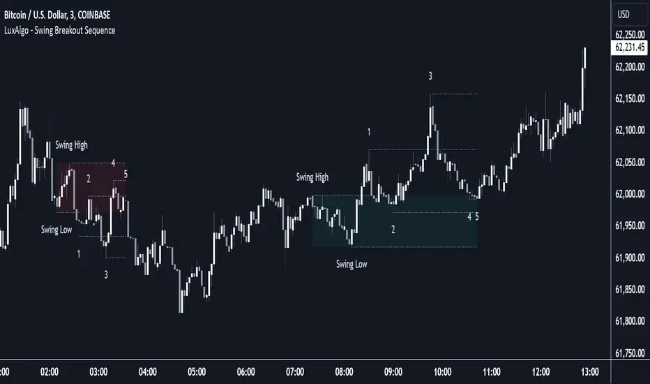
Swing Breakout Sequence [LuxAlgo]The Swing Breakout Sequence tool enables traders to identify a directional price action scalping sequence comprising two unsuccessful breakouts in the same direction, with the expectation of a third.
🔶 USAGE
This sequence looks for pressure on one side of a swing zone.
The market tried to break out of the zone twice but failed. This led to a pullback into the zone after each attempt. Once a reversal inside the zone is identified, the sequence is complete. It is expected that the market will move from the final reversal within the zone to the final breakout attempt outside the zone.
The sequence of price action is as follows:
Point 1: Breakout attempt out of the swing zone
Point 2: Pullback into the zone
Point 3: Breakout attempt out of Point 1
Point 4: Pullback into the zone, tapping into Point 2 liquidity
Point 5: Reversal structure with Point 4 in the form of a double top or double bottom
This sequence assumes traders will be caught off-guard when they try to capitalize on the initial breakout at Point 1, which is likely to result in a loss. If the breakout at Point 3 fails, all traders will be caught out and switch positions.
If there is enough pressure in the swing zone to cause a reversal at Point 5, the trapped traders could be the start of the next breakout attempt.
🔹 Sequence Detection
Traders can define sequence behavior and adjust detection with three parameters from the Settings panel.
Disabling Points 4 and 5 will detect the most uncompleted sequences.
🔹 Showing/Hiding Elements
Traders can change the look of sequences by showing or hiding their parts using the Style settings.
🔶 SETTINGS
Swing Length: Number of candles to confirm a swing high or swing low. A higher number detects larger swings.
Internal Length: Number of candles to confirm a internal high or internal low. A lower number detects smaller swings. It must be the same size or smaller than the swing length.
🔹 Detection
Point 4 Beyond Point 2: It only detects sequences where Point 4 is beyond Point 2.
Show Point 5: Enable/disable Point 5 detection.
Require Equal H/L at Point 5: Enable/Disable double top/bottom detection at Point 5 within a given threshold. A bigger value detects more sequences.
🔹 Style
Show Sequence Path: Enable/disable a line between sequence points.
Show Boxes: Enable/disable colored boxes for each sequence.
Show Lines: Enable/disable horizontal lines from each point of the sequence.
Default Color: Define the color or enable/disable auto color.
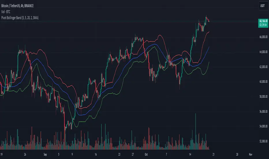
Pivot Bollinger BandThis is a special kind of Bollinger Bands indicator that adapts to the market's pivot points. Instead of using regular price data, it first finds important swing highs and lows in the market (called pivot points). It then uses these pivot points to create a center line, which is like a moving average of where the market is pivoting.
Around this center line, it draws the classic Bollinger Bands - an upper and lower band that show where prices might find resistance or support. The distance between these bands changes based on market volatility, just like regular Bollinger Bands. You can adjust how sensitive it is to pivot points and how wide the bands should be.
By using pivot point based Bollinger Bands, we expect band breakout can be captured more effectively.