Candle Overlay and Change From Open PercentCandle Overlay and Change from Open Percentage
This script is free for all to use was designed to be non-cluttering for those who like their charts clean. This script features two things:
1) An option to allow a candle overlay over the existing stock/security in a charting window.
- By default, the additional candle overlay uses the same ticker you're currently looking at
- By default, the chart resolution for the additional candle overlay uses the same chart resolution as the current charting window you're using
- Please note that if you enable an additional candle overlay for a stock/security that has a wider gap in the stock price between the two different stock/securities, the additional candle overlay may not be visible, due to the big variances in stock price (unless you zoom out to get both charts to fit).
- The benefit to having this feature, is the ability to use a line chart as the primary and the candle chart as the secondary (each overlaying another)
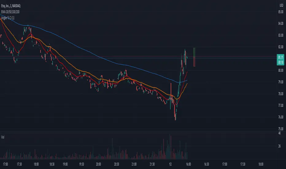
2) An information window showing the percentage change from the market open
- If the market is not currently open, you will see a message, which reads "MARKET CLOSED" and underneath it, the stock/security price from the prior trading day
- If the market is open, you will see a couple of things:
a) The information window will either be green or red and geared towards mostly day traders. This color is based on whether the current price is above or below the market open price. The default color if the current price is at or above market open price is green and the default color if the current price is below the market open price is red. Although, not always the case, you can generally assume if the stock price is above the market open price that the overall trend is generally bullish (but again, not always the case, as there's other varying factors that come into play).
b) There's two lines displayed on the information window and these information automatically changes depending on the color of the information window.
c) The first line that starts with a star symbol begins with the current percentage change/move from the market open price and the secondary number on the same line is either the absolute highest (or lowest) percentage change uncovered during the current trading day. If the information window is green, this percentage number is the highest percentage uncovered. If the information window is red, this percentage number is the lowest percentage uncovered. Please note that nobody knows the absolute highest and lowest price of any particular stock on any particular day; therefore, sometimes the only way to have a better sense of what the absolute highest (or lowest) percentage possible on a stock/security is when the day progresses into power hour and into the market close.
d) The second line that starts with either an UP and DOWN arrow indicates the estimated projected max percentage (again depending on whether the information window is green or red). Please note that this feature is completely experimental and subject to future code changes. If the information window is green, this percentage number guesses what the max percentage change the stock price will go up to. If the information window is red, this percentage number guesses what the max percentage change the stock price will go down to.
e) Please note that the second line which provides the estimated max percentage (either up to down) should not be used as an indicator for your trading, but rather just for entertainment. The estimated percentage max change can auto-adjust itself throughout the day. Stock news, unexpected high trading volume, etc... can cause a stock/security price to exceed (or shortfall) this estimated max percentage.
* Please note that this script is in its early beta stage and there could be bugs. This is being provided as is and the information provided by this script is meant for informational/entertainment purposes only.
Percent

Front Angler Percent CJA nice little gadget.
Can be used to visually hint on volatility.
Will show a leading vertical bar which shows percentage of price, both up and down, in relation to current price.
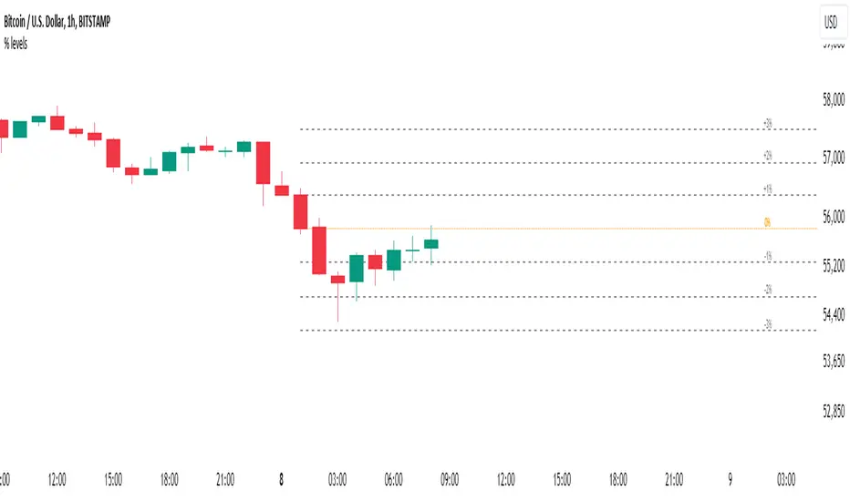
Percent Levels From Previous CloseThis indicator plots on the chart +/- 1% / 2% / 3% ranges based on the previous day's close levels.
Disclaimer :
Success in trading is all about following your trading strategy and indicators should fit into your own strategy, and not be traded purely on.
This script is for informational and educational purposes only. Use of the script does not constitute professional and / or financial advice. You are solely responsible for evaluating the outcome of the script and the risks associated with using the script. In exchange for the use of the script, you agree not to hold monpotejulien TradingView user responsible for any possible claims for damages arising out of any decisions you make based on the use of the script.
Percent Off All-time High (% Off High)Percent Off All-time High tracks the percentage difference between the previous day’s closing price and the All-Time high price of the security’s entire price history.
This metric tells you how far the price has deviated from/converged on the all-time high price.

Momentum Percentage %A Percentage Momentum Indicator (oscillator) is a technical indicator which shows the trend direction and measures the pace of the price fluctuation by comparing current and past values. Normalized to be bounded to oscillate between 0 and 100 percent of recent price variation. As is, it average true range of an instrument can be easily compared to any other because of absolute percentage variation and not prices itselves.
The benefits of Percentage Momentum
It indicates volatility
It ideal to compare fluctuation and volatility between other assets
In assets that changes btw a large range of prices like crypto it's the best way to work with momentum.
It's the right way to work with algotrading.

Daily MovesShow percent daily moves with a 5 period look back. This helps visualize recent performance.
Bitcoin Movement vs. Coin's Movement MTFThis script tracks the percent change of Bitcoin vs. the percent change of the coin on the chart. Crypto markets are usually affected greatly by Bitcoin swings so being able to see if the given coin is trending above or below Bitcoin is useful market data. All choices made with this script are your own! Thanks.

Moving average percent measureit's just an average moving multiplied by a percentage. this is good for measuring the acceleration of price movements

40+ Coin Screener (workaround to 40 Security Limit Per Script) This is a far inferior method for a screener/scanner (compared to my first publication) but after looking at that script from a noobs eyes again, I could see how this form would be a lot easier to take in/understand so wanted to publish it. Everything that I could think of to mention about this is in my 1st pub so ill leave it to you to check it out...though I did include some comments in the script. It is pretty straight forward but if you have any questions don't hold them in. I'll answer them if I can. The only thing that is not in this one is setting up the alert feature so that you only have to create 1 alert per iteration of the script and it takes care of all of the coins for that iteration/set that is chosen in the settings (so please see previous script if would like to do this for your screener/scanner).
To be PERFECTLY CLEAR, the workaround is to the issue of not being able to scan but only 40 coins per script. You can scan more than 40 per script but only if you create "batches" or "sets" that the user can select within the settings which set to use for each iteration of the script on the chart. That being, you have to the script multiple times to the chart and merge them into 1 window and merge the scales (instructions in first publications). Here in this script I am scanning 72 different coins that are the Margin Coins on KUCOIN. I have split them up into 3 sets (24 coins per set). I could have made 2 sets but the script will be slower to load and to respond (like, when it comes to receiving alerts), thus I split them up the way I did. If you want to change any of this there are slightly more details in the previous script.
One great use-case that I LOVE about this particular version (and the way I use it) is right at the end of when I see a whole market dump/pump coming to an end and want to know which horse to bet on. Used to think whichever coin come out the fastest from the dump was the one to bet on but quickly learned that 1-2 (or even a few) hrs needs to go by first bc the ones that look the strongest in the beginning are NOT the ones to have performed the best when viewing the results 12 hrs later. IN FACT, many instances of using this exact script for reasons as such has taught me that the manipulators (I believe this to be the case as least) WANT everyone to bet on these that come out the gate the hardest and thus they make them move REALLY hard in the beginning then they QUICKLY become stagnant (moreso, they become WORSE than stagnant, they actually quickly retrace to put you into the negative so that you get out to get into the others now moving (to provide the market with more liquidity. They WANT you to get into a coin thats moving crazy hard so that they can then cease that movement once many fall for the trick just to then make that once strong looking coin now stagnant and make others move crazy hard. They wait for you to get out of the 1st and into the next set of movers just to do this time and time again bc hey, what are we sheep good for other than to provide the big guns with liquidity, am I right? Thats rhetorical, which you would know if you've ever had this happen to you (without a doubt MANY of you have). Let this script (above all other things) provide good evidence to back up this cynical way of viewing the markets to anyone that is questioning it.
This prolonged time between when the dump is over and when the ACTUAL movers REALLY start moving can actually be of great benefit to us sheep if used correctly, Firstly, it gives us some time to determine if when we thought was the bottom, ACTUALLY was the bottom. That bottom is easily determined if there are no (or very few) coins that went any lower than the point in time that the script began calculating on. Secondly, it allows us time to wait for the REAL movers and shakers to start moving and shaking.
One new feature that I LOVE that TV has implemented is the ability (once the script is added to the chart) to be able to click a point in time on the chart where you want the script to begin its calculations. If this point needs to be changed at any point in time then you can either go into the setting and input the time you wish or simply remove the script and add it again so that you are prompted to select another point in time. Ok, I think that everything I wanted to say. The next version that I will add will be probably my favorite and most used by yours truly...not to mention unique in a way that I have yet to see an implementation anything like it in all of TV's public library. Not to say its not there, but I have yet to come across it and I have DEFINITELY done my fair share of searching for it when I couldn't figure out how to code it for the longest time (though, I was and still am a noob so might get some great feedback on better ways to approach it, but we'll save that jabbering for the next of the publications.
I hope each and every one of ya'll (yes, Im from the South) have the GREATEST of Thanksgivings (if in the US that is...I graced my parents with the best gift anyone could have given them 35 years ago on Thanksgiving....MEEEE ;) So I will sure as hell be having a great holiday. Thanks for checking out my script...you can "like" and leave a comment if you so feel the urge to...or not. Im not doing this for me, but rather to stretch my arms out as far as possible to benefit the most people as possible and more people would see the script if it has more likes/comments/traffic pointing towards it...not to mention as other publishers have...it IS gratifying to see a few likes in my side window, which btw, I have MANY more variations and completely diff types of scanners/screeners Ill be publishing in the future and to know that they've become of use....I"VE become of use to the community is very....pleasing to me and does (as I've also seen many publishers mention as well) drive me to want to publish ones that I originally thought I would keep for myself. Peace out people.

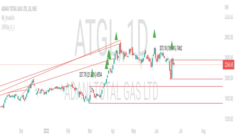
20% up with all continuously green candle: Lovevanshi It can be used to get the indication for 20% up movement among all continuously green candles formed in past. It is suitable for Indian company stock for short term trading plans.
Supertrend with Percent Difference from CloseThis script improves the Supertrend indicator by displaying a label that shows the percent difference between the latest closing price & the Supertrend.
This comes in handy when one is using the Supertrend value as a stoploss level. For instance, one would like to have a maximum stop loss level of 8%. Instead of calculating how much percent the price is away from the Supertrend, one can look at the percent label & make an informed decision as to whether initiating a position would have favourable risk/reward or not.
Another utility would be selling into strength when one is using the Supertrend as a trailing stop loss. For instance, if the price is a certain percentage far away from the Supertrend, one may conclude that the price is now extended & either price correction or time correction would ensue, & decide to sell into strength.

Momentum Performance This Indicator displays the momentum (performance) of the symbol in percent.
You can compare the performance with other symbols.
The default benchmarks are the S&P 500, the MSCI World and the FTSE All World EX US.
The default length corresponds to one year in the timeframes monthly, weekly and daily.
In intraday the default length is 200, but you can also set your own setting.
You have also the opportunity to display a average momentum performance of the main symbol.

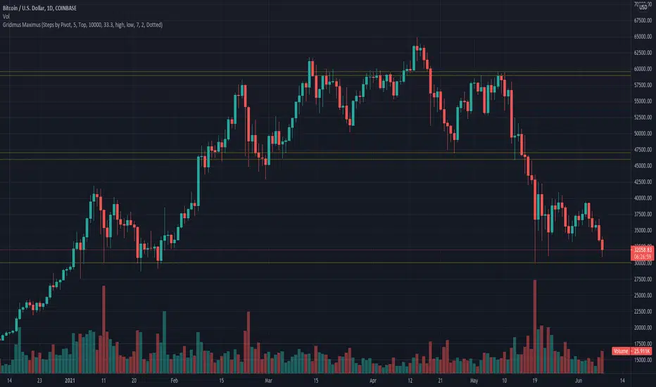
Gridimus MaximusGridimus Maximus draws N grid lines stepping by price or percent in chosen direction from set price, or draws N grid lines stepping by pivots.
The queue function method used is adapted from an example provided on the PineCoders website, much gratitude to LucF for this gem!
To prevent grid lines out of range from causing chart to rescale right click on chart's price column and enable Scale Price Chart Only.
Pictured example above is using Type Of Increment: Steps By Pivot, Number Of Steps: 5.
Pictured example below is using Type Of Increment: Steps By Price, Number Of Steps: 6, Starts From Price: $10k, Steps By Percent Or Price: $10k.
Pictured example below is using Type Of Increment: Steps By Percent, Number Of Steps: 7, Starts From Price: $10k, Steps By Percent Or Price: 33%.
NOTICE: This is an example script and not meant to be used as an actual strategy. By using this script or any portion thereof, you acknowledge that you have read and understood that this is for research purposes only and I am not responsible for any financial losses you may incur by using this script!
Percent Change per CandlestickThe script has two options: volatility (absolute value of change) and updown which has positive and negatives. That's it. useful for alerts.
TheLineMuch like the new map for traders indicator, but with less resources needed by the computer therefore runs more smoothly.

Bell Curve LevelsScript which plots the % change from the open and overlays the 1, 1.5, 2 & 3% levels on the chart.
The bell curve offers a quantifiable clue to the persistent percentages the price moves in the fx market. A simple histogram will convey the %change in bins
this indicator just reflects that with levels on the chart.
Can be an aide for intraday or longer term levels.
Feel free to message me with any queries.
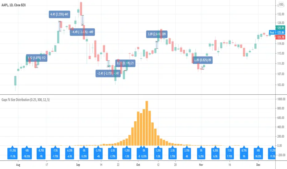
Gaps % Size DistributionThis tool is to visualize the distribution of gap % sizes, i.e. those things that I marked on the main chart. The tool uses the entire history of an instrument.
The detalization depends on the Binning Step parameter. The lower chart timeframe the lower that step should be.
Good luck.
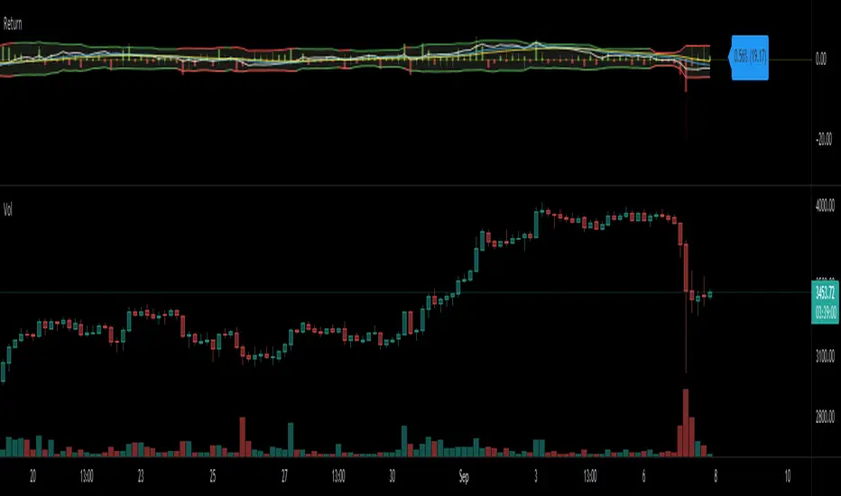
Return (Percent Change)This Script displays Regular or Log Returns as either a line or histogram and labels the current bar.
If something other than price is selected as the source, the result is percent change with a positive or negative slope.
If a moving average of price is used as the source, the result is analogous to a strength index
Other options include a look-back period adjustment (the default is 1),
smoothing results by converting to an EMA, and
Bollinger Bands with Length and Standard Deviation inputs.
ATR PercentAverage True Range in Percent to price
- 2 customizable horizontal line: to be used as custom levels.


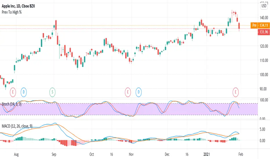
Previous Close To Current High Percentage Per CandleGet the percentage of previous candle price to current high candle price.
This script will make your life easier to get percentage without you calculating it.
Hope you enjoy the tool and let me know if there is any feedback or improvement request.
Thank you very much. :D
--------------------------------
Formula:
Previous To High Percentage Per Candle = (high - previous / previous) * 100%
--------------------------------
Percent changeThis indicator shows WMA ribbons of the percentage of price movements.
Strong peaks show unusual price movement and might indicate a good time to close your position.
A narrow band shows stable price movement and could indicate a good time to get into a position. (Squeeze)
