US Market CrashesThis script allows you to manually highlight specific periods on a chart, making it easy to visualize significant market events such as recessions, market crashes, or other key timeframes. Unlike traditional indicators that are based on price movements, this script provides a flexible way to mark any custom date range directly on your Trading View charts.
Features:
Custom Date Ranges: Easily specify start and end dates for periods you want to highlight on the chart.
Custom Colors: Choose different colors for each highlighted period for clear visual distinction.
Predefined Market Crashes: By default, the script highlights 18 historical market crashes where the market declined by over 20%.
Use Cases:
Historical Analysis: Highlight and study the impact of past recessions or market crashes.
Event Marking: Mark specific economic events, earnings seasons, or other relevant periods.
Presentation: Use the highlighted periods to enhance presentations or reports on market behavior.
How to Use:
Input the start and end dates for the periods you want to highlight.
Adjust the colors and transparency as needed.
Apply the script to your chart to see the highlighted periods.
This tool is perfect for traders, analysts, and investors who want a clean and straightforward way to visualize important historical periods on their charts.
The default setup includes 18 significant market crashes with declines of over 20%.
Marketcrash

75: Notable Financial CrisesThe TradingView script named "75: Notable Financial Crises" visualizes and marks significant financial crises on a financial chart.
This script plots vertical lines on the a chart corresponding to specific dates associated with notable financial crises in history. These crises could include events like the Great Depression (1929), Black Monday (1987), the Dot-com Bubble (2000), the Global Financial Crisis (2008), and others. By marking these dates on a chart, traders and analysts can easily observe the impact of these events on market behavior.

Official Recession Indicator - Market RadarThis is a script that allows you to plot recessionary periods over your charts. This gives you the context between different recessions classified by different institutions over prior periods.
Currently, the indicator allows for the display of shaded periods for the following:
NBER Recessions (Peak through Trough (as seen on FRED charts))
NBER Recessions (Period following the Peak through the Trough)
OECD Recessions (Peak through Trough)
At the moment, all the recessions are for the United States only, this can change over time as more datasets are added.

Market Risk ON/OFFMarket Risk ON/OFF is a indicator designed to show you when it may be a good time to add hedges and/or reduce long exposure to the US stock market. It can be used to make forecasts on the overall market, when a crash or bear market may be about to occur and when a bull market is still strong. When the indicator is applied to a chart, entire time periods will be shaded either Green (Risk-ON Mode) or shaded Red (Risk-OFF Mode). It can be applied to any chart, however it's best applied to a chart of the S&P 500 Index or the ETF $SPY on the daily timeframe.
It's calculation is based on 3 things; price action of the S&P 500 Index ETF $SPY, overall market breadth (that is advancing stocks versus declining stocks) and CBOE Volatility (VIX) Futures term structure. By default 2 out of these 3 signals must be in confluence for a regime change from Risk-On to Risk-Off mode, however this setting can be changed to either 1, 2 or 3 signals required for a regime change.
You can see in the chart above an example of how this indicator would have alerted users on the 25th February 2020 of a change to Risk-Off mode and allowed you to prepare for a possible market crash which happened (the Covid bear market) and when things settled down it switched back to Risk-On mode on the 24th of April 2020 letting you know it was safer to position your portfolio for a bull market again.
Here's another example from the 2008 Global Financial Crisis (GFC) market crash of the Market Risk ON/OFF indicator alerting you to a possible crash.
To get access PM or email me to my address shown below.
Enjoy :)
Disclaimer: All my scripts and content are for educational purposes only. I'm not a financial advisor and do not give personal finance advice. Past performance is no guarantee of future performance. Please trade at your own risk.

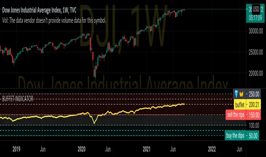
BUFFET INDICATORDISCRIPTION
The stock market cap to GDP ratio has become known as the Buffett Indicator in recent years, as Warren Buffett commented that he believes it is “probably the best single measure of where valuations stand at any given moment.”
CALCULATION
100*VALUE OF ALL STOCKS IN COUNTRY/GDP OF COUNTRY
100*wilshire5000/gdp
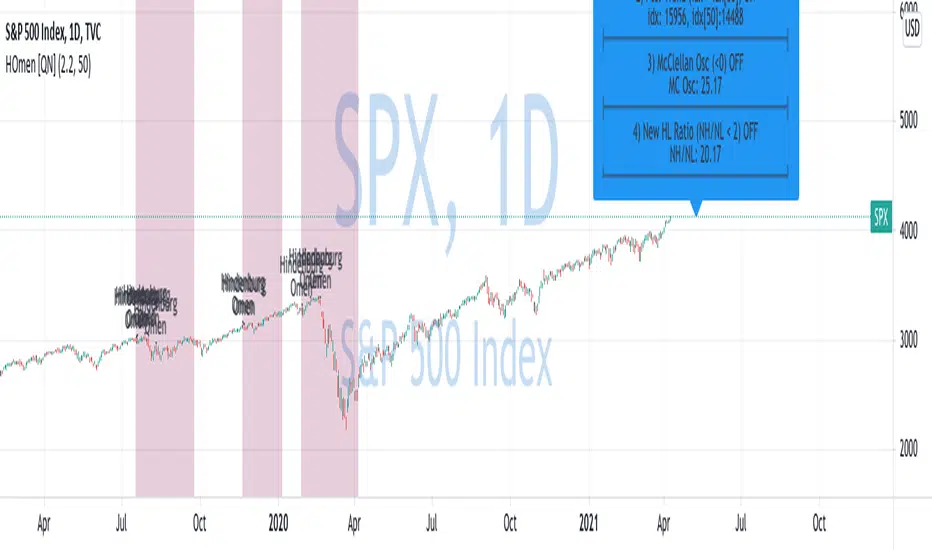
Hindenburg Omen [QuantNomad]New record highs is good time to look at a market crash indicators )
This is a Hindenburg Omen indicator.
The Hindenburg Omen looks for a statistical deviation from the premise that under normal conditions, securities are either making new 52-week highs or 52-week lows. The abnormality would be if both were occurring at the same time. According to the Hindenburg Omen, an occurrence such as this is considered to be a harbinger of impending danger for a stock market. The signal typically occurs during an uptrend, where new highs are expected and new lows are rare, suggesting that the market is becoming nervous and indecisive, traits that often lead to a bear market.
For it to be on 4 conditions should be satisfied:
1. Number of new 52-week highs and 52-week lows in a stock market are greater than a threshold (2.2% for example).
2. Positive recent trend. Index > index
3. The McClellan Oscillator (MCO) is negative.
4. 52-week highs cannot be more than two times the 52-week lows.
You can read more about the indicator on Investopedia:
www.investopedia.com
Based on indicator created by @Boombotcom: