WON WeekliesWilliam O'Neil was a big proponent of using weekly charts, often highlighting the significance of 3 or more tight weekly closes, or a sequence of five or more consecutive up weeks. This indicator recognizes both of these conditions providing clear visual cues to signify this institutional buying activity. When three tight weekly closes or more occur a circle will be drawn around the middle close or the background will change color, depending on user preference. If five or more consecutive up weeks are detected a box is drawn around all the price action of those weeks.
User Options:
- Choose to display both or only one condition
- Customizable colors
- Define what a tight close is (default is less than 1.5%)
- Change background color or display smaller circles for 3 weeks tight
- Alerts for both
Note: 5 weekly closes wont print until the 5th weeks candle is closed.
Ibd

[TTI] Whaley Breadth Thrust––––History & Credit
The Whaley Breadth Trust is a powerful signal that has a great success rate. It was invented by Wayne Whaley in 2009. Since 1970 to 2009, the signal has occured only 12 times!
–––––What it does
The indicator uses 3 conditions.
Condition 1: The Advancing and Declining NYSE stocks
Condition 2: The Up and Down volume
Condition 3:The absolute price increase in the SP500
It calculates different ratios and determine bullish or bearish setting based on this.
When only conditions 1 and 2 are present, we call this a Light Thrust. When all 3 conditions have occured then we call this Full Thrust.
–––––How to use it
Consider very bullish signal when you see this.
The light thrust occured on 12JAN23 on the SPX.
The signal occured in the following years: 1974, 1982, 1987, 2002, 2008

Index VolumeThis indicator displays the volume for the Nasdaq Composite and S&P500 indexes just like any other stock. Also displays any normal stock volume as well. Customizations include choice of colors and moving average length.
Extended from Moving AverageThis indicator helps avoid chasing extended stocks by showing every time a stock is too far extended from a selected moving average.
Features:
✔️ selectable moving average and source (high, low, close)
✔️ choose to plot or hide the moving average
✔️ selectable distance to be considered too extended
Volume With ColorVolume with color helps to quickly identify accumulation or distribution.
An accumulation day is an up day with volume greater than a user selected average.
A distribution day is a down day with volume greater than a user selected average.
This indicator will highlight those days by changing the volume bar colors for an easy visual.
[TTI] Minervini MonAlertHISTORY AND CREDITS–––––––––––––––––––––––––––––––––––––––––––––––––––––––
The inspiration for this script comes from the stealth platform functionality by Mark Minervini, that he calls MonAlert. The acronym for which comes from Monitor and Alert. The indicator has been developed for the traders, who would like to have "Minervini-like" eyes on technical setups for confirmation and violations. It paints on the chart the things that Mark looks for pre and post buy to confirm or violate the trade.
WHAT IT DOES––––––––––––––––––––––––––––––––––––––––––––––––––––––––––––––
The script provides visual and summarised view for technical confirmation and violations of the chart.
The main functionality comes in the form of a button called "Mon Alert". For quick comprehension, the label changes colors and can be 3 colors:
🟩. Green means that confirmations > violations
🟨 Yellow means that confirmations = violations
🟥 Red means that confirmations < violations
When you hover on top of the shape you get a quick report of the technical health of the chart:
👈 click to watch video
The report summarised over 42 different signals in ONE!!
20 violations, 19 confirmations and 3 warning signs
The signals group as follows:
👉 Rules 1-3 deal with the position of the price against the configured Moving averages
👉 Rules 4 & 5 deal with Volume calculations. In essence how does the volume on up days compare against volume on down days. Also how much was the breakout volume compared to the highest down volume.
👉 Rules 6-8 deal with price patterns. The indicator looks if the price pattern has printed 3 lower lows, the number of good vs ad closes as well as respect of the breakout day low
👉 Rules 9-11 deal with the Weekly and Daily patterns. In essence we look for consecutive up weeks, big down weeks on large volume
👉 Rules 12-13 deal with % advancements. There is a famous rule of William O'Neil about stock making 20% advancement. The script also looks for significant advancements like 3% declines or advancements
👉 Rule 14-15 deal with Distribution counts, Number of closes on high vs Number of closes on low as well as Angle D setup, a term coined by Mark of the price close vs 50D SMA.
Additionally, there is the functionality to plot these on the exact bar when they occur.
All signals use price action and volume action only to determine whether the action is confirming or violating. The rules also employ calculations around the moving averages to determine results. The indicator only takes into account price action from the date onwards only.
HOW TO USE IT–––––––––––––––––––––––––––––––––––––––––––––––––––––––––––––
The indicator is great for people who want to train their eyes on the confirmations and violations of a setup BEFORE or AFTER they make a position.
After you load the script you choose from when does the MonAlert start working, you do this by selecting vertical time line and after a few seconds of calculations the indicator appears with the report.
When the violations pile on (e.g. MonAlert button is red), this signals the trader that it is not favorable to stay in the stock anymore and hence close any long position.
On the contrary, when the MonAlert button is green, then the trader is advised to keep position.

[TTI] IBD Market School––––History & Credit
This is a game-changer! Fully based on the Market School Home Study Program (Retail Price $1,500), the script takes the strict, rule-based market timing system developed by Investor's Business Daily and makes it into a easy to ready automated indicator. So that you take the ego and emotions out of the equation!
Over the years, many investors have been asking for a highly specific, quantitative method to assist them in navigating the market, stating that their existing system is too qualitative in character and focused too heavily on feel rather than predetermined principles.
The IBD Market School develops a common sense strategy that will help you enter every major market uptrend and prevent you from entering every major market downtrend/ You will discover the crucial market cues you need to pay attention to in order to manage your account with this indicator.
–––––What it does
The indicator uses 10 buys signals that will get you into the market rally early and 14 sell signal that reduce your market exposure before a downtrend.
👉 Buy Sell signals
Follow Through Days and Failed Rally Attempts
Rules around the 21-Day Moving Average
Rules around the 50-Day Moving Average
Strength and Weakness Rules
Downside Reversals
Distribution Rules
👉 Investment Allocation Rules
Recommended Portfolio Market Exposure at any given time
Buy Switch
Restrain Rules
Power-Trend
–––––How to use it
The combination of the Buy and Sell rules, together with the portfolio management rules, make sure that you are in line with the market trend The Market Exposure box gives information on the Recommended % of total portfolio exposure, that is recommended at any given time. The proliferation of Sell rules indicate danger and the Buy Switch, Restraint Rule and Power Trend indicate show how strong or weak are the current market rallies.
The indicator can be applied on any major market index.

[TTI] IBD Eureka / Phoenix Thrusts––––History & Credit
The indicator was taught to me by an advanced IBD Masterclass that I attended about 8 years ago. When it happens it is noteworthy.
–––––What it does
It shows when there is a positive breadth thrust. It calculates, based on IBD's backtested criteria a strong breadth thrust in either direction. Up or down. The IBD guidelines is to use the NYSE market for this but I have made it so that you can choose between NYSE, AMEX, NASDAQ. The best signals happen within 2 weeks of Follow Through Day.
The indicator prints 2 signals only in a form of an arrow.
1. Eureka Thrust - this is the positive breadth thrust, prints under the bar pointing up
2. Phoenix Thrust - this is the negative breadth, prints over the bar pointing down
–––––How to use it
The arrows show positive or negative environment for trading. The results happen close to the turn of the trend. It should be used as part of the general market assessment.
I use the indicator on the S&P500 or NASDAQ Composite Daily timeframe. I take into consideration this indicator to determine my market exposure.

EPS & SalesHi everyone,
I just adapted a little utility script to visualise EPS % increase (quarters vs Year -1) and sales.
I used the code from @ARUN_SAXENA and modified it to fix what I saw as issues.
(Using base 3M instead of 1M +
request.earnings(syminfo.tickerid, earnings.actual, ignore_invalid_symbol=true)
instead of
request.financial(syminfo.tickerid, "EARNINGS_PER_SHARE", "FQ")
Data will differ from MarketSmith because they use sometimes actual EPS sometimes standard, but think we can at least trust what we see in term of %
The tool is far from being perfect !

[TTI] Volume Rulesibb.co
👆 Look at how the script looks when you hover with the mouse
––––History & Credit
Volume and Price action have been the sole foundation to technical traders since technical analysis has been around. This indicator includes some of the important volume rules that I have collected over the years and the ones I have seen that work. In general credit for the methods used in this indicators has to go to William O'Neil, Stockbee and Mark Minervini.
–––––What it does
There are 3 functions of the Volume rules indicator. The top line, the bottom line and the label.
1️⃣. The top line looks at a few basic volume patterns that are important to pay attention too.
🔵 Higher volume than yesterday and day closes up
🟣 Higher volume than yesterday and day closes down
🟡 Volume X times higher (defined in settings) over the last Y (defined in settings) days. Default is 2x higher compared to yesterday.
2️⃣ The bottom line looks at StockBee Labels
L4 custom criteria + 100k minimum trading day (bearish)
H4 custom criteria + 100k minimum trading day (bullish)
L9 custom criteria + 9M minimum trading day (bearish)
H9 custom criteria + 9M minimum trading day (bullish)
L49 custom criteria + 49M minimum trading day (bearish)
H49 custom criteria + 49M minimum trading day (bullish)
StockBee Labels:
ibb.co
3️⃣ The label looks wether the picked ticker meets the minimum requirement for trading (as per methodology) and how is the price action performing.
TDV = total dollar trading volume
Trading Volume = #stocks
If the above 2 meet the criteria in the settings pannel the label is green if both do not meet the label is red and if one is met and the other is not the label is yellow.
Additional comparison of the trading volume to the 10D, 20D and 50D MA of the volume and two custom indicators:
1. Volume Signature = whereby the indicator looks that the highest down volume over the last 10days and compares it to todays volume
2. Vol in vs Vol out = whereby the indicator looks at the volume of the breakout compared to the average down volume over the last 10 days
–––––How to use it
When trading always look for volume confirmation in the direction of your trend. The volume footprints are one of the ways to shadow institutional support. Bearish and Bullish signals are described above.

[TTI] Net New Highs / Lows––––History & Credit
There are multiple methodologies that use Net New Highs for the NASDAQ or NYSE as a market direction indicator. Recently, I saw Matt Caruso to also apply such methodology, so I decided to code this indicator.
–––––What it does
👉 Plots a Net Change histogram. This shows New Highs - New Lows, if the histogram is above 0 this means there are more highs than lows
👉 Plots Background colouring. This is dependant on the sensitivity setting of the indicator. We would require a few days of downward action before concluding a downward action. Sensitivity can be adjusted in the menu
👉 Bot the Histogram and the Background colouring can be turned on and off (as per screenshot example)
–––––How to use it
You can use it to validate if the market conditions are ripe for entering a trade. For instance if you trade long, you would want to confirm with the indicator that general market is facilitating moves to the upside. IBD have mentioned more than once that a stock move is 50% due to the general market move.

Power Trend Detector Pro [LevelUp]When a Power Trend is active, there is a stronger than usual uptrend underway. The concept of a Power Trend was defined by Investor's Business Daily, more specifically, the Market School course designed to mimic the trading style of IBD's Founder, William O'Neil.
The specifics of a Power Trend were defined by Mike Webster, Justin Nielsen and Charles Harris, while working with William O'Neil at IBD. The uptrends of the Nasdaq Composite were studied in great detail, looking for characteristics that were similar across significant uptrends. The end result was a set of rules that define when a Power Trend starts and ends.
Knowing that there is a Power Trend in play can be helpful to gauge how aggressive to be with your trades.
The price action in a major index, such as the Nasdaq Composite (IXIC), is the source for determining a Power Trend's status. Using an index is based on the definition of a Power Trend from Market School. With this indicator, in addition to indexes, it will allow an ETF (more specifically, a "fund" as defined by TradingView) to be used as the source. The reason for the latter is that various ETFs such as ARKK, which are focused on "disruptive technology," can be helpful to track trends for growth traders.
What Starts a Power Trend?
■ Low is above the 21-day EMA for at least 10 days.
■ 21-day EMA is above the 50-day SMA for at least five days.
■ 50-day SMA is in an uptrend.
■ Close up for the day.
What Ends a Power Trend?
■ 21-day EMA crosses under 50-day SMA.
■ Close 10% below recent high and below the 50-day SMA.
Show Power Trend Status
With this indicator there are four unique ways to highlight Power Trends on a chart, each is shown in the chart that follows:
If you prefer to keep your charts clean, the stoplight option may be your best bet. This signal displays green, yellow or gray depending on the status of the Power Trend. For example, when the light is green, a Power Trend is on. Yellow signals the Power Trend is still in place, however, the price is below the 50-day SMA. Gray equates to the Power Trend being off.
Additional Examples of Power Trends
The example below shows a Power Trend on the ARKK ETF.
One way for a Power Trend to end is when the 21-day EMA crosses under the 50-day SMA.
There are also "circuit-breaker" rules that result in the a Power Trend ending. For example, when the price breaks below the 50-day SMA and closes 10% or more from a recent high.
Alerts on Start and End of a Power Trend
In addition to the visual signals mentioned above, you can also set Alerts to be notified when a Power Trend starts or ends. This is one of the more unique and helpful features of this indicator.
For example, you can create an Alert on the Nasdaq Composite that will send a message whenever the requirements for a Power Trend are met. Given TradingView alerts are stored server-side, you can be on notified even if you are not currently running TradingView.
To set an Alert:
■ Make sure you are viewing an index or fund
■ Right-click on chart and select 'Add alert'
■ From the Condition select 'Power Trend'
■ Choose either 'Power Trend Started' or 'Power Trend Ended'
■ Select 'Once Per Bar Close'
Features
■ Four options to highlight where Power Trends starts and ends:
• Custom colored bars.
• Stoplight with configurable location.
• Custom symbol and color above bar.
• Custom symbol and color below bar.
■ Show recent high price, configurable font size and color.
■ Custom alerts on the start and/or end of a Power Trend.

Relative Strength (IBD Style)This script is meant to give you a Relative Strength indication of the stock. The goal is to use a similar calculation as used by IBD.
It calculates the performance of the current stock for the last year (most recent quarter is weighted double) and compares it to the performance of a reference index or ticker (default is "SPY").
IBD would give you a value between 0 and 100 because this value is the percentile within all stocks. This is not possible with Pine Script at the moment.
So here you get a Relative Strength value that is >0 if the stock is stronger than the index and <0 if it is weaker than the index.
You can still compare the Relative Strength values between stocks (bigger is better) but you won't know which percentile it is right off the bat.

IBD Distribution DaysThis indicator seeks to mimic the conditions for Investors Business Daily's (IBD) Distribution Days that are tracked against the major indexes.
A distribution day is when the market index is down 0.2% or greater and the current day's volume is greater than yesterday's. By default, when a distribution day occurs a red arrow above the bar will appear.
The distribution days are only relevant for up to 25 trading days. This is represented by the gray bar that is shown. Therefore the count of distribution days is valid only to the right of the gray bar.
Distribution days can also be removed if the indexes move up more than 5% from the day of the distribution day.
This indicator must have a volume indicator in order for it to calculate properly. TVC:IXIC will not work without having a data subscription to the Nasdaq Index.
You are able to change the shape, shape color, and location of the shape in the menu. You are also free to change the color of the gray bar.
I welcome your feedback and any enhancements you may suggest.

Volume Indicators PackageCONTAINS 3 OF MY BEST VOLUME INDICATORS ALL FOR THE PRICE OF ONE!
CONTAINS:
Average Dollar Volume in RED
Up/Down Volume Ratio in Green
Volume Buzz/Volume Run Rate in BLUE
If you would like to get these individually, I also have scripts for that too.
Below is information about all three of these indicators, what they do, and why they are important.
---------------------------------------------------------------------------------------------AVERAGE DOLLAR VOLUME----------------------------------------------------------------------------------------
Dollar volume is simply the volume traded multiplied times the cost of the stock.
Dollar volume is an extremely important metric for finding stocks with enough liquidity for market makers to position themselves in. Market Liquidity is defined as market's feature whereby an individual or firm can quickly purchase or sell an asset without causing a drastic change in the asset's price. The key concept you want to understand is that these big instructions with billions of dollars need liquidity in a stock in order to even think about buying it, and therefore these institutions will demand a large dollar volume . A good dollar volume amount, that represents a pretty liquid name, is typically above 100 million $ average. Why are institutions important? Simple because they are the ones who make stocks move, and I mean really move. If you want to see large growth from a stock in a short amount of time, you need institutions wielding billions of dollars to be fighting one another to buy more shares. Institutions are the ones who make or break a stock, this is why we call them market makers.
My script calculates average dollar volume using four averages: the 50, the 30, the 20, and the 10 period. I use multiple averages in order to provide the accurate and up to date information to you. It then selects the minimum of these averages and divides this value by 1 million and displays this number to you.
TL;DR? If you want monster moves from your stocks, you need to pick names with average high liquidity(dollar volume >= $100 million). The number presented to you is in millions of whatever currency the name is traded in.
---------------------------------------------------------------------------------------------UP/DOWN VOLUME RATIO-----------------------------------------------------------------------------------------
Up/Down Volume Ratio is calculated by summing volume on days when it closes up and divide that total by the volume on days when the stock closed down.
High volume up days are typically a sign of accumulation(buying) by big players, while down days are signs of distribution(selling) by big market players. The Up Down volume ratio takes this assumption and turns it into a tangible number that's easier for the trader to understand. My formula is calculated using the past 50 periods, be warned it will not display a value for stocks with under 50 periods of trading history. This indicator is great for identify accumulation of growth stocks early on in their moves, most of the time you would like a growth stocks U/D value to be above 2, showing institutional sponsorship of a stock.
Up/Down Volume value interpretation:
U/D < 1 -> Bearish outlook, as sellers are in control
U/D = 1 -> Sellers and Buyers are equal
U/D > 1 -> Bullish outlook, as buyers are in control
U/D > 2 -> Bullish outlook, significant accumulation underway by market makers
U/D >= 3 -> MONSTER STOCK ALERT, market makers can not get enough of this stock and are ravenous to buy more
U/D values greater than 2 are rare and typically do not last very long, and U/D >= 3 are extremely rare one example I kind find of a stock's U/D peaking above 3 was Google back in 2005.
-----------------------------------------------------------------------------------------------------VOLUME BUZZ-----------------------------------------------------------------------------------------------
Volume Buzz/ Volume Run Rate as seen on TC2000 and MarketSmith respectively.
Basically, the volume buzz tells you what percentage over average(100 time period moving average) the volume traded was. You can use this indicator to more readily identify above-average trading volume and accumulation days on charts. The percentage will show up in the top left corner, make sure to click the settings button and uncheck the second box(left of plot) in order to get rid of the chart line.

Average Dollar VolumeDollar volume is simply the volume traded multiplied times the cost of the stock.
Dollar volume is an extremely important metric for finding stocks with enough liquidity for market makers to position themselves in. Market Liquidity is defined as market's feature whereby an individual or firm can quickly purchase or sell an asset without causing a drastic change in the asset's price. The key concept you want to understand is that these big instructions with billions of dollars need liquidity in a stock in order to even think about buying it, and therefore these institutions will demand a large dollar volume. A good dollar volume amount, that represents a pretty liquid name, is typically above 100 million $ average. Why are institutions important? Simple because they are the ones who make stocks move, and I mean really move. If you want to see large growth from a stock in a short amount of time, you need institutions wielding billions of dollars to be fighting one another to buy more shares. Institutions are the ones who make or break a stock, this is why we call them market makers.
My script calculates average dollar volume using four averages: the 50, the 30, the 20, and the 10 period. I use multiple averages in order to provide the accurate and up to date information to you. It then selects the minimum of these averages and divides this value by 1 million and displays this number to you.
TL;DR? If you want monster moves from your stocks, you need to pick names with average high liquidity(dollar volume >= $100 million). The number presented to you is in millions of whatever currency the name is traded in.

Up/Down Volume RatioUp/Down Volume Ratio is calculated by summing volume on days when it closes up and divide that total by the volume on days when the stock closed down.
High volume up days are typically a sign of accumulation(buying) by big players, while down days are signs of distribution(selling) by big market players. The Up Down volume ratio takes this assumption and turns it into a tangible number that's easier for the trader to understand. My formula is calculated using the past 50 periods, be warned it will not display a value for stocks with under 50 periods of trading history. This indicator is great for identify accumulation of growth stocks early on in their moves, most of the time you would like a growth stocks U/D value to be above 2, showing institutional sponsorship of a stock.
Up/Down Volume value interpretation:
U/D < 1 -> Bearish outlook, as sellers are in control
U/D = 1 -> Sellers and Buyers are equal
U/D > 1 -> Bullish outlook, as buyers are in control
U/D > 2 -> Bullish outlook, significant accumulation underway by market makers
U/D >= 3 -> MONSTER STOCK ALERT, market makers can not get enough of this stock and are ravenous to buy more
U/D values greater than 2 are rare and typically do not last very long, and U/D >= 3 are extremely rare one example I kind find of a stock's U/D peaking above 3 was Google back in 2005.
MAKE SURE TO HIT THE SETTINGS WHEEL AND CHECK THE BOX NEXT TO PLOT IN ORDER TO GET RID OF THE PLOTTED LINE.
Relative Strength Line by @iArpanKHello Traders!
I'm a Momentum Trader, following the Indian & US markets. Most of us are familiar with the Relative Strength (RS) indicator, popularized by Investor's Business Daily (IBD) and available on their MarketSmith platform. So, here I'm sharing a script that does the same and additionally pops an alert label when the RS line hits a new high (similar to Blue Dot appearance on MarketSmith charts).
User Settings
Inputs tab
Base Symbol : Symbol of the security/index with which you want to compare your current active symbol.
Period : Number of days since which you want to scan for a new high (default is 250 days, which approximately pops alerts for new 52 week high in RS). For example, if you want to look for new 10 days high in RS, set the Period to 10.
Style tab
RS Line : Change color using the palette provided (default is blue).
Alert Label : Show/hide alert labels by checking/unchecking the box. Change color using the palette provided. Change alert label symbol.
Precision : Default is two decimal places. Can be changed as per requirement.
Usage
The indicator consists of two components- the Relative Strength (RS) line & alert labels on new RS highs. Relative strength gives a measure of how the underlying security is performing with respect to a base index or security. For example, how is NSE:DIXON performing w.r.t NSE:NIFTY or how is NASDAQ:AAPL performing w.r.t. the TVC:SPX .
A rising RS line tells us that the underlying entity is outperforming the base entity. Similarly, a declining RS line shows under-performance of the underlying entity. A new high in RS (especially before a new high in price) often gives valuable information about the underlying security's strength w.r.t. the general market, and can tip us off to a possible breakout in the price in near future.
Making RS lists (list of stocks making new high in RS on heavy down days in index) can be very helpful to sort out leaders that are best resisting the decline and are likely to move up aggressively when the market turns favorable.
The concept of RS is extensively used by momentum traders and growth stock traders. When used in conjunction with price & volume action, this can be a very powerful tool in your trading arsenal. You can now easily spot RS trends and new highs visually by simply adding this indicator to your chart!
Conclusion
If you like this script, click on Add to favorite indicators , so that you can easily add this indicator from your favorites tab right away.
Thanks!
Volume Buzz 2.0Volume Buzz/Volume Run Rate as seen on TC2000 and MarketSmith respectively.
Basically, the volume buzz tells you what percentage over average(100 time period moving average) the volume traded was. You can use this indicator to more readily identify above-average trading volume and accumulation days on charts. The percentage will show up in the top left corner, make sure to click the settings button and uncheck the second box(left of plot) in order to get rid of the chart line.
Pictured above, a chart with the volume on the bottom along with the 50-day moving average applied to volume. As you can see in the top left it will tell you the "volume buzz" of that day, telling you what days were on above-average volume and how above-average those days were.

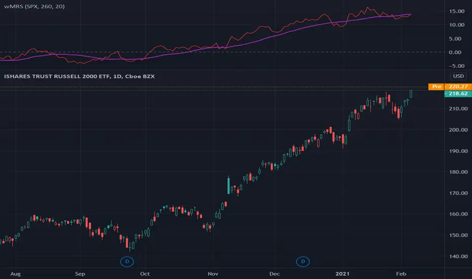
wMRS | Weighted-Mansfield Relative Strength - 4CR CUPThis version of Mansfield Relative Strength ( MRS ) weights the MRSs with different lookback periods by adding the weight of 2:1:1:1 to MRS (1Q) : MRS (2Q) : MRS (3Q) : MRS (4Q).
Typically, the lookback period of a MRS is reference to a full year, i.e. 260 trading dates or 52 weeks; to better represents the relative strength of a stock to a recent performance, someone suggested to add heavier weight on the most recent quarter MRS , i.e. MR(1Q) and the same weight to other quarters, namely, MRS (2Q), MRS (3Q), MRS (4Q).
For some of the stocks you may be interested was IPO not long ago, the lookback period is relaxed for customizing. Once you set the total lookback period, representing the 4Q, in the indicator, the other shorter lookback periods will be auto-calculated, i.e. 1Q, 2Q, 3Q.
A simple moving average of the wMRS is also added for your easier analysis on the trend development of the strength.
MRS | Mansfield Relative Strength - 4CR CUPThere are many investors referring to Relative Strength (RS) indicator published by Investor’s Business Daily (IBD) for their analysis. Since the RS published by IBD is a proprietary indicator, no exact formulation is published on it.
Many discussion suggested that an alternative to the IBD RS is the Mansfield Relative Strength .
There are 2 parameters for Mansfield Relative Strength setting, namely the market index and the lookback period, n. the default setting of Mansfield Relative Strength adopted by Stan Weinstein was “SPY” and “52” in weekly chart and “200” in daily chart .
Stan Weinstein used the Mansfield Relative Strength indicator on weekly charts. He suggested the breakouts out of a base had to go together with rising relative strength . The Mansfield RS needs to be rising and close to or above 0.
This version of Mansfield Relative Strength relaxes these input parameters for your own choice.
The market index can be set to other market index, e.g. NDX, DJI, NI255, MOEX , TAIEX , HSI , etc. and the lookback period is relaxed to integral input, e.g. 60, 90, 150, etc.
Mansfield Relative Strength
The Relative Strength indicator adopted by Stan Weinstein in his book: “Secrets For Profiting in Bull and Bear Markets” is formulated as Mansfield Relative Strength ( MRS ).
The formula of this indicator is based on the regular Dorsey RS (DRS):
DRS = Price_stock / Price_index
MRS = 100 * (DRS_today / sma (DRS, n)) - 1)
Where:
DRS = Dorsey Relative Strength
SMA = Simple moving average over n days.
The Mansfield Relative Strength formulates as the change of ratio of DRS to its own n-day moving average, this means:
MRS equals to 0 if the DRS is exactly equal to its n day moving average.
MRS is negative if the DRS is below its n day moving average.
MRS is positive if the DRS is above its n day moving average.
Using Mansfield Relative Strength
The MRS tells the relative price movement of the stock to the market index in a period of time concern. As with the Dorsey RS , you can use Mansfield RS to examine if a stock performs better than the market.
This indicator has the advantage over the Dorsey RS that in Dorsey RS only trend matters while for Mansfield RS the values whether below or above the 0 also matters. This allows us to screen for stocks with a MRS value above 0. When we see that the MRS is far above 0 and has been above 0 for some time, we have found a stock that outperforms the market heavily. We can buy this kinds of stock when dips occur.

RS.ROC | Relative Strength - Rate of Changes - 4CR CUPFor completeness of Relative Strength studies, the Relative Strength based on rate of changes (ROC) with weighting is coded and presented as well.
The RS.ROC is similar to the formulation of RS by IBD before rank among all the stocks in the market.
The lookback period is relaxed for customizing. Once you set the total lookback period, representing the 4Q, in the indicator, the other shorter lookback periods will be auto-calculated, namely, 1Q, 2Q, 3Q.
A simple moving average of the RS.ROC is also added for your easier analysis on the trend development of the strength.
To use it later at your charting later,
1. Favorite it;
2. Select from your favorite list.

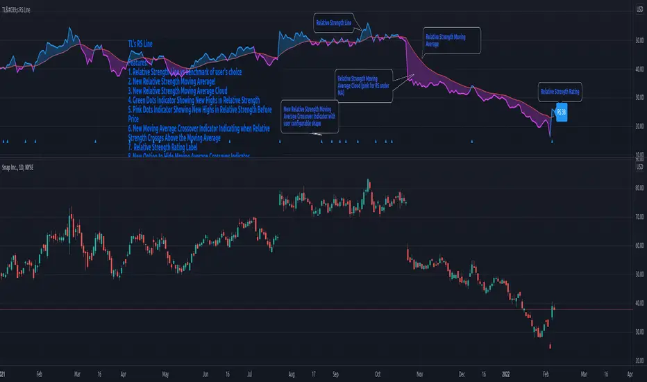
TraderLion's Relative Strength LineRelative Strength Line
Introduction
The script adds a line/candlestick to your charts that shows how well a stock is acting relative to the Index. We call this Relative Strength Line.
Relative Strength ( RS ) separates leading stocks from laggards. Stocks showing RS during a market correction phase will often be the strongest movers once the general market is ready to cooperate.
Instructions on How To Add this Script to Your TradingView Charting Platform
Step 0: Head over to www.tradingview.com
Step 1: Add “TraderLion's Relative Strength Line” to your Favorites by clicking “Add to Favorite Scripts” near the bottom of the page.
Step 2: Click “Indicators” at the very top on TradingView. Under Favorites click “Relative Strength Line”
Step 3: Hover on the Indicator name ( Relative Strength Line) on your plot under legend and click the three dots at the very right. Under the “Pin To Scale” choose a setting that works best for you (optional).
Step 4: Done. You have now plotted the Relative Strength Line
Features
1) The Pink Dot symbolizes the RS Line reaching new highs before price. RS New Highs Before Price (RSNHBP) is often indicative of a break out emerging.
2) Direction-Based Relative Strength. The RS Line can be customized to color coat depending on its most recent direction. When the line moves up it will be blue, and on the way down pink. Easily glance and see phases of relative strength on the chart.
3) Raw RS Rating - The RS Line Script features an RS Rating from 1-99 with 99 being the strongest rating. The measures the stock’s performance relative to the Index you input.
3) Custom Index Input under Settings - requested feature!
4) Candlestick Relative Strength - A different unique way to view the Relative Strength Line
5) Alerts Conditions - Relative Strength New Highs and Relative Strength New Highs Before Price (RSNHBP)