Fed Balance Sheet (Candles)Fed Balance Sheet (Candles) - TradingView Description
📊 OVERVIEW
Fed Balance Sheet (Candles) transforms the Federal Reserve's total assets into an intuitive candlestick visualization, allowing you to track monetary policy changes with the same visual language you use for price action.
This indicator pulls real-time data directly from FRED (Federal Reserve Economic Data) and displays the Total Assets of All Federal Reserve Banks as dynamic candles on your chart, making it effortless to correlate central bank liquidity with market movements.
🎯 WHY THIS MATTERS
The Federal Reserve's balance sheet is one of the most powerful leading indicators in global markets. When the Fed expands its balance sheet (Quantitative Easing), it injects liquidity into the financial system, historically correlating with:
Rising asset prices (stocks, crypto, commodities)
Lower volatility
Risk-on sentiment
Currency devaluation
When the Fed contracts its balance sheet (Quantitative Tightening), liquidity drains from markets, often leading to:
Asset price pressure
Increased volatility
Risk-off sentiment
Dollar strength
By visualizing this as candles, you can instantly see:
The pace of change (candle size)
The direction (green = expansion, red = contraction)
Acceleration or deceleration (consecutive candles in same direction)
Pivots in monetary policy (color changes from green to red or vice versa)
🔧 HOW IT WORKS
Data Source
Source: Federal Reserve Economic Data (FRED)
Metric: Total Assets of All Federal Reserve Banks
Unit: Displayed in Trillions of USD for easy reading
Frequency: Weekly updates (every Wednesday)
Candlestick Construction
Since balance sheet data is reported as a single number each week (not traditional open-high-low-close), this indicator creates candles by comparing each period to the previous one:
Open = Last week's balance sheet value
Close = This week's balance sheet value
High = The higher of the two values
Low = The lower of the two values
This captures directional movement and magnitude of change, making it intuitive for traders accustomed to candlestick analysis.
Color Scheme
🟢 GREEN CANDLES (Expanding Balance Sheet)
When this week's value is higher than last week's
Interpretation: Fed is adding liquidity (Quantitative Easing)
Historically bullish for risk assets
🔴 RED CANDLES (Contracting Balance Sheet)
When this week's value is lower than last week's
Interpretation: Fed is removing liquidity (Quantitative Tightening)
Historically bearish or neutral for risk assets
Value Label
A floating label displays the current balance sheet value in trillions (e.g., "$8.75T") so you always know the exact figure at a glance.
📈 PRACTICAL APPLICATIONS
1. Market Regime Identification
Strings of green candles = Liquidity-driven bull markets
Strings of red candles = Tightening-induced bear markets or corrections
Color transitions = Potential market inflection points
2. Correlation Analysis
Overlay on stock indices (SPY, QQQ, IWM)
Overlay on crypto (BTC, ETH)
Overlay on commodities (Gold, Silver)
Observe how asset prices react to Fed liquidity changes in real-time
3. Macro Timing
Large green candles = Aggressive easing (crisis response)
Large red candles = Aggressive tightening (inflation fighting)
Small candles = Neutral policy (Fed on hold)
4. Risk Management
Shift portfolio allocation based on liquidity environment
Reduce leverage during red candle trends
Increase exposure during green candle trends
Use as confirmation for other technical signals
5. Multi-Timeframe Context
Daily charts: See how daily price action relates to weekly Fed data
Weekly charts: Perfect alignment with data release frequency
Monthly charts: Visualize long-term monetary cycles spanning years
⚙️ SETTINGS
Zero configuration needed. Simply add the indicator to any chart and it works immediately.
The indicator automatically:
Overlays on your main chart
Uses the left price scale (won't interfere with asset prices)
Updates with the latest Fed data
Displays values in trillions for clean readability
🎨 VISUAL DESIGN PHILOSOPHY
The indicator uses semi-transparent candle bodies with vibrant borders to maintain visibility without obscuring your price action. The color scheme follows universal chart conventions where green represents growth/expansion and red represents decline/contraction.
It's designed to blend seamlessly into any chart theme while providing immediate visual clarity about the Fed's monetary stance.
📚 WHAT YOU NEED TO KNOW
Data Availability
Historical data available from December 2002 (over 20 years of Fed policy)
Updates every Wednesday (Federal Reserve's reporting schedule)
Typically published with a 1-week lag
How the Data Appears
On weekdays: Shows the most recent Wednesday's data
On weekends: Shows Friday's data (which is the prior Wednesday's figure)
Updates automatically when new data is released
Scale Considerations
The Fed's balance sheet is measured in trillions, while most assets are priced much lower. The indicator uses the left price scale by default to avoid conflicts with your main asset's price scale. You can easily move it to a separate pane if you prefer.
🧠 INTERPRETATION GUIDE
Historical QE Phases (Green Candles)
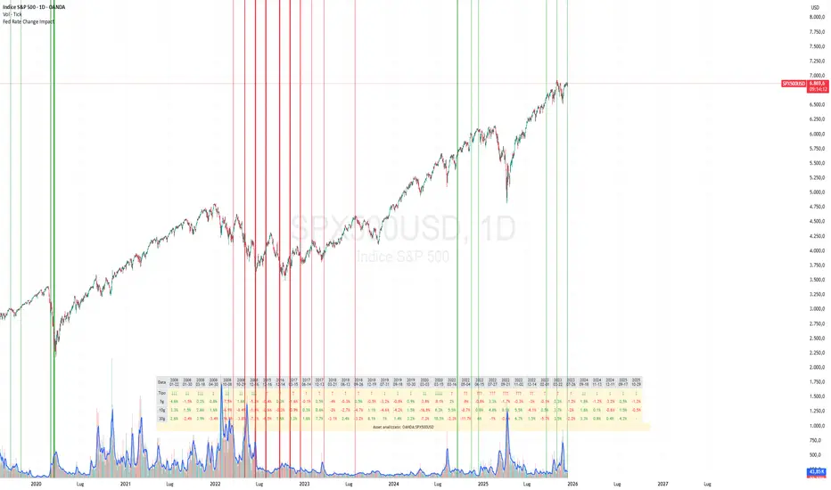
2008-2014: Financial Crisis Response
The Fed's balance sheet expanded from under $1T to ~$4.5T to stabilize markets after the mortgage crisis.
2020: COVID-19 Response
Rapid expansion to ~$7T as the Fed stepped in during pandemic lockdowns.
2020-2022: Extended Support
Balance sheet reached historic peak of ~$9T.
Historical QT Phases (Red Candles)
2017-2019: First Modern QT Attempt
The Fed tried to normalize its balance sheet, reducing it from ~$4.5T to ~$3.8T before pivoting.
2022-Present: Inflation-Fighting QT
The Fed began shrinking its balance sheet to combat inflation, letting bonds mature without replacement.
Key Insights
Size matters, but rate of change matters MORE.
A $9T balance sheet growing slowly has different implications than a $5T balance sheet growing rapidly.
Watch for acceleration.
Increasingly large candles (up or down) signal a policy shift that markets will notice.
Plateaus mean "wait and see."
Tiny candles indicate the Fed is holding steady and watching economic data.
Reversals are major events.
When candles switch from green to red (or vice versa), the Fed has changed course—these are critical market turning points.
🎓 EDUCATIONAL VALUE
This indicator helps you understand:
The mechanics of monetary policy through visual learning
The lag between Fed actions and market reactions by observing temporal correlation
The scale of modern central banking (trillions put into perspective)
The relationship between liquidity and asset prices (cause and effect in action)
Many traders talk about "don't fight the Fed" but never actually track what the Fed is doing. Now you can see it as clearly as you see price action.
🔗 RELATED CONCEPTS
For comprehensive macro analysis, consider also tracking:
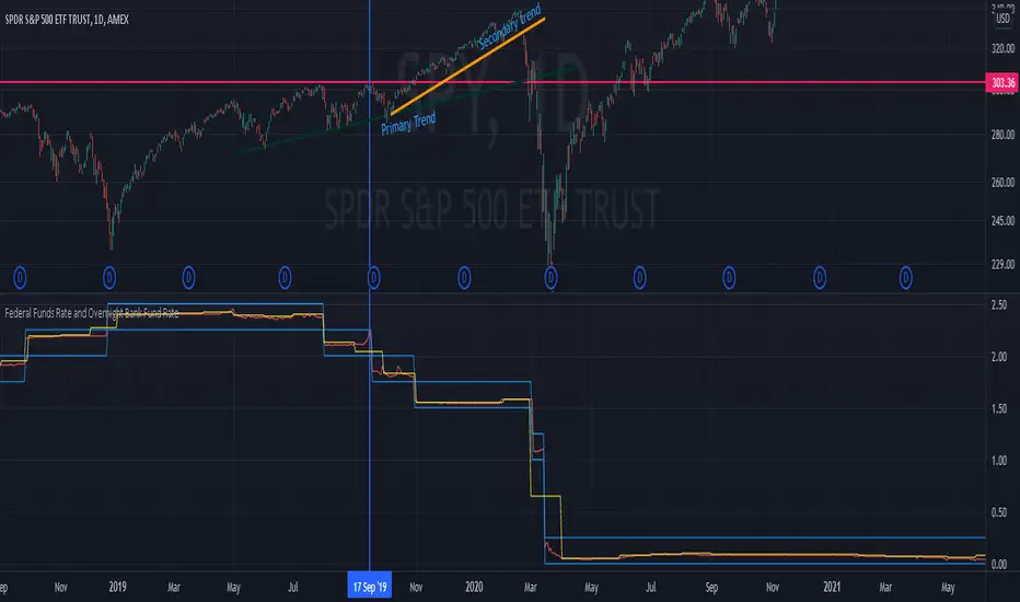
Fed Funds Rate (short-term interest rates)
M2 Money Supply (broader measure of money in circulation)
Treasury Yield Curves (bond market expectations)
Dollar Index (DXY) (currency strength)
VIX (market fear/volatility)
The Fed's balance sheet is just one piece of the puzzle, but it's arguably the most important one for understanding liquidity conditions.
⚠️ DISCLAIMER
This indicator displays publicly available economic data from the Federal Reserve. It is for informational and educational purposes only and does not constitute financial advice.
Important considerations:
Past monetary policy does not guarantee future market outcomes
Correlation does not equal causation
Asset prices are influenced by many factors beyond Fed liquidity
Always use proper risk management
Consult with qualified financial professionals before making investment decisions
Trading involves substantial risk of loss and is not suitable for everyone.
📜 VERSION HISTORY
Version 1.0 - Initial Release
Fed balance sheet visualized as candlesticks
Real-time FRED data integration
Automatic display in trillions
Dynamic color coding (green/red)
Current value label with exact figure
💡 WHY CANDLES?
You might wonder: "Why show the Fed's balance sheet as candles instead of a line?"
Because candles tell stories that lines can't.
A line shows you where we are
Candles show you how we got here, how fast we're moving, and what momentum looks like
Candles make the Fed's actions feel immediate and tangible
Candles connect macro data to the chart language you already speak
When you see three big green candles in a row on the Fed balance sheet while your crypto or stock portfolio is rallying, you feel the connection. When you see the candles turn red and shrink, you understand the headwinds forming.
It transforms dry economic data into actionable market intelligence.
📞 SUPPORT & FEEDBACK
If you find this indicator valuable:
⭐ Like and favorite to help others discover it
📝 Comment with your use cases and insights
🔔 Follow for updates and new macro indicators
Your feedback drives improvements and helps build better tools for the trading community.
🚀 THE BOTTOM LINE
The Fed's balance sheet is the tide that lifts or lowers all boats.
Whether you're trading stocks, crypto, forex, or commodities—whether you're a day trader or long-term investor—understanding the Fed's liquidity operations gives you an edge.
This indicator makes that understanding visual, immediate, and actionable.
Stop guessing about macro conditions. Start seeing them.
"Don't fight the Fed" - Wall Street Wisdom
Now you can see exactly what they're doing—in the same language you use to read price action.
May your trades ride the tide of liquidity. 🌊📈
Pine Script® göstergesi