Educational

Casper 5min candle v0.6--------------------------------------------
Description
--------------------------------------------
This is an indicator showing trade ideas and alerts based on
5minute Candle breakout strategy according to www.youtube.com
BASIC FUNCTIONS
- it draws 5 min Range (default 9:30 NY time at Stock market open)
- detects breakout of range with fvg_tap_wait
- wait for tapping FVG
- waits for entry confirmation
- it has sets of alerts (FVG creation, FVG tapping and Entry confirmation)

New York Midnight Day Separator by JPThis is an updated script with setting added for transparency, line type etc., thanks to the original publisher of this code.

Stock Reference DataIndicator that paints a table with reference data such as Earnings Date, Avg Volume, ATR, ATR% etc.

Institutional S/R Engine + Major FX Scanner v2.1This indicator is designed to map out institutional-style Support & Resistance zones and rank them by strength, so you can immediately see which areas on the chart actually matter.
Instead of drawing random horizontal lines, it automatically detects swing points, builds zones, and scores them based on how price has reacted there in the past. The goal is simple:
Help you focus on the most meaningful levels for entries, partials, and take-profit targets.
What it does
Auto-detects Support & Resistance zones
Uses swing structure to find major highs/lows and converts them into zones instead of thin lines, so you see “areas of interest,” not single magic prices.
Macro + Micro structure in one view
Separates higher-timeframe structure (macro) from local intraday structure (micro), letting you see the bigger picture and the immediate battle zone at the same time.
Zone strength scoring
Each zone is graded using factors such as:
Number of respected touches / reactions
How recently price interacted with the zone
How cleanly price reversed or continued from that level
Stronger zones are visually emphasized so your eye is drawn to the most important areas first.
ATR-aware zone widths
Zone size adapts to volatility, so levels don’t become absurdly thick in fast markets or razor-thin in slow ones. This helps keep zones realistic and tradable.
Clean, minimal visuals
Zones are plotted with clear colors and opacity so they are easy to see without cluttering your chart. You can tune transparency, line styles, and how many zones you want to see.
How to use it
This script is meant to be a decision-support tool, not a signal generator:
Use the strongest zones as:
Locations to plan trend continuation entries
Areas to look for exhaustion / fade behavior
Logical places for partials or final take-profit targets
Combine the zones with:
Your EMA stack or moving average framework
Volume / volatility tools
Candlestick behavior and market structure (HH/HL, LH/LL, breaks of structure)
The edge comes from confluence: strong zone + correct bias + clean price action.
The script will not tell you “buy” or “sell” – it shows you where the fight is most likely to matter.
Markets & Timeframes
Works on Forex, indices, commodities, crypto, and futures.
Timeframe-agnostic: can be used on higher timeframes for swing context and on intraday charts for execution.
Important note
This is an analytical tool only. It does not guarantee profit, and it is not financial advice. Always combine it with your own risk management, trade plan, and backtesting before using it in live markets.

RSI Analytic Volume Matrix [RAVM] Overview
RSI Analytic Volume Matrix is an overlay indicator that turns classic RSI into a multi-layered market-reading engine. Instead of treating RSI 30 and 70 as simple buy/sell lines, RAVM combines RSI geometry (angle and acceleration), statistical volume analysis, and a 5×5 VSA-inspired matrix to describe what is really happening inside each candle.
The script is designed as an educational and analytical tool. It does not generate trading signals. Instead, it helps you read the market context, understand where the pressure is coming from (buyers vs. sellers), and see how price, momentum, and volume interact in real time.
Concept & Philosophy
RAVM is built around a hierarchical logic and a few core ideas:
• Hierarchical State Machine: First, RSI defines a context (where we are in the 0–100 range). Then the geometric engine evaluates the angle-of-turn of RSI using a Z-Score. Only after a meaningful geometric event is detected does the system promote a bar to a potential setup (warning vs. confirmed).
• Geometric Primacy: The angle and acceleration of RSI (RSI geometry) are more important than the raw RSI level itself. RAVM uses a geometric veto: if the geometric trigger is not confirmed, the confidence score is capped below 50%, even if volume looks interesting.
• RSI Beyond 30 and 70: Being above 70 or below 30 is not treated as an automatic overbought/oversold signal. RAVM treats those zones as contextual factors that contribute only a partial portion of the final score, alongside geometry, total volume expansion, buy/sell balance, and delta power.
• Volume Decomposition: Volume is decomposed into total, buy-side, sell-side, and delta components. Each of these is normalized with a Z-Score over a shared statistical window, so RSI geometry and volume live in the same statistical context.
• Educational Scoring Pipeline: RAVM builds a 0–100 "Quantum Score" for each detected setup. The score expresses how strong the story is across four dimensions: geometry (RSI angle-of-turn), total volume expansion, which side is driving that volume (buyers vs. sellers), and the power of delta. The score is designed for learning and weighting, not for mechanical trade entries.
• VSA Matrix Engine: A 5×5 matrix combines momentum states and volume dynamics. Each cell corresponds to an interpreted VSA-style scenario (Absorption, Distribution, No Demand, Stopping Volume, Strong Reversal, etc.), shown both as text and as a heatmap dashboard on the chart.
How RAVM Works
1. RSI Context & Geometry
RAVM starts with a classic RSI, but it does not stop at simple level checks. It computes the velocity and acceleration of RSI and normalizes them via a Z-Score to produce an Angle-of-Turn metric (Z-AoT). This Z-AoT is then mapped into a 0–1 intensity value called MSI (Momentum Shift Intensity).
The script monitors both classic RSI zones (around 30 and 70) and geometric triggers. Entering the lower or upper zone is treated as a contextual event only. A setup becomes "confirmed" when a significant geometric turn is detected (based on Z-AoT thresholds). Otherwise, the bar is at most a warning.
2. Volume & Statistical Engine
The volume engine can work in two modes: a geometric approximation (based on candle structure) or a more precise intrabar mode using up/down volume requests. In both cases, RAVM builds a volume packet consisting of:
• Total volume
• Buy-side volume
• Sell-side volume
• Delta (buy – sell)
Each of these series is normalized using a Z-Score over the same statistical window that is used for RSI geometry. This allows RAVM to answer questions such as: Is total volume exceptional on this bar? Is the expansion mostly coming from buyers or from sellers? Is delta unusually strong or weak compared to recent history?
3. Scoring System (Quantum Score)
For each bar where a setup is active, RAVM computes a 0–100 score intended as an educational confidence measure. The scoring pipeline follows this sequence:
A. RSI Geometry (MSI): Measures the strength of the RSI angle-of-turn via Z-AoT. This has geometric primacy over simple level checks.
B. RSI Zone Context: Being below 30 or above 70 contributes only a partial bonus to the score, reflecting the idea that these zones are context, not automatic signals. Mildly supportive zones (e.g., RSI below 50 for bullish contexts) can also contribute with lower weight.
C. Total Volume Expansion: A normalized Volume Power term expresses how exceptional the total volume is relative to its recent distribution. If there is no meaningful volume expansion, the score remains modest even if RSI geometry looks interesting.
D. Which Side Is Driving the Volume: RAVM then checks whether the expansion is primarily on the buy side or the sell side, using Z-Score statistics for buy and sell volume separately. This stage does not yet rely on delta as a power metric; it simply answers the question: "Is this expansion mostly driven by buyers, sellers, or both?"
E. Delta as Final Power: Only at the final stage does the script bring in delta and its Z-Score as a measure of how one-sided the pressure really is. A strong negative delta during a bullish context, for example, can highlight absorption, while a strong positive delta against a bearish context can highlight distribution or a buying climax.
If a setup is not geometrically confirmed (for example, a simple entry into RSI 30/70 without a strong geometric turn), RAVM caps the final score below 50%. This "Geometric Veto" enforces the idea that RSI geometry must confirm before a scenario can be considered high-confidence.
4. Overlay UI & Smart Labels
RAVM is an overlay indicator: all information is drawn directly on the price chart, not in a separate pane. When a setup is active, a smart label is attached to the bar, together with a vertical connector line. Each label shows:
• Direction of the setup (bullish or bearish)
• Trigger type (classic OS/OB vs. geometric/hidden)
• Status (warning vs. confirmed)
• Quantum Score as a percentage
Confirmed setups use stronger colors and solid connectors, while warnings use softer colors and dotted connectors. The script also manages label placement to avoid overlap, keeping the chart clean and readable.
In addition to labels, a dashboard table is drawn on the chart. It displays the currently active matrix scenario, the dominant bias, a short textual interpretation, the full 5×5 heatmap, and summary metrics such as RSI, MSI, and Volume Power.
RSI Is Not Just 30 and 70
One of the central design decisions in RAVM is to treat RSI 30 and 70 as context, not as fixed buy/sell buttons. Many traders mechanically assume that RSI below 30 means "buy" and RSI above 70 means "sell". RAVM explicitly rejects this simplification.
Instead, the script asks a series of deeper questions: How sharp is the angle-of-turn of RSI right now? Is total volume expanding or contracting? Is that expansion dominated by buyers or sellers? Is delta confirming the move, or is there a hidden absorption or distribution taking place?
In the scoring logic, being in a lower or upper RSI zone contributes only part of the final score. Geometry, volume expansion, the buy/sell split, and delta power all have to align before a high-confidence scenario emerges. This makes RAVM much closer to a structured market-reading tool than a classic overbought/oversold indicator.
Matrix User Manual – Reading the 5×5 Grid
The heart of RAVM is its 5×5 matrix, where the vertical axis represents momentum states (M1–M5) and the horizontal axis represents volume dynamics (V1–V5). Each cell in this grid corresponds to a VSA-style scenario. The dashboard highlights the currently active cell and prints a textual description so you can read the story at a glance.
1. Confirmation Scenarios
These scenarios occur when momentum direction and volume expansion are aligned:
• Bullish Confirmation / Strong Reversal: Momentum is shifting strongly upward (often from a depressed RSI context), and expanded volume is driven mainly by buyers. Often seen as a strong bullish reversal or continuation signal from a VSA perspective.
• Bearish Confirmation / Strong Drop: Momentum is turning decisively downward, and expanded volume is driven mainly by sellers. This maps to strong bearish continuation or sharp reversal patterns.
2. Absorption & Stopping Volume
• Absorption: Total volume expands, but the dominant flow is opposite to the recent price move or the geometric bias. For example, heavy selling volume while the geometric context is bullish. This can indicate smart money quietly absorbing orders from the crowd.
• Stopping Volume: Exceptionally high volume appears near the end of an extended move, while momentum begins to decelerate. Price may still print new extremes, but the effort vs. result relationship signals potential exhaustion and the possibility of a turn.
3. Distribution & Buying Climax
• Distribution: Heavy buying volume appears within a bearish or topping context. Rather than healthy accumulation, this often represents larger players offloading inventory to late buyers. The matrix will typically flag this as a bearish-leaning scenario despite strong upside prints.
• Buying Climax: A surge of buy-side volume near the end of a strong uptrend, with momentum starting to weaken. From a VSA point of view, this is often the last push where retail aggressively buys what smart money is selling.
4. No Demand & No Supply
• No Demand: Price attempts to rise but does so on low, non-expansive volume. The market is not interested in following the move, and the lack of participation often precedes weakness or sideways action.
• No Supply: Price tries to push lower on thin volume. Selling pressure is limited, and the lack of supply can precede stabilization or recovery if buyers step back in.
5. Trend Exhaustion
• Uptrend Exhaustion: Momentum remains nominally bullish, but the quality of volume deteriorates (e.g., more effort, less net result). The matrix marks this as an uptrend losing internal strength, often after a series of aggressive moves.
• Downtrend Exhaustion: Similar logic in the opposite direction: strong prior downtrend, but increasingly inefficient downside progress relative to the volume invested. This can precede accumulation or a relief rally.
6. Effort vs. Result Scenarios
• Bullish Effort, Little Result: Buyers invest notable volume, but price progress is limited. This may reveal hidden selling into strength or a lack of follow-through from the broader market.
• Bearish Effort, Little Result: Sellers push volume, but price does not decline proportionally. This can indicate absorption of selling pressure and potential underlying demand.
7. Neutral, Churn & Thin Markets
• Neutral / Thin Market: Momentum and volume both remain muted. RAVM marks these as neutral cells where aggressive decision-making is usually less attractive and observing the broader structure is more important.
• High Volume Churn / Volatility: Both sides are active with high volume but limited directional progress. This can correspond to battle zones, local ranges, or high volatility rotations where the main message is conflict rather than clear trend.
Inputs & Options
RAVM includes several input groups to adapt the tool to your preferences:
• Localization: Multiple language options for all labels and dashboard text (e.g., English, Farsi, Turkish, Russian).
• RSI Core Settings: RSI length, source, and upper/lower contextual zones (typically around 30 and 70).
• Geometric Engine: Z-AoT sigma thresholds, confirmation ratios, and normalization window multiplier. These control how sensitive the script is to RSI angle-of-turn events.
• Volume Engine: Choice between geometric approximation and intrabar up/down volume, Z-Score thresholds for volume expansion, and related parameters.
• Visual Interface: Toggles for smart labels, dashboard table, font sizes, dashboard position, and color themes for bullish, bearish, and warning states.
Disclaimer
RSI Analytic Volume Matrix is provided for educational and research purposes only. It does not constitute financial advice and is not a signal generator. Any trading decisions you make based on this tool, or any other, are entirely your own responsibility. Always consider your own risk management rules and conduct your own analysis.

Hash Pivot DetectorHash Pivot Detector
Professional Support & Resistance Detection with Multi-Timeframe Zone Analysis
Developed by Hash Capital Research, the Hash Pivot Detector is a sophisticated indicator designed for identifying key support and resistance levels using pivot-based detection with institutional-grade zone analysis.
Key Features
Zone-Based Detection
Unlike traditional single-line S/R indicators, Hash Pivot Detector uses configurable zones around pivot levels to represent realistic institutional order areas. Adjustable zone width accommodates different asset volatilities.
Multi-Timeframe Analysis
Displays higher timeframe support/resistance levels alongside current timeframe pivots, providing crucial context for institutional positioning and stronger price barriers.
Clean Visual Design
Features Hash Capital's signature fluorescent color scheme (pink resistance, cyan support) optimized for dark charts with high contrast and instant visual recognition. Semi-transparent zones keep your chart clean and readable.
How It Works
The indicator uses pivot high/low detection with configurable left and right bar parameters. When a pivot is confirmed, it plots:
Primary support/resistance lines at pivot levels
Semi-transparent zones representing realistic order areas
Higher timeframe S/R levels as crosses for additional context
Recommended Settings
For Swing Trading:
Pivot Bars: 10-20 left/right
Zone Width: 0.5-1.0%
HTF: Daily (on 1H-4H charts)
For Intraday Trading:
Pivot Bars: 5-10 left/right
Zone Width: 0.3-0.5%
HTF: 1H or 4H (on 5min-15min charts)
Asset-Specific Zone Width:
Forex/Crypto: 0.3-0.5%
Stocks: 0.5-1.0%
Volatile Assets: 1.0-2.0%
What Makes It Different
✓ Zone-based approach (more realistic than lines)
✓ Multi-timeframe confluence detection
✓ Minimal visual clutter with maximum information
✓ Professional institutional aesthetic
✓ Comprehensive tooltips for easy optimization
✓ No repainting - all pivots are confirmed
Best Used For
Identifying high-probability entry/exit zones
Setting stop-loss and take-profit levels
Recognizing breakout/breakdown areas
Multi-timeframe confluence analysis
Swing trading and position trading
Intraday scalping with adjusted parameters
Notes
Works on all timeframes and markets
Fully customizable colors and parameters
All settings include detailed optimization guidance
Clean code, efficient performance
No alerts or notifications (visual analysis only)

ZScore SemiConductoresZ-Score of Semiconductor Sector Volume
This custom Pine Script indicator applies a Z-Score calculation to the aggregated trading volume of leading semiconductor companies. The goal is to highlight statistical extremes in sector activity that may signal unusual market behavior.
🔧 How it works
- Fixed ticker list: NVDA, AVGO, TSM, AMD, ASML, MU, ARM, ON, TXN, QCOM, INTC.
- Aggregate volume: The script sums the trading volume of all tickers in the list for the selected timeframe.
- Z-Score calculation:
- Moving average and standard deviation are computed over a configurable window (default = 50 bars).
- Formula:
Z= (Current Volume - Mean) / Standard Deviation
Visualization:
- Z-Score plotted in green.
- Reference lines at 0, ±1σ, ±2σ.
- Labels (triangles) mark critical signals when Z > +2 or Z < -2.
📈 Why it matters
- Detects abnormal surges or drops in sector-wide volume.
- Highlights potential euphoria (+2σ) or panic (-2σ) moments.
- Useful as a filter for trading strategies or as a sector-level alert system.
⚠️ Disclaimer: This script is for educational purposes only and not financial advice

TF7 Option vs Index Change RatioOverview
This indicator helps traders visualise the strength and direction of an option's price movement compared to its underlying index (NIFTY or SENSEX).
It calculates a Change Ratio, which is the percentage move in the option compared to the index movement during the same bar. This is especially useful for intraday traders looking for signs of momentum, divergence, or unusual strength/weakness in option pricing.
How It Works
The ratio is calculated as:
(Option LTP − Option Open) / (Index Close − Index Open)
The value is capped between −10 and +10 to filter out extreme or invalid spikes.
The ratio is displayed as a color-coded column chart:
🟩 Green bars: Option is moving in the same direction as the index.
🟥 Red bars: Option is underperforming or moving opposite to the index.
A compact table shows the last 5 bars of:
Option price change (with +/− sign)
Index price change
Calculated ratio (also color-coded)
You can toggle the table visibility in the settings.
Inputs & Features
Select underlying index: NIFTY or SENSEX
Toggle the data table display
Clean formatting with signed values and conditional color highlights
⚠️ Disclaimer
This is a visual analysis tool, not a buy/sell signal. Always validate with your trading strategy and risk management
#OptionsTrading, #NIFTY, #SENSEX, #ChangeRatio, #IndexAnalysis, #Momentum, #Divergence, #Intraday

FUSED 9.5 INSTITUTIONAL [FINAL] - AgTradezInstitutional style Indicator that gives you trend direction, MSS, with Tp levels and much more.

Volume Intelligence LITE [Abusuhil]📊 Volume Intelligence LITE - Professional Scalping Tool
🎯 English Description
Professional Volume Analysis Indicator for Smart Traders
Volume Intelligence LITE is a comprehensive, real-time volume analysis tool designed specifically for scalpers and day traders who need instant volume insights. This professional-grade indicator combines multiple volume metrics, pressure analysis, and intelligent signal generation in a clean, fully customizable interface.
✨ Key Features
📊 Advanced Volume Analysis
Real-time volume monitoring with moving average comparison
Dynamic volume ratio calculation (Current vs Average)
Instant percentage change tracking
Multi-level spike detection system (Weak, Medium, Strong, Extreme)
Customizable spike thresholds for different market conditions
💹 Buy/Sell Pressure System
Real-time buy vs sell pressure percentage calculation
Market dominance indicator (Buyers/Sellers/Neutral)
Weighted Delta analysis for precise pressure measurement
Multi-timeframe pressure lookback (up to 20 bars)
Historical pressure pattern recognition
📈 Integrated Technical Indicators
VWMA (Volume Weighted Moving Average) - Identifies price position relative to volume-weighted levels
OBV (On Balance Volume) - Trend detection with built-in divergence alerts (Bullish/Bearish)
MFI (Money Flow Index) - Smart money flow direction and strength analysis
🤖 Intelligence & Scoring System
Entry Power Score - Combines volume ratio with price movement magnitude
Trend & Volume Alignment - Identifies strong trending markets with volume support
Comprehensive Volume Score - Multi-factor analysis incorporating all metrics
Confidence Level - Percentage-based signal strength indicator (0-100%)
Final Signal - Clear Bullish/Bearish/Neutral market assessment
🎨 Full Customization Options
Bilingual Interface - Complete English & Arabic support
Modular Display - Show/Hide any section independently (8 sections)
Flexible Positioning - 9 table position options (corners, sides, center)
Size Control - Three size options (Tiny, Small, Normal)
Color Themes - Customizable background and text colors
No Chart Clutter - Clean overlay design without background interference
🔧 Detailed Settings
Volume Configuration
Volume MA Length: 5-50 bars (default: 20)
Weak Spike Threshold: 1.5x average
Medium Spike Threshold: 2.0x average
Strong Spike Threshold: 2.5x average
Extreme Spike Threshold: 3.0x average
Technical Indicators
VWMA Length: 5-100 bars (default: 20)
OBV Smoothing: 5-50 bars (default: 14)
MFI Length: 5-50 bars (default: 14)
Pressure Analysis
Lookback Period: 5-20 bars (default: 10)
Automatic pressure calculation for last N bars
Display Controls
Show/Hide Volume Section
Show/Hide Spike Detection Section
Show/Hide Pressure Analysis Section
Show/Hide VWMA Section
Show/Hide OBV Section
Show/Hide MFI Section
Show/Hide Intelligence Section
Show/Hide Final Signal
📱 Ideal For
✅ Scalpers - Quick volume confirmations for rapid trading decisions
✅ Day Traders - Intraday volume pattern analysis and trend confirmation
✅ Swing Traders - Volume-based entry/exit point identification
✅ Smart Money Followers - Institutional volume detection and tracking
✅ Breakout Traders - Volume spike confirmation for breakout validation
✅ All Timeframes - Works on 1m to Daily charts
🚀 How to Use
Setup
Add indicator to your chart
Select your preferred language (English/Arabic)
Customize table position and size
Toggle sections based on your trading style
Adjust volume thresholds for your market
Trading Workflow
Monitor Volume Ratio - Look for spikes above 1.5x
Check Pressure - Confirm buy/sell dominance
Verify Technical Alignment - VWMA, OBV, MFI confirmation
Review Intelligence Score - Volume Score and Confidence Level
Execute on Final Signal - 🟢 Bullish or 🔴 Bearish confirmation
📊 Signal Interpretation Guide
Volume Score System
+30 to +100 🟢 Strong Bullish Volume (High buy pressure, strong uptrend)
-30 to +30 ⚪ Neutral Zone (Wait for confirmation, range-bound)
-100 to -30 🔴 Strong Bearish Volume (High sell pressure, strong downtrend)
Confidence Levels
60%+ 🔥 High Confidence (Strong signal, optimal entry conditions)
30-60% ⚡ Medium Confidence (Moderate signal, use additional confirmation)
Below 30% ⚪ Low Confidence (Weak signal, wait for better setup)
Spike Detection
🔥 Extreme Spike (3.0x+) - Major institutional activity, potential reversal
💪 Strong Spike (2.5-3.0x) - Significant volume, trend acceleration
⚡ Medium Spike (2.0-2.5x) - Above average activity, watch closely
⚠ Weak Spike (1.5-2.0x) - Mild increase, early signal
💡 Trading Tips & Best Practices
For Best Results:
Use on liquid markets (major forex pairs, popular stocks, top cryptocurrencies)
Combine with price action analysis for maximum accuracy
Higher confidence levels (>60%) indicate stronger, more reliable signals
Watch for pressure shifts from sellers to buyers (or vice versa) for reversal signals
Extreme volume spikes often precede major price movements
OBV divergences are powerful reversal indicators
Risk Management:
Never rely on volume alone - always use proper stop losses
Higher confidence doesn't mean guaranteed profit
Volume analysis works best in trending markets
Adjust thresholds based on asset volatility
🌐 Language Support
Full Bilingual Interface
Complete English interface
كامل باللغة العربية (Complete Arabic interface)
Easy toggle in settings
All labels, metrics, and signals translated
⚠️ Important Disclaimer
This indicator is provided for educational and informational purposes only. It is not financial advice. Trading involves substantial risk of loss. Always:
Practice proper risk management
Never risk more than you can afford to lose
Test on demo accounts before live trading
Understand that past performance doesn't guarantee future results
🔄 Updates & Support
Regular updates and improvements. For questions, suggestions, or support, please comment below!
🎯 الوصف بالعربية
مؤشر تحليل الفوليوم الاحترافي للمتداولين الأذكياء
مؤشر Volume Intelligence LITE هو أداة شاملة لتحليل الفوليوم في الوقت الفعلي، مصمم خصيصاً للمضاربين والمتداولين اليوميين الذين يحتاجون إلى رؤى فورية للفوليوم. هذا المؤشر الاحترافي يجمع بين مقاييس الفوليوم المتعددة، تحليل الضغط، وتوليد الإشارات الذكية في واجهة نظيفة وقابلة للتخصيص بالكامل.
✨ المميزات الرئيسية
📊 تحليل متقدم للفوليوم
مراقبة الفوليوم في الوقت الفعلي مع مقارنة المتوسط المتحرك
حساب نسبة الفوليوم الديناميكية (الحالي مقابل المتوسط)
تتبع النسبة المئوية للتغيير الفوري
نظام كشف الانفجارات متعدد المستويات (ضعيف، متوسط، قوي، شديد)
عتبات انفجار قابلة للتخصيص لظروف السوق المختلفة
💹 نظام ضغط الشراء والبيع
حساب نسبة ضغط الشراء مقابل البيع في الوقت الفعلي
مؤشر سيطرة السوق (المشترون/البائعون/محايد)
تحليل الدلتا المرجح لقياس الضغط الدقيق
مراجعة ضغط متعدد الأطر الزمنية (حتى 20 شمعة)
التعرف على أنماط الضغط التاريخية
📈 مؤشرات تقنية متكاملة
VWMA (المتوسط المتحرك المرجح بالحجم) - يحدد موقع السعر بالنسبة للمستويات المرجحة بالحجم
OBV (حجم التوازن) - كشف الاتجاه مع تنبيهات التباعد المدمجة (صعودي/هبوطي)
MFI (مؤشر تدفق الأموال) - تحليل اتجاه وقوة تدفق الأموال الذكية
🤖 نظام الذكاء والتقييم
درجة قوة الدخول - يجمع بين نسبة الفوليوم وحجم حركة السعر
توافق الاتجاه والفوليوم - يحدد الأسواق ذات الاتجاه القوي مع دعم الفوليوم
درجة الفوليوم الشاملة - تحليل متعدد العوامل يتضمن جميع المقاييس
مستوى الثقة - مؤشر قوة الإشارة بالنسبة المئوية (0-100٪)
الإشارة النهائية - تقييم واضح للسوق (صعودي/هبوطي/محايد)
🎨 خيارات تخصيص كاملة
واجهة ثنائية اللغة - دعم كامل للإنجليزية والعربية
عرض معياري - إظهار/إخفاء أي قسم بشكل مستقل (8 أقسام)
موضع مرن - 9 خيارات لموقع الجدول (الزوايا، الجوانب، الوسط)
التحكم في الحجم - ثلاثة خيارات للحجم (صغير جداً، صغير، عادي)
سمات الألوان - خلفية ونصوص قابلة للتخصيص
لا فوضى في الرسم البياني - تصميم نظيف بدون تداخل في الخلفية
🔧 إعدادات تفصيلية
تكوين الفوليوم
طول المتوسط المتحرك للفوليوم: 5-50 شمعة (افتراضي: 20)
عتبة الانفجار الضعيف: 1.5 ضعف المتوسط
عتبة الانفجار المتوسط: 2.0 ضعف المتوسط
عتبة الانفجار القوي: 2.5 ضعف المتوسط
عتبة الانفجار الشديد: 3.0 ضعف المتوسط
المؤشرات التقنية
طول VWMA: 5-100 شمعة (افتراضي: 20)
تنعيم OBV: 5-50 شمعة (افتراضي: 14)
طول MFI: 5-50 شمعة (افتراضي: 14)
تحليل الضغط
فترة المراجعة: 5-20 شمعة (افتراضي: 10)
حساب تلقائي للضغط لآخر N شمعة
عناصر التحكم في العرض
إظهار/إخفاء قسم الفوليوم
إظهار/إخفاء قسم كشف الانفجار
إظهار/إخفاء قسم تحليل الضغط
إظهار/إخفاء قسم VWMA
إظهار/إخفاء قسم OBV
إظهار/إخفاء قسم MFI
إظهار/إخفاء قسم الذكاء
إظهار/إخفاء الإشارة النهائية
📱 مثالي لـ
✅ المضاربون - تأكيدات فوليوم سريعة لقرارات التداول السريع
✅ المتداولون اليوميون - تحليل أنماط الفوليوم اليومية وتأكيد الاتجاه
✅ المتداولون المتأرجحون - تحديد نقاط الدخول/الخروج المبنية على الفوليوم
✅ متتبعو الأموال الذكية - كشف وتتبع الفوليوم المؤسسي
✅ متداولو الاختراق - تأكيد انفجارات الفوليوم للتحقق من الاختراق
✅ جميع الأطر الزمنية - يعمل من 1 دقيقة إلى الرسوم البيانية اليومية
🚀 كيفية الاستخدام
الإعداد
أضف المؤشر إلى الرسم البياني الخاص بك
اختر لغتك المفضلة (إنجليزي/عربي)
خصص موقع وحجم الجدول
قم بتبديل الأقسام بناءً على أسلوب التداول الخاص بك
اضبط عتبات الفوليوم لسوقك
سير عمل التداول
راقب نسبة الفوليوم - ابحث عن الانفجارات فوق 1.5 ضعف
تحقق من الضغط - أكد سيطرة الشراء/البيع
تحقق من التوافق التقني - تأكيد VWMA، OBV، MFI
راجع درجة الذكاء - درجة الفوليوم ومستوى الثقة
نفذ على الإشارة النهائية - تأكيد 🟢 صعودي أو 🔴 هبوطي
📊 دليل تفسير الإشارات
نظام درجة الفوليوم
+30 إلى +100 🟢 فوليوم صعودي قوي (ضغط شراء عالي، اتجاه صاعد قوي)
-30 إلى +30 ⚪ منطقة محايدة (انتظر التأكيد، محدود النطاق)
-100 إلى -30 🔴 فوليوم هبوطي قوي (ضغط بيع عالي، اتجاه هابط قوي)
مستويات الثقة
60٪+ 🔥 ثقة عالية (إشارة قوية، ظروف دخول مثالية)
30-60٪ ⚡ ثقة متوسطة (إشارة معتدلة، استخدم تأكيداً إضافياً)
أقل من 30٪ ⚪ ثقة منخفضة (إشارة ضعيفة، انتظر إعداداً أفضل)
كشف الانفجار
🔥 انفجار شديد (3.0 ضعف +) - نشاط مؤسسي كبير، انعكاس محتمل
💪 انفجار قوي (2.5-3.0 ضعف) - فوليوم كبير، تسارع الاتجاه
⚡ انفجار متوسط (2.0-2.5 ضعف) - نشاط فوق المتوسط، راقب عن كثب
⚠ انفجار ضعيف (1.5-2.0 ضعف) - زيادة خفيفة، إشارة مبكرة
💡 نصائح التداول وأفضل الممارسات
للحصول على أفضل النتائج:
استخدمه في الأسواق السائلة (أزواج الفوركس الرئيسية، الأسهم الشعبية، العملات المشفرة الأعلى)
ادمجه مع تحليل حركة السعر لأقصى دقة
مستويات الثقة الأعلى (> 60٪) تشير إلى إشارات أقوى وأكثر موثوقية
راقب تحولات الضغط من البائعين إلى المشترين (أو العكس) لإشارات الانعكاس
انفجارات الفوليوم الشديدة غالباً ما تسبق حركات السعر الكبيرة
تباعدات OBV هي مؤشرات انعكاس قوية
إدارة المخاطر:
لا تعتمد على الفوليوم وحده أبداً - استخدم دائماً وقف الخسائر المناسبة
الثقة الأعلى لا تعني ربحاً مضموناً
تحليل الفوليوم يعمل بشكل أفضل في الأسواق ذات الاتجاه
اضبط العتبات بناءً على تقلب الأصل
🌐 دعم اللغات
واجهة ثنائية اللغة كاملة
واجهة إنجليزية كاملة
واجهة عربية كاملة
تبديل سهل في الإعدادات
جميع التسميات والمقاييس والإشارات مترجمة
⚠️ إخلاء مسؤولية هام
يتم توفير هذا المؤشر لأغراض تعليمية وإعلامية فقط. إنه ليس نصيحة مالية. ينطوي التداول على مخاطر كبيرة للخسارة. دائماً:
مارس إدارة المخاطر المناسبة
لا تخاطر بأكثر مما يمكنك تحمل خسارته
اختبر على حسابات تجريبية قبل التداول المباشر
افهم أن الأداء السابق لا يضمن النتائج المستقبلية
🔄 التحديثات والدعم
تحديثات وتحسينات منتظمة. للأسئلة أو الاقتراحات أو الدعم، يرجى التعليق أدناه!
Developed by Abusuhil | تطوير عبدالرحمن أبوسهيل
Tags: #Volume #Scalping #DayTrading #VolumeAnalysis #OrderFlow #SmartMoney #TradingIndicator #PineScript #الفوليوم #المضاربة #التداول_اليومي #تحليل_الفوليوم

Vdubus Divergence Wave Pattern Generator V1The Vdubus Divergence Wave Theory
10 years in the making & now finally thanks to AI I have attempted to put my Trading strategy & logic into a visual representation of how I analyse and project market using Core price action & MacD. Enjoy :)
A Proprietary Structural & Momentum Confluence SystemPart 1: The Strategic Concept1. The Core Philosophy: "Geometry + Physics"Traditional technical analysis often fails because traders confuse location with timing.Geometry (Price Patterns): Tells us WHERE the market is likely to reverse (e.g., at a resistance level or harmonic D-point).Physics (Momentum): Tells us WHEN the energy driving the trend has actually shifted. The Vdubus Theory posits that a trade should never be taken based on Geometry alone. A valid signal requires a specific, fractal decay in momentum—a "Handshake" between price structure and energy exhaustion.2. The 3-Wave Momentum Filter (The Engine)Most traders look for simple divergence (2 points). The Vdubus Theory demands a 3-Wave Structure to confirm the true state of the market.A. The Standard Reversal (Exhaustion)This is the "Safe" entry, catching the slow death of a trend.Wave 1 $\rightarrow$ 2 (The Warning): Price pushes higher, but momentum is lower (Standard Divergence). This signals that the trend is tapping the brakes.Wave 2 $\rightarrow$ 3 (The Confirmation): Price pushes to a final extreme (often a stop-hunt), but momentum is flat or lower than Wave 2 ("No Divergence").The Logic: This confirms that the buyers have expended all remaining energy. The engine is dead.
B. The Climax Reversal (The Trap)This is the "Aggressive" entry, catching V-shape reversals.Wave 1 $\rightarrow$ 2 (The Bait): Price pushes higher, and momentum is Stronger/Higher (No Divergence). This sucks in retail traders who believe the trend is accelerating.Wave 2 $\rightarrow$ 3 (The Snap): Price pushes again, but momentum suddenly collapses (Divergence).The Logic: A "Strong to Weak" shift. The market traps traders with a show of strength before hitting a "concrete wall" of limit orders.C. The Predator (The Trend Continuation)The Logic: Trends rarely move in straight lines. The "Predator" looks for Hidden Divergence during a pullback.The Signal: Price makes a Higher Low (Trend Structure Intact), but Momentum makes a Lower Low (Oversold Trap). This signals the end of the correction and the resumption of the main trend.3. The "Clean Path" PrincipleA trade is only valid if there is no opposing force. If you are looking to Sell (Bearish Reversal), the opposing Bullish momentum must be weak or neutral. If the "Enemy" is strong, the trade is skipped.
Part 2: The Indicator Breakdown
Tool Name: Vdubus Divergence Wave Pattern Generator V1
This script automates your analysis by combining ZigZag Pattern Recognition (Geometry) with your Custom MACD Logic (Physics).
1. The "Golden" Settings
The physics engine is tuned to your specific discovery:
Fast Length: 8
Slow Length: 21
Signal Length: 5
Lookback: 3 (Sensitive enough to catch the exact pivot points).
2. Signal Generation Logic
The indicator scans for four distinct setups. Here is the exact logic code translated into English:
Signal 1: Standard Reversal (Green/Red Pattern)
Geometry: The ZigZag algorithm identifies a 5-point structure (X-A-B-C-D), such as a Gartley, Bat, or Butterfly.
Physics Check:
Finds the last 3 momentum peaks matching the price highs.
Rule: Momentum Peak 2 must be < Peak 1 (Divergence).
Rule: Momentum Peak 3 must be <= Peak 2 (Confirmation/No Div).
Output: Draws the colored pattern and labels it (e.g., "Bearish Gartley (Exhaustion)").
Signal 2: Climax Reversal (Orange Pattern)
Geometry: Identifies the same 5-point structures.
Physics Check:
Rule: Momentum Peak 2 is >= Peak 1 (Strength/No Div).
Rule: Momentum Peak 3 is < Peak 2 (Sudden Failure/Div).
Output: Draws the pattern in Orange labeled "⚠️ CLIMAX REVERSAL". This is your "Trap" detector.
Signal 3: Rounded Top/Bottom (Navy/Maroon Label)
Geometry: Price is compressing or rounding over.
Physics Check:
Scans for 4 consecutive waves of momentum decay.
Rule: Peak 1 > Peak 2 > Peak 3 > Peak 4.
Output: Places a label indicating a "Multi-Wave Decay," identifying turns that don't have sharp pivots.
Signal 4: The Predator (Purple Pattern)
Geometry: Identifies a trend pullback (Higher Low for Buys).
Physics Check:
Rule: Momentum makes a Lower Low while Price makes a Higher Low (Hidden Divergence).
Output: Draws a Purple pattern labeled "🦖 PREDATOR" to signal trend continuation.
3. The Confluence Dashboard
Located in the corner of the screen, this provides a final "Safety Check."
Logic: It compares the absolute value (strength) of the most recent Bearish Momentum Peak vs. the most recent Bullish Momentum Low.
Output:
Green (Bulls Strong): Buying pressure is dominant. Safe to Buy, Dangerous to Sell.
Red (Bears Strong): Selling pressure is dominant. Safe to Sell, Dangerous to Buy.
Grey (Neutral): Forces are balanced.
Summary of Potential
This system solves the "Trader's Dilemma" of entering too early or too late. By waiting for the 3rd Wave, you effectively filter out the market noise and only commit capital when the opposing side has structurally and physically collapsed. It transforms trading from a guessing game into a disciplined execution of identifying Geometric Exhaustion.
Logic 1 / PREVIOUS DIVERGENCE PROJECTS future TREND BREAKS / Reversals *Not in script*
Logic 2 / Wave 1 to 2 = Divergence / Wave 2 to 3 = NO divergence = Signal
Reverse logic: Wave 1 to 2 = NO Divergence / Wave 2 to 3 = Divergence = Signal

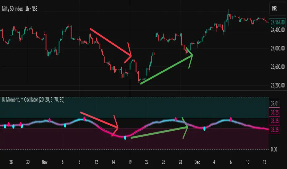
IU Momentum OscillatorDESCRIPTION:
The IU Momentum Oscillator is a specialized trend-following tool designed to visualize the raw "energy" of price action. Unlike traditional oscillators that rely solely on closing prices relative to a range (like RSI), this indicator calculates momentum based on the ratio of bullish candles over a specific lookback period.
This "Neon Edition" has been engineered with a focus on visual clarity and aesthetic depth. It utilizes "Shadow Plotting" to create a glowing effect and dynamic "Trend Clouds" to highlight the strength of the move. The result is a clean, modern interface that allows traders to instantly gauge market sentiment—whether the bulls or bears are in control—without cluttering the chart with complex lines.
USER INPUTS:
- Momentum Length (Default: 20): The number of past candles analyzed to count bullish occurrences.
- Momentum Smoothing (Default: 20): An SMA filter applied to the raw data to reduce noise and provide a cleaner wave.
- Signal Line Length (Default: 5): The length of the EMA signal line used to generate crossover signals and the "Trend Cloud."
- Overbought / Oversold Levels (Default: 60 / 40): Thresholds that define extreme market conditions.
- Colors: Fully customizable Neon Cyan (Bullish) and Neon Magenta (Bearish) inputs to match your chart theme.
LONG CONDITION:
- Signal: A Buy signal is indicated by a small Cyan Circle.
- Logic: Occurs when the Main Momentum Line (Glowing) crosses ABOVE the Grey Signal Line.
- Visual Confirmation: The "Trend Cloud" turns Cyan and expands, indicating that bullish momentum is accelerating relative to the recent average.
SHORT CONDITIONS:
- Signal: A Sell signal is indicated by a small Magenta Circle.
- Logic: Occurs when the Main Momentum Line (Glowing) crosses BELOW the Grey Signal Line.
- Visual Confirmation: The "Trend Cloud" turns Magenta, indicating that bearish pressure is increasing.
WHY IT IS UNIQUE:
1. Candle-Count Logic: Most oscillators calculate price distance. This indicator calculates price participation (how many candles were actually green vs red). This offers a different perspective on trend sustainability.
2. Optimized Performance: The script uses math.sum functions rather than heavy for loops, ensuring it loads instantly and runs smoothly on all timeframes.
3. Visual Hierarchy: It uses dynamic gradients and transparency (Alpha channels) to create a "Glow" and "Cloud" effect. This makes the chart easier to read at a glance compared to flat, single-line oscillators.
HOW USER CAN BENEFIT FROM IT:
- Trend Confirmation: Traders can use the "Trend Cloud" to stay in trades longer. As long as the cloud is thick and colored, the trend is strong.
- Divergence Spotting: Because this calculates momentum differently than RSI, it can often show divergences (price goes up, but the count of bullish candles goes down) earlier than standard tools.
- Scalping: The crisp crossover signals (Circles) provide excellent entry triggers for scalpers on lower timeframes when combined with key support/resistance levels.
DISCLAIMER:
This source code and the information presented here are for educational and informational purposes only. It does not constitute financial, investment, or trading advice.
Trading in financial markets involves a high degree of risk and may not be suitable for all investors. You should not rely solely on this indicator to make trading decisions. Always perform your own due diligence, manage your risk appropriately, and consult with a qualified financial advisor before executing any trades.
RSI < 25 + Price Below 200 SMA (4H) - Text Signal
Price below 200MA on 4hr chart
RSI is below 25 ovsersold
Start buying small positions at every signal
Eventually price will capture the 200MA on 4hr
This will work great for NVDA, AAPL, MSFT, NFLX, PANW, AMZN, PLTR, CRWD and META.
Good for swing trading based on price action, RSI oversold and reversal
Add more on the Pin bar candles on 4hr time frame once the price is oversold.

Harp Day Trading Checklist All-in-one intraday indicator combining key levels, trend analysis, and confluence-based entry signals for options day trading.
Features
EMA Stack Analysis – 5/9/21 EMAs with bullish/bearish stack detection
VWAP – Intraday volume-weighted average price
Opening Range Breakout (ORB) – Customizable ORB period with visual high/low levels
Premarket Levels – Tracks PM high/low for key support/resistance
Previous Day High/Low – Optional prior session reference
Higher Timeframe Bias – 60-min EMA confirmation for directional bias
Entry Signals – CALL/PUT alerts when all conditions align (EMA cross, RSI, MACD, volume, key level)
Auto Stop/Target – ATR-based stop loss and take profit levels
Live Dashboard – Real-time checklist showing bias, HTF trend, VWAP position, RSI, volume, EMA stack, MACD, and key level proximity
How It Works
Signals trigger only when multiple factors align: correct higher-timeframe bias, EMA crossover, RSI confirmation, MACD cross, rising volume, and price near a key level (ORB, premarket, previous day, or VWAP). Background color indicates overall directional bias.
Best For
Intraday options traders looking for high-confluence setups on 1-5 minute charts. Works on stocks, ETFs, and futures.

SABARI BUY SELL PRO 1📌 Kira Clean Buy/Sell Indicator – EMA 9–21 + VWAP Strategy
Kira Clean Buy/Sell is a minimalist trading indicator designed to provide high-probability entry signals without cluttering your chart. The system uses a powerful combination of EMA crossover and VWAP trend confirmation to generate accurate BUY and SELL signals suitable for scalping and intraday trading.
🔍 Strategy Logic
Signals are generated only when trend direction and price position align, helping filter out false entries:
✅ BUY Signal
EMA 9 crosses above EMA 21
Price is trading above VWAP
✅ SELL Signal
EMA 9 crosses below EMA 21
Price is trading below VWAP
This dual confirmation ensures trades are taken with momentum and volume flow, improving consistency during trending market conditions.
🎯 Key Features
✔ Clean chart display – No EMA or VWAP lines shown, only BUY & SELL labels
✔ Non-repainting signals – Based on closed candles for reliability
✔ Trend filtered entries – Eliminates low-probability counter-trend trades
✔ Works on all instruments – Indices, stocks, crypto, forex
✔ Best timeframes: 3-minute, 5-minute, and 15-minute charts
✔ Built-in alerts – Get instant trade notifications
📈 Ideal For
Scalping traders seeking precise momentum entries
Intraday traders wanting clear trend confirmation
Minimalist trading styles without indicator clutter
⚠️ Disclaimer
This indicator provides entry signals only. Risk management, stop-loss, and position sizing must be applied separately. Always confirm signals with your own analysis.

8-Hours Overnight Volume Profile @MaxMaserati 3.08-Hours Overnight Volume Profile MaxMaserati 3.0
The 8-Hours Overnight Volume Profile indicator provides comprehensive volume distribution analysis for overnight trading sessions, helping traders understand institutional accumulation patterns and key price levels developed during low-liquidity periods.
Core Functionality
This indicator analyzes volume distribution across overnight sessions (default: 1:00 AM - 9:00 AM EST) to identify critical price levels where the most trading activity occurred. By utilizing lower timeframe data for accurate volume calculations, it maintains consistency across all chart timeframes while providing detailed profile resolution.
Key Features & Educational Value
Volume Profile Components:
POC (Point of Control): Identifies the price level with highest traded volume, representing the fairest price acceptance during the session
Fair Value Area (FVA): Highlights the price range containing the specified percentage of total volume (default 40%), indicating the primary area of value
High Volume Nodes (HVN): Shows areas of strong price acceptance and potential support/resistance
Low Volume Nodes (LVN): Reveals areas of price rejection that may act as continuation zones
Market Bias Table:
The integrated bias analysis table provides educational context for price action relative to overnight value areas:
Bullish Bias: Close above FVA suggests upside continuation potential
Bearish Bias: Close below FVA indicates downside pressure
P-Shaped or Top-Heavy : Price rallied above FVA but closed inside, suggesting potential rejection
B-Shaped or Bottom-Heavy: Price dropped below FVA but closed inside, indicating potential support
Neutral: Price remained within FVA, suitable for range-based strategies
Professional Customization
Multiple Color Themes: Professional Blue, Dark Gold, Neon, Minimal Gray, or Custom
Visual Styles: Choose between Solid, 3D, or Outlined bar styles
Gradient Effects: Optional gradient intensity for enhanced visual depth
Flexible Display: Adjustable profile width, resolution, and session count
Trading Applications
This tool serves educational purposes by helping traders:
Understand where overnight institutional activity established value
Identify potential support/resistance levels based on volume acceptance
Recognize bias shifts when price moves beyond established value areas
Plan entries based on value area relationships and market structure
Technical Implementation
The indicator uses multi-timeframe analysis to ensure accurate volume calculation regardless of your chart timeframe, providing reliable profile data from lower timeframe consolidation. The session-based approach isolates overnight activity, making it particularly useful for traders analyzing pre-market and early regular session dynamics.
This indicator is designed for educational purposes to enhance understanding of volume profile analysis and overnight market structure. All trading decisions should be made based on comprehensive analysis and proper risk management.

SMC & ICTSMC & ICT Concepts
Key Features:
• Real-time Market Structure: MSS (Market Structure Shift), BOS, CHOCH with labels
• Order Blocks (Bullish & Bearish) – auto-mitigation & breaker detection
• Fair Value Gaps (FVG), Implied FVG, Balance Price Range (BPR)
• Liquidity Grabs (Buyside/Sellside pools from equal highs/lows)
• Volume Imbalance (VI) detection
• Displacement candles
• Killzones: New York, London Open/Close, Asian session background highlight
• NWOG (New Week Opening Gap) & NDOG (New Day Opening Gap)
• Automatic Fibonacci Retracement & Extension between latest FVG, OB, Liquidity, or VI
• Two display modes:
→ Present Mode: Shows only recent & relevant structures (clean chart – recommended for live trading)
→ Historical Mode: Shows full structure history
Perfect confluence tool for scalping, day trading, and swing trading.

My Multiple MA-BandsRelease Notes
MY-BAND – Adaptive Moving Average Channel Indicator
MY-BAND is a customizable Moving Average Band / Channel indicator designed to help traders clearly visualize trend direction, dynamic support & resistance, and market structure on any timeframe.
This indicator builds adaptive price bands around Moving Averages, making it easier to identify:
Trend continuation
Trend reversal
Volatility expansion and contraction
Key breakout and pullback zones
It works perfectly for crypto, forex, and stock markets.
🔧 Key Features
Multi-Timeframe MA Bands
HiLo & LLMA Moving Average Types
Dynamic Channel Width
ZigZag Structure Detection
Average Center Line
Trend Bending Option
Support & Resistance Layer
Fully Adjustable Inputs
Works on All Timeframes
📊 How to Use
Trend Trading
Price above upper band → Strong bullish trend
Price below lower band → Strong bearish trend
Pullback Entries
Enter on pullback to middle MA in trend direction
Breakout Trading
Strong breakout outside the band signals continuation
Market Structure
ZigZag feature helps identify swing highs & lows
⚙️ Inputs Explanation
MA Timeframe (MA TF) – Select the timeframe for MA calculation
Length 1 & Length 2 – Fine-tune band sensitivity
MA Type – Choose between HiLo or LLMA
Width – Controls band distance
AVG Line – Show central average line
Zigzag – Display market structure swings
Extend – Extend channel into the future
Bending – Smooth adaptive band behavior
✅ Best For
Trend Followers
Scalpers
Swing Traders
Crypto Futures Traders
Breakout & Pullback Strategies
⚠️ Disclaimer
This indicator is for educational and analytical purposes only. It does not provide financial advice. Always use proper risk management and confirm signals with other indicators.

V-CORE SMA Matrix LiteV-CORE SMA Matrix Lite
A clean, lightweight 5-SMA structure tool built using Pine Script v6.
This open-source Lite edition provides a simple visual framework for identifying market structure using the most commonly used moving averages:
21 SMA
50 SMA
80 SMA
100 SMA
200 SMA
Each line is individually adjustable and colour-coded for easy trend reading.
No signals, no alerts, no automation — purely a visual tool for traders who prefer clarity over complexity.
This Lite version exposes only basic, non-proprietary logic.
Advanced regime systems, multi-stage confirmation models, and automation features are available only in the full V-CORE Engine suite.
Part of the V-CORE Lite Series
Free open-source tools designed for education, research, and clean charting.
Follow our work:
TradingView: VectorCoresAI
X (Twitter): vectorcoresai
Telegram: vectorcoresai

V-CORE Engine Free v1V-CORE Engine Free v1 — Public Release
This is a simplified trend-state visualiser from the V-CORE suite, designed for clean directional bias on crypto markets using 1H+ timeframes.
The engine runs fixed, non-editable internal logic with multi-stage trend confirmation.
No optimisation, no signals, no settings — just locked-in regime detection for educational and research use.
This free edition is a lightweight derivative of our internal V-CORE Engine architecture.
It includes only the essential background-state display while keeping all proprietary components sealed.
For additional V-CORE tools, future releases, or extended versions, please visit our TradingView profile.

V-CORE Engine Free v2V-CORE Engine Free v2 — Public Release
This is another release from the V-CORE suite, providing simplified market regime visualization based on proprietary trend-state processing.
No settings, no noise — just clean directional bias adapted for crypto markets on 1H+ timeframes.
This free version is intentionally minimal. It uses a reduced feature-set derived from our internal V-CORE Engine architecture.
For more details about V-CORE tools, future releases, or the full professional engine, please check our profile page.

My Band by MAMY-BAND – Adaptive Moving Average Channel Indicator
MY-BAND is a customizable Moving Average Band / Channel indicator designed to help traders clearly visualize trend direction, dynamic support & resistance, and market structure on any timeframe.
This indicator builds adaptive price bands around Moving Averages, making it easier to identify:
- Trend continuation
- Trend reversal
- Volatility expansion and contraction
- Key breakout and pullback zones
It works perfectly for crypto, forex, and stock markets.
🔧 Key Features
✅ Multi-Timeframe MA Bands
✅ HiLo & LLMA Moving Average Types
✅ Dynamic Channel Width
✅ ZigZag Structure Detection
✅ Average Center Line
✅ Trend Bending Option
✅ Support & Resistance Layer
✅ Fully Adjustable Inputs
✅ Works on All Timeframes
📊 How to Use
Trend Trading
Price above upper band → Strong bullish trend
Price below lower band → Strong bearish trend
Pullback Entries
Enter on pullback to middle MA in trend direction
Breakout Trading
Strong breakout outside the band signals continuation
Market Structure
ZigZag feature helps identify swing highs & lows
⚙️ Inputs Explanation
MA Timeframe (MA TF) – Select the timeframe for MA calculation
Length 1 & Length 2 – Fine-tune band sensitivity
MA Type – Choose between HiLo or LLMA
Width – Controls band distance
AVG Line – Show central average line
Zigzag – Display market structure swings
Extend – Extend channel into the future
Bending – Smooth adaptive band behavior
✅ Best For
Trend Followers
Scalpers
Swing Traders
Crypto Futures Traders
Breakout & Pullback Strategies
⚠️ Disclaimer
This indicator is for educational and analytical purposes only. It does not provide financial advice. Always use proper risk management and confirm signals with other indicators.
