3 EMAs CustomizablesIt consists of 3 EMAs, each of which can be customized — you can change colors, thickness, and periods according to your trading strategy to save space on the indicators.
Educational
Trend Engine [MMT]The Trend Engine is a versatile Pine Script indicator designed to identify trend direction, potential reversals, and key price levels using a combination of Exponential Moving Averages (EMAs), and Anchored Volume-Weighted Average Price (VWAP). This indicator provides traders with a clear visual representation of market bias, momentum, and key support/resistance levels, making it suitable for both trend-following and pullback trading strategies.
Key Features:
1. EMA Cloud System:
- Displays three customizable EMAs (Fast, Pullback, and Slow) with configurable lengths and visibility.
- Creates two cloud fills:
- Fast Cloud : Between the Fast EMA (default: 8) and Pullback EMA (default: 13).
- Slow Cloud : Between the Pullback EMA and Slow EMA (default: 21).
- Clouds are color-coded (green for bullish, red for bearish) based on EMA alignment, with adjustable transparency for clarity.
2. Bias EMA:
- A longer-term EMA (default: 35) indicates the overall market bias.
- Changes color based on whether the regular candle close is above (green) or below (red) the Bias EMA, providing a clear trend direction signal.
3. Heikin Ashi Signals:
- Utilizes Heikin Ashi candles to detect strong bullish or bearish momentum.
- Generates buy/sell signals when a Heikin Ashi candle confirms a trend (bullish HA candle closing above Bias EMA for buy, bearish HA candle closing below for sell).
- Signal arrows are currently disabled but can be enabled via settings for visual confirmation.
4. Anchored VWAP and Standard VWAP:
- Plots both a standard VWAP and an Anchored VWAP (anchored to the US RTH session, 09:30–16:00 EST).
- Customizable line styles (solid, cross, or circles) and colors for both VWAPs, aiding in identifying dynamic support/resistance levels.
5. Background and Candle Coloring:
- Optional background coloring reflects the market bias (green for bullish, red for bearish) based on the regular close relative to the Bias EMA.
- Optional Heikin Ashi candle coloring to visually distinguish bullish and bearish market conditions.
6. Regular Candle Close:
- Option to plot the regular (non-Heikin Ashi) close price with customizable styles (line, circles, or cross) for reference.
7. Alerts:
- Built-in alert conditions for bullish and bearish signals, allowing traders to receive notifications when a Heikin Ashi candle confirms a trend relative to the Bias EMA.
How to Use:
- Trend Identification : Use the Bias EMA and background color to determine the overall market direction.
- Pullback Trading : Monitor the EMA clouds for alignment (bullish or bearish) and use the Pullback EMA for entries during retracements.
- Support/Resistance : Leverage the VWAP and Anchored VWAP as dynamic levels for trade entries or exits.
- Signal Confirmation : Enable signal arrows (when fixed) to spot high-probability trend continuation or reversal setups.
- Customization : Adjust EMA lengths, colors, transparency, and visibility to suit your trading style and timeframe.
Settings:
- EMA Cloud : Customize lengths (default: 8, 13, 21), visibility, and cloud colors/transparency.
- Bias EMA : Adjust length (default: 35) and colors for above/below states.
- VWAP : Toggle standard and Anchored VWAP, with customizable styles and colors.
- Background/Candles : Enable/disable background and candle coloring for visual clarity.
- Regular Close : Show/hide the regular close price with style options.
Notes:
- Designed for use on any timeframe, but most effective on intraday (e.g., 5m, 15m) or daily charts.
- Best used in conjunction with other technical analysis tools for confirmation.
- Anchored VWAP is tailored for US markets (RTH session) but can be adjusted for other sessions by modifying the anchor time in the code.
Ideal For:
- Day traders and swing traders looking for trend direction and pullback opportunities.
- Traders using VWAP-based strategies for intraday support/resistance.
- Those seeking a clean, customizable visual aid for market bias and momentum.
This indicator is a powerful tool for traders aiming to capture trends and manage risk effectively, with extensive customization to adapt to various markets and trading styles.
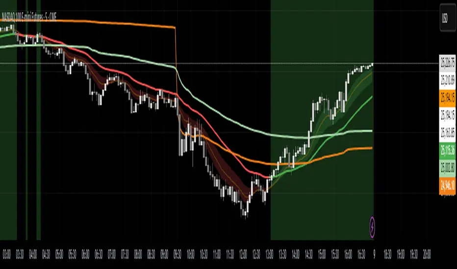
ES on MNQES on MNQ — ES percent-move overlay on the MNQ price scale.
Overview
This indicator projects the ES’s intraday percent change since session open onto the MNQ price scale. At the session start (18:00 chart time), it stores the ES open and the MNQ open, tracks ES’s percentage move from that anchor, and applies the same percent move to the MNQ open. The result is a single line that behaves like ES but is plotted in MNQ points—useful for spotting convergence/divergence, failed breaks, and mean-reversion setups between ES and MNQ.
How it works
1. Detects session open (18:00 on your chart).
2. Saves ES_open and MNQ_open.
3. Computes pct = (ES_close - ES_open) / ES_open.
4. Plots MNQ_open * (1 + pct) as the ES-on-MNQ line.
A label on the last bar shows the current ES value for quick reference.
Inputs
• ES Symbol: default ES1! (change if you use a different continuous).
• Line Color: color of the overlaid ES-on-MNQ line.
Works best on intraday timeframes and when your chart’s session aligns with ES.
Why it’s useful
• Highlights divergences (MNQ decoupling from ES baseline).
• Aids confirmation on pullbacks/breakouts when MNQ’s move disagrees with the ES-based projection.
• Helps risk control by flagging stretches likely to revert toward the ES-anchored path.
Notes & limitations
• This is a percent-rebasing overlay, not a hedge ratio, fair value, or spread model.
• Session/timezone settings matter; if your feed doesn’t print exactly at 18:00 on a higher timeframe, use a smaller TF or adjust session settings.
• Minor differences between ES (full) and MNQ (micro) and data latency can create small offsets.
Disclaimer
For educational use only. Not financial advice. Use proper risk management.
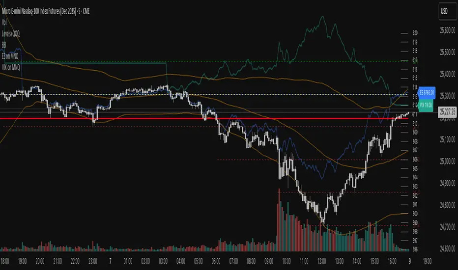
VIX on MNQVIX on MNQ — VIX percent-move overlay on the MNQ price scale (daily-open anchor, optional inversion)
Overview
This indicator projects the VIX’s intraday percent change from the daily open onto the MNQ price scale. It takes today’s open for both VIX and MNQ, measures the VIX’s percentage move since that open, optionally inverts it (given the typical inverse relationship), and applies a scale factor to fit that move onto MNQ’s price axis. The result is a single line that reflects VIX dynamics but is plotted in MNQ points—great for reading risk-on/risk-off tone, spotting divergences, and timing mean-reversion around volatility spikes.
How it works
• Fetches VIX close on your chart timeframe and today’s open for VIX and MNQ.
• Computes pct = (VIX_close − VIX_open) / VIX_open.
• Optionally multiplies by −1 (invert) and then by a Scale Factor to compress amplitude.
• Plots MNQ_open * (1 + pct * (invert? −1 : 1) * scaleFactor) as the VIX-on-MNQ line.
• Adds a last-bar label with the current VIX value and a small info panel (VIX, % change, scaled level).
Inputs
• VIX Symbol: VIX, CBOE:VIX, or TVC:VIX (pick the one that matches your data feed).
• VIX Line Color: color of the overlay line.
• Invert VIX: flip the sign to reflect inverse correlation with MNQ.
• Scale Factor (default 0.05): tune how much of the VIX move is mapped onto MNQ points.
Why it’s useful
• Surfaces volatility-led divergences: when MNQ’s path disagrees with VIX’s risk signal.
• Helps confirm/fade breakouts and pullbacks during volatility expansions/compressions.
• Provides a quick, visual “volatility baseline” directly on the MNQ chart without juggling two panes.
Notes & limitations
• This is a percent-rebased overlay, not a hedge ratio, fair value, or spread model.
• It anchors to the current day’s open; session/timezone settings and your VIX symbol choice (CBOE:VIX vs TVC:VIX) can affect exact prints.
• The scale factor is intentionally manual—adjust until the overlay’s swings are visually informative for your setup.
Disclaimer
For educational use only. Not financial advice. Always manage risk.

ES on MNQES on MNQ — ES percent-move overlay on the MNQ price scale
Overview
This indicator projects the ES’s intraday percent change since session open onto the MNQ price scale. At the session start (18:00 global chart time), it stores the ES open and the MNQ open, tracks ES’s percentage move from that anchor, and applies the same percent move to the MNQ open. The result is a single line that behaves like ES but is plotted in MNQ points—useful for spotting convergence/divergence, failed breaks, and mean-reversion setups between ES and MNQ.
How it works
1. Detects session open (18:00 on your chart).
2. Saves ES_open and MNQ_open.
3. Computes pct = (ES_close - ES_open) / ES_open.
4. Plots MNQ_open * (1 + pct) as the ES-on-MNQ line.
A label on the last bar shows the current ES value for quick reference.
Inputs
• ES Symbol: default ES1! (change if you use a different continuous).
• Line Color: color of the overlaid ES-on-MNQ line.
Works best on intraday timeframes and when your chart’s session aligns with ES.
Why it’s useful
• Highlights divergences (MNQ decoupling from ES baseline).
• Aids confirmation on pullbacks/breakouts when MNQ’s move disagrees with the ES-based projection.
• Helps risk control by flagging stretches likely to revert toward the ES-anchored path.
Notes & limitations
• This is a percent-rebasing overlay, not a hedge ratio, fair value, or spread model.
• Session/timezone settings matter; if your feed doesn’t print exactly at 18:00 on a higher timeframe, use a smaller TF or adjust session settings.
• Minor differences between ES (full) and MNQ (micro) and data latency can create small offsets.
Disclaimer
For educational use only. Not financial advice. Use proper risk management.

EMA 9/15/45 + MACD Confirm + SupertrendThis indicator uses EMA 9, 15, 45 days along with combination of MACD and Supertrend

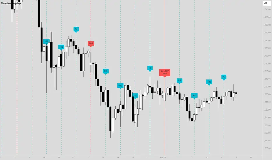
Market Working days🔶What it is ?
"Market trading days" is an indicator to define the new trading in Finance market.
As a trader or investor, we separate the days and weeks, months to understand how market is moving on each day easier. Give out plans on each day more effective.
Plus, when we're recording trading journal with detail info of "Market trading days", you also
can understand it faster.
You can understand the trend of last days, last week easier to give out plans on current week/month/day.
🔶 Who can use it ?
1. All traders who are using NCI, ICT , Smart money concepts, MACD system and other systems...
2. All traders who are trading on any timeframes
3. All traders who are trading on Forex, Crypto, Stock, Indices, Futures...
4. All traders who are new or experienced traders
5. All traders who are swing or scalping traders
🔶 The purpose of indicator
1. Separate days/weeks/months to be easier to analyze
2. Supporting traders to have a better view of market circle
3. Reducing stressful in analyzation process by a clearly view of day/week/month
🔶 How will indicator appear on chart
After you added it on chart, indicator will create the vertical lines with labels when a new day/week/month starts.
New Monday (new week) : Dashed line with red label "MON"
New Tue-Sun (normal days) : Dashed line with aqua label "TUE"-"SUN"
New month : Solid line with red label "Nov - 2025 MON"
🔶 INPUT value and How to use indicator
This indicator just need to add and use it directly. There's no input date required.
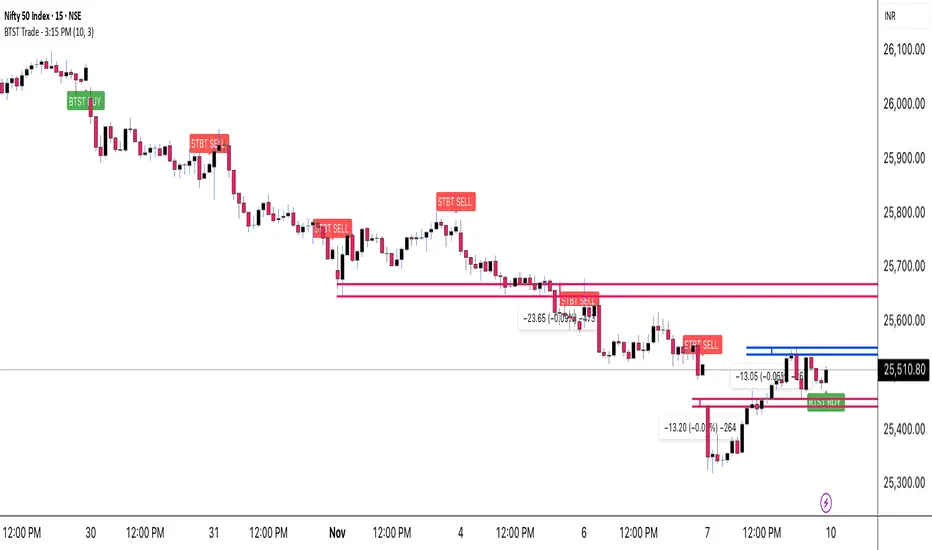
BTST Trade - 3:15 PMOverview
This indicator is specifically designed for BTST (Buy Today, Sell Tomorrow) traders who want a clear directional signal at 3:15 PM, just before the market closes.
It identifies the active market trend and instantly shows whether the market is positioned for a BTST BUY or BTST SELL setup.
Its goal is simple — help you take a data-based end-of-day decision rather than relying on guesswork or emotion.
Detects the current market trend throughout the day.
At exactly 3:15 PM, it checks that trend and prints one clear signal:
🟢 BTST BUY → Trend is bullish.
🔴 BTST SELL → Trend is bearish.
The signal appears as a label on the chart, making it easy to spot and understand.
Only one signal per day, ensuring clarity and discipline.
How to Use
Apply the indicator on an intraday timeframe (recommended 5-min or 15-min).
Make sure your chart’s exchange timezone is set correctly (for NSE / BSE, use India Standard Time).
Observe the signal generated at 3:15 PM:
If you get a green BUY label, plan a BTST long trade for the next session.
If you get a red SELL label, consider a short-side opportunity or avoid longs.
Use it together with your own price-action or volume confirmation before entering a trade.
Best Practices
Works best on liquid stocks/indices where volume is strong near close.
Combine with Supertrend, EMA, or RSI for additional confirmation.
Avoid using on higher timeframes like 1 hour or daily (no 3:15 bar there).
Designed mainly for BTST and short-term traders.
Disclaimer
This indicator is created for educational purposes only.
It is not financial advice, and no outcome is guaranteed.
Always use proper risk management and confirm signals with your own analysis before taking any trade.
Credits
Created by Virendra Pandey
A simple, time-based approach to identify the BTST & STBT opportunity at 3:15 PM.
Time Range HighlighterThis indicator highlights up to two custom time ranges on your chart with fully adjustable settings:
🔧 Features:
Define two separate time sessions
Set custom start and end times (in any time zone)
Choose unique highlight colors and opacity for each session
Toggle each range on or off independently
Timezone input allows syncing sessions to any global market hours (e.g., UTC, Asia/Tehran, New York)
🕒 Example Use Cases:
Highlight market opening hours (e.g. NYSE: 0930–1600)
Track your personal trading hours or peak volatility sessions
Visualize specific algorithm time filters
📌 Usage:
Enter your desired timezone string (e.g., "Asia/Tehran" or "Etc/UTC")
Customize session times like "0930-1200" and "1500-1700"
Adjust colors and visibility to fit your strategy
Ideal for traders who rely on time-based setups or session overlays.

Ichimoku Silver Bullet 2026 – Precision Cloud Signals⚡️ Ichimoku Silver Bullet 2026 – Precision Cloud Signals
Take your Ichimoku trading to the next level with Silver Bullet 2026 ⚔️
This advanced system detects Tenkan-Kijun crossovers, Kumo breakouts, and true Cloud confirmations — giving you only the cleanest, most reliable signals.
🔥 Features:
✅ Smart Bull 🟢 & Bear 🔴 alerts with Kumo validation
✅ Precision cloud logic for fewer fake signals
✅ Works on any timeframe & any market
✅ Plug-and-play Ichimoku setup — no clutter, pure signal
🎯 Trade with clarity. Enter with precision. Ride the Silver Bullet. 🌥🚀

3HH/3LL → Next Bar Inside = Signal (Neon)Here’s a minimal, compile-ready Pine v5 indicator that does exactly this:
Detects 3 consecutive Higher Highs or 3 consecutive Lower Lows.
Signals only when the very next candle is an Inside Bar.
Uses your Neon Lime (HH case) and Neon Pink (LL case) colors.

Multi-Symbol Fib Zone Signal Scanner NSEMulti-Symbol Fib Zone Signal Scanner NSE
this indicator will suggest to buy or sell basis fib retracement
it is for educational purpose only.

3D Cube Projection - √3 Diagonal3D Cube Projection - √3 Diagonal
OVERVIEW
This indicator implements Bradley F. Cowan's cube projection methodology from his "Four Dimensional Stock Market Structures & Cycles" work. It visualizes a 3D cube projected onto the 2D price-time chart, using the √3 (square root of 3) body diagonal as the primary analytical tool for identifying market structure and potential cycle termination points.
METHODOLOGY
The cube is constructed by selecting two pivot points (A and E) which form the body diagonal - the longest diagonal running through the cube's interior from one corner to the diagonally opposite corner. According to Cowan's geometric approach:
- Point A = Starting pivot (low or high)
- Point E = Ending pivot (opposite extreme)
- Body Diagonal (A→E) = √3 × cube side length
- Face Diagonal (A→C) = √2 × cube side length
The script calculates the cube dimensions by:
1. Measuring the total price range from A to E
2. Dividing by √3 to determine the cube side length in price
3. Distributing the time component across three equal segments
4. Projecting the 3D structure onto the 2D chart plane
FEATURES
✓ Interactive date selection for points A and E
✓ Automatic UPLEG/DOWNLEG detection
✓ All 8 cube vertices labeled (A-H)
✓ All 6 cube faces with independent color/opacity controls
✓ √3 body diagonal (red line by default)
✓ √2 face diagonal (orange line by default)
✓ Customizable cube lines, fills, and labels
✓ Information table showing key measurements
VISUAL CUSTOMIZATION
- Front & Back faces: Box fills for the two square faces
- Side faces: Left and right vertical faces
- Top & Bottom faces: Horizontal connecting faces
- Each group has independent color and opacity settings
- Label size and transparency fully adjustable
- Cube line styles (solid, dashed, dotted) for depth perception
IMPORTANT LIMITATIONS & DISCLOSURES
This indicator works within the inherent constraints of projecting 3D geometry onto a 2D price-time chart:
⚠️ VISUAL APPROXIMATION: This is a visual projection tool, not a mathematically perfect 3D cube. True 3D geometry cannot be accurately represented on a 2D plane without distortion.
⚠️ TIME DISTRIBUTION: The script divides the time axis into three equal segments (total bars ÷ 3) for practical visualization. This is an approximation that prioritizes visual coherence over strict geometric accuracy.
⚠️ UNIT SCALING: Price and time use different units (dollars vs. bars), making true isometric projection impossible. The cube appears proportional on screen but the dimensions are not directly comparable.
⚠️ 2D CONSTRAINT: We only have X (time) and Y (price) axes available. The Z-axis (depth) is simulated through visual projection techniques (line styles, shading).
INTENDED USE
This tool is designed for traders and analysts who study Bradley Cowan's geometric market analysis methods. It helps visualize:
- Market structure in geometric terms
- Potential support/resistance zones at cube edges
- Cycle timing relationships using √2 and √3 ratios
- Harmonic price-time relationships
The cube projection should be used as one component of a comprehensive analysis approach, combined with other technical tools and fundamental analysis.
MATHEMATICAL FOUNDATION
While the visual representation involves approximations, the core √3 relationship is mathematically sound:
- For any cube, the body diagonal = √3 × side length
- The face diagonal = √2 × side length
- These ratios are preserved in the price dimension calculations
HOW TO USE
1. Select your starting date (Point A) - typically a significant low or high
2. Select your ending date (Point E) - the opposite extreme pivot
3. The indicator automatically constructs the cube geometry
4. Analyze the cube edges, diagonals, and faces for market structure insights
5. Adjust colors and opacity to suit your chart aesthetic
TECHNICAL NOTES
- Works on all timeframes and instruments
- Best viewed on charts with sufficient historical data
- Cube updates in real-time as new bars form
- Range selection is marked with vertical lines and shading
- Calculator table shows Point A, Point E, side length, and bar measurements
ACKNOWLEDGMENT
This indicator is based on the geometric market analysis principles developed by Bradley F. Cowan. Users are encouraged to study Cowan's original works for deeper understanding of the theoretical framework.
DISCLAIMER
This indicator is for educational and analytical purposes only. It does not constitute financial advice. Past performance does not guarantee future results. Always conduct your own research and risk management before making trading decisions.

The Capture - Wargame v2.0- Visualizes historical wargame session data by drawing time-based boxes on the chart showing when Low of Day (LOD) and High of Day (HOD) typically occur
- Calculates price levels as percentage distributions from the daily Globex open (18:00 EST) and positions boxes using actual timestamps in America/New_York timezone
- Supports four session types (Long True/False, Short True/False) with customizable colors, transparency, labels, and includes a configurable data table overlay

Apex FX - 1st 4H CandleApex FX - 1st 4H Candle
Overview
This indicator identifies the very first 4-hour candle of the trading day and plots its high and low as horizontal lines. These levels are designed to act as key support and resistance for the rest of the 24-hour session.
The lines are calculated using 4-hour data but display on any timeframe, allowing you to see these key daily levels while trading on lower timeframes like the 15-minute or 5-minute chart. The lines extend for the first six 4-hour candles (24 hours) before stopping.
Features
Flexible Timezone: A simple dropdown menu to select your local timezone (e.g., "America/New_York", "Europe/London", "UTC") to ensure the candle is always correctly identified.
Asset Presets: Instantly set the correct start time for major asset classes:
Forex (23:00)
Indices (00:00)
Crypto (21:00)
Fully Custom: A "Custom" option lets you define any hour and minute for the start of your session, giving you full control for other assets like Gold or Oil.
Custom Colors: Change the color of the high and low lines from the settings menu.
How to Use
Add the indicator to your chart.
Open the indicator's "Settings".
In the "Your Timezone" dropdown, select the same timezone you use for your chart (e.g., "America/New_York").
In the "Asset Type Preset" dropdown, choose the asset you are trading (e.g., "Indices").
The indicator will wait for the first 4-hour candle (e.g., the 00:00 candle for Indices) to close, and then it will automatically draw the high and low lines.

Wargame - The Capture v1.0- Visualizes historical wargame session data by drawing time-based boxes on the chart showing when Low of Day (LOD) and High of Day (HOD) typically occur
- Calculates price levels as percentage distributions from the daily Globex open (18:00 EST) and positions boxes using actual timestamps in America/New_York timezone
- Supports four session types (Long True/False, Short True/False) with customizable colors, transparency, labels, and includes a configurable data table overlay

Magic Candle [MMT]The Magic Candle indicator is a dynamic price-action tool that visually and intuitively tracks trend bias shifts, entry signals, stop levels, and reversal triggers based on a custom candle-state logic. It is designed for traders seeking to identify actionable shifts in market structure and trend momentum, blending key elements of trend-following and reversal anticipation into one system.
Core Functionality
1: Flip Candidate and Trigger Logic :
For both bullish and bearish trends, the indicator identifies "flip candidate" candles – the most extreme, recent candle in the direction of the current trend. A "flip trigger" level is set at the high (for bearish) or low (for bullish) of this candidate. If price breaks decisively past this level, it signals a potential trend reversal, switching the indicator's bias and updating the tracked ranges and stop-loss points.
2: Entry and Stop-Loss Visualization :
Before entries, the indicator highlights the tracked high and low as "Entry" levels. Upon bias confirmation (break of the tracked level), a stop-loss line is automatically plotted at the opposite extreme of the tracked move for real-time risk guidance.
3: State Table Panel :
A dedicated on-chart table summarizes, in real time: current state (trend bias), active stop-loss level, entry reference level, and the present flip trigger. This offers at-a-glance status updates for systematic trade management.
Practical Usage
Momentum Confirmation :
Stay synchronized with price momentum by entering long or short once tracked highs or lows are broken, aligning trades with confirmed directional moves. Best to use in a confirmed trend direction.
Reversal Alerts :
The flip trigger logic allows traders to anticipate potential reversals, with visual cues and optional labels that remove guesswork at possible shift points.
Risk Management :
Fully integrated stop-loss plotting supports disciplined trade management, setting stop points based on recent price extremes to correspond with current bias and volatility.
This indicator benefits traders looking to combine the clarity of structured price-action logic with robust automation, suitable for many timeframes and all liquid instruments.

TopStepX Closed/Rollover/Weekend ClosedIndicator shows when TopStepX trading market is closed, when you should exit prior to Rollover as well as when the TopStep market is closed for the weekend.


Midnight ET + Daily H/L True dayThis script divides each day from midnight EST to the next midnight opening price (True day). Full credits go to my mentor ICT for the idea behind the script
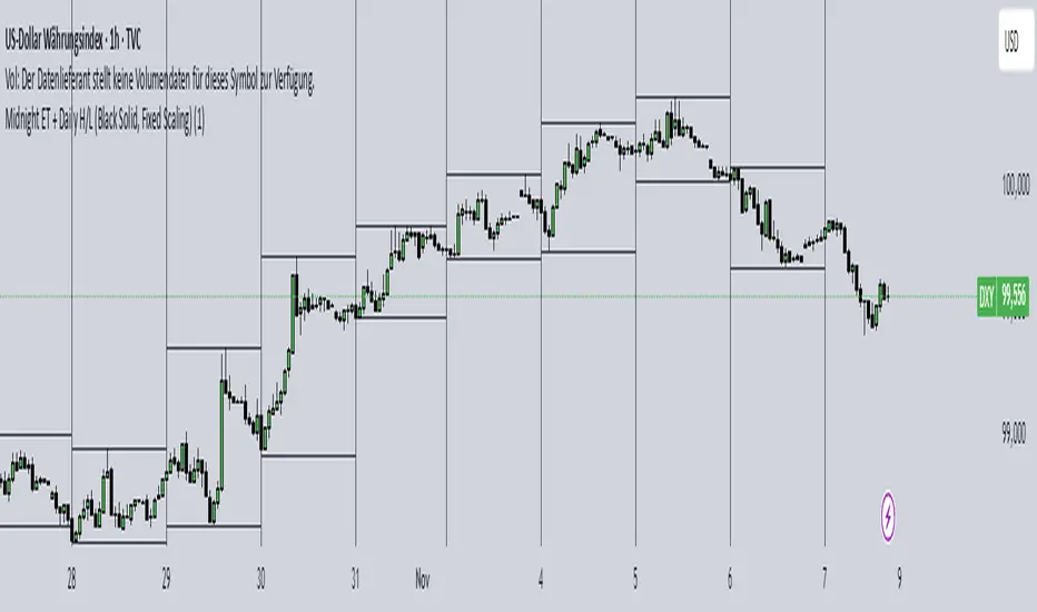
Midnight ET + Daily H/L (vertical midnight + HL lines)This script provides midnight EST dividers for each day and marks each daily high and low during each True day. Credits go to my mentor ICT for the idea behind this script.

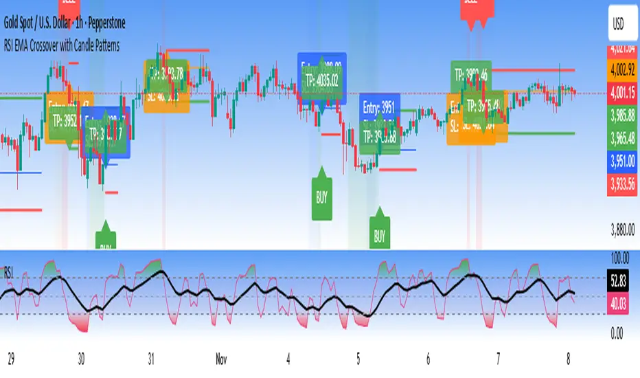
RSI EMA Crossover with Price ActionThe RSI and RSI's EMA Crossover with Price Action (1:2 Risk-Reward) strategy combines Momentum, Trend confirmation, and Basic price-action logic to generate high-probability trade setups with Proper Risk Management.
This script identifies entries when the RSI crosses a key threshold and aligns with an RSI - EMA crossover, confirming Exhaustion of a current trend and Price action confirms the Change in Trend direction. It integrates price action filters to avoid false signals during low-volatility or choppy conditions.
The strategy also includes a risk-management module, setting a fixed 1:2 risk-to-reward ratio — automatically placing a take-profit target twice the size of the stop loss. Also the Stop loss can be adjusted to nearest swing low or last 3 candles Low. to avoid Stoploss hunt.
Features
✅ RSI and EMA crossover confirmation for directional bias
✅ Basic price-action validation (optional filters)
✅ Configurable stop-loss and take-profit levels (default 1:2)
✅ Visual trade markers for entries and exits
Disclaimer: This script is intended for educational and research purposes only. It should not be considered financial advice or a guaranteed trading system. Users are encouraged to test and optimize parameters before using in live markets.