BHUVANA Fib 50–61.8 • Turn Alerts when FIB directions change
Detects step-up / step-down on both Fib 50 & 61.8 (your “stairs” logic).
Triggers BUY/SELL on that slope change (optionally also requires price to be above/below the line).Spot volatility compression around the 50%–61.8% Fibonacci mid-band of the current swing, then trade the first expansion with clean, rules-based entries and auto SL references.
Swing mapping: Finds the active high/low over a user-defined lookback and computes Fib 50% and Fib 61.8%.
Squeeze detection: Measures the distance between 50% and 61.8%. If the band width is ≤ (ATR × multiplier), the zone is flagged as a Squeeze.
Breakout entries (on close):
Long when price crosses up through 50% while squeezed.
Short when price crosses down through 61.8% while squeezed.
Risk framework: Auto-plots stop lines from the signal bar:
Long SL = swing low; Short SL = swing high.
Visuals: Fib lines (50/61.8) + optional yellow zone highlight during squeeze.
Signals evaluate on bar close (no forward-looking data).
Works well on XAUUSD / US30 intraday (5–15m) during London/NY sessions.
Add your own alertcondition() lines if you want push alerts on Long/Short entries.
Educational

Finlu CONTINUACIÓN PRO V3.4.7
Finlu Continuation PRO is an invite–only indicator designed to detect high–probability continuation zones after a strong impulse.
It helps you filter out noise, avoid random entries and stay aligned with the real trend.
The script was built to work together with Finlu Momentum PRO and with a structured trading plan.
You can use it on any asset (indices, forex, crypto, stocks) and on multiple timeframes, as long as you follow a clear process.
What it does
• Highlights momentum impulses and the areas where a continuation move is more likely.
• Filters many false signals that usually appear after overextended moves.
• Helps you synchronize your continuation entries with the main trend instead of fighting it.
• Can be integrated into any strategy based on structure, impulses and pullbacks.
This is not a “buy/sell” toy or a get–rich–quick tool.
It is meant for traders who value risk management, process and clarity.
Access
This is an invite–only script. If you want to use it as part of the full Finlu method, you can:
• Send me a message on Instagram @finlu_trading with the text “Quiero Continuación PRO”, or
• Join the Finlu Founders Group, where you get access to Finlu Momentum PRO, Finlu Continuation PRO and exclusive risk–management material.

Fair Value Gaps [Fax Academy]FVG — Precision Fair Value Gap Detection for Professional Traders
Overview
Identifies and draws Fair Value Gaps (FVGs) using a refined 3-bar displacement model on the selected timeframe.
Optimized for Forex and Gold, but fully compatible with all instruments and timeframes.
Non-repainting, fast, and engineered to filter only meaningful imbalances.
ATR% or Points-based thresholds ensure cleaner charts; optional “latest only” mode and automatic gap removal on fill.
Detection Logic
Bullish FVG :
Current low > high from two bars ago, and the prior bar closes above that high at a source-timeframe boundary.
Bearish FVG :
Current high < low from two bars ago, and the prior bar closes below that low at a source-timeframe boundary.
All boxes anchor using xloc.bar_time for precise alignment with the source timeframe.
Inputs
Source Timeframe : Chart timeframe or any higher TF (1H, 4H, D, etc.)
Show Bullish / Show Bearish : Direction toggles.
Threshold Mode : Points or ATR % filter (dynamic). ATR length is internal; set your preferred percentage.
Min Gap (points) : Used when Threshold Mode = Points.
Extend Bars : How many bars the box extends to the right.
Show Latest Only : Only show the most recent gap.
Delete On Fill : Automatically remove gaps once price fully mitigates them.
Colors & Border Width : Fully adjustable styling.
How To Use
Select a Source Timeframe to map higher-TF FVGs onto lower-TF charts (e.g., 4H → 1H/15m).
Use ATR % filtering (10–20% recommended) to eliminate small, irrelevant gaps.
Enable “Latest Only” for a clean chart, or keep full history for multi-mitigation analysis.
Combine with:
EMA for trend + pullback structure.
Sessions for timing and volatility alignment.
Reading FVGs
Unmitigated FVGs can behave like magnets or supply/demand pockets.
In trending markets, fresh FVGs aligned with higher-TF bias offer high-quality continuation entries.
Filled gaps are automatically deleted when “Delete On Fill” is enabled.
Defaults
Bullish = ON, Bearish = ON
Threshold Mode: ATR % (10%)
Extend Bars: 1
Latest Only: OFF
Delete On Fill: ON
Colors: Dark Green (bullish), Dark Red (bearish)
Notes
Non-repainting — all detection occurs only when the source timeframe bar closes.
Works on any chart timeframe with perfect timestamp alignment.
If your chart lacks enough higher-TF bars, extend history or select a lower Source TF.
Brand
Developed by Fax Academy to bring precision, clarity, and professional-grade imbalance analysis to modern trading.
For educational and analytical purposes only — always combine with sound risk management and verification.

Forex Sessions [Fax Academy]Forex Sessions — Precision Session Mapping for Professional Traders
Overview
Highlights the four major FX sessions — Sydney, Tokyo, London, New York — directly on your chart.
Kill Zones: high-impact windows around the session open (default 10 minutes).
Timezone-aware with full DST support — sessions that cross midnight shade correctly.
Engineered for clean intraday context, overlap visibility, and professional session-based execution.
What It Shows
Kill Zones — bold-tinted windows around each session's open.
Full Session Shading — lighter background for the entire active window.
London–New York Overlap highlight for maximum-liquidity hours.
Inputs
Timezone
Exchange • UTC • Europe/London • America/New_York • Asia/Tokyo • Australia/Sydney
Use Exchange to automatically align with instrument time.
Per-Session Controls for Sydney, Tokyo, London, New York:
Kill Zone toggle + custom minutes (default 10)
Full Session toggle
Start/End hour (24h format)
How To Use
Set the Timezone first — regional options auto-adjust for DST (London/New York).
Enable Kill Zones to expose opening-volatility spikes and liquidity sweeps.
Tune session hours to match your broker if schedules differ from the global standard.
Watch the London–NY overlap for directional moves, breakouts, and trend continuation.
Practical Tips
Intraday Bias : Favor setups inside or shortly after Kill Zones that align with higher-timeframe structure.
Overlap Hours : Often produce the day’s key breakout/continuation legs.
Combine with:
EMA — pullback precision inside session windows.
FVG — imbalance-based entries during high-liquidity periods.
Defaults
Kill Zones: 10 minutes at each session open.
Full sessions: standard global FX windows (fully adjustable).
Color scheme: bold tint for Kill Zones, subtle tint for session ranges.
Notes
Non-repainting — all shading is based on confirmed chart bars.
Works on any instrument and any timeframe.
If a session’s opening bar is missing (holiday/limited trading), shading is automatically skipped.
Brand
Built by Fax Academy to elevate timing, clarity, and execution in the FX markets.
For educational and analytical use only — always validate with backtesting and disciplined risk management.

ATR Trailing Stop (Long or Short Selectable)The ATR Trailing Stop (Long or Short Selectable) will start calculating on a set date that you specify. This is great because you want to trail the price from the breakout day or even after exceeding specific price level (can be your breakeven level or even to capture more of the upside after the price target is met).
Entry price: If you act at the close of the day, you can leave this value as 0 and it will take the close of the day for the initial protective stop-loss calculation. You can choose to add a value such as the pattern boundary and in that case it will subtract the initial protective stop-loss from the pattern boundary and not the close of the day. If you use a scaling in tactic during the day (buying in tranches intraday as the breakout takes place) and your average purchase price is different than the close of the day, you can also plug that number in to calculate the initial protective stop-loss.
This is a modified version as many followers asked for ATR trailing for short setups. Now you can select the Long/Short trade setup from the drop down menu.
ATR period: You can select the ATR period. It can be 10 day, 14 day or 30 day or any ATR period of your choice.
ATR Multiplier for Stop-loss: This is the multiplier that you want to trail the price with. From the highest level price reached it will trail the price with a 3 x ATR () distance. The higher the number, the wider the trailing stop-loss. A multiplier of 1 will trail the price so close that and adverse movement can result in triggering the stop-loss.
Custom Value for First day Trailing Stop: This is my favorite part. For aggressive risk management, your initial protective stop can be smaller than what the ATR Trailing Stop will use in its calculation after entry day. In this case you can take 1xATR () or even with FX and Futures you can apply 0.5xATR() as the first day to calculate initial protective stop. The protective stop turns into a trailing stop after the first day.
Asset Correlation Matrix [PEARSON|BETA|R2]The Market Dilemma: The Liquidity Trap and The Illusion of Diversification
One of the most expensive mistakes in modern trading is the assumption that holding different asset classes—such as Technology Stocks, Crypto, and Commodities—automatically provides safety. In stable economic times, this may be true. However, in environments defined by high liquidity stress or macroeconomic shocks, the correlations between these seemingly distinct assets tend to converge mathematically to 1.0. This phenomenon is known in quantitative finance as "Systemic Coupling." When this occurs, technical analysis on individual charts loses its predictive power because the asset is no longer trading on its own idiosyncratic fundamentals (e.g., earnings or user growth) but is merely acting as a high-beta proxy for global liquidity flows. This toolkit solves this problem by providing an institutional-grade framework to quantify exactly how much "independence" your assets truly possess at any given moment. It objectively separates a "Stock Picker's Market," where individual analysis works, from a "Macro Regime," where only the broader trend matters.
Scientific Foundation: Why Logarithmic Returns Matter
Standard retail indicators often calculate correlation based on simple percentage price changes. This approach is mathematically flawed over longer timeframes due to the compounding effect. This algorithm is grounded in Modern Portfolio Theory (MPT) and utilizes Logarithmic Returns (continuously compounded returns). As established in academic literature by Hudson & Gregoriou (2015), log returns provide time-additivity and numerical stability. This ensures that the statistical relationship measured over a rolling 60-day window is accurate and not distorted by volatility spikes, providing a professional basis for risk modeling.
The Three Pillars of Analysis: Understanding the Metrics
To fully understand market behavior, one must look at the relationship between an asset and a benchmark from three distinct mathematical angles. This indicator allows you to switch between these institutional metrics:
1. Pearson Correlation (Directional Alignment):
This is the classic measure of linear dependence, ranging from -1.0 to +1.0. Its primary value lies in identifying Regime Changes . When the correlation is high (above 0.8), the asset has lost its autonomy and is "locked" with the benchmark. When the correlation drops or turns negative, the asset is "decoupled." This mode is essential for hedging strategies. If you are long Bitcoin and short the Nasdaq to hedge, but their correlation drops to zero, your hedge has mathematically evaporated. This mode warns you of such structural breaks.
2. Beta Sensitivity (Volatility Adjusted Risk):
While Correlation asks "Are they moving together?", Beta asks "How violently are they moving together?". Beta adjusts the correlation by the relative volatility of the asset versus the benchmark. A Beta of 1.5 implies that for every 1% move in the S&P 500, the asset is statistically likely to move 1.5%. This is the single most important metric for Position Sizing . In high-beta regimes, you must reduce position size to maintain constant risk. This mode visualizes when an asset transitions from being a "Defensive Haven" (Beta < 1.0) to a "High Risk Vehicle" (Beta > 1.0).
3. Explained Variance / R-Squared (The Truth Serum):
This is the most advanced metric in the toolkit, rarely found in retail indicators. R-Squared ranges from 0% to 100% and answers the question of causality: "How much of the asset's price movement is purely explained by the movement of the benchmark?" If R2 is 85%, it mathematically proves that 85% of the price action is external noise driven by the market, and only 15% is driven by the asset's own news or chart pattern. Institutional traders use this to filter trades: They seek Low R-Squared environments for alpha generation (breakouts) and avoid High R-Squared environments where they would simply be trading the index with higher fees.
The Theory of "Invisible Gravity" and Macro Benchmarking
While comparing assets to the S&P 500 is standard, the theoretical value of this matrix expands significantly when utilizing Macro Benchmarks like US Treasury Yields (US10Y). According to Discounted Cash Flow (DCF) theory, the value of long-duration assets (like Tech Stocks or Crypto) is inversely related to the risk-free rate. By setting the benchmark to yields, this indicator makes this theoretical concept visible. A strong Negative Correlation confirms that asset appreciation is being driven by "cheap money" (falling yields). However, a sudden flip to Positive Correlation against yields signals a profound shift in market mechanics, often indicating that inflation fears are being replaced by growth fears or monetary debasement. This visualizes the "Denominator Effect" in real-time.
Visualizing Market Breadth and Internal Health
Beyond individual lines, the "Breadth Mode" aggregates the data into a histogram to diagnose the health of a trend. A healthy rally is supported by broad participation, meaning high correlation across risk assets. A dangerous, exhausted rally is characterized by Divergence : Price makes a new high, but the Correlation Breadth (the number of assets participating in the move) collapses. This is often the earliest warning signal of a liquidity withdrawal before a reversal occurs.
References
Markowitz, H. (1952). Portfolio Selection. The Journal of Finance.
Sharpe, W. F. (1964). Capital Asset Prices: A Theory of Market Equilibrium.
Hudson, R., & Gregoriou, A. (2015). Calculating and Comparing Security Returns: Logarithmic vs Simple Returns.
Disclaimer: This indicator is for educational purposes only. Past performance is not indicative of future results.

Auto Position CalculatorA position sizing tool that automatically detects the instrument you're trading and calculates the correct position size based on your risk parameters.
What It Does
This indicator calculates how many contracts, lots, or shares to trade based on your account size, risk percentage, and stop loss distance. It auto-detects the instrument type and adjusts the point/pip value accordingly.
Supported Instruments
Futures: NQ, MNQ, ES, MES, YM, MYM, RTY, M2K, CL, MCL, GC, MGC
Forex: All major pairs (USD, EUR, GBP, JPY, etc.)
Index CFDs: NAS100, US500, US30, GER40, UK100
Metals: XAU, XAG
Crypto and Stocks: Automatic detection
How to Use
Set your account size and risk % in settings
Click the settings icon and place Entry, Stop Loss, and Take Profit on the chart
The position size and risk calculations appear automatically
Levels auto-reset at your chosen session (Asia, London, or New York open)
Limitations
CFD and forex pip values assume standard lot sizing - your broker may differ
Auto-detection relies on ticker naming conventions, which vary by broker/data feed
Session reset times are based on ET (Eastern Time)

piPH"Signals Refined. Opportunities Defined."
piPH is built for traders who value precision over noise. By demanding multiple confirmations, it avoids the trap of chasing every move and instead focuses on high-probability setups that align with trend, momentum, and divergence.

Josh FXJoshFX Multi-Timeframe Levels & Fair Value Gap Indicator
This powerful TradingView indicator provides a comprehensive view of key market levels and trends across multiple timeframes. Designed for traders who want precise entries and market context, it includes:
Previous Daily Levels: Automatically marks the previous day’s High, Low, and 50% midpoint.
Multi-Timeframe Trend: Displays the trend direction for 5-minute, 15-minute, 1-hour, and 4-hour charts directly on your current chart.
Daily Candle Display: Shows the current daily candle for quick visual reference.
Pivot Points: Accurately marks technical highs and lows (pivot points) to the exact unit on the chart.
Fair Value Gaps (FVGs): Highlights areas of imbalance for potential high-probability trade setups.
JoshFX Telegram Watermark: Includes branding for the JoshFX community.
This all-in-one tool is perfect for traders combining price action, liquidity concepts, and multi-timeframe analysis to find high-quality setups efficiently.

TIK Options Trade Setup v2TIK Options Trade Setup v2 is a specialized options-based intraday framework designed for Expiryscalping Group Members, premium behavior analysis, and breakout confirmation using both Call (CE) and Put (PE) data.
Using this data, it calculates a set of high-accuracy option scalping levels.
Underlying index (e.g., NIFTY / BANKNIFTY / SENSEX)
💎 Why This Indicator Is Powerful
This system uses both CE and PE data together, making it superior to single-side indicators.
It helps expiry-day traders:
⭐ Identify premium equilibrium
⭐ Predict CE/PE combined reversal zones
⭐ Catch sharp scalps with predefined levels
⭐ Avoid fake breakouts
⭐ Trade with confidence using data-backed zones

EMA+维加斯通道+Boll「ED22x」Multi EMA & Boll Function
- 6 EMA Line.
- Boll Function.
多均线指标+布林带指标
- 6条EMA 均线可自调试
- 可设置维加斯通道
- 布林带指标
By ED22x
X : ED22_x

成交量分位高亮「ED22x」Vol Highlight
with 30% 85% and x3 highlight function.
成交量分位高亮指标
- 加入回朔周期
- 附带20均线
- 自动高亮分别为
< 30%
> 30% < 85%
> 85% <
> 大于平均交易量3倍
By ED22x
X : ED22_x


Top-Down 8 Levels + Wick Alerts + H4 Box (Stable)Top-Down Analysis Box
This Indicator Helps You Do
Perform top-down analysis quickly
Identify HTF liquidity levels instantly
Spot wick taps (liquidity grabs) in real-time
Trade key institutional levels with confidence
Use H4 zones for direction and bias
Set alerts for high-probability reaction levels

Pivot Alert Bot - Multi-TimeframeOverview
Pivot Alert Bot automatically detects and labels pivot highs and pivot lows as they confirm across multiple timeframes. Designed for active traders who want clean, actionable signals without chart clutter.
Two-Tier Pivot System
📍 Main Pivots (Length 20)
Confirmed swing points that have proven themselves with 20 bars of price action on each side. Marked with clean PH (Pivot High) and PL (Pivot Low) labels. These are your high-conviction levels.
⭐ Temporary Pivots (Length 3)
Early-stage pivots marked with ***** labels in blue. These signal potential reversals before full confirmation — ideal for aggressive entries with tighter stops.
How to Trade
The indicator is built around a simple pivot-to-pivot strategy:
🔴 Short Setup: Enter short at a Pivot High → Target the previous Pivot Low
🟢 Long Setup: Enter long at a Pivot Low → Target the previous Pivot High
This approach gives you logical, structure-based profit targets instead of arbitrary calculations.
Multi-Timeframe Support
Scan for setups across:
⚡ 5 minute — Scalping and quick intraday moves
📊 15 minute — Primary day trading timeframe
📊 30 minute — Confirmation and larger moves
⏱️ 1 hour — Context and swing trade setups
Built-In Alerts
Never miss a pivot. Alert conditions included for:
Main Pivot High confirmed
Main Pivot Low confirmed
Temporary Pivot High detected
Temporary Pivot Low detected
Set alerts once and get notified on any timeframe.
Best Used On
High-volume, liquid instruments: SPY, QQQ, NVDA, TSLA, AMD, META, AMZN, COIN, and similar names with clean price action.
Settings
Adjustable pivot lengths for both main and temporary pivots
Toggle temporary pivot visibility on/off
Customizable label colors and sizes

Global Liquidity - Impulse (ROC & Z-score) [GMI-style]What it is:
Liquidity is a faucet. When central banks add money, the faucet opens (risk-on). When they pull money out, it closes (risk-off). This indicator builds a global net-liquidity proxy and shows its impulse :
- ROC (green/red histogram): % change vs N weeks ago.
- Z-score (cyan line): how unusually strong the latest weekly move is.
Why it matters:
Liquidity impulse often leads risk assets (equities/crypto) by weeks to a few months.
- Green bars > 0 + positive Z → friendlier risk-on backdrop.
- Red bars < 0 + negative Z → tightening conditions; caution.
Data used (TV Economics / FRED):
USA (FRED, millions USD):
- FRED:WALCL (Fed assets)
- FRED:RRPONTSYD (Reverse Repo – subtract)
- FRED:WTREGEN (Treasury General Account – subtract)
Other CBs (Economics, units vary):
- ECONOMICS:EUCBBS (ECB)
- ECONOMICS:JPCBBS (BoJ)
- ECONOMICS:CNCBBS (PBoC)
Optional:
- ECONOMICS:GBCBBS (BoE, UK)
- ECONOMICS:CACBBS (BoC, Canada)
- ECONOMICS:CHCBBS (SNB, Switzerland)
- ECONOMICS:AUCBBS (RBA, Australia)
Proxy (scaled to billions):
(Fed − RRP − TGA) + ECB + BoJ + PBoC +
How to read:
- Green bars above 0 = faucet opening → money in → risk-on.
- Red bars below 0 = faucet closing → money out → risk-off.
- Taller bar = stronger push.
- Cyan Z > +1 = unusually strong positive impulse; Z < −1 = unusually strong negative impulse.
- Background : green when ROC>0 & Z>0 , red when ROC<0 & Z<0 .
Quick reading guide (TL;DR):
- Early risk-on: ROC crosses > 0 and Z > 0 (ideally Z ≥ +1 ).
- Early risk-off: ROC crosses < 0 and Z < 0 (ideally Z ≤ −1 ).
- Use weekly timeframe; price often reacts with a 0–12 week lag.
- Combine with PMIs/New Orders, real yields (down), and credit spreads (narrowing).
Notes:
Symbols may differ by provider; leave optional banks OFF if missing. Currencies/units differ across CBs; this is a pragmatic proxy, not a perfect macro model. Educational use only; not financial advice.

Nifty Participants - Top 10 📌 Nifty Participants – Top 10 (Indicator Description)
This indicator displays the top 10 weighted stocks from the NIFTY index and shows how each stock is contributing to the index movement in real time.
For each participant, the script calculates price change, percentage change, RSI, VWAP position, volume spike, previous day levels, and their estimated participation based on weightage.
A dynamic table is plotted on the chart with color-coded cells for bullish, bearish, and neutral conditions. Users can customize which columns to display (LTP, Change, Change %, Share, RSI, VWAP, Volume Spike, Previous Day High/Low) and select the timeframe for calculations. The index itself appears as the first row for quick comparison.
Volume spikes are highlighted when current volume exceeds a configurable multiple of the average volume. RSI and VWAP columns also use adaptive coloring to quickly show strength or weakness.
All weightages are user-editable, and the table automatically limits output to the selected number of rows. This makes it an ideal real-time market breadth and contribution tracker for intraday and positional traders.

Micro Pullback Entry SystemMicro Pullback Entry System - Quick Reference
The Pattern
▲ ENTRY (first green to break high)
│
┌──┴───┐
│ 1-3 │ ← PULLBACK (red candles)
│ red │ Stop = Low of this zone
└──────┘
│
┌──┴───┐
│ 3+ │ ← THE MOVE (green candles)
│green │ Strong momentum
└──────┘
Pattern Checklist
Requirement: Why It Matters
3+ green candlesConfirms momentum
1-3 red pullback Brief = momentum intact< 50% retracementShallow = buyers in controlVolume on entryConfirms breakout Above EMA Trend support
Status Flow
Scanning... → 📈 TRENDING → 👀 WATCHING → ⏳ FORMING → 🎯 ENTRY!
StatusMeaningActionScanningLooking for setupWait📈 TRENDINGGreen streak buildingMonitor👀 WATCHINGPullback startedPrepare⏳ FORMINGValid pullback readyGet ready!🎯 ENTRY!Signal triggeredExecute
Entry/Stop/Target
LevelLine ColorHow to SetEntryLime solidClose of signal candleStopRed dashedLow of pullbackTarget 1Aqua dottedEntry + (2 × Risk)Target 2Yellow dottedEntry + (3 × Risk)
Example
Entry: $5.00
Stop: $4.80
Risk: $0.20
Target 1 (2R): $5.00 + $0.40 = $5.40
Target 2 (3R): $5.00 + $0.60 = $5.60
Quality Grades
GradeScoreActionA+5/5 ✓Best setup - full sizeA4/5 ✓Good setup - standard sizeB3/5 ✓Average - reduced sizeC2/5 ✓Weak - skip or tiny size
Scoring Factors
✓ Green streak met minimum
✓ Pullback length valid (1-3)
✓ Retracement shallow (<50%)
✓ Volume confirmed
✓ Above EMA
Trade Execution
Entry
Wait for "⏳ FORMING" status
Watch for green candle forming
Entry triggers when green candle closes above pullback high
Enter at market or small limit above current price
Stop Loss
Set at pullback low (red dashed line)
Non-negotiable - this is your max risk
Trade Management
If no immediate follow-through → exit early
Take 50% off at Target 1 (aqua line)
Move stop to breakeven
Let remainder run to Target 2
Settings Guide
Default (Recommended)
Min Green Candles: 3
Min Pullback: 1
Max Pullback: 3
Max Retracement: 50%
Volume Multiplier: 1.2x
EMA Filter: ON (20)
Conservative (Fewer, Better)
Min Green Candles: 4
Min Pullback: 2
Max Pullback: 3
Max Retracement: 40%
Volume Multiplier: 1.5x
EMA Filter: ON (20)
Aggressive (More Signals)
Min Green Candles: 2
Min Pullback: 1
Max Pullback: 4
Max Retracement: 60%
Volume Multiplier: 1.0x
EMA Filter: OFF
Common Mistakes
❌ Entering before signal
Wait for green triangle
"FORMING" ≠ "ENTRY"
❌ Wide stop
Stop must be at pullback low
If too wide, skip the trade
❌ Ignoring volume
Low volume entries fail more often
Look for ✓ in volume row
❌ Fighting trend
Check EMA status
Should show "Above ✓"
❌ Chasing after entry
If you miss entry by 3+ candles, wait for next setup
Don't chase extended moves
Best Setups
A+ Quality Setup ✓
4-5 green candles (strong move)
2 candle pullback (brief)
25-35% retracement (shallow)
2x+ volume on entry
Well above EMA
Stock already up 5%+ on day
Avoid These ✗
Only 2 green candles
4+ candle pullback (losing momentum)
50%+ retracement (too deep)
Below average volume
Below or at EMA
Against market direction
Timeframe Guide
TFSignalsQualityBest For1mMostLowerScalping5mBalancedGoodDay trading15mFewestHigherSwing entries
Quick Decision Tree
1. Status showing "FORMING"?
NO → Wait
YES → Continue
2. Quality grade A or better?
NO → Skip or small size
YES → Continue
3. Volume confirmed (✓)?
NO → Caution, reduce size
YES → Continue
4. Above EMA (✓)?
NO → Skip
YES → Continue
5. Risk acceptable? (Stop not too wide)
NO → Skip
YES → TAKE THE TRADE
Alert Setup
Essential Alert
"Micro Pullback Entry" - Main signal
How to Set
Right-click chart → Add Alert
Condition: Micro Pullback Entry System
Select "Micro Pullback Entry"
Set notification preferences
Combining with Other Indicators
IndicatorHow to Use5 PillarsFind stocks meeting criteria firstGap & GoLook for micro pullbacks after gap breakoutsR2G TrackerConfirm stock is green before enteringFloat RotationHigh rotation + micro pullback = best setupsBull FlagMicro pullback is a "mini" bull flag
Example Trade
Stock: XYZ
Pre-market: Gapped up 15%
9:35 - 9:38: 4 green candles (move from $4.50 to $5.00)
9:39 - 9:40: 2 red candles (pullback to $4.85)
9:41: Green candle breaks $4.90 (pullback high)
ENTRY: $4.92
STOP: $4.82 (pullback low)
RISK: $0.10
TARGET 1: $5.12 (+$0.20 = 2R)
TARGET 2: $5.22 (+$0.30 = 3R)
Result: Hit Target 2 by 9:55 → +$0.30 per share
Key Takeaways
Micro = 1-3 candles - Brief pullback
Entry = First green to break high - Specific trigger
Stop = Pullback low - Tight risk
Quality matters - Focus on A/A+ setups
Breakout or bailout - Exit if no follow-through

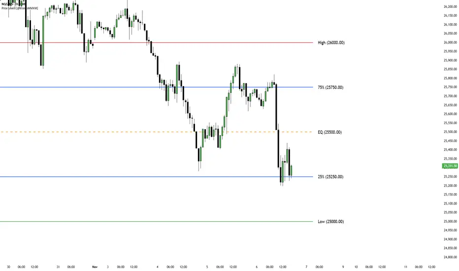
Fixed Price LevelsOverview
This indicator automatically calculates and plots fixed horizontal dealing ranges based on "Power of 10" mathematics. Unlike dynamic ranges that move with every tick or rely on lagging averages, these levels are fixed to specific mathematical grids (10s, 100s, 1000s, etc.). This provides a clean, objective structure for analyzing price action, psychological levels, and market equilibrium without the noise of repainting levels.
How it Works
The indicator uses a mathematical floor function to "snap" the current price to the nearest grid bottom based on your selected multiplier. This creates a static box around price.
The core formula concept is:
Dealing Range Low = math.floor(price / multiplier) * multiplier
Dealing Range High = Dealing Range Low + multiplier
Equilibrium (EQ) = Dealing Range Low + (multiplier / 2)
Key Features
Power of 10 Multipliers: Select between 1, 10, 100, 1000, or 10000 to suit your asset class (e.g., 100 for Indices, 0.01 logic for Forex).
Adjacent Ranges: Automatically plots ranges above and below the current price action to see future targets or support levels immediately.
Overlap Prevention: Includes logic to prevent label clutter. When multiple ranges are active, it ensures that a "Range High" and the next "Range Low" do not overlap visually.
Quarter Levels: Option to display the 25% and 75% levels within the range for granular precision.
Visual Customization: Full control over line extensions (Left, Right, Both, None) and label placement.
Settings Overview
Range Multiplier: Select the base grid size.
Number of Adjacent Ranges: Determines how many grid boxes to draw above and below the current price.
Visual Settings: Customize colors, styles (Solid, Dashed, Dotted), and widths for Low, High, EQ, and Quarters.
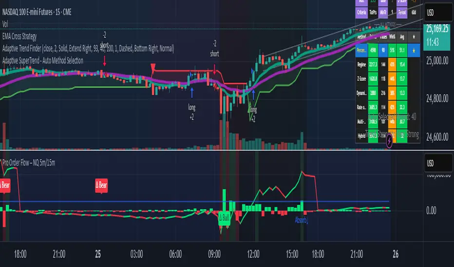
Pro Order Flow – NQ 5m/15mThis is a professional-grade order flow tool designed for scalpers and intraday futures traders (especially NQ 5m/15m, ES, SPY, BTC, and gold).
Right-click indicator → Move to new pane below (recommended, so price is clean)
It combines five high-probability institutional signals into one clean, fast indicator:
What This Indicator Shows
1. Candle Delta Histogram (Buyer vs Seller Pressure)
Each bar shows whether aggressive buyers (market orders lifting ask) or aggressive sellers (hitting bid) controlled that candle.
Green = buying pressure
Red = selling pressure
2.Session Cumulative Delta (True Direction)
Tracks buyer/seller domination for the entire session.
Rising cumDelta = buyers absorbing sellers
Falling cumDelta = sellers absorbing buyers
If price goes up but cumulative delta goes down → distribution (short signal)
If price goes down but cumulative delta goes up → accumulation (long signal)
This is one of the strongest institutional signals.
3 Big Delta Bars (Unusual Aggression)
Highlights candles where delta is 2.2× larger than average volume.
These mark:
Institutional absorption
Breakout pressure
Stop-run attacks
Failed breakout reversals
Green = big buying aggression
Red = big selling aggression
4 Smart-Money Wick Absorption (Absorb↑ / Absorb↓)
Tracks wick length vs body size + delta.
Used to detect:
Stop hunts
Liquidity grabs
Reversals off trapped traders
Absorb↓ (triangle up) = buyers absorbed sell-side liquidity (bullish)
Absorb↑ (triangle down) = sellers absorbed buy-side liquidity (bearish)
This is a high-confidence signal for NQ.
5 Real Delta Divergences (Δ Bull / Δ Bear)
Not RSI divergences — order flow divergences:
🔻 Bearish Delta Divergence (Δ Bear)
Price makes higher high
Cumulative delta makes lower high → buyers weakening
High-probability short
🔺 Bullish Delta Divergence (Δ Bull)
Price makes lower low
Cumulative delta makes higher low → sellers weakening
High-probability long
These are professional reversal points.
How to Use (Trading Strategy)
Recommended for:
NQ 5m entries + 15m bias, ES, SPY, BTC, gold.
🟩 Long Setup (Buy)
On 15m, session cumulative delta sloping UP
Price in an uptrend (higher highs/lows)
On 5m, look for ANY of these:
Δ Bull divergence
Absorb↓ tail after a stop-hunt wick
Big positive delta bar at support
Delta flips from red → green at VWAP
Entry: Enter on close of the signal candle
Stop: Below swing low or wick
Targets: Next liquidity high, or 2R–3R
🟥 Short Setup (Sell)
On 15m, session cumulative delta sloping DOWN
Price in a downtrend
On 5m, look for:
Δ Bear divergence
Absorb↑ tail above a high
Big negative delta bar
Delta flips from green → red at resistance
Entry: Enter on close
Stop: Above wick or structure
Targets: Prior low, or 2R–3R
Best Timeframes
15m = trend/bias
5m = signal + entry
Works on: NQ, ES, SPY, QQQ, BTC, Gold, Oil
Settings (Recommended)
Avg Volume Length = 100 (best for NQ volatility)
Big Delta Sensitivity = 2.2×
Pivots = 3 left / 3 right (good for intraday swings)
Included Alerts
Bullish Delta Divergence
Bearish Delta Divergence
Big Positive Delta (aggressive buying)
Big Negative Delta (aggressive selling)
Perfect for scalpers who want real-time signals.
Sessions Indicator(clean))🔰 True Day Open + Asian / London / NY Session Levels
Intraday Market Structure & Session Liquidity Indicator
This indicator automatically plots the True Day Opening Price, Asian Session High & Low, London Session High & Low, and New York Session Open — helping you understand daily directional bias, session liquidity zones, and potential reversal levels.
📌 What It Does
✔ Plots True Day Open (not broker-based — captures real market direction)
✔ Marks Asia Session High & Low – accumulation zone
✔ Marks London Session High & Low – expansion zone
✔ Shows New York Session Open – reversal / continuation zone
✔ Works on any chart: Forex, Indices, Crypto, Commodities
✔ Ideal for ICT / SMC / Day Trading / Scalping
✔ Fully customizable colors & display options
🧠 Why It’s Useful
The market often moves in this sequence:
➡ Asia → consolidation
➡ London → expansion / breakout
➡ New York → reversal OR continuation
This indicator helps you see this structure clearly, allowing traders to:
Avoid fake breakouts
Understand the daily bias earlier
Trade liquidity grabs & session-to-session transitions
Time entries with precision
📌 Best Timeframes
M5 / M15 / M30 → Scalping & intraday setups
H1 / H4 → Market structure view
Daily → Session zone backtesting
⚙ Inputs & Customization
Enable/Disable each session
Change session time manually
Color settings
Line styles: solid / dashed / background zones
🧠 Suggested Trading Concepts
Works great with:
Smart Money Concepts (SMC)
ICT Models
Liquidity Sweep Strategy
Session Breakout Trading
Mean Reversion Trading
📈 How to Use
Wait for Asian Range
Trade break of Asian High/Low during London
At NY Open, check for reversal or continuation
Use True Day Open for directional bias
Look for liquidity sweeps near session levels
📢 Coming Soon (Next Update)
🔔 Session Break Alerts
📊 Liquidity Sweep Labels

RSI Rate of Change (ROC of RSI)The RSI Rate of Change (ROC of RSI) indicator measures the speed and momentum of changes in the RSI, helping traders identify early trend shifts, strength of price moves, and potential reversals before they appear on the standard RSI.
While RSI shows overbought and oversold conditions, the ROC of RSI reveals how fast RSI itself is rising or falling, offering a deeper view of market momentum.
How the Indicator Works
1. RSI Calculation
The indicator first calculates the classic Relative Strength Index (RSI) using the selected length (default 14). This measures the strength of recent price movements.
2. Rate of Change (ROC) of RSI
Next, it computes the Rate of Change (ROC) of the RSI over a user-defined period.
This shows:
Positive ROC → RSI increasing quickly → strong bullish momentum
Negative ROC → RSI decreasing quickly → strong bearish momentum
ROC crossing above/below 0 → potential early trend shift
What You See on the Chart
Blue Line: RSI
Red Line: ROC of RSI
Grey dotted Zero Line: Momentum reference
Why Traders Use It
The RSI ROC helps you:
Detect momentum reversals early
Spot bullish and bearish accelerations not visible on RSI alone
Identify exhaustion points before RSI reaches extremes
Improve entry/exit precision in trend and swing trading
Validate price breakouts or breakdowns with momentum confirmation
Best For
Swing traders
Momentum traders
Reversal traders
Trend-following systems needing early confirmation signals
BETA ZONES v1.0BETA ZONES v1.0 Indicator
Overview
BETA ZONES v1.0 is a comprehensive technical analysis tool designed for TradingView, combining an EMA-based ribbon with dynamic glow zones, structural pivot detection, and real-time ATR visualization. This overlay indicator helps traders identify trends, support/resistance zones, and potential breakout points by blending moving averages, volatility-based shading, and pivot structures. It's particularly useful for trend-following strategies, swing trading, and confirming market reversals on any timeframe or asset, including those using Heikin Ashi candles (as it incorporates real close data to bypass transformations).
The indicator emphasizes visual clarity with color-coded elements: bullish trends in shades of green/lime and bearish in red/maroon. It includes customizable toggles for each component, allowing users to focus on specific features without cluttering the chart.
Key Features
• EMA Ribbon & Glow System:
o Displays a ribbon formed by three EMAs (5, 20, and 50 periods) with gradient fills between them, colored based on trend strength.
o A dynamic "glow" zone around the 50-period EMA, calculated using ATR (Average True Range), acts as a volatility-based support (bullish) or resistance (bearish) band. The glow expands/contracts with market volatility, providing a visual buffer for potential price reactions.
o Real Close Dot: A small circle plotted at the actual closing price of each bar (sourced from standard candles), aiding in precise data verification even on transformed charts like Heikin Ashi.
• Structural Pivots:
o Automatically detects and labels confirmed pivot highs and lows using customizable symbols (e.g., arrows, dots, or curves).
o Draws breakout lines connecting pivots to the bar where structure is broken (Break of Structure - BOS), highlighting bullish (green) or bearish (red) shifts.
o Pivots are trend-aware: In uptrends, it tracks higher highs/lows until a downside break; in downtrends, lower highs/lows until an upside break.
• Real ATR Display:
o A compact table at the bottom-center of the chart showing the current 14-period ATR value (calculated on real data), useful for gauging volatility and setting stop-losses or targets.
How It Works
• EMA Ribbon Logic: The fast EMA (5) is compared to the mid (20), and mid to slow (50), to determine sub-trends. Price relative to the slow EMA sets the overall bullish/bearish bias. Fills create a "ribbon" effect, with colors intensifying in strong trends.
• Glow Zone: Uses a user-defined ATR length and multiplier to create upper/lower bands around the slow EMA. The glow is one-sided: below for bullish (support) and above for bearish (resistance), with semi-transparent shading for easy price overlay.
• Pivot Detection: Tracks the current trend direction (up or down) and reference high/low from the last confirmed pivot. A breakout (close crossing the reference level) confirms a new pivot, labels it, and optionally draws a line to the breakout bar. Bar coloring (yellow) highlights breakout candles.
• Data Handling: All calculations use real close prices via request.security to ensure accuracy on non-standard chart types.
Settings and Customization
The indicator is divided into intuitive input groups for easy configuration:
1. EMA Ribbon & Glow:
o Show EMA Ribbon & Glow: Master toggle to enable/disable the entire ribbon and glow (default: true). Note: Real Close Dot is independent.
o ATR Length (Glow): Lookback for ATR calculation (default: 3; higher = smoother glow).
o ATR Multiplier (Glow Size): Scales the glow width (default: 0.15; higher = wider zone).
o Show Real Close Dot: Toggle for the orange dot at real closes (default: true).
o Real Close Dot Color: Customize the dot's color (default: orange).
2. Structural Pivots:
o Show Pivot Labels: Toggle visibility of high/low symbols (default: true).
o Pivot Symbol Style: Choose from pairs like "︽ ︾" (low/high) or "•" (dots) (default: "•").
o Label Size: Adjust symbol size (Tiny to Huge; default: Normal).
o Pivot High/Low Label Colors: Set colors for labels (default: white).
o Show Breakout Lines: Toggle lines from pivot to breakout (default: true).
o Line Width: Thickness of breakout lines (default: 2).
o Line Style: Solid, Dashed, or Dotted (default: Solid).
o Resistance Break Line (Bullish): Color for upside breaks (default: green).
o Support Break Line (Bearish): Color for downside breaks (default: red).
No additional inputs are required for the ATR table, as it's always displayed on the last bar for quick reference.
Usage Tips
• Trend Identification: Use the EMA ribbon colors to gauge momentum—full green for strong bulls, red for bears. The glow zone can act as a dynamic entry/exit area (e.g., buy near bullish glow support).
• Breakout Trading: Watch for pivot labels and BOS lines as signals for trend reversals. Combine with volume or other indicators for confirmation.
• Volatility Awareness: The displayed ATR(14) helps in position sizing; for example, set stops at 1-2x ATR from entry.
• Chart Compatibility: Works best on candlestick or Heikin Ashi charts. For lower timeframes, reduce ATR length for faster reactivity; increase for higher timeframes.
• Limitations: Pivots are reactive and may lag in ranging markets. Glow is based on historical ATR, so it doesn't predict future volatility.
This indicator is in beta (v1.0) and open to feedback for improvements. Add it to your chart via TradingView's indicator search and experiment with settings to fit your strategy!
