PRO Scalper(EN)
## What it is
**PRO Scalper** is an intraday price–action and liquidity map that helps you see where the market is likely to move **now**, not just where it has been.
It combines five building blocks that professional scalpers often watch together:
1. **Session Volume-Weighted Average Price (VWAP)** — the intraday “fair value” anchor.
2. **Opening Range** — the first minutes of the session that set the day’s balance.
3. **Trend filter** — higher-timeframe bias using **Exponential Moving Averages (EMA)** and optional **Average Directional Index (ADX)** strength.
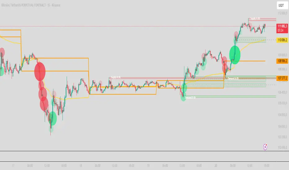
4. **Two independent Supply/Demand zone engines** — zones are drawn from confirmed swing pivots, with midlines and **touch counters**.
5. **Order-flow style visuals**:
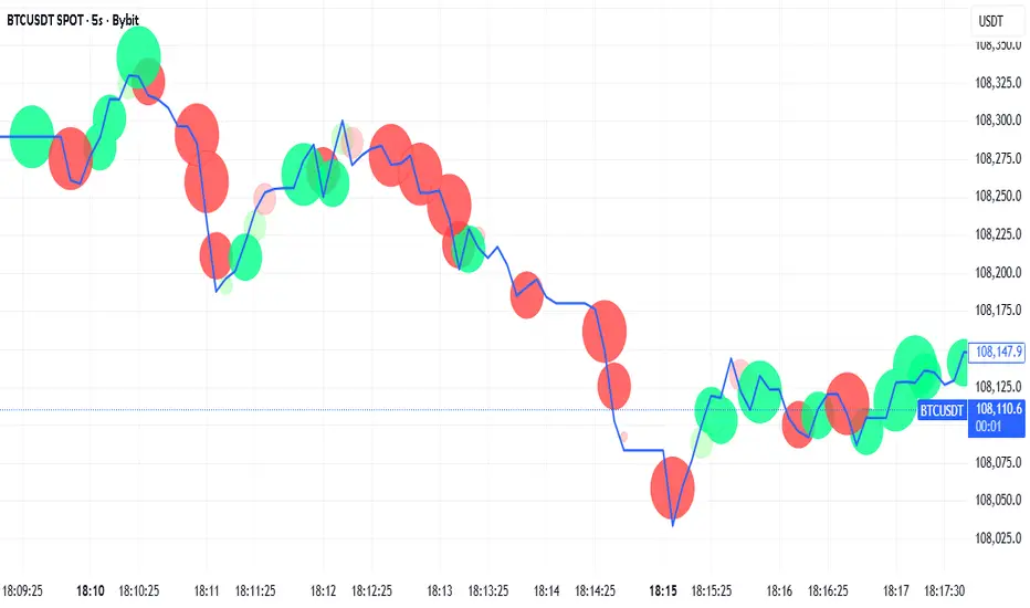
* **Delta bubbles** (green/red circles) show where buying or selling pressure was unusually strong, using a safe **delta proxy** (no external feeds).
* **Liquidity densities** (subtle rectangular bands) highlight clusters of large activity that often act as magnets or barriers and disappear when “eaten” by strong moves.
This mix gives you a **complete intraday picture**: the mean (VWAP), the day’s initial balance (Opening Range), the higher-timeframe push (trend filter), the nearby fuel or brakes (zones), and the live pressure points (bubbles and densities).
---
## Why these components
* **VWAP** tracks where the bulk of traded value sits. Price tends to rotate around it or accelerate away from it — a perfect compass for scalps.
* **Opening Range** frames the early auction. Many intraday breaks, fades and retests start at its boundaries.
* **EMA bias + ADX strength** separates trending conditions from chop, so you can keep only the zones that agree with the bigger push.
* **Pivot-based zones (two pairs at once)** are simple, objective and fast. Midlines help with confirmations; touch counters quantify how many times the zone was tested.
* **Bubbles and densities** add the “effort” layer: where the push appeared and where liquidity is concentrated. You see **where** a move is likely to continue or fail.
Together they reduce ambiguity: **context + level + effort** — all on one screen.
---
## How it works (plain language)
* **VWAP** resets each day and is calculated as the cumulative sum of typical price multiplied by volume divided by total volume.
* **Opening Range** is either automatic (a multiple of your chart timeframe) or a manual number of minutes. While it is forming, the highest high and lowest low are captured and plotted as the range.
* **Trend filter**
* **EMA Fast** and **EMA Slow** define directional bias.
* **ADX (optional)** adds “trend strength”: only when the Average Directional Index is above the chosen threshold do we treat the move as strong. You can source this from a higher timeframe.
* **Zones**
* There are **two independent pairs** of pivots at the same time (for example 10-left 10-right and 5-left 5-right).
* Each detected pivot creates a **Supply** (from a swing high) or **Demand** (from a swing low) box. Box depth = **zone depth × Average True Range** for adaptive sizing; the boxes **extend forward**.
* Midline (optional dashed line inside the box) is the “balance” of the zone.
* **“Only in trend”** mode can hide boxes that go against the higher-timeframe bias.
* The **touch counter** increases when price revisits the box. Labels show the pair name and the number of touches.
* **Bubbles**
* A safe **delta proxy** measures bar pressure (for example, range-weighted close vs open).
* A **quantile filter** shows only unusually large pressure: choose lookback and percentile, and the script draws a circle sized by intensity (green = bullish pressure, red = bearish).
* **Densities**
* The script marks heavy activity clusters as **subtle bands** around price (depth = fraction of Average True Range).
* If price **breaks** a density with volume above its moving average, the band **disappears** (“eaten”), which often precedes continuation.
---
## How to use — practical playbooks
> Recommended chart: crypto or index futures, one to five minutes. Use **one hour** or **fifteen minutes** for the higher-timeframe bias.
### 1) Trend pullback scalp (continuation)
1. Enable **Only in trend** zones.
2. In an uptrend: wait for a pullback into a **Demand** zone that overlaps with VWAP or sits just below the Opening Range midpoint.
3. Look for **green bubbles** near the zone’s bottom or a fresh **density** under price.
4. Enter on a candle closing **back above the zone midline**.
5. Stop-loss: below the bottom of the zone or a small multiple of Average True Range.
6. Targets: previous swing high, Opening Range high, fixed risk multiples, or VWAP.
Mirror the logic for downtrends using Supply zones, red bubbles and densities above price.
### 2) Reversion with liquidity sweep (fade)
1. Bias neutral or countertrend allowed.
2. Price **wicks through** a zone boundary (or an Opening Range line) and **closes back inside** the zone.
3. The bubble color often flips (absorption).
4. Enter toward the **inside** of the zone; stop beyond the sweep wick; first target = zone midline, second = opposite side of the zone or VWAP.
### 3) Opening Range break and retest
1. Wait for the Opening Range to complete.
2. A break with a large bubble suggests intent.
3. Look for a **retest** into a nearby zone aligned with VWAP.
4. Trade continuation toward the next zone or the session extremes.
### 4) Density “eaten” continuation
1. When a density band **disappears** on high volume, it often means the resting liquidity was consumed.
2. Trade in the direction of the break, toward the nearest opposing zone.
---
## Settings — quick guide
**Core**
* *ATR Length* — used for zone and density depths.
* *Show VWAP / Show Opening Range*.
* *Opening Range*: Auto (multiple of timeframe minutes) or Manual minutes.
**Trend Filter**
* *Mode*: Off, EMA only, or EMA with ADX strength.
* *Use higher timeframe* and its value.
* *EMA Fast / EMA Slow*, *ADX Length*, *ADX threshold*.
* *Plot EMA filter* to display the moving averages.
**Zones (two pairs)**
* *Pivot A Left / Right* and *Pivot B Left / Right*.
* *Zone depth × ATR*, *Extend bars*.
* *Show zone midline*, *Only in trend zones*.
* Labels automatically show the touch counters.
**Bubbles**
* *Show Bubbles*.
* *Quantile lookback* and *Quantile percent* (higher percent = stricter filter, fewer bubbles).
**Densities**
* *Metric*: absolute delta proxy or raw volume.
* *Quantile lookback / percent*.
* *Depth × ATR*, *Extend bars*, *Merge distance* (in ATR),
* *Break condition*: volume moving average length and multiplier,
* *Midline for densities* (optional dashed line).
---
## Tips and risk management
* This script **does not use external order-flow feeds**. Delta is a **proxy** suitable for TradingView; tune quantiles per symbol and timeframe.
* Do not trade every bubble. Combine **context (trend + VWAP + Opening Range)** with **level (zone)** and **effort (bubble/density)**.
* Set stop-losses beyond the zone or at a fraction of Average True Range. Predefine risk per trade.
* Backtest your rules with a strategy script before using real funds.
* Markets differ. Parameters that work on Bitcoin may not transfer to low-liquidity altcoins or stocks.
* Nothing here is financial advice. Scalping is high-risk; slippage and over-trading can quickly damage your account.
---
## What makes PRO Scalper unique
* Two **independent** zone engines run in parallel, so you can see both **larger structure** and **fine intraday levels** at the same time.
* Clean **“only in trend” rendering** — zones and midlines against the bias can be hidden, reducing clutter and hesitation.
* **Touch counters** convert “feel” into numbers.
* **Self-contained order-flow visuals** (bubbles and densities) that require no extra data sources.
* Careful defaults: subtle colors for densities, clearer zones, and responsive auto Opening Range.
---
(RU)
## Что это такое
**PRO Scalper** — это индикатор для внутридневной торговли, который показывает **контекст и ликвидность прямо сейчас**.
Он объединяет пять модулей, которыми профессиональные скальперы пользуются вместе:
1. **VWAP** — средневзвешенная по объему цена за сессию, «справедливая стоимость» дня.
2. **Opening Range** — первая часть сессии, задающая баланс дня.
3. **Фильтр тренда** — направление старшего таймфрейма по **экспоненциальным средним** и при желании по силе тренда **Average Directional Index**.
4. **Две независимые системы зон спроса/предложения** — зоны строятся от подтвержденных экстремумов (пивотов), имеют **среднюю линию** и **счетчик касаний**.
5. **Визуализация «ордер-флоу»**:
* **Пузыри дельты** (зеленые/красные круги) — места повышенного покупательного/продажного давления, рассчитанные через безопасный **прокси-дельты**.
* **Плотности ликвидности** (ненавязчивые прямоугольные ленты) — скопления объема, которые нередко притягивают цену или удерживают ее и исчезают, когда «разъедаются» сильным движением.
Итог — **полная картинка момента**: среднее (VWAP), баланс дня (Opening Range), старшая сила (фильтр тренда), ближайшие уровни топлива/тормозов (зоны), текущие точки усилия (пузыри и плотности).
---
## Почему именно эти элементы
* **VWAP** показывает, где сосредоточена стоимость; цена либо вращается вокруг него, либо быстро уходит — идеальный ориентир скальпера.
* **Opening Range** фиксирует ранний аукцион — от его границ часто начинаются пробои, возвраты и ретесты.
* **EMA + ADX** отделяют тренд от «пилы», позволяя оставлять на графике только зоны по направлению старшего таймфрейма.
* **Зоны от пивотов** просты, объективны и быстры; средняя линия помогает подтверждать разворот, счетчик касаний переводит субъективность в цифры.
* **Пузыри и плотности** добавляют слой «усилия»: где именно возник толчок и где сконцентрирована ликвидность.
Комбинация **контекста + уровня + усилия** уменьшает двусмысленность и ускоряет принятие решения.
---
## Как это работает (простыми словами)
* **VWAP** каждый день стартует заново: сумма «типичной цены × объем» делится на суммарный объем.
* **Opening Range** — автоматический (кратный минутам вашего таймфрейма) или вручную заданный период; пока он формируется, фиксируются максимум и минимум.
* **Фильтр тренда**
* Две экспоненциальные средние задают направление.
* **ADX** (по желанию) добавляет «силу». Источник можно взять со старшего таймфрейма.
* **Зоны**
* Одновременно работает **две пары** пивотов (например 10-лево 10-право и 5-лево 5-право).
* От пивота строится зона **предложения** (от максимума) или **спроса** (от минимума). Глубина зоны = **коэффициент × Average True Range**; зона тянется вперед.
* Внутри рисуется **средняя линия** (по желанию).
* Режим **«только по тренду»** скрывает зоны против старшего направления.
* **Счетчик касаний** увеличивается, когда цена снова входит в зону; подпись показывает пару и количество касаний.
* **Пузыри**
* Используется безопасный **прокси-дельты** — измерение «напряжения» внутри свечи.
* Через **квантильный фильтр** выводятся только необычно сильные места: настраиваются окно и процент квантиля; размер кружка — сила, цвет: зеленый покупатели, красный продавцы.
* **Плотности**
* Крупные активности отмечаются **ненавязчивыми прямоугольниками** (глубина — доля Average True Range).
* Если плотность **пробивается** объемом выше среднего, она **исчезает** — часто это предвещает продолжение.
---
## Как пользоваться — практические схемы
> Рекомендация: крипто или фьючерсы, таймфрейм 1–5 минут. Для старшего фильтра удобно взять **1 час** или **15 минут**.
### 1) Скальп на откат по тренду
1. Включите **«только по тренду»**.
2. В восходящем тренде дождитесь отката в **зону спроса**, желательно рядом с **VWAP** или серединой **Opening Range**.
3. Подтверждение — **зеленые пузыри** у нижней границы зоны или свежая **плотность** под ценой.
4. Вход после закрытия свечи **выше средней линии** зоны.
5. Стоп-лосс: за нижнюю границу зоны или небольшой множитель Average True Range.
6. Цели: предыдущий максимум, верх Opening Range, фиксированные R-множители, либо VWAP.
Для нисходящего тренда зеркально: зоны предложения, красные пузыри и плотности над ценой.
### 2) Контрдвижение с «выбиванием ликвидности»
1. Нейтральный или контртрендовый режим.
2. Цена **выносит хвостом** границу зоны (или линию Opening Range) и **закрывается обратно внутри**.
3. Цвет пузыря часто меняется (поглощение).
4. Вход внутрь зоны; стоп — за хвост выбивания; цели: средняя линия, противоположная граница зоны или VWAP.
### 3) Пробой Opening Range + ретест
1. Дождитесь завершения диапазона.
2. Сильный пробой с крупным пузырем — признак намерения.
3. Ищите **ретест** в зоне по тренду рядом с линией диапазона и VWAP.
4. Торгуйте продолжение к следующей зоне.
### 4) Продолжение после «съеденной» плотности
1. Когда прямоугольник плотности **исчезает** на повышенном объеме, это значит, что ликвидность поглощена.
2. Торгуйте в сторону пробоя к ближайшей противоположной зоне.
---
## Настройки — краткая шпаргалка
**Core**
— Длина Average True Range (для размеров зон и плотностей).
— Включение VWAP и Opening Range.
— Длина Opening Range: автоматическая (кратная минутам ТФ) или ручная.
**Trend Filter**
— Режим: выкл., только средние, либо средние + ADX.
— Источник со старшего таймфрейма и его значение.
— Длины средних, длина ADX и порог силы.
— Показать/скрыть линий средних.
**Zones (две пары одновременно)**
— Пара A: лев/прав; Пара B: лев/прав.
— Глубина зоны × Average True Range, продление по барам.
— Средняя линия, режим **«только по тренду»**.
— Подписи со счетчиком касаний.
**Bubbles**
— Вкл./выкл., окно поиска и процент квантиля (чем выше процент — тем реже пузыри).
**Densities**
— Метрика: абсолютная прокси-дельты или чистый объем.
— Окно/квантиль, глубина × Average True Range, продление,
— Порог объединения (в Average True Range),
— Условие «разъедания» по объему,
— Средняя линия плотности (по желанию).
---
## Советы и риски
* Индикатор **не использует внешние потоки ордер-флоу**. Дельта — **прокси**, подходящая для TradingView; подбирайте квантили под инструмент и таймфрейм.
* Не торгуйте каждый пузырь. Склейте **контекст (тренд + VWAP + Opening Range)** с **уровнем (зона)** и **усилием (пузырь/плотность)**.
* Стоп-лосс — за границей зоны или по Average True Range. Риск на сделку задавайте заранее.
* Перед реальными деньгами протестируйте правила в стратегии.
* Разные рынки ведут себя по-разному; настройки из Биткоина могут не подойти малоликвидным альткоинам или акциям.
* Это не инвестиционная рекомендация. Скальпинг — высокий риск; проскальзывание и переизбыток сделок быстро наносят ущерб капиталу.
---
## Чем уникален PRO Scalper
* Две **одновременные** системы зон показывают и **крупную структуру**, и **точные локальные уровни**.
* Режим **«только по тренду»** чистит экран от лишних уровней и ускоряет решение.
* **Счетчики касаний** дают количественную опору.
* **Самодостаточные визуализации усилия** (пузыри и плотности) — без сторонних источников данных.
* Аккуратная цветовая схема: плотности — мягко, зоны — ясно; Opening Range — адаптивный.
Пусть он станет вашей «картой местности» для быстрых и дисциплинированных решений внутри дня.
Bubble
Tick-Based Delta Volume BubblesTICK-BASED DELTA VOLUME BUBBLES
OVERVIEW
A real-time order flow indicator that displays volume delta at the tick level, helping traders identify buying and selling pressure as it develops during live market hours. Unlike traditional volume delta indicators that rely on bar close data, this indicator captures actual tick-by-tick volume changes and directional bias, providing granular insight into market dynamics.
HOW IT WORKS
The indicator monitors live tick data during real-time trading by tracking volume increases between consecutive price updates. Each time volume increments, the script calculates the volume delta, determines price direction, assigns directional bias to the volume, and accumulates net delta for each bar.
This methodology is identical to the tick detection mechanism used in professional cumulative volume delta tools, ensuring accuracy and reliability.
FEATURES
Real-Time Tick Detection
- Captures genuine tick-by-tick volume flow using varip persistence
- Not estimated from OHLC data
- Processes actual market ticks as they occur
Adaptive Bubble Sizing
- Bubbles scale based on delta strength relative to a customizable moving average (default 20 bars)
- Highlights significant order flow imbalances
- Five size levels from tiny to huge
Dual Display Modes
- Normal Mode: Sized bubbles with optional volume labels positioned at bar midpoint
- Minimal Mode: Clean dots above/below bars for unobtrusive delta visualization
Flow Classification
- Aggressive Buy (bright green): Strong positive delta with greater than 1.2x strength
- Aggressive Sell (bright red): Strong negative delta with greater than 1.2x strength
- Passive Buy (light green): Moderate positive delta
- Passive Sell (light red): Moderate negative delta
Intensity Mode (Optional)
- Gray: Low intensity (less than 0.5x average)
- Blue: Medium intensity (0.5-1.0x average)
- Orange: High intensity (1.0-2.0x average)
- Red: Extreme intensity (greater than 2.0x average)
Smart Filtering
- Percentile-based filters (customizable) ensure only significant delta events are displayed
- Reduces chart clutter while highlighting important order flow
- Separate thresholds for bubble display and numeric labels
Data Collection Status
- Optional progress box in top-right corner
- Shows real-time bar collection progress
- Displays percentage completion and bars remaining
- Automatically hides when sufficient data is collected
Hide Until Ready Option
- Suppresses bubble display until the averaging period is complete
- Prevents misleading signals from incomplete data
- Default requires 20 bars before displaying bubbles
SETTINGS
Delta Average Length (1-200, default 20)
- Lookback period for calculating delta strength baseline
- Higher values = longer-term delta comparison
- Lower values = more sensitive to recent changes
Hide Bubbles Until Enough Data
- Prevents display until averaging period completes
- Ensures reliable delta strength calculations
Show Data Collection Status Box
- Displays progress indicator during initialization
- Can be disabled if you understand the warmup period
Minimal Mode
- Switches to simple dot display above/below bars
- Green dots above bars = positive delta
- Red dots below bars = negative delta
- Maintains color intensity or flow type classification
Show Bubbles
- Master toggle for bubble display
Bubble Volume Percentile (0-100, default 60)
- Minimum percentile rank required to display bubble
- Higher values = fewer, more significant bubbles
- Lower values = more bubbles displayed
Show Numbers in Bubbles
- Toggle delta value labels
- Only appears in normal mode
- Disabled automatically in minimal mode
Label Volume Percentile (0-100, default 90)
- Higher threshold for displaying numeric labels
- Typically set higher than bubble percentile
- Reduces label clutter on chart
Intensity Mode
- Switch from flow-type coloring to magnitude-based coloring
- Useful for identifying volume spikes regardless of direction
IMPORTANT NOTES
Real-Time Only: This indicator processes live tick data and does not provide historical analysis. It begins collecting data when added to a live chart.
Volume Required: Symbol must have volume data available. Will not function on symbols without volume (most forex pairs from retail brokers).
Initialization Period: Requires the specified number of bars (default 20) to calculate accurate delta strength. Use the "Hide Until Ready" option to prevent premature signals.
Market Hours: Only collects data during live market hours. Does not backfill historical data.
CREDITS
Tick detection methodology inspired by the Kioseff Trading Tick CVD indicator. This implementation adapts the same core tick-level volume delta calculation for bubble-style visualization and per-bar delta analysis.
Bubble Chart LiteBubble Chart Lite - Visual Market Intelligence
⸻
⚡ Quick Start - Here is how you get started in 30 seconds
Default view (Y-axis: None) = market heatmap
X-axis always = performance
Bubble size = importance (your choice of metric)
Hover any bubble for details
Switch timeframes to change the measurement window
Pick any stock ticker to see their friends
Pick one of the 143 etfs listed below and see their top constituents
That's it. Everything else is deeper cuts of data
⸻
Overview
The Bubble Chart is a market-wide visual map designed to instantly reveal how thousands of stocks and ETFs are performing relative to their peers, all in a single glance.
It dynamically builds relationships between ~3,400 stocks and 143 ETFs , each with its own “friends list” of most-connected tickers. It’s a bit unlike all the other indicators, which you’ll see shortly. It’s a very Tops Down, then Sideways view of the market.
The 144 ETFs covered in the Bubble Chart indicator are listed here in this watchlist: www.tradingview.com
Each bubble represents a security.
X-axis → performance (% change)
Y-axis → variable (you choose the insight)
Bubble size → market cap, relative weight, or %volume
Color → relative performance (green up, red down)
Border → sector color
Your current chart’s timeframe determines the measurement window:
Intraday chart → today so far
Daily chart → week-to-date (WTD)
Weekly chart → month-to-date (MTD)
Monthly chart → year-to-date (YTD)
Everything is relative to that timeframe’s performance window — making it as useful for morning scans as for long-term sector rotations. I recommend starting with an intraday chart. The bubbles represent the day so far on this timeframe.
⸻
📦 Version Differences
Bubble Chart Lite (Free):
✓ All features and dimensions
✓ Up to 5 bubbles displayed
✓ Perfect for tracking top movers
Bubble Chart (Invite-Only):
✓ All features and dimensions
✓ Up to 38 bubbles displayed
✓ See actual market breadth and structure
✓ Indicator name: “Bubble Chart”
✓ Available under the indicator “Bubble Chart” (Invite-Only) — details on my profile
⸻
📊 Y-Axis Options
1. “None” - Heatmap Mode
By default, the Y-axis is set to “None”.
In this mode, the chart functions as a market heatmap, with:
Left-to-right representing relative performance (% change)
Bubble color indicating gain/loss
Bubble size reflecting your chosen metric (Market Cap, Weight, or %Volume)
Up-down randomized just for bubble separation
Think of it as a fancy heatmap with extra context — sector coloring, bubble sizing, and tooltips that surface live data.
Perfect for a quick snapshot of the day’s winners and losers across your selected universe.
⸻
1. %Turnover
This measures conviction behind each move.
Turnover = current money flow vs. average money flow over your lookback window.
A large % move with low turnover = a weak move with little backing.
A moderate % move with high turnover = strong participation, higher conviction.
This is my personal favorite morning setup — it instantly reveals where real buying and selling pressure is emerging as the session unfolds.
A horizontal line across your selected ticker acts as a benchmark, so you can compare others’ conviction levels relative to it.
Any %turnover score >100 means more money than average is flowing in and out of this name. In the example above based on the top 5 holdings of GDX, there was one standout performer, and that’s WPM. this should put WPM on a watchlist if you’re interested in gold. It shows, that at least for one day, the market was putting money behind it.And more so than the other top 5 miners.
⸻
2. %ATR
Measures range expansion or compression relative to average volatility.
A stock can move big in price but stay inside a tight range → no expansion.
A stock can move little but break its typical volatility boundary → range expansion.
Expansion often signals momentum continuation; compression after large moves can precede turnarounds or consolidations.
This view helps you spot early volatility inflection points.
In the example above, in the food and beverage space, based on the top 5 holdings of the ETF PBJ, KR and DASH had moves that will expand their ATR. This means volatility is increasing for this ticker, in the direction of the color of the circle. So KR is expanding to the upside, while DASH is expanding to the downside. It should make a person cautious to go long DASH, as that’s not what the market is showing.The other moves by the other bobbles, show up as volatility contraction. Their price (CTVA, PBJ, KDP, and SYY) is stabilizing. (over the lookback period in settings).
⸻
3. ROC(5) Z-Score
Z-Score quantifies how far a data point deviates from its mean, measured in standard deviations.
Here it’s applied to 5-period Rate of Change (ROC5).
A high positive Z-Score = performance far above its historical average.
A low (negative) Z-Score = deeply oversold vs. history.
Use this view to identify stretched momentum or mean-reversion candidates:
Stocks high on the Y-axis and green = extended upside momentum
Stocks high but red = potential reversal zones
Stocks low and red = extreme washouts that may soon rebound
This makes it a powerful stock-picking lens for traders who look for reversions or contrarian entries.
The following is the XLU and its 5 top holdings. Looked at on the daily timeframe, which means the ROC(5) score is for its weekly ROC (see timeframe discussion above).
What you can see here is NEE is at a z-score of 205 (it’s 2.05 but we multiply by 100 for spacing). This means its weekly ROC(5) only happens 4-5 percent of the time. This is a perfect candidate to fade the move.
As you can see in the graph below, that charts NEE, every time its ROC(5) z-score (the bottom pane) has reached this level on the weekly, the move ends (at least for a short period of time. The rubber band of momentum is too far extended. You can use this for long setups too
⸻
4. RSI(15) Z-Score
Similar to the ROC version, but based on RSI(15).
It contextualizes RSI against its own historical distribution, not the fixed 0–100 scale.
When RSI’s Z-Score is above +100 → historically overbought.
Below -100 → historically oversold.
A stock with a high RSI Z-Score but negative performance may be starting to roll over.
A stock with a low RSI Z-Score but positive performance could be beginning a rebound.
This lens is especially powerful for early spotting of turning points in swing and position trades.
Above is an example of how to read it with the top 5 stocks in the IFRA ETF.
⸻
5. %52-Week High / %52-Week Low
These two let you visualize positioning within the broader yearly range.
%52-Week High:
Shows how close each ticker is to its highs. Stocks near the top may be in breakout mode.
%52-Week Low:
Shows distance from the lows. Watching these can highlight potential recovery trades — many reversals start when beaten-down stocks begin to cluster and climb from their lows.
Are you really going to want to mess around with VZ? Other companies are winning the race
⸻
⚙️ Bubble Size Options
Market Cap-
Larger companies = larger bubbles.
Ideal for weighting visibility by overall size of influence in the market or sector.
ETF/Friend Weight-
Scales bubbles by their relationship weight to the target ETF or stock.
This helps identify which peers or constituents exert the most pull within the current context.
%Volume-
This scales by relative volume to average volume.
Big bubbles here mean unusual activity, perfect for spotting where participation is surging.
⸻
👥 Friends — Relationship Mapping
Every ticker on the chart has its own “friends list.”
These aren’t arbitrary. They’re discovered through a multi-stage algorithm that analyzes co-occurrence of holdings across ETFs and sectors, roughly like social network analysis for stocks. This is what allows a chart of one stock to intelligently surface others that behave like it, whether through shared ETFs, sector overlap, or statistical co-presence.
Why Friends Matter: When you load AAPL, the chart doesn't just show random stocks. It shows AAPL's "friends", the tickers most connected to it through:
Shared ETF holdings
Sector relationships
Statistical co-movement
This means you're seeing AAPL's context, not just AAPL. Example: AAPL up 2% might look strong, but if all its friends are up 3-4%, AAPL is actually lagging. The chart reveals this instantly.
⸻
Common Setups - do these today
Morning Momentum Scan: - Y-axis: %Turnover - Bubble Size: %Volume - Look for: Top-right quadrant (high performance + high conviction)
Reversal Hunting: - Y-axis: RSI(15) Z-Score - Look for: Red bubbles above +100 (overbought rolling over) Green bubbles below -100 (oversold bouncing)
Sector Rotation: - Y-axis: None (heatmap mode) - Bubble Size: Market Cap - Look for: Color clustering by sector (border colors)
⸻
🧩 Data Sources
ETF Constituents:
ETF holdings are derived from information filed with the SEC’s EDGAR database, specifically N-PORT-P filings. These filings are public records submitted by ETF issuers.
Because EDGAR data can vary in structure and naming conventions, additional parsing, fuzzy matching, and ticker reconciliation logic were applied. Some inconsistencies may remain, and minor inaccuracies are possible.
EDGAR filings can also lag slightly behind real-time changes to ETF portfolios; however, for this visualization tool, that level of latency does not materially affect its purpose or insights.
Exchange & Share Count Data:
Information on exchanges and outstanding shares primarily comes from the SEC Company Facts API.
When unavailable, supplemental values are inferred from public SEC filings such as 8-K, 10-Q, and 10-K reports, and the SEC Company Submissions API for general company metadata.
All such data is publicly accessible through the SEC’s online systems.
I will update the SEC information on the ETFs once every 3 months to ensure etf constituent accuracy.
Sector & Industry Classification:
Sector and industry classifications were developed through a custom workflow that combines automated and human-reviewed methods.
An internal AI system analyzed each company’s publicly available website information to summarize business activities and assign one of 144 custom-defined industry categories.
Results were cross-checked by multiple independent classification models, and any uncertain outputs were manually reviewed for accuracy.
To improve interpretive consistency, publicly available information from StockAnalysis.com was also referenced (not republished) to inform final classifications.
Their content was used in accordance with their stated policy allowing limited reference with attribution — no full content or proprietary data was reproduced.
⸻
🚀 How to Use It
Load the Bubble Chart on any stock, ETF, or futures symbol.
Choose your Y-axis insight — start with “None” for the heatmap.
Adjust bubble size to highlight capital weight or activity.
Switch timeframes to shift context (today, this week, month, or year).
Hover bubbles for details: sector, turnover, z-scores, %volume, and more.
⸻
❓ Frequently Asked Questions
Q: Why do I only see 5 bubbles?
A: You're using Bubble Chart Lite. The full version shows up to 39 bubbles simultaneously for complete market breadth..
To get access:
Find the "Bubble Chart" (invite-only) indicator on TradingView
Read the description for access instructions
Or visit my TradingView profile for details
Q: Can I customize which tickers appear?
A: The indicator automatically selects the most relevant tickers based on the current chart's symbol and the friends algorithm. This ensures you're seeing context, not random stocks.
Q: What timeframe should I use?
A: Any timeframe works. The chart adapts: - Intraday = today's performance - Daily = week-to-date - Weekly = month-to-date - Monthly = year-to-date
Q: How often does the friends list update?
A: Friends relationships are recalculated periodically as ETF holdings change (once every 3 months). The relationships are stable enough that daily changes are minimal.
Q: Does this work on crypto/forex?
A: Currently optimized for US equities and ETFs. Other asset classes may show limited friends data.
Q: The chart looks cluttered. Help?
A: Start with Y-axis: None and Bubble Size: Market Cap. You can also choose to pick less number of bubbles which will clear up the chart
⸻
The Bubble Chart is a market topology engine that visualizes participation, conviction, volatility, and sentiment in real time.
Whether you’re scanning morning momentum, identifying exhausted moves, or exploring ETF ecosystems, it gives you a spatial view of where the action really is.

LPPL Critical Pulse (by BigBlueCheese) Version 1.1LPPL Critical Pulse (by BigBlueCheese)
I couldn’t locate a single script on TradingView that utilized the Log-Periodic Power Law (LPPL) and period doubling—key tools used by street professionals. Here is my first script…More to come.
Log-Periodic Power Law (LPPL)
LPPL is a mathematical framework used to model asset price bubbles that can help predict market crashes or corrections. It is based on the idea that speculative bubbles exhibit self-reinforcing, positive feedback behavior that leads to increasingly unsustainable price growth, followed by a crash or correction. But the big news is that because of the speculative behavior it can identify, it has equal application across many other instruments & timeframes.
The LPPL, has been around since the 1950’s and 1960’s where its theoretical foundation lies in the concepts of renormalized group theory and critical point behavior. Physicists Lev Landau, Vitaly Ginzburg & Kenneth Wilson contributed to how we can understand systems behave at critical points and was further developed by Benoit Mandelbrot via the concept of discrete scale invariance and log-periodicity. The concepts were popularized by Didier Sornette in Why Stock Markets Crash, where he used his model to detect when markets are experiencing extreme price movements, indicating the potential for a bubble to burst or a significant correction to occur. It is suspected that others like Jim Simons was an early adopter/adapter of this (and other) advanced mathematical concepts. LPPL is especially valuable for traders trying to anticipate rapid price movements—both upward and downward.
What is a Speculative Bubble?
A speculative bubble forms when an asset’s price skyrockets due to excitement from investors, pushing it well beyond its true value. At some point, this unsustainable growth leads to a crash, as the bubble “pops.” However, these crashes don’t need to be massive market-shaking events. They can also emerge from short-term price anomalies in any market or timeframe…..and they apply equally to upward & downward price moves. That is you can use this approach for both long and short trades.
Power Law & Log-Periodicity
The Power Law aspect describes how prices accelerate as they approach a critical point, forming a steep curve that signals instability.
The Log-Periodic component captures the oscillations that grow increasingly frequent as the price nears this tipping point, marking rising volatility.
Criticality in Trading: Feedback Loops, Attractors and Repellers
LPPL can be applied to financial markets by comparing them to natural systems prone to critical points, like avalanches or earthquakes. The key concept is criticality—the idea that, just like pressure building in an earthquake zone or snow stacking up on a mountain, there’s a feedback loop in markets where investor behavior becomes increasingly synchronized. This creates a self-reinforcing cycle, accelerating price movements until the system can no longer sustain the tension, and it collapses—similar to a critical phase shift in nature when physical systems experience sudden, catastrophic events when they reach a critical threshold.
In this context, the LPPL model aims to identify these critical points in financial markets by recognizing specific patterns in price movements, providing insight into the potential timing of major market shifts.
This is how markets can behave like attractors (drawing prices into unsustainable growth or collapses) or repellers (pushing them away through sudden corrections), depending on the balance of forces. LPPL captures this dynamic, helping traders anticipate when the market is nearing these critical moments.
Attractors are states or patterns that a system tends to gravitate towards over time, representing points of stability or equilibrium. Repellers are states that the system tends to avoid or move away from, representing instability or points of divergence.
In the context of the LPPL model, the market is seen as a dynamic system that is moving towards a critical point—often a bubble or a crash. The critical point itself can be viewed as an attractor, pulling the market toward a period of instability as prices accelerate and oscillations become more frequent. This movement reflects positive feedback loops, where investor behavior (e.g., herd mentality or speculative buying) reinforces the trend until it reaches an unsustainable level.
Conversely, once the critical point is reached, it can act as a repeller, causing the system (market) to rapidly move away from that state, often resulting in a crash or market correction. In essence, the LPPL model tries to identify these phases of movement toward or away from critical points, using attractors and repellers to describe the behavior of the system before and after major market events.
This dynamic interaction between stability and instability, or attractors and repellers, is a key feature of how Sornette’s LPPL approach models financial markets, emphasizing the market’s ability to oscillate between periods of calm and critical shifts.
Bubbles and Crashes in Any Timeframe
While people often think of bubbles and crashes as huge events like the Crash of 87, the Global Financial Crisis or COVID-19, they can also be much smaller or instrument specific. A short-term spike in a stock or a sudden currency drop can behave like a miniature bubble. LPPL helps spot these shorter-term price anomalies, making it versatile for traders looking for opportunities in all instruments and timeframes.
How Can I Use LPPL Critical Pulse?
Monitor price acceleration that signals unsustainable growth/movement .
Spot volatility, oscillations, extensions and compressions and exhaustion as the market nears critical instability and levels.
Combine with other indicators to help time entries and exits, manage risk as markets approach/consolidate/leave critical levels.
LPPL Critical Pulse (LPPLCP)
LPPLCP is based on LPPL principles that identify potential upward and downward market movements, exhaustion and consolidation periods.
Visualization
The LPPL line is smoothed using a moving average to reduce noise, and the result is scaled to fit within the price range of the past 100 bars, aligning the LPPL line with the price movements on the chart.
Dynamic LPPL Line Plot:
A smoothed and scaled LPPL line plotted directly on the price chart.
• Color-Coded Trend Analysis: The LPPL line changes color dynamically based on the conditions of slope and acceleration to reflect market behaviors such as period doubling or exhaustion.
1. White (Exhaustion/Consolidation Condition): Indicates that both the slope and the acceleration of the LPPL line are zero, suggesting a potential market flattening or exhaustion/consolidation. At the end of this period, a new trend may emerge OR the prior trend may reassert itself.
2. Purple (Period Doubling): This color appears when the LPPL model detects rapid changes in acceleration, indicating the potential for a market turning point (period doubling). The slope of the LPPL line during this period suggests whether the market is moving upward or downward.
3. Green (Positive Slope with Increasing Acceleration): A green LPPL line suggests that the market is in an upward trend, with increasing acceleration.
4. Red (Negative Slope with Decreasing Acceleration): A red LPPL line indicates a downward market trend with decreasing acceleration.
5. Yellow (Neutral): Yellow is the default color when none of the specific conditions (exhaustion, period doubling, positive/negative slope with acceleration) are met, i.e. generally a continuation of the prior condition but at a slower pace.
Customization for Any Market
LPPL Critical Pulse has application across most time frames for pretty much whatever you want to trade…stocks, commodities, currencies, futures, and more. You will have to tweak the inputs to optimize for the market(s) you choose to trade.
Inputs
1. Lookback Period for Adaptation
o Type: Integer
o Default: 1
o Description: Defines the lookback period for calculating the Simple Moving Average (SMA) and Standard Deviation (StDev) used in the LPPL model. A higher value smooths the calculations over a longer period.
2. Period Doubling Threshold
o Type: Float
o Default: 0.01
o Description: Determines the sensitivity for detecting period doubling in the LPPL line. A lower threshold increases sensitivity.
3. Flattening Threshold
o Type: Float
o Default: 0.01
o Description: This input is not actively used in the current version but can be modified for further customizations in the LPPL model.
4. Period Doubling Acceleration Threshold
o Type: Float
o Default: 0.02
o Description: This controls the threshold for detecting rapid changes in the LPPL acceleration, helping identify when period doubling occurs.
Calculation Components
The LPPL line is calculated using several components:
• SMA (A): The simple moving average of the closing prices over the selected lookback period.
• Standard Deviation (B, C): These parameters are calculated based on the standard deviation of prices and control the amplitude of the LPPL oscillations.
• Exponential Decay: The LPPL line decays as it approaches a theoretical critical time (tc), where market crashes or rapid changes may occur.
Disclaimer.
Not investment advice. Use at your own risk. Past results do not represent and are not indicative of future results

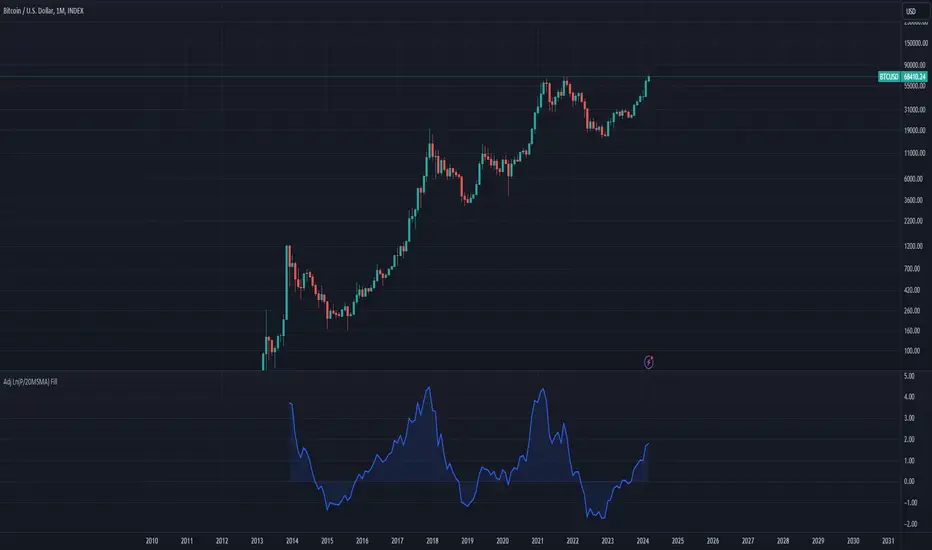
Bitcoin Bubble Risk (Adjusted for Diminishing Returns)Description:
This indicator offers a unique lens through which traders can assess risk in the Bitcoin market, specifically tailored to recognize the phenomenon of diminishing returns. By calculating the natural logarithm of the price relative to a 20-month Simple Moving Average (SMA) and applying a dynamic normalization process, this tool highlights periods of varying risk based on historical price movements and adjusted returns. The indicator is designed to provide nuanced insights into potential risk levels, aiding traders in their decision-making processes.
Usage:
To effectively use this indicator, apply it to your chart while ensuring that Bitcoin's price is set to display in monthly candles. This setting is vital for the indicator to accurately reflect the market's risk levels, as it relies on long-term data aggregation to inform its analysis.
This tool is especially beneficial for traders focused on medium to long-term investment horizons in Bitcoin, offering insights into when the market may be entering higher or lower risk phases. By incorporating this indicator into your analysis, you can gain a deeper understanding of potential risk exposures based on the adjusted price trends and market conditions.
Originality and Utility:
This script stands out for its innovative approach to risk analysis in the cryptocurrency space. By adjusting for the diminishing returns seen in mature markets, it provides a refined perspective on risk levels, enhancing traditional methodologies. This script is a significant contribution to the TradingView community, offering a unique tool for traders aiming to navigate the complexities of the Bitcoin market with informed risk management strategies.
Important Note:
This indicator is for informational purposes only and should not be considered investment advice. Users are encouraged to conduct their own research and consult with financial professionals before making investment decisions. The accuracy of the indicator's predictions can only be ensured when applied to monthly candlestick charts of Bitcoin.
HPK Crash IndicatorFrom Hari P. Krishnan's book, The Second Leg Down: Strategies for Profiting after a Market Sell-Off :
"We start by specifying the year on year (YoY) change in the index. Next, we calculate the 5 year trailing Z score of the YoY returns. We also calculate the 5 year trailing Z score of 1 month historical volatility for the index, using daily returns. Our crisis warning indicator flashes if both Z scores are above 2. In other words, recent price increases and current volatility need to be at least 2 standard deviations above normal.
It can be seen that this basic implementation is reasonably effective, accepting that the effective sample set is small. A false signal is given in mid-2006, but the signal is quickly washed away. The remaining signals occur fairly close to the point of collapse. The idea that elevated volatility is predictive of danger is not new and underpins many asset allocation schemes. However, Sornette deserves credit for moving away from a largely valuation-based approach to predicting crises to one that relies upon price action itself."

Bubbles BB futuresQuick and simple BB bubble indicator for Futures
Draw an arrow if candle corpse is out of Bollinger Band (Upper / Lower)
It's not a signal.
I use it to off-load my charts

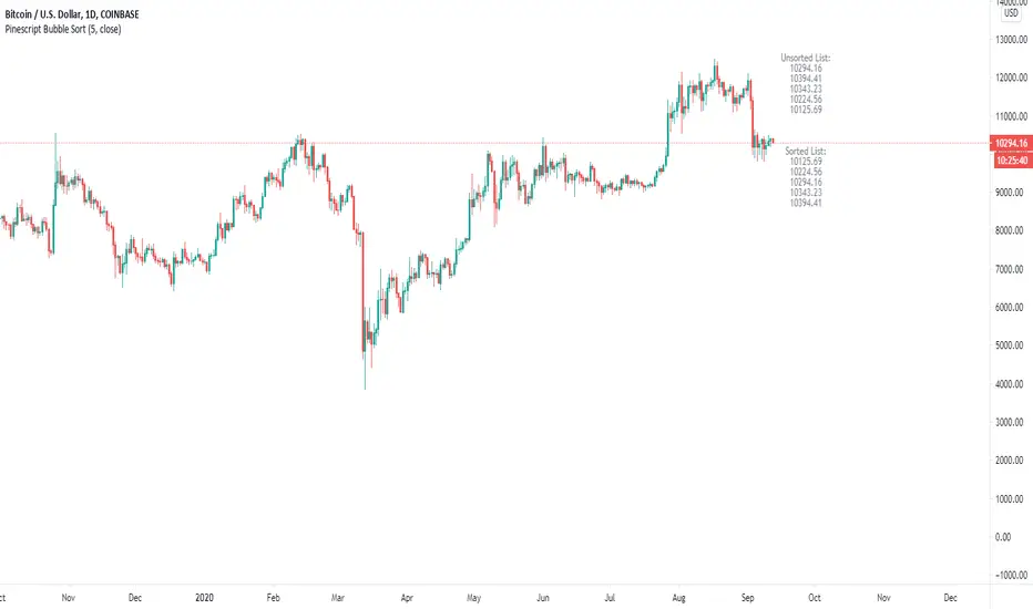
Pinescript Bubble Sort using ArraysThe new feature of arrays allows for a multitude of new possibilities within Pinescript. This script implements a bubble sort function with most probable efficiency of О(n^2) with a best-case being O(n). This sort does not require large amounts of memory to process and has advantages when sorting small lists of data.
The main advantages: Bubble sort is an in-place sorting algorithm. It does not require extra memory or even stack space like in the case of merge sort or quicksort.
The main disadvantages: In the worst case the time complexity is equal to O(n^2) which is not efficient in comparison to other sorts which can have a time complexity of O(n*logn).
The Pseudocode for a bubble sort is as follows:
begin BubbleSort(list)
for all elements of list
if list > list
swap(list , list )
end if
end for
return list
end BubbleSort
The results of the sort are plotted against the unsorted list and overlayed on the chart.
A big thanks to Alex Grover for the help.
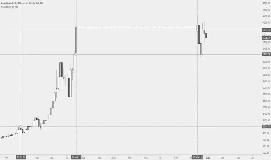
No BubbleSimply removes a period of time from the chart and replaces it with no value. This can help with scaling or bias.
[STRATEGY] Follow the Janet YellenIn the era of central bank's helicopter money, the market will always be skyrocketing up and up given enough time.
What's the strategy to profit from indices?
Only short the market when its in a state of euphoria /irrational exuberance bubble, or sell when it is confirmed (20% drawdown). Otherwise, you really have no reason not to long at every chance.
Conclusion:
Follow the printing press like a sheep.
