RSI and CMF V 1.0
Introduction: RSI and CMF
The Relative Strength Index (RSI) and Chaikin Money Flow (CMF) are two powerful tools for analyzing market behavior. Each serves a unique purpose and provides insights into different aspects of price action.
The RSI measures the speed and magnitude of price movements. By comparing recent gains to losses over a chosen period, it identifies overbought and oversold conditions in the market. RSI focuses solely on price and offers traders a quick glance at whether an asset is trending too high or too low relative to its recent performance.
On the other hand, the CMF evaluates market behavior by integrating both price and volume. It measures money flow to determine whether an asset is being accumulated (bullish) or distributed (bearish). Positive CMF values indicate buying pressure, while negative values signal selling pressure, making it an essential tool for volume-based analysis.
Our Innovation
Traditionally, indicators like the RSI and CMF are analyzed in separate panels, limiting their connection to the price chart itself. We’ve developed an innovative solution that combines the power of these two indicators, enabling traders to simultaneously measure both price movements and volume flow in a unified visualization. By mapping the RSI and CMF directly onto the price chart, our indicator provides a seamless way to observe and analyze how price momentum and money flow interact with the actual price action.
This integration of volume, price, and momentum into a single chart offers traders a comprehensive tool for deeper market insights and faster decision-making.
__________________________________________________________________________
Simple Settings Panel with Tooltips
Our indicator comes with an intuitive and user-friendly settings panel, designed for ease of use and full customization. Each input is accompanied by a tooltip to guide users through the settings and ensure clear understanding of their purpose.
Settings Overview
1. Enable RSI over Price:
Tooltip: "Toggle this option to enable or disable the RSI plotted on the price chart."
This setting allows users to control whether the RSI is displayed directly over the price chart.
2. RSI Length:
Default Value: 14
Tooltip: "Set the period for RSI calculation. Typical value is 14."
Adjusts the time period used for RSI calculations, affecting its sensitivity to price changes.
3. RSI Source:
Default Value: Close
Tooltip: "Choose the data source for RSI calculation, usually the closing price."
Allows users to specify which price data (e.g., close, open, high, low) is used in the RSI calculation.
4. Enable CMF over Price:
Tooltip: "Toggle this option to enable or disable the CMF mapped onto the price chart."
Controls the visibility of the CMF line on the price chart.
5. CMF Length:
Default Value: 20
Tooltip: "Set the period for CMF calculation. Typical value is 20."
Adjusts the time period used to compute the CMF, determining the volume-weighted money flow sensitivity.
Description of RSI and CMF Settings
RSI Settings:
The RSI Length determines how many periods are included in the RSI calculation. Shorter lengths make the RSI more reactive to price changes, while longer lengths smooth out fluctuations. The RSI Source provides flexibility in selecting the price input for calculation, which is typically the closing price by default.
CMF Settings:
The CMF Length defines how many periods are used to calculate the Chaikin Money Flow, enabling users to focus on short-term or long-term trends in money flow. Enabling the CMF over price ensures the relationship between volume and price action is visually evident on the price chart.
The Style Settings
panel allows users to customize the visual appearance of the indicator, ensuring clarity and alignment with their preferences. Users can independently adjust the line colors for RSI and CMF, with default settings of green for RSI and red for CMF, enabling a clear distinction between the two.
Additionally, the Fill between RSI and CMF option provides two customizable colors (Color 0 and Color 1) to represent the dynamic fill. This fill visually highlights the relationship between the RSI and CMF, enhancing the interpretability of their interaction on the price chart. The settings also include options to toggle precision, labels on the price scale, and values in the status line for added flexibility.
_______________________________________________________________________________
How to Analyze with RSI and CMF V 1.0
The RSI and CMF V 1.0 indicator provides an intuitive and integrated approach to analyzing market trends, combining momentum and volume dynamics directly on the price chart. Its innovative mapping of RSI and CMF makes it easy to spot key trends and reversals with unmatched clarity.
Key Insights:
1. Dynamic Relationship Between RSI and CMF:
The indicator maps RSI (momentum-based) and CMF (volume-based) values onto the price chart. This makes it easier to analyze how price momentum aligns with money flow.
The color-coded fill highlights the strength of their relationship:
- Blue Fill: RSI is stronger than CMF, indicating price momentum leads the movement.
- Red Fill: CMF dominates RSI, reflecting the strength of volume flow.
2. Spotting Trends:
Uptrends: Consistent blue fills paired with RSI and CMF rising together suggest bullish momentum backed by strong volume.
Downtrends: Red fills with declining RSI and CMF signal bearish pressure driven by selling volume.
3. Reversals and Divergences:
Divergences between price action and the mapped RSI/CMF lines can signal potential reversals.
For instance, if price is rising but RSI and CMF are both falling, it could indicate weakening bullish momentum.
Ease of Use:
Color Coding: The dynamic fills (blue and red) allow for immediate visual identification of trend strength and direction, reducing analysis time.
Overlay on Price: By plotting directly on the price chart, traders don’t need to switch between multiple panels, ensuring the context remains clear.
Customizable Settings: Inputs for length, source, and enable/disable toggles make it adaptable for all trading styles and timeframes.
In conclusion, this indicator offers a visually clear and easy-to-understand way to combine momentum and volume analysis, empowering traders with actionable insights at a glance.
Bist100
Volume and Price, EMA Hierarchy Scoring Relations V 1.1Understanding the Volume and Price, EMA Hierarchy Scoring Indicator
Financial markets are often analyzed through a series of technical indicators, each providing valuable but isolated insights into price movements, volume dynamics, and trends. While these tools are widely used, they often lack context when applied individually. The Volume and Price, EMA Hierarchy Scoring Indicator was developed to bridge this gap by introducing structure, context, and relationships between these known indicators.
By utilizing Exponential Moving Averages (EMAs) and assigning periods derived from prime numbers, this indicator creates a scoring system that evaluates the relative positioning and interaction of 13 widely used technical tools. This approach adds meaning to individual indicator outputs by:
Revealing how their results align, diverge, or complement each other.
Quantifying their collective behavior through a hierarchy scoring system.
Enabling traders to not only analyze indicators individually but also combine them to uncover how they influence and interact with each other.
The result is a tool that provides clarity and insight into market behavior, enabling traders to move beyond surface-level analysis and uncover deeper patterns and relationships within the data.
Key Features and Methodology
The Volume and Price, EMA Hierarchy Scoring Indicator is built on a robust mathematical framework that evaluates and visualizes the relationships between 13 widely used technical indicators. By leveraging Exponential Moving Averages (EMAs) and prime numbers, the indicator provides meaningful insights into individual indicator performance as well as their combined behavior.
1. EMA Hierarchy Scoring
At the core of the indicator is its ability to assess the hierarchy of EMAs for each tool. This hierarchy scoring evaluates how the EMAs are aligned relative to one another, providing traders with a quantifiable measure of the indicator's internal consistency and its alignment with trends.
How It Works:
Each EMA is assigned a period derived from a unique prime number. This ensures that no two EMAs overlap, preserving their individuality.
The scoring system measures the gaps between these EMAs, assigning weighted values to these relationships based on their position in the hierarchy.
Why Prime Numbers?
Prime numbers ensure that the EMA periods are distinct and mathematically unrelated, creating a structured yet diverse dataset for analysis.
This approach allows the scoring system to capture both short-term and long-term trends, while avoiding redundancy.
2. Independent Indicator Evaluation
One of the key features of this indicator is the ability to analyze any of the 13 tools individually. Each indicator has its own module, complete with adjustable parameters and dedicated visualizations:
Histograms: Represent the raw EMA hierarchy score. Positive bars indicate alignment with upward trends, while negative bars highlight potential reversals or misalignments.
Smoothed Line: Averages the histogram values, reducing short-term noise and emphasizing longer-term trends.
Signal Line: Highlights trend shifts by smoothing the smoothed line further. Crossovers between the smoothed line and the signal line act as actionable signals for traders.
3. Combining Indicators for Context
Beyond individual analysis, the indicator allows users to combine multiple indicators to evaluate their interactions. For example:
Pairing ALMA (price smoothing) with Volume enables traders to see how price trends are supported or contradicted by market activity.
Combining Delta Volume and CMF (Chaikin Money Flow) reveals nuanced dynamics of buying and selling pressure.
Number of Combinations
With 13 tools available, the indicator supports "two to the power of thirteen minus one," which equals 8,191possible combinations. This flexibility empowers traders to experiment with various subsets of indicators, tailoring their analysis to specific market conditions or strategies.
Detailed Breakdown of Indicators
The Volume and Price, EMA Hierarchy Scoring Indicator integrates 13 widely used technical indicators, each bringing a unique perspective to market analysis. These indicators are scored individually using the EMA hierarchy system and can also be combined for more comprehensive insights.
Here’s a detailed look at what each indicator contributes:
Price Analysis
Arnaud Legoux Moving Average (ALMA):
Purpose:
ALMA smooths price data, reducing noise while maintaining responsiveness to trends.
Unique Features:
The EMA hierarchy scoring highlights how well ALMA’s EMAs align, revealing the strength of price trends.
Visualization includes a histogram of ALMA scores, a smoothed line, and a signal line.
Settings:
Adjustable parameters for the window size, offset, and sigma.
Tooltips guide users on how each setting affects the calculation.
Application:
Evaluate price momentum or combine with volume-based indicators to validate trends.
2. Price Hierarchy Score (PRC):
Purpose:
Focuses solely on price behavior to identify consistency and strength.
Visualization:
Includes a histogram representing raw scores and smoothed and signal lines for trend detection.
Settings:
Adjustable EMA periods derived from prime numbers.
Customizable smoothing and signal periods.
Volume Insights
3. Chaikin Money Flow (CMF):
Purpose:
Integrates price and volume data to measure capital flow direction and strength.
Visualization:
Raw CMF hierarchy scores are plotted, alongside smoothed and signal lines for easier trend identification.
Settings:
Lookback period adjustment for CMF calculation.
Toggle for enabling/disabling the module.
Application:
Use alongside Delta Volume to assess buying and selling pressure.
Above chart snapshot, in addition to the well-known CMF indicator, the Volume and Price indicator and the EMA Hierarchy Scoring can also be seen in the chart. By enabling the CMF evaluation, you can observe both how the CMF is analyzed and how it aligns with the price chart.
4. Delta Volume:
Purpose:
Captures the balance between buying and selling activity in the market.
Visualization:
A histogram represents the raw divergence in buying and selling strength.
Signal lines help identify momentum shifts.
Settings:
Options to set lower timeframes for more granular analysis.
Adjustable smoothing and signal periods.
Application:
Combine with CMF for a deeper understanding of capital flow dynamics.
In the above chart, alongside the Volume Delta indicator, you can observe our evaluation of this indicator's performance.
In the above chart, as explained, you can observe the impact of our evaluation metrics both individually and in combination with other indicators. This chart featuring VPR (Volume and Price Indicator along with EMA Hierarchy Scoring) illustrates the interplay between CMF and Volume Delta.
5. Volume Hierarchy Score (VOL):
Purpose:
Tracks raw volume data to identify areas of heightened market activity.
Visualization:
Histogram and smoothed lines highlight volume trends.
Settings:
Prime-numbered EMA periods to analyze volume hierarchy.
Adjustable smoothing and signal line parameters.
In the above chart, as previously explained, by analyzing the EMA of volume data over 25 iterations within specified periods (based on the first 25 prime numbers), you can observe the relationship between volume and price. We are witnessing a price increase, while the current volume position shows significant deviation and instability relative to the EMAs calculated over 25 different time periods.
In the above chart, by simultaneously enabling the evaluation of both volume and price, you can clearly observe the interplay and impact of volume and price in relation to each other.
Momentum and Trend Strength
6. Aroon Up:
Purpose:
Evaluates the strength of trends by measuring time since price highs.
Visualization :
Hierarchy scores plotted as histograms with trend-tracking smoothed and signal lines.
Settings:
Lookback period adjustments.
Module toggle for focus on Aroon trends.
If the analysis and interpretation of Aroon lines seem somewhat complex, the Volume and Price Indicator along with EMA Hierarchy Scoring provides a clear and intuitive representation of the Aroon indicator in relation to the price chart, as you can see in the current chart.
7. Average Directional Index (ADX):
Purpose:
Quantifies the strength of trends, regardless of direction.
Visualization:
ADX scores and smoothed lines for trend confirmation.
Settings:
Adjustable directional indicator (DI) and ADX smoothing periods.
Tooltip guidance for parameter optimization.
The simultaneous chart of the well-known ADX indicator alongside the evaluation system of the Volume and Price Indicator with EMA Hierarchy Scoring provides an integrated perspective on the ADX indicator.
8. Elder Force Index (EFI):
Purpose:
Combines price and volume to measure the strength of price movements.
Visualization:
EFI hierarchy scores with clear trend representation through signal and smoothed lines.
Settings:
Length adjustments for sensitivity control.
Smoothing and signal line customization.
In the above chart, we simultaneously have the well-known EFI indicator and the Volume and Price Indicator along with EMA Hierarchy Scoring. As we progress further, you will become increasingly familiar with the functionality and precision of the Volume and Price Indicator along with EMA Hierarchy Scoring.
Volatility and Oscillators
9. Ehler Fisher Transform:
Purpose:
Highlights extreme price movements by transforming price data into a Gaussian distribution.
Visualization:
Fisher Transform scores with smoothed trend indicators.
Settings:
Fisher length adjustment.
Module toggle and smoothing controls.
10. McGinley Dynamic (MGD):
Purpose:
Tracks price trends while adjusting for volatility, providing a smoother signal.
Visualization:
Raw MGD hierarchy scores with smoothed and signal lines.
Settings:
Lookback period customization.
Adjustable smoothing and signal periods
.
Ichimoku Components
11. Conversion Line (ICMC):
Purpose:
Captures short-term price equilibrium levels within the Ichimoku framework.
Visualization:
Short-term hierarchy scores visualized with smoothed lines.
Settings:
Adjustable conversion line length.
Tooltips explaining Ichimoku-related insights.
12. Base Line (ICMB):
Purpose:
Identifies medium-term equilibrium levels in the Ichimoku system.
Visualization:
Scores and smoothed trend lines for medium-term trends.
Settings:
Base line period adjustments.
Tooltip guidance for Ichimoku analysis.
In the chart below, to better illustrate the capabilities of the Volume and Price, EMA Hierarchy Scoring relation, we present a chart that evaluates the simultaneous interaction of Ichimoku Base and Conversion lines, Price, Volume, and Delta Volume.
Market Health
13. Money Flow Index (MFI):
Purpose:
Detects overbought or oversold conditions using price and volume data.
Visualization:
MFI hierarchy scores with trend tracking through smoothed and signal lines.
Settings:
Lookback period customization for sensitivity adjustment.
Module toggle and visualization controls.
EMA of Indicators: A Unified Scoring Metric
The EMA of Indicators module introduces a unique way to aggregate and analyze the individual scores of all 13 indicators. By applying a unified EMA calculation to their hierarchy scores, this module provides a single, combined metric that reflects the overall market sentiment based on the collective behavior of all indicators.
How It Works
1. Indicator-Specific EMAs:
An EMA is calculated for each of the 13 indicator hierarchy scores. The EMA period is adjustable in the settings menu, allowing traders to control how responsive the metric is to recent changes.
2. Combined EMA Calculation:
The individual EMAs are summed and averaged to generate a single Combined EMA Value. This value represents the average performance and alignment of all the indicators.
3. Smoothed and Signal Lines:
To enhance the interpretability of the Combined EMA Value:
- A Smoothed EMA is calculated using an additional EMA to filter out short-term fluctuations.
- A Signal Line is applied to the Smoothed EMA, providing actionable signals when crossovers occur.
Visualization
The Combined EMA Value is visualized as:
Histogram Bars: Represent the raw Combined EMA Value, highlighting positive or negative market alignment.
Smoothed Line: Tracks longer-term trends by smoothing the combined value.
Signal Line: Marks potential shifts in market sentiment when it crosses the Smoothed Line.
Customization and Settings
The settings menu allows full control over the EMA calculation:
Enable/Disable Module: Toggle the entire EMA of Indicators functionality.
Adjust EMA Period: Define the responsiveness of the individual indicator EMAs.
Set Smoothing Period: Control the degree of smoothing applied to the combined score.
Signal Line Period: Fine-tune the signal line's sensitivity for detecting trend shifts.
Tooltips accompany each parameter, ensuring that users understand their impact on the final visualization.
Applications in Market Analysis
1. Market Health Overview:
Use the Combined EMA Value as a quick snapshot of overall market sentiment based on all 13 indicators.
2. Trend Confirmation:
Analyze crossovers between the Smoothed EMA and Signal Line to confirm market trends or reversals.
3. Flexible Strategy Development:
Adjust EMA and smoothing periods to align the module with short-term or long-term trading strategies.
From EMA Scoring to Divergence-Weighted Insights
While the EMA scoring system provides insights into individual indicators and their trends, the Divergence-Weighted Volatility Adjusted Score takes this analysis further by combining and comparing all 13 indicators into a unified metric.
The Divergence-Weighted Volatility Adjusted Score
This score evaluates how the EMA scores of the 13 indicators interact and diverge, adding a layer of context and collective behavior analysis to the raw hierarchy scores.
1. Normalization:
All EMA scores are scaled to a common range, ensuring comparability regardless of the magnitude of individual indicators.
2. Divergence Analysis:
The system calculates the average score of the 13 indicators and evaluates the deviation (or divergence) of each individual score from this average.
Indicators with significant divergence are highlighted, as they often signal critical market dynamics.
3. Dynamic Weighting:
Indicators with greater divergence are assigned higher weights in the combined score. This ensures that outliers with meaningful signals are emphasized.
4. Volatility Adjustment:
The combined score is adjusted based on market volatility (calculated as the standard deviation of the score over a defined lookback period). This stabilizes the output, making it reliable even during turbulent market conditions.
Visualization and Customization
The Divergence-Weighted Volatility Adjusted Score is plotted as a dynamic line chart, offering a clear visual summary of the collective behavior of all indicators. The chart includes:
Smoothed Score Line: Filters out noise and emphasizes longer-term trends.
Signal Line: Helps identify potential trend shifts by tracking smoothed score crossovers.
Settings:
Lookback Period: Defines the time frame for volatility calculation.
Smoothing Period: Controls the degree of noise reduction in the smoothed score line.
Signal Line Period: Adjusts the responsiveness of the signal line.
These settings are fully adjustable, with tooltips guiding users to understand their impact.
Applications
The Divergence-Weighted Volatility Adjusted Score has several practical applications:
1. Cross-Indicator Alignment:
Detect when multiple indicators align or diverge, signaling potential opportunities or risks.
2. Dynamic Market Insights:
Adapt to changing conditions with the volatility-adjusted scoring.
3. Trend Confirmation:
Use smoothed and signal lines to validate trends identified by individual indicators.
Conclusion
The Volume and Price, EMA Hierarchy Scoring Indicator redefines how traders analyze financial markets. By combining 13 widely used technical tools with a structured scoring system based on Exponential Moving Averages (EMAs) and prime-numbered periods, this indicator brings depth and context to market analysis.
Key features include:
Independent Analysis: Evaluate individual indicators with precise EMA hierarchy scoring to assess their alignment with market trends.
Dynamic Combinations: Explore the relationships between indicators through over 8,000 combinations to uncover nuanced interactions and patterns.
Divergence-Weighted Scoring: Compare the collective behavior of indicators using a divergence-weighted system, providing a holistic market perspective adjusted for volatility.
Customization: Enable or disable modules, adjust smoothing and signal periods, and fine-tune settings to align the indicator with specific trading strategies.
User-Friendly Visualizations: Intuitive histograms, smoothed lines, and signal lines help traders identify trends, reversals, and market alignment at a glance.
This indicator empowers traders to move beyond isolated analysis by creating meaning and context between known tools. Whether you’re a scalper seeking short-term trends or a swing trader analyzing broader market movements, the Volume and Price, EMA Hierarchy Scoring Indicator offers insights tailored to your strategy.
Disclaimer
The Volume and Price, EMA Hierarchy Scoring Indicator is a tool for technical analysis and market evaluation. While it provides structured insights into market behavior, no indicator can guarantee success or eliminate the inherent risks of trading. Market conditions are complex, and multiple factors influence price movements.
Users are advised to:
Combine this indicator with other analysis methods, such as fundamental analysis or risk management strategies.
Make informed decisions based on their own analysis, trading goals, and risk tolerance.
Trading involves significant risk, and past performance does not guarantee future results. Always consult with a financial advisor or professional before making trading decisions.
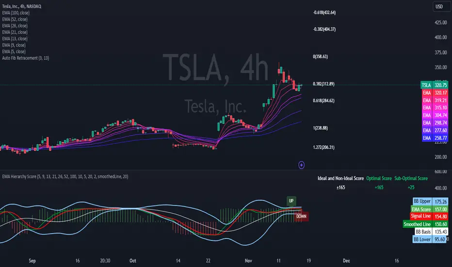
EMA Hierarchy Score V.1.0
EMA Hierarchy Score V.1.0
Purpose
The EMA Hierarchy Score indicator assesses the relative positioning of multiple Exponential Moving Averages (EMAs) for a financial asset. This tool provides insights into trend strength by calculating ideal and non-ideal configurations of EMAs, allowing for effective interpretation when used alongside standard EMA charts.
Variables and Inputs
The indicator organizes a set of EMAs and other metrics into a hierarchy for scoring:
* Primary Variables (A–J):
A: Close price
B: Open price
C: Previous close price
D to J: EMAs of configurable periods (5, 9, 13, 21, 26, 52, 100).
* User Inputs:
* Customizable periods for each EMA, allowing users to adjust the indicator’s sensitivity.
* Customizable period and standard deviation multiplier for Bollinger Bands, enabling further control over the indicator’s analysis.
Mathematical Method
The EMA Hierarchy Score calculates how closely the current EMA structure aligns with an “ideal” configuration through a structured scoring system:
1- Hierarchy Scoring:
* Ideal Order: Defined as A > B > C > D > E > F > G > H > I > J, representing a strong upward trend where each EMA progressively increases.
* Non-Ideal Order: Defined as J > I > H > G > F > E > D > C > B > A, indicating a weak or downward trend where each EMA progressively decreases.
* Optimal Order: Calculated based on achieving maximum alignment with the ideal configuration for each EMA across the chosen period.
* Sub-Optimal Order: The least-aligned structure across the same period.
2- Score Calculation:
* The indicator calculates a score by comparing all EMA pairs in values. For each comparison, a score increment of +1 (ideal) or -1 (non-ideal) is applied.
* The final score reflects the EMA configuration’s deviation from the ideal order:
- Positive Score: Indicates closer alignment with the ideal structure.
- Negative Score: Indicates deviation toward a non-ideal structure.
3- Smoothed and Signal Lines:
* A smoothed score is created using a Simple Moving Average (SMA) of the raw hierarchy score.
* A signal line (an SMA of the smoothed score) further aids in tracking directional shifts in the score.
4- Trend Labels and Bollinger Bands:
* Trend Labels: Display "UP" or "DOWN" based on the smoothed score’s relationship to the signal line.
* Bollinger Bands: Plotted around a selected source (smoothedLine, signalLine, or score) to analyze score volatility and deviations from the mean. The period and standard deviation multiplier for Bollinger Bands are user-configurable.
Result Definition
The Ideal and Non-Ideal Scores represent the upper and lower bounds of achievable configurations, ensuring the score does not exceed these values.
1- Ideal and Non-Ideal Result:
* Calculated based on how closely the current EMA configuration follows the “ideal” ascending or descending order.
* Ideal Score: Defined as +165, representing perfect alignment with the ideal configuration.
* Non-Ideal Score: Defined as -165, indicating full alignment with the descending, non-ideal structure.
* The score is bounded by these values and will not go above or below this range.
2- Optimal and Sub-Optimal Scores:
* Optimal Score: The highest score over the selected scoring period, calculated with the same period as the Bollinger Bands. Using consistent periods reinforces the reliability of the score by aligning with the period already used to gauge volatility.
* Sub-Optimal Score: The lowest score over the same period, capturing points of minimal alignment with the ideal order.
Interpretation and Analysis
1- Use with EMA Charts:
* This indicator is designed to be used alongside EMA charts, as its results provide insights into the relative order of EMAs and their alignment with trend strength.
* The EMA Hierarchy Score interprets the underlying EMA structure, offering additional context on whether current trends are aligned with optimal or non-optimal EMA configurations.
2- Ideal and Non-Ideal Analysis:
* A positive EMA Hierarchy Score indicates an orderly, ideal upward trend, suggesting stronger alignment with the ideal structure.
* A negative score signals a potential downward trend or deviation from the ideal structure.
3 - Trend Indicators and Bands:
* Trend Labels: The "UP" and "DOWN" labels offer real-time feedback on trend direction shifts, based on the smoothed score and signal line relationship.
* Bollinger Bands: Visualize the range of score fluctuations, helping to identify breakout or breakdown points.
4 - Optimal and Sub-Optimal Scores:
* Use the Optimal Score to understand peak trend alignment and Sub-Optimal Score to spot potential reversal or correction zones.
* A consistently high score over time indicates trend stability, while variations may suggest instability.
Quick Reference Table
The table displayed at the top right provides an at-a-glance view of key metrics:
* Ideal and Non-Ideal Score: Fixed at ±165 to represent the calculated ideal and non-ideal configuration.
* Optimal and Sub-Optimal Scores: Show maximum and minimum scores over the scoring period, color-coded green for positive and red for negative values.
This concise table helps users quickly assess indicator values, reducing the need to interpret multiple chart lines and making it easier to understand overall trend strength.
Disclaimer
The EMA Hierarchy Score V.1.0 is a technical analysis tool designed to assist in understanding the alignment and strength of trends as defined by EMA configurations. This indicator does not constitute investment advice, nor does it make specific recommendations for buying or selling assets. Users should consult with a financial advisor before making any trading decisions, as past performance or technical signals do not guarantee future results. The developers of this indicator disclaim all liability for potential financial losses arising from reliance on this tool. Users assume full responsibility for interpreting and applying the indicator’s outputs in their investment decisions.
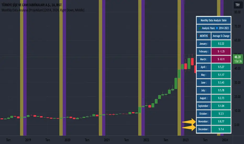
Monthly Data Analysis [ProjeAdam]OVERVIEW
This indicator was developed to quickly analyze the seasonal movements of financial investment instruments.
I would like to thank Zafer Brother for his ideas.
IMPORTANT NOTE:
In order to calculate monthly price changes properly, we need to examine the chart on a monthly time period.
USER GUIDE:
1 - Time Period Selection: Users can input the start and end years for their analysis. This feature enables users to focus on specific time frames that are of interest to them, such as analyzing market behavior during certain historical events or periods.
2 - Monthly Data Aggregation: The script seems to collect and process data on a monthly basis, enabling a detailed analysis of market trends within each month.
3 - Percentage Change Calculation: It calculates the percentage change in prices, which is a crucial metric in financial analysis for understanding market movements.
4 - Customization and Visualization: Users can customize background colors for each month, enhancing the visual appeal and readability of the data on charts.
ALGORITHM
1 - Time Range Settings:
The user can enter the start and end year of the analysis. These dates determine the time period in which data analysis will be performed.
2- Creating Monthly Data Series and Calculating Total Months:
A separate float array and percentage change array is created for each month.
3- Percentage Change Calculation:
Using the data in the series created for each year and each month, the months of the selected years are summed and divided by the total number of years.
4 - Visualization of Results:
Table helps us to quickly check our data in our monthly average percentage change for selected years.
5- Coloring the Graph According to Background Conditions:
The user who checks the results in the table can check the price changes in the months between the selected years from the graph by turning on the background of the desired month in the indicator settings.
In the example above, I selected the months of June, July and August.
By changing the background of the months of June, July and August between the years I have selected in the chart, I can easily examine the seasonal price movement in these months.
Example
I observe that the snowiest month among the years I choose in the airline company I work with is November, and I can easily make my analysis by turning on the background setting of November.
Benefits
Customized Analysis: By allowing users to select specific start and end years, the script provides tailored analysis, making it more relevant and useful for individual trading strategies or historical research.
Trend Identification: Monthly data aggregation and percentage change calculations can help in identifying short-term and long-term market trends, vital for making informed trading decisions.
Enhanced Visualization: Custom background colors for different months can make the chart more user-friendly, aiding in quicker interpretation and analysis of data.
User-Friendly Dashboard: The script includes a dashboard feature that provides a summary of data analysis, making it easier for users to get an overview of market trends.
If you have any ideas what to add to my work to add more sources or make calculations cooler, suggest in DM .
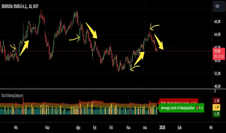
Bist Manipulation [Projeadam]
OVERVIEW | GENEL BAKIŞ
ENG: Indicator that detects manipulation candles according to changing market conditions.
TR: Değişen piyasa koşullarına göre manipülasyon mumlarını tespit eden gösterge.
ENG: IMPORTANT NOTE: This indicator works in BIST Market and only in Future Parities.
Example ->> PETKM1! --SASA1!
TR: ÖNEMLİ NOT: Bu indikatör BİST Piyasasında ve sadece Future Paritelerde Çalışır.
Örnek- >> PETKM1! -- SASA1!
ENG: Market makers manipulate the market because most people who trade on the stock exchange act with their emotions and are forced to close the transaction at a loss.
TR: Piyasada market yapıcı oluşumlar manipülasyon yaparlar çünkü borsada işlem alan insanların birçoğu duygularıyla hareket eder ve zararla işlem kapatılmaya zorlanır.
ENG: If we detect manipulation candles in the market, we can control our fragile psychology and close our transactions in profit by trading with market-making formations in these areas.
TR: Marketde manipülasyon mumlarını tespit edersek kırılgan psikolojimizi kontrol edebilir ve bu alanlardan market yapıcı oluşumlarla beraber işlem alarak işlemlerimizi karda kapatabiliriz.
ALGORITHM | ALGORİTMA
ENG: With the help of this indicator, you can detect manipulation candles in the BIST exchange with the help of the algorithm I created by using volumetric data and wicks created by the price.
When there is excessive volatility in price movement, the algorithm in this indicator notices this price volatility and calculates a manipulation value by dividing it by the volatility value in past price movements.
TR: Bu indikatör yardımıyla hacimsel veriler ve fiyatın oluşturduğu fitillerden yararlanarak oluşturduğum algoritma yardımıyla siz de BİST borsasında manipülasyon mumlarını tespit edebilirsiniz.
Fiyat hareketinde aşırı derece oynaklık olduğunda bu indikatördeki algoritma bu fiyat oynaklığını fark eder ve geçmiş fiyat hareketlerindeki oylanklık degerine bölerek bize bir manipülasyon degeri hesaplar.
How does the indicator work? | Gösterge nasıl çalışır?
ENG: The manipulation candle does not give us information about the direction of price movement, it is only used as an auxiliary indicator.
TR: Manipülasyon mumu bize fiyat hareketinin yönü hakkında bilgi vermez sadece yardımcı bir gösterge olarak kullanılır.
ENG: We show our manipulation values as columns. We draw a channel over the values we show and we understand that there is manipulation in the candle of our values above this channel.
TR: Manipülasyon degerlerimiz kolonlar şeklinde gösteriyoruz. Gösterdiğimiz değerlerimizin üzerine bir kanal çizdiriyoruz ve bu kanalın üzerinde kalan değerlerimizdeki mumda manipülasyon yapıldığını anlıyoruz.
ENG: The indicator shows the manipulation value in the form of columns. Our manipulation value that goes outside the channel we have determined is colored red, within the channel it is colored yellow, and below the channel it is colored green. Red columns indicate candles that are manipulations.
TR: İndikatör manipülasyon degerini kolonlar şeklinde gösteriyor. Bizim belirlediğimiz kanal dışına çıkan manipülasyon degerimiz kırmızı, kanal içerisinde sarı, kanal altında yeşil olarak renklendiriliyor. Kırmızı kolonlar manipülasyon olan mumları göstermektedir.
Example | Örnek
ENG: In our example above, we see a manipulation candle that clears the price gaps, while the market maker clears the orders in the price gaps at the bottom to move the price up.
TR: Yukarıdaki örneğimizde oluşan fiyat boşluklarını temizleyen bir manipülasyon mumu görmekteyiz, alt kısımdaki fiyat boşluklarındaki emirleri temizleyen market maker fiyatı yukarı taşımak için buradaki emirleri temizliyor.
SETTINGS PANEL | AYARLAR PANELİ
ENG: We have only one setting in this indicator.
TR: Bu indikatörde tek ayarımız vardır.
ENG: Our multiplier value determines the width of the band value formed above our manipulation value. In the chart above, our multiplier value is 3.3. If we reduce our multiplier value, our manipulation sensitivity will decrease as there will be much more candles on the band.
TR: Çarpan değerimiz manipülasyon değerimizin üstünde oluşşan band değerinin genişliğini belirlemektedir.Yukarıdaki grafikte çarpan değerimiz 3.3, Eğer çarpan değerimizi azaltırsak band üstünde çok daha fazla mum olacağı için manipülasyon hassasiyetimiz azalacaktır.
ENG: When we set our multiplier value to 2.3, we have a more sensitive manipulation skin and it gives signals in more candles.
TR: Çarpan değerimizi 2.3 yapınca daha hassas manipülasyon derimiz oluyor ve daha fazla mumda sinyal veriyor.
If you have any ideas what to add to my work to add more sources or make calculations cooler, suggest in DM .
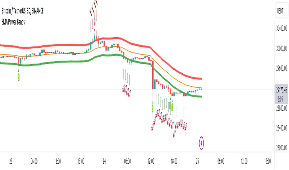
EMA Power BandsHello!
Today, I am delighted to introduce you to the "EMA Power Bands" indicator, designed to assist in identifying buying and selling points for assets moving in the markets.
Key Features of the Indicator:
EMA Bands: "EMA Power Bands" utilizes Exponential Moving Average (EMA) to create trend lines. These bands automatically expand or contract based on the price trend, adapting to market conditions.
ATR-Based Volatility: The indicator measures price volatility using the Average True Range (ATR) indicator, adjusting the width of the EMA bands accordingly. As a result, wider bands form during periods of increased volatility, while they narrow during lower volatility.
RSI-Based Buy-Sell Signals: "EMA Power Bands" uses the Relative Strength Index (RSI) to identify overbought and oversold zones. Entering the overbought zone generates a sell signal, while entering the oversold zone produces a buy signal.
Trend Direction Identification: The indicator assists in determining the price trend direction by analyzing the slope of the EMA bands. This allows you to identify periods of uptrends and downtrends.
Visualization of Buy-Sell Signals: "EMA Power Bands" visually marks the buy and sell signals:
- When RSI enters the overbought zone, it displays a sell signal (🪫).
- When RSI enters the oversold zone, it indicates a buy signal (🔋).
- When a candle closes above the emaup line, it displays a bearish signal (🔨).
- When a candle closes below the emadw line, it indicates a bullish signal (🚀).
By using the "EMA Power Bands" (EMA Güç Bantları) indicator, especially in trend-following strategies and periods of volatility, you can make more informed and disciplined trading decisions. However, I recommend using it in conjunction with other technical analysis tools and fundamental data.
*You can also use it with CCI as an example.
With this indicator, you can identify potential trend reversals in advance and strengthen your risk management strategies.
So, go ahead and try the "EMA Power Bands" (EMA Güç Bantları) indicator to enhance your technical analysis skills and make more informed trading decisions!
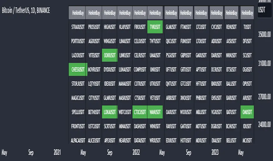
Heikin Ashi Master Buy Signal ScannerHeikin Ashi Master Buy Signal Scanner is an algorithm consisting of smoothed Heiken Ashi candles and moving averages.Moving averages use 5 basic moving averages. I preferably use ema for smoothing.In addition, the main purpose of this indicator is the preferred stock market and its shares, trading pairs, etc. scanning on a single screen and seeing the buy signals on a single screen.The buy signal appears on the screen as green.
With Column Width from the indicator properties, the width of the column of 30 symbols is adjusted, and the position of the column on the screen is adjusted with the Column Number.
With the indicator, a maximum of 30 symbols can be listed at once. However, this number can be increased according to your tradingview membership type. Especially if you are a premium member of tradingview, you can add as many indicators as you want to the chart without any limitation, and you can add as many symbols as your screen width to the chart. Heikin Ashi Master Buy signals you can see on a single screen.
In addition, the indicator gives you the opportunity to set the time zone you want and you can see the signals according to the time zone you want. All you need to do for this is to set the time zone from the indicator properties.
Now, if you wish, you can see examples of scans made on a single screen below.
Buy signals of 346 coins of Binance usdt trading pair on a single screen
Buy signals of 420 stocks of the Indian market on a single screen
Buy signals of 300 stocks of the NASDAQ on a single screen
Buy signals of 300 stocks of the BORSA ISTANBUL-BIST on a single screen
Buy signals on a single screen with 49 trading pairs in Forex
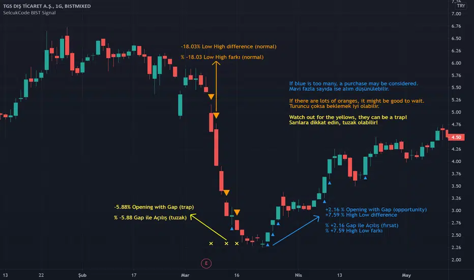
SelcukCode BIST SignalIt is a signal control indicator designed for the daily time frame within Borsa İstanbul. It allows us to control the multiplicity of rises or falls at a glance.
*******************************
Borsa İstanbul içerisinde günlük time frame için tasarlanmış bir sinyal kontrol indikatörüdür. Yükselişlerin veya düşüşlerin çokluk kontrolünü bir bakışta yapmamıza yarar.
*******************************
Turkey Yield Curve SpreadYield spreads are used to see investors' perception of future risk and predict a recession. The spread is the value obtained by subtracting the near term bond from the distant one. This indicator plots this value historically. I used 3-year and 10-year Turkey treasury bond yields instead of 2-year and 10-year Turkey treasury bond yields due to lack of historical data on Tradingview.
RSI Cross by uykusuzpenguenRSI Cross Explanation;
It's simple,
When short-term RSI crossover long-term RSI ; BUY ( Green Area )
When short-term RSI crossunder long-term RSI ; SELL ( Red Area )
You can change RSI lenghts or moving average lenght on settings.
If you knew that, you would sell all your bitcoins at a price of $13.500 and not look back on 8th January.
Happy trading.

Bull&Bear Signals by uykusuzpenguenHow to use Bull&Bear Signals Script
Purpose: We developed this indicator for short and middle term buyer and seller small inverstor.
Scope of Script: This script should use stock markets and digital currency markets. We are not recommend this script for use in any other assets.
General Approaching: While this script creating, mostly take support, highest high price & lowest low price, volume and RSI . We strongly recommending to use 4h,1d,1w time frame on the graph.
Notation:
Purple Point: If a bar volume more than volume moving average four times
Grey Point : If a bar volume less than volume moving average four times
Turquois Bar Color : If a bar RSI level more than 75 ( Overbought areas )
Purple Bar Color : If a bar RSI level less than 25 ( Oversell areas )
Note: We don’t want all your graphs filling text and line etc. But generally spectacular price movement become after that points. That’s why we think this notation will be usefull.
Important Warning: Please do your risk management . This formula does not eliminate the possibility that it may mislead you in the next process.
Take risk and set a stop-loss
HIGH & LOW STRATEGY
This scripts calculate previous 3 bar from current bar to prev. 26 bar highest high and lowest lowe price and drawing on board. This lines just like a bollinger band but not. If price closing upper line , price wants to down and if price closing bottom line , price wants to up, like a bollinger band. But we will not to use this script like this
PRINCIPLE :
For safety buy point ; Price should fall bottom line and again rise over the bottom line completely.
For sell point ; Price should rise over the upper line and again fall the upper line completely.
For Detailed Description in English : drive.google.com
Detaylı Türkçe Anlatım için : drive.google.com
