Best!

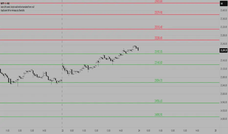
GapCluster SR For Intraday by Chaitu50c**GapCluster SR For Intraday by Chaitu50c**
**Overview**
GapCluster SR plots dynamic intraday support and resistance lines based on candle-to-candle gaps. Whenever an Open/Close or High/Low gap is detected, the script draws a horizontal level and “clusters” nearby gaps into a single line to keep your chart clean. Lines automatically color-code relative to price—green when below, red when above.
---
**Key Features**
* **Gap Detection Modes**: Choose between Open/Close gaps (default) or High/Low gaps.
* **Clustering**: Merge levels within a user-defined vertical range to avoid clutter.
* **Dynamic Coloring**: Levels below price turn green; levels above price turn red.
* **Session Reset**: Automatically removes levels older than X days.
* **Fully Customizable**: Adjust buffer, cluster range, line width, lookback period, and both above/below colors.
---
**Inputs**
| Input | Default | Description |
| ---------------------------- | :--------: | ------------------------------------------- |
| Gap Type | Open/Close | Select gap detection method |
| Price Buffer (points) | 5.0 | Maximum distance for gap matching |
| Cluster Range (points) | 100.0 | Vertical distance within which levels merge |
| Line Width | 2 | Thickness of plotted lines |
| Days to Include | 14 | Number of days to retain past levels |
| Color for Levels Above Price | red | Line color when level > current price |
| Color for Levels Below Price | green | Line color when level < current price |
---
**How to Use**
1. **Add to Chart**: Apply on any intraday timeframe (1 min, 5 min, etc.).
2. **Select Mode**: Pick Open/Close or High/Low in settings.
3. **Tweak Inputs**: Raise/lower buffer for tighter/looser gap detection; adjust cluster range to group levels; change lookback (“Days to Include”) to control session reset.
4. **Interpret Levels**:
* **Green Lines** mark potential support zones.
* **Red Lines** mark potential resistance zones.
5. **Combine with Your Strategy**: Use alongside volume, momentum, or trend filters for confirmation.
---
**Tips & Tricks**
* **Intraday Entries**: Look for price reaction at green (support) lines for long setups, or red (resistance) lines for shorts.
* **Filter Noise**: Increase the “Cluster Range” to consolidate many close levels into stronger, singular lines.
---
**Disclaimer**
This indicator is provided “as-is” for educational purposes only. Always backtest any setup and practice proper risk management.
Ensemble Alerts█ OVERVIEW
This indicator creates highly customizable alert conditions and messages by combining several technical conditions into groups , which users can specify directly from the "Settings/Inputs" tab. It offers a flexible framework for building and testing complex alert conditions without requiring code modifications for each adjustment.
█ CONCEPTS
Ensemble analysis
Ensemble analysis is a form of data analysis that combines several "weaker" models to produce a potentially more robust model. In a trading context, one of the most prevalent forms of ensemble analysis is the aggregation (grouping) of several indicators to derive market insights and reinforce trading decisions. With this analysis, traders typically inspect multiple indicators, signaling trade actions when specific conditions or groups of conditions align.
Simplifying ensemble creation
Combining indicators into one or more ensembles can be challenging, especially for users without programming knowledge. It usually involves writing custom scripts to aggregate the indicators and trigger trading alerts based on the confluence of specific conditions. Making such scripts customizable via inputs poses an additional challenge, as it often involves complicated input menus and conditional logic.
This indicator addresses these challenges by providing a simple, flexible input menu where users can easily define alert criteria by listing groups of conditions from various technical indicators in simple text boxes . With this script, you can create complex alert conditions intuitively from the "Settings/Inputs" tab without ever writing or modifying a single line of code. This framework makes advanced alert setups more accessible to non-coders. Additionally, it can help Pine programmers save time and effort when testing various condition combinations.
█ FEATURES
Configurable alert direction
The "Direction" dropdown at the top of the "Settings/Inputs" tab specifies the allowed direction for the alert conditions. There are four possible options:
• Up only : The indicator only evaluates upward conditions.
• Down only : The indicator only evaluates downward conditions.
• Up and down (default): The indicator evaluates upward and downward conditions, creating alert triggers for both.
• Alternating : The indicator prevents alert triggers for consecutive conditions in the same direction. An upward condition must be the first occurrence after a downward condition to trigger an alert, and vice versa for downward conditions.
Flexible condition groups
This script features six text inputs where users can define distinct condition groups (ensembles) for their alerts. An alert trigger occurs if all the conditions in at least one group occur.
Each input accepts a comma-separated list of numbers with optional spaces (e.g., "1, 4, 8"). Each listed number, from 1 to 35, corresponds to a specific individual condition. Below are the conditions that the numbers represent:
1 — RSI above/below threshold
2 — RSI below/above threshold
3 — Stoch above/below threshold
4 — Stoch below/above threshold
5 — Stoch K over/under D
6 — Stoch K under/over D
7 — AO above/below threshold
8 — AO below/above threshold
9 — AO rising/falling
10 — AO falling/rising
11 — Supertrend up/down
12 — Supertrend down/up
13 — Close above/below MA
14 — Close below/above MA
15 — Close above/below open
16 — Close below/above open
17 — Close increase/decrease
18 — Close decrease/increase
19 — Close near Donchian top/bottom (Close > (Mid + HH) / 2)
20 — Close near Donchian bottom/top (Close < (Mid + LL) / 2)
21 — New Donchian high/low
22 — New Donchian low/high
23 — Rising volume
24 — Falling volume
25 — Volume above average (Volume > SMA(Volume, 20))
26 — Volume below average (Volume < SMA(Volume, 20))
27 — High body to range ratio (Abs(Close - Open) / (High - Low) > 0.5)
28 — Low body to range ratio (Abs(Close - Open) / (High - Low) < 0.5)
29 — High relative volatility (ATR(7) > ATR(40))
30 — Low relative volatility (ATR(7) < ATR(40))
31 — External condition 1
32 — External condition 2
33 — External condition 3
34 — External condition 4
35 — External condition 5
These constituent conditions fall into three distinct categories:
• Directional pairs : The numbers 1-22 correspond to pairs of opposing upward and downward conditions. For example, if one of the inputs includes "1" in the comma-separated list, that group uses the "RSI above/below threshold" condition pair. In this case, the RSI must be above a high threshold for the group to trigger an upward alert, and the RSI must be below a defined low threshold to trigger a downward alert.
• Non-directional filters : The numbers 23-30 correspond to conditions that do not represent directional information. These conditions act as filters for both upward and downward alerts. Traders often use non-directional conditions to refine trending or mean reversion signals. For instance, if one of the input lists includes "30", that group uses the "Low relative volatility" condition. The group can trigger an upward or downward alert only if the 7-period Average True Range (ATR) is below the 40-period ATR.
• External conditions : The numbers 31-35 correspond to external conditions based on the plots from other indicators on the chart. To set these conditions, use the source inputs in the "External conditions" section near the bottom of the "Settings/Inputs" tab. The external value can represent an upward, downward, or non-directional condition based on the following logic:
▫ Any value above 0 represents an upward condition.
▫ Any value below 0 represents a downward condition.
▫ If the checkbox next to the source input is selected, the condition becomes non-directional . Any group that uses the condition can trigger upward or downward alerts only if the source value is not 0.
To learn more about using plotted values from other indicators, see this article in our Help Center and the Source input section of our Pine Script™ User Manual.
Group markers
Each comma-separated list represents a distinct group , where all the listed conditions must occur to trigger an alert. This script assigns preset markers (names) to each condition group to make the active ensembles easily identifiable in the generated alert messages and labels. The markers assigned to each group use the format "M", where "M" is short for "Marker" and "x" is the group number. The titles of the inputs at the top of the "Settings/Inputs" tab show these markers for convenience.
For upward conditions, the labels and alert messages show group markers with upward triangles (e.g., "M1▲"). For downward conditions, they show markers with downward triangles (e.g., "M1▼").
NOTE: By default, this script populates the "M1" field with a pre-configured list for a mean reversion group ("2,18,24,28"). The other fields are empty. If any "M*" input does not contain a value, the indicator ignores it in the alert calculations.
Custom alert messages
By default, the indicator's alert message text contains the activated markers and their direction as a comma-separated list. Users can override this message for upward or downward alerts with the two text fields at the bottom of the "Settings/Inputs" tab. When the fields are not empty , the alerts use that text instead of the default marker list.
NOTE: This script generates alert triggers, not the alerts themselves. To set up an alert based on this script's conditions, open the "Create Alert" dialog box, then select the "Ensemble Alerts" and "Any alert() function call" options in the "Condition" tabs. See the Alerts FAQ in our Pine Script™ User Manual for more information.
Condition visualization
This script offers organized visualizations of its conditions, allowing users to inspect the behaviors of each condition alongside the specified groups. The key visual features include:
1) Conditional plots
• The indicator plots the history of each individual condition, excluding the external conditions, as circles at different levels. Opposite conditions appear at positive and negative levels with the same absolute value. The plots for each condition show values only on the bars where they occur.
• Each condition's plot is color-coded based on its type. Aqua and orange plots represent opposing directional conditions, and purple plots represent non-directional conditions. The titles of the plots also contain the condition numbers to which they apply.
• The plots in the separate pane can be turned on or off with the "Show plots in pane" checkbox near the top of the "Settings/Inputs" tab. This input only toggles the color-coded circles, which reduces the graphical load. If you deactivate these visuals, you can still inspect each condition from the script's status line and the Data Window.
• As a bonus, the indicator includes "Up alert" and "Down alert" plots in the Data Window, representing the combined upward and downward ensemble alert conditions. These plots are also usable in additional indicator-on-indicator calculations.
2) Dynamic labels
• The indicator draws a label on the main chart pane displaying the activated group markers (e.g., "M1▲") each time an alert condition occurs.
• The labels for upward alerts appear below chart bars. The labels for downward alerts appear above the bars.
NOTE: This indicator can display up to 500 labels because that is the maximum allowed for a single Pine script.
3) Background highlighting
• The indicator can highlight the main chart's background on bars where upward or downward condition groups activate. Use the "Highlight background" inputs in the "Settings/Inputs" tab to enable these highlights and customize their colors.
• Unlike the dynamic labels, these background highlights are available for all chart bars, irrespective of the number of condition occurrences.
█ NOTES
• This script uses Pine Script™ v6, the latest version of TradingView's programming language. See the Release notes and Migration guide to learn what's new in v6 and how to convert your scripts to this version.
• This script imports our new Alerts library, which features functions that provide high-level simplicity for working with complex compound conditions and alerts. We used the library's `compoundAlertMessage()` function in this indicator. It evaluates items from "bool" arrays in groups specified by an array of strings containing comma-separated index lists , returning a tuple of "string" values containing the marker of each activated group.
• The script imports the latest version of the ta library to calculate several technical indicators not included in the built-in `ta.*` namespace, including Double Exponential Moving Average (DEMA), Triple Exponential Moving Average (TEMA), Fractal Adaptive Moving Average (FRAMA), Tilson T3, Awesome Oscillator (AO), Full Stochastic (%K and %D), SuperTrend, and Donchian Channels.
• The script uses the `force_overlay` parameter in the label.new() and bgcolor() calls to display the drawings and background colors in the main chart pane.
• The plots and hlines use the available `display.*` constants to determine whether the visuals appear in the separate pane.
Look first. Then leap.

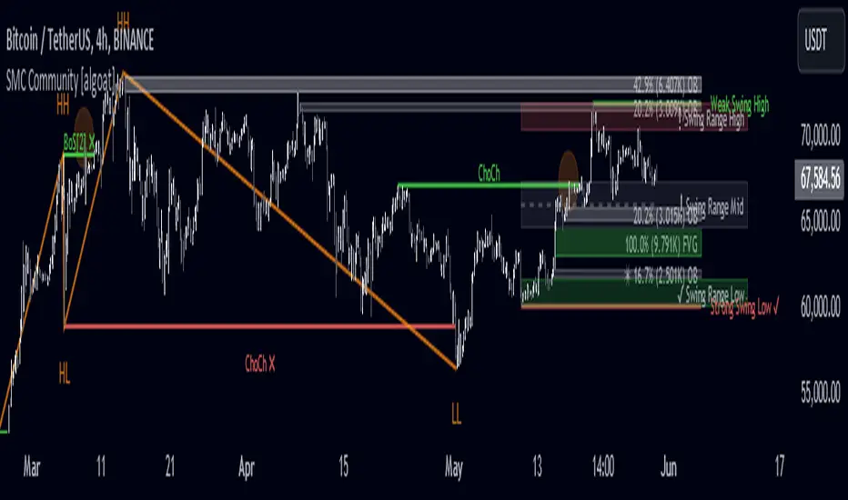
SMC Community [algoat] — Smart Money ConceptsEmpower your trading with the core principles of the Smart Money Concepts through interactive features and highly customizable settings.
The indicator's strength lies in the unique SMC Core algorithm, a calculation based on real price action data, capturing every tick from small intraday fluctuations to significant high timeframe movements.
algoat SMC Core is our continually evolving, specialized structure mapping algorithm, serving as the backbone of our price action related publications.
⭐ Key Features
Swing Market Structure: Change of Character, Break of Structure
Recognize and visualize real-time market structures with swing elements. Identify and mark key structural changes in the market to visually highlight shifts in market trends and patterns. This feature is designed to alert you to significant changes in the market's behavior, signaling a potential shift from accumulation to distribution phases, or vice versa. It helps traders adapt their strategies based on evolving market dynamics.
Order Flow: Structure Fractal
Connect the successive structural high and low levels, visualizing the intricate flow of market movements. This feature highlights fractal structures within the market, enabling traders to detect significant price action patterns.
Structure Range: Determine Discount, Premium, and Equilibrium Zones
This feature provides a unique way of visualizing price areas where a security could be overbought or oversold (premium or discount zones) and where the price is expected to be fair and balanced (equilibrium zone). Distance from the current price is displayed in percentage terms, which can assist traders with crucial data for risk management and strategic planning. The Range function helps you identify the most favorable price zones for entries and set your stop-loss and take-profit levels more accurately.
Liquidity Grabs: Reveal Hidden Manipulation Attempts
Identify uncovered market areas where high liquidity trading may take place. Liquidity Grabs help track "smart money" footprints by identifying levels where large institutional traders may have induced liquidity traps. Understanding these traps can aid in avoiding false market moves and optimizing trade entries.
Institutional Interest Zones: Order Blocks and Fair Value Gaps
Uncover areas where bigger orders may be lined up. Reveal zones of interest ordered by volume strength. Receive warnings about market price imbalances.
▸ Order Blocks pinpoint crucial zones where large institutional investors ("smart money") have shown strong buying or selling interest recently. These blocks can serve as a tool for identifying key areas for potential trade entries or exits.
▸ Fair Value Gaps detect discrepancies between the perceived market value and the actual market price, revealing potential areas for price correction. With its mitigation settings, you can fine-tune the FVG detection according to the magnitude of value misalignment you consider significant.
Mitigation types dictate how price interacts with a zone, with order blocks requiring a close through (indicating stronger price movement) and fair value gaps requiring a wick through (hinting at weak rejection).
══════════════════
⭐ Why SMC?
In the ever-evolving trading landscape, mainstream methods and strategies can quickly become outdated as they are widely adopted. Liquidity is constantly sought after, and the best source for this is exploring and exploiting trading strategies that are widely accepted and applied. Currently, one of these strategies is the SMC (Supply, Demand, and Price Action).
It's no coincidence that our educational materials incorporate concepts such as liquidity grabs (LG) and Smart Money Traps (SMT). As the application of SMC gains popularity among retail traders, trading with this approach becomes more challenging. Therefore, the recent focus has been on reforming the SMC methodology, as it is the only method that relies on real price movements and will always work when applied correctly.
The indicator reflects our personal use and deep comprehension of Smart Money Concepts. It provides streamlined tools for tracking algorithmic trends with modern visualizations, without unnecessary clutter.
▸ What does the proper application of SMC entail?
Many SMC traders associate their key areas of interest with the market structure, which is generally considered acceptable. However, depending solely on a single foundation can lead to significant deviations, which may cause notable impacts on trading results. Moreover, if the basis for the market structure calculation is inaccurate, the consequences can be even more severe. It's akin to risking money on a lottery ticket, believing it will be a winner.
Our methodology is different, and it may ensure longevity in the financial markets. The structure remains crucial, but it is not the sole foundation of everything; instead, it serves as a validation tool. Each calculation, such as order blocks (OB), Fair Value Gaps (FVG), liquidity grabs (LG), range analysis, and more, is independent and unique, separate from the structure. However, validation must ultimately come from the structure itself.
We employ individual and high-quality filters: before a function calculation is validated by the structure, it must undergo rigorous testing based on its own set of validation conditions. This approach aims to enhance robustness and accuracy, providing traders with a reliable framework for making informed trading decisions.
▸ An example of structure validation: Order Block with "Swing Sensitivity"
These order blocks will only be displayed and utilized by the script if there is a swing structure validation with a valid break. In other words, the presence of a confirmed swing Change of Character (ChoCh) or Break of Structure (BoS) is essential for the Order Block to be considered valid and relevant.
This approach ensures that the order blocks are aligned with the overall market structure and are not based on isolated or unreliable price movements. Whether it's Fair Value Gaps (FVG), Liquidity Grabs (LG), Range calculations, or other functionalities, the same underlying principle holds true. The background structure calculation serves as a validation mechanism for the data and insights generated by these functions, ensuring they adhere to the specific criteria and rules established within our methodology. By incorporating this robust validation process, traders can have confidence in the reliability and accuracy of the information provided by the indicator, allowing them to make informed trading decisions based on validated data and analysis.
══════════════════
👉 Usage - the general approach
Determine your trading style and build your basic strategy:
The indicator helps you understand your trading style, whether it's swing trading, scalping or another approach. By analyzing the SMC indicator, you gain valuable information about potential market trends, entry and exit points, and overall market sentiment.
Steps:
Identify Trading Style: Determine whether you are a swing trader, scalper, or long-term investor. This will influence how you use the indicator.
Analyze Market Trends: Use the SMC indicator to observe market trends and identify potential entry and exit points.
Adapt Strategies: Adjust your strategies based on the market dynamics revealed by the SMC indicator, such as changes in order flow or market structure.
👉 Example of usage
In the following chart, you'll notice how we've utilized the indicator to formulate a strategic trading approach. We've employed Order Blocks equipped with volume parameters to identify crucial market zones. Simultaneously, we've leveraged swing/internal market structures to gain insights into potential long- and short-term market turnarounds. Lastly, we've examined trend line liquidity zones to pinpoint probable impulses and breakouts within ongoing trends.
Now we can see how the price descended to the order block with the highest volume, which we had previously marked as our point of interest for an entry. As the price closed below the median Order Block, we noted its mitigation. After an internal CHoCH, it's directing us towards the main Order Block as a target.
══════════════════
🧠 General advice
Trading effectively requires a range of techniques, experience, and expertise. From technical analysis to market fundamentals, traders must navigate multiple factors, including market sentiment and economic conditions. However, traders often find themselves overwhelmed by market noise, making it challenging to filter out distractions and make informed decisions. By integrating multiple analytical approaches, traders can tailor their strategies to fit their unique trading styles and objectives.
Confirming signals with other indicators
As with all technical indicators, it is important to confirm potential signals with other analytical tools, such as support and resistance levels, as well as indicators like RSI, MACD, and volume. This helps increase the probability of a successful trade.
Use proper risk management
When using this or any other indicator, it is crucial to have proper risk management in place. Consider implementing stop-loss levels and thoughtful position sizing.
Combining with other technical indicators
Integrate this indicator with other technical indicators to develop a comprehensive trading strategy and provide additional confirmation.
Conduct Thorough Research and Backtesting
Ensure a solid understanding of the indicator and its behavior through thorough research and backtesting before making trading decisions. Consider incorporating fundamental analysis and market sentiment into your trading approach.
══════════════════
⭐ Conclusion
We hold the view that the true path to success is the synergy between the trader and the tool, contrary to the common belief that the tool itself is the sole determinant of profitability. The actual scenario is more nuanced than such an oversimplification. A word to the wise is enough: developed by traders, for traders — pioneering innovations for the modern era.
Risk Notice
Everything provided by algoat — from scripts, tools, and articles to educational materials — is intended solely for educational and informational purposes. Past performance does not assure future returns.
Sticky Notes, Checklist, To-do, Journal [algoat]I forgot to bring my notes again...
Ever feel like your trading notes are all over the place, much like your portfolio after a market dip? Worry not! With this script, you'll have all your trading notes, tasks, and brilliant (or not so brilliant) ideas neatly organized right on your chart. It's like having a sticky note board, but way cooler and without the risk of paper cuts.
⭐ Features :
To-Do Lists
Keep track of tasks with satisfying checkmarks for those dopamine hits.
Journal Entries
Document your market insights, trade plans, or just random thoughts. "I forgot something" – we've all been there.
Due Dates
Never miss an important deadline again. Red alert for overdue tasks because procrastination is a trader's worst enemy.
Customization
Choose the size and position of your notes because one size doesn't fit all.
Perfect for the organized trader who loves a bit of fun or the chaotic one who needs a bit of structure. Embrace the power of notes and stay on top of your trading game!
══════════════════
🧠 General advice
Trading effectively requires a range of techniques, experience, and expertise. From technical analysis to market fundamentals, traders must navigate multiple factors, including market sentiment and economic conditions. However, traders often find themselves overwhelmed by market noise, making it challenging to filter out distractions and make informed decisions. By integrating multiple analytical approaches, traders can tailor their strategies to fit their unique trading styles and objectives.
Confirming Signals with other indicators
As with all technical indicators, it is important to confirm potential signals with other analytical tools, such as support and resistance levels, as well as indicators like RSI, MACD, and volume. This helps increase the probability of a successful trade.
Use proper risk management
When using this or any other indicator, it is crucial to have proper risk management in place. Consider implementing stop-loss levels and thoughtful position sizing.
Combining with other technical indicators
The indicator can be effectively used alongside other technical indicators to create a comprehensive trading strategy and provide additional confirmation.
Keep in mind
Thorough research and backtesting are essential before making any trading decisions. Furthermore, it's crucial to have a solid understanding of the indicator and its behavior. Additionally, incorporating fundamental analysis and considering market sentiment can be vital factors to take into account in your trading approach.
══════════════════
⭐ Conclusion
We hold the view that the true path to success is the synergy between the trader and the tool, contrary to the common belief that the tool itself is the sole determinant of profitability. The actual scenario is more nuanced than such an oversimplification. A word to the wise is enough: developed by traders, for traders — pioneering innovations for the modern era.
Risk Notice
Everything provided by algoat — from scripts, tools, and articles to educational materials — is intended solely for educational and informational purposes. Past performance does not assure future returns.

The Master Pattern Indicator***READ THIS FIRST****
THE MASTER PATTERN Indicator
USER AGREEMENT
*** The personal/private use of this indicator is allowed, commercial use is FORBIDDEN.
***Commercial use will be interpreted as taking advantage of the free indicator in order to profit from it, for example: as part of any courses or mentorships offering training of the indicator or the concept its based. You don't need to pay for any training for this, the strategy is a simple trend following approach, even a caveman would understand.
**********************************************************************************************************************
Now please enjoy the BEST Master Pattern indicator you will ever find for Tradingvew, and for the best price: FREE.
Please do not give money to people trying to charge you for any inferior version of this indicator.
DESCRIPTION
The Master Pattern indicator or The Forex Master Pattern is an alternative form of technical analysis that provides a framework which will help you to find and follow the hidden price pattern that reveals the true intentions of financial markets. This algorithm I came up with does a very good job detecting the Phase 1 of the Forex Master Pattern cycle, which is the contraction point (or Value), and then proceeds to differentiate between major or minor lines and prints the liquidity lines the correct manner in relation to the swings expanding from the contraction.
On Phase 2 we get higher timeframe activation (also called Expansion), which is where price oscillates above and below the average price defined on Phase 1.
On Phase 3 is where we get a sustained deviation from value (the Trend).
In a very short time you will start noticing this pattern, even on naked charts. It is all a matter of training your eyes - the more time you invest studying the charts with this indicator (both historically and replaying the market on strategy tester), the faster you will become familiar with this method.
This indicator DOES NOT REPAINT. You can safely study the chart historically because what is printed historically is what prints real time.
Why do traditional based indicator systems fail over time? Because the markets move in cycles that constantly change structure. Those traditional indicator systems must be constantly optimized and settings tinkered with because of the changing market environment. There are an infinite number of variables that affect price so no exact technical system can work the same forever, which is also the reason why most bots/EA fail.
If you learn to spot the Forex Master Pattern and understand the sequence of the real cycles that drive the markets, you can more accurately forecast market behavior. By using traditional indicators you end up masking this pattern.
Use the insights provided by the Forex Master Pattern indicator to elevate your trading to the next level.
This method of analysis works in any liquid market and timeframe.
VERY IMPORTANT:
The default setting of historical bars is set to 500. This is more than enough for day trading and ensures fast drawings loading time and stable performance. Bear in mind that, the more bars you choose to load historically, the longer it will take to draw everything. The max setting of this input for now is 800. If it is possible to increase it, I will update the code. So if you want to make historical analysis far in the past, just use the chart replay feature.
Indicator Parameters:
They are all self-explanatory, except Type. You can choose between 1 and 2.
1 is better suited for LTF (M1 to M30)
2 is better suited for HTF (H1 and upwards)
However, this is my personal preference. You can of course experiment and choose what looks best for you.
Instructions to use the alert function:
1st step - Choose symbol and timeframe for the alert
2nd step - Go to indicator settings and tick/untick the boxes for the alerts you want
3rd step - Click on the ... (three dots) next to the indicator name (chart upper left corner) and click to add indicator alert
Then it's gonna add the alert with the conditions that you've ticked/unticked inside indicator settings.
Then repeat the process for different symbols, timeframes and different alert conditions.

Multi Bollinger Bands with Over ZoneThis indicator is called "Multi Bollinger Bands with Over Zone". The indicator uses linear regression to calculate the regression line and standard deviation to calculate the upper and lower deviation lines. It also plots filled areas between the deviation lines to highlight overbought and oversold zones.
The indicator has several customizable inputs, including the length of the regression period, depth, and deviations used to calculate the deviation lines.
The regression line is plotted in green color with circle markers. The upper and lower deviation lines are plotted in blue and red colors, respectively. The area between the deviation lines is filled with light blue color for the overbought zone and light pink color for the oversold zone.
This indicator helps traders in identifying trends and potential price reversals. When the price is above the upper deviation line, it indicates a potential overbought zone, while when the price is below the lower deviation line, it indicates a potential oversold zone.
Please note that this indicator is only a tool for analysis and does not provide direct trading signals. It is important to combine this indicator with additional analysis and appropriate trading strategies.

Option ScalperWhat is Scalping?
Scalping is a trading strategy aimed at profiting from quick momentum in a volatile index or stock or any other instrument that can be traded.
Traders who use such strategies place anywhere from 10 to a few hundred trades in a single day.
The idea behind such type of trading is that small moves in an index or stock price are much easier to capture than the larger moves.
Traders who use such strategies are known as scalpers. When you take many small profits a number of times, say 10 points scalped 20 times per day, they can easily add up to large gains.
An Option Buyer's Biggest Enemy is Time Decay and when you scalp, you do not allow the time decay to eat your Option Premium as your Entry and Exit is often quick enough.
What is Option Scalper?
Option Scalper indicator is a momentum-based indicator that tries to detect momentum based upon a number of factors as given below:
(1) Price action accumulated over a period of time when big candles are nowhere
(2) Repeatedly Occurring, certain Candle patterns which indicate if buyers have the upper hand or sellers are ruling the market.
(3) Gradient of moving averages which shows consistency of net buying/selling force
(4) Price jumping normal distribution line and landing in outlying areas, signalling increasing momentum of buying/selling activity.
Based upon the above factors, when Option Scalper thinks a move has the potential to turn into a big move, it generates its Buy/Sell Signals.
When aggressive buying or selling starts where Buying & Selling Forces become unequal, the Price starts moving in one direction with candles making Higher Highs or Lower Lows, moving average lines start scaling up or down or volumes start increasing.
Option Scalper detects these (1) Higher Highs or Lower Lows, (2) scaling up moving average lines, and/or (3) price breaking out of channels; and generates Buy or Sell signals.
In order to use this indicator, simply deploy this on your chart, and wait for Buy/Sell signals. When a Buy/Sell Signal appears, a small line starts forming up at the closing level of Buy/Sell signal candle. Your Entry will be above that line for Buy Signal and below that line for Sell Signal.
It works on all time frames.
Whenever a Buy Signal is followed by Sell signal (let it be after 7 - 8 candles or after many candles) or vice-versa, you have to switch your position to make most of the reverse move.
It is a general purpose indicator and may be used on stocks, commodities, forex and any other instruments alike and is not meant for any specific market.
How to Take Buy/Sell Entry with Option Scalper?
Whenever a Buy/Sell Signal appears on a candle, Option Scalper starts marking its closing price with a horizontal line that keeps extending towards right side with every new candle. This line is Blue in Color for Buy Signal and dark golden color for Sell Signal.
Initially this horizontal line will be very small but as more and more candles appear with the passage of time, the length of the line keeps increasing.
The purpose of this line is to mark the closing price of Signal candle and you have to take your Buy Entry above this line (if last signal is BUY) or you have to take your trade Below this line (if last signal is SELL).
The indicator will also draw another line at the Opening Price of Signal Candle, which can act as your initial stop loss. If trade starts moving in your direction and price goes above upper variance line (light green curvy line) or goes below lower variance line (purple wavy line), then that line becomes your trailing stop loss line from that point onwards.
The indicator also marks the consolidation zone for you. If the Buy/Sell Signal has come but price is in consolidation zone (grey colour cloud), do not take any positions yet and wait for the price to come out of the cloud and breach the Entry Line.
Exiting Buy/Sell Positions and Re-Entry Rules
1. Exiting your Buy Trade: When a Buy Trade is active, indicator can detect where the ongoing upmove may end or retrace for a while and it will print an X symbol (RED COLOR) to warn you. After you see a Red Color X symbol, if price starts making lower lows, you can exit your Buy Trade there or if you are in good profit, you can wait for the price to go below upper variance line (the green color Trailing Stop Loss Line for Buy Trade). See the image below for Red Color X symbol which warns you to be prepared for EXIT from Buy Trade:
2. Re-Entry for Buy Trade: If the last signal on your chart is still Buy Signal but your stop loss has been hit once or twice and you have no open positions now, you can RE-ENTER in buy trade if and when price again climbs above the grey cloud.
3. Exiting your Sell Trade: When a Sell Trade is active, indicator can detect where the ongoing down-move may end or retrace for a while and it will print an X symbol (Green COLOR) to warn you. After you see a Green Color X symbol, if price starts making higher highs, you can exit your Sell Trade there or if you are in good profit, you can wait for the price to go above lower variance line (the purple color Trailing Stop Loss Line for Sell Trade).
4. Re-Entry for Sell Trade: If the last signal on your chart is Sell Signal but your stop loss has been hit once or twice and you have no open positions now, you can RE-ENTER in Sell trade if and when price again crosses below the grey color cloud.
See the image below for recognizing Red and Green X symbols which indicate that temporary retracement or reversal signal is developing:
What are the other features of Option Scalper?
1. End to End Horizontal Support/Resistance Lines: Indicator also detects, prints and deletes horizontal support and resistance lines which can help in your trading decisions. For example, a Buy Signal comes and price crosses above upper variance line and also crosses nearby horizontal resistance line means it has higher probability of moving further up. The reverse is also true (for Sell Signal). See an example of a resistance line below:
2. Star Symbols: If 5 or more consecutive candles are of the same color, then Star Symbol (*) starts appearing above or below the candles. When price has moved too high or too low from the upper or lower variance line, these stars indicate that there is higher probability of retracement happening now which should prompt you to book full or partial profit. See the circled stars in the below image
3. Color Changing Candles: If a candle changes its color from Red to Purple or from Green to light green, they indicate increased intensity of Selling or Buying activity. For example, if each 1 min candle within a 5 min candle is red, then that 5 min candle will turn purple which means Selling pressure is too much and there are very few or no buyers at all. Reverse is also true when Green Candle becomes Light Green. Example images of such candles can be seen below:
4. Consolidation Zone: It is very important for an option buyer to strike only when there is momentum and not to take any fresh trade (or if you already have a position, then closing it for the time being) when price is in consolidation zone. Consolidation zone is marked by a grey colour cloud as seen in below image.
What Type of Alerts Can be Set up: You can set up 3 type of alerts with this indicator (a) Buy Entry Signal which happens when Price closes above the marked Buy Price Level (b) Sell Signal which happens when Price closes below the marked Sell Price Level or (c) Any signal (if you want to be alerted when either Buy or Sell Signal happens)
How to get this indicator?
This is invite-only indicator. Get in touch with us using information given below in Signature field to try this indicator FREE. You may also chat with us through Private Chat feature of TradingView.

Strongest Supports And ResistancesDraws the best support and resistance lines. How it works:
1) Tries every possible line through lows, highs, opens, closes
2) Finds the total hit counts given the confidence interval as input to the candlesticks
3) Calculates the strength of every line according to hit count, total volumes on hits, and timestamps
4) Eliminates similar lines, confidence interval is set as input
5) Selects the strongest 20(changable as an input) lines and draws them on the graph.
Makes your work way easier!!!
Feel free to adjust the parameters for your own style!
Cheers!!

HARKAT momentombest indicator for momentom and movement
in btcusdt 15 min just harkat above 1 indicates movment in market
in bearish or bullish trend

Best Ichimoku Buy and Sell with alertsThis is Indicator is based on Ichimoku Clouds with Buy and Sell positions and alerts. Before using this indicator take note of the following:
1. This indicator is not Repaiting.
2. there are three ways to put your SL/TP:
* you can use the yellow line above or below the candles to put your SL and your R/R ratio will be 1:1, 1:2, 1:3 (depending on the timeframe and the pairs you choose; I advise you to backtest in your desired timeframe and your currency pairs to choose the right R/R)
* You can choose SL/TP based on Percentage or ATR (It is configurable in the setting; I again advise you to backtest in your desired timeframe and your currency pairs to choose the right R/R)
3. Please pay attention to the Green and Red circles. If there is a Green circle before the Buy position it gives it more confirmation and if there is a Red circle before the Sell position it gives more confirmation on the Sell position (pay attention that these circles appear with latency)
4. If the yellow line is below the candles and it gives Sell signal or the yellow line is above the candles and it gives Buy signal, it is better to avoid that signals.
4. Use this indicator with top 30 Crypto pairs (You can also backtest on other coins as well)
5. Please use this indicator at your discretion and backtest first.
6. If you have any idea to improve the results please let me know in the comments.

[UPRIGHT Trading] OrderZones - Supply & Demand (Predictive) (cc)Hello Traders,
This is one that I've been working on a very, Very long time. As easy as it is to draw after the fact, as someone well versed in Supply and Demand; it's a bit more difficult to create all the calculations to show them, code them out, and then I went a step further — attempting to predict future ones as well.
Let's talk about what Supply & Demand Zones are. They are a pattern and technical analysis technique used in day and swing trading. Demand zone represents the area with strongest buying pressure and Supply zone represents selling pressure. Often these zones will show Institutional/Large buyers and sellers executing their orders causing price to move up or down very quickly, creating a long wick on a small and sometimes momentum that feeds into the larger timeframes. Therefore, in the simplest terms, the Supply and Demand Orderzones are the zones the price often gets rejected from or returned to; when Demand exceeds Supply, price jumps up and vice versa.
Unlike lines of support and resistance , these are zones more closely than precise lines, but can help gauge Support and Resistance on the fly.
Richard Wykoff was one of the first market analysts to explain the interaction of these phases, giving them four labels. It is in the understanding of Wyckoff's explanation of market price action, that supply and demand zones are also known as Accumulation and Distribution zones (Accumulation, Markup, Distribution, Markdown).
Shows potential entries on break from zone. Pivots. Large breakdowns or breakouts signalling possible trend change.
Super Fast Real-time Orderzone creation. Resistance line at Supply, shows multiple dimensions of each zone when large enough.
Different calculation, line, transparency settings
Minimalist mode with autobox
Features:
Multiple calculation modes with different lengths and displays.
AutoBox (Predictive Orderzones).
Buy/Sell Highlights.
UPRIGHT – Ultimate Reversals (Support/Resistance version).
Breakouts/Breakdowns + Signals.
Pivot Labels (HH, HL, etc).
Pivot Bar.
Pivot Buy /Sell Signals.
Fully Customizable—Change line types, transparency, colors, etc).
I am still working on the calculations for one more addition, but as it is, this should help anyone automate their S/D technical analysis.
Please see author instructions for access.
Cheers,
Mike
(UPRIGHT Trading)

[UPRIGHT Trading] Trend Direction Force Index (TDFI)The Trend Direction Force Index, TDFI or TDF Index, is a staple in the Forex community, but is excellent on most asset (i.e. stock) trading.
Developed by Pyotr Wojdyo for metastock trading platform originally, but now on several other.
The idea of the TDFI is that there is enough trend directional force to enter the trade.
How it works:
When the signal is above the high threshold, the trader can go long.
When the signal is below the low threshold, the trader can go short.
It's usually used as confirmation along with another indicator.
Features:
Fully customizable
Built-in color changing
Alerts!
If you like this, you will definitely like what else I've published.
Like, follow, support, etc.
Enjoy.
Cheers,
Mike
(UPRIGHT Trading)

[UPRIGHT Trading] Auto-Trendlines Pro (cc)Hello Traders -
Today I am releasing a full-featured auto-trendline indicator.
This makes it easier for beginners and professionals alike to analyze a charts trending support and resistance.
What are Trendlines and why do we use them?
In short, a trendline is a diagonal line that connects to two or more price points on a chart to show the current direction of price. These are used to identify and confirm trend direction in technical analysis and show support and resistance points.
Utilizing pivot points and different calculations for sources we're able to create the trendlines; with adjustable slopes (or just use of proprietary calculations) we are able to make these lines to line up with the current trend.
How it's different:
Accurate auto-drawn calculated trendlines.
Fully customizable - the ability to adjust the trendlines easily to exact specifications with every type of trader in mind.
Can be used to spot long trend as well as short, by adjusting length or using extend both to see previous pivots it's touched.
Then retracted, for perfect long trend.
Can show old trendlines for analysis (click image to see).
Auto-labels Higher-Highs, Higher-Lows, Lower-Highs, Lower-Lows at pivots.
Lining up trendlines with Break signals can help provide more accurate trendlines (potentially teaching) beginners how to draw them better.
Signature double trendline set.
Also notice the additional sell/buy signals (shown above).
Squeeze / Low-float mode adjusts to fit big moves.
Adjust the opacity to hide or fade a line (as seen above).
Pre-filled alerts for breakouts / breakdowns.
Please see author instructions for access.
Cheers,
Mike
(UPRIGHT Trading)
[UPRIGHT Trading] Awesome STC+Hello Traders,
I hope you all are doing well.
Today I'm releasing another one of my favorites: the Schaff Trend Cycle (STC). In 2008, Doug Schaff publically released the STC as an improvement on cycle oscillators and the MACD, hence its common nickname, "The better MACD."
This oscillator is essentially a fusion of the benefits of trend and cycle indicators; the idea is to minimize their drawbacks, such as lags or false signals. The STC is mainly used to determine or confirm price direction and market reversals.
We calculate the STC as a double smoothed stochastic of the MACD, which outputs an oscillator that moves between 0 and 100.
How is it typically used?
In trending markets, we can expect the oscillator to move up if the market is in the accelerating uptrend and an accelerating downtrend are to push the oscillator down.
In sideways markets, the STC shows oversold when it reverses after falling below 25; overbought when the STC turns down from above 75.
How the Awesome STC+ is different:
This STC uses several complex equations and filters to improve accuracy and reduce lag.
My original STC wave.
Multiple extremely accurate Buy/Sell signals not found on a traditional STC indicator.
Ability to use 4 different background highlights and several buy/sell and confirmation signals.
Fully customizable (as always), ability to turn on or off any signals, change any of the colors to suit your needs.
Pre-filled Alerts.
Reversals and Continuations.
Chart should look like this:
Please see the "Author's Instructions" for access.
Cheers,
Mike
(UPRIGHT Trading)

Precise Supply Demand Levels
Concept of Supply and Demand Zones
The concept of supply and demand zones is confusing to some traders. And most tend to believe it's not a concrete concept to be relied upon as they don't exactly know where to draw the lines precisely that best represents the supply and demand zones.
A demand zone is where most traders placing their buy order based on the historical trade analysis; these areas could be found at the lowest low with strong support levels. A demand zone is formed where price is most deviated from it's equilibrium market price in lower direction where most sellers has exhausted their energy along the way and the buyers has regained their energy for a bullish momentum.
A supply zone is where most traders placing their sell orders. These are are often found at the highest high with strong resistance level. A supply zone is formed where price is most deviated from it's equilibrium market price in higher direction where most buyers has exhausted their energy along the way and the sellers has regained their energy for a bearish momentum.
Underlying Algorithm used in the indicator
I am using the of concept of "Frequency Lines" to calculate the areas. Lines with the highest frequency has the most support and resistant strength to cause a reversal on the opposite direction.
Settings and Stylings
Lookback : Default is 50 (The lookback period for calculatibf pivots)
No of Pivots: Default is 3 (The maximum number of pivots to consider, higher will result more boxes)
Aligned: Default is True
Whether to align the supply demand levels or not. If true, it will check the deviation of adjacent supply demand levels, if they are very close it will align themselves vertically to create a single level of support or resistance.
A layout with the levels not aligned
Aligned layout
This levels also will most of the times work as support and resistance levels.
I haven't added any other extra features to make the performance robust. Although I might add in future upon requests.
For now I am keeping it in protected mode, as this is my first indicator script and I am unsure of what to expect from it, but If I get enough of your support and love, I might make the source code public.
Thank you for visiting my page and I hope this helps in your trading journey. If it does truly help, follow me as I will be publishing many more indicators soon.

[UPRIGHT] Awesome DMI+Hello Traders,
Today I'm releasing a spin on an 'oldie but goodie'; the Directional Movement Index (DMI).
DMI is a combination of 3 different indicators developed by the famous J. Welles Wilder. DMI has 3 different plots: the ADX, +DI, and -DI. The first is the ADX (Average Directional Index), which Wilder created in 1978 to show the strength of a trend by comparing the current price with the previous price range. The other two are the +DI (positive directional indicator) and the -DI show up as two separate lines, +DI is the difference between the highest price of the current day and the highest price of the day before, and -DI does the same calculation with the current and previous day's lows.
How does it work?
When the ADX line is above 25 (as a general rule, some traders use a different threshold, +/- 5), the trend is strong. When the +DI line is above the -DI line, the asset (stock) is moving in an uptrend, and the opposite means the asset is in a downtrend.
How is this different?
Uses multiple calculations to produce signals for an indicator than normally doesn't have any.
Multiple ADX's, +DI's, and -DI's for better accuracy and clearer direction changes.
Ability to use 2 different background highlight signals and several buy/sell signals.
Fully customizable (as always), ability to turn on or off any signals, change any of the colors to suit your needs.
Added pre-filled Alerts.
The ribbons created by the fill make it easier to see the change in direction of each plot.
The chart should look like:
Cheers,
Mike
(UPRIGHT TRADING)
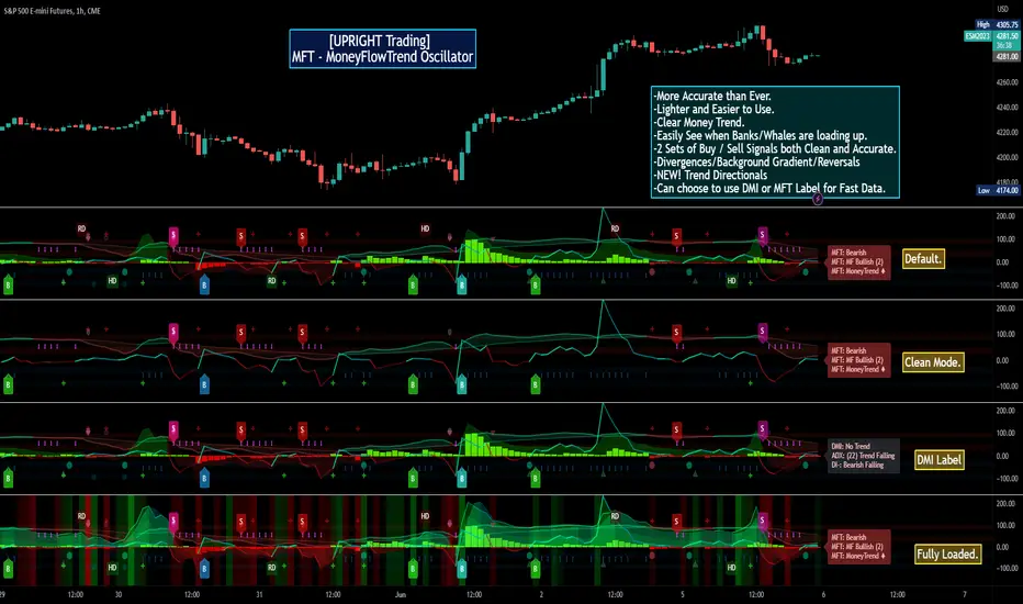
[UPRIGHT Trading] MoneyFlowTrend Oscillator(cc) PremiumHey Traders,
Tonight I'm updating my beloved original MoneyFlowTrend Oscillator with a Premium version.
A little background:
This is an indicator that I've been working to bring to life for years; learning pinescript code has allowed me to do just that.
Built on the idea of Supply & Demand Zones, this utilizes money flow and numerous calculations to create a picture of what is happening underneath the surface of the price action.
Richard Wykoff was one of the first market analysts to explain how the economic cycle can be applied to explain market price action; thus, technical analysis . He described two zones among the total of 4 phases; the two zones are Distribution and Accumulation zones, also known as Supply & Demand zones.
______________________________
Since most of you already know the economic cycle, I will try to be concise.
The basic ideas:
When supply > demand, the price goes up down.
When demand > supply, price goes up.
When demand = supply, the price stays about the same (going sideways).
Price action has --Uptrends, downtrends, and price ranges (consolidation).
Wykoff's 4 phases to explain this price action :
1) Accumulation (Demand zone)
2) Markup (Uptrend)
3) Distribution (Supply zone)
4) Markdown (Downtrend)
______________________________
With all that said, usually you will either see a sharp jump from a supply or demand zone or it will consolidate within it. Until a new one is formed on the chart.
This indicator attempts to put all of that into a lower indicator. I tried to separate the retailers and the banks and then put them back together to get a full picture.
Premium:
-Even MORE (quality & quantity) Accurate signals.
-Reversal Signal added (Circle- shown on chart)
-Cleaner Scaling and Organization.
The chart shown above should look like this:
Good luck traders.
Cheers,
Mike
(UPRIGHT Trading)
[UPRIGHT Trading] Awesome MACD+ (cc)Hello Traders,
I'd like to introduce you all to the Awesome MACD+ indicator.
As most of you know, the Moving Average Convergence Divergence, MACD, indicator is a one of the most popular indicator among traders. The MACD is a trend-momentum indicator that measures the relationship between moving averages and uses a signal line to show crossovers between the MACD line. The signal line is generally used as a trigger for buy/sell signals with a cross of the MACD line or confirmation when used with other strategies. More advanced traders will look for divergences; divergences can, for example, indicate a weakness in the current trend.
How the Awesome MACD+ is different:
This MACD uses several complex equations and filters to improve accuracy.
Multiple extremely accurate Buy/Sell signals not found on a traditional MACD indicator.
Ability to use 2 different background highlight signals and several different buy/sell signals.
Fully customizable (as always), ability to turn on or off any signals, change any of the colors to suit your needs.
***I've used Bitcoin in the chart above just to show that it is still extremely accurate using alt-coins as well.
On AAPL
Advanced algo trend filtering
Easy to read signals for every level of trader.
..Can work for the minimalist.
..Those that want every signal.
..Those that like a balance of signals.
Whatever your style or skill level, the Awesome MACD+ can be customized to fit your needs.
The above chart should look like this:
Good luck Traders.
Cheers,
Mike
(UPRIGHT Trading)

Bjorgum Key Levels
Key Levels Aims to capture 3 of the most significant points in price action
Breakouts
False Breakouts (Traps)
Back Checks
These 3 points alone, if properly identified, can be some of the most significant points of movement in the price history of an asset and bring significant gains to traders, if capitalized on. Here are a few examples of these setups
Breakouts
Breakouts can bring significant rallies as the market swings one sided after key levels are breached. This entry type can bring large trending runs to follow. Momentum is on your side, but the trade off is a higher entry.
False Breakouts
Also known as a bull trap or a bear trap, false breaks can lead to swift and significant reversals and potential for a large and sudden move to the opposite side. When a key level breakout fails to hold, parties entering to capitalize on the "epic breakout" can get left holding the bag forcing them to exit at a loss, which can double the force of pressure. Traps can bring swift gains from good entry prices. However, price is still in a larger trend against you so momentum is weak, so price action is susceptible to roll over.
Backchecks
Back checks are pull backs in trend that find middle ground to the 2 areas already described. Both momentum and entry price are decent, but risk is defined as a key level has flipped offering entry with stops below demand, or above supply.
Combining these 3 methods helps to diversify risk, understand trend development, and bring steady gains. This script helps to identify these points to traders with analysis of key levels, price structure, and trend direction, while providing visual signals and alerts for when they occur.
Best of luck in your coding and trading and thank you for your support

M.Right Awesome RSI+ (cc)Hey Traders,
Tonight I figured I'd release a special indicator that I've had in the works for years and finally was able to piece it together using pine. It's an extremely accurate take on the RSI. I plan to continue to refine the indicator and add more features, but as it is this is still one you can make a lot of money with.
(((((Please note: all circles and arrows in the chart above are drawn for illustration. Below is a chart showing regular session)))))
This indicator will act similarly to a regular RSI (Relative Strength Indicator) in that there are Oversold and Overbought levels, but also volatility bands around it to allow for more accurate signals whilst moving the Oversold (OS) and Overbought (OB) levels further apart ( less false OB/OS signals ). As shown in the chart above, it's able to detect some pretty big moves with both speed and accuracy .
Most of you are familiar with and use an RSI indicator so I will keep this description as brief as possible: The Relative Strength Index (RSI), developed by the legendary J. Welles Wilder, is a momentum oscillator that measures the speed and change of price movements; it oscillates between 0 - 100, with levels set as Overbought and Oversold. These levels are where a trader make look for a reversal, however they must keep in mind in an uptrend or bull market, the RSI tends to remain in the 40 - 90 range; 40 - 50 zone often will act as support. More advanced traders will also look for divergences between the price and the oscillator (i.e. price trending upward while oscillator trending downward). As far as oscillators go, the RSI is one of the most frequently used, by both advanced and beginner traders alike.
Works great on multiple timeframes. It may not catch every rally, but it will catch most --even on smaller timeframes (i.e. 5 minutes in image below).
As with all of my scripts I like to make them customizable:
You can change the up and down colors on the RSI ribbons and the color and style (dotted shown) of Overbought / Oversold lines. In future versions, I will add more color customizations and additions.
Can toggle 1 or both of the 2 highlight signals off to make it a little more plain.
Lot's of ways to make it look the way you'd like it to.
--The alerts include both the super accurate Bullish and Bearish signals shown with the background highlights. They are pre-filled so it will automatically display the price and time that the alert went off for you.
If I missed anything or you have a question, please let me know!
Cheers,
Mike
Please note: I have made this indicator invite only, send me a DM if you're interested in trying it out.

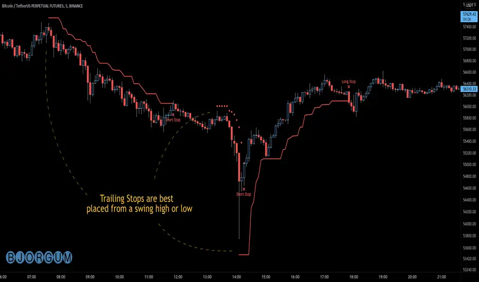
Bjorgum AutoTrailOne Time Trade Risk Management
Incorporating the new interactive feature, this script is meant as a one time trailing stop for the active trader to manage positional risk of an ongoing trade. As a crypto trader or Fx trader, many may find themselves in a position late into the evening, or perhaps daily life is calling while a trade progresses in their favor. Adding a trailing stop to a position thats trending can help to keep you in the trade and lock in gains if things turn around when you are unable to react.
To use the trail, the user would add the script to the chart. Once added, a set of crosshairs will appear allowing the user to choose a point to begin. Often choosing to start a trail from a swing high/ low can be an ideal option. This tends to provide some protection for a stop by placing it under support for a long trade or above resistance for a short trade.
Price based trail
The trail will automatically plot and the offset is a factor of the distance from price action selected by the crosshairs. If placed above price action the script will plot a short trail, if placed below it will trail for a long position.
Additionally, there are several other trail types other than price based. There is also percent based, which offsets the trail as a percent from close. A hard stop is placed at the cross hair value, then once the distance is exceeded by the percentage specified, the trail begins.
There are 2 more volatility based trails. There is a PSAR trail which can provide quicker and tighter stops that accelerate with the trend locking in gains faster, and an ATR trail that keeps a distance from price action as a function of volatility. Volatility levels can be adjusted from the menu.
Volatility based trail (ATR)
Volatility based trail (PSAR)
Lastly, within the code for more the more technical savvy, is some starting setups for string alerts to be sent to exchanges via 3rd party or custom API applications. Some string manipulation is required for specific providers to meet their requirements, but there is some building block alerts that will take the ticker symbol, recognize the asset your trading (Fx, Crypto, etc) and take input quantity or exchange names from the settings via inputs.
Complex strings can be built to perform almost any trade related task when to comes to alerts via web hook. A little setup this way with some technology to back your system can mean a semi-automated half man, half machine setup that actually manages your trail stop while you cannot. For those that don’t go this far, there is some basic alert functionality that well trigger when a trail is hit so you can react and make a decision.
Please note that for now, interactive mode is engaged only when the script is added to the chart. Additional stops, or for adjustments to be made it is best to add a new version. Also as real trades could be at play managing an actual position, alerts are designed to go off only once to ensure no duplicate orders are sent meaning alerts are not reoccurring. Once an alert is triggered, a new trail is to be set up.
A modified version of the TradingView built in SAR equation was used in this script. To provide the value of the SAR on the stop candle, it was necessary to alter the equation to extract this value as the regular SAR “flips” at this point. Thank you to TradingView for supplying access to the built in formula so that this SAR could behave the same as the built-in function outside of these alterations
Example of SAR value maintained in trigger candle
Cheers and happy trading.
Holy Pro ScalperWhat is Holy Pro Scalper
This is an advanced Indicator comprising of 21 Fuzzy and Quantitative logics running at once, which takes care of a lot of things for a trader, such as:
1> The current Dominant Trend
2> A Good Entry Point
3> A Way to Recover
4> A point to Stop
5> A Method to Book and Trail Profits
The Logics Includes Likes of :
> DonchainChannels, Supertrend, Bollinger Bands, ATR, Volume, RSI, Stoch etc....
The main Aim of this Indicator is to help traders trade with Rules, and make money if they follow it correctly.
Because One of the most important learnings which I have learnt in my professional trading career is creating a solid trading rule, which takes care of you even if the market is against you!
Another Problem the indicator tries to Solve Is What Securities to Trade for Tomorrow, Traders can plan before day trading and make the strategy towards the instrument in an effective way by just following a few rules, which are Easy to learn!
So Getting into how to Use this Indicator, (U can read the text and see the Video, shared below )
The indicator Comprises of 3 Basic UI Parts
1> Trading Signal
2> Recovery Signal
3> Dominant Trend
Trading Signal
This is represented by a triangle (both buy and sell) in (blue and Orange Colors)
There are two types of trading signals
a> Normal Trading Signal
b> Requiring Confirmation Trading Signal (“c” on top/ below of the Candle where signal Came)
The way to trade them is, one can straight away trade a normal Trading Signal, on the High of the Candle,
A “Requiring Confirmation Trading Signal” must be traded on the high of the Closing candle above the respective Signal candle, that is a trader must wait for the confirmation candle closing above the high of the Requiring Confirmation Trading Signal Candle.
Recovery Signal
A Recovery signal is a sign of recovery the system presents to a trader, when he/she have taken position/ trade as per the trading signal,
A recovery Signal helps to identify the time when its good to look for a recovery at breakeven cost or profit, if the recovery is broken,
There are two types of Recovery in the System,
1> Green Recovery
Which should be considered as a recovery when a Short Trade is active, it shows the intent of the market to change direction, so a trader while in short trade if he sees a green recovery anytime after his order is filled, he may plan to recover, if the recovery candle is broken, so he can wait to recover at breakeven cost or plan for a stop or book profit if market permits
2> Red Recovery
Which should be considered as a recovery when a Long Trade is active, it shows the intent of the market to change direction, so a trader while in long trade if he sees a red recovery anytime after his order is filled, he may plan to recover, if the recovery candle is broken, so he can wait to recover at breakeven cost or plan for a stop or book profit if market permits
Stopping Point and Dominant Trend
So Dominant Trend of the market is represented by a trend Following Line and Area
So if Area on Trend Following Line is Red, market’s dominant trend is Bear
And if Area on Trend Following Line is Green, market’s dominant trend is Bull
If a trader is in Trade the dominant trend line is considered as a stopping point, if market closes below it, in Long position, one can straight away take a Stop and May reverse trade according to thought process
Provision For Alerts
All Trading Signals
Bull Trading Signals
Bear Trading Signals
Green Recovery Signals
Red Recovery Signals
Video Examples
What Instruments and Time Frames It Works
Works on Every Liquid Instrument and Standard Timeframe (1m to 1month)
How Can u Get Access
Only do Private Message to me, use Comment Box for Constructive Comments
What If you Want To learn the Trading Setups of Profitability
Only do Private Message to me, use Comment Box for Constructive Comments
