COT Net Positions OTCCOT Net Positions Indicator Description
This is a TradingView Pine Script indicator that displays Commitment of Traders (COT) data for any trading instrument.
What it does:
Fetches COT Data - Uses the TradingView COT library to retrieve official CFTC (Commodity Futures Trading Commission) data for the current symbol
Calculates Net Positions for three trader categories:
Commercial (Blue) - Large hedging institutions; represents institutional long/short positioning
Non-Commercial (Yellow) - Large speculators and hedge funds; often considered "smart money"
Retail (Red) - Small individual traders; often considered contrarian indicators
Net Position Calculation - For each category:
Takes Long Positions minus Short Positions
Plots the result on a separate panel below the price chart
Special Symbol Handling - Includes custom mappings for specific commodities:
Copper (HG) → CFTC code 085692
Brazilian Real (LBR) → CFTC code 058644
Use Cases:
Market Bias Detection - See if institutions are mostly long or short
Contrarian Trading - When retail traders are extremely positioned one way, often the market reverses
Trend Confirmation - Non-commercial positioning often aligns with established trends
Support/Resistance - Extreme COT positions can signal market turning points
Bantlar ve Kanallar

SELL TOP
Short TradingView Description
This indicator identifies potential exhaustion points in upward trends by combining multiple technical components into one weighted signal.
It evaluates price behavior, volatility structure, momentum shifts, volume pressure, and candle characteristics.
A SELL alert is triggered only when several conditions align and exceed a predefined threshold.
The indicator uses three core technical tools:
* **RSI** – to measure strength and potential overextension
* **MACD** – to confirm momentum weakness
* **Bollinger Bands (BB)** – to assess volatility and price deviation
Each signal is clearly marked on the chart, including a visual stop-level above the signal candle.
This tool does not execute trades or guarantee results; it serves as an analytical assistant to highlight areas where bullish momentum may be weakening.
Sensitivity and behavior can be adjusted through the indicator’s settings.
raziel arusi
### 🌟 Divine Master V10.1 - Ultimate Hybrid System (Stocks & Options)
**Description:**
The **Divine Master V10.1** is a comprehensive, "All-In-One" algorithmic trading system designed for both long-term investors and short-term traders who demand a complete market overview in a single glance. This system uniquely combines classic technical analysis, institutional trend tracking, and a real-time **Black-Scholes options calculator**.
The standout feature of this version is the **"Smart Portfolio Memory"**, which allows you to save entry prices for up to 12 different assets and track P&L for two separate portfolios simultaneously (e.g., Personal & Family) without re-entering data every time you switch charts.
---
### 🚀 Key Features:
#### 1. 💼 Smart Portfolio Manager
* **12-Asset Memory:** The system automatically detects the ticker you are viewing (e.g., QQQ, NVDA) and retrieves your pre-set entry prices.
* **Dual Tracking:** Calculate P&L (Profit & Loss) in real-time for two separate accounts simultaneously ("Raziel" & "Mom" / Primary & Secondary).
* **Performance Comparison:** A clear display comparing the return on the underlying stock vs. the leveraged return on the option.
#### 2. ⚡ Real-Time Options Simulator (Black-Scholes)
* **Live Pricing:** Calculates the theoretical value of an option (Call/Put) at any given moment based on stock price, DTE (Days to Expiration), and IV (Implied Volatility).
* **Expected Move:** Visualizes a "Purple Box" on the chart, indicating the statistical range the stock is expected to move within until expiration.
* **Smart Recommendations:** Provides textual actionable advice in real-time: "Hold", "Take Profit", "Cut Loss", or warnings about "Divergence".
#### 3. 🏛️ Long-Term Investment Analysis
* **Institutional View (MA 150):** Visual indication of whether the stock is supported by institutional investors (Price above/below the 150-day Moving Average).
* **Macro Trends:** Automatic detection of **Golden Cross** (Bull Market start) and **Death Cross** (Bear Market warning).
* **Drawdown:** Measures the percentage drop from the All-Time High (ATH) to identify value opportunities.
#### 4. 📉 Short-Term Trading Tools
* **Smart Money Filter (Volume):** Identifies abnormal capital inflows (high volume) to validate trade signals.
* **Divergence Hunter:** Alerts on RSI divergences (Bullish/Bearish) to spot potential trend reversals.
* **Squeeze Radar:** Detects low-volatility consolidation periods ("Squeezes") before explosive moves.
* **ATR (Volatility Meter):** Displays volatility levels in percentage (🔥 = High Risk/Expensive Premiums, 🌊 = Calm).
* **Earnings Countdown:** Counts down days to the next earnings report with a red alert warning when the date is near (Risk Management).
#### 5. 📊 Live Dashboard (HUD)
A high-contrast table located at the top-right corner, consolidating all critical data:
* **Weighted Score:** A dynamic score from 0-100 based on all indicators.
* **Win Rate:** Historical success rate of the strategy's signals.
* **Live P&L:** Real-time profit/loss tracking.
* **Actionable Signals:** Clear Buy/Sell/Hold instructions.
---
**Developed by Raziel Arusi.**
*A tool for smart decision-making, combining wisdom and financial practice.*

FancyITM💰-Honey DripFancyITM💰 – Honey Drip is an all-in-one trading toolkit built for members of the Honey Drip Network.
It combines smart-money style Order Blocks & Breaker Blocks with a full intraday framework:
Automatic bullish & bearish order blocks
Breaker blocks and polarity shifts
VWAP, 200 SMA, EMA 21 & EMA 9
Bollinger Bands (volatility and squeeze structure)
Premarket High/Low and Previous Day High/Low key levels
How to use it (Honey Drip style):
Use VWAP + MAs to define trend and intraday bias.
Mark liquidity zones with Order Blocks, Premarket H/L, and Previous Day H/L.
Watch Bollinger Bands for volatility expansions, squeezes, and extended moves.
Look for liquidity sweeps and retests of OBs or key levels in the direction of your bias.
Use the opposite OBs, VWAP, or prior day levels as logical targets/trim zones.
Everything is color-configurable and designed to be professional, readable, and friendly how FancyITM trades with the Honey Drip Network!
Learn more at honeydripnetwork.com and follow @fancyITM on instagram


Systemic Net Liquidity (Macro Fuel for Crypto & Stocks)This indicator tracks Systemic Net Liquidity, the single most important macro factor for determining the long-term trend of risk assets like Bitcoin (BTC) and major indices (S&P 500). It measures the amount of actual cash available in the financial system to chase speculative assets, distinguishing between money that is circulating and money that is locked up at the Federal Reserve.
Mechanism (What It Measures)
The script uses direct data from the FRED (Federal Reserve Economic Data) to calculate the true state of market funding:
\text{Net Liquidity} = \text{Fed Assets (WALCL)} - \text{Treasury General Account (TGA)} - \text{Reverse Repo (RRP)}
1. Fed Assets (WALCL): The total balance sheet of the Fed (The overall supply of money).
2. Treasury General Account (TGA): Funds the US Treasury collects via bond issuance. When the TGA rises, liquidity is actively drained from the banking system (A major bearish pressure).
3. Overnight Reverse Repo (RRP): Cash parked by banks and money market funds at the Fed, effectively frozen and not contributing to market activity.
How to Interpret Signals
Treat the Net Liquidity line as the market's "Fuel Gauge":
📈 BULLISH SIGNAL (Liquidity Injection): When the Net Liquidity line is rising, money is flowing back into the system, signalling a tailwind for risk assets.
📉 BEARISH SIGNAL (Liquidity Drain): When the line is falling (often due to high TGA balances), cash is being removed. This signals major friction and pressure on price action.
⚠️ DIVERGENCE WARNING: A strong signal is generated when Price (e.g., BTC) rises, but Net Liquidity falls. This macro divergence strongly suggests a major trend reversal or correction is imminent.
Important Notes
Data Source: Data is directly sourced from FRED and updates daily/weekly. This tool is best used for macro analysis and identifying high-level cycles, not short-term scalping.
Disclaimer: Use this indicator as a confirmation tool within your broader strategy. It is not a standalone trading signal.

Opening Range FVG Indicatoruse open range and first fvg to mark out high and low to identify the market direction


Cúpula dos gestores 1,0!We present the Opening Bias Indicator, a proprietary predictive intelligence tool developed specifically for Fund Managers, Market Analysts, and High-Frequency Traders who demand a rigorous assessment of market sentiment and direction before the official opening of Wall Street (Dow Jones and NASDAQ).
Integrated Analysis of Critical Factors:
Our proprietary model transcends traditional technical analysis, robustly integrating a set of macroeconomic and geopolitical variables to generate a highly calibrated directional forecast (High, Neutral, or Low).
The methodology is based on reading and consolidating key liquidity and risk-off/risk-on global signals, including:
Global Sessions: Evaluation of the momentum and performance of Asian and European markets.
Volatility and Risk: Continuous monitoring of the VIX (Volatility Index) as a thermometer of market fear.
Monetary Fundamentals: Analysis of the 10-Year Yield Curve (Treasuries) and the strength of the DXY (Dollar Index) as pillars of global capital allocation.
Strategic Sectors: Detailed observation of performance and sentiment in the Biotechnology (Biotechs) sector.
High-Impact Events: Real-time confirmation of Impactful News and releases that may redefine the operational bias.
The Opening Bias Indicator offers an invaluable tactical advantage, allowing capital allocation and hedging strategies to be adjusted with institutional precision in the pre-market phase, mitigating the risk of surprise and capitalizing on the information gap.

Coinbase Premium Index (Custom Tickers)📊 Coinbase Premium Index (Auto Symbol Support)
1. Overview
The Coinbase Premium Index is a widely used indicator to gauge the sentiment difference between US institutional investors (Coinbase Pro) and global retail/futures traders (Binance).
This script calculates the percentage difference between the Coinbase (USD pair) price and the Binance (USDT pair) price.
2. Key Features
🔄 Auto Symbol Matching (New): You no longer need to manually change tickers when switching charts.
If you are looking at a SOL/USDT chart, the indicator automatically detects "SOL" and compares COINBASE:SOLUSD vs BINANCE:SOLUSDT.
🛠 Manual Mode: Includes a manual override option if you wish to compare specific fixed tickers (e.g., strictly BTC).
🎨 Dynamic Visuals:
Histogram: Color-coded bars (Green/Red) indicate positive or negative premiums.
Smart Label: Displays the real-time premium value on the chart. The label color adapts to the trend, and hovering over it shows a Tooltip confirming exactly which tickers are being compared.
3. How to Interpret
The premium indicates the flow of funds and buying pressure:
🟢 Positive Premium (Green Bar):
Coinbase Price > Binance Price
Interpretation: Strong buying pressure from US institutions or spot whales. Often considered a Bullish signal.
🔴 Negative Premium (Red Bar):
Coinbase Price < Binance Price
Interpretation: Strong selling from US investors, or overheated buying in the offshore futures market (Binance). Often considered a Bearish or mean-reversion signal.
4. Settings Guide
Ticker Mode:
Auto (Current Chart): Automatically sets the comparison based on your current chart's base currency (Recommended).
Manual (Custom): Uses the specific tickers defined in the manual input fields below.
Manual Inputs: Enter tickers here if using Manual Mode (Default: COINBASE:BTCUSD vs BINANCE:BTCUSDT).
Bar & Label Settings: Customize colors, transparency, and the vertical position (Y-Offset) of the data label to fit your chart layout.

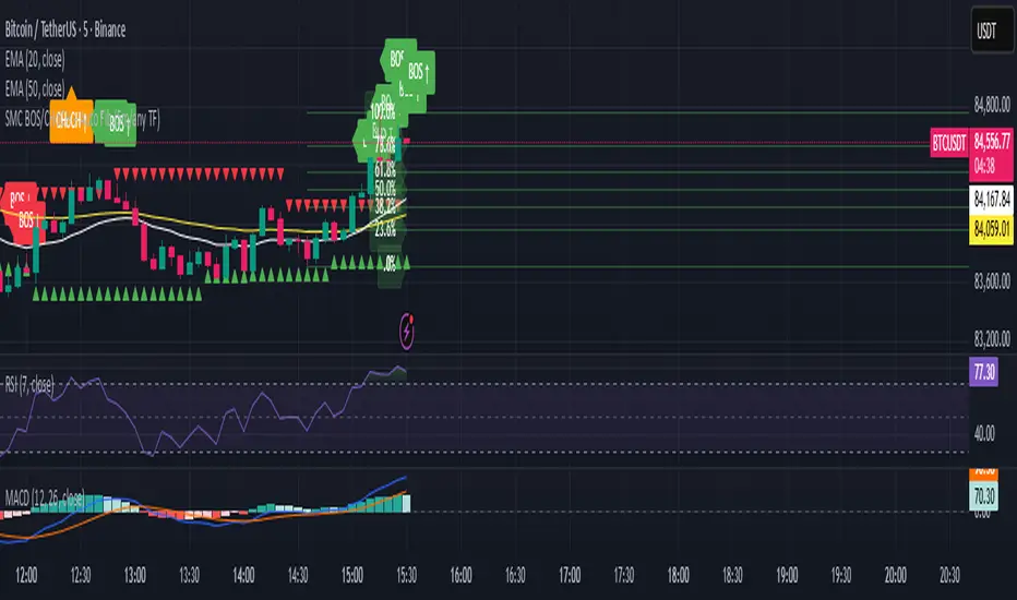
SMC BOS/CHoCH + Auto Fib (5m/any TF) durane//@version=6
indicator('SMC BOS/CHoCH + Auto Fib (5m/any TF)', overlay = true, max_lines_count = 200, max_labels_count = 200)
// --------- Inputs ----------
left = input.int(3, 'Pivot Left', minval = 1)
right = input.int(3, 'Pivot Right', minval = 1)
minSwingSize = input.float(0.0, 'Min swing size (price units, 0 = disabled)', step = 0.1)
fib_levels = input.string('0.0,0.236,0.382,0.5,0.618,0.786,1.0', 'Fibonacci levels (comma separated)')
show_labels = input.bool(true, 'Show BOS/CHoCH labels')
lookbackHighLow = input.int(200, 'Lookback for structure (bars)')
// Parse fib levels
strs = str.split(fib_levels, ',')
var array fibs = array.new_float()
if barstate.isfirst
for s in strs
array.push(fibs, str.tonumber(str.trim(s)))
// --------- Find pivot highs / lows ----------
pHigh = ta.pivothigh(high, left, right)
pLow = ta.pivotlow(low, left, right)
// store last confirmed swings
var float lastSwingHighPrice = na
var int lastSwingHighBar = na
var float lastSwingLowPrice = na
var int lastSwingLowBar = na
if not na(pHigh)
// check min size
if minSwingSize == 0 or pHigh - nz(lastSwingLowPrice, pHigh) >= minSwingSize
lastSwingHighPrice := pHigh
lastSwingHighBar := bar_index - right
lastSwingHighBar
if not na(pLow)
if minSwingSize == 0 or nz(lastSwingHighPrice, pLow) - pLow >= minSwingSize
lastSwingLowPrice := pLow
lastSwingLowBar := bar_index - right
lastSwingLowBar
// --------- Detect BOS & CHoCH (simple robust logic) ----------
var int lastBOSdir = 0 // 1 = bullish BOS (price broke above), -1 = bearish BOS
var int lastBOSbar = na
var float lastBOSprice = na
// Look for price closes beyond last structural swings within lookback
// Bullish BOS: close > recent swing high
condBullBOS = not na(lastSwingHighPrice) and close > lastSwingHighPrice and bar_index - lastSwingHighBar <= lookbackHighLow
// Bearish BOS: close < recent swing low
condBearBOS = not na(lastSwingLowPrice) and close < lastSwingLowPrice and bar_index - lastSwingLowBar <= lookbackHighLow
bosTriggered = false
chochTriggered = false
if condBullBOS
bosTriggered := true
if lastBOSdir != 1
// if previous BOS direction was -1, this is CHoCH (change of character)
chochTriggered := lastBOSdir == -1
chochTriggered
lastBOSdir := 1
lastBOSbar := bar_index
lastBOSprice := close
lastBOSprice
if condBearBOS
bosTriggered := true
if lastBOSdir != -1
chochTriggered := lastBOSdir == 1
chochTriggered
lastBOSdir := -1
lastBOSbar := bar_index
lastBOSprice := close
lastBOSprice
// --------- Plot labels for BOS / CHoCH ----------
if bosTriggered and show_labels
if chochTriggered
label.new(bar_index, high, text = lastBOSdir == 1 ? 'CHoCH ↑' : 'CHoCH ↓', style = label.style_label_up, color = color.new(color.orange, 0), textcolor = color.white, yloc = yloc.abovebar)
else
label.new(bar_index, high, text = lastBOSdir == 1 ? 'BOS ↑' : 'BOS ↓', style = label.style_label_left, color = lastBOSdir == 1 ? color.green : color.red, textcolor = color.white, yloc = yloc.abovebar)
// --------- Auto Fibonacci drawing ----------
var array fib_lines = array.new_line()
var array fib_labels = array.new_label()
var int lastFibId = na
// Function to clear previous fibs
f_clear() =>
if array.size(fib_lines) > 0
for i = 0 to array.size(fib_lines) - 1
line.delete(array.get(fib_lines, i))
if array.size(fib_labels) > 0
for i = 0 to array.size(fib_labels) - 1
label.delete(array.get(fib_labels, i))
array.clear(fib_lines)
array.clear(fib_labels)
// Decide anchors for fib: if lastBOSdir==1 (bullish) anchor from lastSwingLow -> lastSwingHigh
// if lastBOSdir==-1 (bearish) anchor from lastSwingHigh -> lastSwingLow
if lastBOSdir == 1 and not na(lastSwingLowPrice) and not na(lastSwingHighPrice)
// bullish fib: low -> high
startPrice = lastSwingLowPrice
endPrice = lastSwingHighPrice
// draw
f_clear()
for i = 0 to array.size(fibs) - 1 by 1
lvl = array.get(fibs, i)
priceLevel = startPrice + (endPrice - startPrice) * lvl
ln = line.new(x1 = lastSwingLowBar, y1 = priceLevel, x2 = bar_index, y2 = priceLevel, xloc = xloc.bar_index, extend = extend.right, color = color.new(color.green, 60), width = 1, style = line.style_solid)
array.push(fib_lines, ln)
lab = label.new(bar_index, priceLevel, text = str.tostring(lvl * 100, '#.0') + '%', style = label.style_label_right, color = color.new(color.green, 80), textcolor = color.white, yloc = yloc.price)
array.push(fib_labels, lab)
if lastBOSdir == -1 and not na(lastSwingHighPrice) and not na(lastSwingLowPrice)
// bearish fib: high -> low
startPrice = lastSwingHighPrice
endPrice = lastSwingLowPrice
f_clear()
for i = 0 to array.size(fibs) - 1 by 1
lvl = array.get(fibs, i)
priceLevel = startPrice + (endPrice - startPrice) * lvl
ln = line.new(x1 = lastSwingHighBar, y1 = priceLevel, x2 = bar_index, y2 = priceLevel, xloc = xloc.bar_index, extend = extend.right, color = color.new(color.red, 60), width = 1, style = line.style_solid)
array.push(fib_lines, ln)
lab = label.new(bar_index, priceLevel, text = str.tostring(lvl * 100, '#.0') + '%', style = label.style_label_right, color = color.new(color.red, 80), textcolor = color.white, yloc = yloc.price)
array.push(fib_labels, lab)
// --------- Optional: plot lastSwing points ----------
plotshape(not na(lastSwingHighPrice) ? lastSwingHighPrice : na, title = 'LastSwingHigh', location = location.absolute, style = shape.triangledown, size = size.tiny, color = color.red, offset = 0)
plotshape(not na(lastSwingLowPrice) ? lastSwingLowPrice : na, title = 'LastSwingLow', location = location.absolute, style = shape.triangleup, size = size.tiny, color = color.green, offset = 0)
// --------- Alerts ----------
alertcondition(bosTriggered and lastBOSdir == 1, title = 'Bullish BOS', message = 'Bullish BOS detected on {{ticker}} @ {{close}}')
alertcondition(bosTriggered and lastBOSdir == -1, title = 'Bearish BOS', message = 'Bearish BOS detected on {{ticker}} @ {{close}}')
alertcondition(chochTriggered, title = 'CHoCH Detected', message = 'CHoCH detected on {{ticker}} @ {{close}}')
// End
My script// @version=5 indicator("Custom LuxAlgo-Style Levels", overlay=true, max_lines_count=500)
// --- Trend Detection (EMA Based) fastEMA = ta.ema(close, 9) slowEMA = ta.ema(close, 21) trendUp = fastEMA > slowEMA trendDown = fastEMA < slowEMA
plot(fastEMA, title="Fast EMA", color=color.new(color.blue, 0)) plot(slowEMA, title="Slow EMA", color=color.new(color.orange, 0))
// --- Buy / Sell Signals buySignal = trendUp and ta.crossover(fastEMA, slowEMA) sellSignal = trendDown and ta.crossunder(fastEMA, slowEMA)
plotshape(buySignal, title="Buy", style=shape.labelup, color=color.new(color.green,0), size=size.small, text="BUY") plotshape(sellSignal, title="Sell", style=shape.labeldown, color=color.new(color.red,0), size=size.small, text="SELL")
// --- Auto Support & Resistance length = 20 sup = ta.lowest(length) res = ta.highest(length)
plot(sup, title="Support", color=color.new(color.green,70), linewidth=2) plot(res, title="Resistance", color=color.new(color.red,70), linewidth=2)
// --- Market Structure (Simple Swing High/Low) sh = ta.highest(high, 5) == high sl = ta.lowest(low, 5) == low
plotshape(sh, title="Swing High", style=shape.triangledown, location=location.abovebar, color=color.red, size=size.tiny) plotshape(sl, title="Swing Low", style=shape.triangleup, location=location.belowbar, color=color.green, size=size.tiny)
// --- Alerts alertcondition(buySignal, "Buy Signal", "Trend Buy Signal Detected") alertcondition(sellSignal, "Sell Signal", "Trend Sell Signal Detected")

FXG Elite Signals | FXG v2.0.4Reversal Zone Trading With Scalp , Intraday and Swing setups
Applicable for M1 Timeframe
GOLD Indicator
Added
Pre Trade Alert
SL / TP Alert
Trade Cancellation Alert

Session Open Vertical LinesThis script automatically draws vertical lines on your chart at the exact opening times of three market sessions (in your chart’s timezone):
Asian session → red line
London session → yellow line
US session → blue line

Sessions & ORB Pro | Bifrost InstituteSessions & ORB Pro | BI
Professional Session Analysis and Opening Range Breakout Tracker
This advanced indicator provides comprehensive session tracking and Opening Range Breakout (ORB) analysis across multiple global trading sessions. Designed for intraday traders, this tool helps identify key support and resistance levels, session volatility patterns, and potential breakout opportunities.
Overview
Session-based trading is crucial for understanding market behavior, as different global sessions (US, European, Asian) exhibit distinct characteristics in terms of volatility, volume, and price action. This indicator allows traders to:
Identify Session Highs and Lows: Track the boundaries of each trading session to spot key support/resistance levels
Monitor Opening Range Breakouts: Capture the first 5, 15, or 30 minutes of major exchange openings to identify early directional bias
Analyze Multi-Session Patterns: View up to 4 concurrent or sequential sessions with full historical data
Customize Visual Analysis: Tailor colors, styles, and overlays for each session independently
Key Features
Multi-Session Support
Configure up to 4 independent trading sessions (US, Europe, Asia, Custom)
Fully customizable session times with timezone support (UTC offset, Chart timezone, or Exchange timezone)
Daylight Savings Time adjustment for accurate session timing
Session range boxes with adjustable transparency and outline styles
Historical session tracking (1-20 previous sessions)
Opening Range Breakout (ORB)
Track Opening Range for major exchanges: NYSE, LSE, TSE, TSX, ASX, HKEX, SSE
Configurable ORB periods: 5-minute, 15-minute, or 30-minute ranges
Visual ORB boxes with customizable colors and outline styles
ORB High/Low lines with optional extension beyond session close
Individual color control for each session's ORB
Session Analytics
Session High/Low: Horizontal lines marking the session's price extremes
Trendline: Linear regression trendline showing session directional bias
Mean: Session average price for mean reversion analysis
VWAP: Volume-weighted average price for institutional level analysis
Range Boxes: Visual representation of each session's price range
Advanced Customization
Individual Color Pickers: Set unique colors for each overlay type per session
Line Styles: Choose between Solid, Dashed, or Dotted for all line types
Label Options: Customize labels to show Date (d/M), Day of Week (ddd), and/or Price
Extend Options: Extend Session H/L and ORB lines beyond current bar
Outline Styles: Independent control of Range and ORB outline appearance
Information Dashboard
Optional real-time dashboard displaying:
Session Status: Open/Closed indicator for each session
Trend: R² correlation coefficient showing directional strength
Volume: Cumulative session volume
σ (Sigma): Session standard deviation for volatility analysis
Range: Session High, Low, and Range in points
ORB: Opening Range High, Low, and Range in points
Dashboard is fully customizable with toggleable columns and adjustable size/position.
Flexible Configuration
Time Zone Management: Three modes for precise session timing
Historical Display: Show/hide previous sessions for cleaner charts
Label Customization: Independent label size and content options for Session H/L vs ORB
Range Settings: Adjustable transparency, outlines, and label positioning
Use Cases
Session Traders: Identify when specific markets are most active and volatile
ORB Traders: Capture early session momentum and breakout opportunities
Support/Resistance: Use session highs/lows as key price levels
VWAP Strategies: Track institutional activity through session VWAP
Multi-Market Analysis: Monitor overlap between global trading sessions
Default Configuration
The indicator comes pre-configured with US (NYSE), Europe (LSE), and Asia (TSE) sessions, making it immediately useful for forex, indices, and global equity traders. Session D is available for custom session requirements.
Perfect for day traders, scalpers, and swing traders who rely on session-based analysis and institutional order flow.

Coin Jin Multi SMA+ BB+ SMA forecast Ver2.02This script provides a complete trend-analysis system based on the
5 / 20 / 60 / 112 / 224 / 448 / 896 SMAs.
It precisely detects bullish/bearish alignment and automatically identifies
12 advanced trend-shift signals (Start, End, and Reversal).
Key Features:
● 9 SMA lines (including custom X1 & X2)
Each SMA supports custom color, width, and style (Line/Step/Circles).
● Bollinger Bands with customizable options
Fully adjustable length, source, width, style, fill transparency, and more.
● SMA Forecast (curved projection)
– Slope computed via linear regression
– Predicts up to 30 future bars
– Forced dotted style ensures visibility at all zoom levels
● 12 Advanced Trend Signals (alertcondition)
Automatically detects:
Start of full alignment (with/without SMA 896)
End of alignment
Bull ↔ Bear transitions
Perfect for momentum trading, trend-following, reversal detection, or automated alert systems.
● Labeling last value of each SMA
Each SMA prints a label such as "5", “20”, “60”, “896”, or custom lengths at the latest bar.
이 스크립트는 5 / 20 / 60 / 112 / 224 / 448 / 896 이동평균선을 기반으로
정배열·역배열 상태를 정밀하게 분석하고,
총 12가지 고급 추세 신호(시작·종료·전환) 를 자동으로 감지하는 통합 추세 분석 도구입니다.
주요 기능:
● 9개의 SMA 표시 (커스텀 X1, X2 포함)
각 SMA는 색상·굵기·형태(Line/Step/Circle)를 개별 설정할 수 있습니다.
● 볼린저밴드 표시 및 채우기 옵션
BB 길이, 소스, 타입, 두께, 투명도 등을 자유롭게 조절 가능.
● SMA Forecast (미래 방향 곡선 예측)
– 기울기 기반 선형회귀 슬로프 계산
– 곡선 형태로 미래 30봉까지 예측
– 점선(Dotted) 강제 적용으로 어떤 배율에서도 선명하게 표시
● 12가지 고급 추세 신호(alertcondition)
정배열·역배열의
Start (처음 완성될 때)
End (깨질 때)
Switch (전환)
을 모두 자동 탐지하여 트레이딩뷰 알림으로 받을 수 있음.
● SMA 마지막 가격 라벨 표시
각 SMA 끝 지점에 “5 / 20 / 60 / ... / 896” 식으로 라벨 표시.


SIGMA 0.20المؤشر SIGMA 0.20 هو نظام تداول متكامل مبني بلغة Pine Script لإعطاء إشارات واضحة وقوية للانعكاسات والاتجاهات.
💡 الوظائف الأساسية:
إشارات شراء وبيع محسّنة
مناطق الاختراق أو الكسر مع أهداف صعودًا وهبوطًا
عرض مناطق محورية مثل افتتاح اليوم، أول شمعة 4 ساعات، أول 5 دقائق
قناة الانحدار الخطي لرصد الاتجاه (Linear Regression)
لوحة معلومات Dashboard توضح الاتجاه العام، RSI، ADX، DI
صندوق السيناتور لتحديد دعم ديناميكي بناءً على قيعان قوية
✅ المميزات:
يعتمد على إشارات حقيقية
لا يكرر الإشارات كل شمعة بل فقط عندما تتحقق الشروط
يستخدم فلترة الإشارات القوية
يحتوي على رسومات ذكية (Boxes, Labels, Lines) لتوضيح كل عنصر بصريًا
⚠️ إخلاء المسؤولية:
هذا المؤشر أداة تحليل فني فقط ولا يُعتبر توصية مالية أو دعوة للشراء أو البيع. التداول في الأسواق المالية ينطوي على مخاطر وقد يؤدي إلى خسارة رأس المال. المستخدم يتحمّل كامل المسؤولية في اتخاذ قراراته بناءً على هذا المؤشر.
The SIGMA 0.20 indicator is a complete trading system built using Pine Script, designed to provide clear and strong signals for trend reversals and directions.
💡 Core Features:
Enhanced buy and sell signals
Breakout or breakdown zones with upside and downside targets
Displays key zones like daily open, first 4H candle, and first 5-minute candle
Linear Regression channel for identifying the overall trend
Dashboard panel showing trend direction, RSI, ADX, and DI
Senator Zone for identifying dynamic support based on strong pivot lows
✅ Advantages:
Based on real signals
Does not repeat signals on every candle – only when valid conditions are met
Uses advanced filtering to ensure high-quality signals
Includes smart visual elements (Boxes, Labels, Lines) to clearly highlight each signal
⚠️ Disclaimer:
This indicator is for technical analysis purposes only and does not constitute financial advice or a recommendation to buy or sell. Trading in financial markets involves risk and may result in loss of capital. The user bears full responsibility for any decisions made based on this tool.

SMA Cross + KC Breakout + ATR StopThis is the same script previously published with the exception of utilizing SMA vs EMA for those who prefer that moving average type.

MicroX- in side bar 4-7In Side bar
Shading the range of the host candle for a group of 4-7 candles makes it easier to read the movement.
تظليل نطاق الشمعة الحاضنة لمجموعة من الشموع 4-7 لتسهيل قراءة الحركة

VOSC+RSI Pro-Trend V22 (Bollinger Integration) [PersianDev]this is an extention of andicator volume osc and rsi

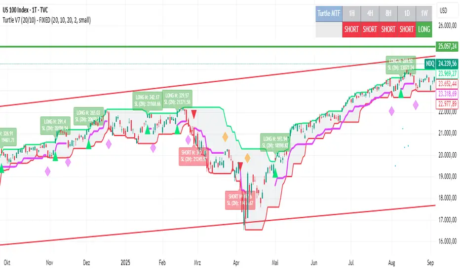
Turtle System 1 (20/10) + N-Stop + MTF Table V7.2🐢 Description: Turtle System 1 (20/10) IndicatorThis indicator implements the original trading signals of the Turtle Trading System 1 based on the classic Donchian Channels. It incorporates a historically correct, volatility-based Trailing Stop (N-Stop) and a Multi-Timeframe (MTF) status dashboard. The script is written in Pine Script v6, optimized for performance and reliability.📊 Core Logic and ParametersThe system is a pure trend-following model, utilizing the more widely known, conservative parameters of the Turtle System 1:FunctionParameterValueDescriptionEntry$\text{Donchian Breakout}$$\mathbf{20}$Buy/Sell upon breaking the 20-day High/Low.Exit (Turtle)$\text{Donchian Breakout}$$\mathbf{10}$Close the position upon breaking the 10-day Low/High.Volatility$\mathbf{N}$ (ATR Period)$\mathbf{20}$Calculation of market volatility using the Average True Range (ATR).Stop-LossMultiplier$\mathbf{2.0} BER:SETS the initial and Trailing Stop at $\mathbf{2N}$.🛠️ Key Technical Features1. Original Turtle Trailing Stop (Section 4)The stop-loss mechanism is implemented with the historically accurate Turtle Trailing Logic. The stop is not aggressively tied to the current candle's low/high, which often causes premature exits. Instead, the stop only trails in the direction of the trend, maximizing the previous stop price against the new calculated $\text{Close} \pm 2N$:$$\text{New Trailing Stop} = \text{max}(\text{Previous Stop}, \text{Close} \pm (2 \times N))$$2. Reliable Multi-Timeframe (MTF) Status (Section 6)The indicator features a robust MTF status table.Purpose: It calculates and persistently stores the Turtle System 1 status (LONG=1, SHORT=-1, FLAT=0) for various timeframes (1H, 4H, 8H, 1D, and 1W).Method: It uses global var int variables combined with request.security(), ensuring the status is accurately maintained and updated across different bars and timeframes, providing a reliable higher-timeframe context.3. VisualizationsChannels: The 20-period (Entry) and 10-period (Exit) Donchian Channels are plotted.Stop Line: The dynamic $\mathbf{2N}$ Trailing Stop is visible as a distinct line.Signals: plotshape markers indicate Entry and Exit.MTF Table: A clean, color-coded status summary is displayed in the upper right corner.