Sigmoid Risk AllocatorThe Sigmoid Risk Allocator is a dynamic position sizing indicator that tells you how much of your capital to allocate based on current market conditions. Unlike simple "risk-on/risk-off" signals, this indicator gives you smooth, gradual transitions based on a sigmoid function.
Why a Sigmoid Curve?
Most position sizing approaches use fixed thresholds: "If drawdown > 20%, buy. Otherwise, don't." This creates all-or-nothing decisions.
Using the sigmoid (S-curve) makes this decision different. It creates a smooth transition where:
Small drawdowns → Stay near your baseline allocation
Moderate drawdowns → Gradually increase exposure
Large drawdowns → Approach maximum allocation
The sigmoid curve naturally "saturates" at the extremes, preventing you from going all-in too early or panicking out too fast. This is very useful to meek traders psychology and risk management in check.
What's a Sigmoid Function?
The sigmoid function is a mathematical S-curve defined as:
σ(x) = 1 / (1 + e^(-x))
This formula takes any input value and smoothly maps it to a number between 0 and 1. The curve has three key properties that make it ideal for position sizing in investing:
Smooth transitions: No sudden jumps. Allocation changes gradually.
Saturation at extremes: The curve flattens near 0 and 1, preventing overreaction and overexposure.
Sensitive in the middle: Most of the action happens around the midpoint.
To convert this into an allocation percentage, the indicator uses:
Allocation = α_min + (α_max - α_min) × σ(k × (Risk - Midpoint))
Where:
- `α_min` = Your minimum allocation (default 50%)
- `α_max` = Your maximum allocation (default 100%)
- `Risk` = Current risk metric (drawdown %, volatility, or Kelly %)
- `Midpoint` = The risk level where allocation sits halfway between min and max (default 15%)
- `k` = Steepness—how quickly allocation changes around the midpoint
Example : With defaults, if drawdown hits 15% (the midpoint), your allocation will be 75% (halfway between 50% and 100%). As the drawdown increases beyond 15%, the allocation curves toward 100%. As it decreases toward 0%, allocation curves toward 50%.
Cool, isn't it?
Asymmetric Response: Fast In, Slow Out
The indicator uses different steepness values for scaling in vs. scaling out. This is great to increase trend following. This is something I'm proud of too in this indicator.
k_increase = 30 (steep curve): When drawdowns appear, allocation ramps up quickly to catch the opportunity
k_decrease = 5 (slower curve): When conditions normalize, allocation decreases slowly to avoid selling the rebound
This asymmetry reflects how markets behave—drawdowns often overshoot fundamentals (rewarding quick entries), while recoveries tend to be more orderly (rewarding patience on exits).
Three Risk Metrics
You can choose what drives your allocation:
Drawdown (Default)
Volatility - Scales your position inversely to current market volatility.
Kelly Criterion - Automatically calculates optimal position size. The indicator applies a conservative "half Kelly" by default.
Use Cases
Position sizing for swing trading or trend following
Risk management overlay for any existing strategy
Drawdown-based DCA (dollar cost averaging) decisions
Volatility-adjusted exposure management
Feel free to provide feedback and share your thoughts!
- Henrique Centieiro
Allocation

Sigmoid Allocation Indicator & DashboardTL;DR This sigmoid-based allocation indicator tells you percentage of your portfolio to invest based on how much the market has dropped.
Market at all-time high? → Stay defensive, invest less (e.g., 30%)
Market crashed hard? → Get aggressive, invest more (e.g., 100%)
The "sigmoid" part just means the transition between these two extremes follows a smooth S-shaped curve.
Description
This indicator is a sigmoid-based allocation system that dynamically adjusts a portfolio exposure based on market drawdown.
It compares multiple steepness curves (K values) to find your optimal risk profile for leveraged ETF strategies, but it can also be used to scale in-out from stocks, crypto and to understand whether to use leverage or not.
The Sigmoid Allocation Dashboard helps you to dynamically adjust a portfolio allocation based on how much a market has dropped from its all-time high.
I've implemented it using a sigmoid (S-curve) function, that dynamically calculates the optimal allocation percentages. Depending on the market conditions, the S curves transition between defensive and aggressive allocations.
The Math Behind It (if you are a geek like me)
This indicator uses the sigmoid function to create smooth S-curve transitions:
α(D) = α_min + (α_max - α_min) × σ(k × (D - D_mid))
Where:
σ(x) = 1 / (1 + e^(-x)) ← Standard sigmoid function
You can also check it here:
// Sigmoid function: σ(x) = 1 / (1 + e^(-x))
sigmoid(float x) =>
1.0 / (1.0 + math.exp(-x))
// Alpha calculation: α(D) = α_min + (α_max - α_min) × σ(k × (D - D_mid))
calcAlpha(float drawdown, float k, float a_min, float a_max, float d_midpoint) =>
sig_input = k * (drawdown - d_midpoint) / 100.0
a_min + (a_max - a_min) * sigmoid(sig_input)
User parameters (you can tweak this):
Allocation Min (%): Your baseline allocation when markets are at ATH (default: 30%)
Allocation Max (%): Your maximum allocation during deep drawdowns (default: 100%)
D_mid (%): The drawdown level where you want to be at the midpoint (default: 25%)
Why do I like sigmoid and not a linear line?
Unlike linear models, the sigmoid creates "floors" and "ceilings" for your allocation. It transitions smoothly, no sudden jumps, and you never exceed your defined min/max bounds.
Understand the K Values (Steepness)
The K parameter controls how quickly your allocation shifts from defensive to aggressive.
Lower K (for example K=5) will give you a gradual transition, but at 0% drawdown you are already at a 46% allocation.
A higher like (like K=40) will give you a sharp transition, but at 0% drawdown you are close to the minimum allocation. On the other hand, a higher K will give close to 100% allocation when the markets are at new lows.
The example below illustrates this well, then the S&P 500 reached new lows in October 2022:
Different K values will affect the sigmoid curves (and you allocations differently). The chart below illustrates well how K affects the sigmoid curves:
Read the Dashboard
The main dashboard shows:
Current drawdown from ATH
Allocation % for each K value
Suggested action (Defensive → MAX LONG)
Use the Reference Chart
The static reference panel shows what your allocation would be at various drawdown levels (0%, 10%, 20%, 30%, 40%, 50%), helping you plan ahead.
Identify Zones
The color-coded chart background shows:
- 🟢 Green Zone: Aggressive positioning - "Buy the Dip"
- 🟡 Yellow Zone: Transition zone - Scaling in/out
- 🔴 Red Zone: Defensive positioning - Protect ya gains
Use Cases
Use case 1: Leveraged ETF Portfolio Management (this is my main use case)
When holding leveraged ETFs like TQQQ or UPRO, volatility makes it important to:
- Reduce exposure near all-time highs (when crashes hurt most)
- Increase exposure during drawdowns (when recovery potential is highest)
Example Strategy:
- At ATH: Hold 30% TQQQ, 70% cash/bonds or other uncorrelated assets
- At 25% drawdown: Hold 65% TQQQ, 35% cash/bonds
- At 40%+ drawdown: Hold 100% TQQQ
Use case 2: Diversified Leveraged Portfolio
Compare different K values for different assets:
- Use K = 10 for broad market (QQQ/SPY exposure via TQQQ/UPRO)
- Use K = 25 for sector bets (TECL, SOXL, TMF) that you want to scale into faster
Use case 3: Systematic Rebalancing Signals
Use the alerts to trigger rebalancing:
- Alert when K3 allocation crosses above 90% (time to add)
- Alert when drawdown exceeds your D_mid threshold
- Alert when market returns to within 5% of ATH
Tips for Best Results
It works best in longer time frames
Adjust the ATR lookback window
Match your risk tolerance level
I use this for index investing and stocks and haven't tried with crypto
Thanks for using the indicator and let me know if you have any feedback :)
- Henrique Centieiro

Correlation Heatmap Matrix [TradingFinder] 20 Assets Variable🔵 Introduction
Correlation is one of the most important statistical and analytical metrics in financial markets, data mining, and data science. It measures the strength and direction of the relationship between two variables.
The correlation coefficient always ranges between +1 and -1 : a perfect positive correlation (+1) means that two assets or currency pairs move together in the same direction and at a constant ratio, a correlation of zero (0) indicates no clear linear relationship, and a perfect negative correlation (-1) means they move in exactly opposite directions.
While the Pearson Correlation Coefficient is the most common method for calculation, other statistical methods like Spearman and Kendall are also used depending on the context.
In financial market analysis, correlation is a key tool for Forex, the Stock Market, and the Cryptocurrency Market because it allows traders to assess the price relationship between currency pairs, stocks, or coins. For example, in Forex, EUR/USD and GBP/USD often have a high positive correlation; in stocks, companies from the same sector such as Apple and Microsoft tend to move similarly; and in crypto, most altcoins show a strong positive correlation with Bitcoin.
Using a Correlation Heatmap in these markets visually displays the strength and direction of these relationships, helping traders make more accurate decisions for risk management and strategy optimization.
🟣 Correlation in Financial Markets
In finance, correlation refers to measuring how closely two assets move together over time. These assets can be stocks, currency pairs, commodities, indices, or cryptocurrencies. The main goal of correlation analysis in trading is to understand these movement patterns and use them for risk management, trend forecasting, and developing trading strategies.
🟣 Correlation Heatmap
A correlation heatmap is a visual tool that presents the correlation between multiple assets in a color-coded table. Each cell shows the correlation coefficient between two assets, with colors indicating its strength and direction. Warm colors (such as red or orange) represent strong negative correlation, cool colors (such as blue or cyan) represent strong positive correlation, and mid-range tones (such as yellow or green) indicate correlations that are close to neutral.
🟣 Practical Applications in Markets
Forex : Identify currency pairs that move together or in opposite directions, avoid overexposure to similar trades, and spot unusual divergences.
Crypto : Examine the dependency of altcoins on Bitcoin and find independent movers for portfolio diversification.
Stocks : Detect relationships between stocks in the same industry or find outliers that move differently from their sector.
🟣 Key Uses of Correlation in Trading
Risk management and diversification: Select assets with low or negative correlation to reduce portfolio volatility.
Avoiding overexposure: Prevent opening multiple positions on highly correlated assets.
Pairs trading: Exploit temporary deviations between historically correlated assets for arbitrage opportunities.
Intermarket analysis: Study the relationships between different markets like stocks, currencies, commodities, and bonds.
Divergence detection: Spot when two typically correlated assets move apart as a possible trend change signal.
Market forecasting: Use correlated asset movements to anticipate others’ behavior.
Event reaction analysis: Evaluate how groups of assets respond to economic or political events.
❗ Important Note
It’s important to note that correlation does not imply causation — it only reflects co-movement between assets. Correlation is also dynamic and can change over time, which is why analyzing it across multiple timeframes provides a more accurate picture. Combining correlation heatmaps with other analytical tools can significantly improve the precision of trading decisions.
🔵 How to Use
The Correlation Heatmap Matrix indicator is designed to analyze and manage the relationships between multiple assets at once. After adding the tool to your chart, start by selecting the assets you want to compare (up to 20).
Then, choose the Correlation Period that fits your trading strategy. Shorter periods (e.g., 20 bars) are more sensitive to recent price movements, making them suitable for short-term trading, while longer periods (e.g., 100 or 200 bars) provide a broader view of correlation trends over time.
The indicator outputs a color-coded matrix where each cell represents the correlation between two assets. Warm colors like red and orange signal strong negative correlation, while cool colors like blue and cyan indicate strong positive correlation. Mid-range tones such as yellow or green suggest correlations that are close to neutral. This visual representation makes it easy to spot market patterns at a glance.
One of the most valuable uses of this tool is in portfolio risk management. Portfolios with highly correlated assets are more vulnerable to market swings. By using the heatmap, traders can find assets with low or negative correlation to reduce overall risk.
Another key benefit is preventing overexposure. For example, if EUR/USD and GBP/USD have a high positive correlation, opening trades on both is almost like doubling the position size on one asset, increasing risk unnecessarily. The heatmap makes such relationships clear, helping you avoid them.
The indicator is also useful for pairs trading, where a trader identifies assets that are usually correlated but have temporarily diverged — a potential arbitrage or mean-reversion opportunity.
Additionally, the tool supports intermarket analysis, allowing traders to see how movements in one market (e.g., crude oil) may impact others (e.g., the Canadian dollar). Divergence detection is another advantage: if two typically aligned assets suddenly move in opposite directions, it could signal a major trend shift or a news-driven move.
Overall, the Correlation Heatmap Matrix is not just an analytical indicator but also a fast, visual alert system for monitoring multiple markets at once. This is particularly valuable for traders in fast-moving environments like Forex and crypto.
🔵 Settings
🟣 Logic
Correlation Period : Number of bars used to calculate correlation between assets.
🟣 Display
Table on Chart : Enable/disable displaying the heatmap directly on the chart.
Table Size : Choose the table size (from very small to very large).
Table Position : Set the table location on the chart (top, middle, or bottom in various alignments).
🟣 Symbol Custom
Select Market : Choose the market type (Forex, Stocks, Crypto, or Custom).
Symbol 1 to Symbol 20: In custom mode, you can define up to 20 assets for correlation calculation.
🔵 Conclusion
The Correlation Heatmap Matrix is a powerful tool for analyzing correlations across multiple assets in Forex, crypto, and stock markets. By displaying a color-coded table, it visually conveys both the strength and direction of correlations — warm colors for strong negative correlation, cool colors for strong positive correlation, and mid-range tones such as yellow or green for near-zero or neutral correlation.
This helps traders select assets with low or negative correlation for diversification, avoid overexposure to similar trades, identify arbitrage and pairs trading opportunities, and detect unusual divergences between typically aligned assets. With support for custom mode and up to 20 symbols, it offers high flexibility for different trading strategies, making it a valuable complement to technical analysis and risk management.

Asset Allocation CalculatorOverview
This script is a tool that automatically calculates asset allocation for your investment portfolio. Users can set the weight of multiple assets and monitor the portfolio value in real time based on price fluctuations.
Key Features
Supports input of asset allocation percentages
Dynamic allocation calculation based on real-time price data
Automatically calculates allocated amounts for each asset based on the total investment amount
User-friendly interface with intuitive visual feedback
Settings
Total Capital : Enter the total capital, including the value of assets.
Quantity rounding : Using the rounding function may cause the target allocation to exceed 100%.
Tickers, Weight, Holdings :
To retrieve accurate asset prices, specify both the exchange and the ticker.
If you want to include cash in your portfolio, use $.
Ensure that the total allocation sums to 100%.
Refer to the pre-filled example for the correct format.
Table Settings : You can adjust the table's position, height, font size, and background color.
How to Use
By buying or selling the quantity shown in the Buy column, you can continuously maintain your target allocation.
Hold - Current holdings
Buy - Quantity to buy or sell to reach the target allocation
Target - Quantity aimed for after buying or selling
Caution
It can only calculate for a single currency, so do not mix multiple currency markets.
자산 배분 계산기
소개
이 스크립트는 투자 포트폴리오의 자산 배분을 자동으로 계산해주는 도구입니다. 사용자는 여러 자산의 비중을 설정할 수 있으며, 가격 변동에 따라 포트폴리오 가치를 실시간으로 모니터링할 수 있습니다.
주요 기능
자산 배분 비율 입력 지원
실시간 가격 데이터를 기반으로 한 동적 배분 계산
총 투자 금액을 기준으로 각 자산에 할당된 금액 자동 계산
직관적인 시각적 피드백을 제공하는 사용자 친화적인 인터페이스
설정
Total Capital : 자산 가치를 포함한 총 자본금을 입력하세요.
Quantity rounding : 반올림 기능을 사용하면 목표 비중이 100%를 초과할 수 있습니다.
Tickers, Weight, Holdings :
정확한 자산 가격을 불러오기 위해 거래소와 티커를 함께 입력하세요.
포트폴리오에 현금을 포함하려면 '$'를 사용하세요.
비중 합계가 반드시 100%가 되도록 설정하세요.
예제 형식을 참고하여 올바르게 입력하세요.
한국(원화) 시장을 위한 입력 예시입니다.
KRX:360750, 17.5, 100
KRX:310960, 17.5, 120
KRX:148070, 25, 20
KRX:305080, 25, 10
KRX:139320, 10, 150
UPBIT:BTCKRW, 5, 0.002
$,0,5000000
Table Settings : 테이블의 위치, 높이, 글자 크기 및 배경색을 조정할 수 있습니다.
사용 방법
Buy 열에 표시된 수량만큼 매수 또는 매도하면 목표 비중을 지속적으로 유지할 수 있습니다.
Hold - 현재 보유 수량
Buy - 목표 비중을 맞추기 위해 매수 또는 매도해야 하는 수량
Target - 매수, 매도 후 목표로 하는 수량
주의
한 가지 통화로만 계산할 수 있으니 여러 통화 시장을 혼용하지 마세요.

[ AlgoChart ] - Compare MarketIndicator Description:
This indicator allows you to display a second asset, selectable from the input panel, in a separate window. Plotted on the same time scale as the first asset but with a distinct price scale, the indicator enables analysis of the relationships and relative movements of two financial instruments. It’s an ideal tool for understanding whether two assets move in a correlated or divergent manner.
Key Features:
Multi-Asset Comparison: Display two assets simultaneously to compare their trends.
Custom Scale: Each asset uses its own price scale, making comparative analysis easier.
Intuitive Interface: Easily select the second asset through the input panel.
Operational Applications:
Spread Trading: Identify optimal moments to execute spread trades when two highly correlated instruments move in opposite directions.
Supply & Demand: Pinpoint zones of interest on both assets, increasing the validity of support and resistance areas.
Exposure Reduction: Monitor instruments that move similarly to avoid exposing the portfolio in identical directions, thereby reducing the risk of double losses.
Additional Features:
Candle Color Change: When a directional divergence occurs between the two assets, the candles change color to highlight the event.
Customizable Notifications: Receive instant alerts when a divergence occurs, allowing you to act promptly.

BetaBeta , also known as the Beta coefficient, is a measure that compares the volatility of an individual underlying or portfolio to the volatility of the entire market, typically represented by a market index like the S&P 500 or an investible product such as the SPY ETF (SPDR S&P 500 ETF Trust). A Beta value provides insight into how an asset's returns are expected to respond to market swings.
Interpretation of Beta Values
Beta = 1: The asset's volatility is in line with the market. If the market rises or falls, the asset is expected to move correspondingly.
Beta > 1: The asset is more volatile than the market. If the market rises or falls, the asset's price is expected to rise or fall more significantly.
Beta < 1 but > 0: The asset is less volatile than the market. It still moves in the same direction as the market but with less magnitude.
Beta = 0: The asset's returns are not correlated with the market's returns.
Beta < 0: The asset moves in the opposite direction to the market.
Example
A beta of 1.20 relative to the S&P 500 Index or SPY implies that if the S&P's return increases by 1%, the portfolio is expected to increase by 12.0%.
A beta of -0.10 relative to the S&P 500 Index or SPY implies that if the S&P's return increases by 1%, the portfolio is expected to decrease by 0.1%. In practical terms, this implies that the portfolio is expected to be predominantly 'market neutral' .
Calculation & Default Values
The Beta of an asset is calculated by dividing the covariance of the asset's returns with the market's returns by the variance of the market's returns over a certain period (standard period: 1 years, 250 trading days). Hint: It's noteworthy to mention that Beta can also be derived through linear regression analysis, although this technique is not employed in this Beta Indicator.
Formula: Beta = Covariance(Asset Returns, Market Returns) / Variance(Market Returns)
Reference Market: Essentially any reference market index or product can be used. The default reference is the SPY (SPDR S&P 500 ETF Trust), primarily due to its investable nature and broad representation of the market. However, it's crucial to note that Beta can also be calculated by comparing specific underlyings, such as two different stocks or commodities, instead of comparing an asset to the broader market. This flexibility allows for a more tailored analysis of volatility and correlation, depending on the user's specific trading or investment focus.
Look-back Period: The standard look-back period is typically 1-5 years (250-1250 trading days), but this can be adjusted based on the user's preference and the specifics of the trading strategy. For robust estimations, use at least 250 trading days.
Option Delta: An optional feature in the Beta Indicator is the ability to select a specific Delta value if options are written on the underlying asset with Deltas less than 1, providing an estimation of the beta-weighted delta of the position. It involves multiplying the beta of the underlying asset by the delta of the option. This addition allows for a more precise assessment of the underlying asset's correspondence with the overall market in case you are an options trader. The default Delta value is set to 1, representing scenarios where no options on the underlying asset are being analyzed. This default setting aligns with analyzing the direct relationship between the asset itself and the market, without the layer of complexity introduced by options.
Calculation: Simple or Log Returns: In the calculation of Beta, users have the option to choose between using simple returns or log returns for both the asset and the market. The default setting is 'Simple Returns'.
Advantages of Using Beta
Risk Management: Beta provides a clear metric for understanding and managing the risk of a portfolio in relation to market movements.
Portfolio Diversification: By knowing the beta of various assets, investors can create a balanced portfolio that aligns with their risk tolerance and investment goals.
Performance Benchmarking: Beta allows investors to compare an asset's risk-adjusted performance against the market or other benchmarks.
Beta-Weighted Deltas for Options Traders
For options traders, understanding the beta-weighted delta is crucial. It involves multiplying the beta of the underlying asset by the delta of the option. This provides a more nuanced view of the option's risk relative to the overall market. However, it's important to note that the delta of an option is dynamic, changing with the asset's price, time to expiration, and other factors.

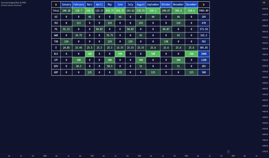
Dividend Calendar (Zeiierman)█ Overview
The Dividend Calendar is a financial tool designed for investors and analysts in the stock market. Its primary function is to provide a schedule of expected dividend payouts from various companies.
Dividends, which are portions of a company's earnings distributed to shareholders, represent a return on their investment. This calendar is particularly crucial for investors who prioritize dividend income, as it enables them to plan and manage their investment strategies with greater effectiveness. By offering a comprehensive overview of when dividends are due, the Dividend Calendar aids in informed decision-making, allowing investors to time their purchases and sales of stocks to optimize their dividend income. Additionally, it can be a valuable tool for forecasting cash flow and assessing the financial health and dividend-paying consistency of different companies.
█ How to Use
Dividend Yield Analysis:
By tracking dividend growth and payouts, traders can identify stocks with attractive dividend yields. This is particularly useful for income-focused investors who prioritize steady cash flow from their investments.
Income Planning:
For those relying on dividends as a source of income, the calendar helps in forecasting income.
Trend Identification:
Analyzing the growth rates of dividends helps in identifying long-term trends in a company's financial health. Consistently increasing dividends can be a sign of a company's strong financial position, while decreasing dividends might signal potential issues.
Portfolio Diversification:
The tool can assist in diversifying a portfolio by identifying a range of dividend-paying stocks across different sectors. This can help mitigate risk as different sectors may react differently to market conditions.
Timing Investments:
For those who follow a dividend capture strategy, this indicator can be invaluable. It can help in timing the buying and selling of stocks around their ex-dividend dates to maximize dividend income.
█ How it Works
This script is a comprehensive tool for tracking and analyzing stock dividend data. It calculates growth rates, monthly and yearly totals, and allows for custom date handling. Structured to be visually informative, it provides tables and alerts for the easy monitoring of dividend-paying stocks.
Data Retrieval and Estimation: It fetches dividend payout times and amounts for a list of stocks. The script also estimates future values based on historical data.
Growth Analysis: It calculates the average growth rate of dividend payments for each stock, providing insights into dividend consistency and growth over time.
Summation and Aggregation: The script sums up dividends on a monthly and yearly basis, allowing for a clear view of total payouts.
Customization and Alerts: Users can input custom months for dividend tracking. The script also generates alerts for upcoming or current dividend payouts.
Visualization: It produces various tables and visual representations, including full calendar views and income tables, to display the dividend data in an easily understandable format.
█ Settings
Overview:
Currency:
Description: This setting allows the user to specify the currency in which dividend values are displayed. By default, it's set to USD, but users can change it to their local currency.
Impact: Changing this value alters the currency denomination for all dividend values displayed by the script.
Ex-Date or Pay-Date:
Description: Users can select whether to show the Ex-dividend day or the Actual Payout day.
Impact: This changes the reference date for dividend data, affecting the timing of when dividends are shown as due or paid.
Estimate Forward:
Description: Enables traders to predict future dividends based on historical data.
Impact: When enabled, the script estimates future dividend payments, providing a forward-looking view of potential income.
Dividend Table Design:
Description: Choose between viewing the full dividend calendar, just the cumulative monthly dividend, or a summary view.
Impact: This alters the format and extent of the dividend data displayed, catering to different levels of detail a user might require.
Show Dividend Growth:
Description: Users can enable dividend growth tracking over a specified number of years.
Impact: When enabled, the script displays the growth rate of dividends over the selected number of years, providing insight into dividend trends.
Customize Stocks & User Inputs:
This setting allows users to customize the stocks they track, the number of shares they hold, the dividend payout amount, and the payout months.
Impact: Users can tailor the script to their specific portfolio, making the dividend data more relevant and personalized to their investments.
-----------------
Disclaimer
The information contained in my Scripts/Indicators/Ideas/Algos/Systems does not constitute financial advice or a solicitation to buy or sell any securities of any type. I will not accept liability for any loss or damage, including without limitation any loss of profit, which may arise directly or indirectly from the use of or reliance on such information.
All investments involve risk, and the past performance of a security, industry, sector, market, financial product, trading strategy, backtest, or individual's trading does not guarantee future results or returns. Investors are fully responsible for any investment decisions they make. Such decisions should be based solely on an evaluation of their financial circumstances, investment objectives, risk tolerance, and liquidity needs.
My Scripts/Indicators/Ideas/Algos/Systems are only for educational purposes!
Consensio Allocation ToolOriginally created and taught by Taylor Jenks, this indicator provides portfolio allocation suggestions based on the behaviour of price and 3 simple moving averages (4/10/40 by default)
(ie. when short & medium term SMAs are above the long term then allocation is to be 100%).
This percentage allocated to the stock/commodity is to be reduced as it passes below the SMA's, particularly as each moving average crosses.
Consensio is useful for scaling in and out of a position as the portfolio allocation will change according to the momentum of the asset.
The rules below are my own based on understanding of the trading system developed by Jenks and his online content.
This script has the following rules:
if fastAboveSlowMA and not mediumAboveSlowMA
allocation := 30.0
else if longAboveFastMA
allocation := 0.0
else if fastAboveMediumMA and fastAboveSlowMA
allocation := 100.0
else if not fastAboveMediumMA and fastAboveSlowMA
allocation := 80.0
else if not fastAboveMediumMA and not fastAboveSlowMA
allocation := 50.0
else if not mediumAboveSlowMA and fastAboveSlowMA
allocation := 50.0
// Calculate adjusted allocation percentage based on crossing moving averages
allocation := allocation + (priceAboveFastMA ? 10.0 : -10.0)
allocation := allocation + (priceAboveMediumMA ? 10.0 : -10.0)

Portfolio Tracker For Stocks & CryptoThis is a portfolio tracker that will track individual, overall and daily profit/loss for up to 12 assets. You can set the size of your buys and price of your buys for accurate, up to date profit and loss data right on your chart. It works on all markets and timeframes.
HOW TO USE
Go into the indicator settings and you will see all of the available settings. The first is the ability to turn the tracker info table on or off from the chart, so it saves your portfolio info but let’s you remove it from the chart while trading. Second is the option to move the position of the info table to suit your preference.
Next we get into setting up your portfolio tickers, order size and price. Each ticker lets you set which stock/crypto you bought, then set how much you purchased and then what price you purchased them at.
Go through and set up all of your assets and then turn off any tickers that you don’t need. Once that is all done, your portfolio will be shown on the chart with all the data.
FEATURES
Top Section
The portfolio tracker has 2 sections. The top section shows each ticker in your portfolio individually with the following data:
- Ticker Name
- Weight of that asset compared to your total portfolio in %
- Current value of that position in $
- Profit or loss value from purchase price in %
- Todays change in value from yesterday’s close in %
The $ Value, PnL % and Today % will all change colors from green to red depending if they are in profit or not.
Bottom Section
The bottom section of the tracker will give you info for your portfolio as a whole. It has the following data:
- Total cost of your entire portfolio in $
- Current value of your entire portfolio in $
- Current profit or loss of your entire portfolio in $
- Current profit or loss of your entire portfolio in %
- Todays change of your entire portfolio value compared to yesterday’s close in %
The $ Value, PnL $, PnL % and Today % will all change colors from green to red depending if they are in profit or not.

Portfolio PerformanceThis indicators will help you to compute portfolio performance and display results with a stats table and a nice monthly chart.
In this script you can do following:
Compose portfolio with up to 15 instruments
Change Initial capital / date range / rebalancing period
Compare portfolio performance with a benchmark
Compute basic stats
Compute instruments contribution
Display monthly performance of portfolio and benchmark
Change style for almost everything you see on your chart
Hope it will be useful for you!
Thanks to @MUQWISHI for helping me coding it.
Disclaimer
Please remember that past performance may not be indicative of future results.
Due to various factors, including changing market conditions, the strategy may no longer perform as well as in historical backtesting.
This post and the script don’t provide any financial advice.

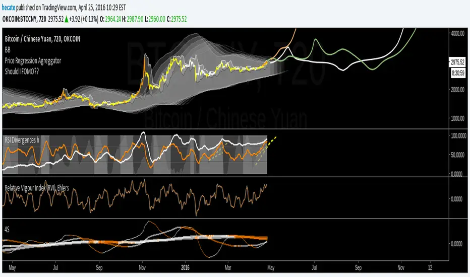
4S4Slopes. hecate
==============
Using 4 smoothed Slopes (not lagging) and checking when they start to decrease (entering the orange zone) we can either get a general idea (although quite chaotic) view or general tendency of all together .
OR
Use them trading the equity in 4 parts. one will be trading on faster movements (faster slope), second slightly slower and the other two slower and slower. Faster ones will be more profitable but more aggressive and risky than the slower ones.